Small multiple lines

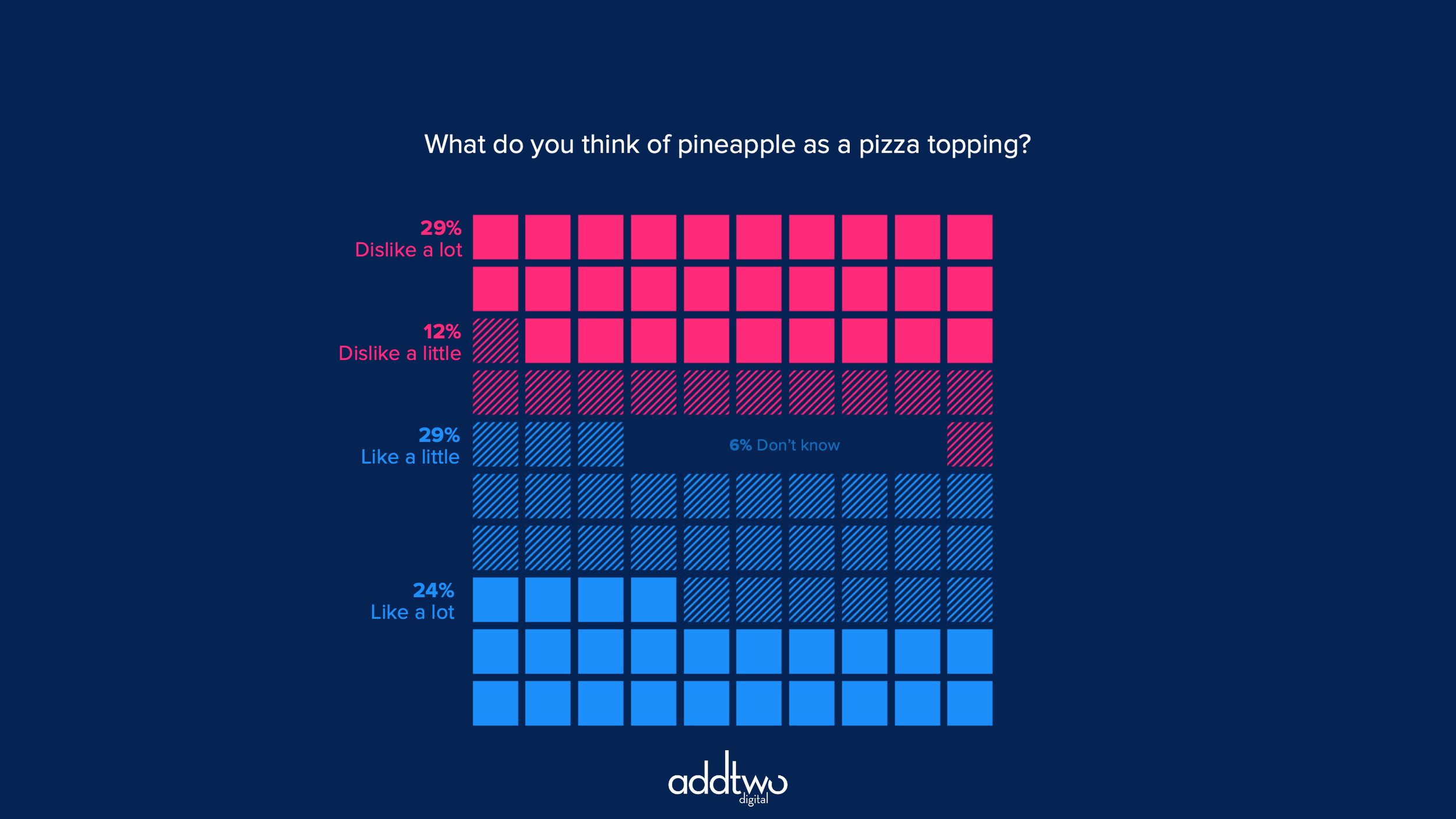
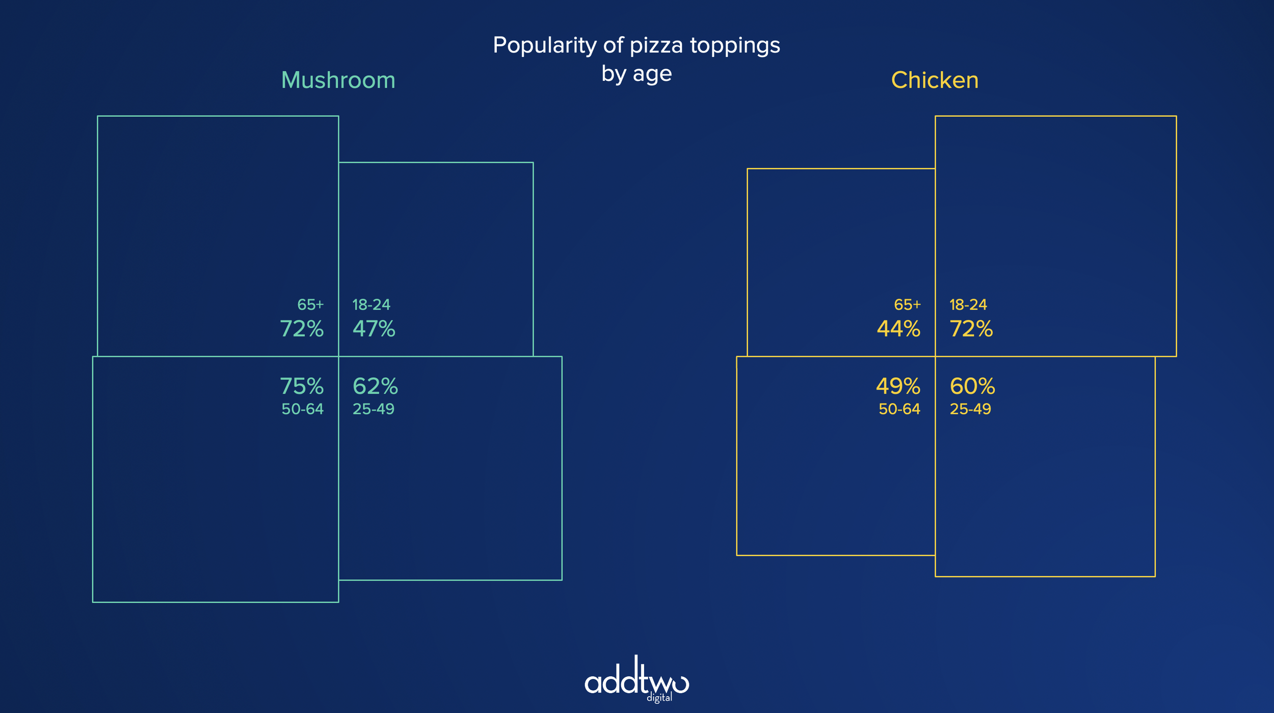
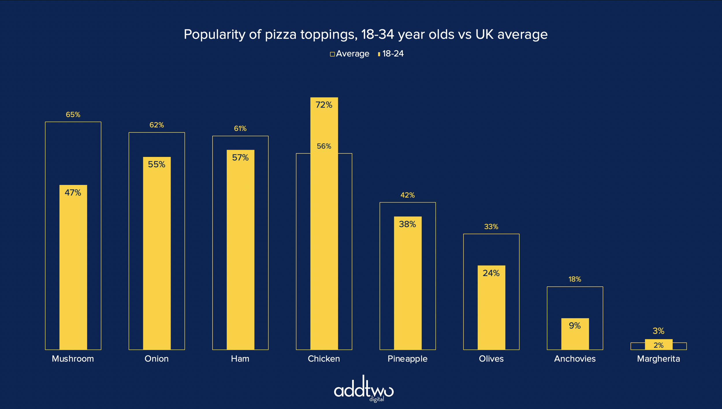
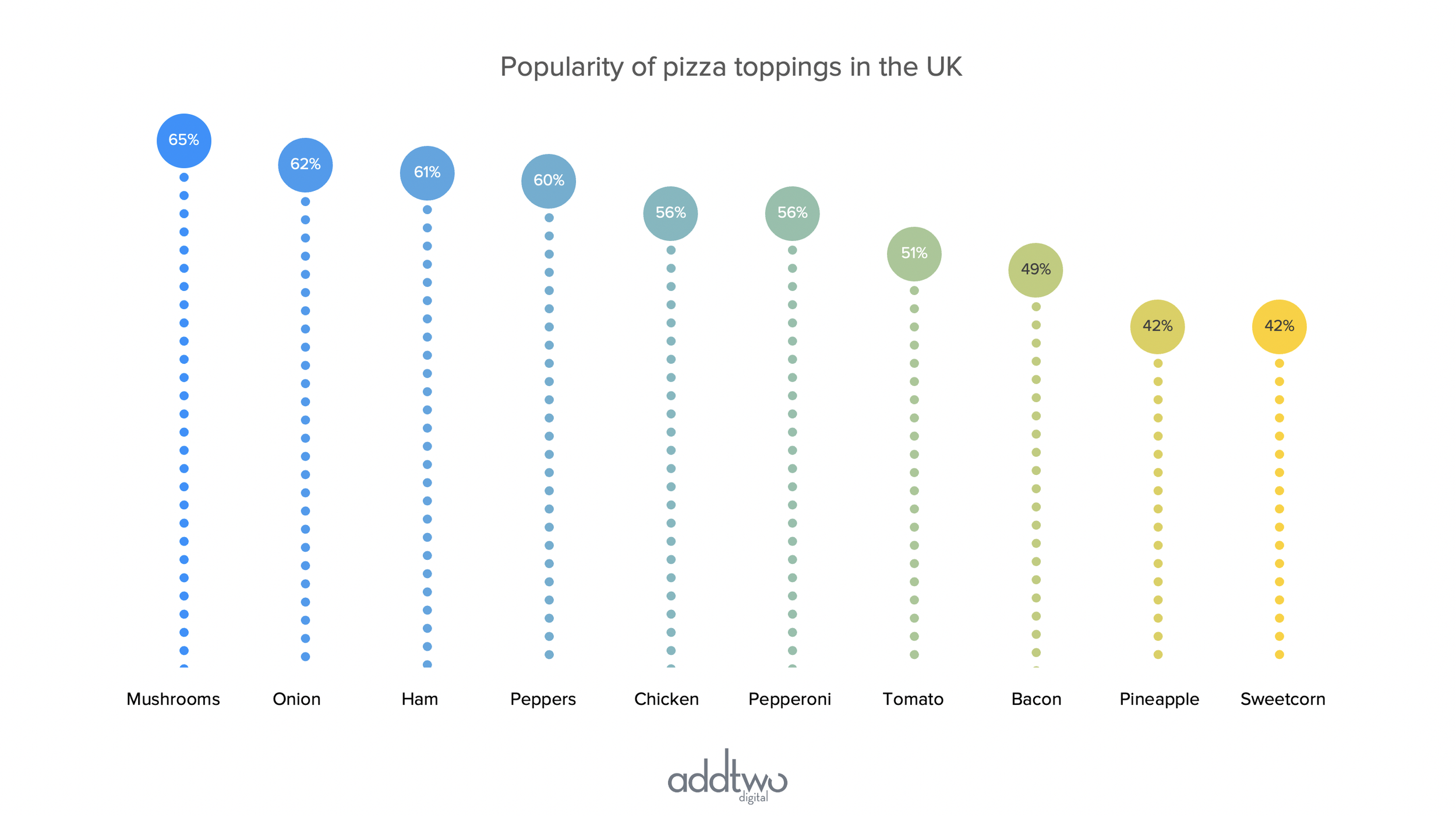
Small multiples are created by repeating simple versions of the same chart, to allow the individual charts to be easily compared. They can be very useful as a way of avoiding overly complex line charts with lots of overlapping lines. You can, of course, make them by simply making lots of small line charts, but this method uses a single PowerPoint line chart to make lots of separate charts.

This tutorial assumes you’re reasonably au fait with PowerPoint and how it makes charts. If you feel you need a more indepth introduction, click here to find out more about the basics of the PowerPoint charting engine

So, how do we make this in PowerPoint?

In this how-to, we’ll be using the default sample data PowerPoint gives you, so you can follow along without needing to download anything, but if you want to, you can find the dataset we used to make the example at the top, and a PowerPoint deck with that slide in, and other examples, here: 

https://docs.google.com/presentation/d/1UExqGd35DYvxmcsaRdKA17oQmFEWmsfG?rtpof=true&usp=drive_fs

What you’ll need

  • Line chart

  • Data manipulation

  • Chart manipulation

  • Custom labelling

How you do it

We’re going to make a line chart with multiple consecutive data series and then introduce a gap between each series filled with a placeholder data point. By converting that final series into a column chart we can make a space, separating out the individual lines from each other.

Details

Insert the chart

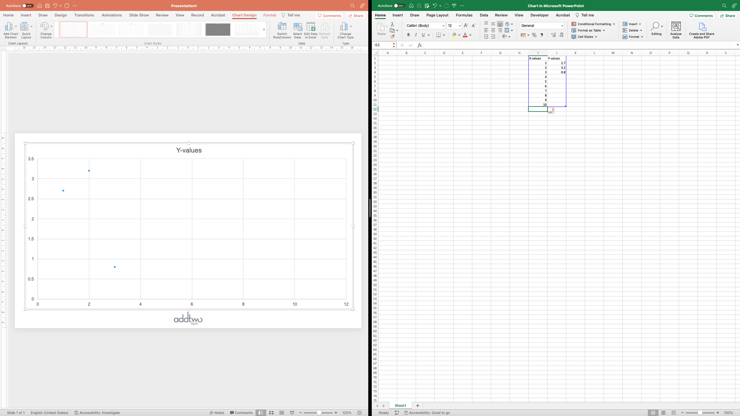
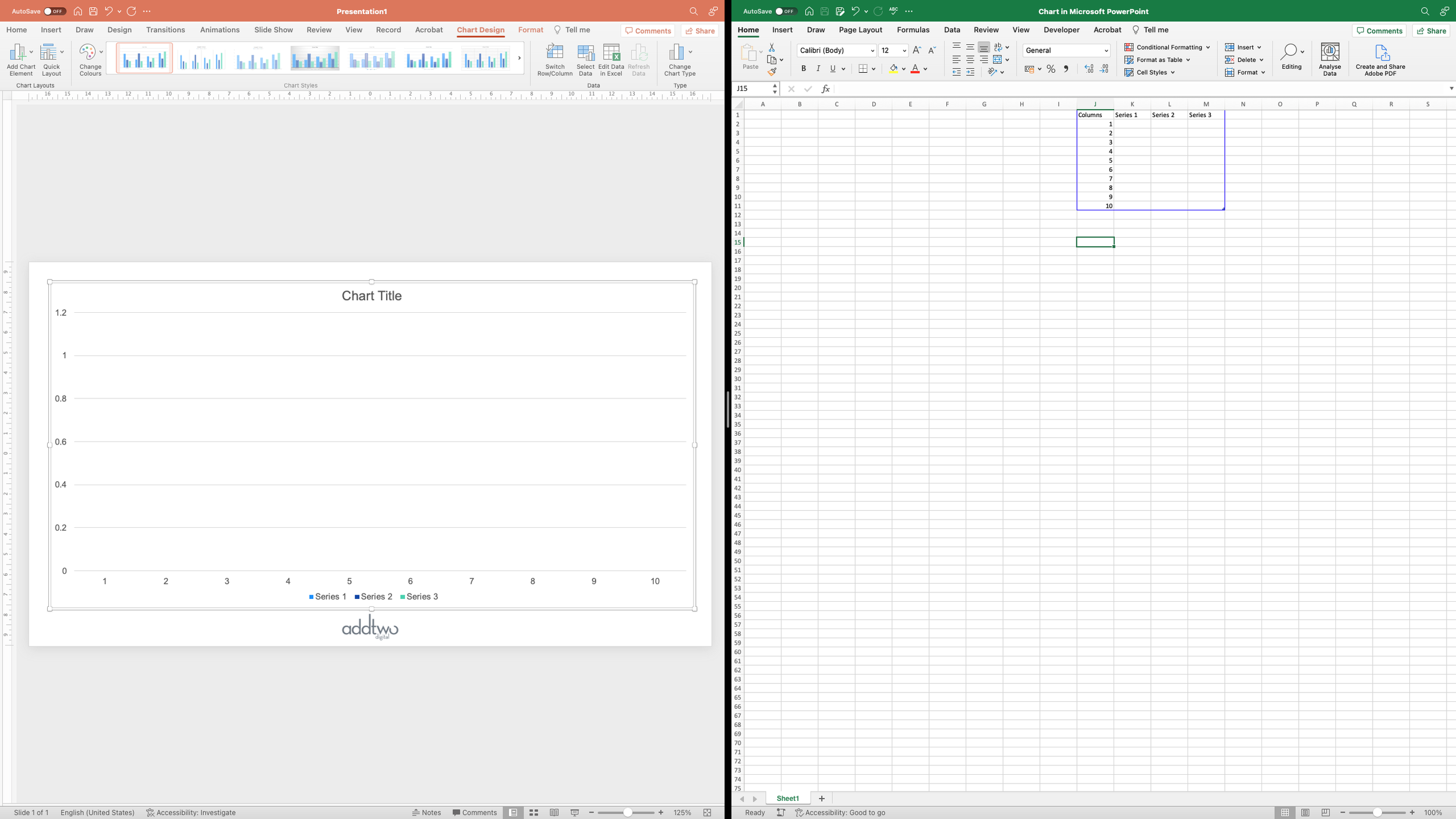
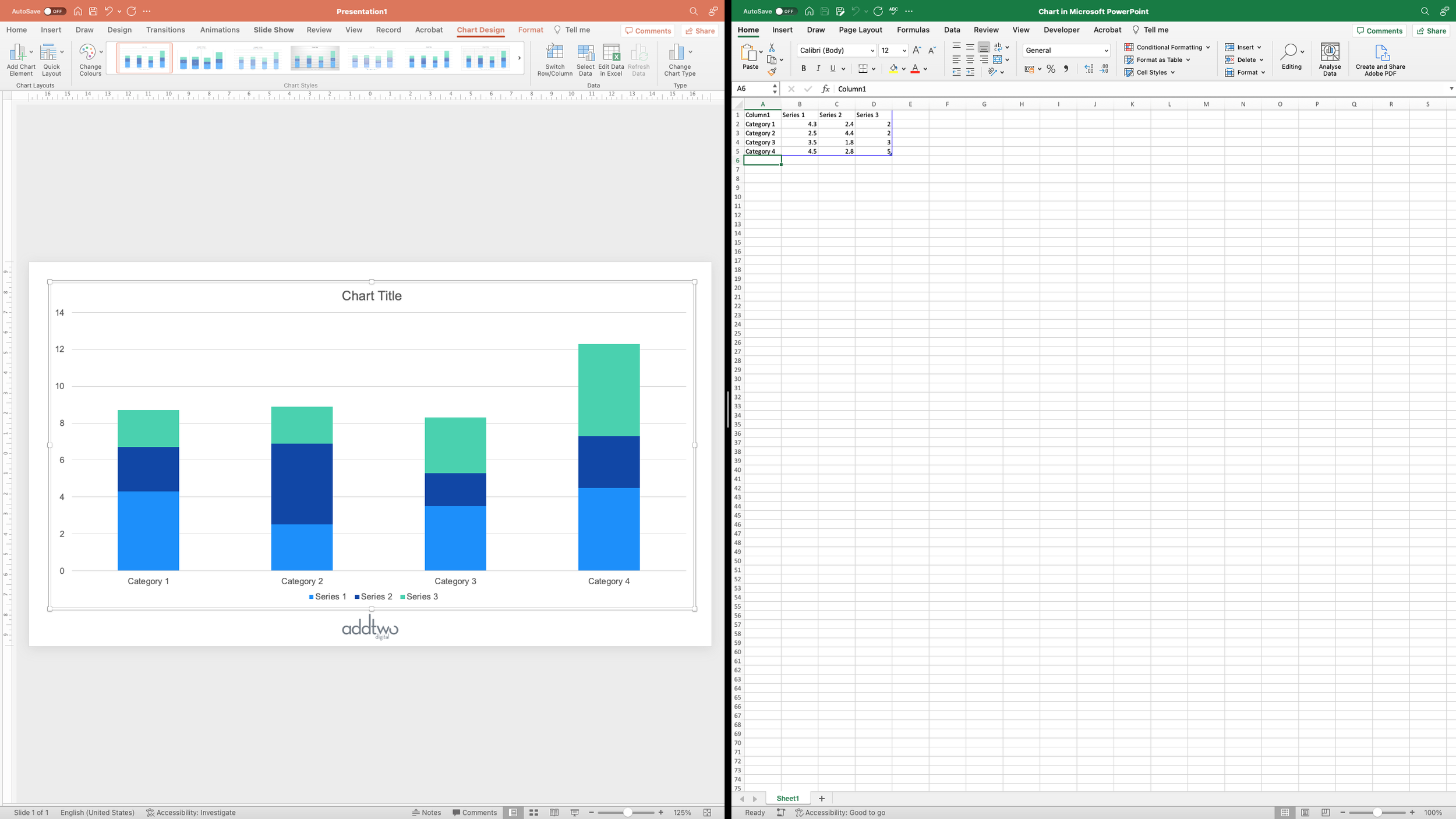
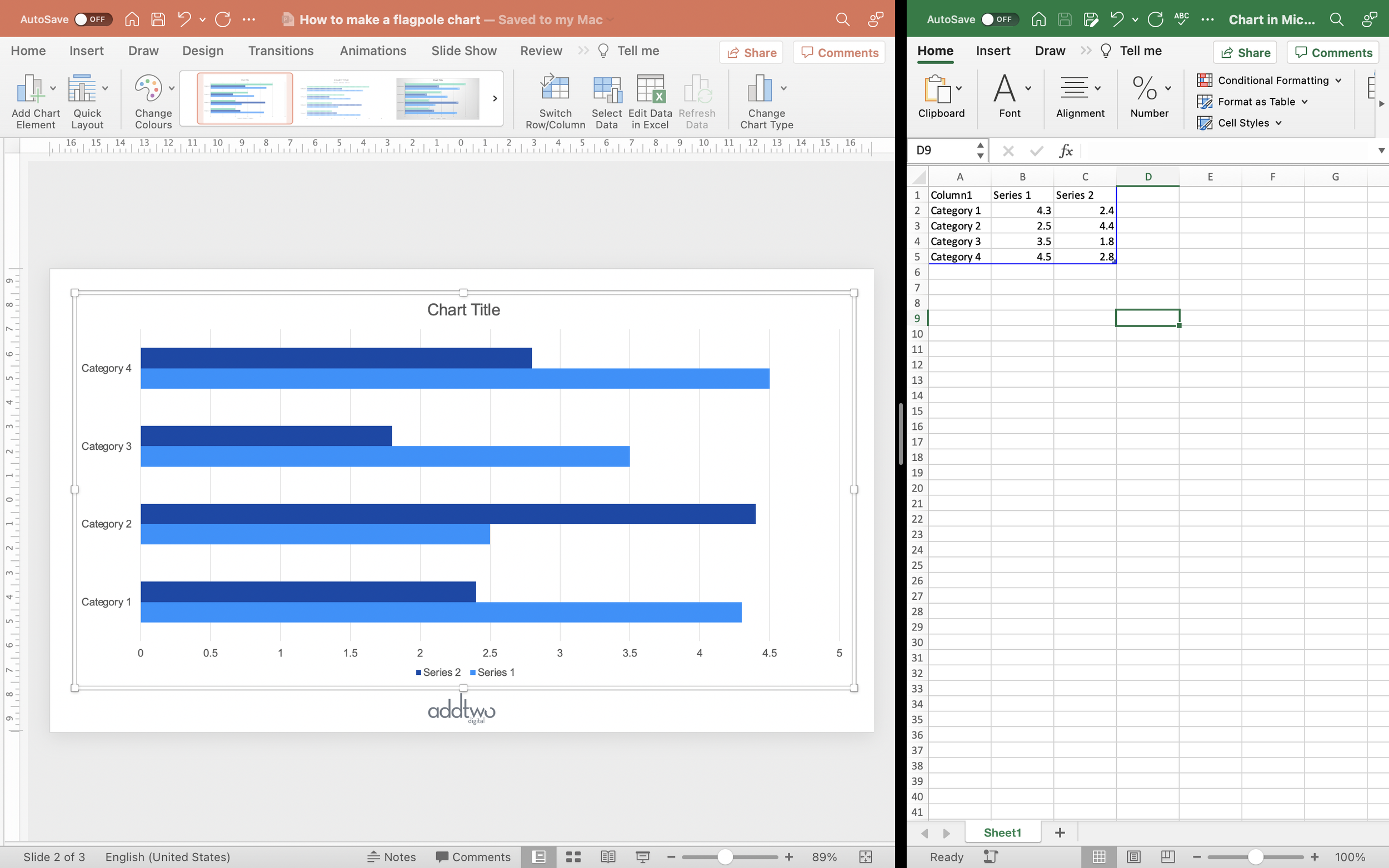
We’re going to start by inserting a standard PowerPoint line chart

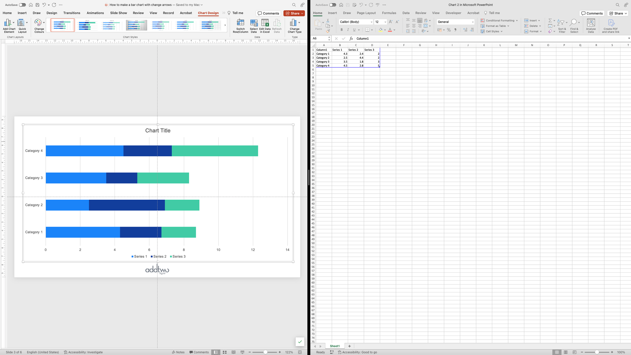
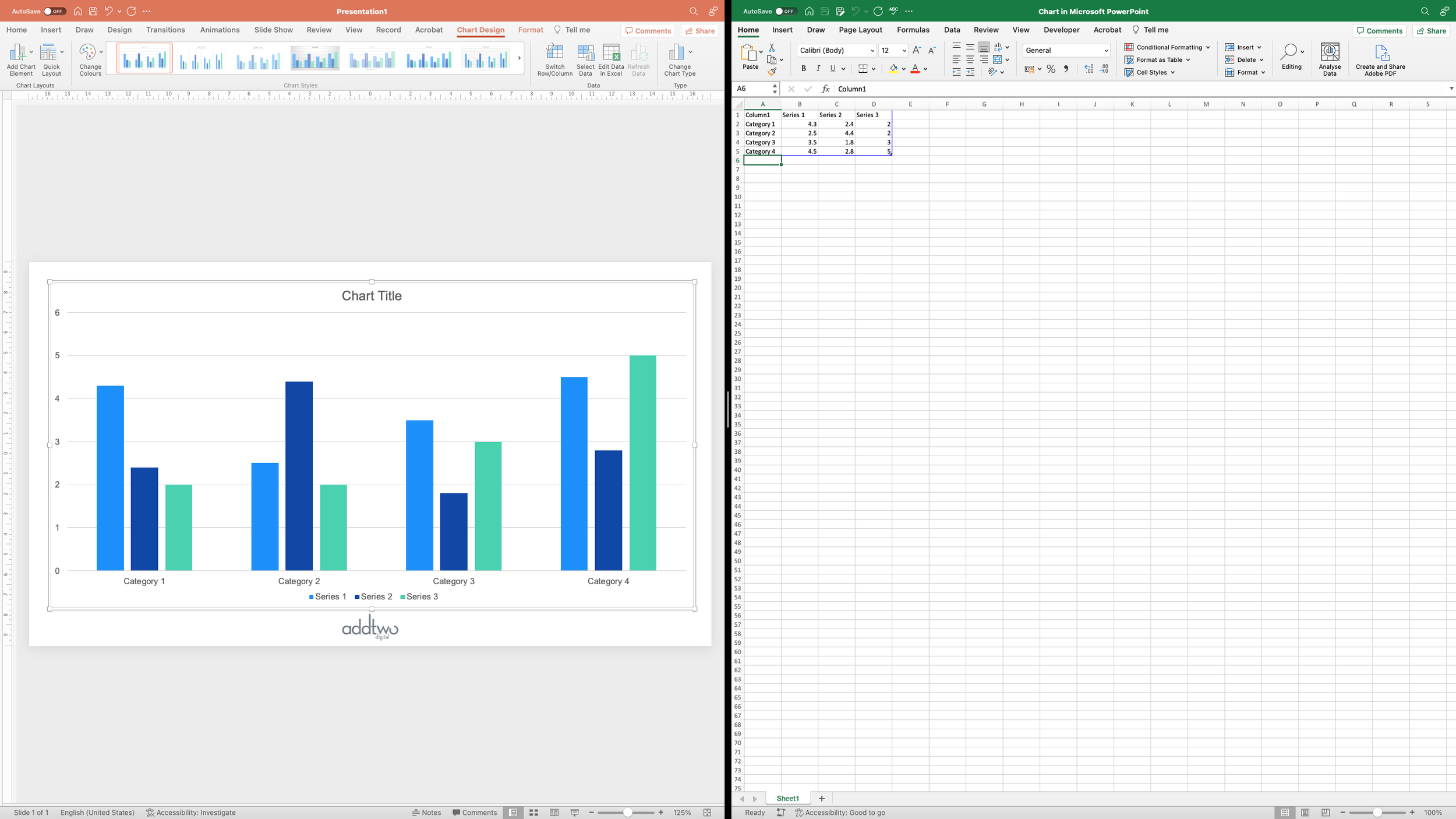
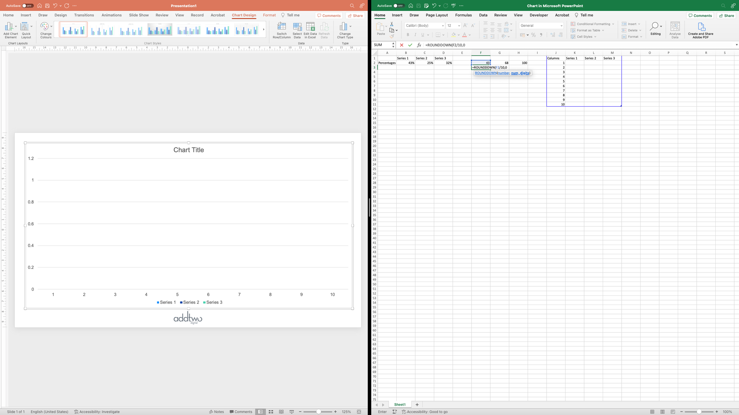
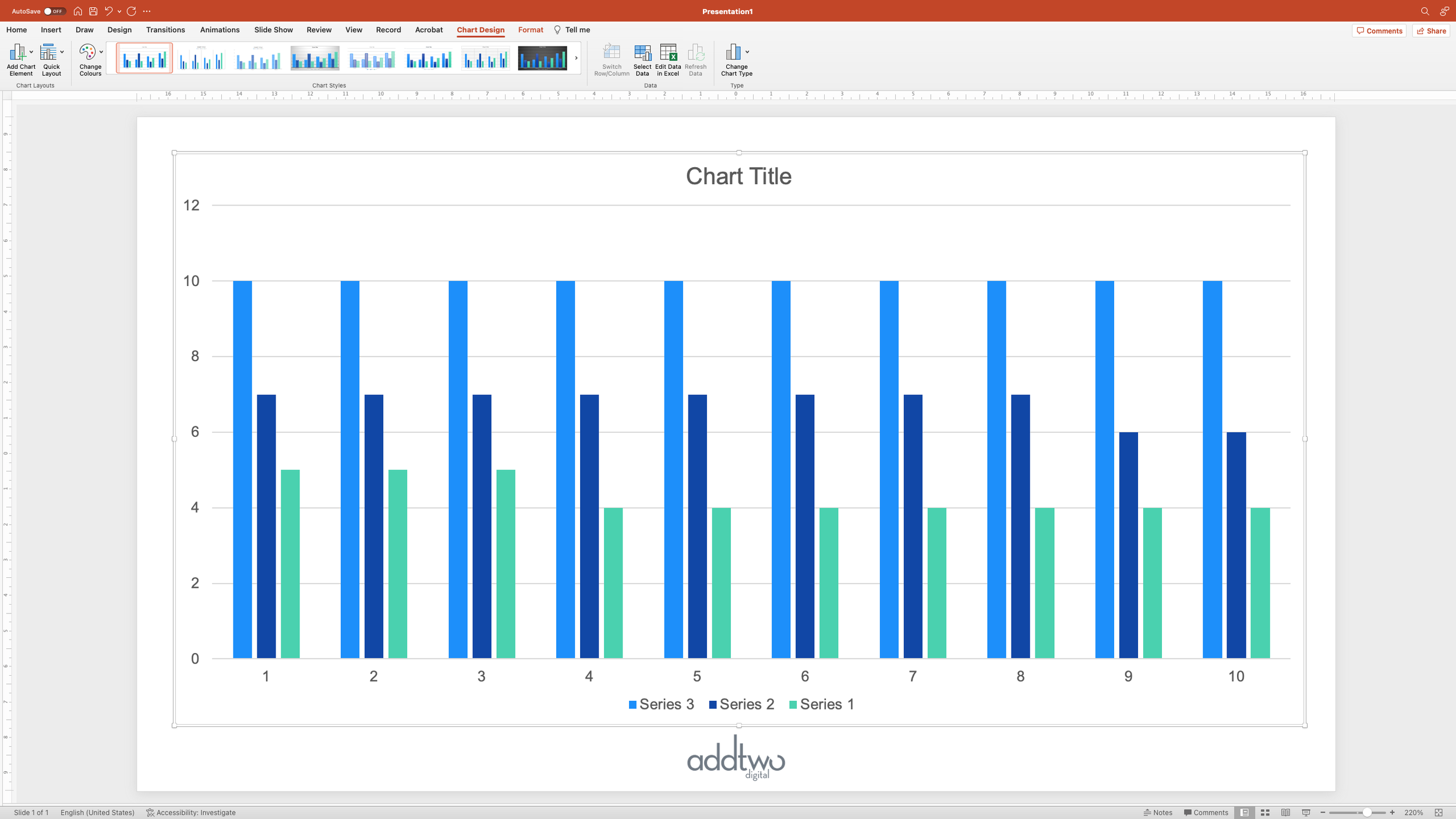
As usual PowerPoint will create an example chart and open Excel to show us the dummy data behind it.

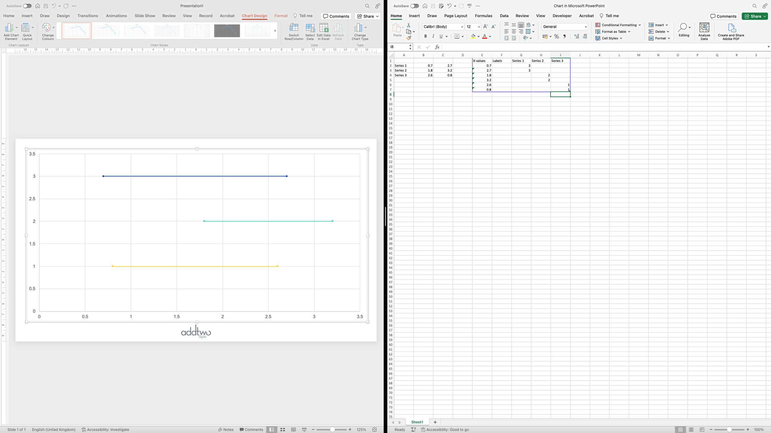
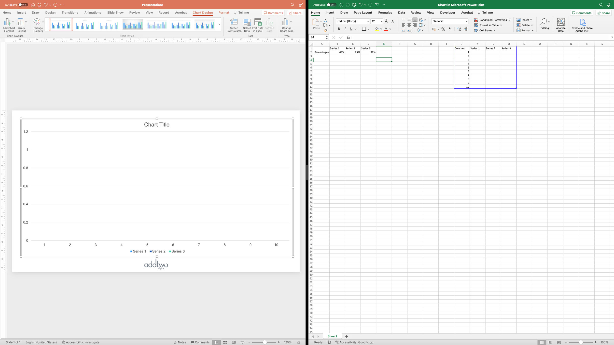
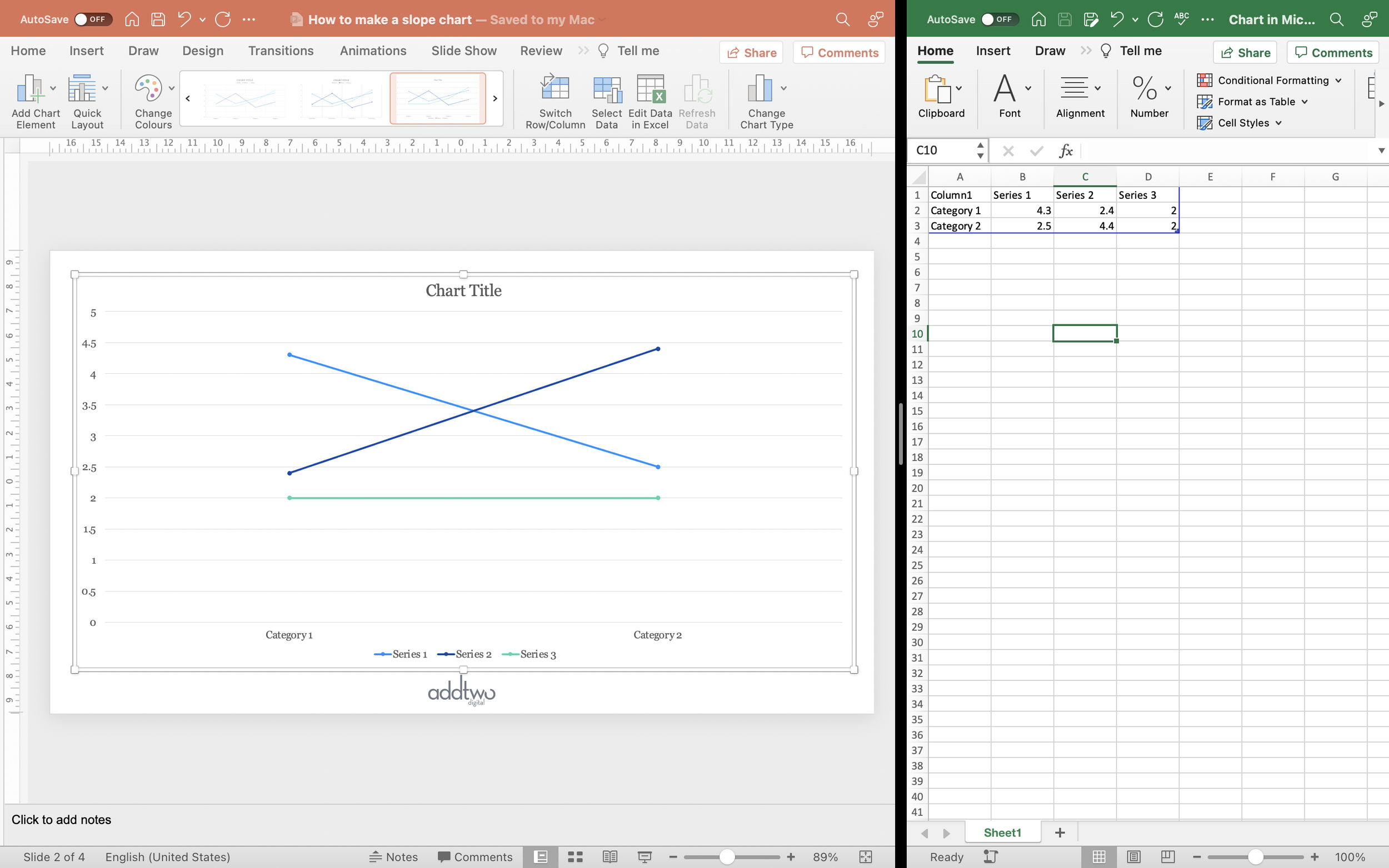
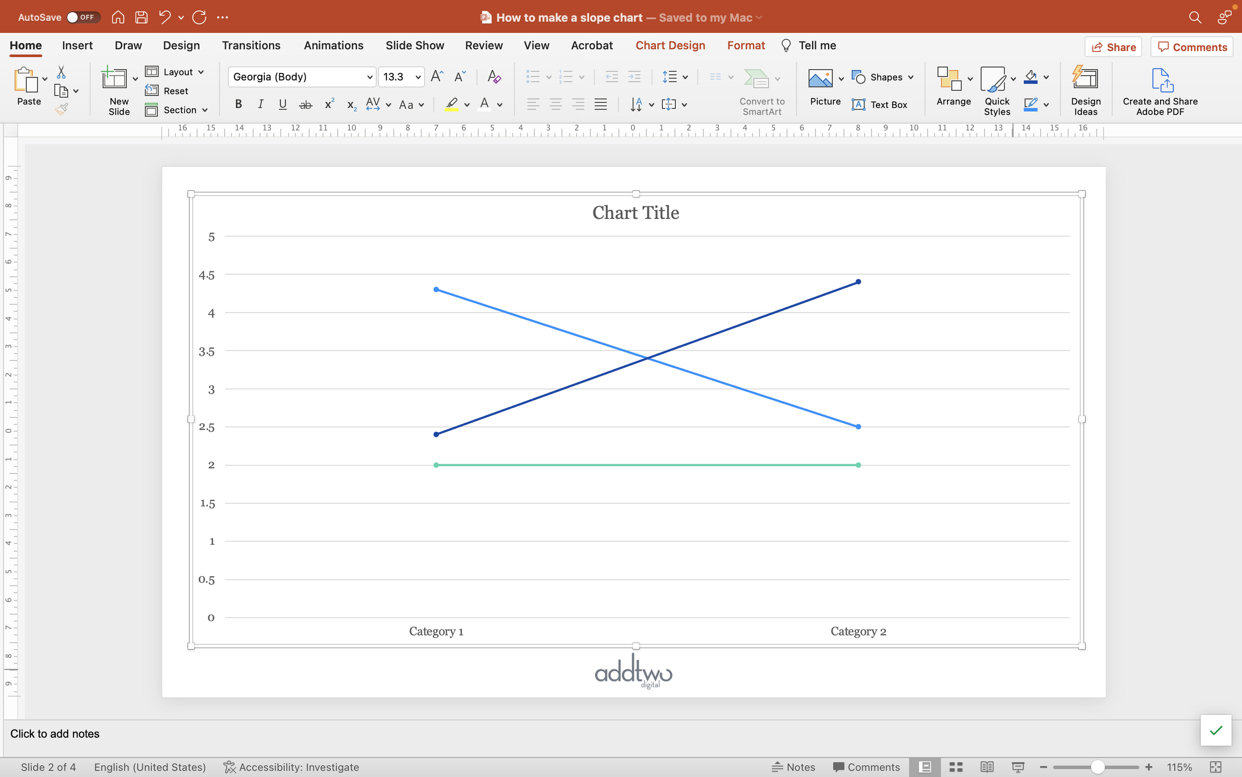
The example gives us three lines laid over the top of each other, but we’re going to want them laid out sequentially across the chart.

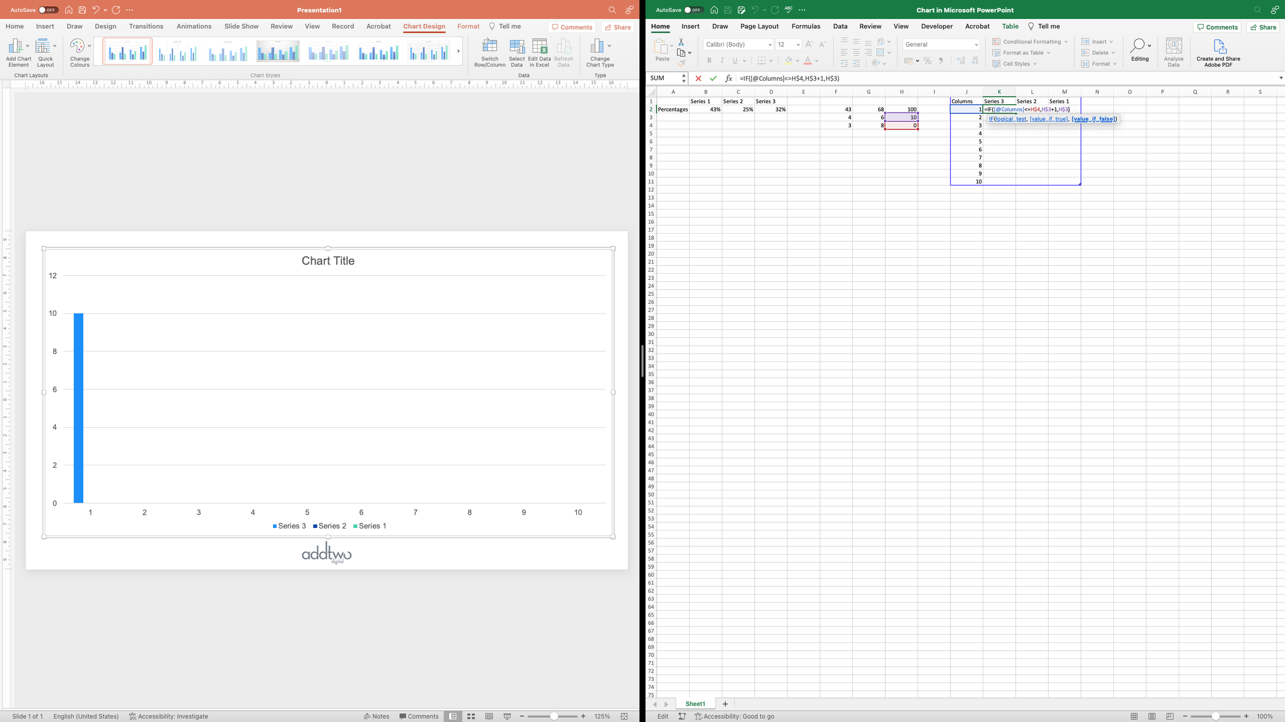
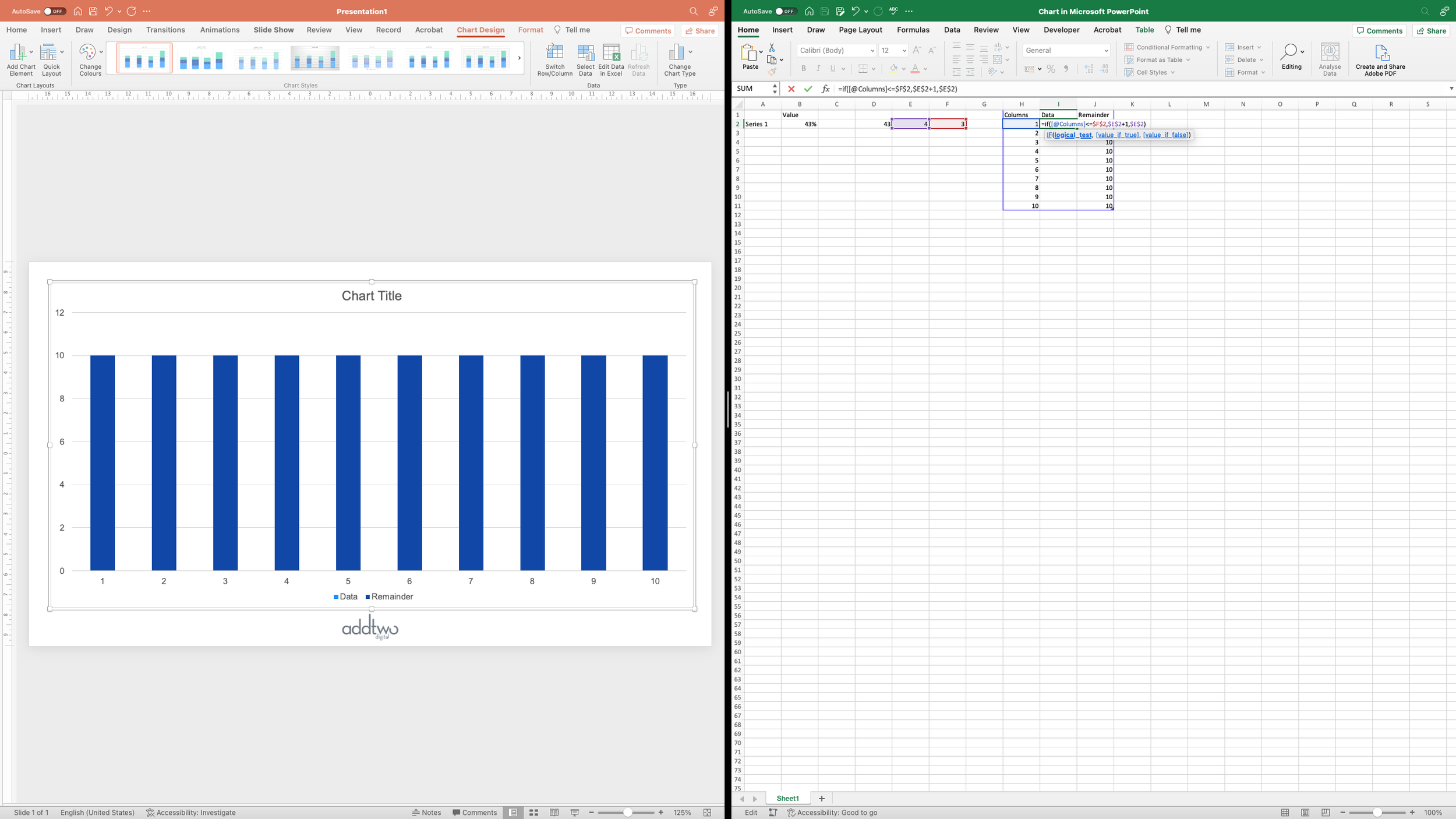
To achieve this, we’re going to want to layout the data series sequentially as rows in the data.

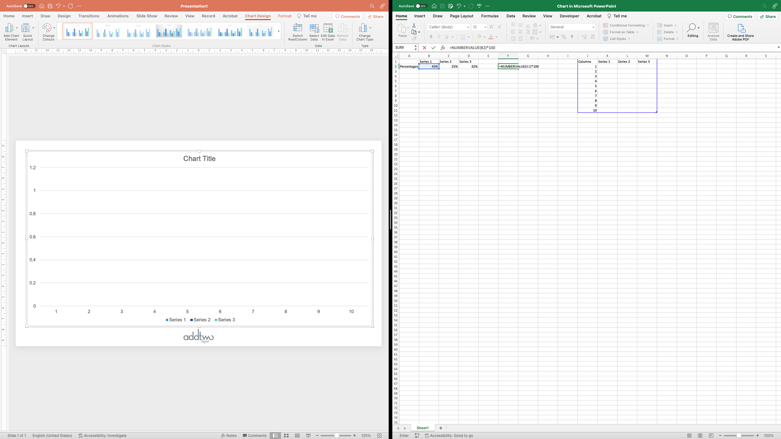
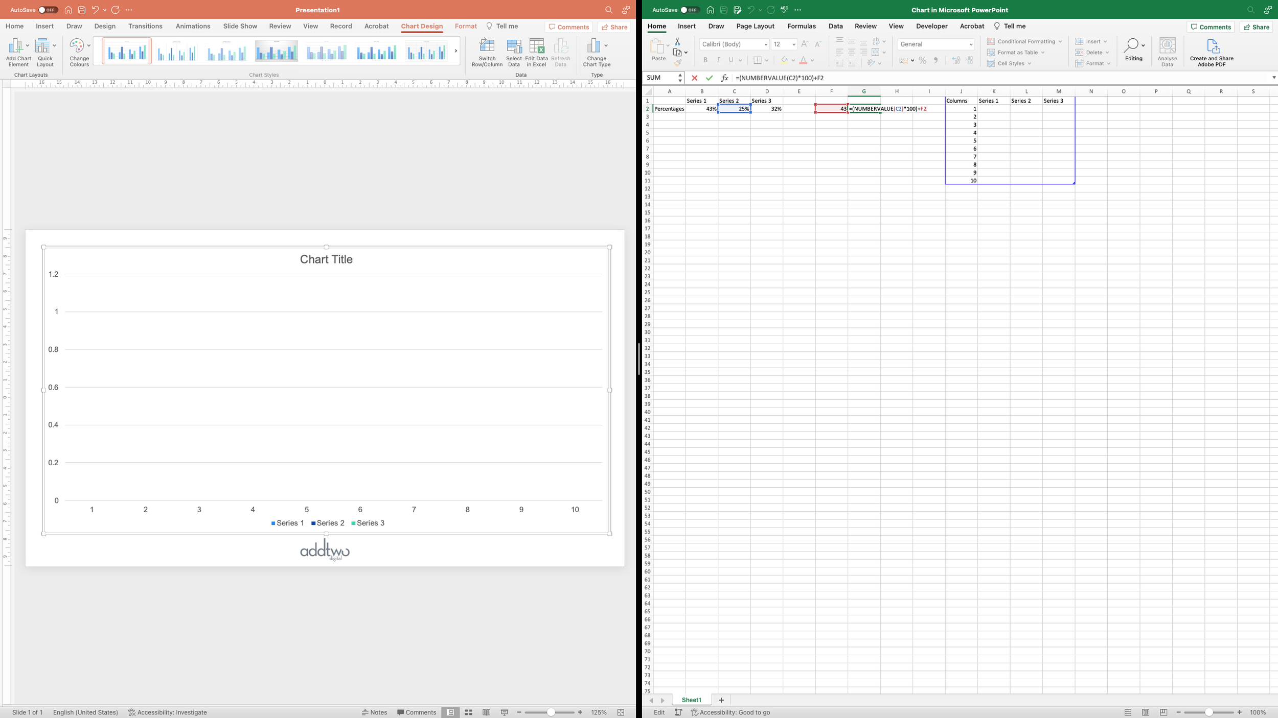
We can just drag the values for each series down to make new rows. This will then separate the lines out across the chart.

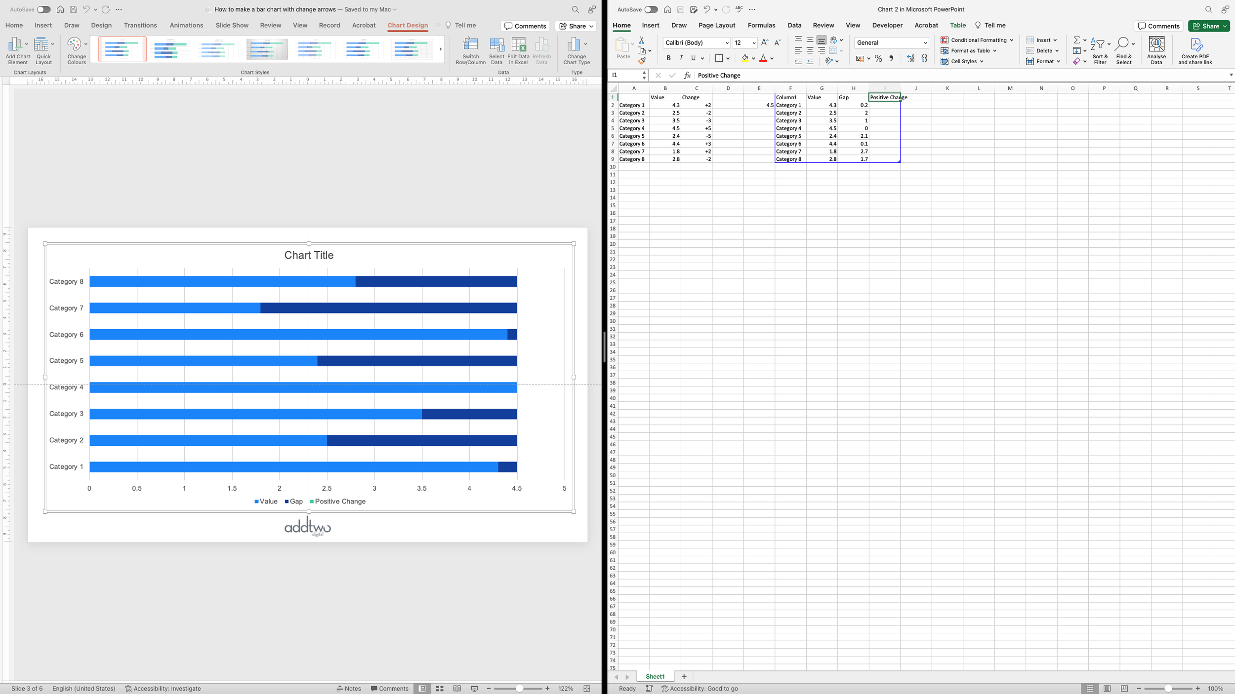
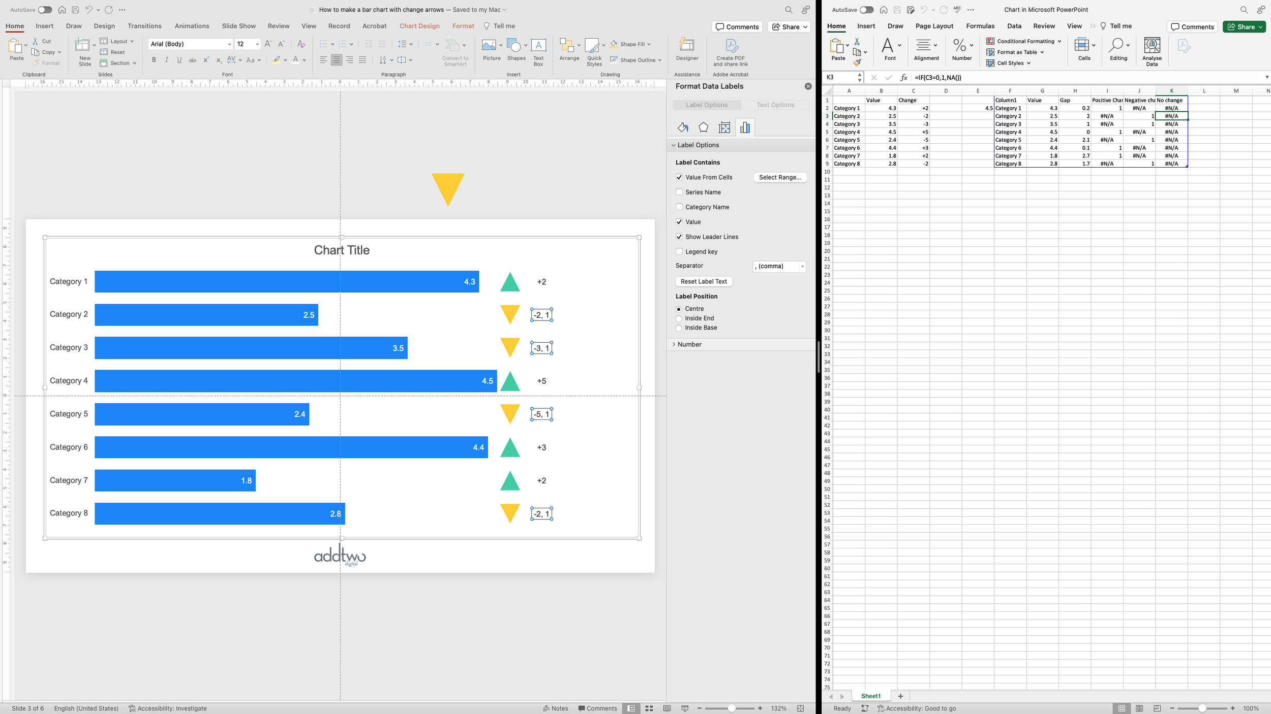
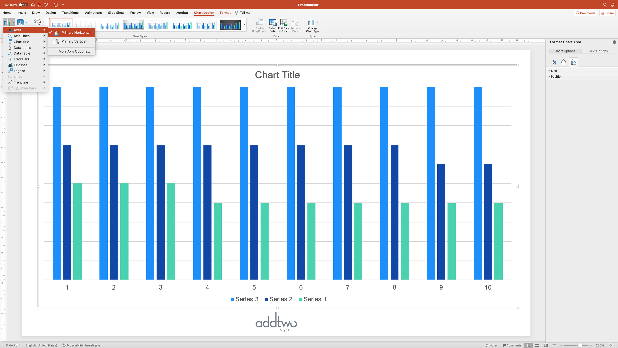
Each of these lines is going to be, effectively, a separate chart, but they will all share the same y-axis and will therefore need to share the same x-axis. So we need to copy the x-axis labels for each line.

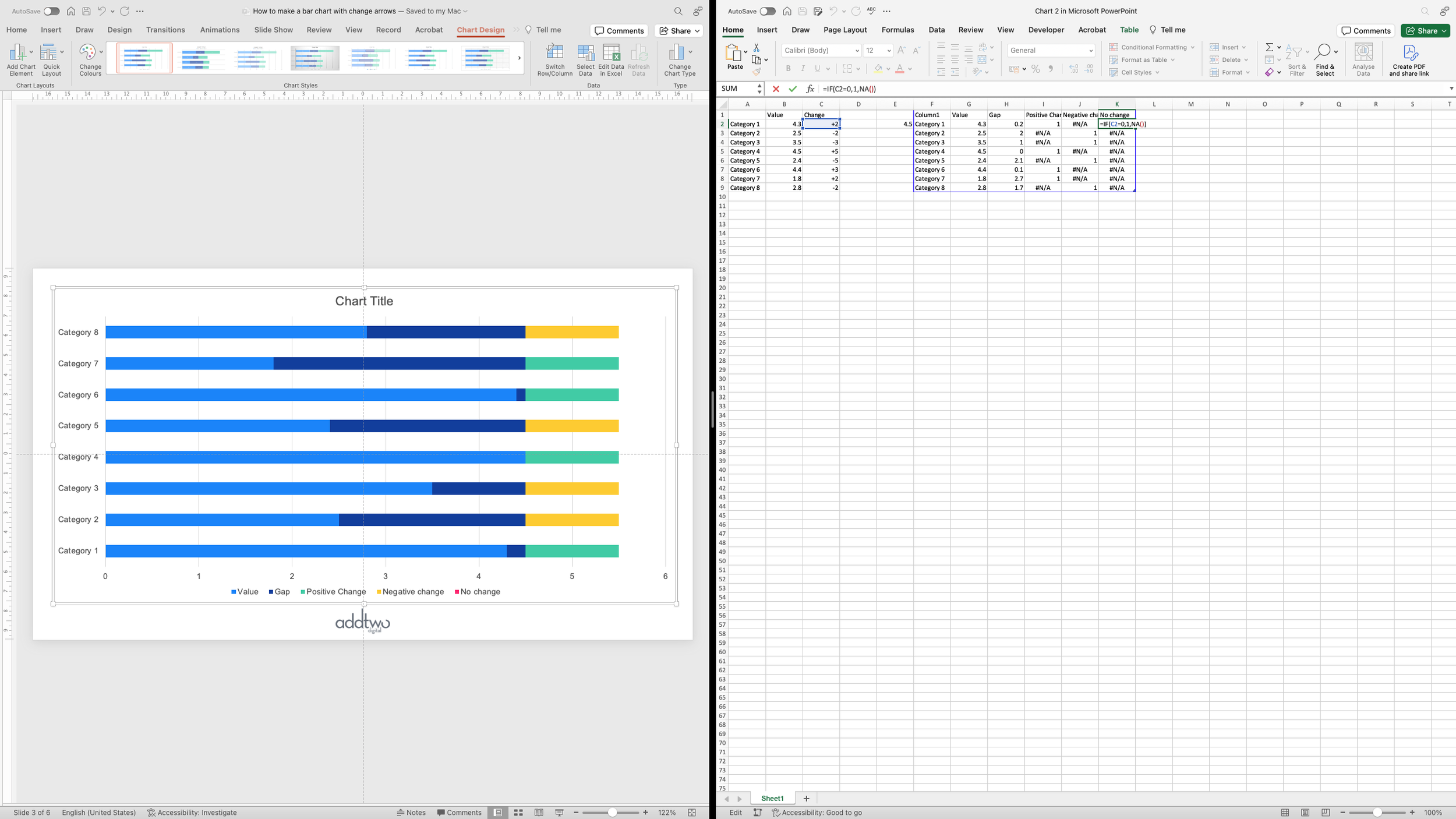
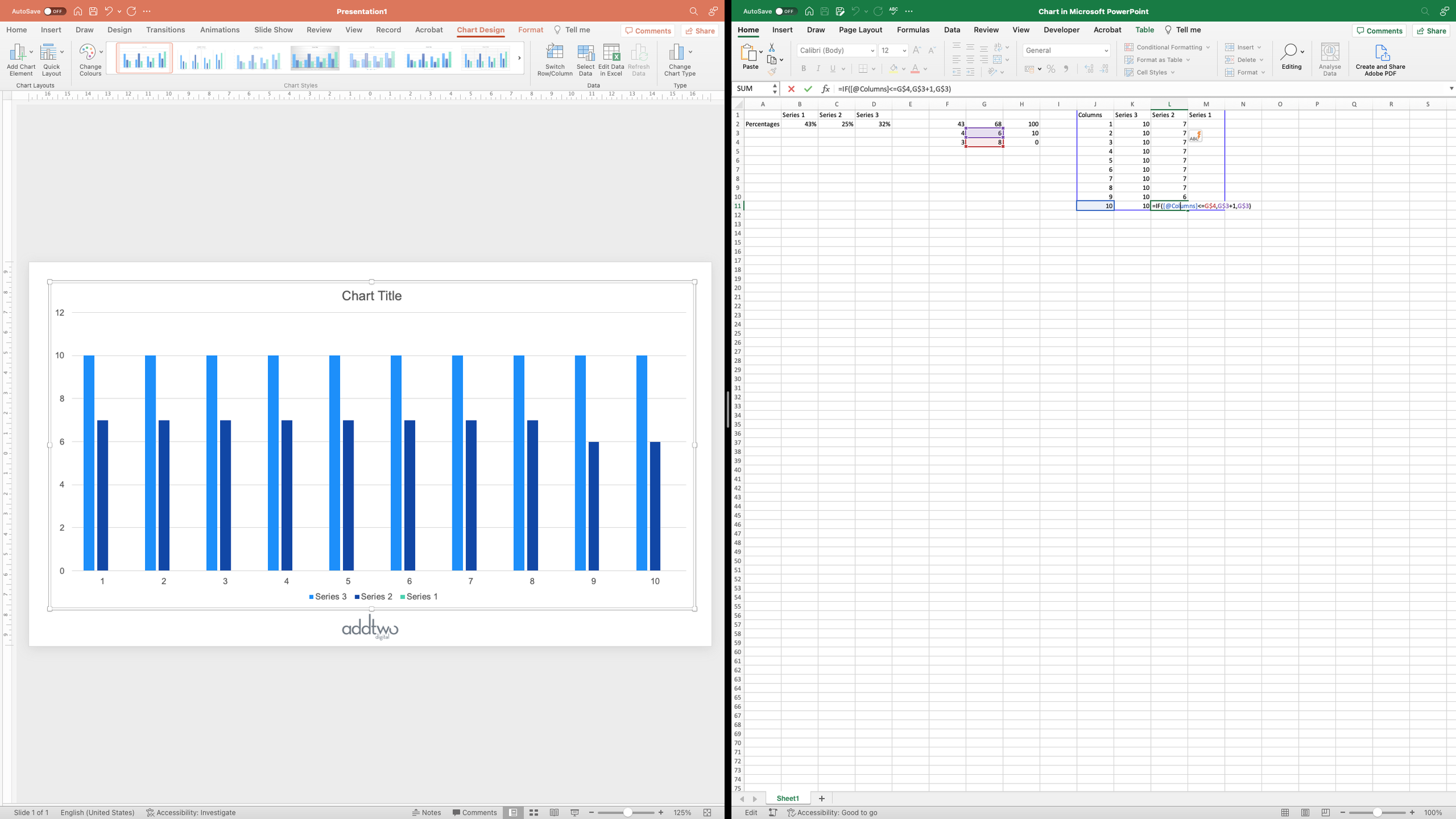
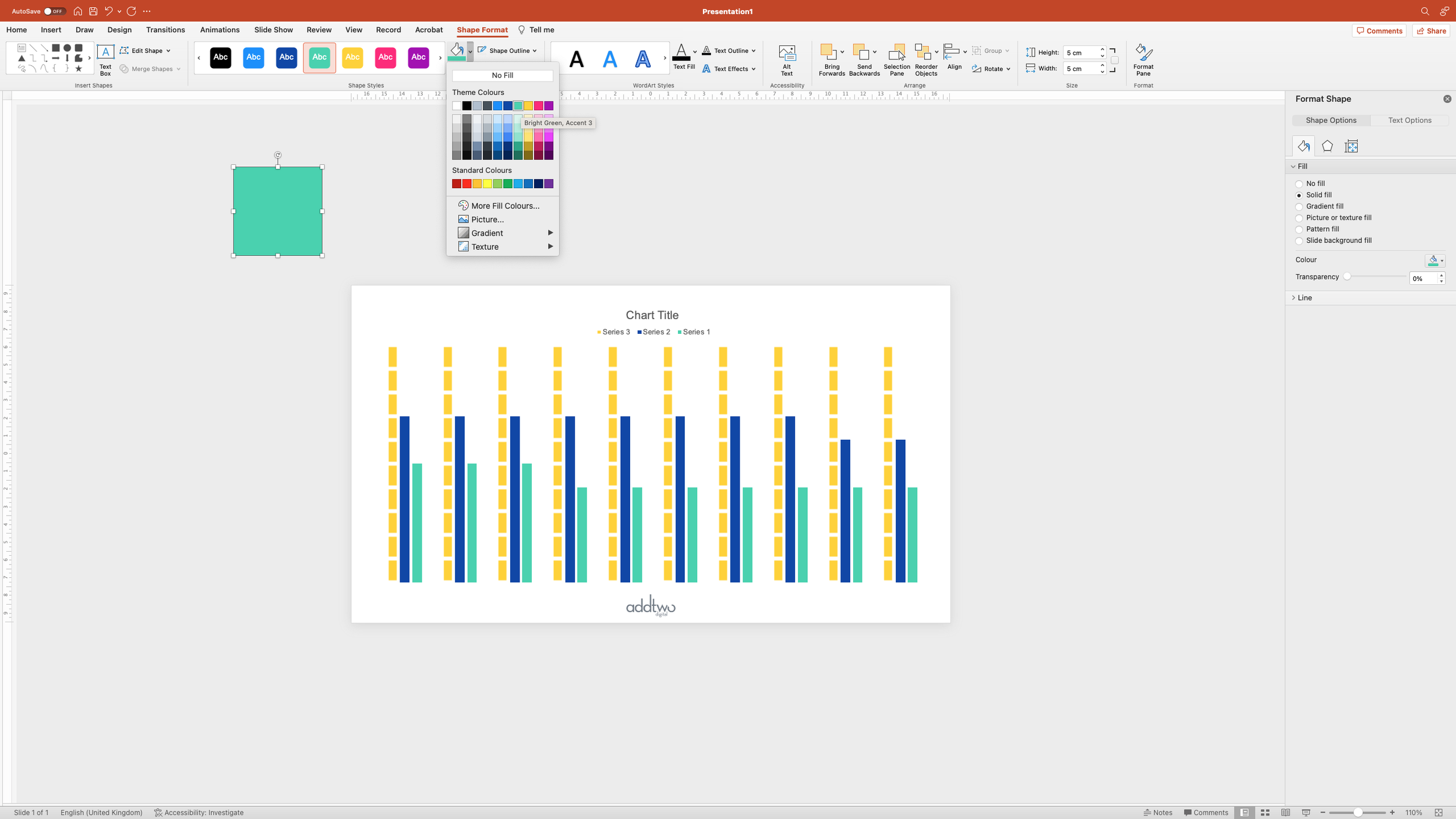
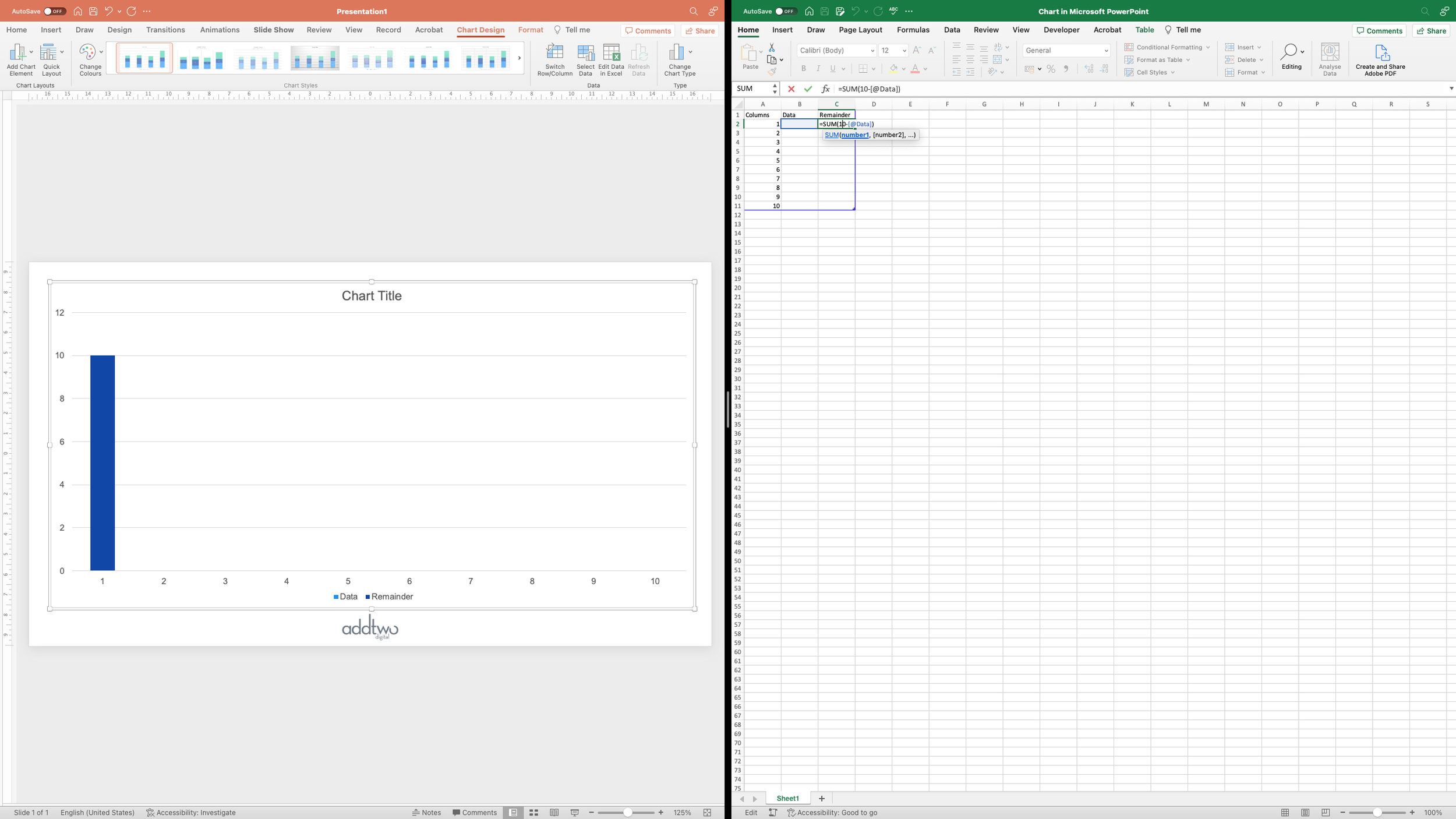
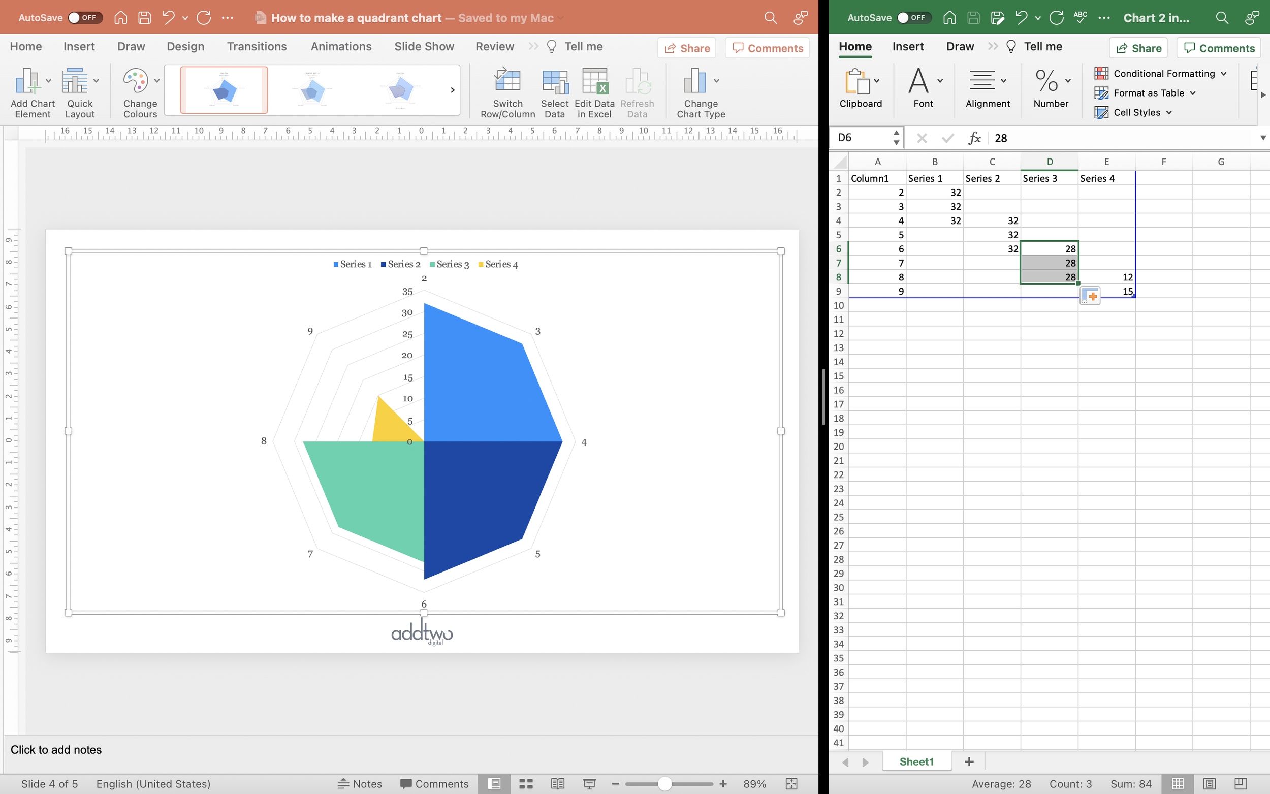
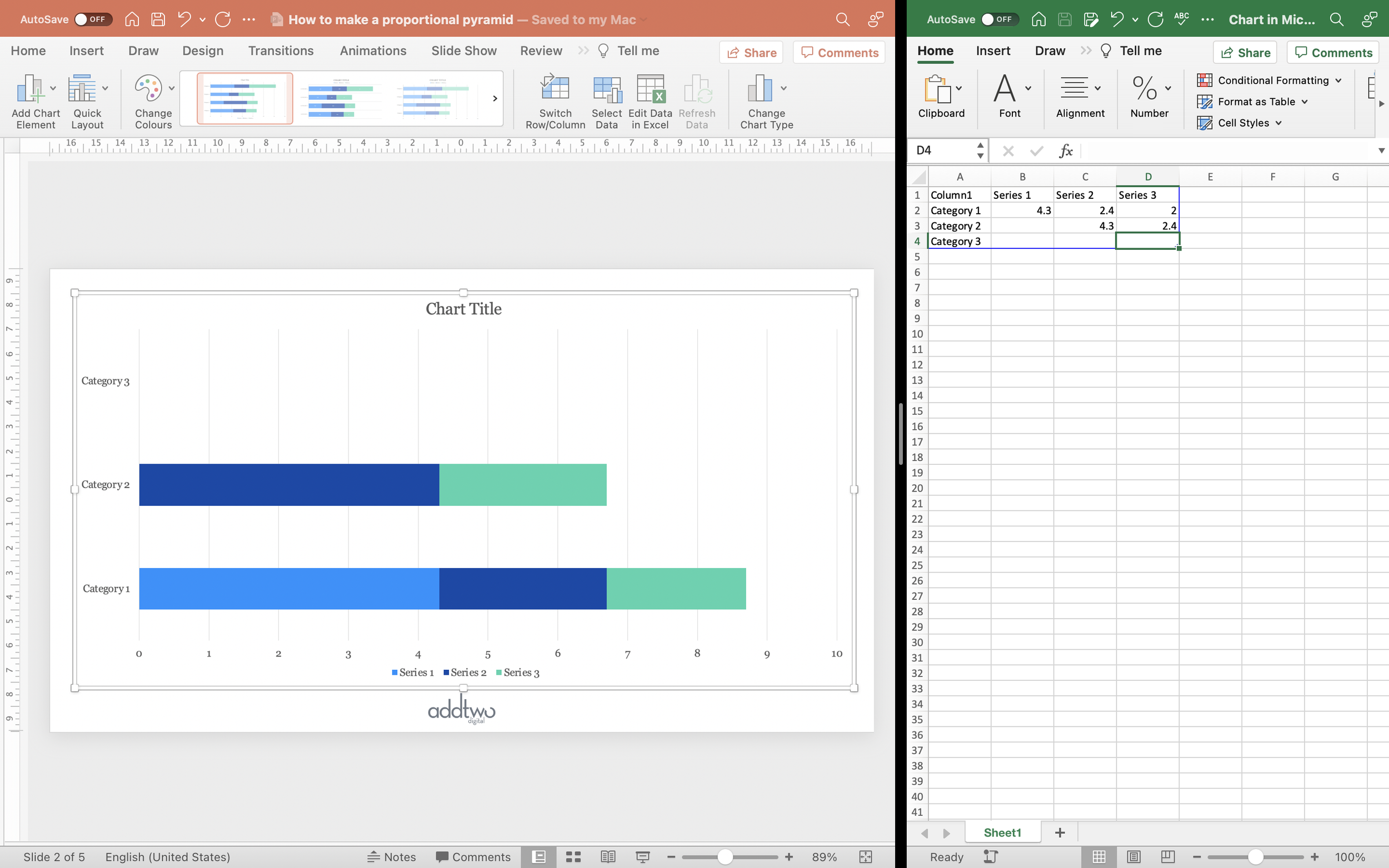
But this means we’re also going to need gaps between the lines. We can create these by adding in new rows between each data series.

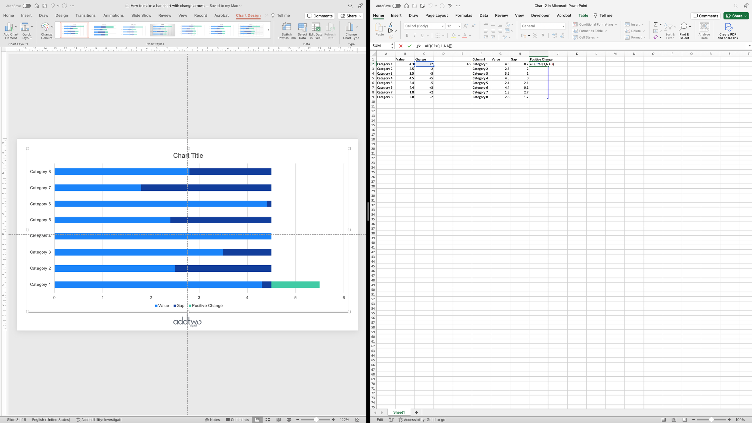
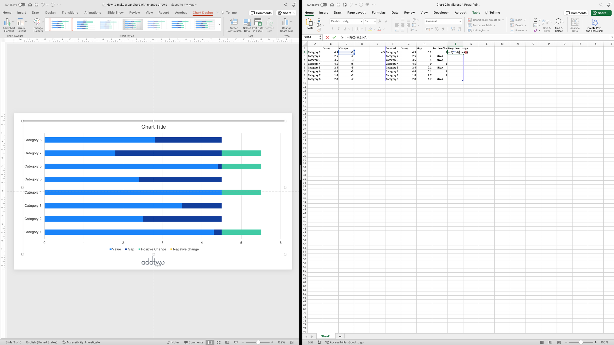
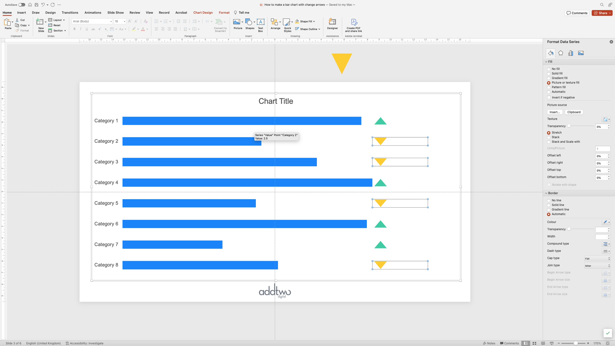
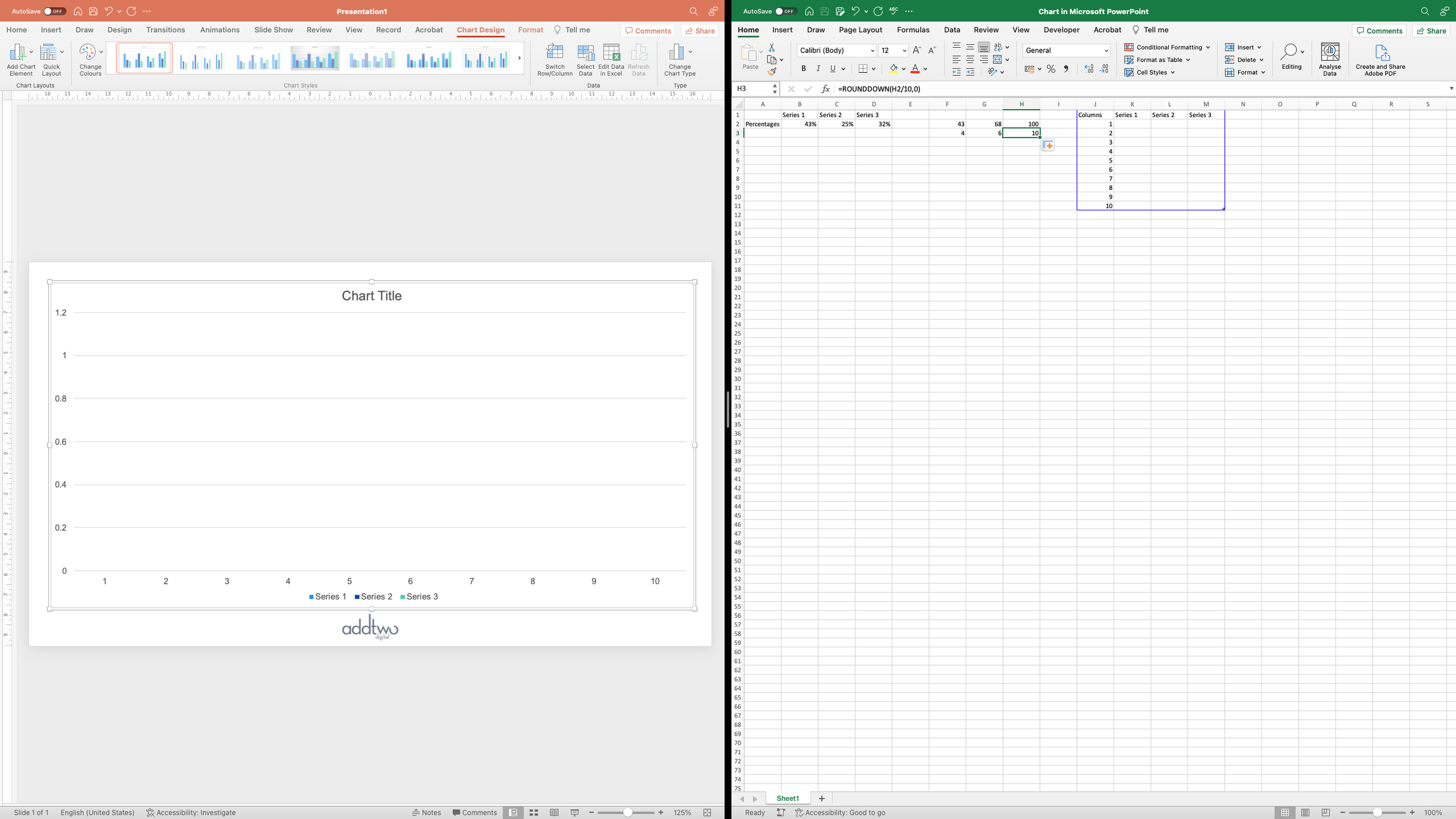
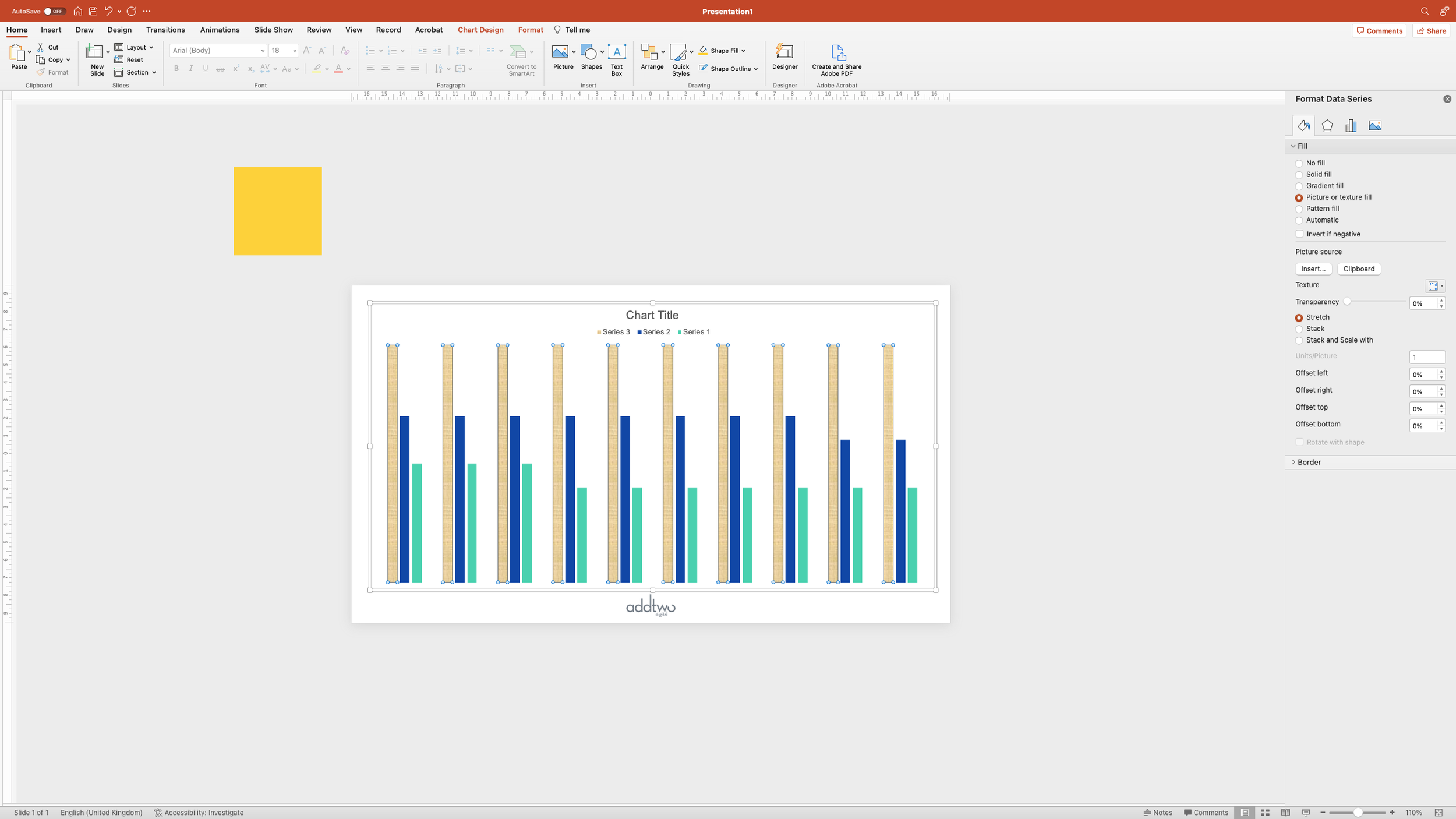
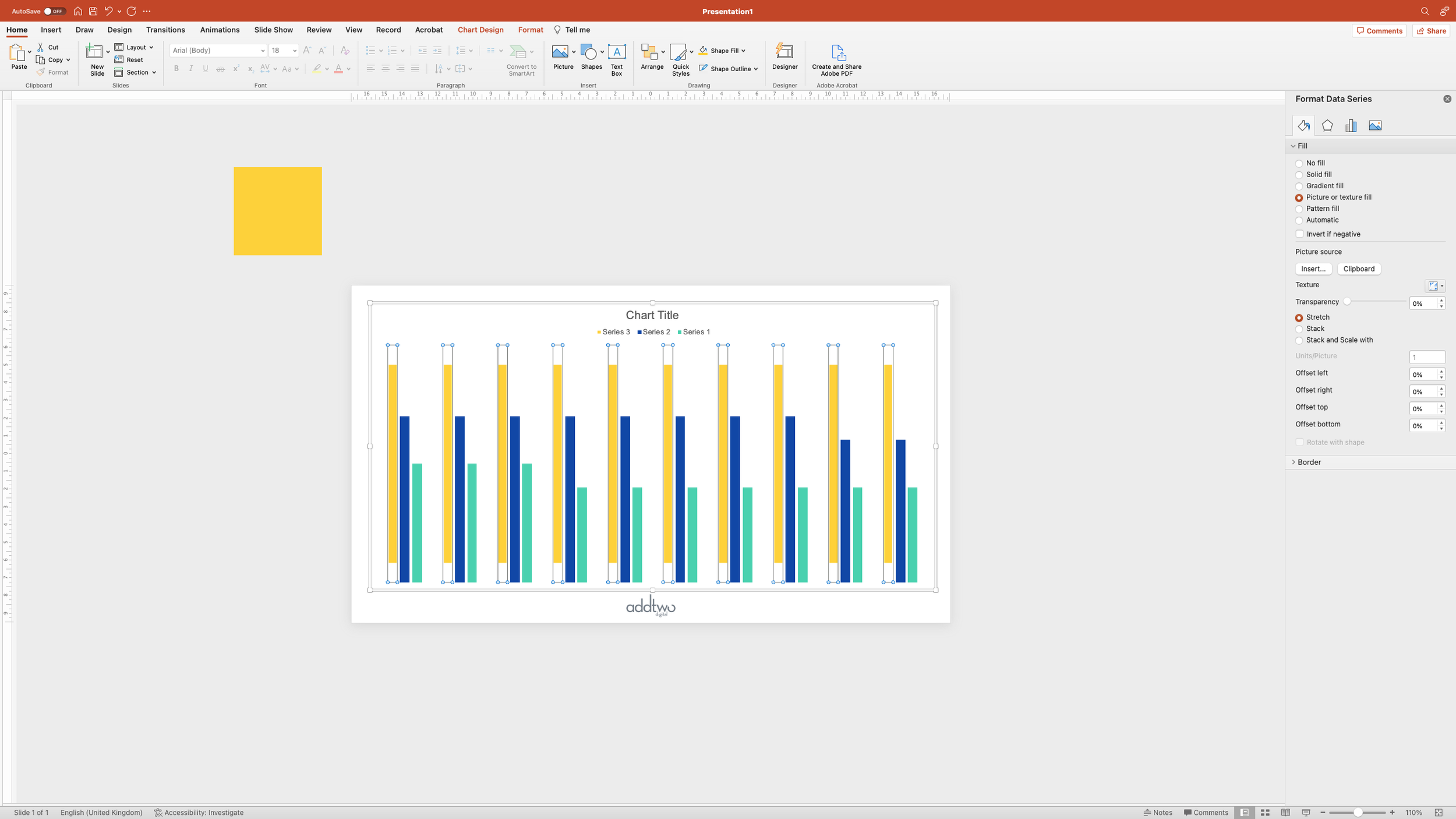
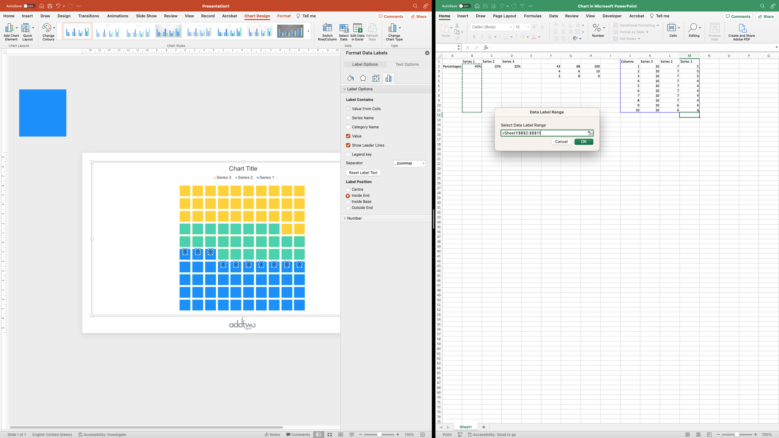
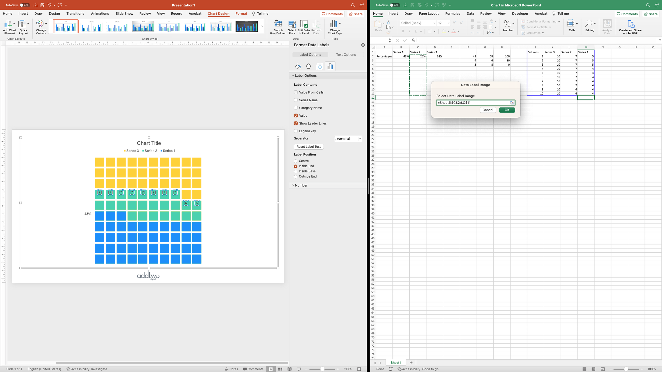
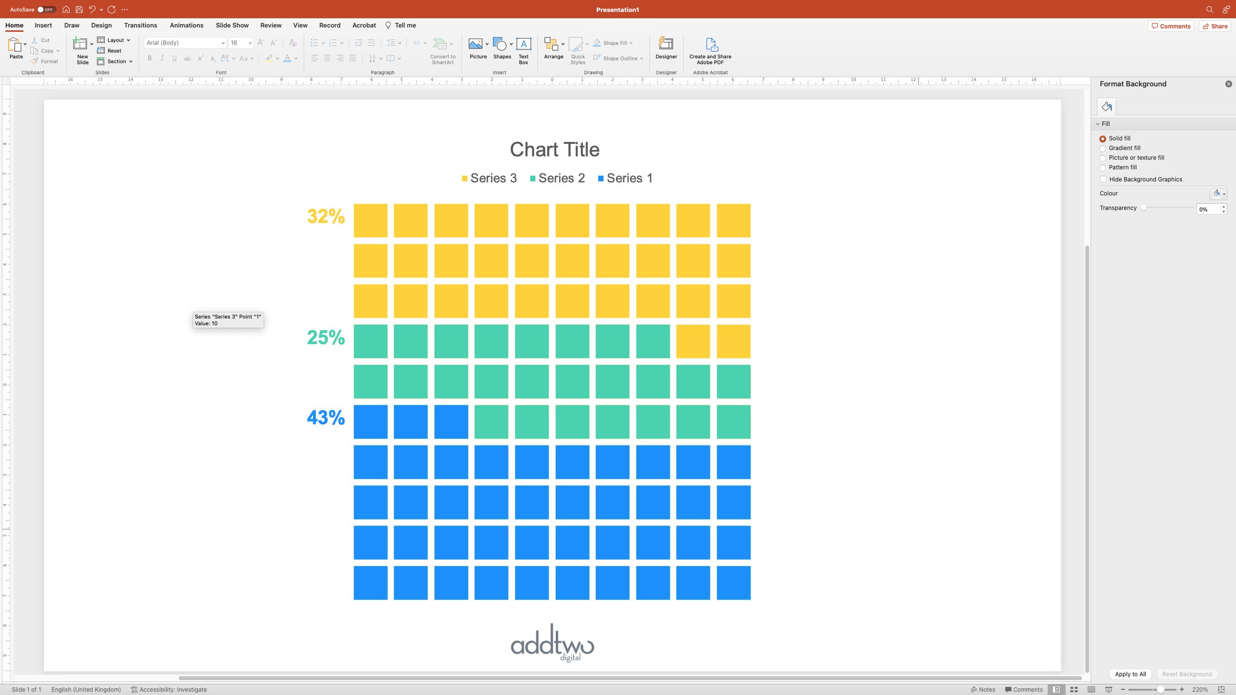
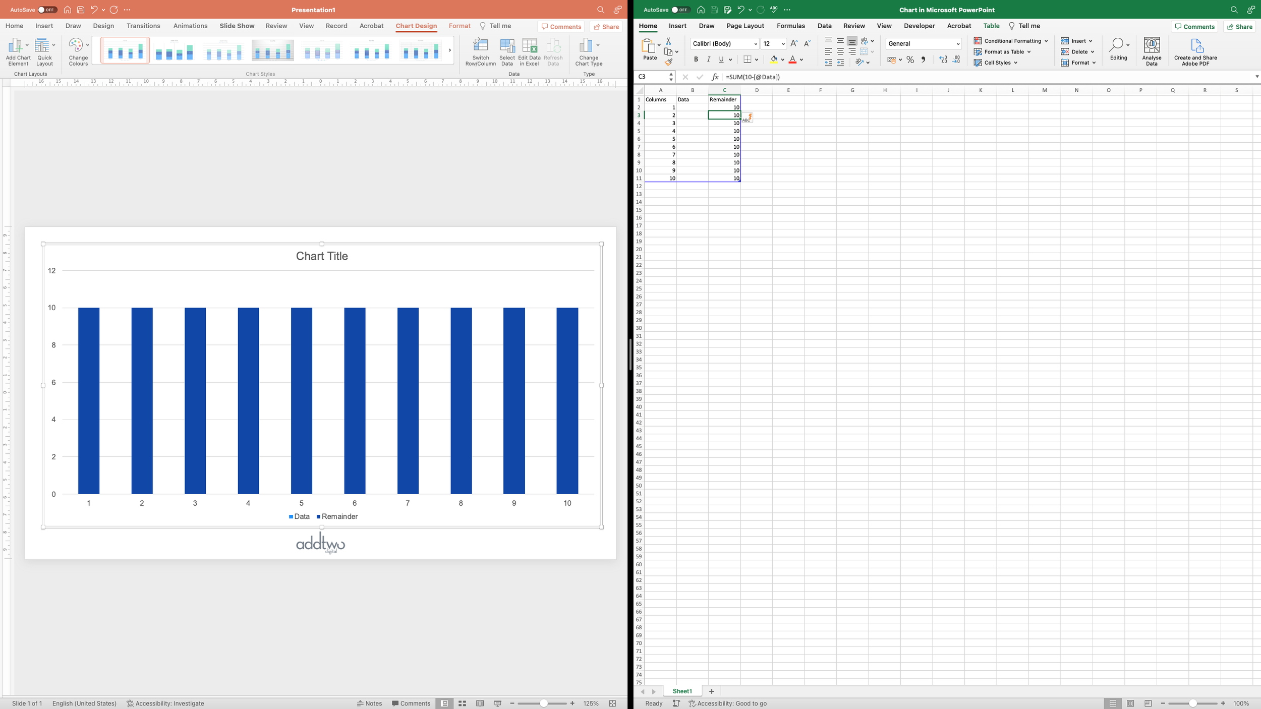
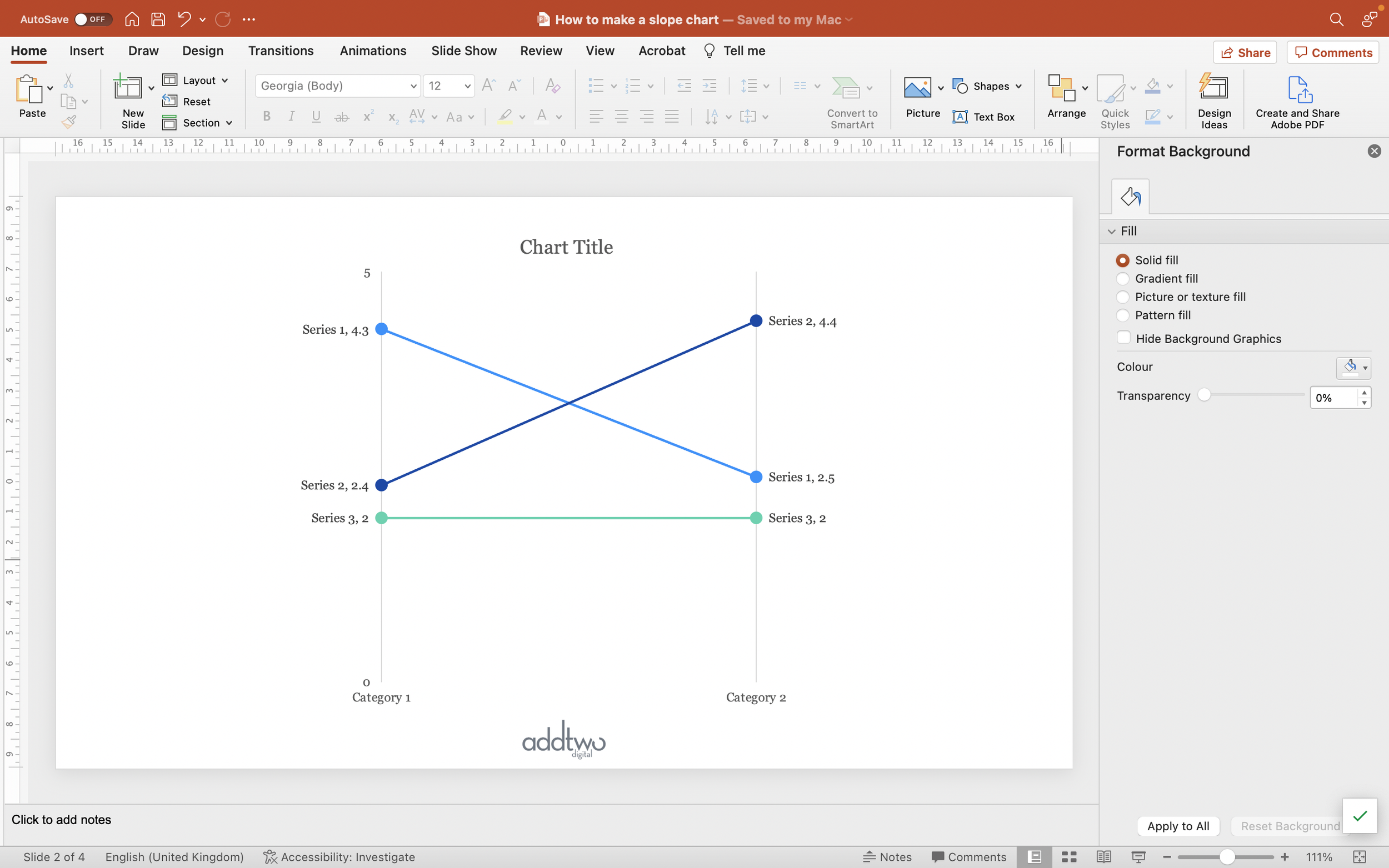
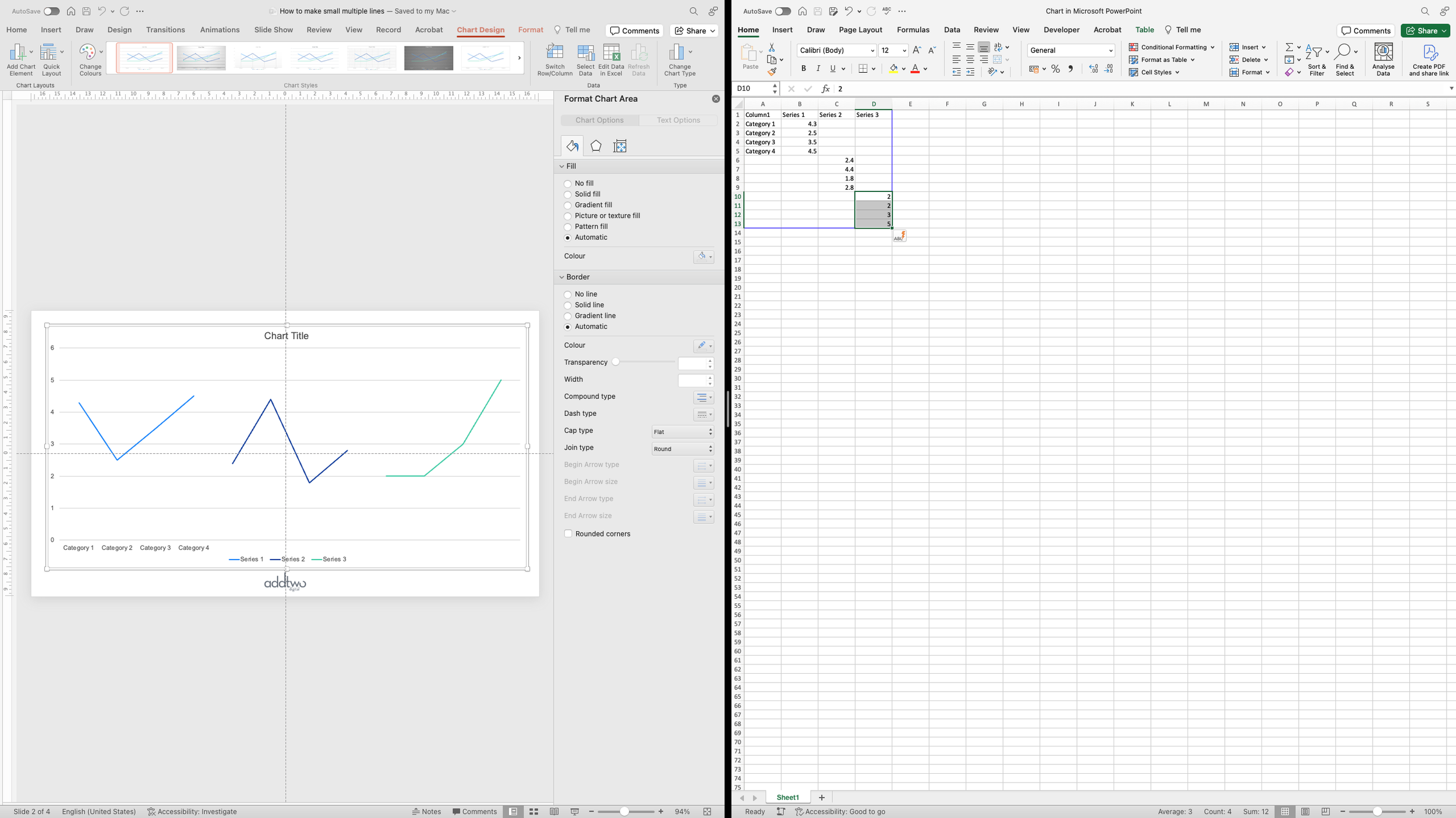
We’re also going to need an element to make into the physical gap between the lines, so we’ll add a new data series, with values just in those gaps. The values will be something higher than any other value in the chart. In this case our highest value in the data is 5, so we’ll set this new data series to values of 6.

Once the new data series in added, we won’t need to do any more with the data and we can close the Excel chart

Tweak the chart layout

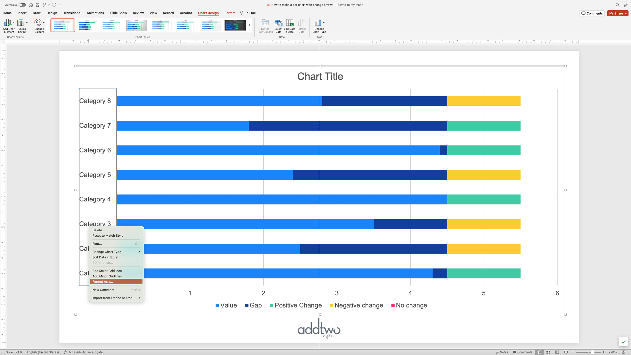
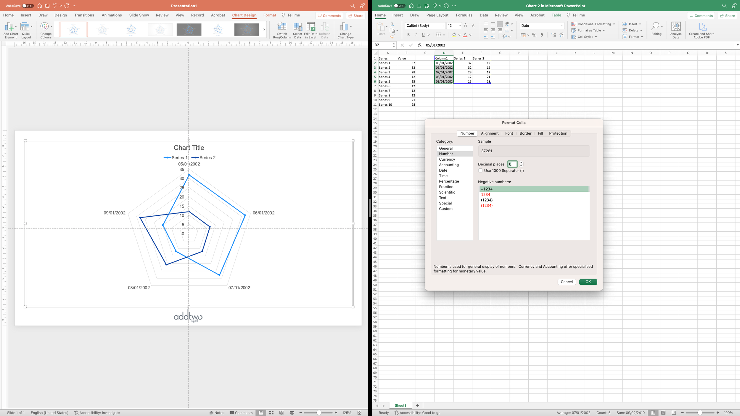
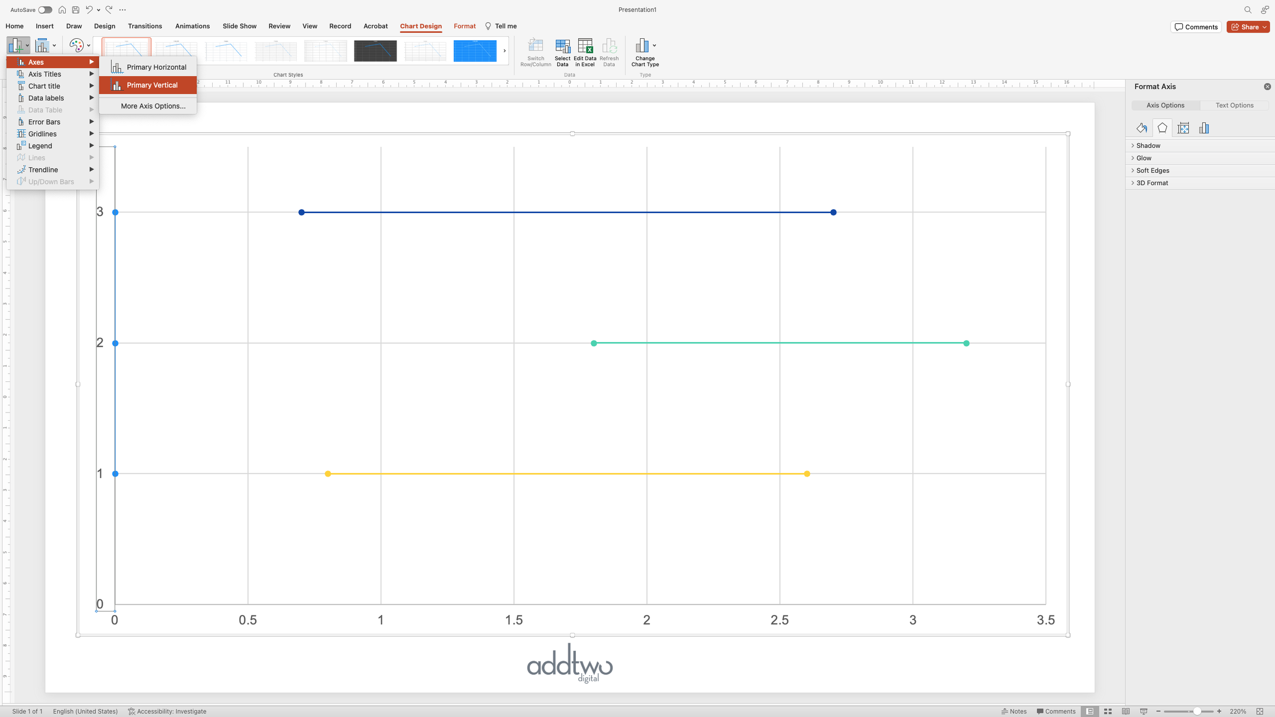
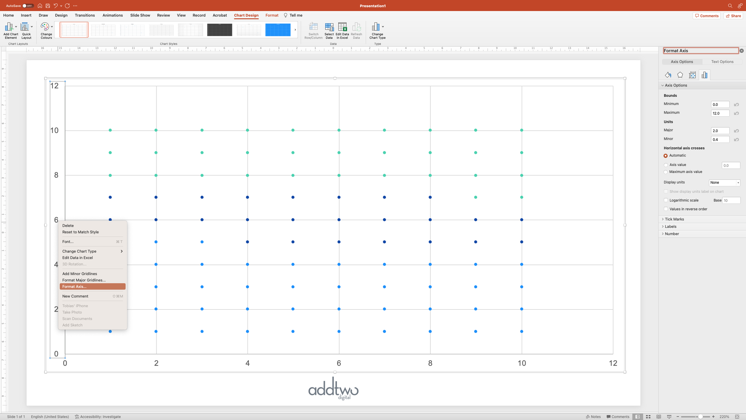
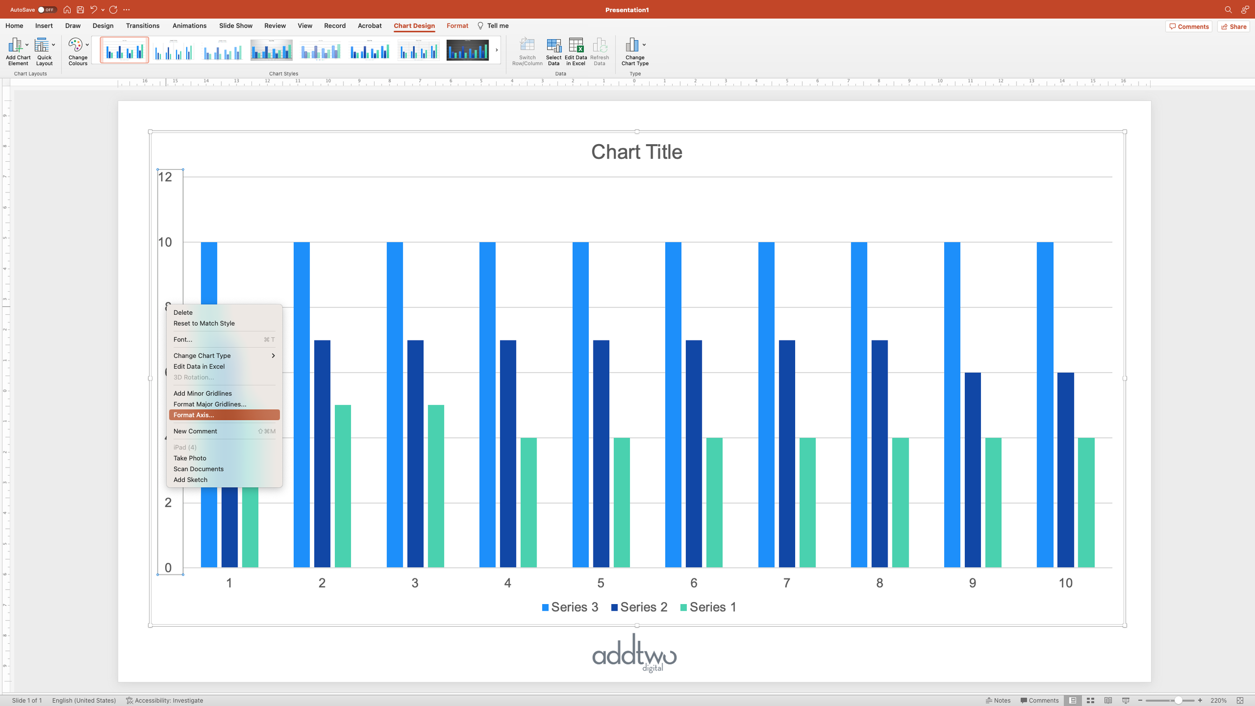
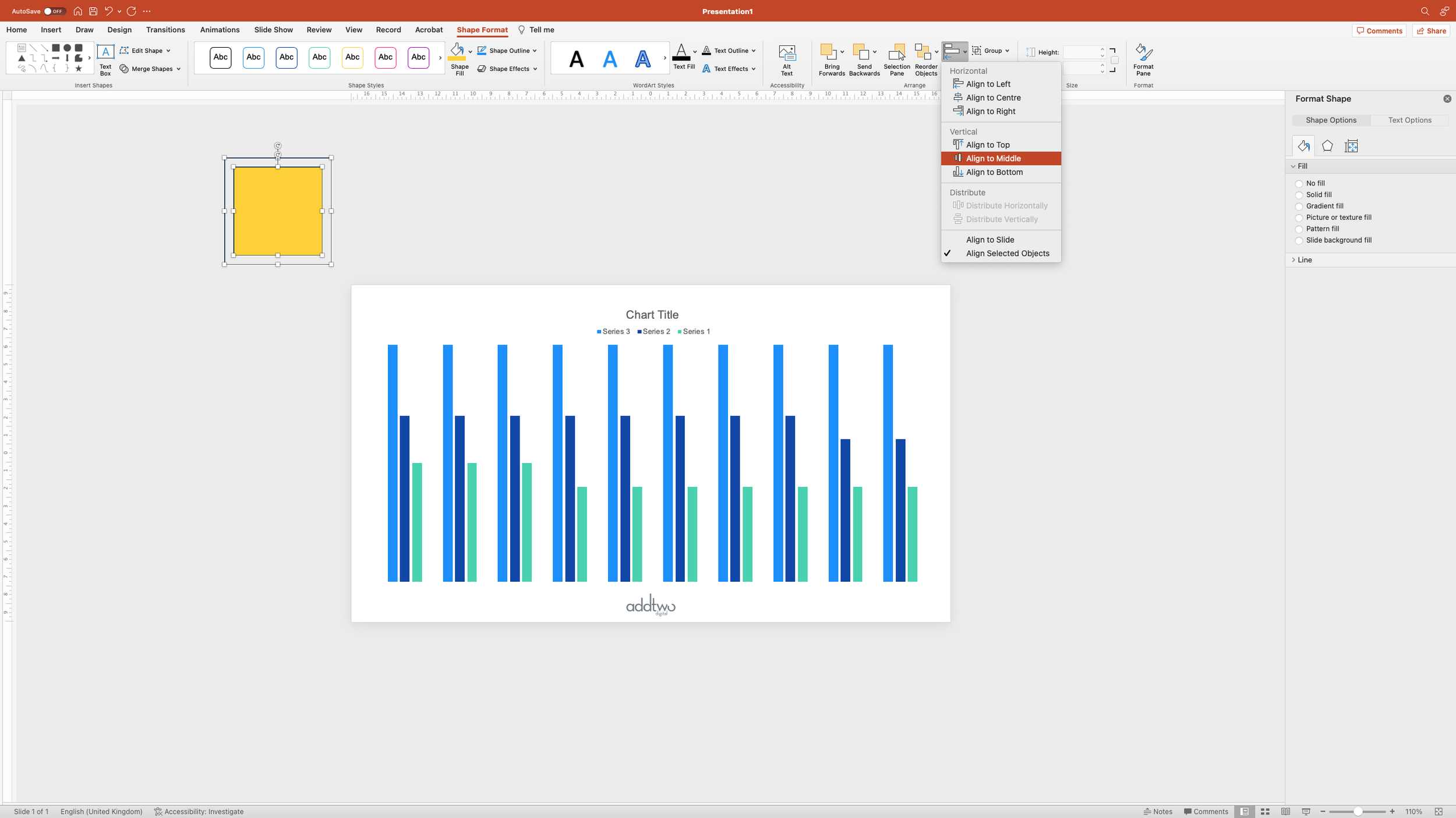
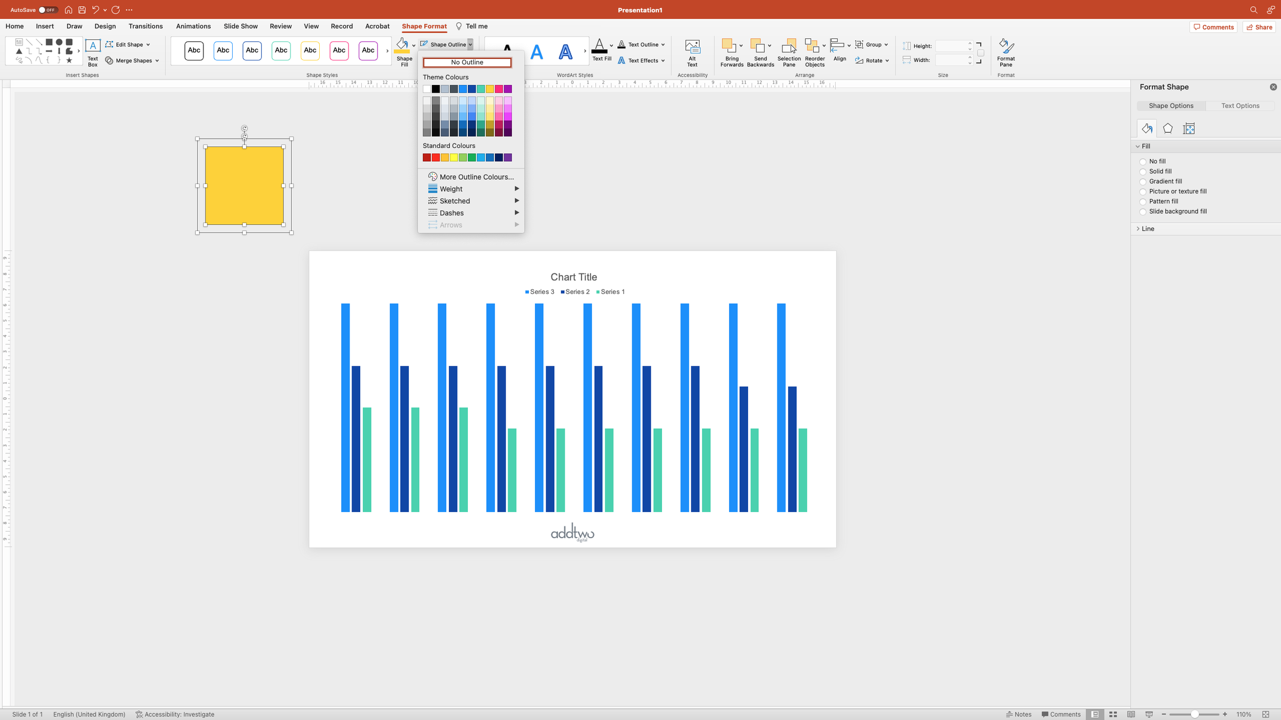
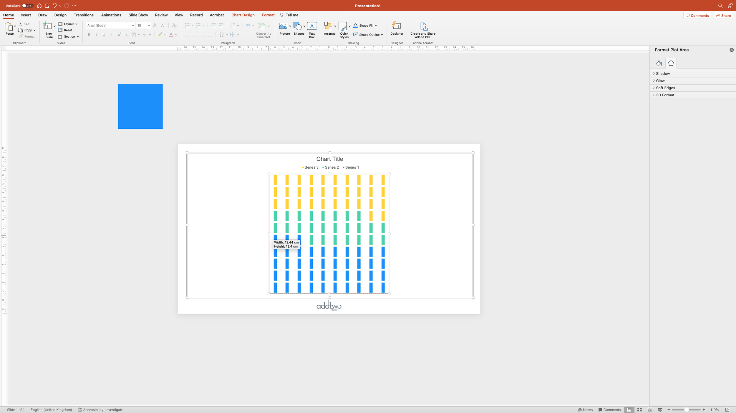
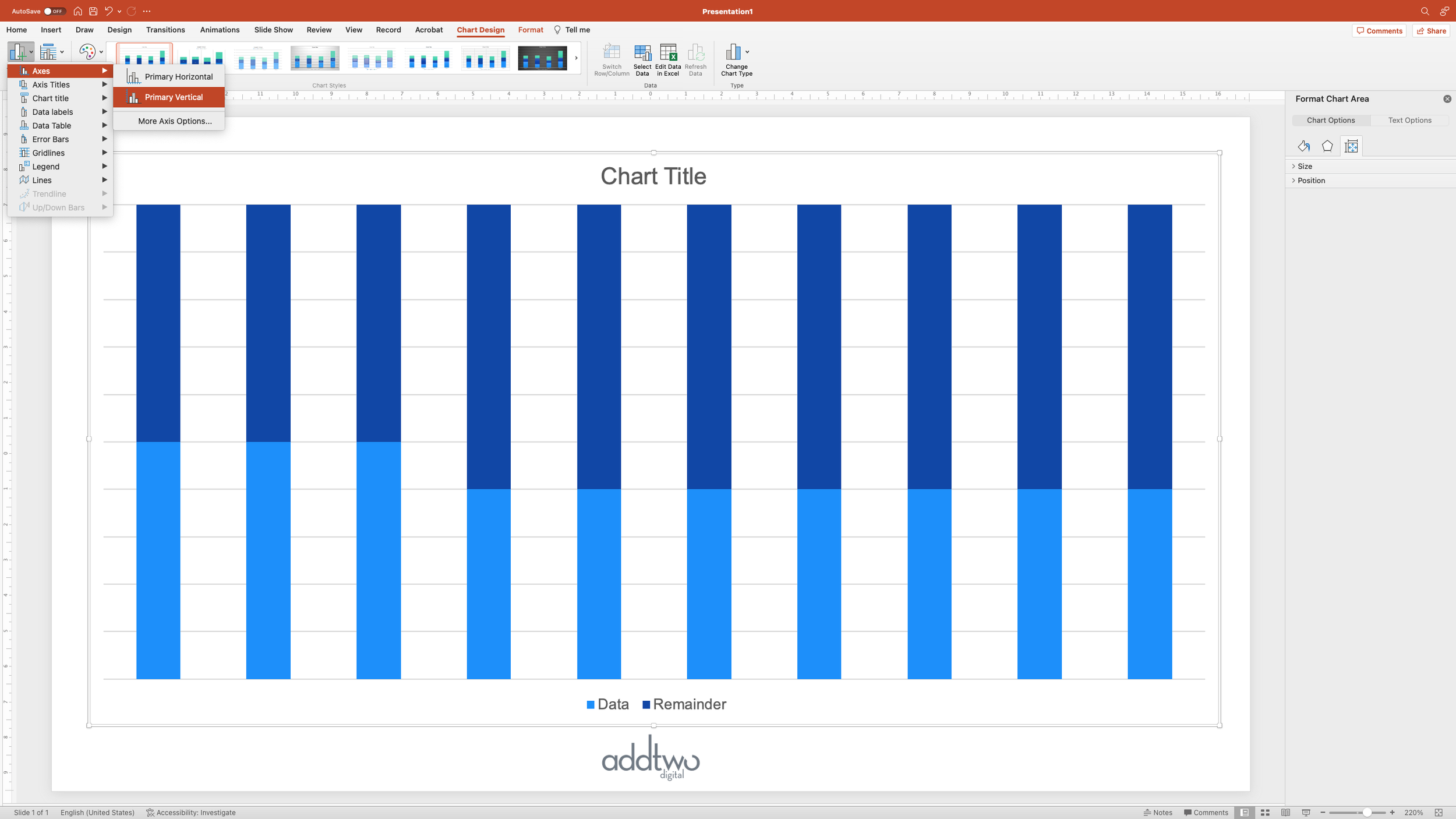
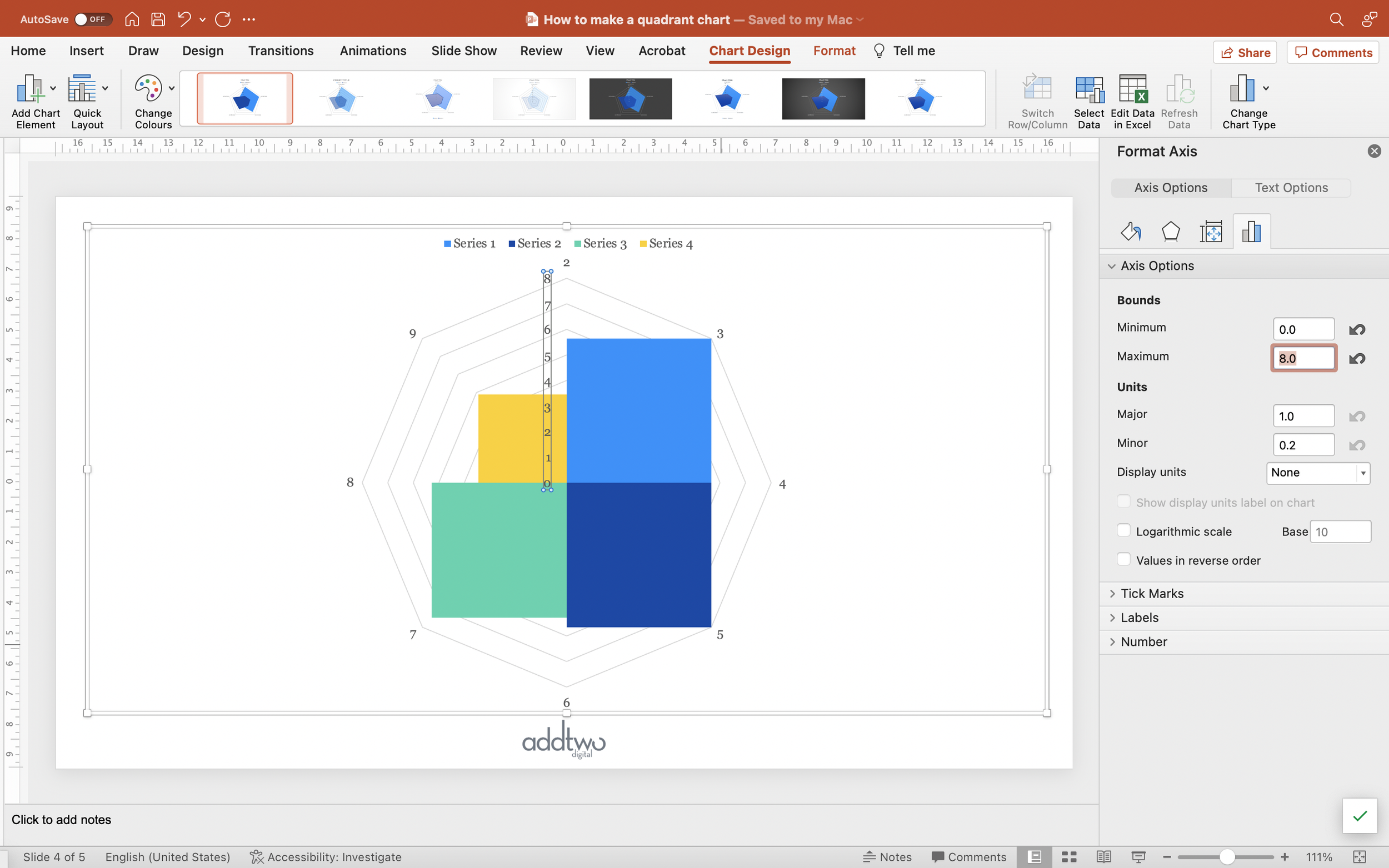
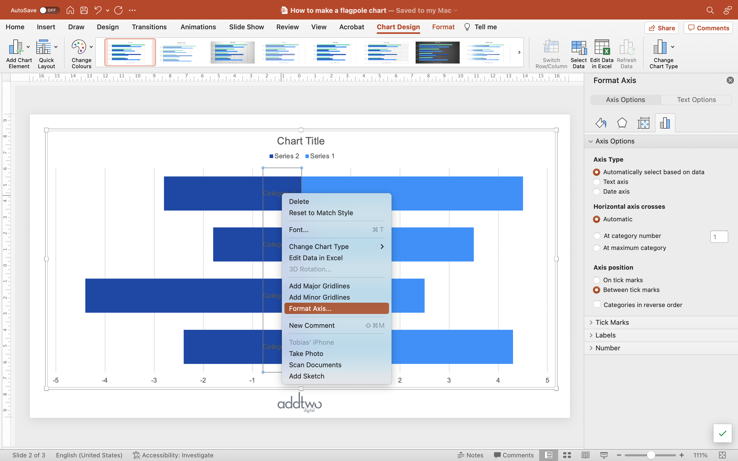
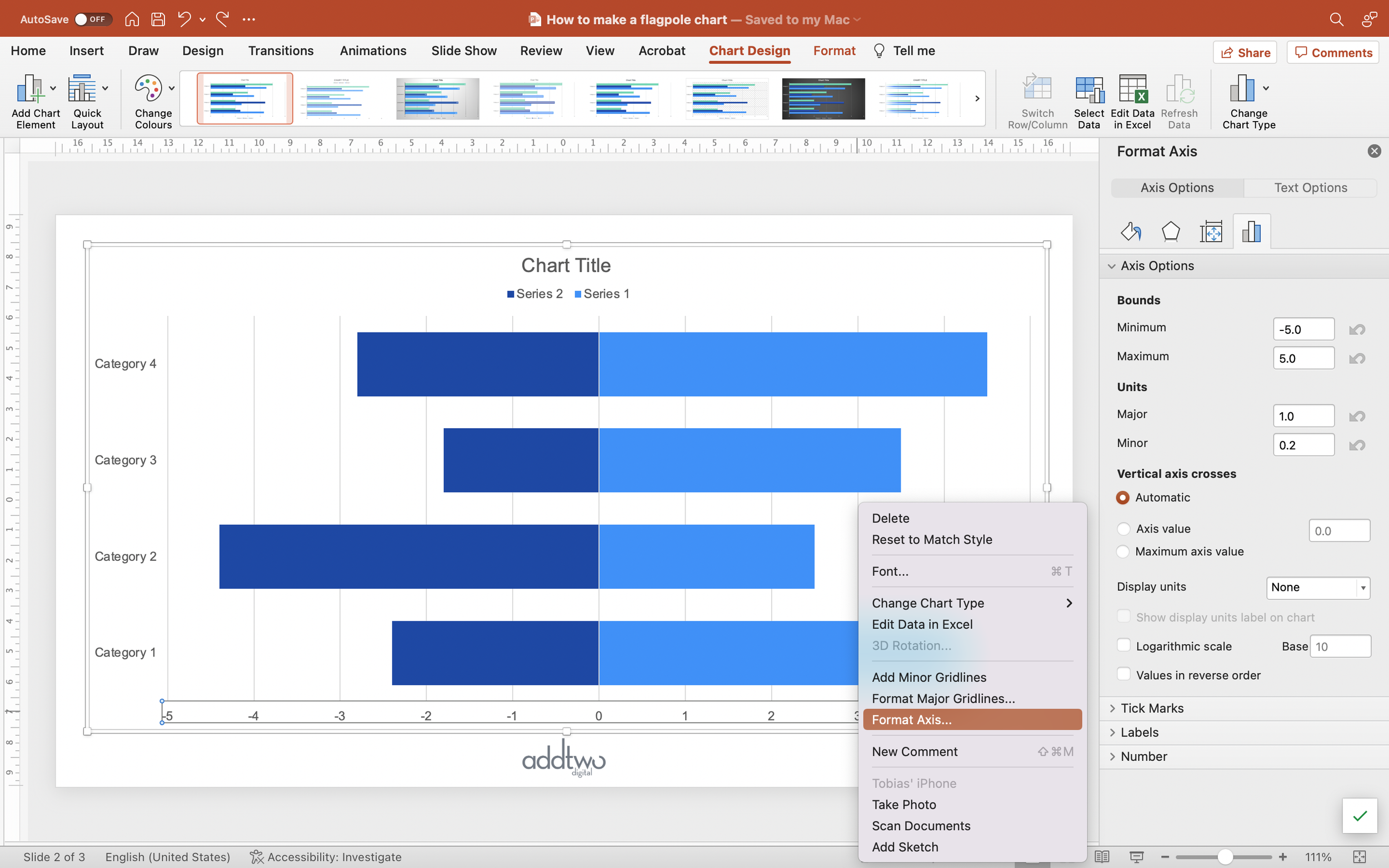
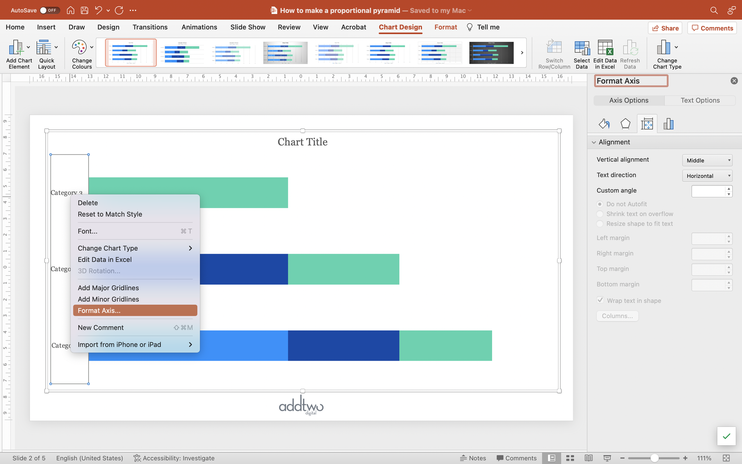
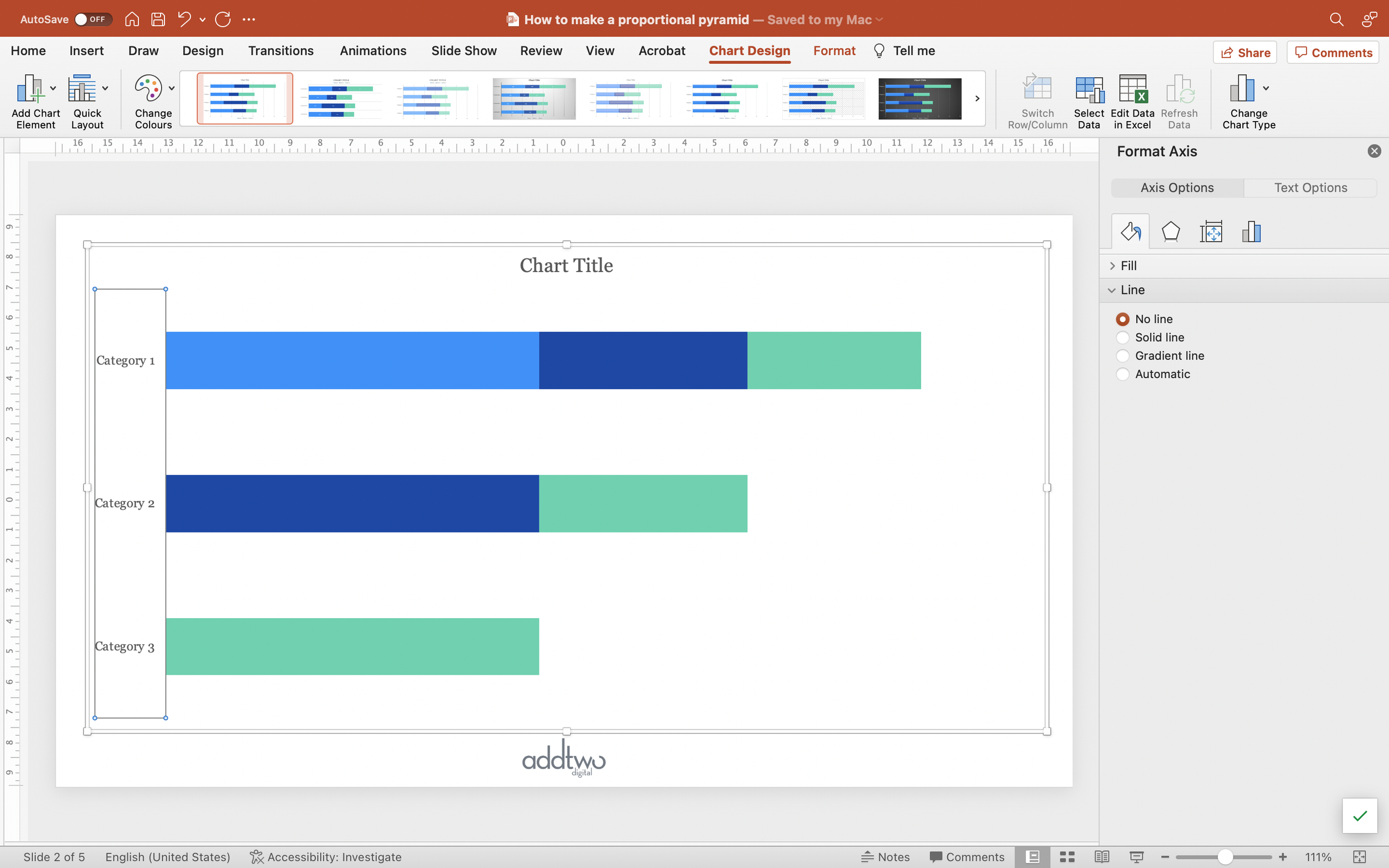
The first thing we need to do is to set up the x-axis. We can do this in the Format Pane. We can open this by right-clicking on the axis and selecting ‘Format Axis…’

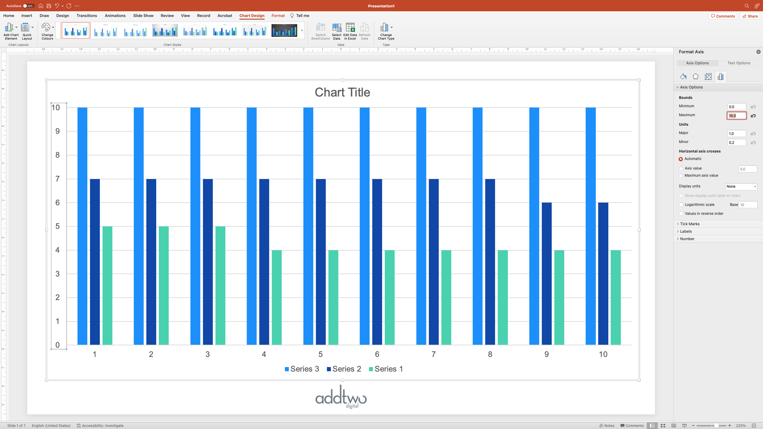
We’re going to set the maximum x-axis value to be lower than the value we gave to our extra ‘spacer’ data series. But we also need it to be higher than the highest value in our actual data, so that we have some space around our lines. In this case, we’re going to set it to 5.5.

This also means that we need to set the Minimum value too, even if it's just to ‘0’, so that we can also set values for our gridlines in the Major units. By setting the Minimum value for the axis to 0 and then our Major units to 2.5, we get gridlines at 2.5 and 5, even though our axis now goes to 5.5.

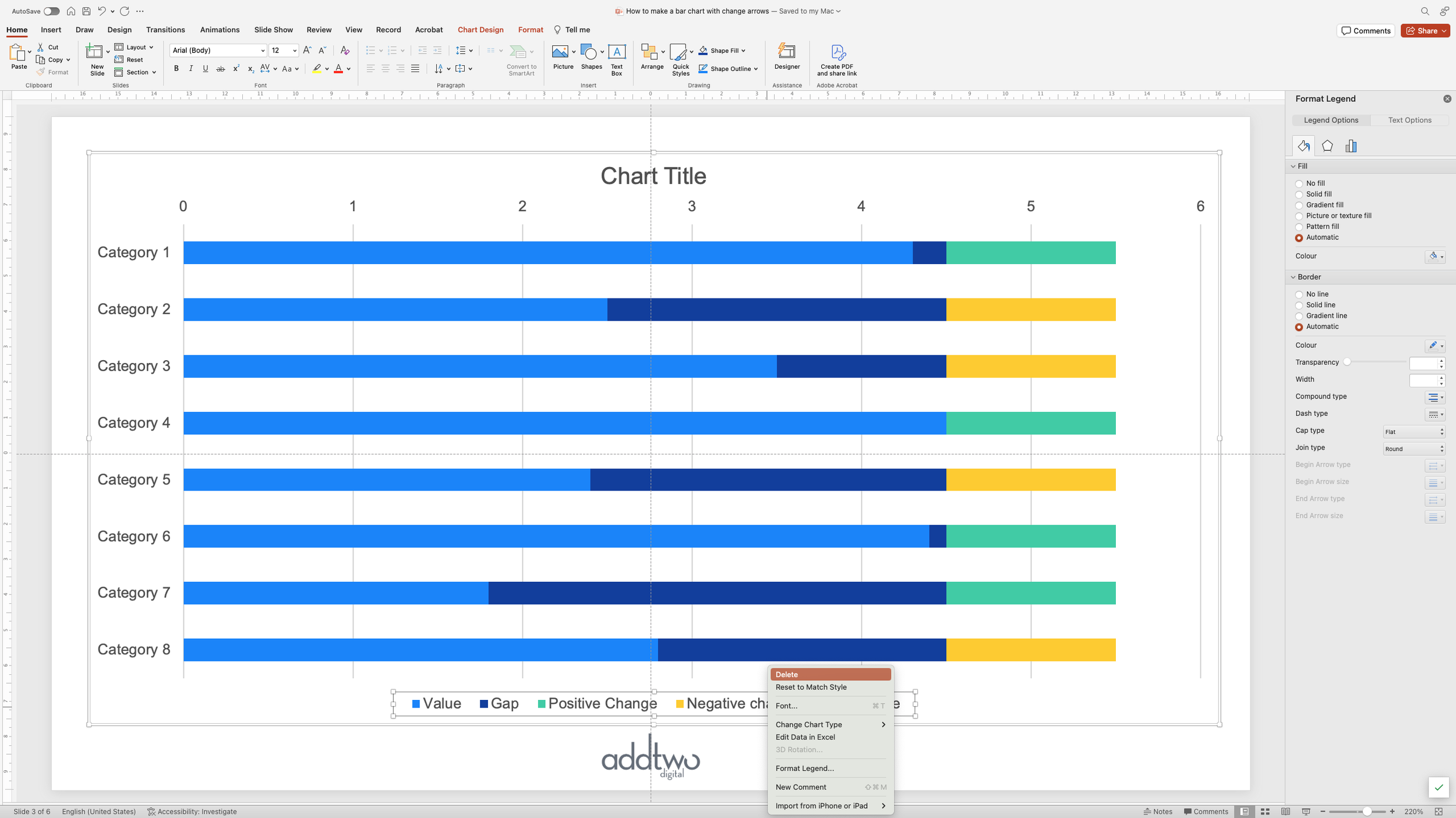
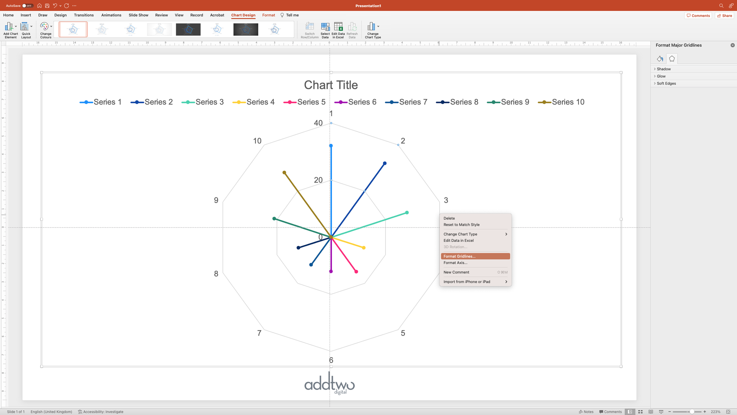
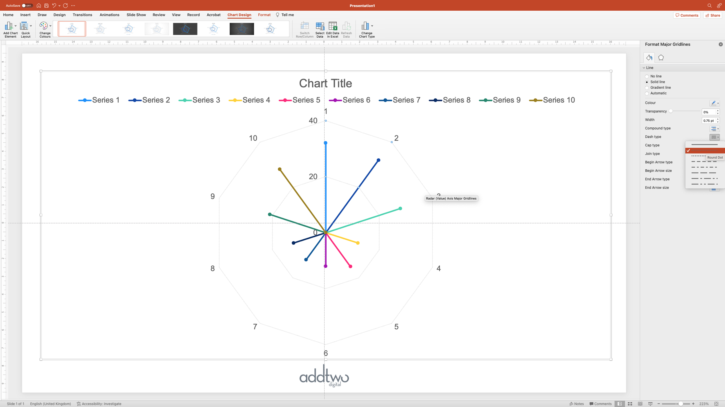
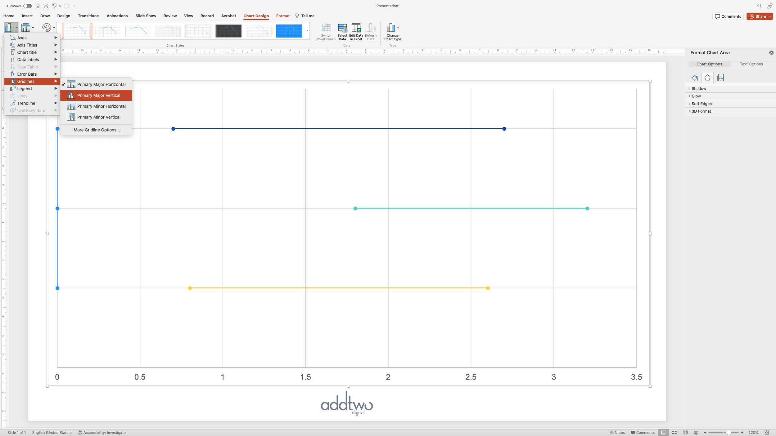
Then we’re going to style the gridlines. We can do this in the Format Pane too. If we already have the Format Pane open we could just select the gridlines. Or we could right-click on them and select ‘Format Gridlines…’

We’re going to set the gridlines to dotted lines, just to de-emphasise them a bit.
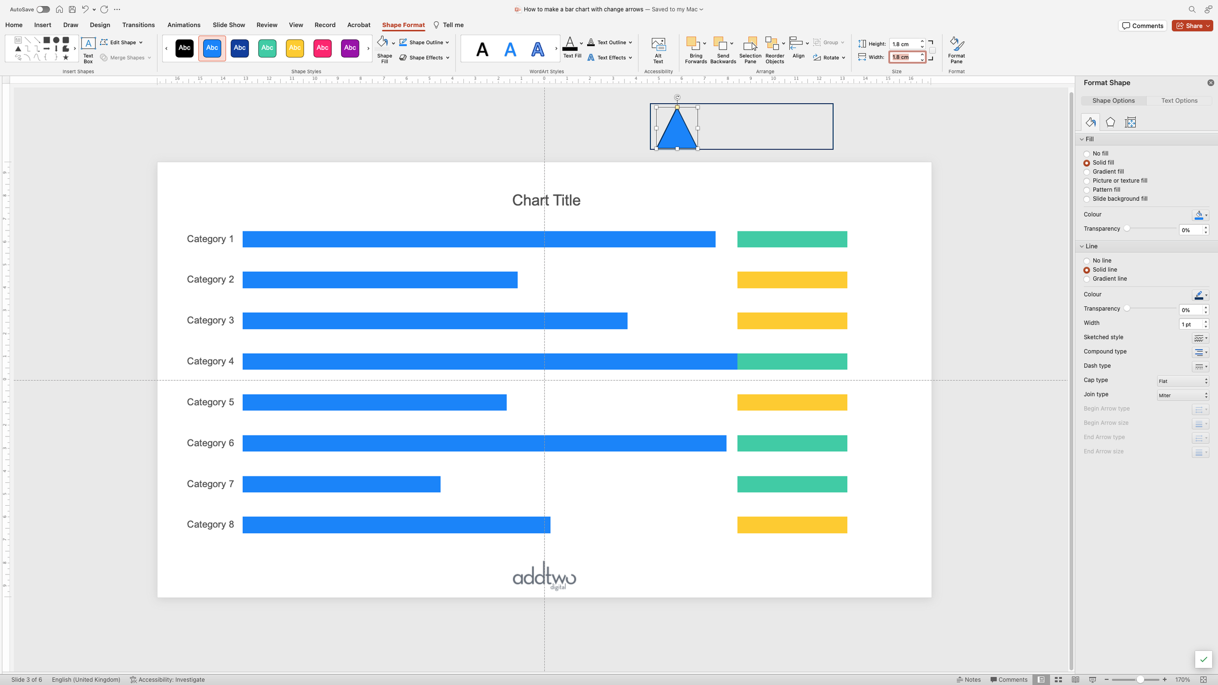
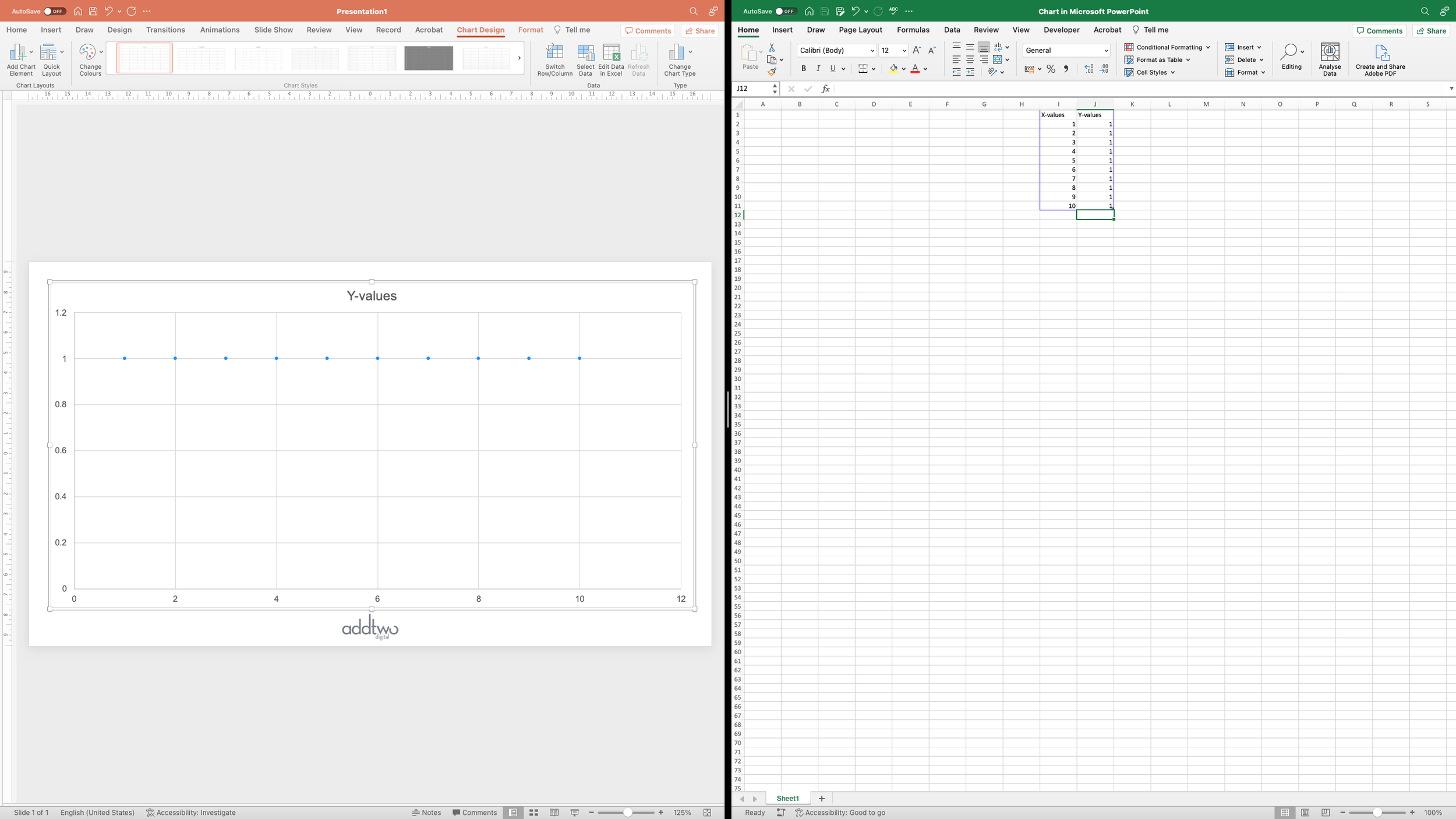
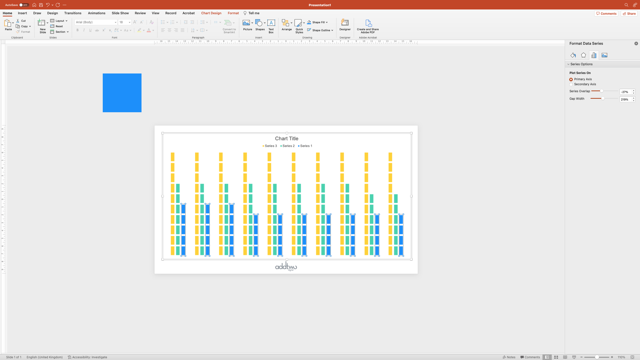
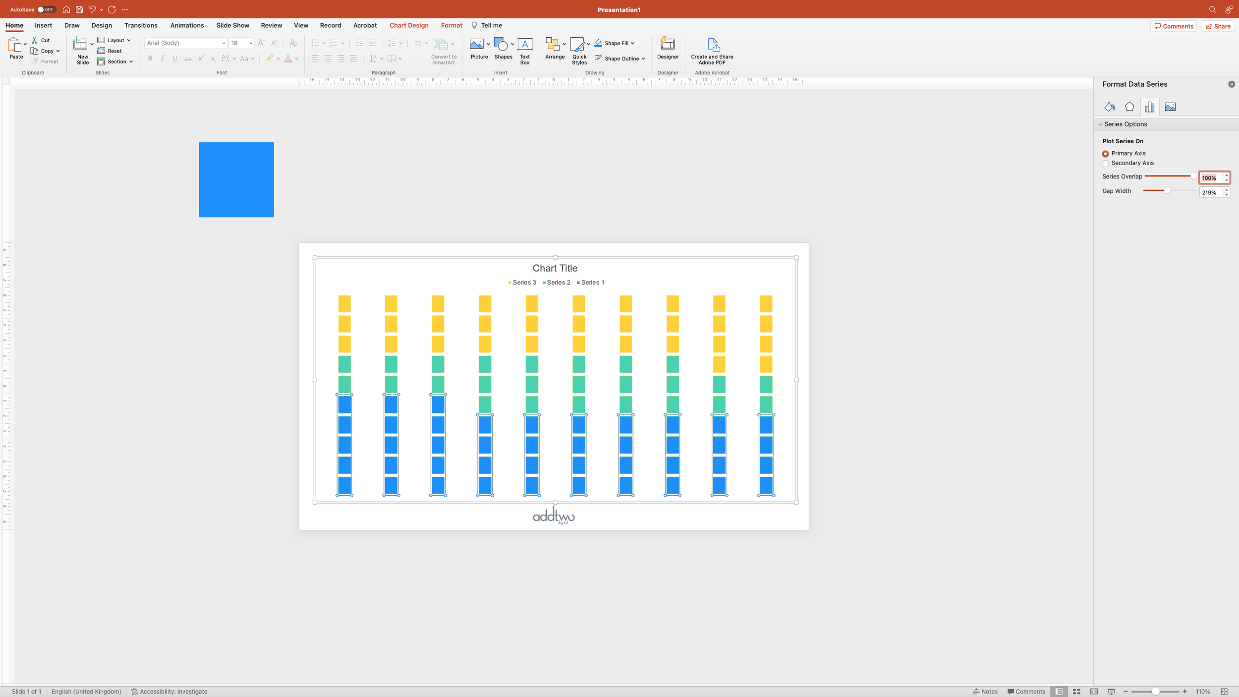
Create the gaps

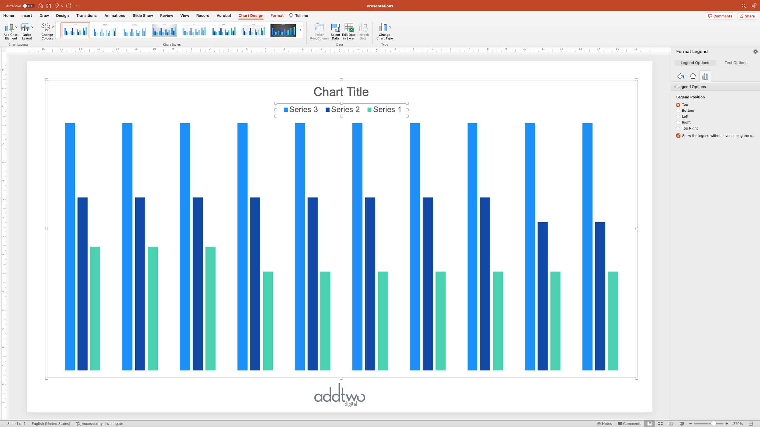
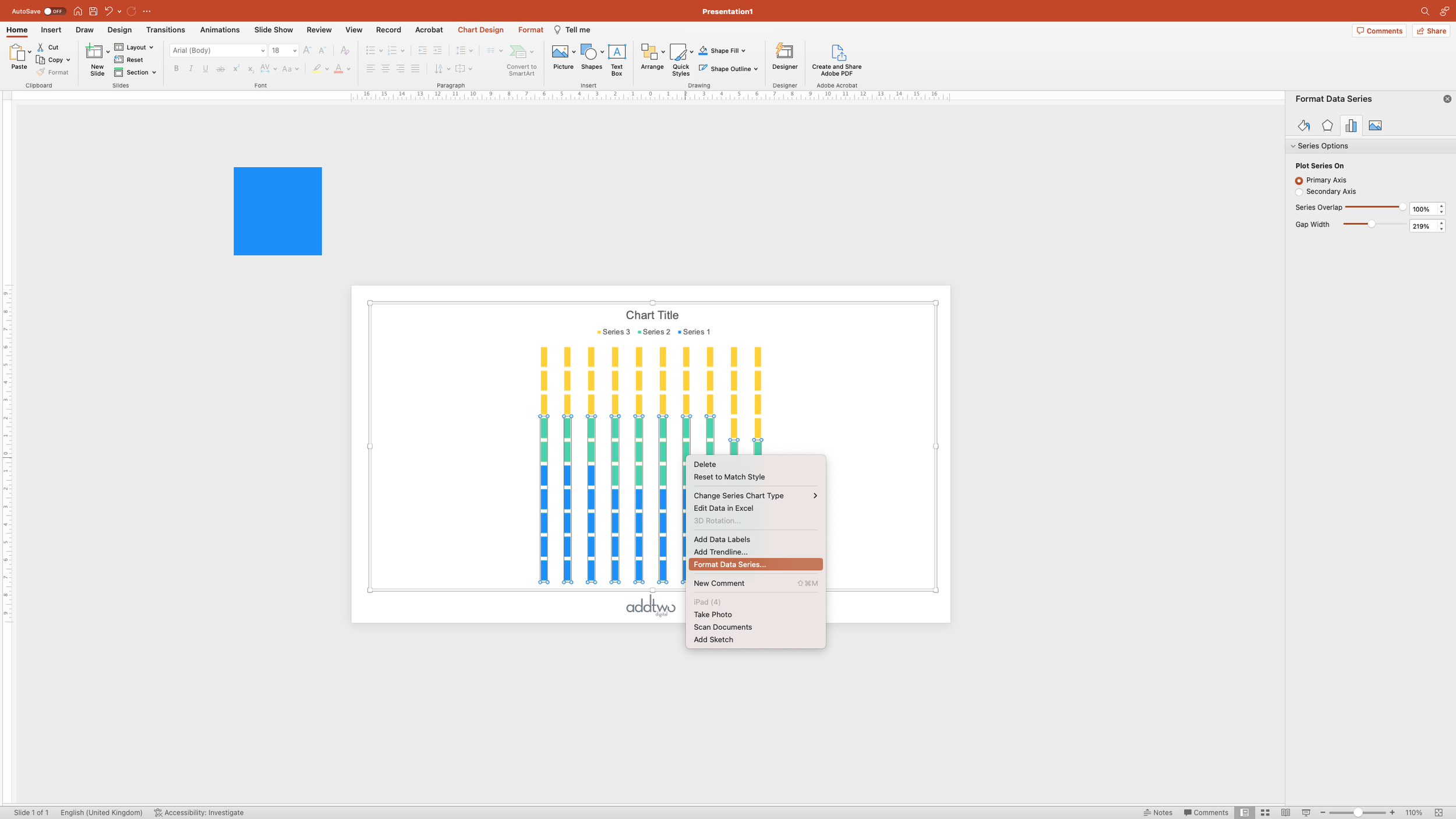
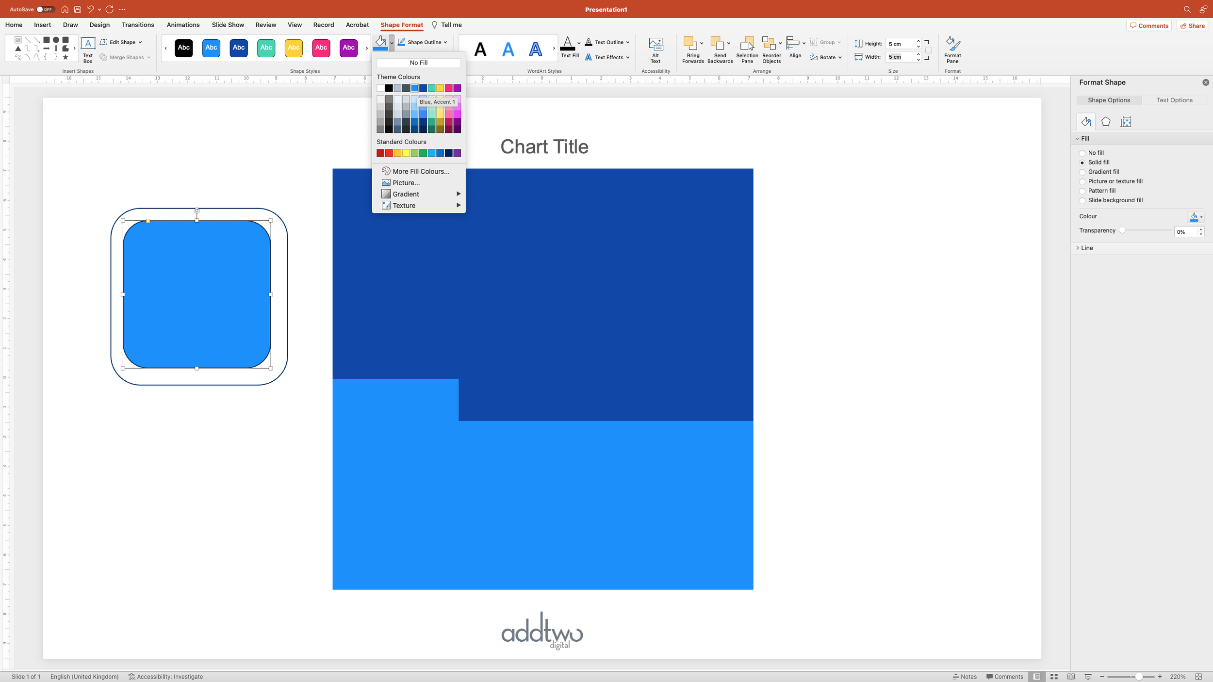
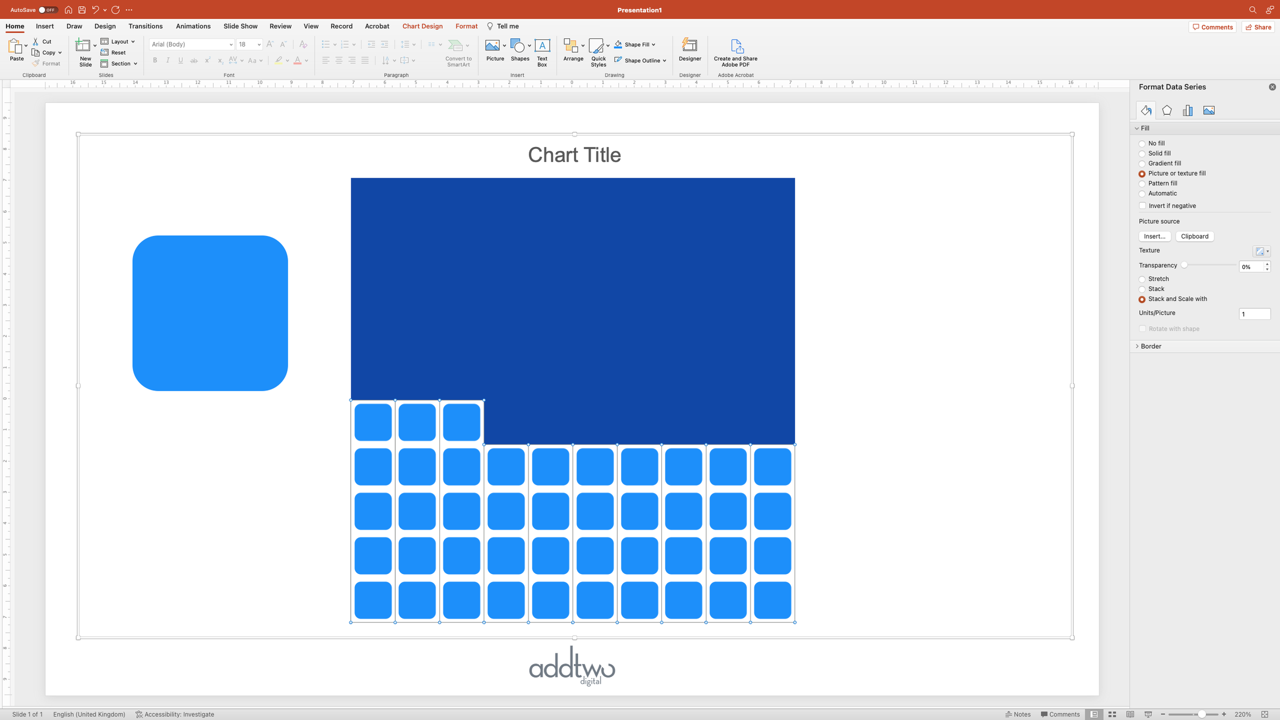
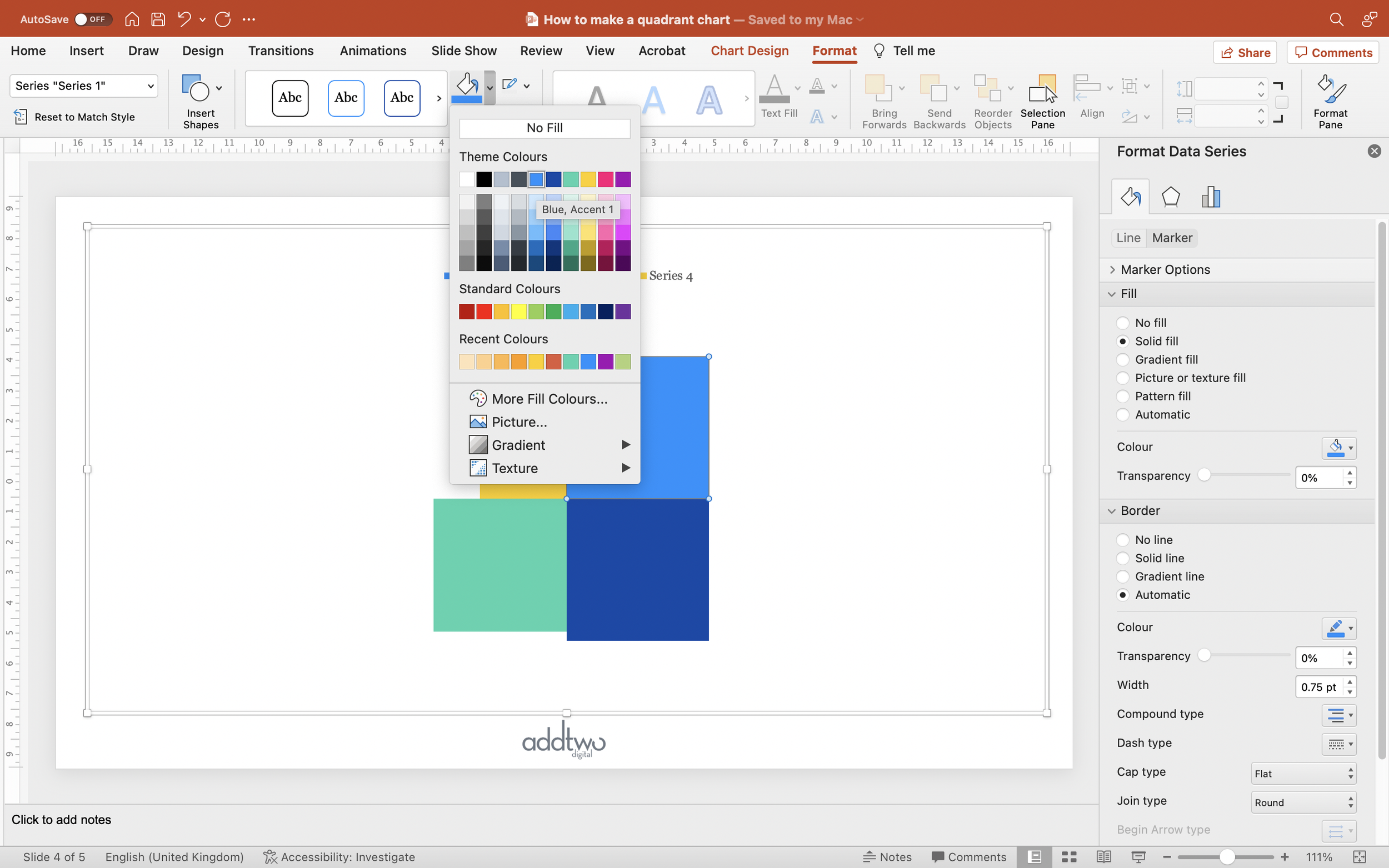
Now we’re going to make the gaps between the individual lines. First we need to select that extra ‘spacer’ data series. We can do that by just selecting the data series in the Legend.

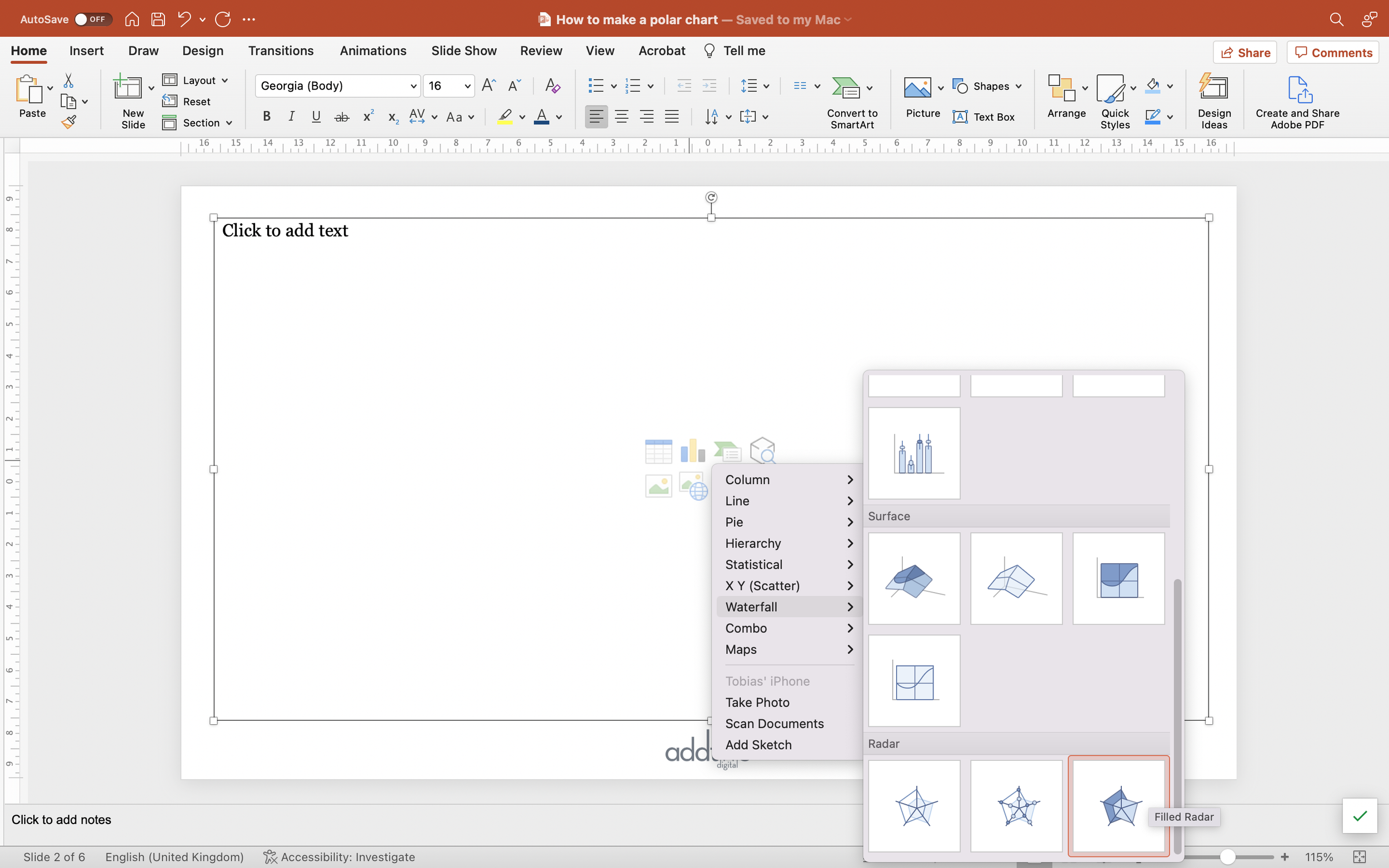
With that selected, we’re going to change its chart type using the ‘Change Chart Type’ button in the Chart Design tab on the ribbon.

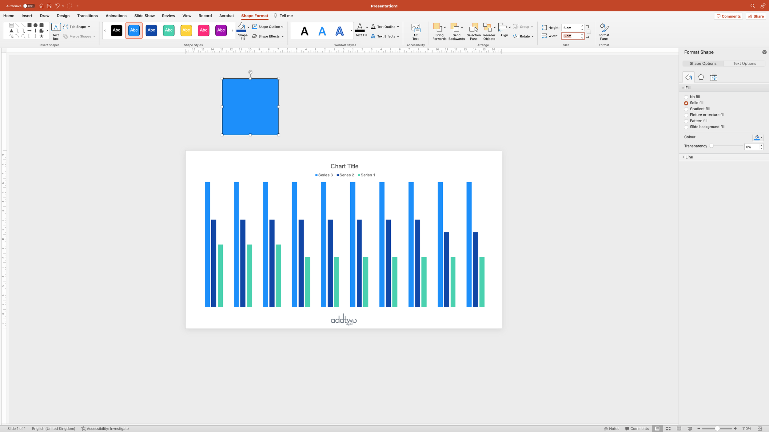
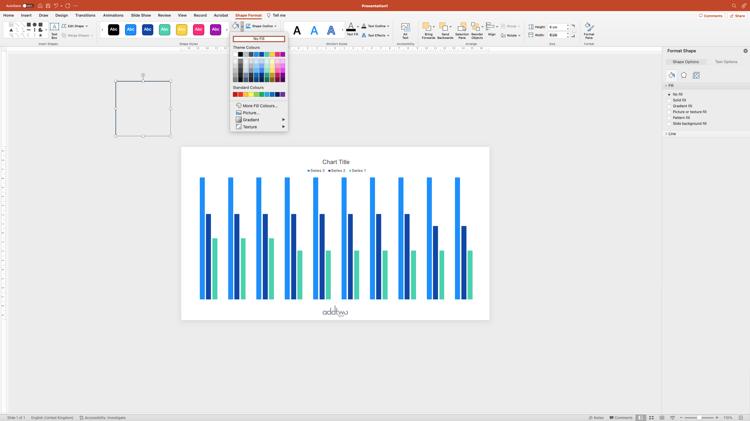
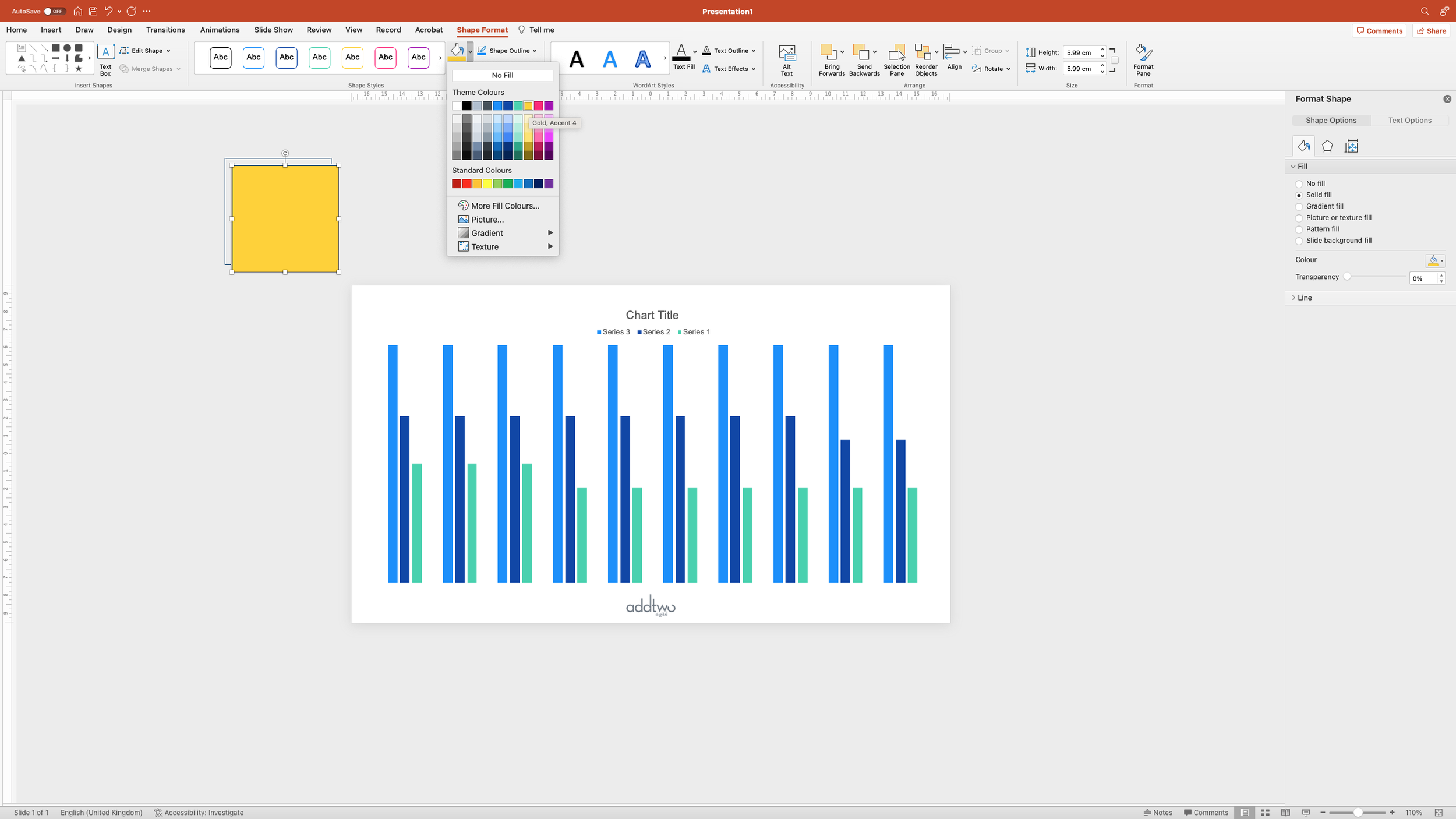
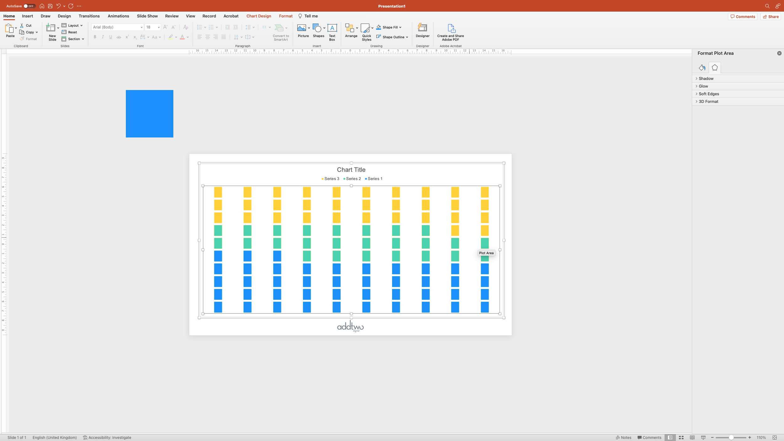
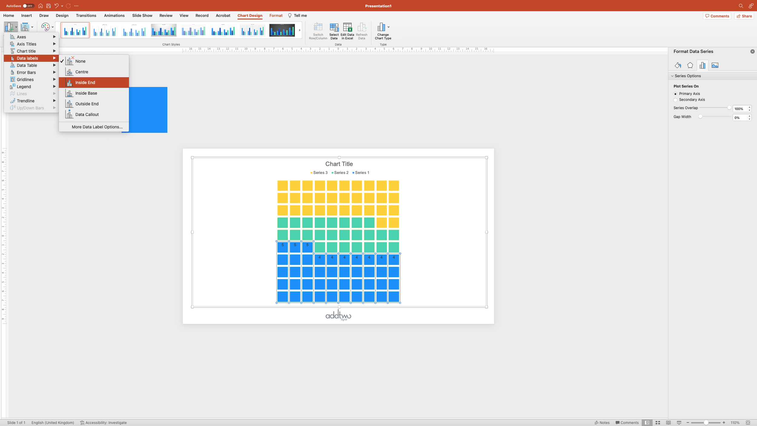
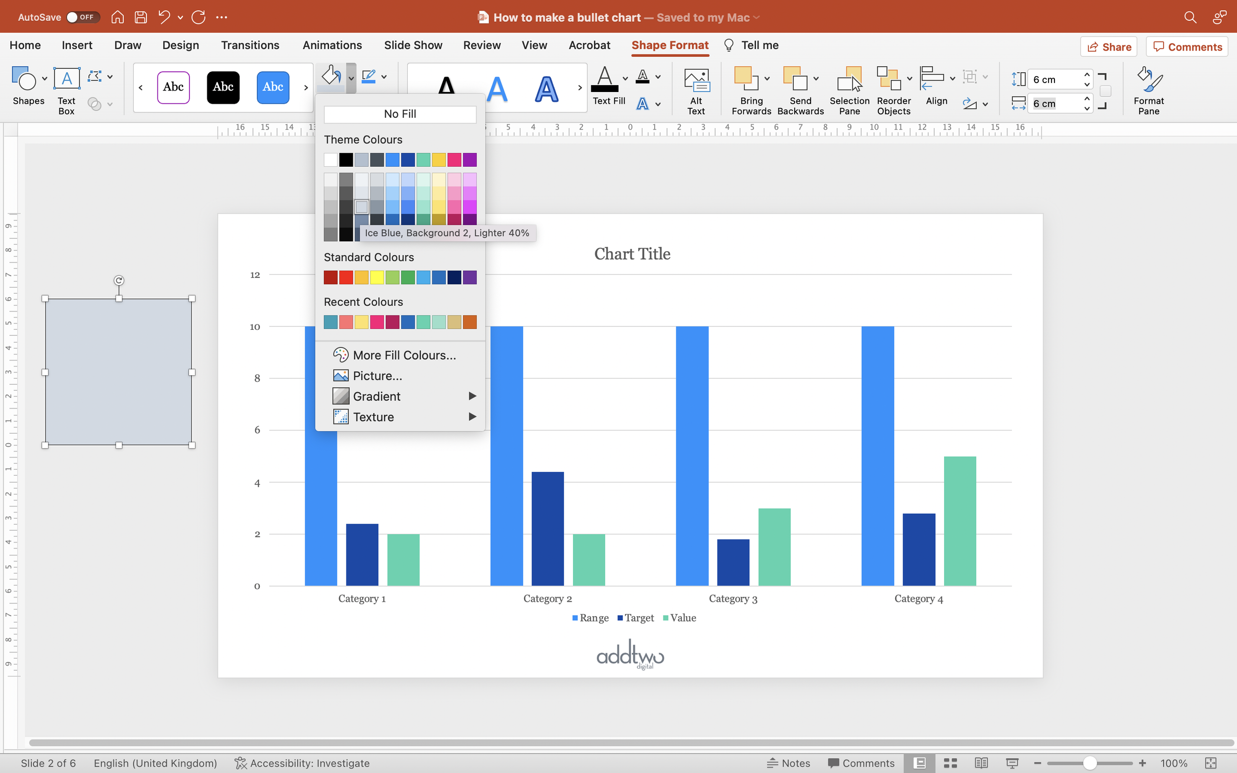
We’re going to change that data series into a column chart and then fill that column with the background colour of our slide to create what appears to be an empty space.
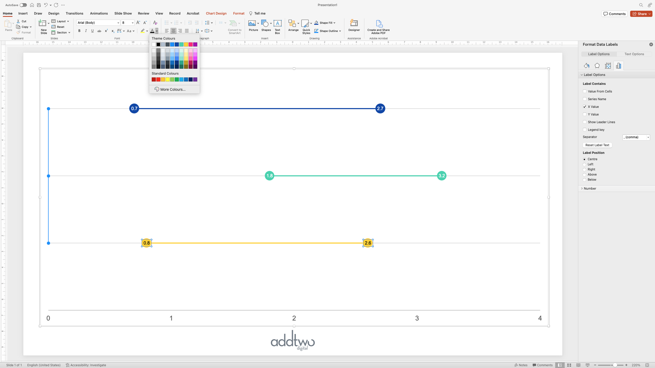
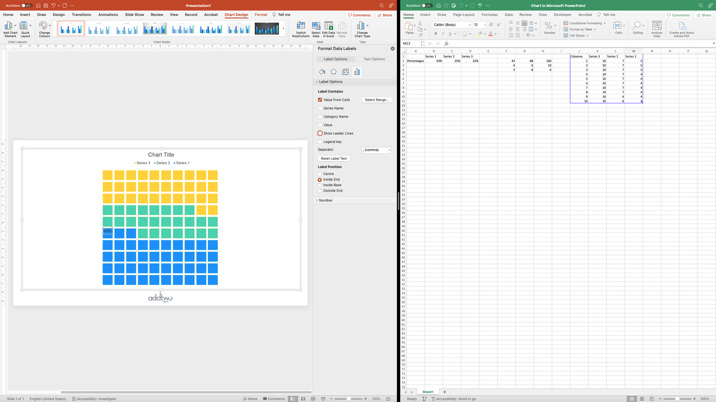
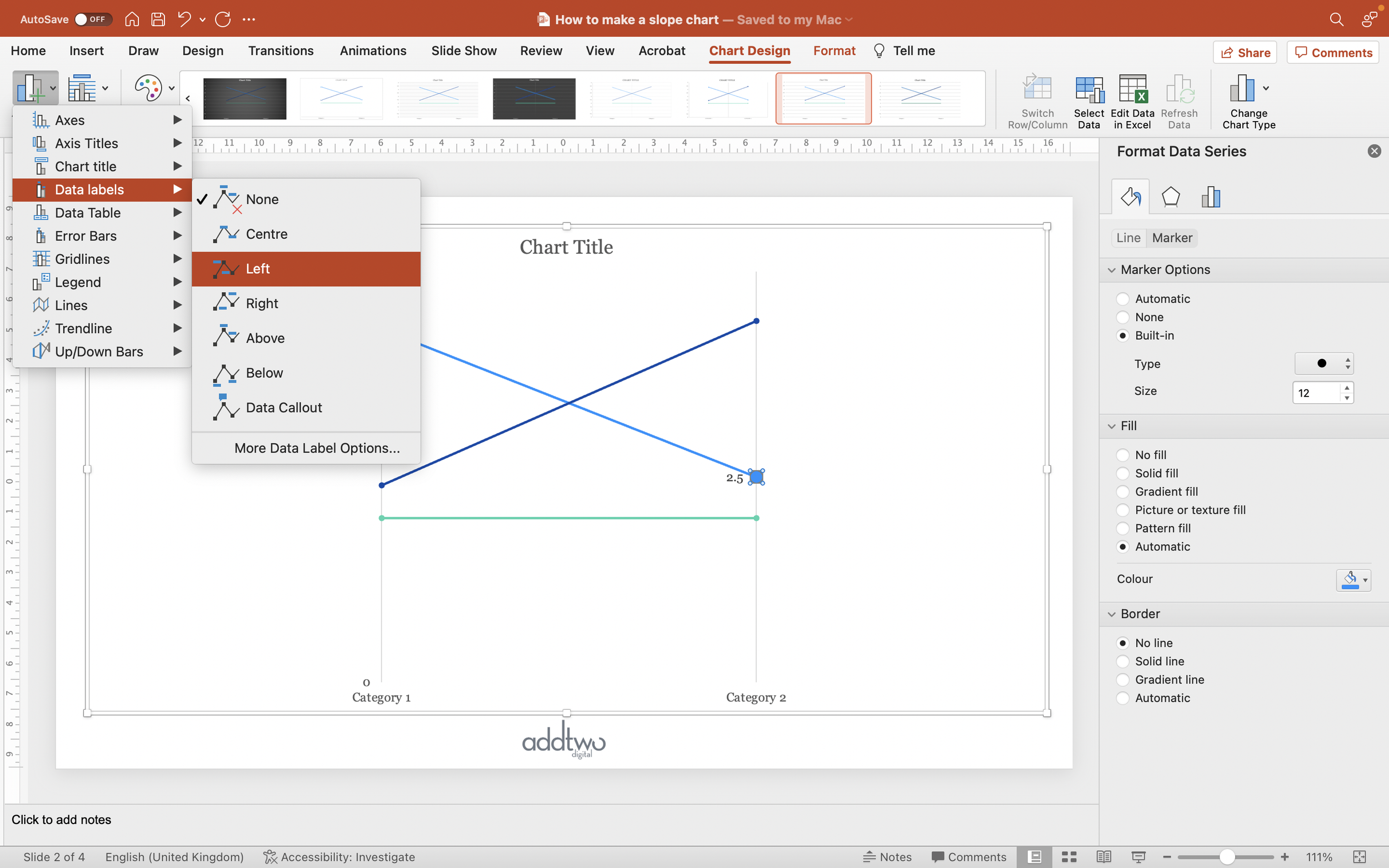
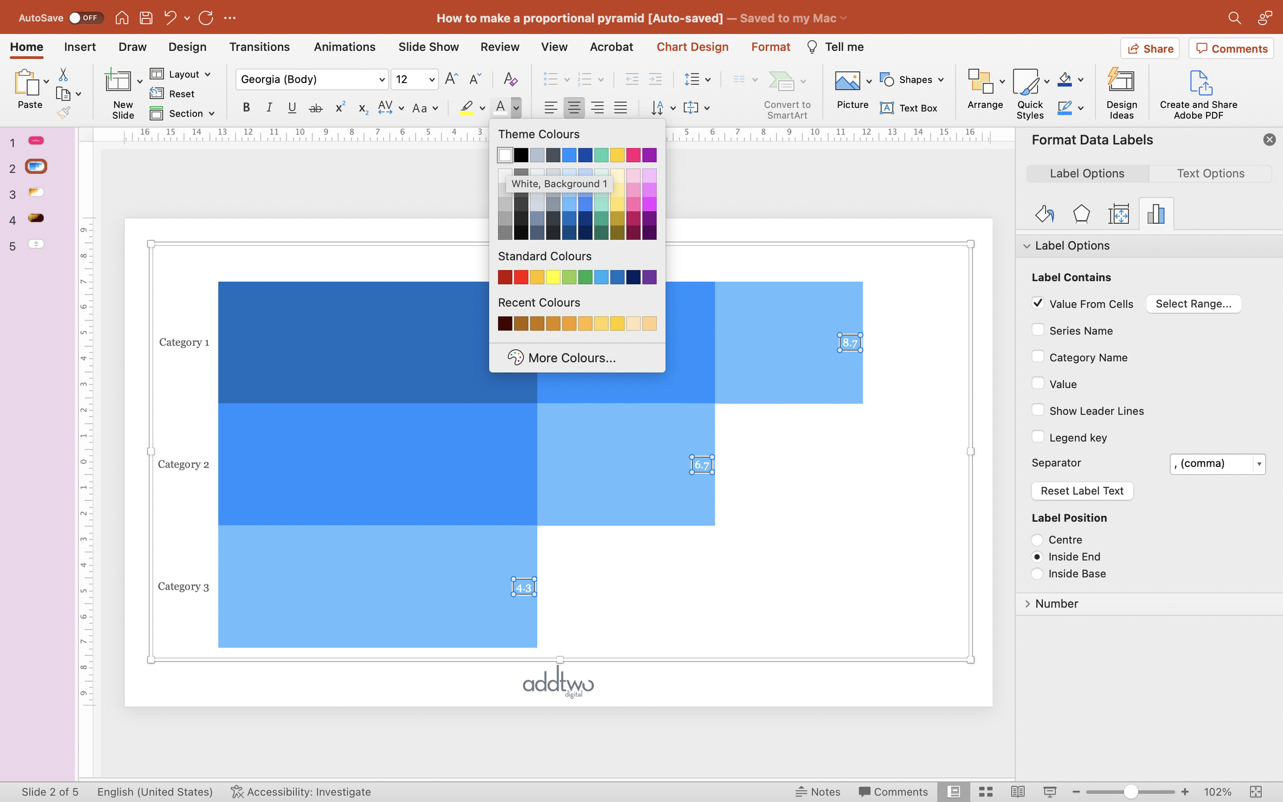
Add data labels

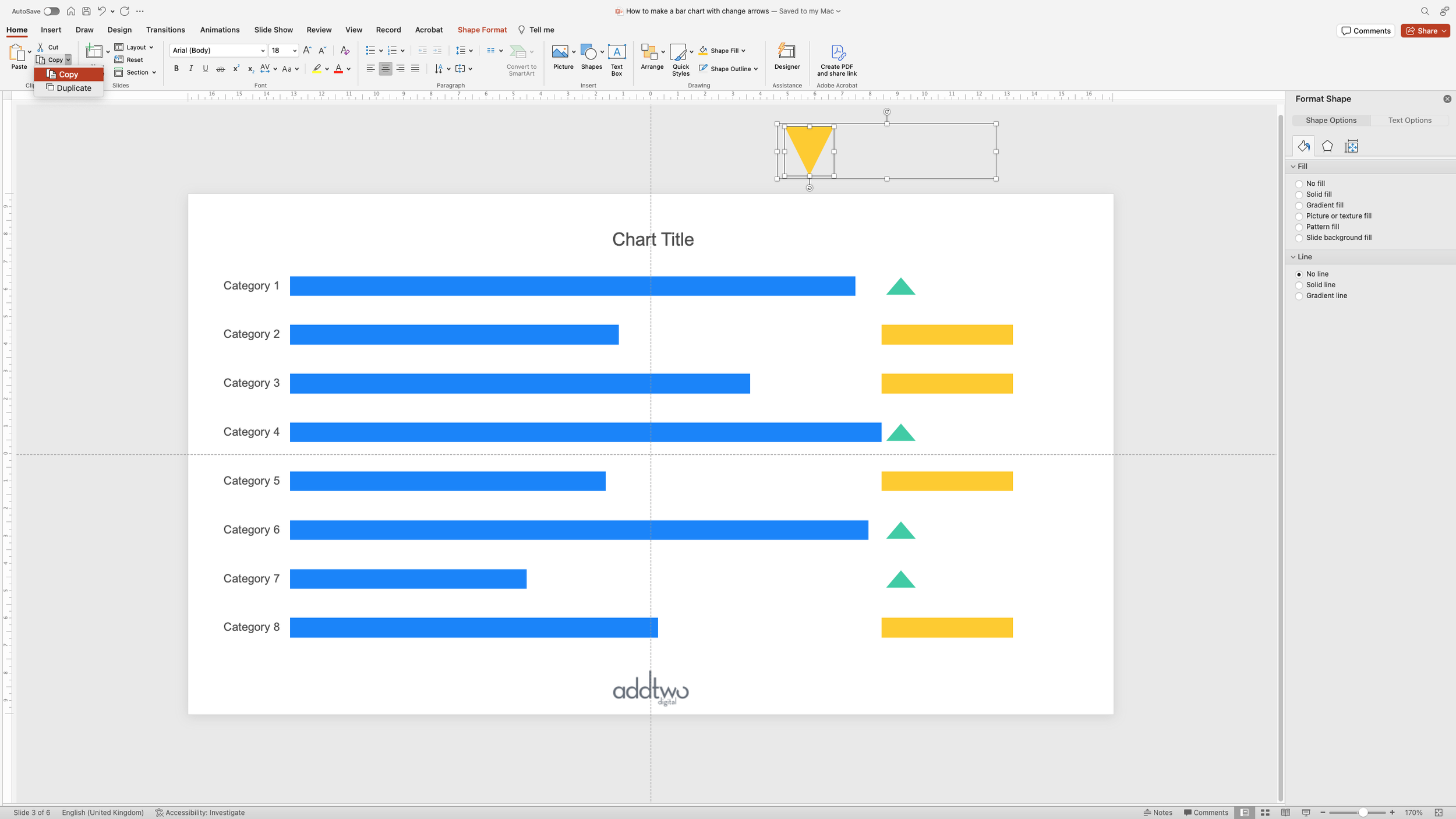
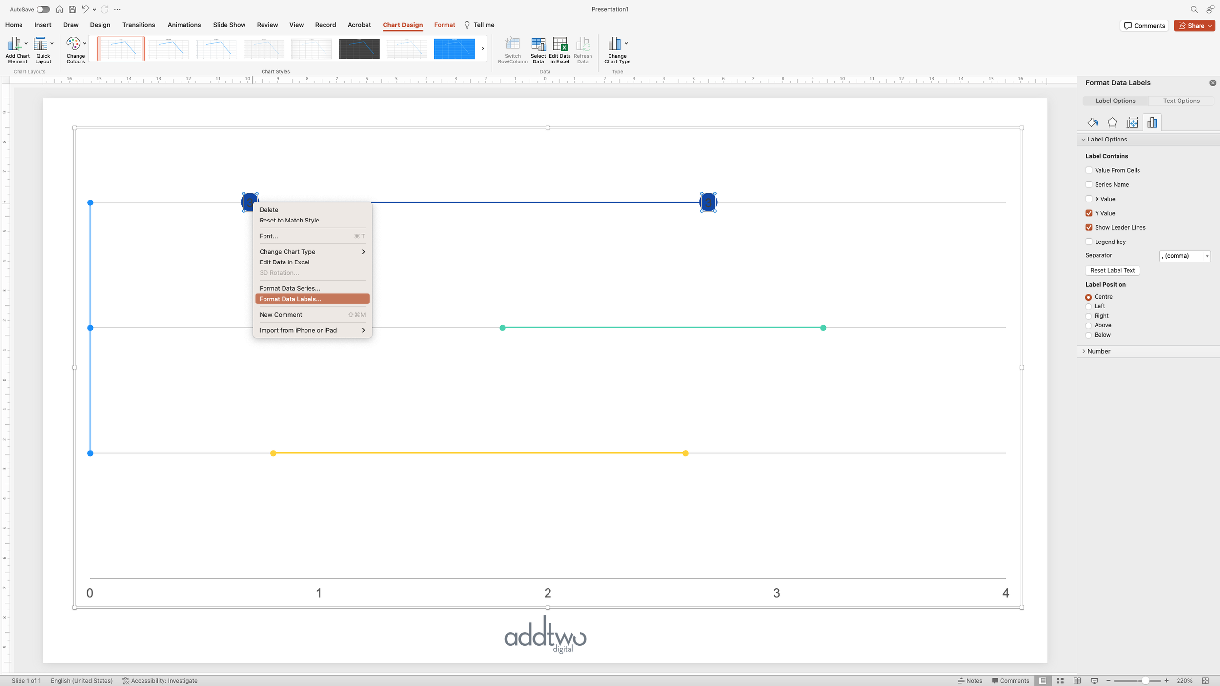
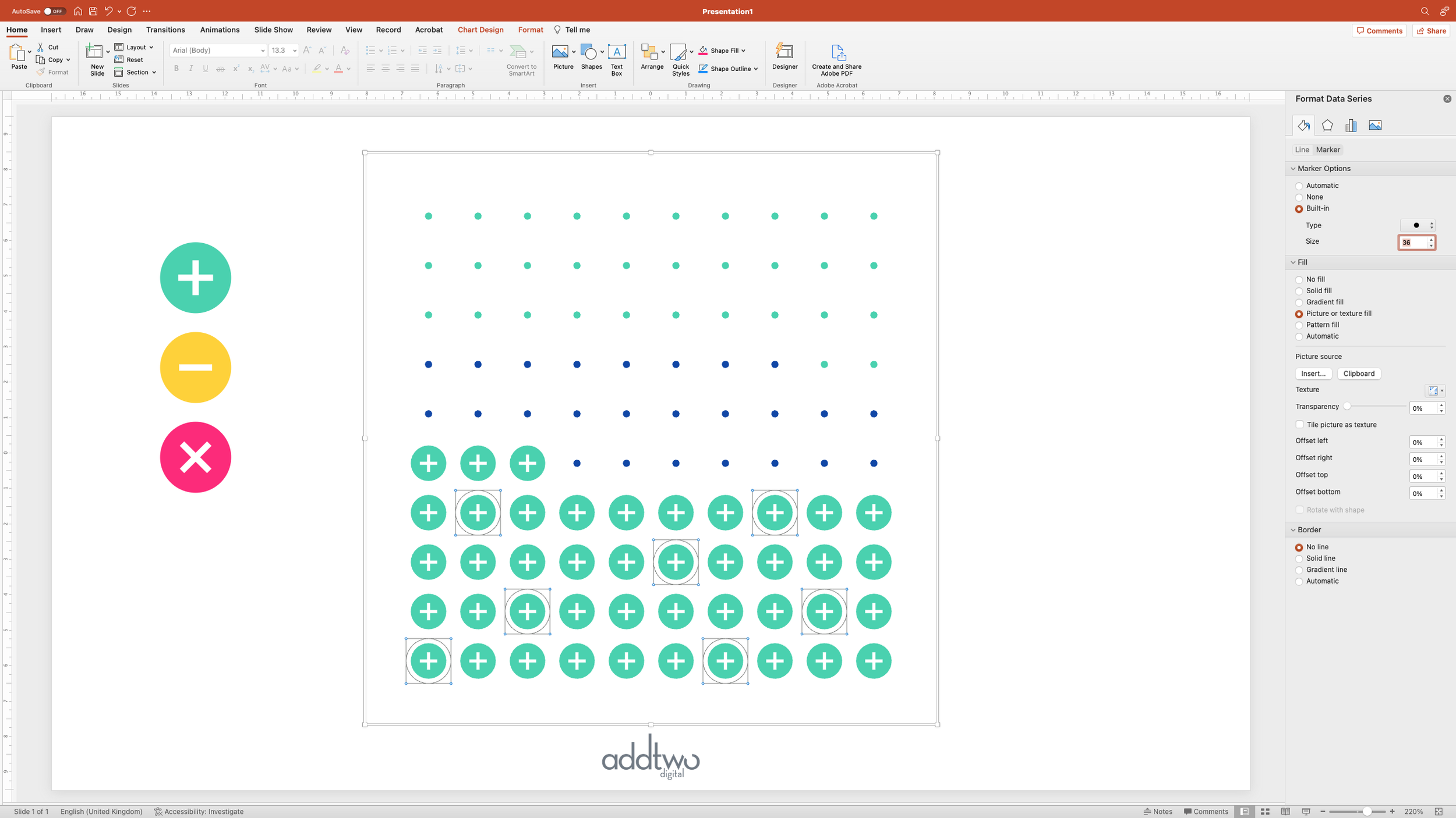
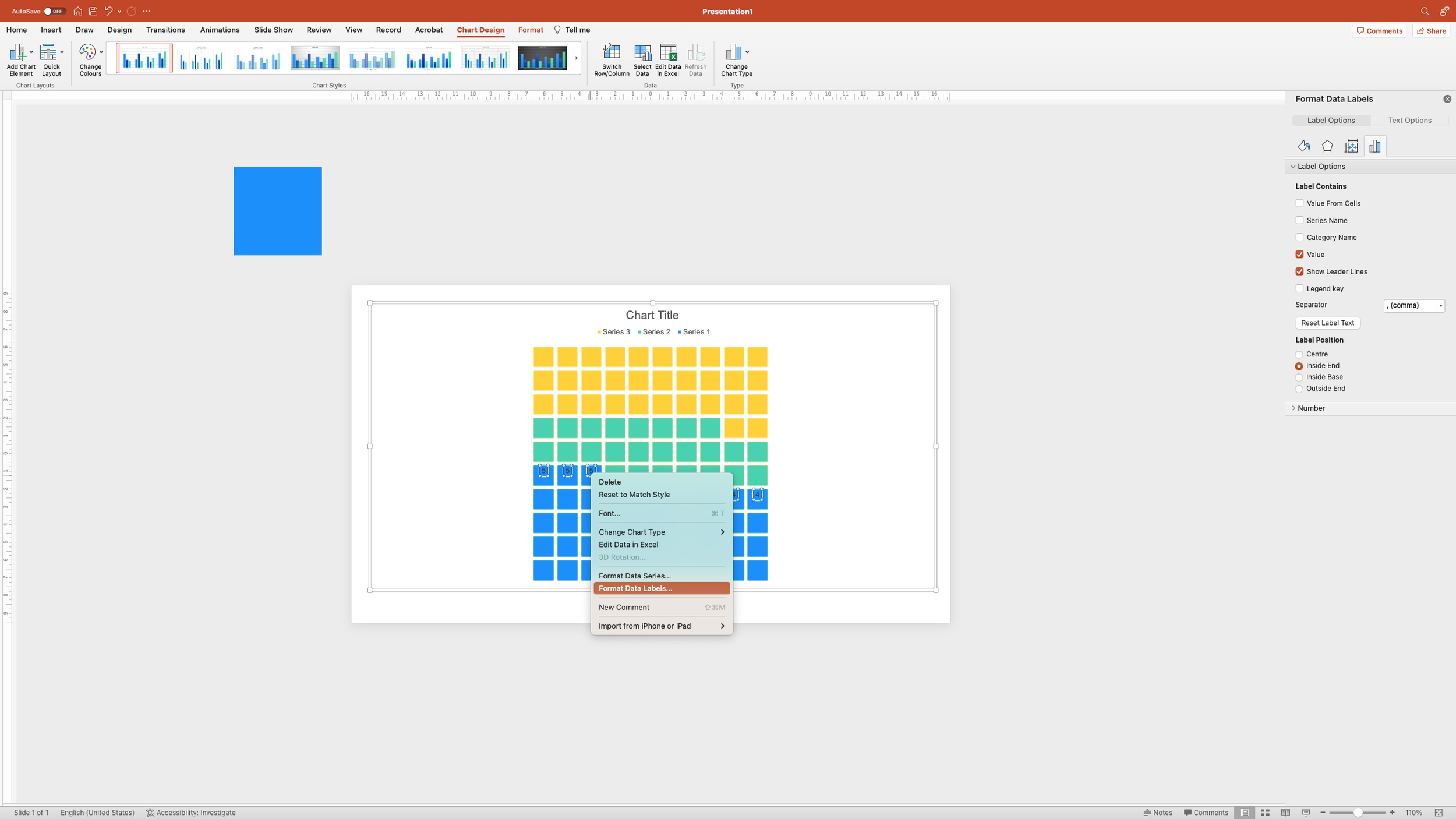
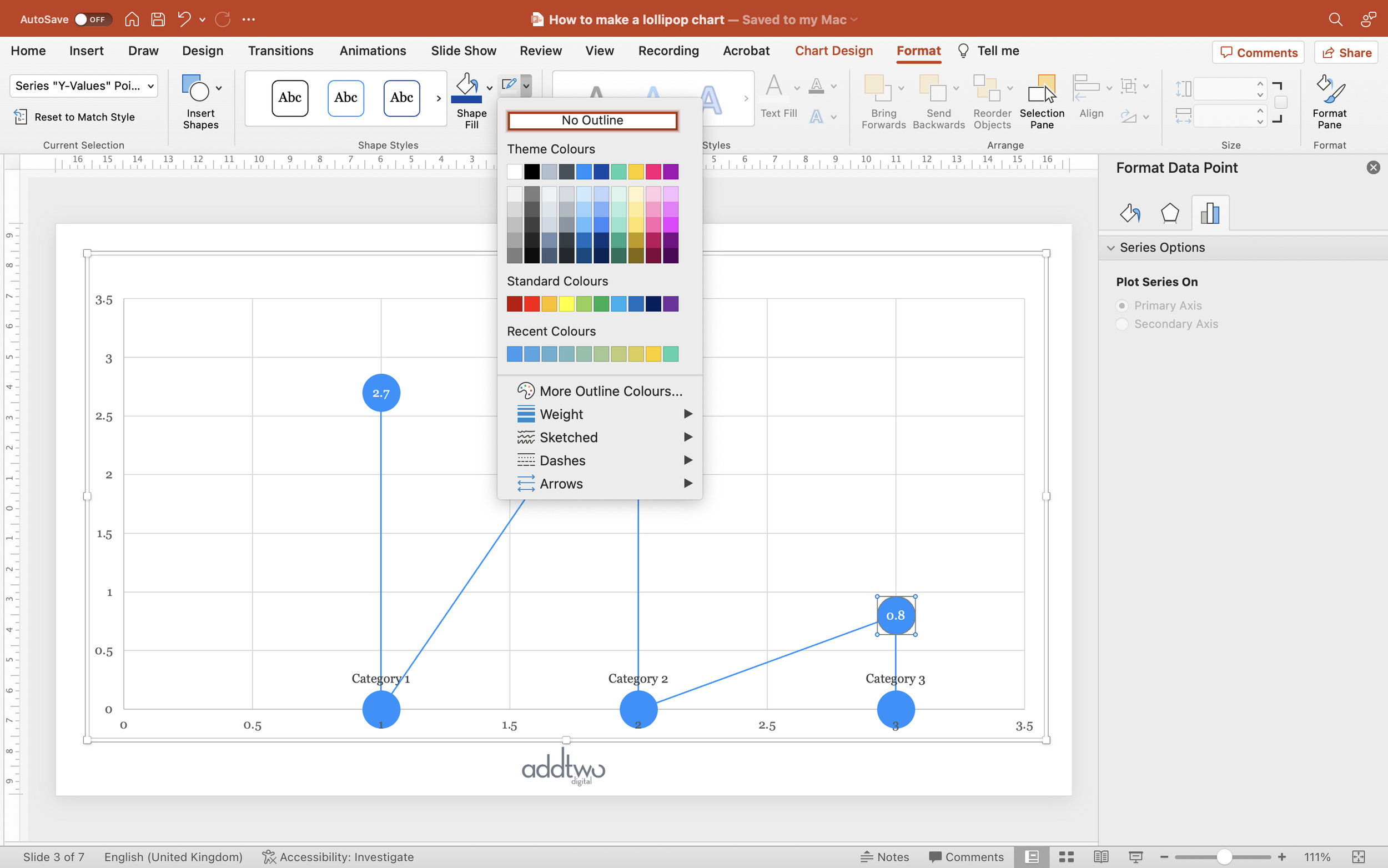
We’re also going to add markers and data labels for the beginning and end points of each line. We can do this in the Format Pane. If it’s not already open, we can access it by right-clicking and selecting ‘Format Data Series’

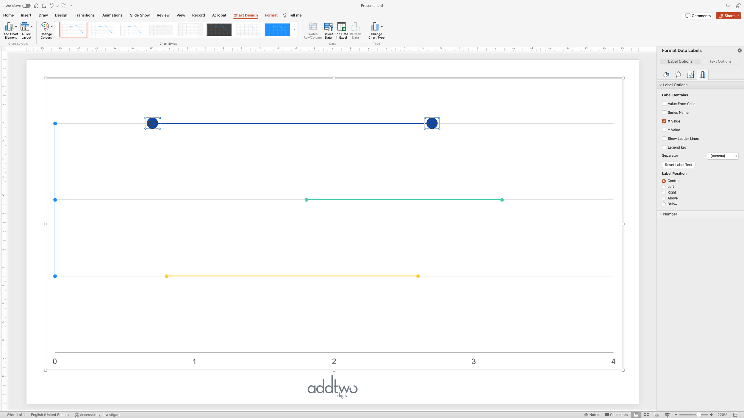
We can find the Marker options under the ‘Fill & Line’ tab (the little paint pot icon) in the Format Panel. We’ll have to select the ‘Marker’ button and open the ‘Marker Options’ panel. We’re going to select the built-in circle marker at an 8pt size.

This will add markers to all the data points and we only want them at the beginning and end, so we’ll have to select the markers in between and delete them. You can do this by just hitting ‘delete’ or selecting ‘None’ under the Marker options.

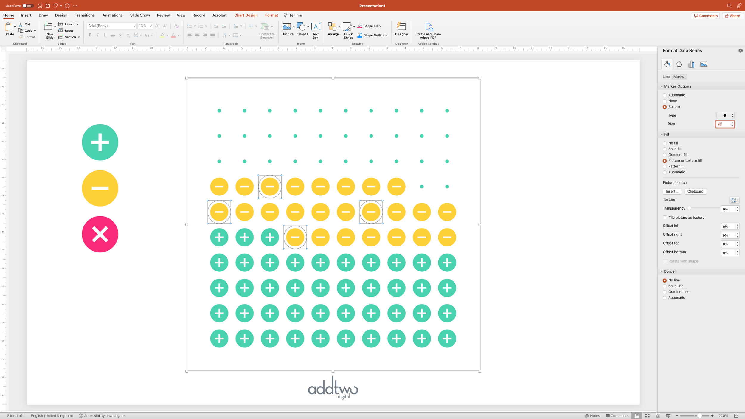
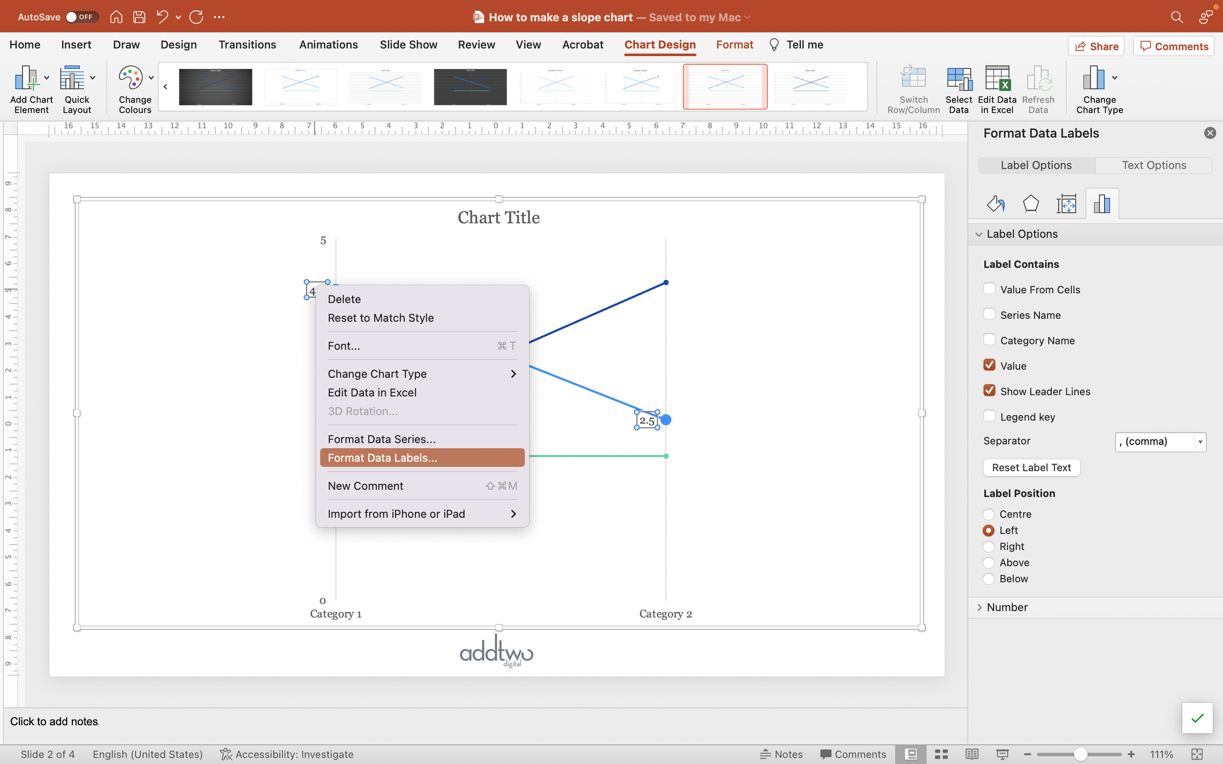
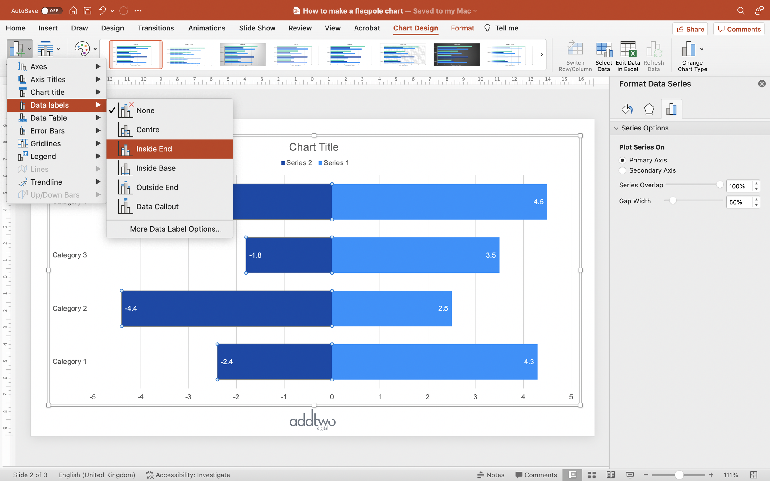
We’re going to then select the first marker and add a data label. We can do this by selecting ‘Data labels’ under the ‘Add Chart Element’ button in the ‘Chart Design’ tab on the ribbon.

We’re then going to repeat this process for the last data point in the series.

And then for the first and last data points in the other two data series.

Tidy the chart

Finally we’re going to remove the line on the x-axis. We can do this in the Format Pane. We can open this by right-clicking on the axis and selecting ‘Format Axis…’

We’re then going to set the line options under the ‘Fill & Line’ tab (the little paint pot icon) to ‘No Line’.

This will remove the solid line by the horizontal gridline will still be there. Crucially, though, this line is broken by our ‘spacer’ data series, giving us our apparently separate line charts.

So that’s how we make that in PowerPoint

Small multiples are obviously most useful in multiples, with many charts set up against each other, but it can be really useful in making line charts with lines that are very similar in value but which all need to be clearly distinguished.

Bars with change arrows

This is a common request: to add some indication of change into something like a bar or column chart. In this case, we’re going to add some little up and down arrows to indicate whether the key value has changed.

This tutorial assumes you’re reasonably au fait with PowerPoint and how it makes charts. If you feel you need a more indepth introduction, click here to find out more about the basics of the PowerPoint charting engine

So, how do we make this in PowerPoint?

In this how-to, we’ll be using the default sample data PowerPoint gives you, so you can follow along without needing to download anything, but if you want to, you can find the dataset we used to make the example at the top, and a PowerPoint deck with that slide in, and other examples, here: 

https://docs.google.com/presentation/d/1JuMc8Inkf8t5snQSVtGp7qffzfGwUbV3?rtpof=true&usp=drive_fs

What you’ll need

  • Stacked bar

  • Data manipulation

  • Chart manipulation

  • Design tweaks

  • Custom labeling

How you do it

We’re basically going to create a stacked bar, in which one segment visualizes the data and then use other segments as containers for the custom visuals. We’ll use Excel formulas to create segments for rising and falling values and then use custom fills to add appropriate arrows to those segments.

Details

Add the chart

We’ll start by adding a stacked bar chart. In this case we’ll use the standard stacked bar rather than the 100% option.

PowerPoint will then create an example chart and open Excel to show us the dummy data its populated with.

Although PowerPoint opens a whole Excel spreadsheet to show us that data, its only every visualising the section in the blue frame. We can move that around and not affect the chart at all.

However, the spreadsheet still operates as a conventional Excel document. We can add data, formulas and other content to it and it will all be saved in PowerPoint.

Add the data

In this case, we’ll add a table with our actual data in. We’ve got a column of values and then a column of change (from some previous time period, presumably).

Now we’re going to add a formula. What we’re going to want to do is to have one data series that shows our values and then a data series (or two) that contain our arrows. But we want the latter to line up neatly, which means we’re going to want a series in between to make a gap to even everything out.

We’re going to calculate this based on the maximum value in our values series. We can use the Excel MAX() function to do this.

Calculate values to visualise

We’re then going to create rows for all our values inside the blue frame, to add them to our chart. We can name our categories by simply referring to our data table, using the Excel ‘=’ function.

We can do the same to add a column of our actual values.

This then gives us our basic bar chart of our data.

But now we’re going to add a gap at the end of each bar so that our arrows will line up vertically.

We’re going to calculate this by subtracting the value of the data point from the maximum we found earlier, so the formula will look something like:

=SUM($E$2-G2)

Don’t forget that adding the ‘$’ to cell references will mean that Excel won’t try and update the reference when you copy it down a column. Instead it will stay referring to a specific cell. The other reference, however, will update to refer to all the cells in our Value column.

This then gives us a set of bars with equal totals: the values and then the remainder of that value subtracted from the maximum.

Add data series for arrows

We’re then going to create a data series for each kind of marker we want to add. We’ll want an arrow for positive change, so we’ll add a data column for that.

Now we want to fill those cells only if we have a positive change in our change column.

We can do this easily but using an Excel IF() statement. They take the form of IF(thing to test, do this if that’s true, do this if its false). In this case, IF (change is positive, add a value to this cell, otherwise don’t add anything).

The value we’re going to add if it’s true is totally arbitrary and depends on the rest of the chart. Basically we want a section of bar long enough to contain an arrow and a data label. We can devise a formula to calculate this, but in this case we’ll just set it to ‘1’.

So our resulting IF() statement will look something like this:

=IF(C2>0,1,NA())

That NA() simply defines a cell as not having a value in it at all, stopping PowerPoint from visualising anything.

We’re then going to want to do the reverse for negative change - testing to see whether the change is negative and filling those cells with the value ‘1’:

IF(C2<0,1,NA())

You can see that this then ends each bar with an equally sized section, but in two different data series. PowerPoint has coloured these using default colours from our palette: green and yellow.

We’re also going to add a column for where there’s no change:

=IF(C2=0,1,NA())

In this case, this makes no difference, as all the values have changed, but it could prove useful in the future.

Now we've done all we need to do with the data - for the moment - and we can close the Excel spreadsheet.

Layout the chart

To start with we need to get the basics of the chart sorted out. We can start by getting the vertical axis in the right order (PowerPoint always reverses the order from the data for some reason).

We can do this in the Format Pane. To open we can right click on the axis and select ‘Format Axis’.

We can then just tick the ‘Categories in reverse order’ to flip the axis the right way up.

While we’ve got that open, let’s remove the axis line from the y-axis, as its entirely superfluous. We can do this by clicking on the Paint Pot icon in the Format Pane and then selecting ‘No line’ under the Line options.

There’s a bunch of other chart elements that we don’t need too.

Because we’ve manipulated the data to make the chart, the legend doesn’t help, so we can get rid of that. We can just select it and hit delete, or right-click and select ‘Delete’.

Another way to delete things is to untick them in the ‘Add Chart Element’ menu, which we’ll do to the horizontal axis and the gridlines.

the chart

Now we’ve got the basics out of the way, we can concentrate on the visualisation. To begin with we want to make our ‘gap’ data series at the end of each bar go away.

We can do this by selecting the data series and selecting ‘No Fill’ in the Fill options. You can do this in a number of ways, in the Format Pane, for instance, or just using the usual Fill tools in the ribbon.

Add the arrows

Now we can add the arrows. This means creating a custom fill. 

We can start by adding a rectangle using the Shape menu in the Insert tab on the ribbon.

We can set that rectangle to be roughly the same proportions as the blocks for the change data series that we added in the spreadsheet - the green and yellow segments in our chart.

Then we’re going to remove the fill colour from that rectangle by setting it to ‘No Fill’.

Now we’re going to add our arrow for positive change. We’re going to just use an upward pointing triangle.

We’re going to want to position that triangle over the rectangle background we’ve made.

We can then fill that triangle with whatever colour we want to use for positive change.

And we’re going to want to make sure that it’s properly vertically centred against the rectangle, although we’re going to want to keep it over to the left hand side.

With both still selected we’re then going to remove then going to remove the outlines.

This will leave us with a green triangle against an entirely transparent rectangle. We’re going to want to keep them both selected and copy them both.

Then we want to select the data series for positive change - the green series in our example - and open the Format Pane. We can do this by right-clicking on any data point from that series and selecting ‘Format Data Series’.

Then, under the Fill options, we’re going to selecting ‘Picture or texture fill’. By default this will fill all this data series with a picture of a canvas texture.


Underneath, however, there are ‘Picture source’ options and we can just click on ‘Clipboard’ to fill the bars with the shapes we just copied.

As you can see, we added the rectangle in the background to give us a bar fill that just features a triangle on the left, with everything else being transparent. Everything’s a bit distorted at the moment, but we’ll get to that.

First we want to add arrows for the negative change. We can do this in exactly the same way. Let’s recolour that triangle for negative change.

And then invert it so it’s pointing downwards.

Then we’re going to select both it and the invisible rectangle (the easiest thing is to just drag around them both) and copy them.

Then we’ll select the negative change data series.

And do the same as the positive change - fill from the clipboard.

And we have our up and down arrows for change.

One more thing, let’s tweak those proportions. Basically, our bars ought to be closer together. We can set this in the Series Options in the Format Pane. By lowering the Gap Width we make the bars wider, which gets the proportions of the triangles looking nicer.

Add labels

We also need some data labels. The labels for the main bars are easy: just right-click on the bars and select ‘Add Data Labels’.

We can then format those labels in the Format Pane by right-clicking on them and selecting ‘Format Data Labels’.

We can set them to appear Inside End on the bars and set the text colour to contrast against the bar fill.

We’re then going to do the same with the change segments. We can right-click on the positive change arrows and select ‘Add Data Labels’.

But these labels are just going to read ‘1’, as that was the default value we gave to all these segments. We can change that though.

We can start by opening the Format Pane for these labels.

Then, in the Label Contains options, we’re going to select ‘Value From Cells’ options. This will open the Excel spreadsheet with the chart data in. It will then open a dialog box and ask us to select a cell range to use as labels.

We’re going to use our original column of change values.

We can then untick all the other options - these are the only labels we want. Because we’ve set the bars with no positive change to NA(), PowerPoint doesn’t try and label them.

Because we’ve set up the positive and negative changes as separate data series, we’re going to have to repeat this operation for the negative change too.

We’ll select the same column for our Value From Cells labels, and this will then add the negative labels to this data series.

So that’s how we make that in PowerPoint

The hardest part of making these is getting the arrow data series and the arrow graphics themselves the right size, so they look good once they’re added to the chart. It may take some tweaking, especially if you’re making something that you’re going to want to reuse, but it’s worth it.

The great advantage of these change arrows is that they allow you to emphasise the main values but still add in the change. It’s always better to add a separate visualisation rather than just keep trying to shoehorn in elements onto a chart until the whole thing becomes impossible to understand.

Sized arrows

Proportionally sized arrows are often a useful - and eye-catching - way of showing change, especially given how visualising using area means we can accommodate wide ranges of data and still have them all visible.

This tutorial assumes you’re reasonably au fait with PowerPoint and how it makes charts. If you feel you need a more indepth introduction, click here to find out more about the basics of the PowerPoint charting engine

So, how do we make this in PowerPoint?

In this how-to, we’ll be using the default sample data PowerPoint gives you, so you can follow along without needing to download anything, but if you want to, you can find the dataset we used to make the example at the top, and a PowerPoint deck with that slide in, and other examples, here: 

https://docs.google.com/presentation/d/1JuMc8Inkf8t5snQSVtGp7qffzfGwUbV3?rtpof=true&usp=drive_fs

What you’ll need

  • Bubble chart

  • Data manipulation

  • Chart manipulation

  • Design tweaks

  • Custom labelling

How you do it

We’re basically going to use custom fills to turn the seized bubbles of a bubble chart into sized circles. While we’re at it, we’re going to use one series of bubbles to add a bunch of custom labels to a bubble table that are driven by the data spreadsheet and don’t have to be edited by hand.

Details

Insert the chart

We’re going to start by inserting a Bubble chart, which you’ll find under the Scatter plots in the PowerPoint chart menu

As usual PowerPoint will generate an example chart and open Excel to show the dummy data behind it in a spreadsheet

Although it opens a whole Excel spreadsheet, the PowerPoint charting engine is only ever looking at the data inside the blue frame. We can move that data around and PowerPoint will just carry on visualising it, ignoring the rest of the spreadsheet.

But that spreadsheet still works like an Excel spreadsheet, so we can use it in different ways to help manipulate the data we’re visualising.

Add the data

We’re going to add the data we’re going to visualise in a different part of the spreadsheet. We’re going to make a table of sized arrows, so we’re going to make a table of our example data. We’ll make some of the values negative, as well, so we can have two kids of arrows - positive and negative.

Layout the data

We want our visualisation to be a table of sized arrows, so it’s only the size of the arrows that will actually be linked to our data. We’re going to use the X and Y values just to layout the table into rows (from the Y values) and columns (from the X values).

By adding three rows of data, with X values of 1, 2, 3 but all the same Y values (and all the same Size values), we get a row of bubbles, all in a line.

We’re going to use this row to create our column headers using custom labelling, so let’s prepare for that by adding the column names into an Excel column outside of our data frame (we’re also going to call this data series ‘Labels’, just so we’ll know what is going on if we ever try and reuse this chart).

We’re then going to create two rows in our data by adding two rows to our data. Both the same X value this time: 0, but Y values of 2 & 1, giving us two bubbles down the left hand side of the chart.

These will be the labels for our rows, so we’ll add those names to the column by the side of the data frame.

Generate the data

We now need to add the data for our actual arrows. We have two rows and three columns of data, but as also have two data series: positive and negative. We’re going to want these series to look different, so we’re going to add them as different data series in our spreadsheet.

PowerPoint normally differentiates between data series by requiring each one to be in a distinct Y values column. For a bubble chart this becomes two new columns: Y value and size for each data series.

So to create our new Positive data series, we’re going to add two new columns for the Y value and the Size.

We’re then going to add three new rows for the X values for the three columns: 1, 2 and 3.

The Y values for these three new Excel rows will all be the same: 2, to create  a new row directly under the top row of blue bubbles we already have.

BUT we only want to add values where we have a Positive value in our data, so we’re going to have to use an IF Excel formula to test whether the value in question is higher than zero. IF statements in Excel take the form: test something is true, if it is true do this, if its false do this.

So the IF statement for our first Y value will be:

IF(B2 >= 0, 2, NA())

The ‘NA()’ just fills the cell with a null value, meaning PowerPoint won’t try and visualise anything.

We’re going to want to do the same thing for the Size, but here, having checked that the value is above 0, we’re going to want to add the value of the cell, as this is what we’re going to visualise in our bubble.

IF(B2 >= 0, B2, NA())

Then we’re going to want to repeat this process for the next value in our table.

This value is negative, so we’ll get a NA() entry. We’ll do the same thing for the final value in this first row in our data table.

You can see that PowerPoint has now added two new circles as a second row in our bubble table.

Now we repeat the same process for the second row in the Excel table.

And we get another circle in the bottom row of the bubble table, as we only have one positive value in that row.

That’s all our positive values, so now we’re going to add two more columns for the negative values.

As before, the first column will be our y-values, placing our bubbles into rows, but, like before, we’re only going to want to add a bubble if our value is negative. So we’re going to write another IF statement, but this time testing if the data is below 0 and, only if it is, giving a y-value of 2 to make our first row.

IF(B2 < 0, 2, NA())

And then we’re going to want to run the same test to add the size value for the bubble, but this time with a slight change.

Sized scatters can visualise negative numbers, but this is done by default using a bubble with only an outline, no fill. We’re going to create our own distinction between positive and negative numbers using these series, so we don’t want our value to be negative. We want to plot a positive value but then style it as negative in the chart design. Fortunately, we can easily convert a negative number to positive using the ABS() function in Excel, which gives us the absolute value of a cell: ABS(B2), for example.

So our IF statement in this case will look like this:

IF(B2 < 0, ABS(B2), NA())

Then, as before, we’re going to copy those IF statements for all the data points in our table.

This gives us our 3 x 2 table of positive and negative numbers.

Label the rows and columns

While we have the data sheet open, let’s add the custom labels for the rows and columns, as we’ll need to reference the data to do this.

We’ll select that first data series - the same-sized bubbles across the top and down the left hand side, and add data labels to them. We can do this by right-clicking on the bubbles and selecting ‘Add Data Labels’.

We then want to format those labels, so we’ll select them (you can just click on any of the labels and PowerPoint should select all of them by default), right click and select ‘Format Data Labels’ from the dropdown.

This will open up the Format Pane. Under the Label Options tab, under ‘Label Contains’ we’re then going to select ‘Value from Cells’.

This will then open a dialogue box, asking us to select a range cells in our Excel spreadsheet with which to populate the data labels.

We don't have to select cells from a data range, they can be any cells in the spreadsheet but the range must be the same size as the data being labelled. So we will select the whole column containing the label content that we created earlier.

Once we’ve selected that column we don’t need any of the other, default label content, so we can untick them in the options. We can then centre our new labels in the bubbles.

And now we can close the spreadsheet and concentrate on styling the chart.

Layout the chart

First we’re going to get our table neatly laid out. We’ll start by refining the axes. We can open the Format Pane for the x-axis by right-clicking on it and selecting ‘Format Axis’.

We’re then going to set the Minimum and Maximum bounds for this axis. We have three columns along the x-axis at the x values of 1, 2 and 3. We want to centre these columns in the plot area, so we’ll add an equal amount of space to either side by setting the axis to run from 0 to 4.

So we set the Minimum Bound to 0 and the Maximum to 4.

Now we’ll do the same to the y-axis. If we click on it with the Format Pane still open, the pane will update to show us the values for that axis.

In this case, though, we want to leave some room for our column headers, so we’ll set the Maximum to 3.5, and the Minimum to 0.

But now we no longer need those axes. They don’t show any relevant data, those values are just there to make our rows and columns, so we can delete them.

We can do this by de-selecting them in the Add Chart Element menu under the Chart Design tab.

We can get rid of the gridlines, too, because they’re not serving any real purpose either.

The last thing we’re going to do with the layout is polish up those row and column headers. We’re going to select the bubbles behind the labels.

And then we’re going to set them to No Fill and No Outline to make them completely invisible.

This leaves us with just our row and column labels showing.

Make the arrows

Now we can get on and make the sized arrows to show the two data series. We’re going to do this by creating custom fills for the bubbles. So we’re going to start by adding a circle to the slide, to give us our bubble shape. We can do this using the Shape menu under the Insert tab.

We can make sure that the shape is properly even by setting the width and height in the Shape Format settings.

We’re then going to remove the Fill from the circle, leaving just the outline.

And we’re also going to move that circle off of the slide. This is a really useful little feature. We can have all kinds of graphics stored outside the bounds of the slide - they won’t show up when we’re in presentation mode, but they’ll still be there when we need them.

Now we’re going to add our arrow shape by adding an upward pointing triangle to the slide.

We then want to centre it over the top of our circle, aligning it with the top edge and making sure all the tips touch the circumference.

We can then style that triangle with whatever fill colour we want to use. We’re going to use the options in the Format Pane to do this because we also want to give it a 20% transparency, making it slightly see through. This will come in useful if our shapes overlap.

We’re then going to select both the arrow and the circle underneath - you can do this by holding down shift as you click one after the other, or by simply dragging around both. And then we’re going to remove the outlines from both by selecting ‘No Outline’ under the Shape Format tab.

The circle in the background is now entirely invisible but, crucially, PowerPoint still knows it’s there. We now have a semi-transparent arrow within an invisible circle. Now, with both still selected, we’re going to copy them.

Then we’re going to select the first series of bubbles, the series showing positive change, and open the Format Pane.

In the Format Pane we’re going to set the Fill options to ‘Picture or texture fill’. By default, PowerPoint will fill the bubbles with a canvas texture.

We can change that by hitting the ‘Clipboard’ button underneath. This will fill the bubble with whatever is on the clipboard, in this case our arrow inside the invisible circle.

Now we’re going to make the custom fill for the negative change. We’re going to do this by selecting the semi-transparent triangle and flipping it upside down.

We should also change the colour of this data series, but we need to ensure that whatever colour it is, its still 20% transparent.

Then we’re going to select both the triangle and the invisible circle behind it (it’s easiest to just drag over both in this instance), and this time align the triangle to the bottom of the circle.

And again, with both selected, we’re going to copy them.

The we’re going to do the same thing as we did with the first data series: select the negative data series and Fill with Picture or texture fill from the clipboard.

So we now have our two data series, positive and negative change, shown by up and down arrows.

Add labels

We can easily label the triangles using the Add Chart Element menu by selecting the positive data series and then choosing ‘Centre’ from the Data Labels options.

By default PowerPoint will label using the y value, but we can change that in the Format Pane. We can right click and select ‘Format Data Labels’.

In the Label contains options, we can switch the label to ‘Bubble size’, which is our data point.

Now we want to do the same for the negative data series. We can simply right click on it and select ‘Add Data Labels’.

Then we’ll need to change those labels to ‘Bubble Size’ in the Format Pane.

However, because we set the Size value to be absolute, to get a full bubble, that label is now positive, when we need it to be negative. Fortunately we can set a Custom Number format to amend this.

We then want to make the positive value appear negative, so we can just set it to have a minus sign, “-”, before it.

The number format structure is format for positive number, semi-colon, format for negative number. The format for the negative number already has a minus sign in front of it: -#,##0 (the ‘#’ signs simply show the formatting for the thousands separator, then the 0 the decimal points), so we can adjust the positive number by adding: “-”#,##0 (the inverted commas let PowerPoint know we’re adding text to the number.

So we now have positive and negative labels for our positive and negative data series.

Emphasise the data

There’s one more thing we can do. At the moment we’re just got a bunch of little arrows and nothing looks terribly impressive, but we can fix that.

If we right-click on a data series and select ‘Format Data Series’, we should get the Format Pane with the Scale Data Series option

For reasons I don’t pretend to understand you can scale between 1 & 300. I have no idea what those numbers mean. If we scale to 200, say, we get nice big arrows and we start to see how having a little transparency can help when triangles overlap.

So that’s how we make that in PowerPoint

I’ve deliberately chosen rises and falls here, so I could show you how to make different sized shapes for different data series, but obviously you could use this technique to fill your bubbles with any shape you wanted.

You should, though, restrict yourself to simple shapes: squares and triangles and circles. Anything more complicated and it gets harder and harder to judge the differences in area and thus harder and harder to get anything meaningful out of the chart.

Definitely NOT sized icons, right?

Thistledown

The trouble with radar charts is how useful they are. They give us a really easy way to draw shapes with data. This makes them really tempting to use to make small multiples, making a whole series of shapes so that we can quickly see the difference between them, the difference between a series of categories across a range of datasets.

And this is the trouble: because radar charts draw continuous lines, making complete shapes, they suggest causal and sequential relationships between those categories which, unless they’re days of the week or hours of the day, there rarely is.

Fortunately this problem is also its own solution. We can use radar charts to draw shapes - shapes that are more useful for tracing these relationships, like polar area charts, quadrants or thistledowns.

This tutorial assumes you’re reasonably au fait with PowerPoint and how it makes charts. If you feel you need a more indepth introduction, click here to find out more about the basics of the PowerPoint charting engine

So, how do we make this in PowerPoint?

In this how-to, we’ll be using the default sample data PowerPoint gives you, so you can follow along without needing to download anything, but if you want to, you can find the dataset we used to make the example at the top, and a PowerPoint deck with that slide in, and other examples, here: 

https://docs.google.com/presentation/d/1IbmUxJgxBtLa8x7QAGPTB62frOsBqTGg?rtpof=true&usp=drive_fs

What you’ll need

  • Radar chart with markers

  • Data manipulation

  • Design tweaks

How you do it

We’re going to use the radar chart to draw lines from the centre, ending in a marker for the data points. Because we’re using the actual values we can easily use the built-in data labels and legends to add detail to the chart.

Details

Insert the chart

Add a Radar with Markers chart to the slide - they’re hidden away under ‘Waterfall’ charts in the menu for some reason:

As usual PowerPoint will insert a dummy chart and then open Excel to show the example data behind that chart

Although PowerPoint opens an entire Excel spreadsheet, it's only ever actually visualizing the data in the blue frame - we can move that frame around so we can work with the rest of the sheet and the PowerPoint chart won’t care.

This means we can have our data in a nice orderly table and then manipulate it to make the chart.

Manipulate the data

Firstly, that first column - the x axis around the outside of the radar chart - is in date format. We don’t actually need that, so we can reformat it to make it a little more legible. We can do this by selecting the cells and then changing the format, either using the Format menu or just right clicking and selecting ‘Format cells’.

We’re going to reformat them to just numbers.

This will give us some very weird looking results - if you’re interested in why, try investigating the ‘Unix Epoch’ and if that doesn’t sound enough like a beach-side spinner rack sci-fi novel to pique your interest, I don’t know what will.

Anyway, we can renumber that column to make more sense. We’ve got ten data points, so lets number it from 1 to 10.

Now we want to add our data.

Each data point is going to need it’s own series, so we can have each line coming from the centre outwards, so each data point is going to have to be in a separate column of y values.

To add to the complication, we’re going to want to draw round in a circle, so, for the moment, our first column is just going to be a single data point.

The second data point is where the fun really begins. Each data series needs to overlap with the previous, because we want it starting on the same radial as the previous data point. Each data series will also start with a ‘0’ because we want to draw a line from the centre of the visualisation out to the data point, which is our second row in this column.

We’re then going to repeat this for the other data points: creating a new column of y values, adding a 0 as the first entry and then our actual data point for the other.

We are going to follow that all the way down our column of data.

We’ll finish by adding a final ‘0’ in the first column, adding the start to our original data point.

Now we can close the data sheet and concentrate on the chart itself.

Design the chart

The first thing to do is to sort out the axes. The vertical axis is a bit busy and dominant, so we can simplify it a bit. Find the axis options in the Format Pane - the easiest way to do this is to right-click and select ‘Format Axis’ from the options.

Under the Axis options, we’ll set the Major Units to half the total value of the axis, giving us a halfway line.

We could also calm those gridlines down a bit by selecting ‘Format Gridlines’

Then we can set them to a dotted line, making them a little visually lighter.

As far as the axis around the outside goes, we don’t need it at all, it’s simply there to arrange the data, so we can go ahead and delete it.

Now we want to style up the data points

Style the data points

We’re going to start by selecting the last of the data series. This is simply because its slightly easier to go anti-clockwise around the chart. Open the Format Pane for that data series.

The Format Pane should default to the options for the line. Here we can set the line width and colour we want.

Then we can switch to the Marker settings using the buttons at the top of the panel. If we then open the Marker Options we can set the marker style and size.

We can then set the marker colour to match the line (and also remove the border by setting it to ‘No line’).

Then we want to select the bottom marker, the one in the centre of the chart. Clicking it twice should select it: once selects all the markers, twice the marker you’ve clicked on.

Set this marker to ‘None’ in the Marker Options panel. This will remove that central marker, leaving the one on the end of the line.

There is an alternative way of doing this: you can remove all the makers and use the End Arrow options for the line itself to add a circle onto the end of it, although this gives you less control over size and appearance (and PowerPoint can be a little fussy about it, too).

We then repeat that process for all the data series.

So that’s how we make that in PowerPoint

And here’s where I admit that I made up the name ‘thistledown’. I’m not sure this chart has a proper name, but they are useful alternatives to radars when you want to use multiple charts to allow the audience to see differences between data series across multiple categories.

There are also lots of different styling options, using different markers or line arrows, or even not having markers at all and just letting the lines make a star shape - especially if you add a little transparency to thick lines and generate a little starburst in the centre of each chart.

Bar bells

Bar bells are a really great way of showing ranges - either the range within a dataset or the difference between two data points. They can even be used as an elegant way of showing uncertainty, a range which the data may fall.

This tutorial assumes you’re reasonably au fait with PowerPoint and how it makes charts. If you feel you need a more indepth introduction, click here to find out more about the basics of the PowerPoint charting engine

So, how do we make this in PowerPoint?

In this how-to, we’ll be using the default sample data PowerPoint gives you, so you can follow along without needing to download anything, but if you want to, you can find the dataset we used to make the example at the top, and a PowerPoint deck with that slide in, and other examples, here:

https://docs.google.com/presentation/d/1IOQaYhFiCZKHqIufCU6eHQ9jsibf8bSM?rtpof=true&usp=drive_fs

What you’ll need

  • Connected scatter chart

  • Data manipulation

  • Design tweaks

  • Custom labelling

How you do it

We’re going to use a connected scatter to make the actual bar bells along the axis - a line with markers at each end, using the y axis values to line the bar bells up into rows. We’re then going to use the ‘Value from cells’ custom labeling option to replace the y-axis with row labels.

Details

Insert the chart

Insert a connected scatter chart or, as PowerPoint calls it, ‘Scatter with straight lines and markers’:

As usual, PowerPoint will create a dummy chart then open Excel to show us the data behind it.

Manipulate the data

Although PowerPoint opens a whole Excel spreadsheet to show us the data, it’s only visualising the cells surrounded by the blue frame. And it only ever does. We can move those cells around and PowerPoint will still only see them:

We can still use the rest of the spreadsheet as a spreadsheet, though, out of the sight of PowerPoint.

We’re going to put our data into a little table outside of the frame and then set up the cells within the frame to create the right structure for our visualization.

We’re going to use the x-axis to show our actual data, so we’re going to add our values into the X-values column, pair by pair:

To keep each range as a separate pair of values, we want to make each pair a distinct data series. For PowerPoint each new data series is distinguished by being a new column of y-values.

We’re going to give each pair the same y-value, which will line the pairs up into rows. We’re giving the first pair of values the y-axis value of 3, to make them our top row:

By giving the other pairs the values of 2 and 1 respectively, we can make two more rows in our chart:

Prepare the labels

We still have that empty column of y values - an empty data series. We’re going to use that column to make a data series to hold our row labels.

First move all the other data series down three rows, as we need to make space for three row labels.

Then we’re going to add a data series at the far left, at the beginning each row, so we’ll give everything a x-axis value of 0, and then the y values of 3, 2, 1, corresponding to our rows:

Having done that, we can close the data sheet for now and concentrate on the chart.

Layout the chart

First we want to adjust the vertical axis. Select it and open the Format Pane (you can do this by right-clicking the axis and selecting ‘Format Axis…’ from the menu:

In this case PowerPoint has generated an axis of 0 to 3.5. This is the axis we want, but we want to stipulate it as custom Maximum and Minimum for the axes to stop PowerPoint changing it as we make other adjustments, so we’re going to set the Minimum and Maximum Bounds in the Format Pane:

Now we want to adjust the horizontal gridlines - we want to use them as the threads along which our bar bells will sit - so we’re going to set the Major unit for the y-axis to 1, giving us a horizontal gridline for each of our rows are 1,2 and 3:

Because we set the maximum of the y axis to 3.5, we get a gridline at 3, but still have a little headroom, so our bar bells aren’t jammed right up against the top of the chart.

Having done this, we can delete the vertical axis, as its not doing anything other than lay out our rows. We can do this by unticking it in the Add Chart Element menu in the Chart Design tab.

We also want to delete the vertical gridlines

While we’re at it, we might as well format the horizontal axis too. Open the Format Pane for the x-axis:

And set the Major Unit to 1, to make it a little less fussy:

Style the chart

Now we’ll set the appearance of the bar bells themselves. Click on the first data series to select it and open the Format Pane.

Under the Fill & Line options (the paintpot icon), we’ll up the line thickness a little to make it more dominant:

But that means we also have to tweak the markers. We need to the select the ‘Marker’ option at the top of the panel.

In there we can select a Marker style (always better to do it deliberately than rely on defaults) and increase their size. We want them to be a decent size because we’re going to add labels inside them.

We can add labels using the Add Chart Element menu, choosing to position them in the Centre of the marker.

We then need to make sure we’re showing the right label - select label (clicking on one should select both by default) and open the Format Pane.

In the options for Label Contains we can select X Values and deselect the others.

We can then style the labels using the usual text styling options

Because PowerPoint differentiates each data series by style, we have do the same thing for each of the data series:

We need to make sure the labels are legible against the markers

Now we can turn our attention to our row labels

Label the rows

We can start by selecting the label series running down the vertical axis and adding labels to it:

Now we want to customise those labels, so we select them and open the Format Pane

Under the Label Contains options, we select ‘Value from cells’, which will open the data sheet for the chart and ask us to select a range of cells to use as labels.

This can be any column in the spreadsheet, as long as the row count matches the rows of the data being charted.

By selecting the column of series names, those become the labels for the data points

We can now deselect the other label options

Now we want to remove the actual visuals for this data series, as they’re only there to position the labels. We can do this by selecting the data series and opening the Format Pane:

We can then remove the line by setting the options to ‘No line’:

And similarly, remove the Markers by selecting ‘None’ under the marker options

One last touch - at the moment the labels are laying over the top of the gridlines, making them hard to read. We can remedy that by giving the labels a background colour, covering up the gridlines

So that’s how we make that in PowerPoint

Bar bells aren’t that hard to make, and are extremely useful, especially when we want to emphasise the difference between data points, rather than just show the data points themselves.

Using different colours for markers can help with the comparison, although that all has to be done by hand, sadly.