Bullet charts (originally developed by Stephen Few) are bar chart replacements for gauges and meters. They allow us to measure values both against a range and in comparison to a target.
This means we get to combine the clarity and ease of understanding of a bar chart with a lot of contextual detail and they are especially useful in measuring progress and success.
[This tutorial assumes you’re reasonably au fait with PowerPoint and how it makes charts. If you feel you need a more indepth introduction, click here to find out more about the basics of the PowerPoint charting engine]
So, how do we make this in PowerPoint?
In this how-to, we’ll be using the default sample data PowerPoint gives you, so you can follow along without needing to download anything, but if you want to, click here for the dataset we used to make the example at the top, and a PowerPoint deck with that slide in.
What you’ll need
Clustered column chart
Custom shape fills
Visual tweaks
Chart setting adjustments
How you do it
Short version: we’re going to use a clustered bar with three data series: the total range, the target and the actual value. By giving the target an outline without a fill, we can display it as just a line and by using custom fills we can make the measured value a thinner column, so we can then use the Series Overlap settings to layer them to create a Bullet chart.
The details
Create the chart
We’re going to insert a standard column chart. For some reason PowerPoint creates clustered columns by default, but for once that’s not as irritating as it usually is, because that’s what we want.
Also by default PowerPoint creates a clustered bar with three data series and again, that’s perfect for our purposes. Basically we want a data series for each of the three parts of the chart - the range, the target and the value. And we need those series in that order. PowerPoint layers up the columns in the order they’re in in the spreadsheet, with the last column uppermost in the layer order. When we layer up the columns we’re going to want the range on the bottom, then the target, then the value, so that’s the order we want the columns in.
The main thing we need to do with the data is to set that first column - the range - to the maximum value for the range, in every row (often 100%, but whatever is right for your range). This will give us a full height column behind the other elements in the chart.
Then we can enter our data for our particular targets and values in the other two columns.
Then we can close the spreadsheet - the rest of what we’re doing is in PowerPoint.
Style the range
First we’re going to set the style for the range columns.
Traditionally in a Bullet chart the range background shows some qualitative gradations - indicating quarter marks, or some transition from low to high, to give some context for the value in the foreground.
We’re going to make a traditional range that indicates the lower 50%, then 75%, then the upper quarter of the range.
We’re going to do this with a custom fill.
Add a square shape to the slide. Make sure it’s properly square by setting the width and height in the Shape Format tools. 6cm x 6cm allows us to divide by halves and thirds easily, so that’s something.
TIP
To be able to see what you’re doing, try moving the shapes off the edge of the slide.
The shapes will still be there but they’ll be out of the way of your chart and they won’t show up in present mode.
(The slide works like an artboard in Illustrator, if you’re used to such things)
/TIP
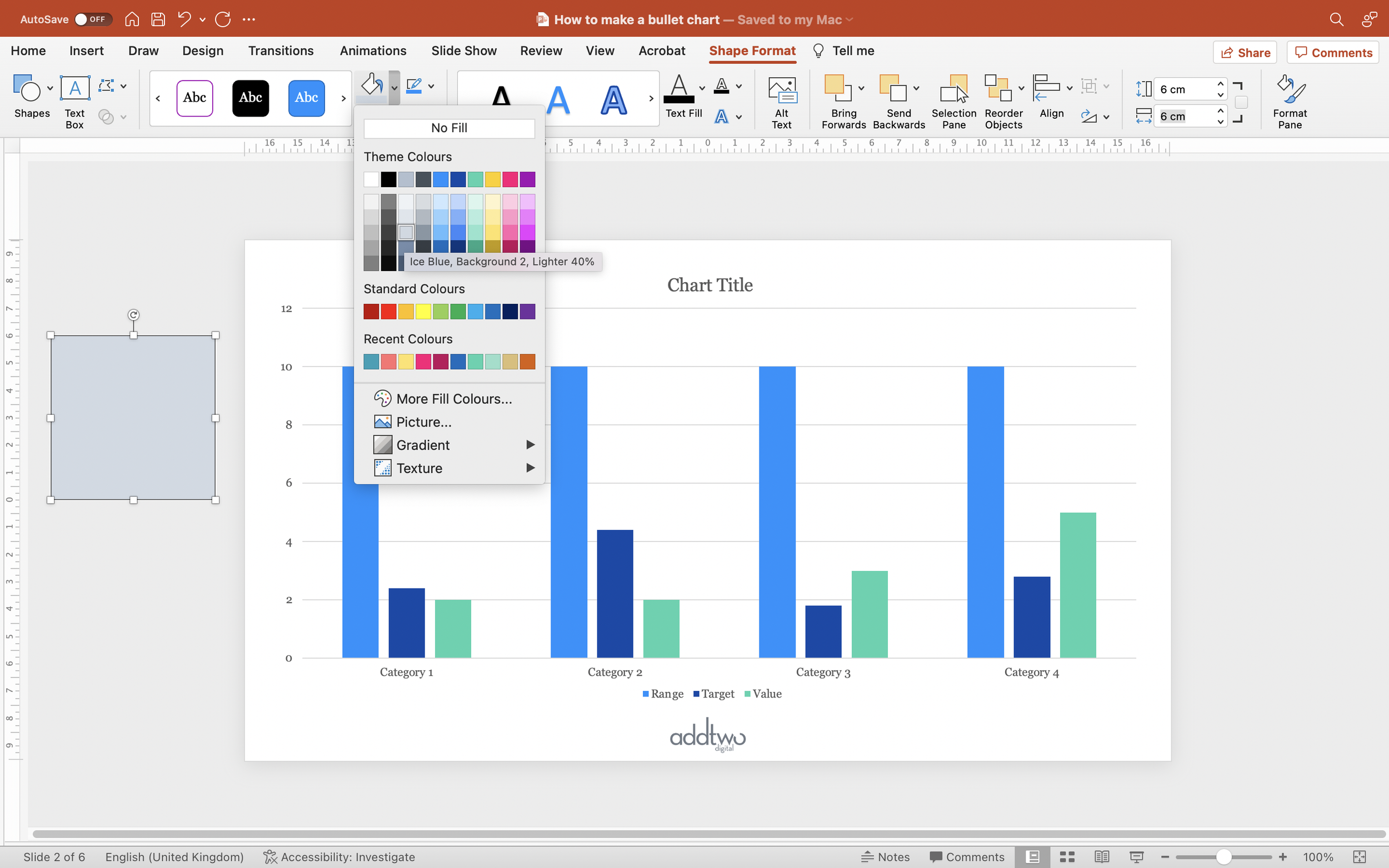
Set the fill of that shape to a mid-shade - we’re going to want it to be darker than the other sections, but not so dark that it’s going to distract from the foreground value. Make sure it has no border (set the outline to ‘No Outline’).
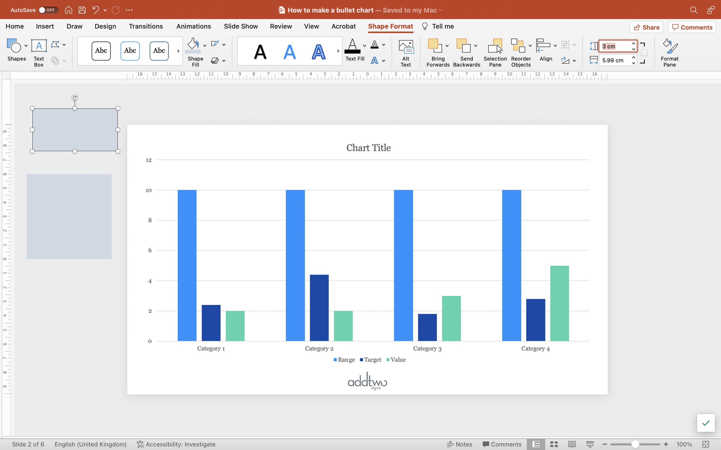
Duplicate that shape and then set the height of the new shape to half that of the original square.
Fill the new shape with a slightly lighter shade than the square and then stack it directly above the dark square.
Duplicate the new rectangle, fill that shape with a slightly lighter shade again and stack that rectangle directly above the first, so we now have a column with a bottom half of one colour and the upper two quarters getting progressively lighter.
Select all three shapes (drag round or shift-click all three) and copy them.
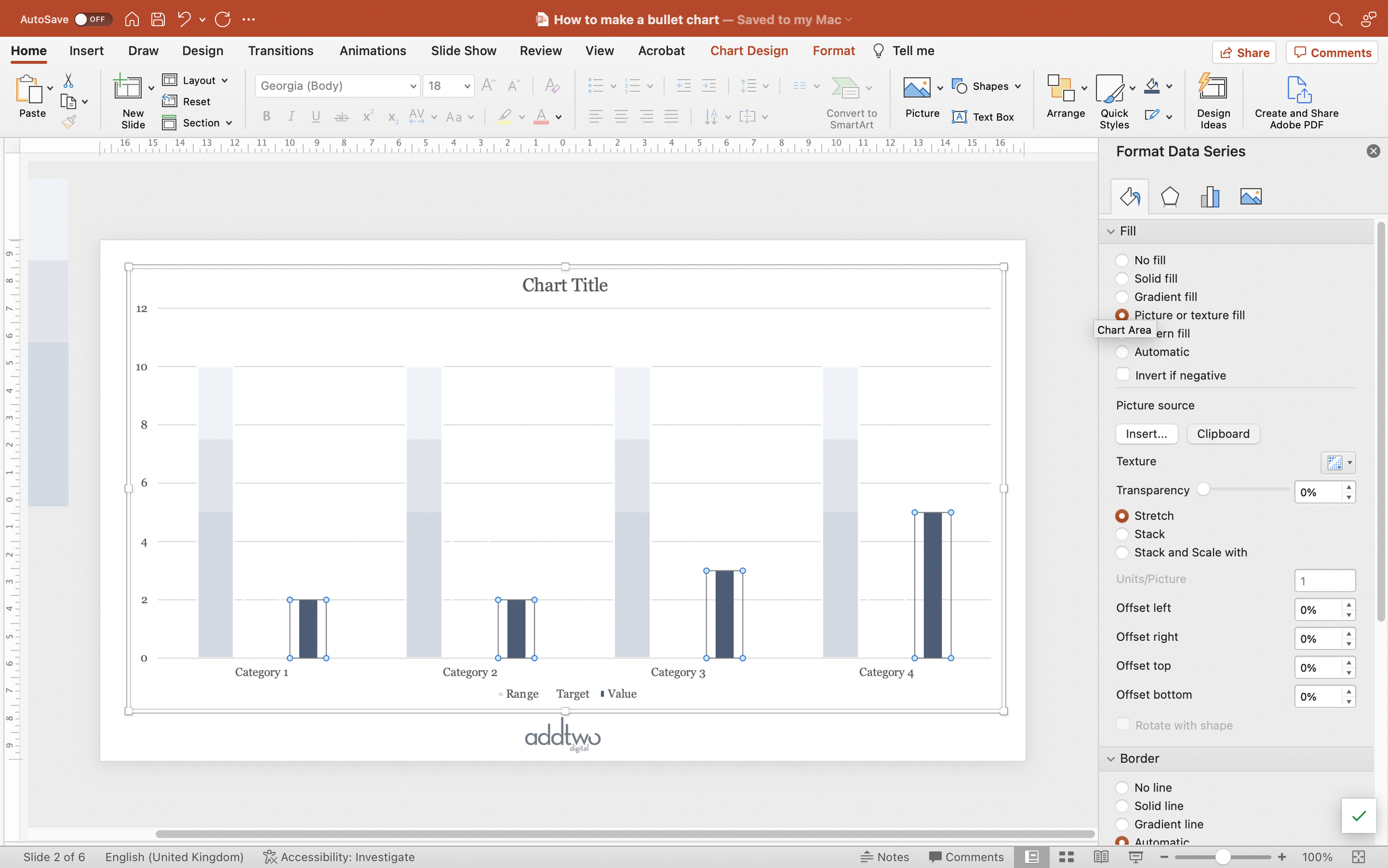
Now select the main data series in the chart (click once and PowerPoint should by default select all the columns in the data series). You now either open the Format Pane or right-click and select Format Data Series. Either way you want to open the Format Data Series tools and find the Fill options in the panel.
Select Picture or Texture Fill and for Picture Source select Clipboard. This will paste in as a Fill in all of the columns the combined square and rectangle we just copied.
Make sure that the Picture options are set to Stretch (PowerPoint should do this by default).
Under Format set the Outline of the columns to match your background colour (this chart type only works on slides with a single background colour - you can’t use it on gradients or photographs - at least, not easily)
Those columns should now all be filled with the half/quarter/quarter colour gradations.
Style the target
Select the second, target data series in the chart (click once and PowerPoint should by default select all the columns in the data series).
Under Format set the Shape Fill to ‘No Fill’. This will make the fill of the column entirely transparent.
Set the Outline to match your background colour (this chart type only works on slides with a single background colour - you can’t use it on gradients or photographs - at least, not easily). Make sure the border width is the same as the width on the background column.
This should give us a column with just an outline and no fill. At the moment this column should be entirely invisible against the background, but don’t worry about that, it’ll be visible once we overlay all the columns.
Style the value
In order to make the range visible behind the value, we’re going to use a custom fill to make the value column slightly thinner than the range.
Add a square shape to the slide. Make sure it’s properly square by setting the width and height in the Shape Format tools. As before 6cm x 6cm is a good choice.
Set the Fill colour of the square to ‘No Fill’. This makes the Fill transparent. You can leave the border on for the time being though - it makes things easier to find.
Duplicate the square.
Set the duplicate to be of a narrower width than the square. Half width is a good start.
Give this new rectangle a fill colour that will stand out against the range column.
Now select both the rectangle and the square (shift-click will allow you to select them both) and centre the rectangle against the square both vertically and horizontally.
With them both selected set their outlines to No Outline. This will make the square entirely transparent, but still there as a notional shape, with the rectangle as a filled strip down the middle of it.
Now copy them both (Ctrl-C with them both selected will work).
Now select the third, value series columns in the chart.
You now either open the Format Pane or right-click and select Format Data Series. Either way you want to open the Format Data Series tools and find the Fill options in the panel.
Select Picture or Texture Fill and for Picture Source select Clipboard. This will paste in as a Fill in all of the columns the combined square and rectangle we just copied.
Make sure that the Picture options are set to Stretch (PowerPoint should do this by default).
You can see, hopefully, that this gives columns that are transparent at the sides with a filled strip up the middle - a thinner column, effectively.
Overlay the columns
Now we’re going to overlay the three columns..
In the Format Data Series pane, go to the Series Options tab (it has a little chart as an icon).
Set the Series Overlap to 100%. This puts all the columns in each category over the top of each other.
Because we put the data columns in the spreadsheet in the order range, target, value, the columns will now appear with the range at the back, target on top of that and the value in the foreground.
And because we set the target column to just have an outline, it should now appear as just a line across the range.
Style the chart
Traditionally the only data labels on a Bullet chart are on the value column. We can add these easily. Select the value data series and then, under Chart Design > Add Chart Element, select Data Labels to be Inside End.
Set the label colour to be appropriately contrasting against the column fill.
We should also have a y-axis to explain the range gradations. Select the y-axis and open the Format Axis tools in the Format Panel (you can do this by right-clicking and selecting ‘Format Axis…’).
Under the Axis Options, set the Minimum and Maximum Bounds to match the minimum and maximum of the range (the maximum would therefore match the number you’ve used for the range column in the spreadsheet).
Then we’re going to set the Major Units to match the gradations in the range fill - in this case ‘2.5’ to match the fill changes on the quarters.
But we don’t need anything else, so we can get rid of the gridlines and x-axis line - as well as the Legend, as it doesn’t really help understand the chart.
So that’s how we make that in PowerPoint
Gauges in particular are hard to make in PowerPoint and Bullet charts provide an editable, and - more importantly - superior alternative. They combine the accuracy and ease of column charts with the contextual data of a gauge or thermometer, packing a lot of information into a simple and legible visual.
They are still quite complex charts, though, and probably best used for knowledgeable - or patient - audiences.


