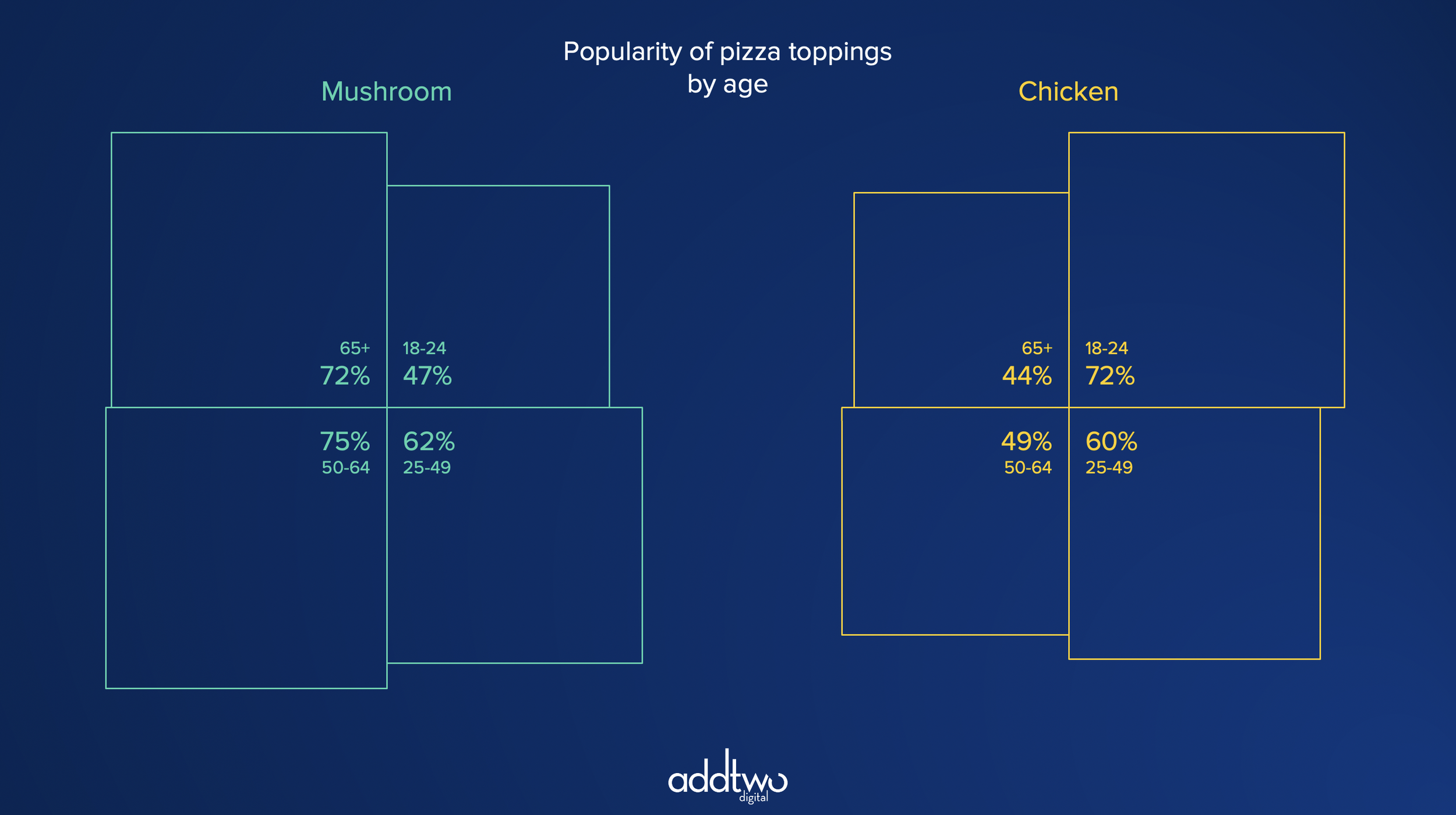
Quadrants allow us to compare four different categories against each other. This is a more common use case than you’d expect, particularly when comparing business quarters.
They also allow us to replace Radar Charts when comparing patterns across different data series - giving us an oversight, at a glance, of where the series differ in trends and shape.
So, how do we make this in PowerPoint?
In this how-to, we’ll be using the default sample data PowerPoint gives you, so you can follow along without needing to download anything, but if you want to, you can find the dataset we used to make the example at the top, and a PowerPoint deck with that slide in, and other examples, here: https://docs.google.com/presentation/d/1mDQIUBhK-_wJCpJpvrSkMOEA_3i1cfvy/edit?usp=drive_link&ouid=112240584160970239353&rtpof=true&sd=true
What you’ll need
A Filled Radar chart
Data manipulation
Design tweaks
Custom labelling
How you do it
To make the four squares of a Quadrant Chart, we’re going to use a Radar Chart as a means of drawing with numbers (the only thing it’s good for, frankly, it certainly sucks as a chart). We can manipulate the underlying data (warning, this requires trigonometry) to make squares of an area equal to the values in our data.
The details
Insert the chart
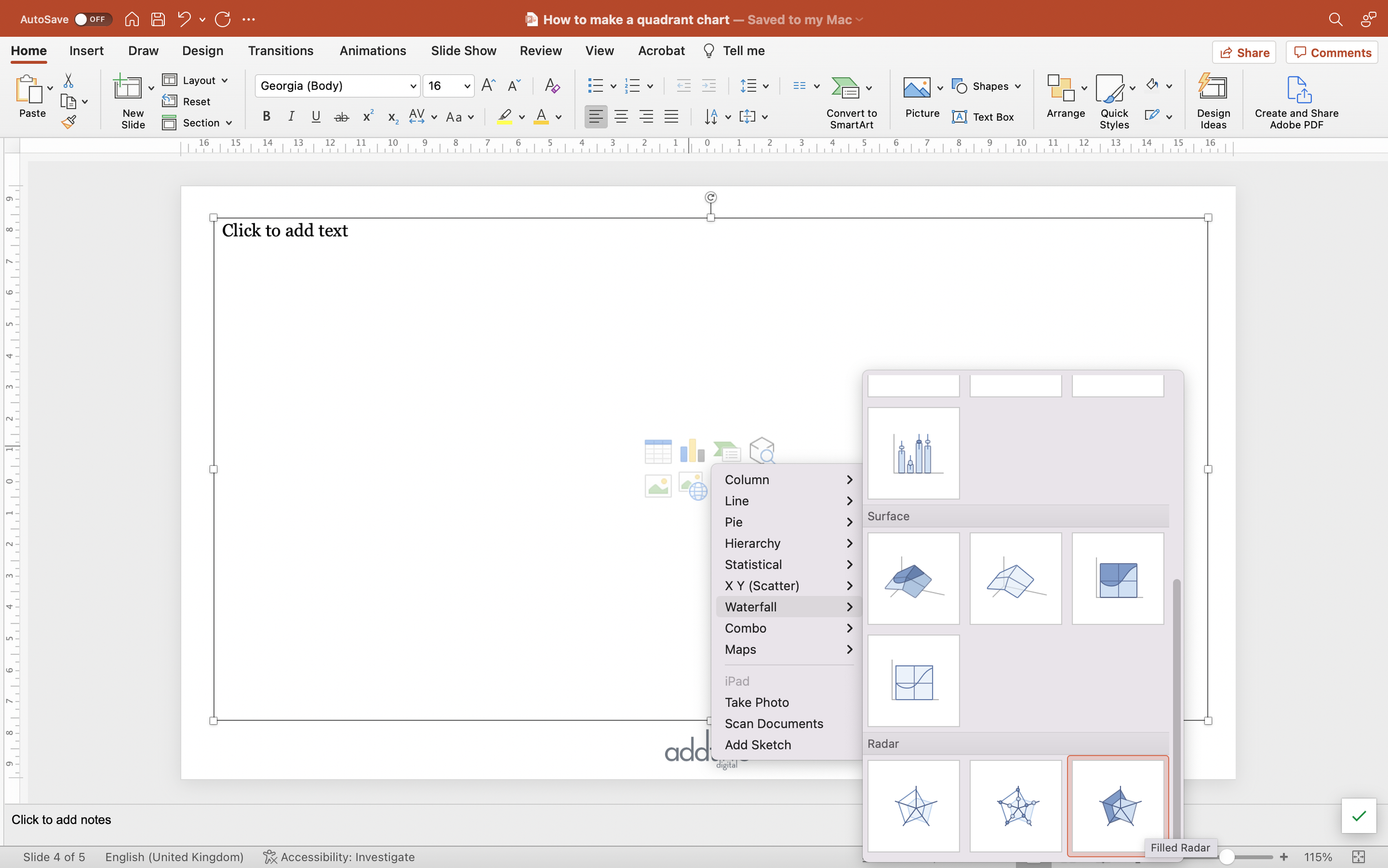
We’re going to start by inserting a Filled Radar chart. They’re buried away under the ‘Waterfall’ group of charts in the PowerPoint insert chart menu, right at the bottom, hopefully where no one will find them.
They’re probably the least useful chart PowerPoint has to offer. However, they do give us a tool with which to draw shapes using data, which is going to turn out to be useful.
Arrange the data
We’re going to use the radar chart to make four segments, so we’re going to have to arrange our data to make those segments.
Radar charts draw their shapes by plotting down radial axes from the centre. This means that to make squares, each segment will need three data points, one for each corner of the square, with the fourth corner being the centre of the plot.
The first thing to do is to delete the second column of data - we’re not going to need that right now.
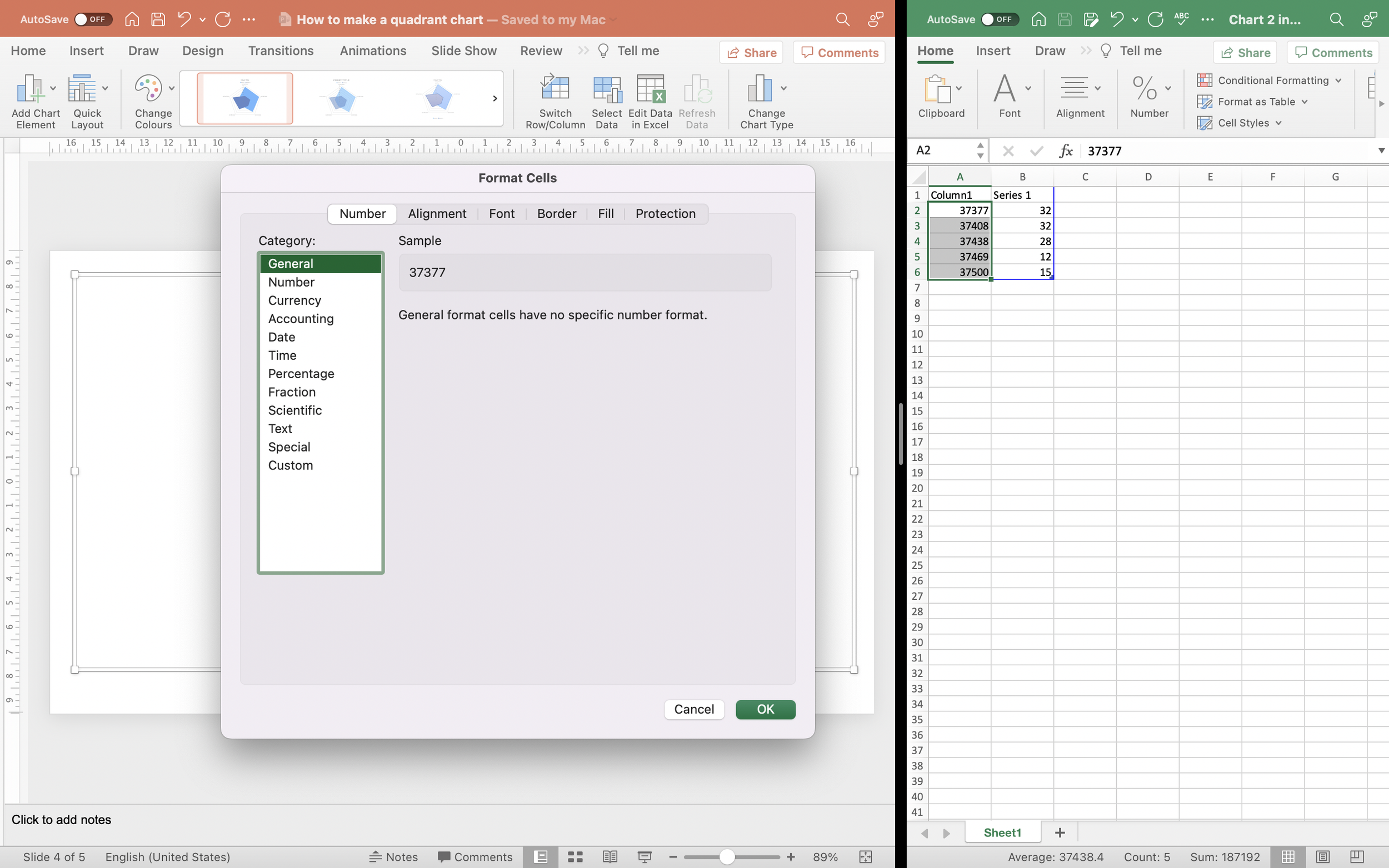
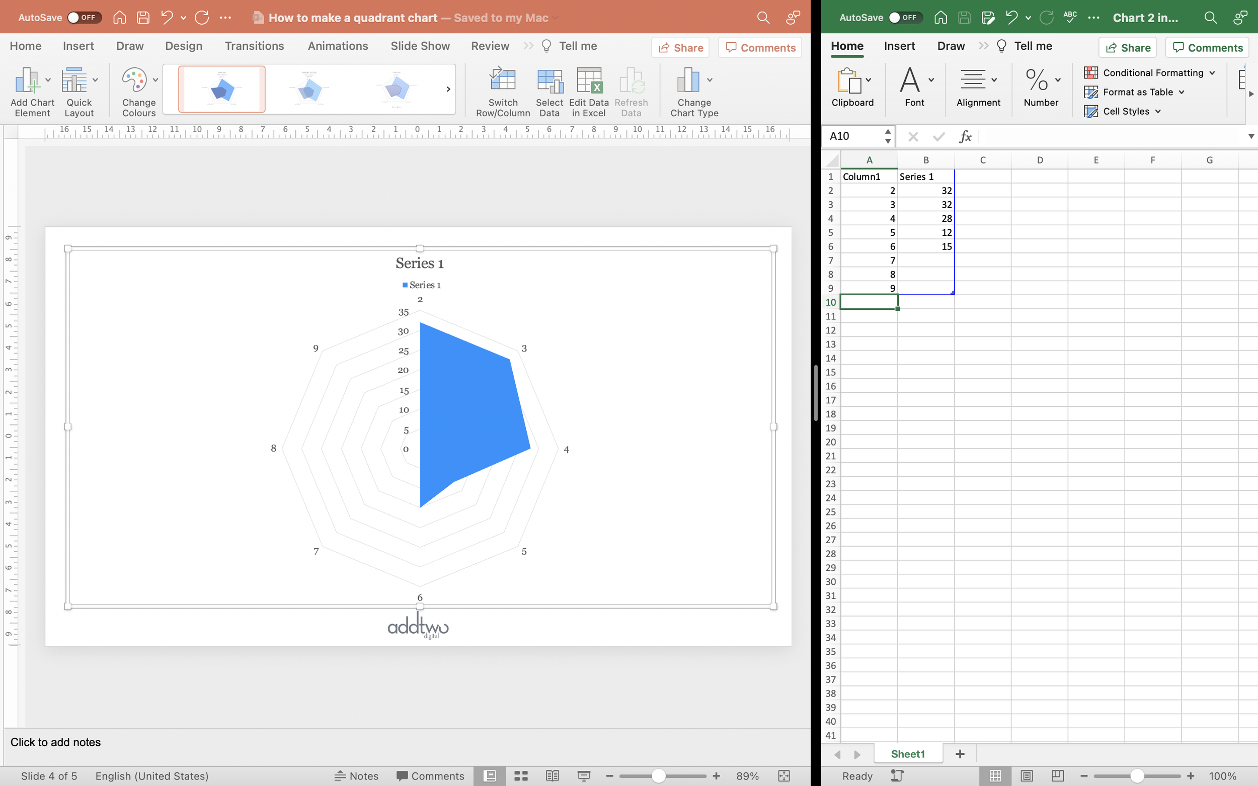
Then reformat the first column, which PowerPoint makes dates as default, to be just a General format (you can do this by selecting the column, right-clicking and selecting ‘Format Cells’). We start with five rows of data by default - add three more and make the contents of this first column the numbers 2-9 to match the spreadsheet row numbers (this column could be anything - but numbering them helps us keep track).
Hopefully you should now see that the chart has 8 axes coming out from the centre.
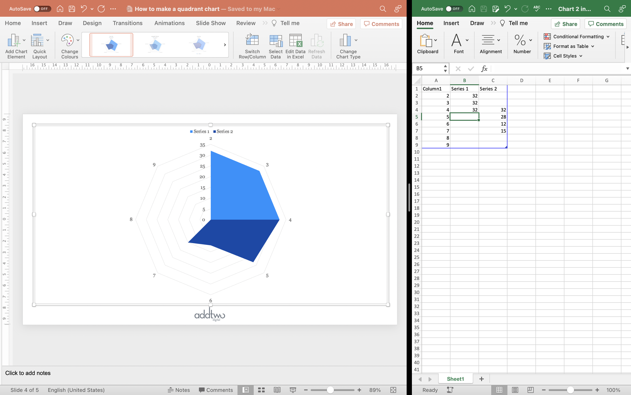
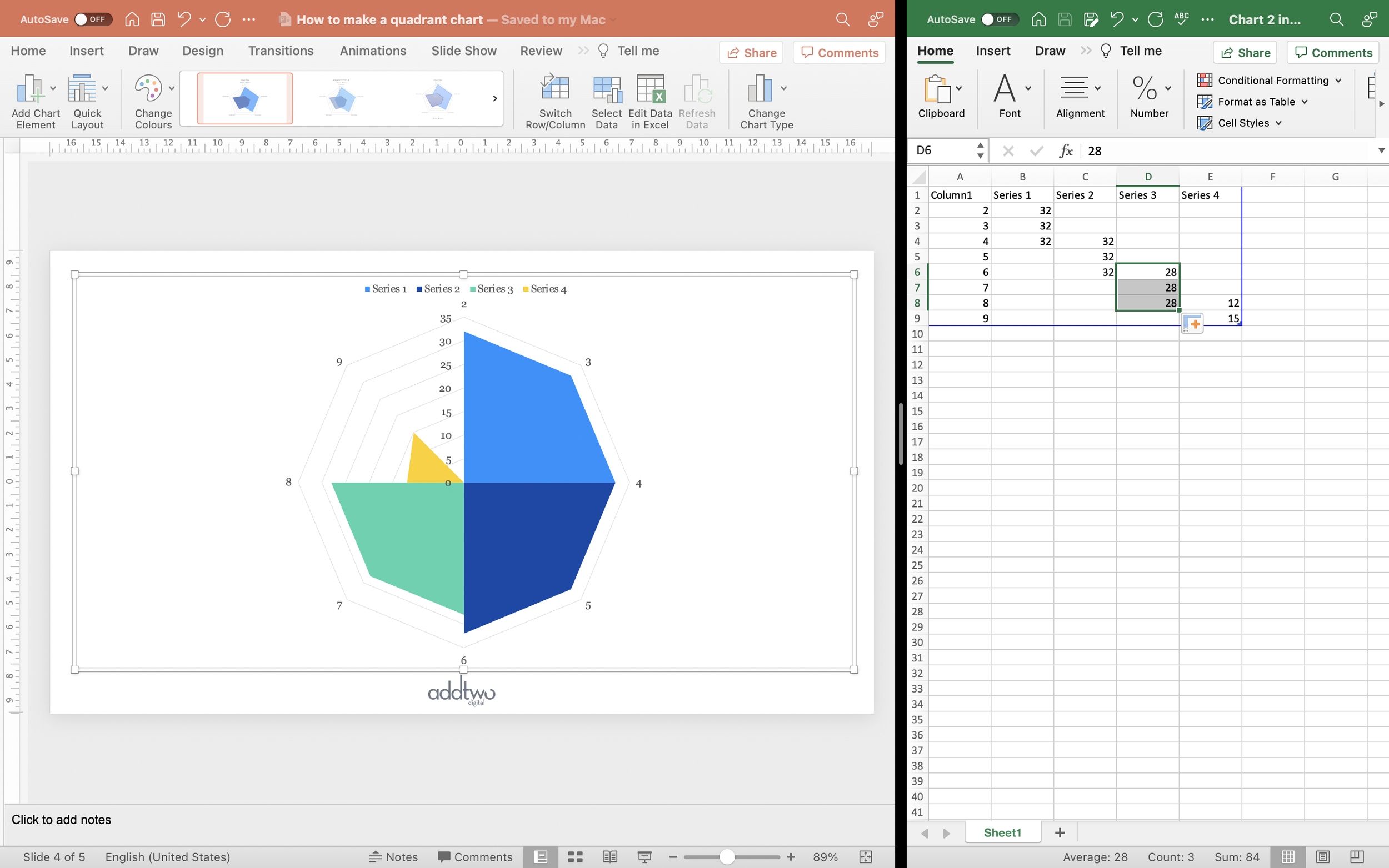
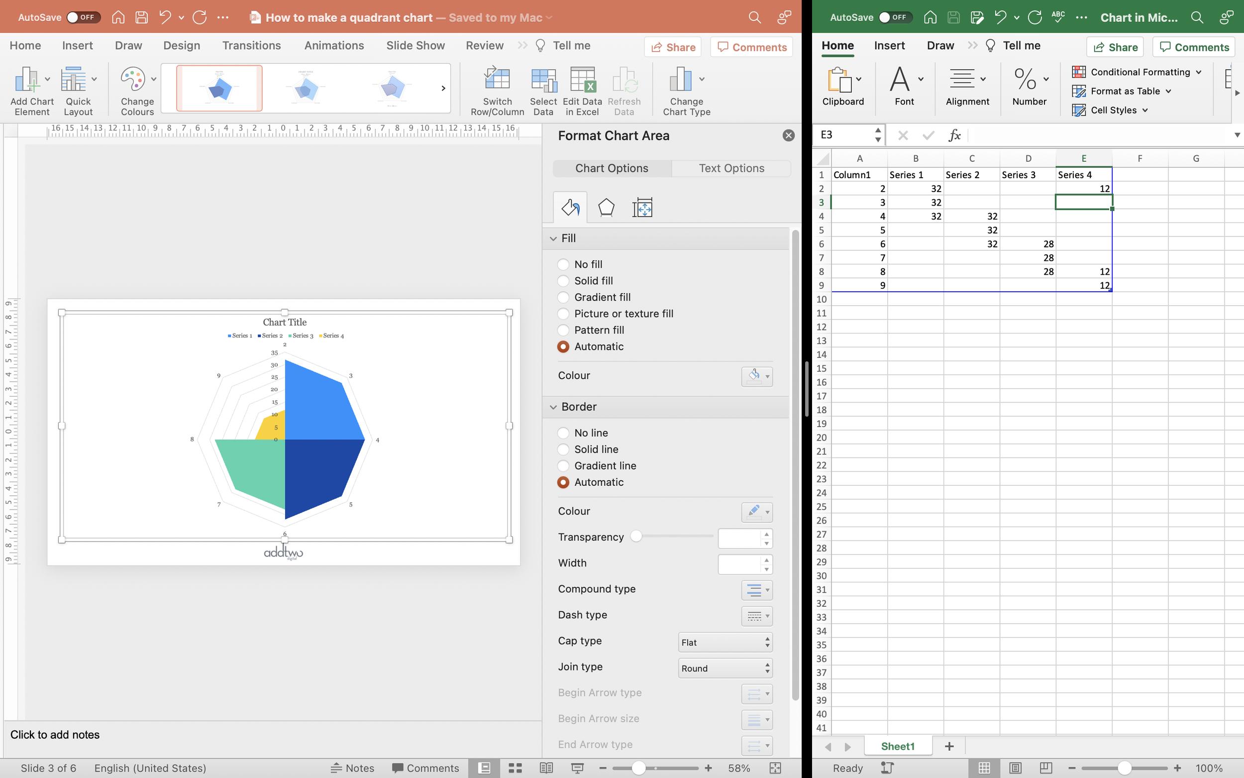
How we’re going to make the segments. Repeat the first value three times in the first column, in rows 2,3 and 4.
Then repeat the second value three times in a new column. We want this segment to overlap with the first, so we start it on row 4 and then repeat the value in rows 5 and 6.
Now do the same for the third value, adding it in a new column at row six and repeating it rows 7 and 8.
With the fourth value we’re going to add it in a new column in row 8 and then repeat it in row 9. Then, to make sure it overlaps with the first segment, we’re going to repeat it in row 2.
Now we have our data arranged into four segments. However, they’re not yet squares and they’re all measured by the raw values instead of the area of the shape. So, here comes the maths.
Manipulate the data
What we actually want to draw is a square with the area equal to our data point. Of our three values in each column in our spreadsheet, the first and third values are just going to be equal to the lengths of the sides of that square.
We know the area of that square, so we know that that area is the length of the sides squared, so to find the length of the sides we can just square root our area - our original data point.
In Excel we can use a formula for this: “=SQRT(#value)”.
However, the middle value is a little harder - that’ll be the top right corner of our square, so to find its position, we’ll have to calculate the length of the diagonal across the square.
Fortunately really all we’re doing there is calculating the length of the hypotenuse of a right-angled triangle, where the length of the other two sides is what we just calculated: the square root of our data point. And the length of that hypotenuse is, of course, the square root of the sum of the squares on the other two sides.
We can simplify this, then, down to: “=SQRT(#value*2)”
Hopefully this will give you a little square.
It’s going to look a little too little right now, but that’s because we need to repeat these calculation for the other segments.
Do that and we should then have four squares (PowerPoint should automatically adjust the bounds of the axes to make sure the segments are as big as possible).
We can close the spreadsheet now.
Customise the chart
Because we’re just using the chart to draw with numbers, most of the other chart elements like axes labels and gridlines aren’t going to be terribly helpful when trying to read the chart. We’re going to have to label by hand.
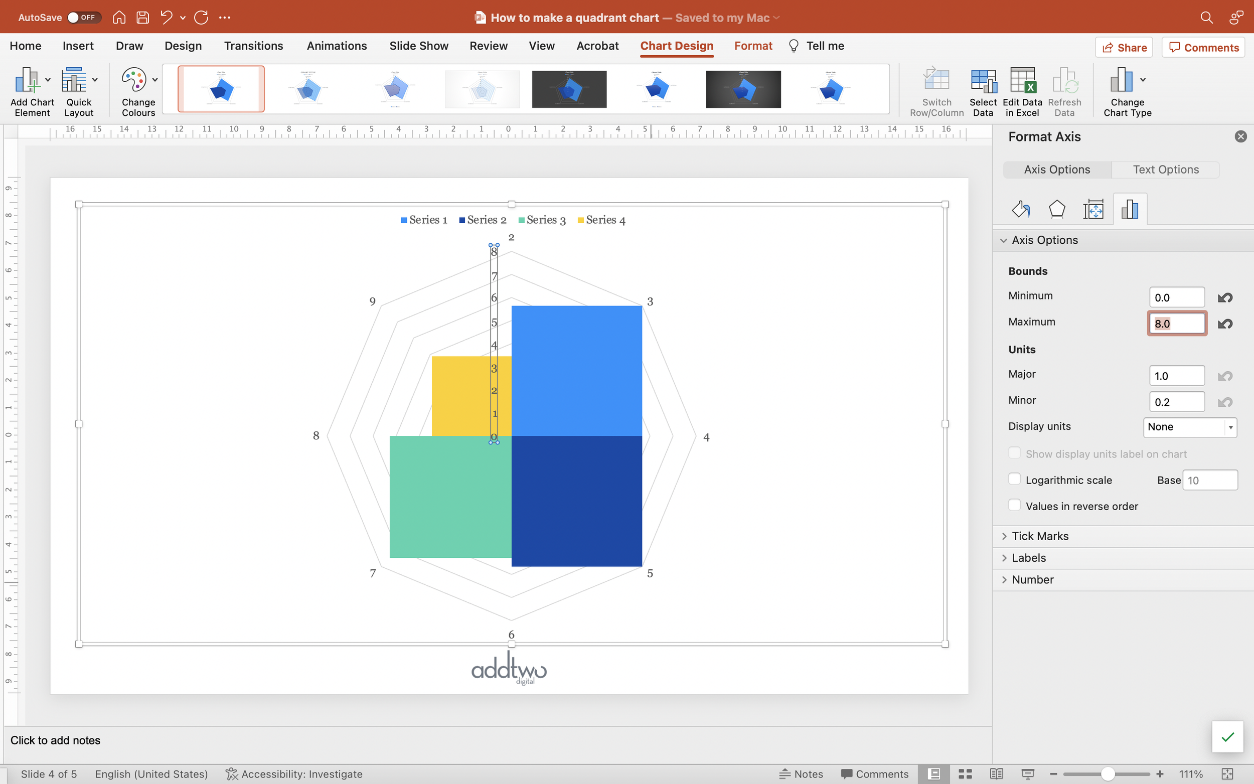
One thing we should do is make sure our axis bounds make sense, especially if we’re going to be comparing two charts, where we’re absolutely going to need matching axes.
Open the Format Pane to edit the Axis bounds (you can do this by right-clicking on the vertical axis and selecting ‘Format Axis’). Under the Axis Options tab (the little chart icon) set the Minimum and Maximum Bounds. Your minimum is probably 0, the maximum should be whatever maximises the size of the squares - ie: just larger than the highest value in the spreadsheet.
Both the chart title and the legend can still be useful, but delete the axes and gridlines.
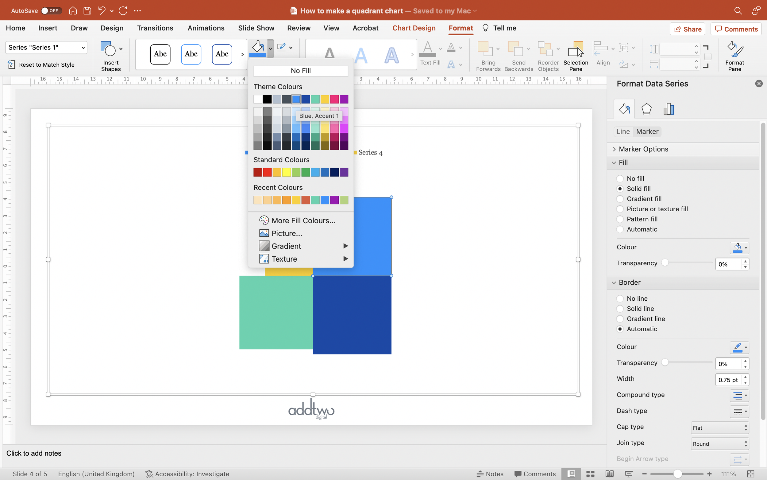
You can set the colour of the segments by selecting the segment and then selecting a Shape Fill colour in the Format tab or in the Marker settings in the Data Series Fill & Line options in the Format Pane.
Add labels
There are ways round this but they’re complex and for the purposes of this walkthrough, the easiest approach is to label the squares by hand.
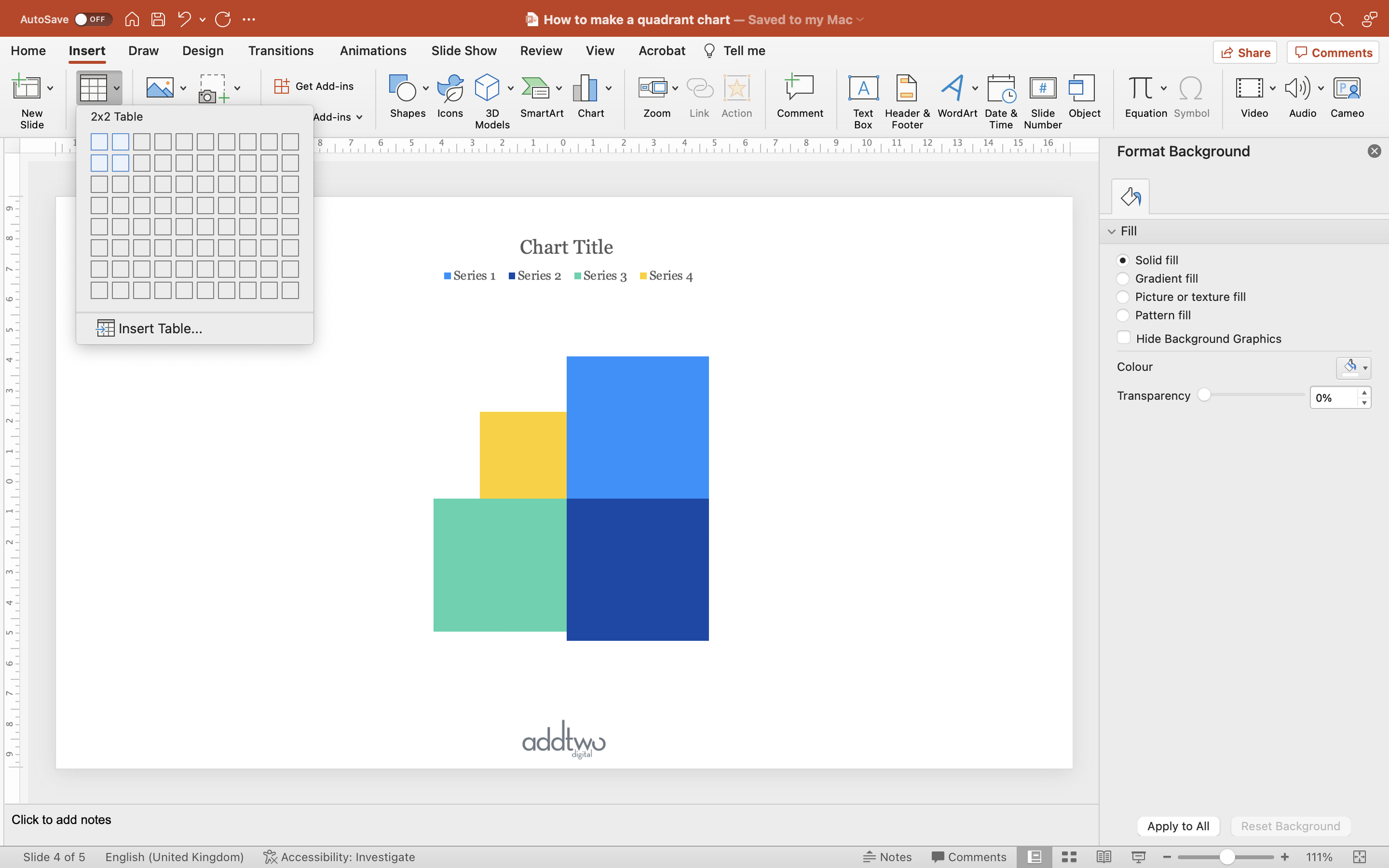
Add a 2x2 table to the slide (go to Insert and Table and select one with two columns and two rows). A table helps us keep everything neatly aligned and spaced.
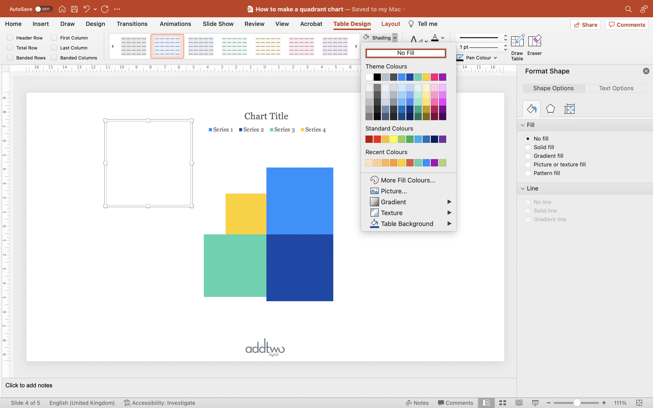
Make the table square (I’ve made mine 6cm x 6cm out of force of habit). PowerPoint will, by default, give it a header row and banding - turn these off in the Table Design tab. You’re also going to want to set the Shading to ‘No Fill’ and turn off any table borders. We’re just using the table to lay things out, we don’t want it to be visible.
Centre the table over the chart, then add the labels into the cells.
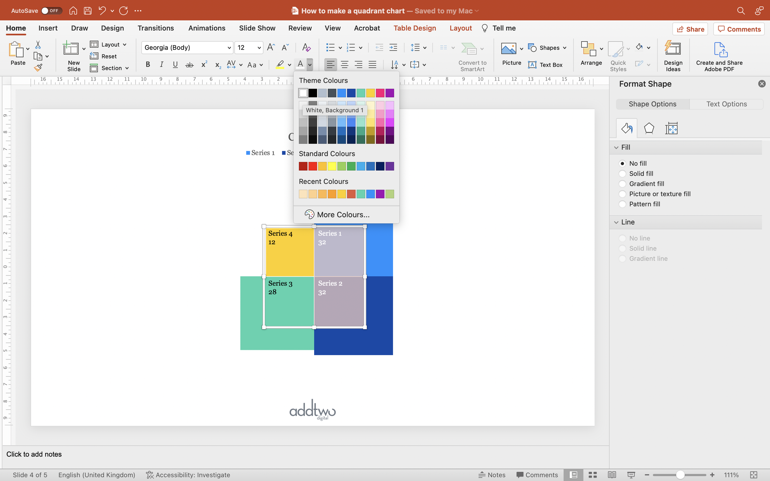
Style up the text, sizing it and making sure the text colour is appropriately contrasting against the chart fill.
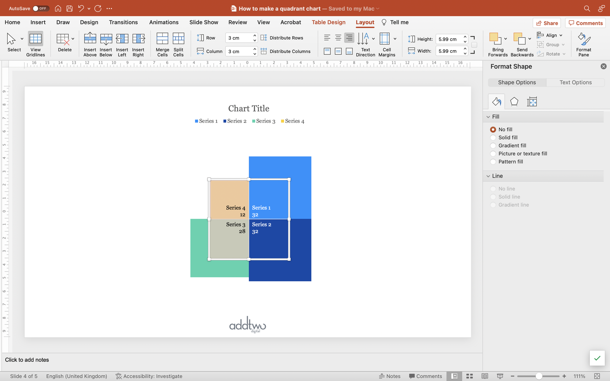
Select the first row and Bottom Align the text (you can do this in a number of ways, but the easiest is probably in the Layout tab of the Table tools).
Select the first column and Right Align the text.
This should give us a table with all the labels neatly arranged around the centre of the chart.
So that’s how we make that in PowerPoint
Quadrants probably seem a little niche, but we seem to end up using them more often than you would expect. Financial quarters, seasons, demographic quadrants: we’re often comparing patterns across different data series.
They’re also a really neat example of using the Radar chart to draw shapes, which is a useful skill to master, I promise.


