Pyramids are most usually used for populations, comparing patterns of sex splits by age, but they are also a useful alternative to clustered bars when comparing any two data series. They allow us to see each series as a coherent bar chart, while still comparing the two series for patterns of difference.
So, how do we make this in PowerPoint?
In this how-to, we’ll be using the default sample data PowerPoint gives you, so you can follow along without needing to download anything, but if you want to, you can find the dataset we used to make the example at the top, and a PowerPoint deck with that slide in, and other examples, here: https://docs.google.com/presentation/d/1m9GSa-F-ZC64uhP266Ftb0vmRDF62BYI/edit?usp=drive_link&ouid=112240584160970239353&rtpof=true&sd=true
What you’ll need
Clustered bar chart
Amended chart layout
Custom labelling
How you do it
We can make a pyramid using a standard clustered bar, but changing one set of values to be negative, so that they run right to left from the axis. We can then set the series to overlap, so that the two series are symmetrical across the vertical axis. Finally, using custom number formatting, we can display the data in the ‘negative’ bar as positive.
The details
Insert chart
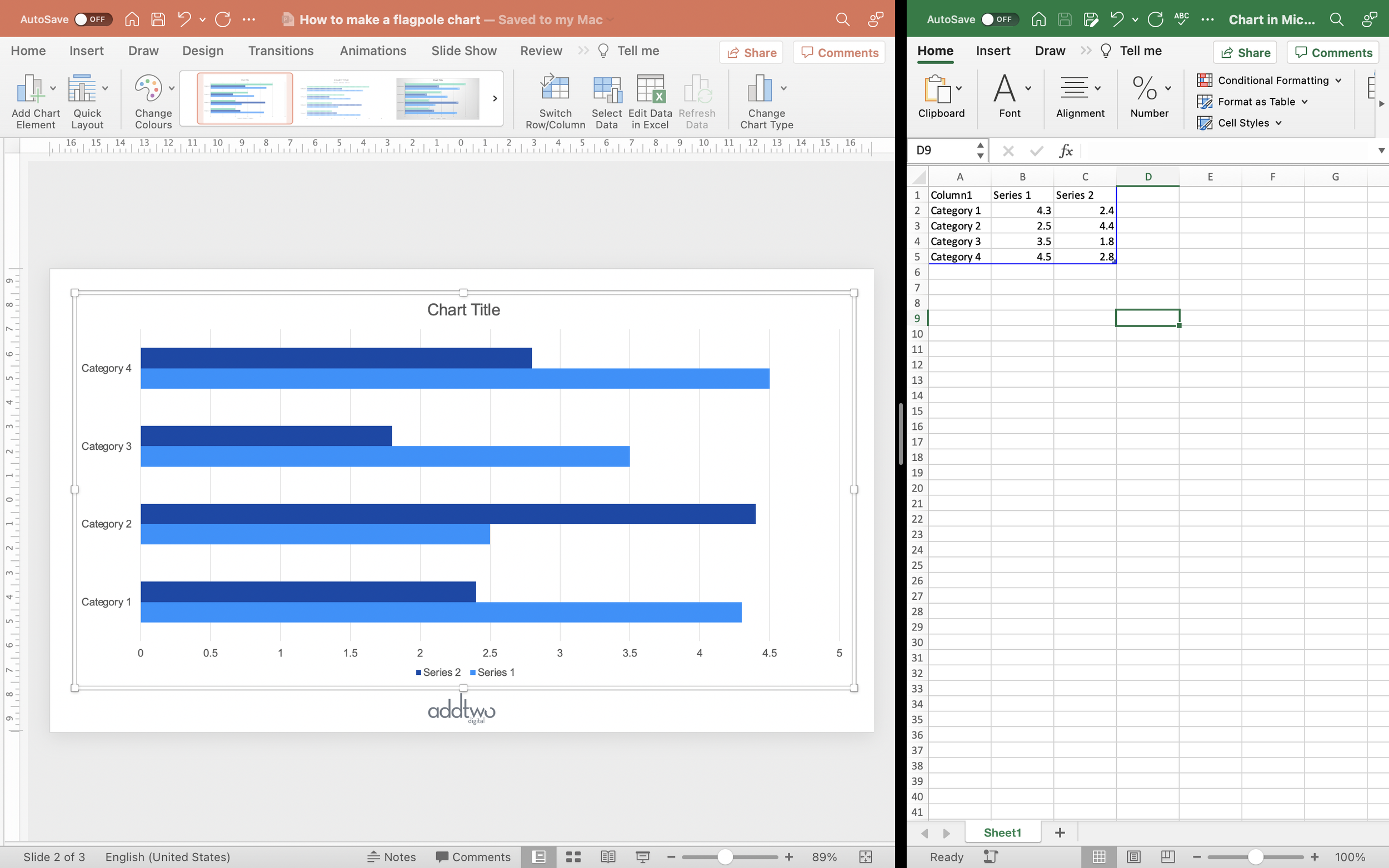
Insert a bar chart. PowerPoint inserts a clustered bar chart by default.
By default PowerPoint will generate an example chart and open Excel to show us the example data behind that chart.
We only want two data series for the pyramid, so we can delete the third column of data.
We’re then going to amend the second column to be negative.
That’s all we need to do the data, everything else is going to be altering the chart layout, so we can close the spreadsheet for now.
Amend the chart
First let's make the bars run opposite each other. Open the Format Data Series options (you can do this by right-clicking on the bars and selecting ‘Format Data Series’).
Set the Series Overlap to 100%. This will set the bars to be opposing across the central axis.
While; we’re at it, let’s set the Gap Width to be something slightly less, so the bars are closer together.
Now let’s tidy up the rest of the chart.
Let’s set the Legend to be at the top (you can do this using the options under the Add Chart Element menu). Incidentally, this is the reason we set the second column of data to be negative: because the PowerPoint chart legend shows the second data series first, so this way the colours on the chart line up with the colours in the legend.
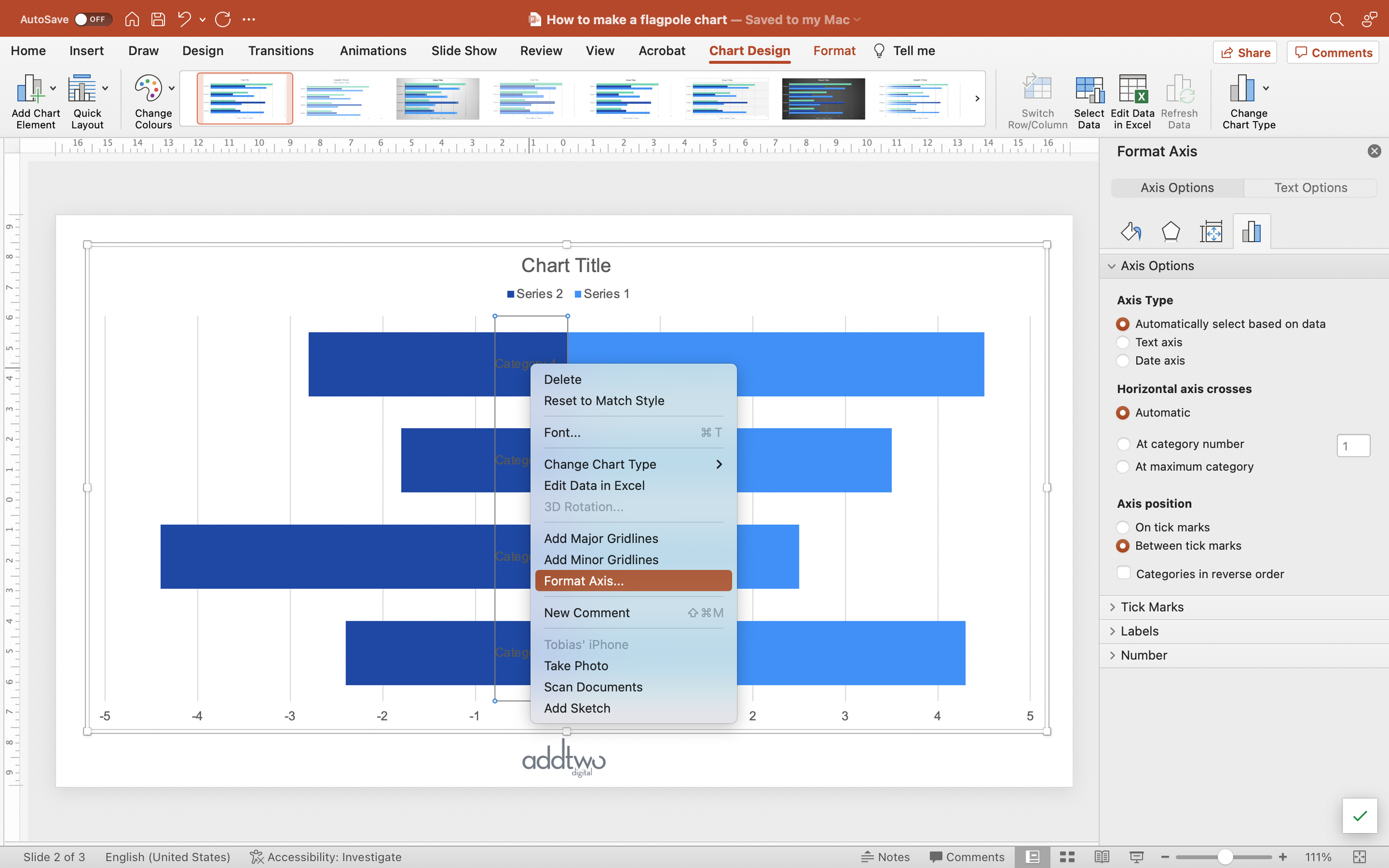
Now let’s arrange the axes labels somewhere more legible. Open the Axis Format options (you can right-click the vertical axis and select ‘Format Axis Options’).
Under the Label options set the Label Position to ‘Low’. This will push the axis labels out to the left of the chart.
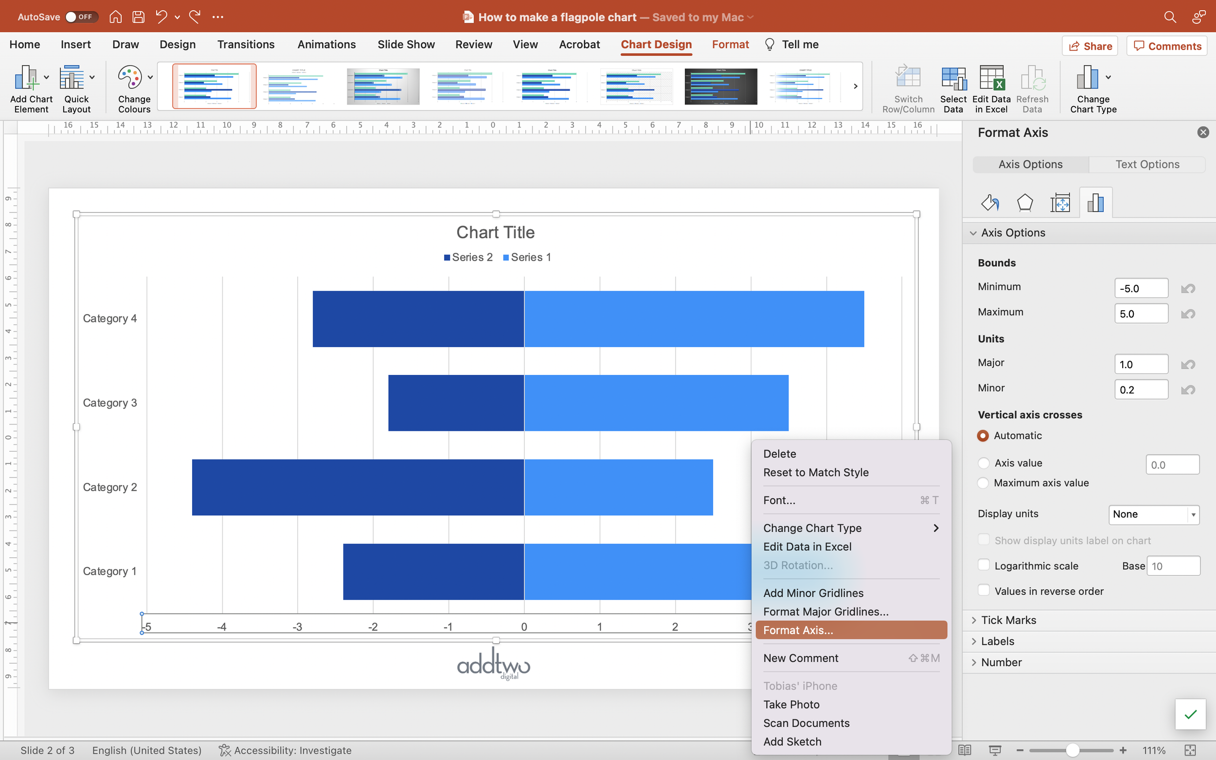
We also need to make sure the horizontal axis is evenly distributed. Open the axis formatting options (right-click and select ‘Format Axis’).
Make sure the Minimum and Maximum bounds are even - the same negative Minimum as positive Maximum (-5 and 5 in our example).
While we’re at it, we can reduce the number of gridlines. We can set the Major Units to half the Maximum Bound, giving us just a single mid-point gridline.
Custom labelling
Now let’s add the data labels.
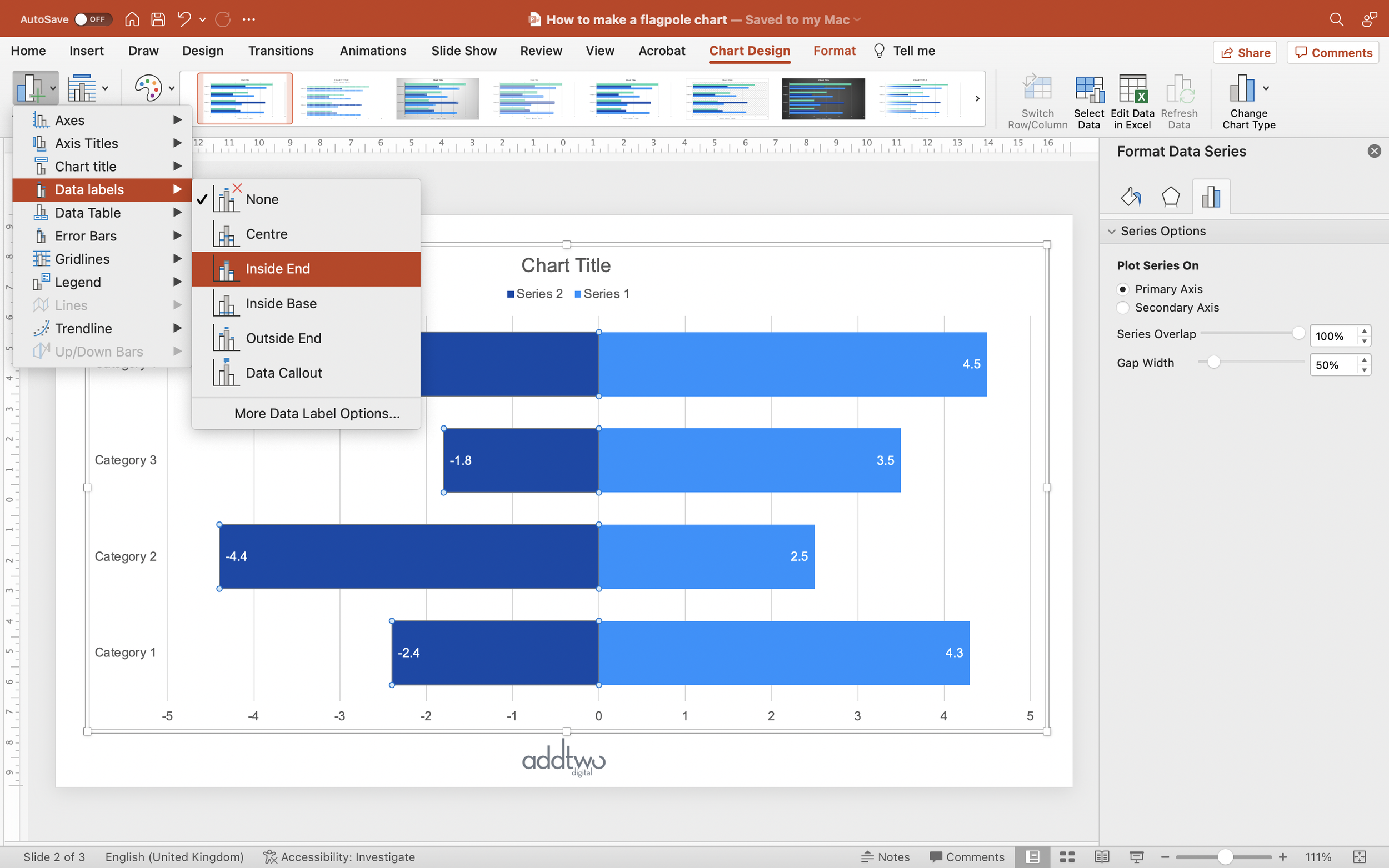
Select the right-hand data series and add data labels (you can do this by selecting Data Labels in the Add Chart Element menu - set the position to Inside End).
Make sure the text colour is appropriately contrasting against the bar fill.
Now do the same to the left hand data series.
These labels, however, show the data (correctly) as negative. But we only made the data negative so it was ranged left to right. We still want the values to be listed as positive. We can adjust this using a custom number format.
Open the Data Label formatting options (you can right-click on the data labels and open Format Data Labels…).
Open the Number formatting options and select Custom as the Category.
Set the Format Code to: #,##0.0;#,##0.0
Everything before the semicolon is the format for positive numbers, everything after for negative numbers. Hashes represent numbers, the 0s tell PowerPoint to include series and also, in this case a single decimal place. By not including a minus sign in the format for negative numbers we force PowerPoint to display the negative values as positive.
We can use the same Number Format in the horizontal axis (right-click on the axis and select Format Axis, then set the same Custom Format under the Number options).
So that’s how we make that in PowerPoint
It goes without saying, I hope, that the Pyramid is only really of use when comparing two positive data series, but it is really when comparing two demographics responding to survey questions, for instance, or distributions of demographics across different categories.
There is a slightly more complex way of making these using a stacked bar chart, if you want to be able the position the axis labels between the two sides of the chart, but that’s fiddlier to make and update. Let’s be thankful for what we have, eh?


