Split circles are a nicely attention grabbing way to visualise comparisons, especially a before and after, or two regions/demographics/departments.
So, how do we make this in PowerPoint?
In this how-to, we’ll be using the default sample data PowerPoint gives you, so you can follow along without needing to download anything, but if you want to, you can find the dataset we used to make the example at the top, and a PowerPoint deck with that slide in, and other examples, here: https://docs.google.com/presentation/d/1mFdfAGiiy4-ccbUS5lhLD2MRIEA6k0gB/edit?usp=drive_link
What you’ll need
X Y (Scatter) - Bubble
Data manipulation
Custom shape fills
How you do it
Short version: we’re going to use a standard Excel bubble scatter but use the x & y coördinates to arrange the bubbles on top of each other. Then we’re going to use a custom fill to make one half of each bubble transparent, giving us two separate halves to compare.
The details
Insert the chart
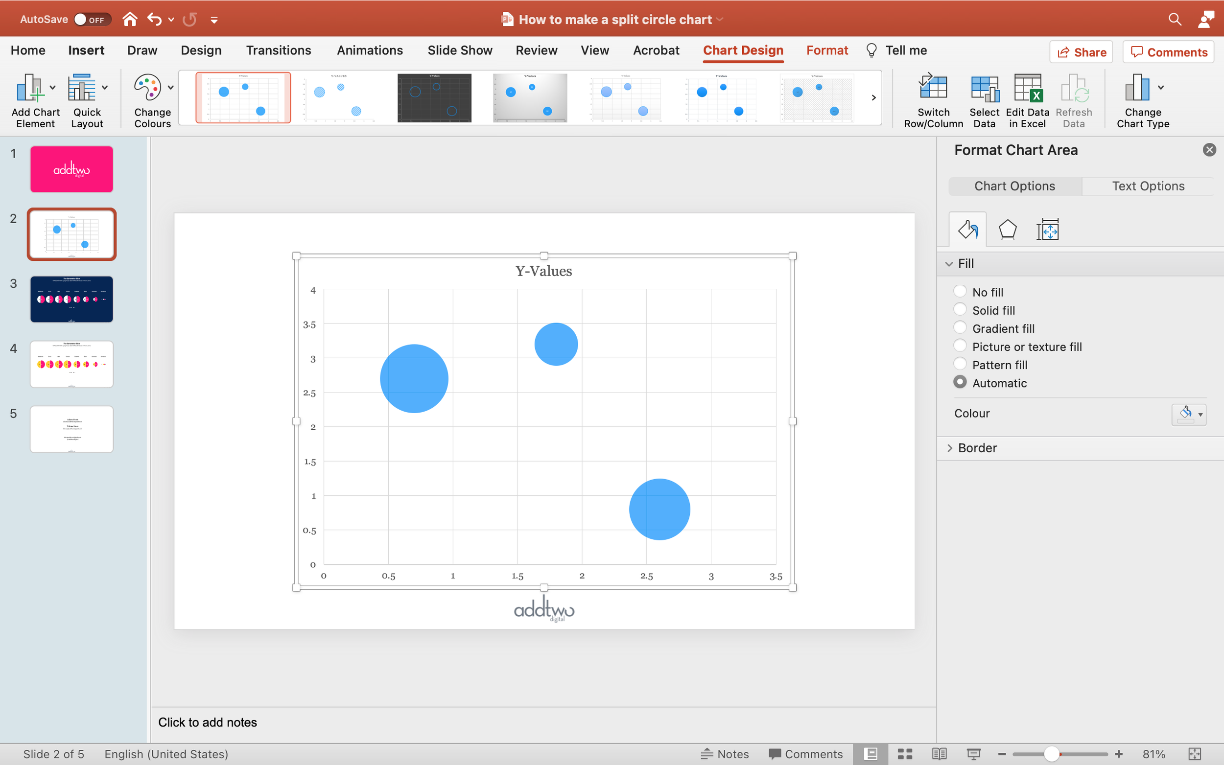
Open a blank PowerPoint slide. Under Insert/Chart select 'X Y (Scatter)' and then 'Bubble' (no, NOT '3D Bubble'. What is *wrong* with you?)
PowerPoint will drop in a Bubble Chart and open an Excel spreadsheet with sample data in it
Edit the data
This usually has a row of headers and then three rows and three columns of data
These rows and columns are then outlined with a blue frame. This frame shows us the data that PowerPoint is visualising in the chart
Have a look at the structure of that sample data. Each row is a separate entry, with the columns giving the different dimensions. The first column in the position on the x-axis, the second the position on the y-axis and the last, the size of the bubble.
We're just going to be using the size to represent data
For this example we’re just going to make one pair of split circles, so we only need two rows of data. .Pull the blue frame up so it’s just highlighting the top two rows and delete the bottom row of data
-
Due to some unguessed-at trauma, PowerPoint does not like Bubble charts and will do its best to forget how they work
Especially if you copy and paste a Bubble chart from somewhere else and then try and add data
Frequently PowerPoint will simple refuse to acknowledge new data or new cells
If this happens to you, try to adjust the blue frame
But frequently you will have to resort to more powerful tools
Under the 'Chart Design' tab in the ribbon is a 'Select Data' button
This will open up a dialogue box in Excel that will enable you to tell PowerPoint precisely which cells to look for data in
It can be a beastly thing to deal with, but there are plenty of how-to guides online
Instead of using them to represent data, we’re going to use the X-Values and Y-Values to position the bubbles. Change the Y-Values for both rows to be ‘1’
If you look at the PowerPoint, you'll see that this lines all the bubbles up in a row
Make data series
At the moment PowerPoint is displaying everything in one colour. This is because everything is currently one data series. Often we are going to want to colour our two halves differently, to distinguish them. Of course, we could just do this by colouring the bubbles differently using PowerPoint's Format tools. But it's better to represent those series in the data structure
Go back to the Excel.
PowerPoint usually uses the Y-Values to represent a data series. By creating new columns of Y-Values we can delineate new series in the data set. With a bubble chart this means creating new columns of Y-Values and Sizes
Highlight the Y-Values and Size in the second row of data (so cells B3 & C3)
Pull that data across to the right, until its in two columns on its own (so into columns D & E, so it now occupies cells D3 and E3)
Notice that I’ve also changed the names of the Y-Values columns (cells B1 and D1)
This is because, by default, PowerPoint will draw the labels for a Legend from those column titles. By setting them in the Sheet, I make sure that if I add a Legend it will automatically have the right labels
Flick back to the PowerPoint and you'll see that the two bubbles are now different colours.
PowerPoint will automatically colour data series differently. As usual it will do this by just taking the next colour in the slide template colour palette. But now we’re going to get properly crazy and mess with those choices
Make the half fill
Essentially we want to only half fill those circles, so that one half of each circle is transparent. To do this, we need to make a fill that’s half transparent
We could do this using a gradient fill, making half of it transparent and half of it a solid fill, which does work, but PowerPoint has a habit of forgetting how that gradient is supposed to work, and we’ll come back in six months and discover everything looks like an eighties computer game title screen.
Instead, we’ll use a different technique that’s a little fiddlier but more reliable (so far)
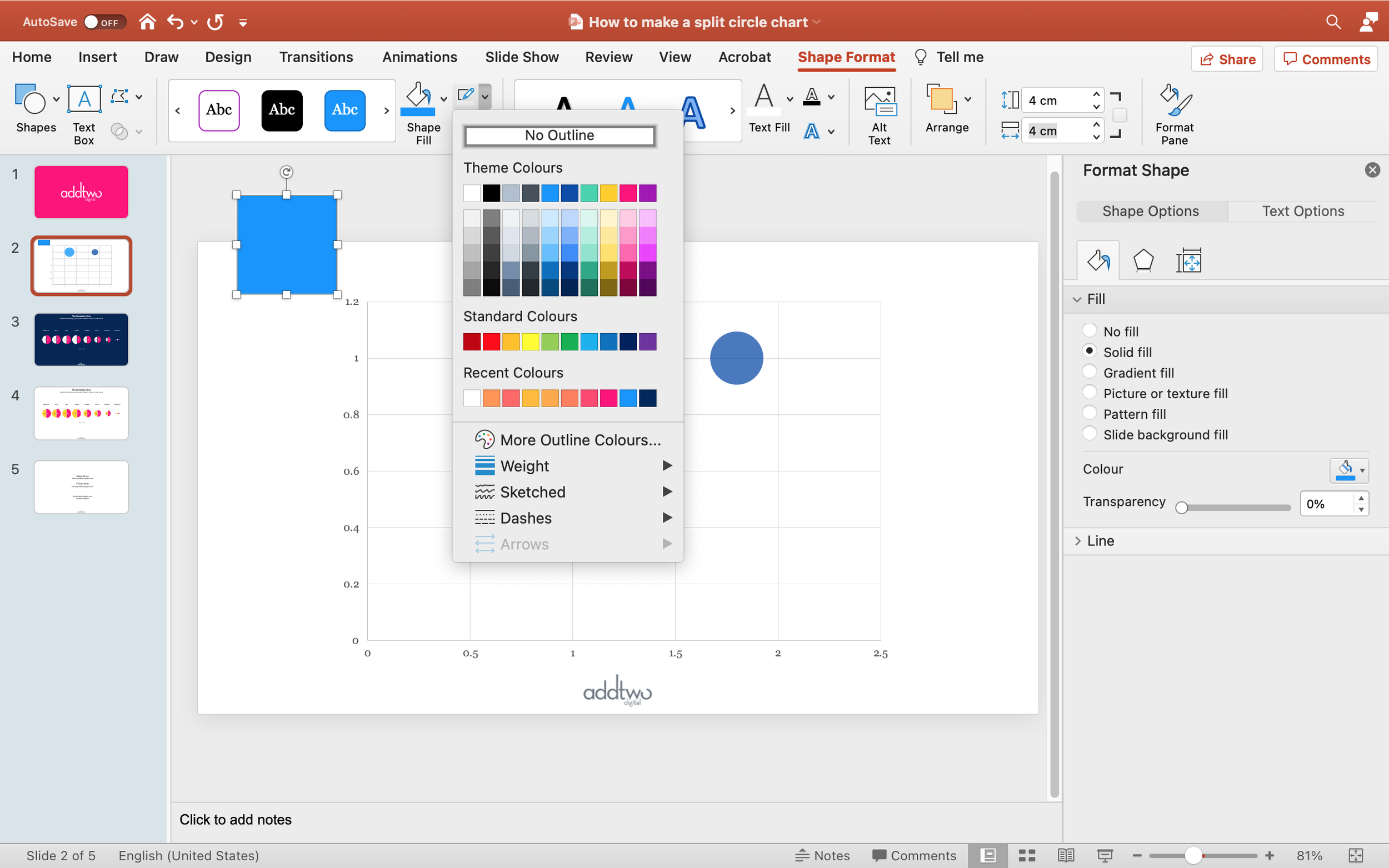
Add a square to the slide
Make sure the square has a fill, but no border
You can find these tools in lots of different ways: in the Format Pane, by right-clicking and selecting ‘Format Shape’ or by selecting the shape and then going to the Shape Format tab in the ribbon
Make sure the shape is a square by setting the width and height to be equal (for example, making both 4 cm)
Now copy and paste that shape, so we now have two identical squares
Adjust the width of the new shape to be slightly under half the width of the first shape - but still the same height (for example, keeping the height at 4cm but making the width 1.9cm)
Now select the original square and remove the fill entirely, so you’re left with an completely transparent shape
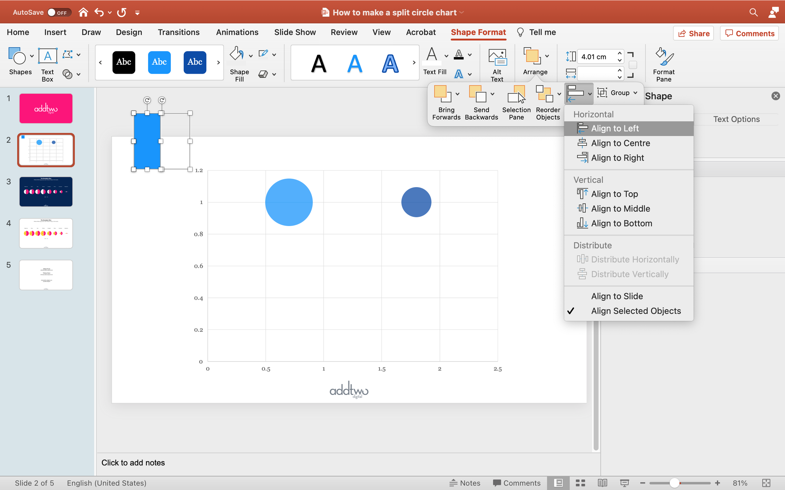
Select both shapes and under the Arrange options, choose ‘Align’ and the ‘Align to Middle’ - this will line them up precisely
Keep them both selected and then align them both left
Keep them selected and copy the whole group
Now select the circle that’s going to be on the left of our split
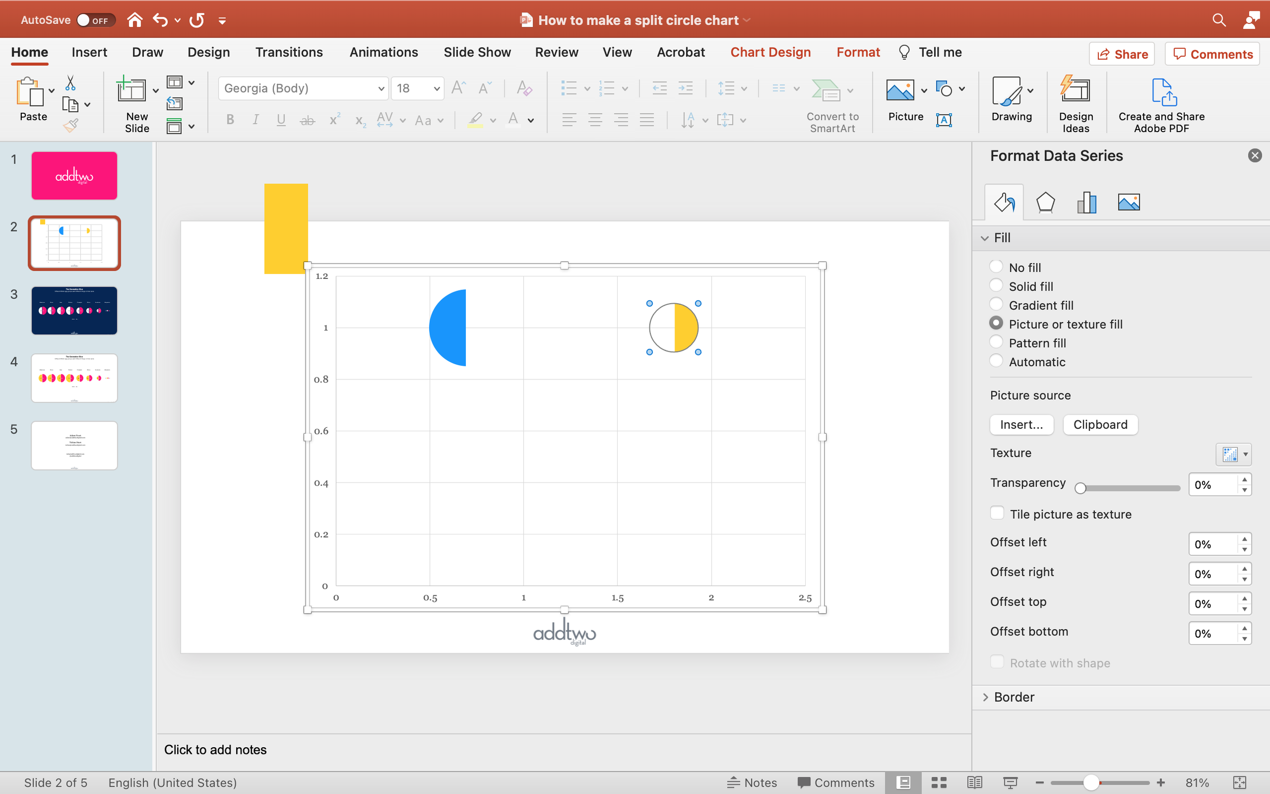
Open the Fill properties for that shape - you can find those in the Format Pane, or by right-clicking and selecting ‘Format Data Series’ from the pop-up menu
Go to the ‘Fill and Line’ tab, with the paint bucket icon and under ‘Fill’ select ‘Picture or texture fill’
PowerPoint will fill the shape with a default texture and open a fresh set of options
Click ‘Clipboard’ under Picture Source
PowerPoint should now have filled the bubble with the half-transparent group.
We’re now going to reverse that group to do the other bubble
If you want to, change the colour of the filled rectangle.
Once you have the colour set, select both the rectangle and the invisible square behind it. Under the Arrange/Align options, select to ‘Align to Right’
Now copy both shapes
Select the right-hand bubble and again, edit the Fill, selecting ‘Picture or texture fill’ and the ‘Clipboard’ option
This will then will fill the bubble with the right-hand half transparent fill
Now we need to make these two bubbles into a split circle
Make the split circle
Go back to the Excel Sheet
We’re going to use the X-Values to lay one bubble over the top of the other
Change both X-Values to 1
If you look at the PowerPoint, you’ll see that this places both bubbles at the same point on the x-axis, placing them one on top of the other
But shoved all up in one corner there, so let’s tidy that up
Tidy up the chart
Select the y-axis and open up the Format Pane to the Axis Options tab - the one with the little chart icon on it
We want to centre the bubbles on the y-axis, with an equal space above and below it. We do this by adjusting the Bounds under the Axis Options - these set the lowest and highest values on the y-axis
We just need to set these to give an equal count above and below whatever we’ve set our Y-Value to in our data (in our case, since our Y-Value is 1, we can set the Minimum Bound to 0 and the Maximum to 2)
Now we need to do the same to the x-axis
Open up the Format Axis panel for the x-axis and edit the Bounds to place the bubbles in the centre of the table (since we only have one split circle at position 1 on the x-axis, we’ll make those Bounds 0 & 2, but if we had, say, 3, at positions 1, 2 & 3, we’d make the Bounds 0 & 4)
Now we’ve evened everything up we can get rid of the axes, as they’re not needed for reading the chart (in fact, they’re actively confusing)
You can select them and just hit delete, or use the ‘Add Chart Elements’ menu and untick them under the ‘Axes’ option
And let’s get rid of the gridlines too
While we’ve got the ‘Add Chart Elements’ menu open, we could also add some chart elements like titles or legends (if we need them)
The single split circle looks a little lonely in the middle of the screen there, but PowerPoint gives us a quick tool for scaling up bubbles without losing their relative size
Select a bubble and, in the Format Pane, find the Series Options tab (the one with the little chart icon)
There you will find an option to ‘Scale bubble to’ and a textbox that is set by default to 100
You can scale to a number between 0 and 300. I have no idea what those numbers mean and why they stop at 300. PowerPoint insists on preserving some of its mystique.
I usually just shove random numbers in there until something looks good (in this case, with just one split circle, we can probably safely go all the way up to 300 (300 what? Spartans? Degrees centigrade? Trombones? We may never know))
Add Labels
We should also add some labels to our bubbles
This is going to be tricky, because we have two bubbles overlaying each other, so their automatically generated labels will also overlay each other. We’d prefer labels inside the bubbles, but if we just centre them both, they’ll get in each other’s way.
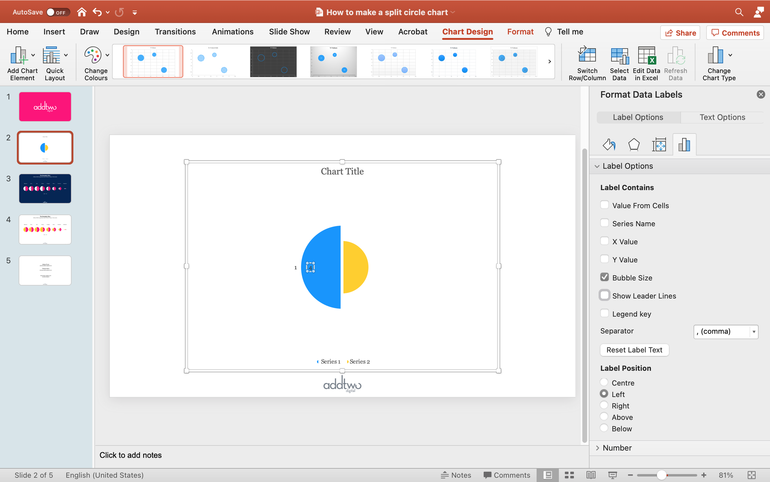
Select the whole chart, rather than a single series and then, under the 'Add Chart Element' menu select Data Labels and select the ‘Left’ option
You will see that PowerPoint, by default, labels them with the Y-Value, not the size
This means we're going to have to change that, since the relevant data is in the Size columns
Unfortunately, if we have multiple series, we can only change one series at a time because.... <waves hand at Redmond>
Select one of the labels (start with the one on the right, as we’ve got everything aligned left, currently) and open the Format Pane
Under the 'Label Options' tab, there is a 'Label Options' pane
In the 'Label Contains' options there, deselect 'Y Value' (and 'Show Leader Lines', while you're at it)
Select 'Bubble Size' - the labels should update
While we’re here, we’re now going to get the position of this label where we want it
Under Label Position, select Centre
The label will shift over to sit over the gap between the bubbles - the centre of the bubble (if half of it wasn’t transparent)
So now we’re going to want to shift that over, into the right hand half of the circle
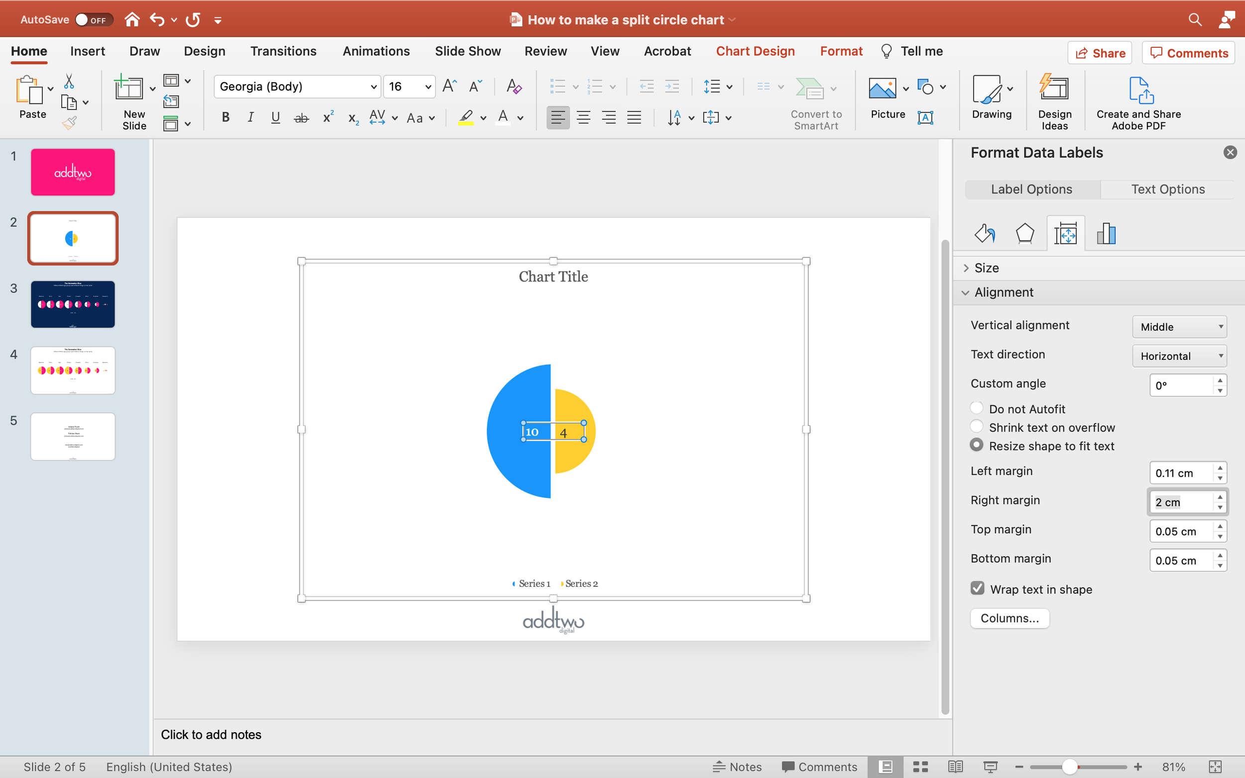
Select the next tab over - the ‘Size and Properties’ tab with the little measured square icon
Under Alignment we’re going to increase the left margin to push the label rightwards
PowerPoint measures this in cm because that’s a totally normal thing to do with digital elements <side-eye.gif>. Anyway, this means it’s a bit trial and error (1 cm seems about right here)
The good news is that if you have a whole load of circles, you only have to do this once per data series.
So let’s do it to the other data series
Click on the other label and open the Label Options in the format pane
Update it to ‘Bubble Size’ and centre align it
In this case, we’re also going to want to change the text colour for legibility, which we can do with the standard text tools in the Home tab on the ribbon, or by opening the Text Options in the Format Pane, or with the Text Fill option in the Format tab on the ribbon. And probably in other ways I’ve temporarily forgotten.
Now go to the Size and Properties tab for this label
This time we want to adjust the Right margin to shift the label leftwards (2cm looks ok)
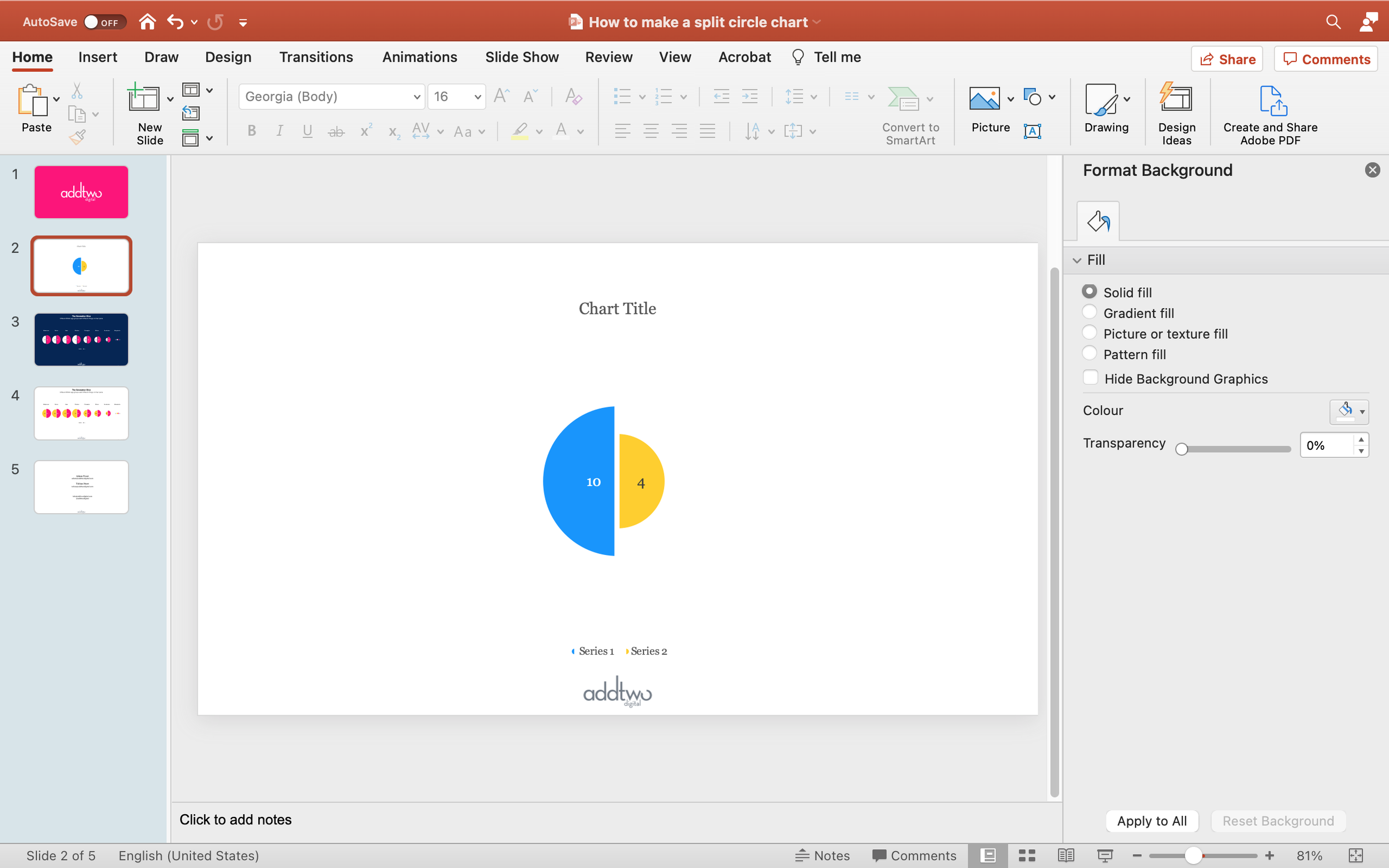
And there we are, neatly aligned labels, one for each half, both pulling from the data, so if we update the numbers, the labels will automatically update
So that’s how we make that in PowerPoint
Obviously, we’ve only made one split circle here - which is not an uncommon need. But all we have to do if we need more is add more bubbles, changing the y-axis values to make columns, or the x-axis values to make rows.
(In general split circles should be used sparingly in PowerPoint - we tend to only make single rows rather than tables, for instance)
Have a look at our tutorial on Bubble Tables for a proper walkthrough of this technique for lining up bubbles.
Also, you can find an example PowerPoint here, which has the slide we just made, along with more complex editable examples like the one below, which can explore and update for yourself. Enjoy!


