Waffle charts are a delightful alternative to pie charts for composition data, especially for single values. They do a really nice job of emphasising the ‘part’ bit of ‘part to whole’, showing us the individual elements that go to make up the total.
There are multiple ways to make waffle charts in PowerPoint by using columns, stacked columns or scatter plots. In this case we’re going to make a waffle showing a single percentage using a simple stacked column chart
So, how do we make this in PowerPoint?
In this how-to, we’ll be using the default sample data PowerPoint gives you, so you can follow along without needing to download anything, but if you want to, you can find the dataset we used to make the example at the top, and a PowerPoint deck with that slide in, and other examples, here:
What you’ll need
Stacked column chart
Data manipulation
Excel formulas
Design tweaks
Custom labelling
How you do it
We’re going to use a stacked bar chart to show a percentage and then its remainder out of 100%. We’re going to make a chart of ten columns, each of a maximum value of ten, giving us that 100%. The value is then split across those ten columns, allowing us to show the percentage. We can use the custom fill options on the columns and the ‘stack and scale with’ feature to fill each column with ten shapes, which, with ten columns, gives us a grid of 100 shapes: our waffle.
Details
Insert the chart
Insert a standard clustered bar - you could use a 100% stacked bar, but we’re going to be creating that 100% fill with formulas anyway, and a standard clustered bar is a little easier to work with.
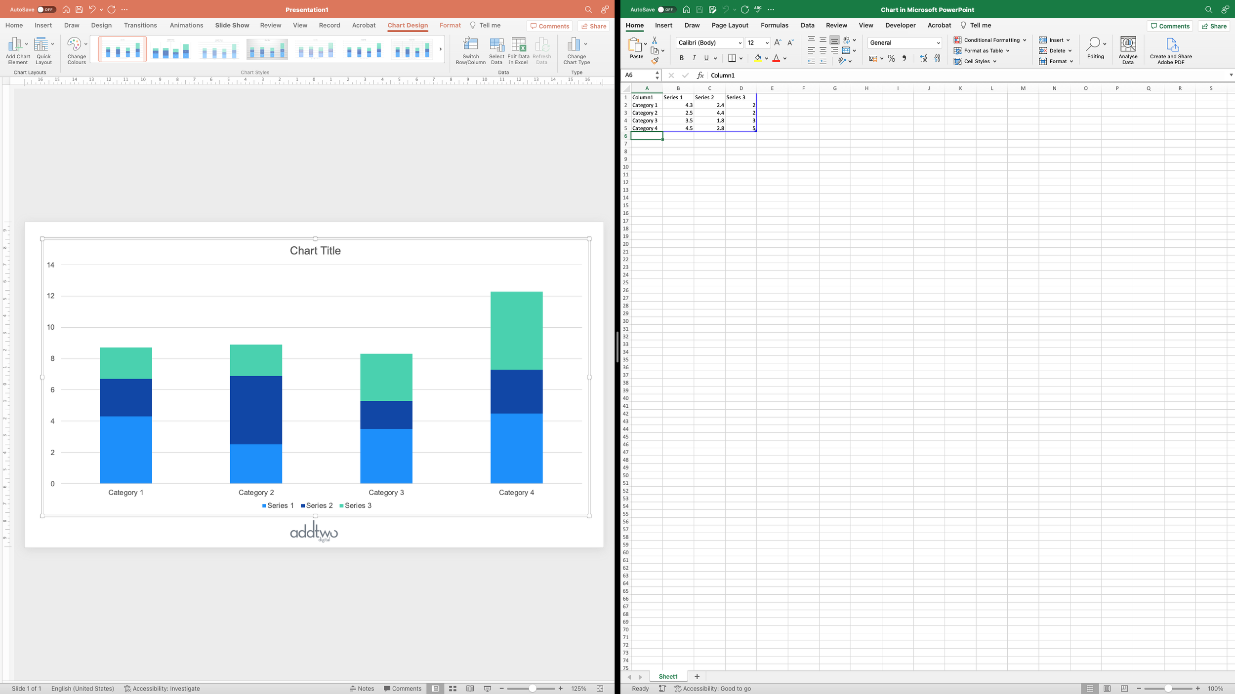
As usual, PowerPoint will create a dummy chart and then open Excel to show you the data structures behind that chart
By default, PowerPoint creates a stacked column with three data series - we’re only going to need two of those, so we can grab hold of that blue rectangle that frames the data that PowerPoint is visualising and drag it in to exclude that third column of data.
Structure the data
First of all, let’s get the data into the right structure for our waffle.
We’re going to need ten columns to make our 10 x 10 grid, so we will need ten rows of data. We can also delete the dummy data as we’re going to be filling those cells using formulas.
I’ve numbered the rows, because that will make the formulas I write easier, and I’ve named the columns just to make everything clearer.
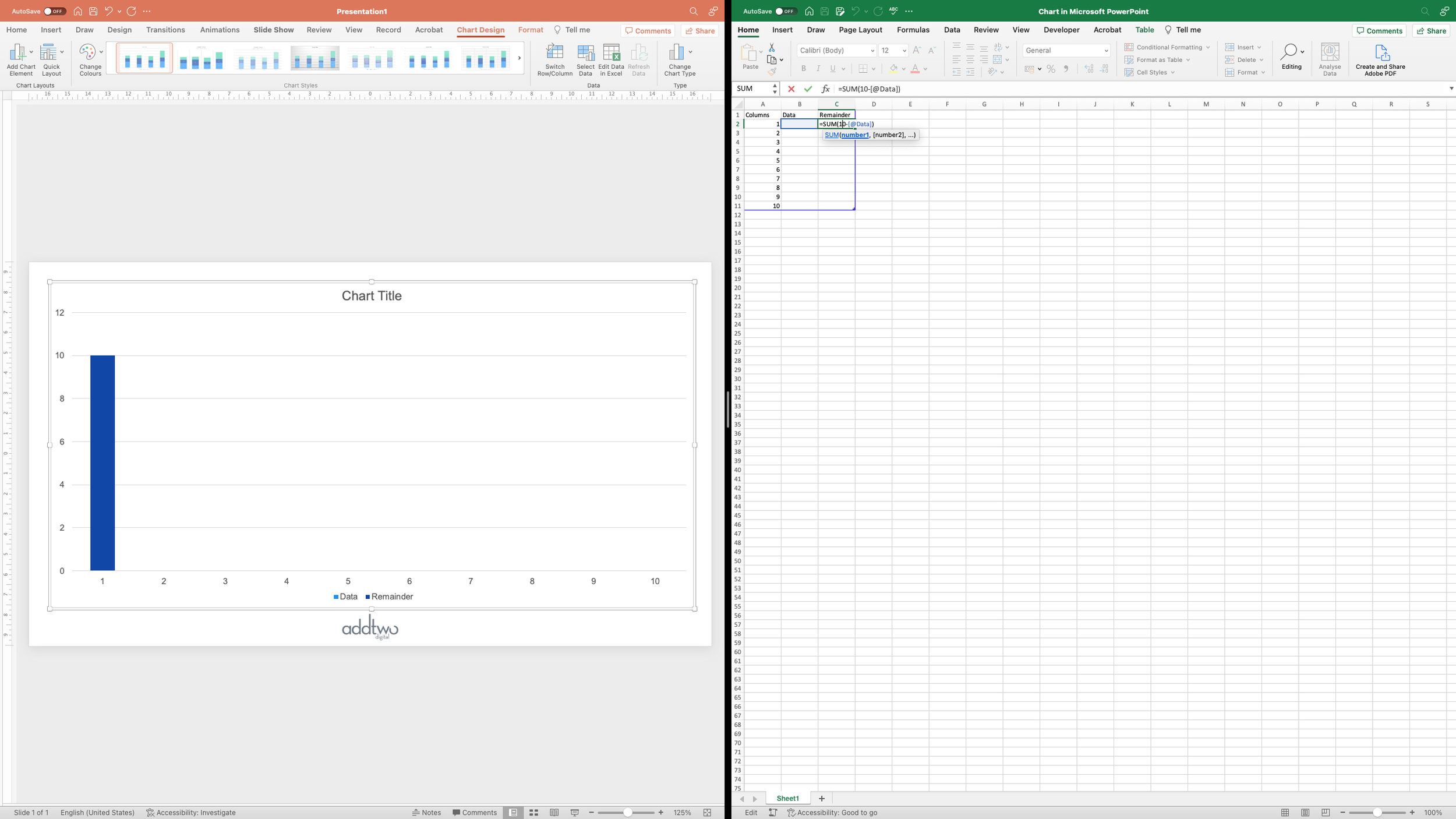
We can actually fill out that ‘Remainder’ column already, because it’s just going to be the remainder of our percentage subtracted from the total 100%. However, remember that we’re going to have ten columns, totalling ten each, so the value of that Remainder is going to be 10 - (whatever is in the first column). In an Excel formula that will look like:
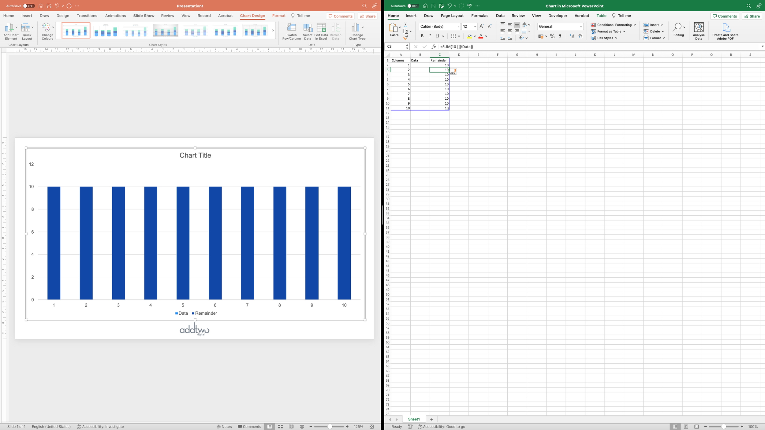
=SUM(10-[@Data])At the moment there’s nothing in the Data column, so we get 10 columns all of a value of 10:
Next we’re going to change that and start calculating the percentage we want to show, and in order to make room for that, we’re going to move the data we’re visualising over - we can just grab the cells in the blue frame and pull them across. PowerPoint will just carry on chart whatever is in the blue frame and ignore everything else.
The chart remains entirely unchanged.
Calculate the data
First we need a value to calculate, so let’s add that in with a little table:
The point of laying it out like this is to make the chart reusable - having clear labelling, even just for a single value like this - just 43% - is that if we come back to this chart in the future and want to update it, or copy and paste and make a duplicate, it’s really easy to open the data and understand what needs to be updated.
Our first problem is that for the sake of clarity (and also to make our labelling of our chart easier, as you’ll see), we’ve used a percentage for our value. The problem is that in Excel, from the point of view of formulas, those percentages are actually decimals. Any calculations performed on that percentage will be treating it as if it’s actually 0.43, not 43%. So first we’re going to convert it to a whole number. This means changing it from a percentage using the Excel NUMBERVALUE() function and then multiplying it by 100:
=SUM(NUMBERVALUE(B2)*100)We can then use this number to calculate the other values we need for our chart.
The end result we want for this waffle chart is for 100 squares, 43 of which are filled in, to represent the 43%. We colour in the squares from the bottom left, moving along the rows left to right until we reach 43, so we end up with four rows of ten coloured squares and one final row of three:
But we’re making this out of columns, so what we actually have is three columns of 5 squares and then seven columns of 4 squares.
So these are the values we want to plug into that first column in the charted data in the spreadsheet.
However, we want this to be an easily updatable chart, so we’re going to generate those values with formulas. We just have to work out what those formulas should be.
To begin with we’re thinking in terms of rows of ten squares. If our percentage was 40% we’d have four rows of ten squares, so each of our ten columns would have a value of 4, or 4 divided by 10.
In fact we can think about our 43 squares as four rows of ten squares plus three: all of our columns are going to be at least four high. So we can begin by calculating that minimum height for our columns by using the ROUNDDOWN() function in Excel, dividing our percentage by 10 and then rounding down with no decimal points:
=ROUNDDOWN(D2/10,0)This will give us our minimum value of 4. Now we just have to add on our extra 3 squares to take it to 43. To do this, we’re essentially going to add a square on top of each column, starting with the first, until we reach the correct total. So what we need to know is how many columns we need to add a square to. Our ten columns of 4 are going to give us the 40, we need to find the remainder, the 3. Fortunately there’s an easy mathematical way of discovering this: modulo, which gives us the remainder of any division, in Excel MOD().
=MOD(D2,10)This will give us the remainder when 43 is divided by 10: 3.
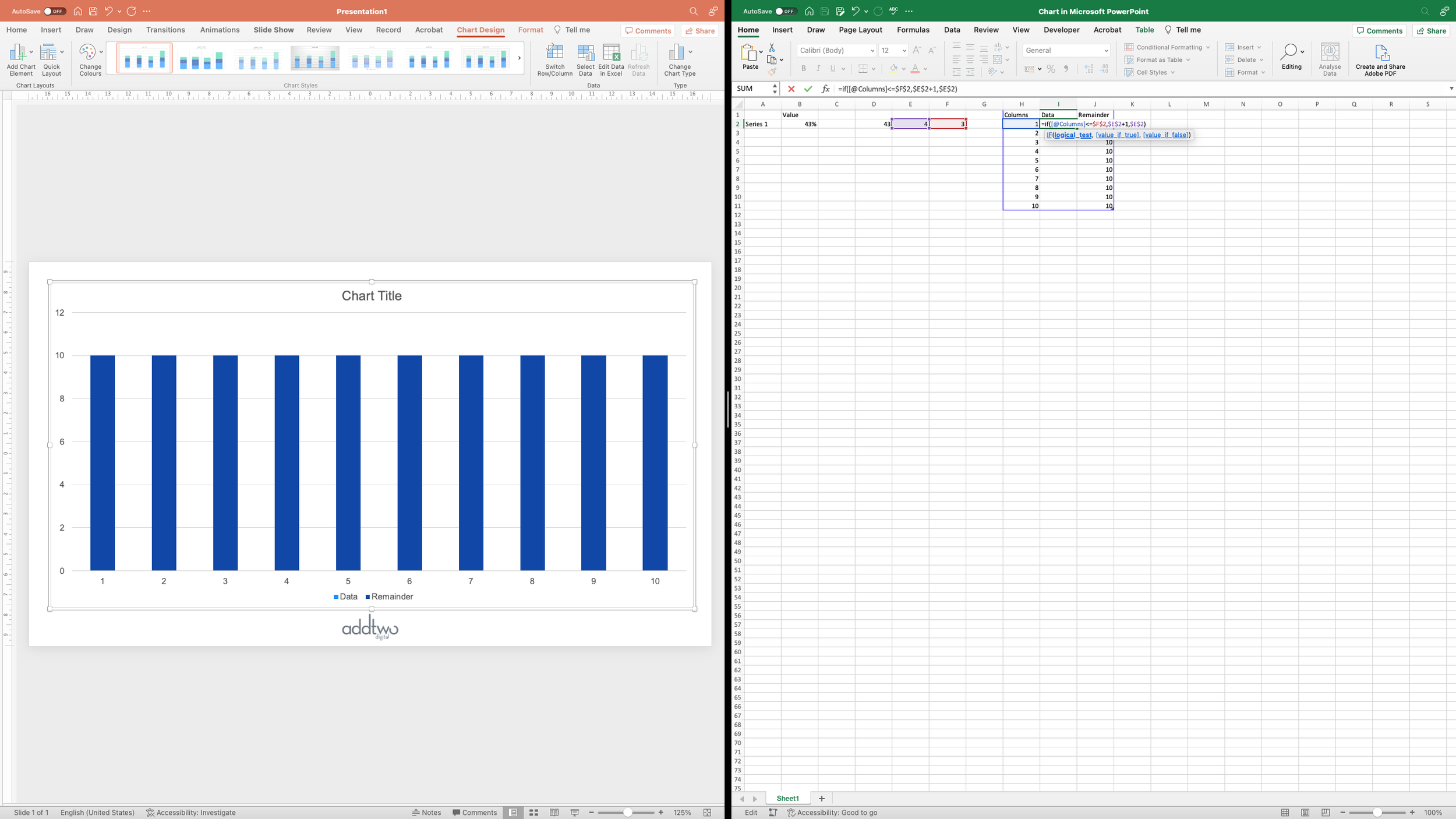
We can use these two numbers to calculate the heights of our ten columns using a simple IF statement.
IF the column we’re calculating is lower in number than the remainder, THEN give it the height of the minimum value plus 1, ELSE just give it the minimum value.
In an Excel formula - IF(TEST STATEMENT, IF TRUE, IF FALSE) - that looks like this:
=IF([@Columns]<=F2,E2+1,E2)Only we’re going to put $ signs in F2 and E2 to fix the references to those cells, so we can copy the formula down and it will work cleanly.
There - we have our three columns of 5 and our seven columns of 4, totalling to our 43, and our Remainder column has updated to fill in the total to 10 x 10.
Now we can close the data for a moment and concentrate on the chart
Lay out the chart
The first thing we need to do is to set our axes. PowerPoint automatically gives a little leeway when it generates a value axis - for instance, our y-axis currently goes to 12:
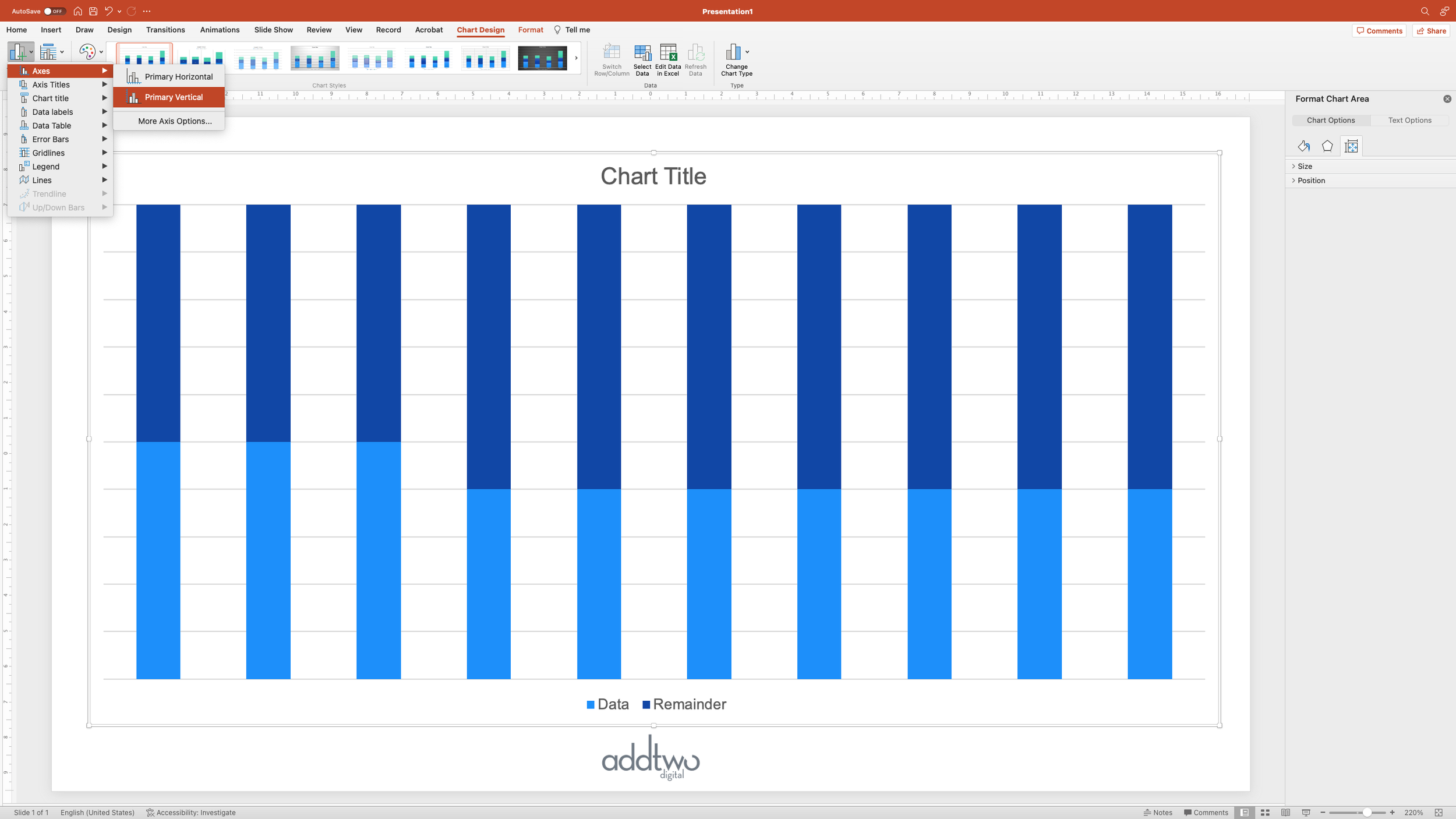
But the whole point of this chart is that we’re only ever going to have a total of ten, so we want to set that. Open up the Format pane for that axis - one way to do this is to right-click on the axis and select ‘Format Axis…’
We’re going to set the Maximum Bound of the y-axis to 10, to let us use as much of the chart space as possible.
Having set that, we no longer need the axes - they’re not telling us anything useful about the data - we’re mostly just using those values for layout purposes, so we can delete them. You can do this by simply selecting them and hitting Delete or by unticking them in the ‘Add Chart Element’ menu.
In fact we’re going to get rid of everything apart from the title (we’re not actually going to use it in this example, but it would be useful in practice).
Now we want to adjust the appearance of the chart itself. A 10 x 10 waffle ought to be square in shape, so we’re going to select the plot area of the chart and resize it by dragging to make it square.
Now we want to make the actual visualisation square. Open the Format Pane for the chart - you can do this by right clicking and selecting ‘Format Data Series’.
Open the ‘Series Options’ pane (the little chart icon) if it’s not already open and set the Gap Width to 0%. This will remove the gaps between the columns, turning them into a solid square, 43% of which is coloured differently to the rest (because it's a different data series).
Now we need to turn those blocks into waffles.
Style the chart
Deselect the chart (you can do this by just clicking outside it, on the slide background) - this helps because we’re going to be adding a bunch of elements to the slide and PowerPoint will add them inside the chart by default if we still have selected.
Insert a square shape - you can do this under the Insert tab in the ribbon.
It helps to set a size for it. We’ve set this to 6 cm x 6 cm (PowerPoint still, inexplicably, uses centimetres for its measurements instead of pixels).
Then set the fill options to ‘No Fill’ (you can do this under the Shape Format tab in the ribbon). This should give you a square with an outline but transparent in the middle.
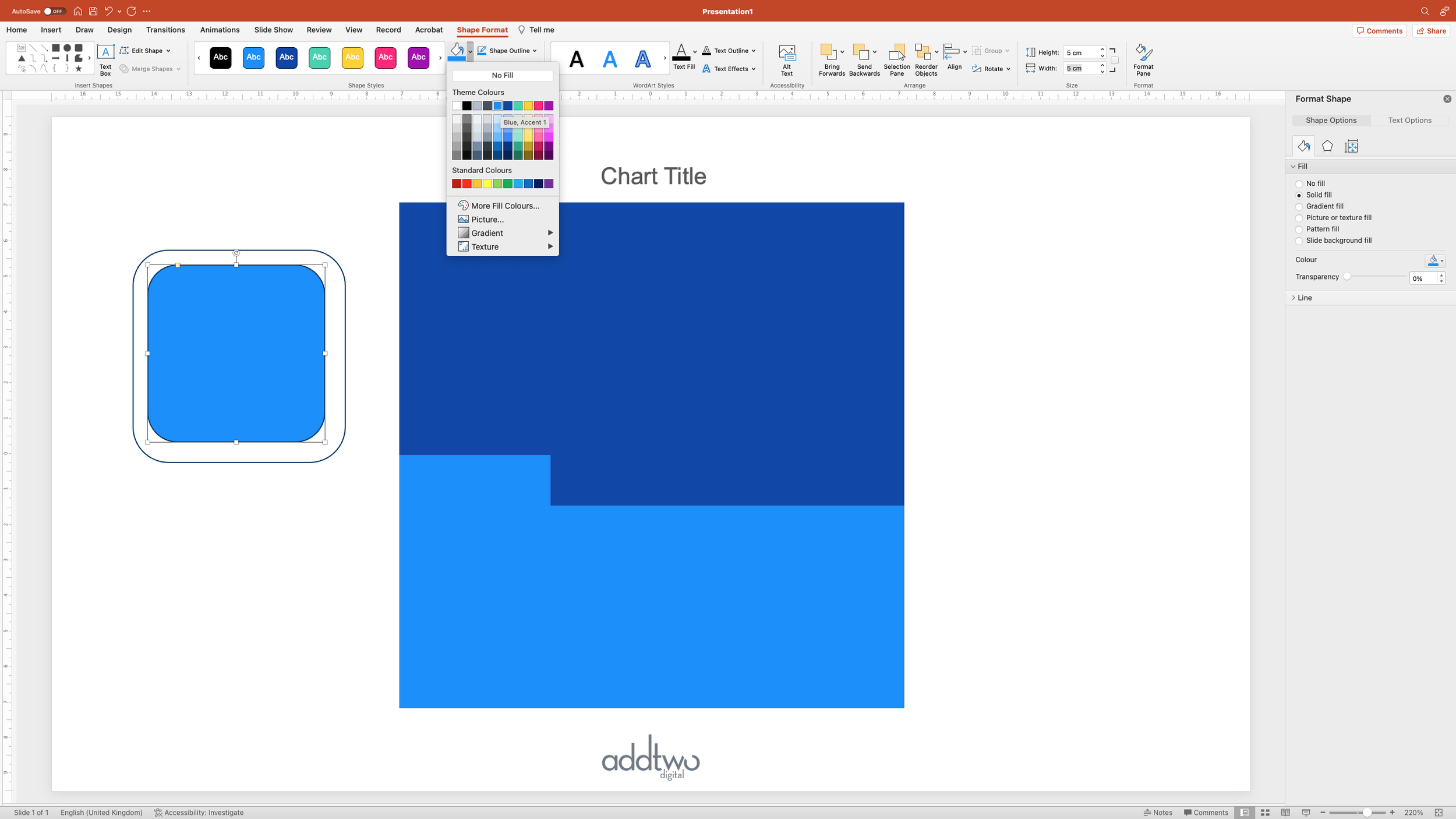
Copy and paste that square and make the duplicate slightly smaller. We’ve made it 5 cm x 5 cm.
You want to make this square coloured, so pick a Fill colour.
Select both squares and make sure they are neatly centred, one inside the other. You can do this by using the Align options on the Shape Format tab.
Then, with them both still selected, set their outline to ‘No Outline’. This will make the bigger square entirely transparent, but you’ll see it’s still selected. PowerPoint still knows it’s there, it’s just now entirely invisible.
Keeping them both still selected, copy them both:
Now select the value columns in the chart - the first data series - and open the Format Pane.
Under the Fill options (click on the little paint pot icon), set the Fill to ‘Picture or texture fill’
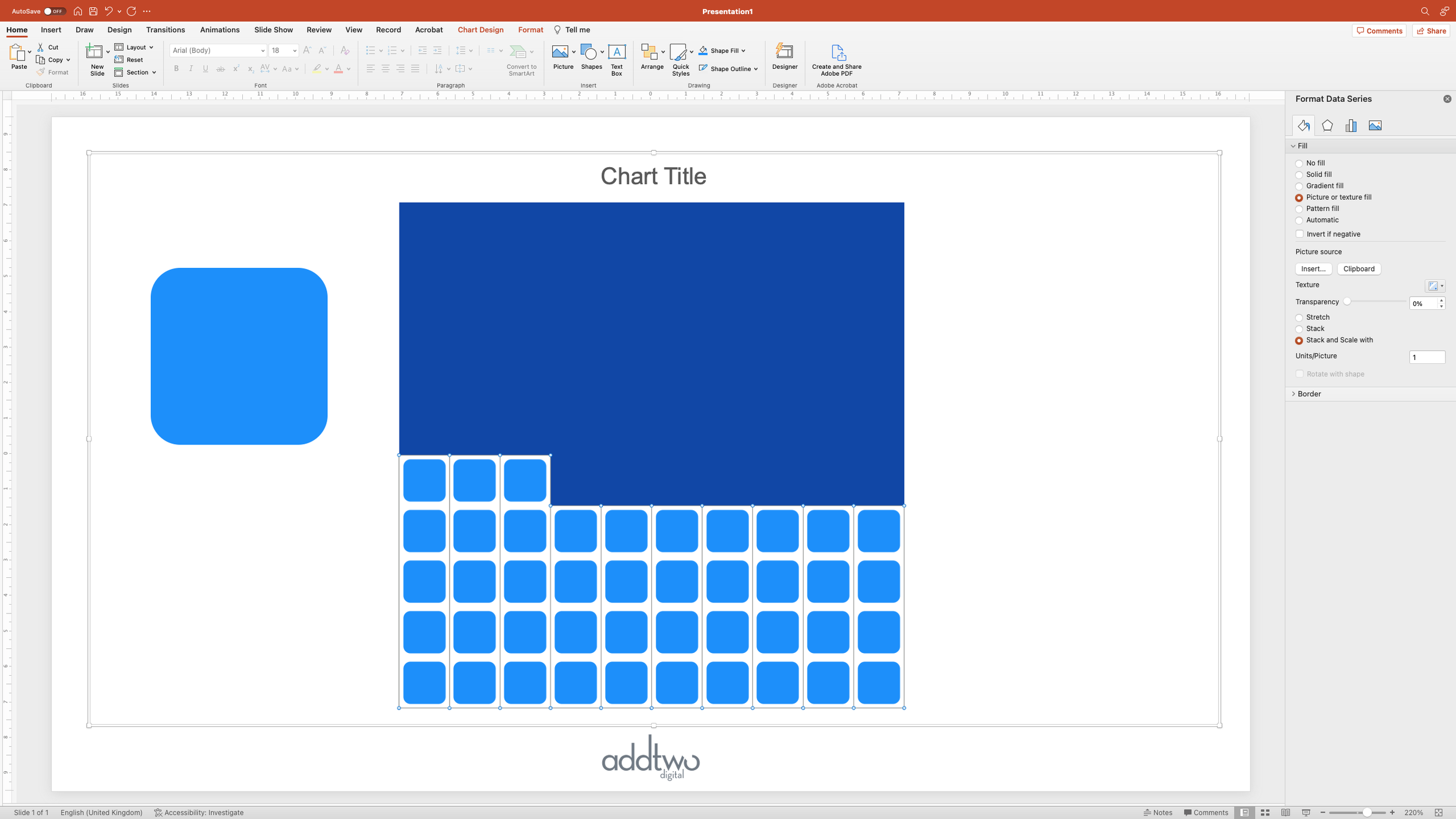
By default, PowerPoint will fill the columns with a canvas texture. But we’re going to fix that. Under ‘Picture Source’ select ‘Clipboard’. This will fill the columns with the squares we just copied.
This looks weird, but that’s because ‘Stretch’ is selected by default for the fill options. Instead set it to ‘Stack and Scale with’.
By default the ‘Stack and Scale with’ option is set to 1 Unit/Picture - which means PowerPoint will fill the chart by repeating the fill in a 1:1 relationship to the data - one picture for every unit in the data.
Which is perfect for our purposes - it gives us our 43 blocks to show our percentage.
Now we just need to do the same for the Remainder.
Go back to the coloured square and choose a different colour to distinguish from our key value. We’ve used a paler colour here to make it more of a background visual.
Once that’s done, select both that and the invisible square behind it and copy them both.
Then do the same thing with the other data series. Set the Fill to ‘Picture or texture’, select the image on the Clipboard and set to ‘Stack and scale’ with 1 Units/Picture.
…and we have our waffle, showing 43%. But we really ought to say that explicitly with a label.
Add data label
The problem we’re now going to have with the built in data labels is that the data in the chart isn’t the data we want to label with - we had to manipulate the data to make the chart - but, fortunately, there are ways round that.
Although we have ten columns, we only need one label, so we’ll add one to just the first column.
Select the first column and then, under the Add Chart Element dropdown (under the Chart Design tab) add a data label inside the end of the column.
By default PowerPoint will label the column by it’s value, but we want to change that. Open the Format Pane (by right-clicking on the label and selecting ‘Format Data Label’ and in the Label options, un ‘Label Contains’ select ‘Value from cells’. This will re-open the underlying Excel spreadsheet and ask you to pick a column of cells to draw the label from. We’re going to pick that second column where we put our original data point.
This will add that ‘43%’ to our label. We can then turn off the ‘Value’ option to leave just that ‘43%’. Note: you will need to select that particular label directly to do this. Clicking on once will select all the labels for that data series (even if there aren’t any others, as in this case), clicking twice will select that specific label.
We can then style up that label with the usual tools.
We can also adjust its positioning, by going into the Text box options in the Format Pane and giving the label a wide Right Margin. This will push the label left, outside of the waffle, but still adjacent to the column.
Creating the label this way means that if we update the original value in the spreadsheet, not only will all the formulas update the chart, but the label will update correctly too.
So that’s how we make that in PowerPoint
Phew. Those formulas were a bit mad, but there is a point to it all. But setting all of that up to generate the chart, we make a thoroughly reusable visualisation.
Visualising a single, important percentage is a common ask, and hard to do in a properly arresting and visually striking way: waffles give us one, simple but striking way to do this.


