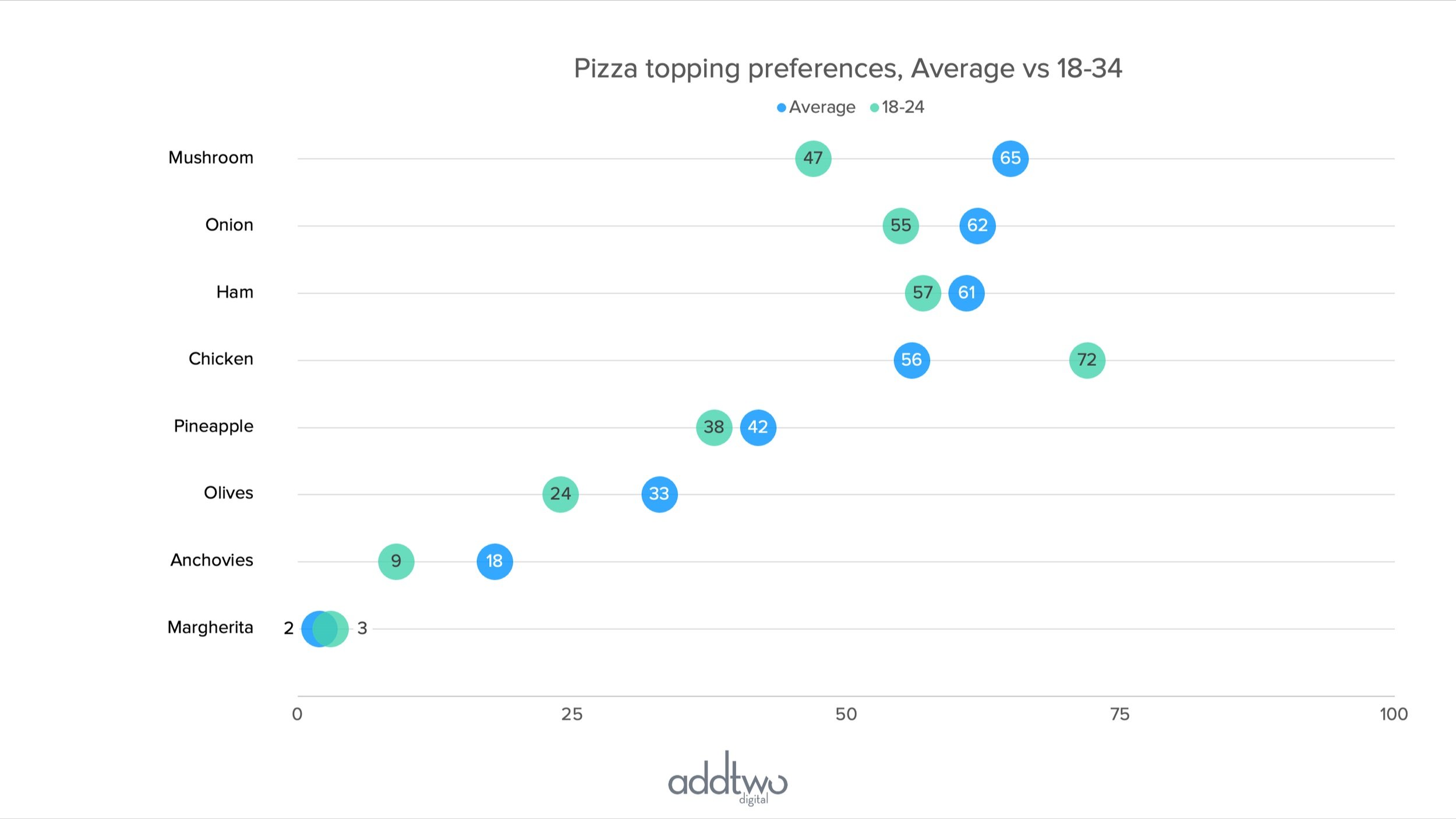
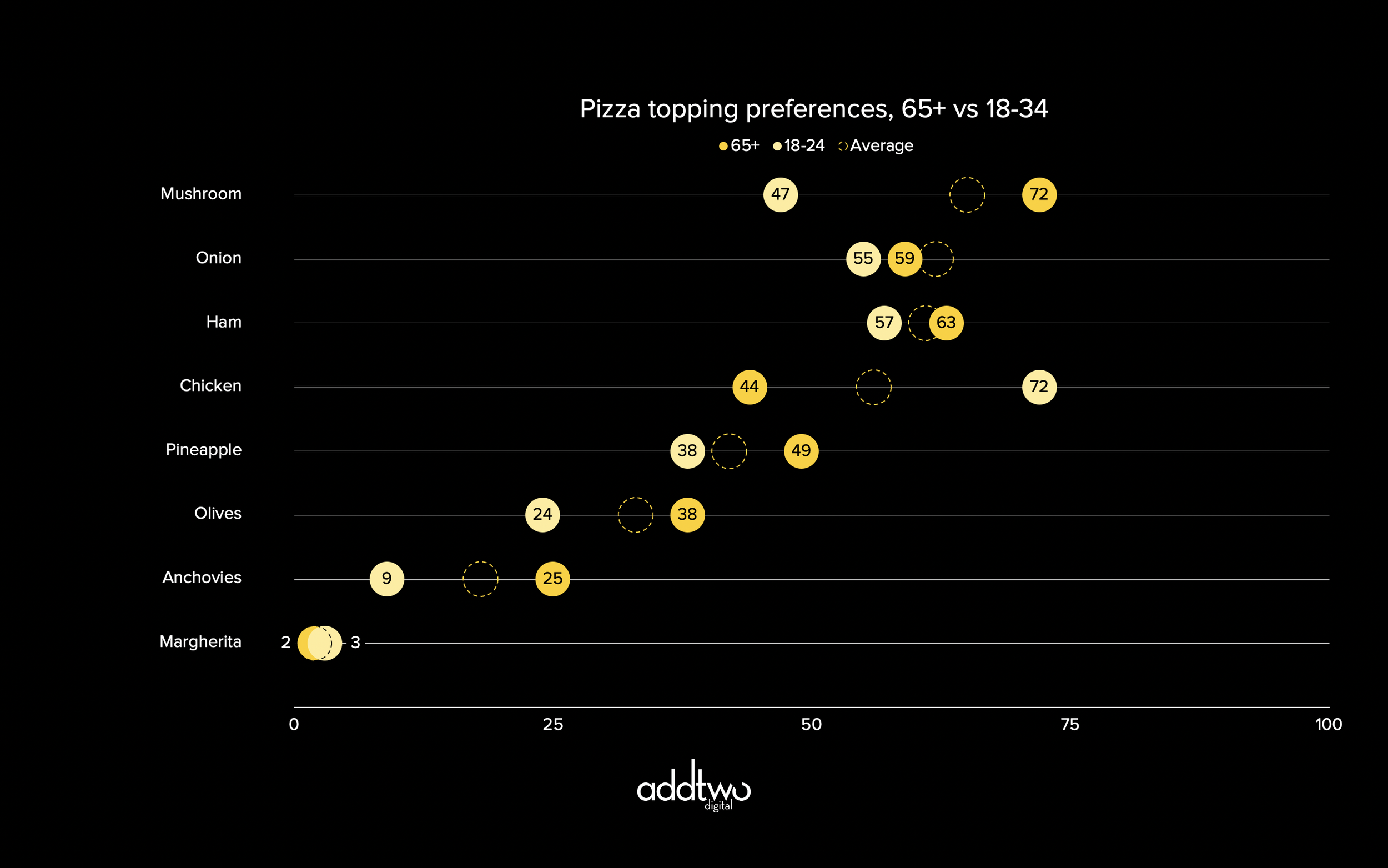
An abacus visualises data by placing markers on a line, like beads on wire in an abacus.
It makes a useful and attractive alternative to bar charts, particularly to clustered bars, since we can place several data series on the same line while still retaining a comparison between different categories.
[This tutorial assumes you’re reasonably au fait with PowerPoint and how it makes charts. If you feel you need a more indepth introduction, click here to find out more about the basics of the PowerPoint charting engine]
So, how do we make this in PowerPoint?
In this how-to, we’ll be using the default sample data PowerPoint gives you, so you can follow along without needing to download anything, but if you want to, click here for the dataset we used to make the example at the top, and a PowerPoint deck with that slide in.
What you’ll need
Scatter plot
Data manipulation
Chart layout tweaks
How you do it
We’re going to use a scatter plot to make the markers, with the gridlines of the chart acting as the ‘wires’ the beads will sit on. This will mean - for a horizontal abacus - using the y-axis purely as a means of arranging the beads into rows, the x-axis will do all the job of showing the actual data.
The details
Insert the chart
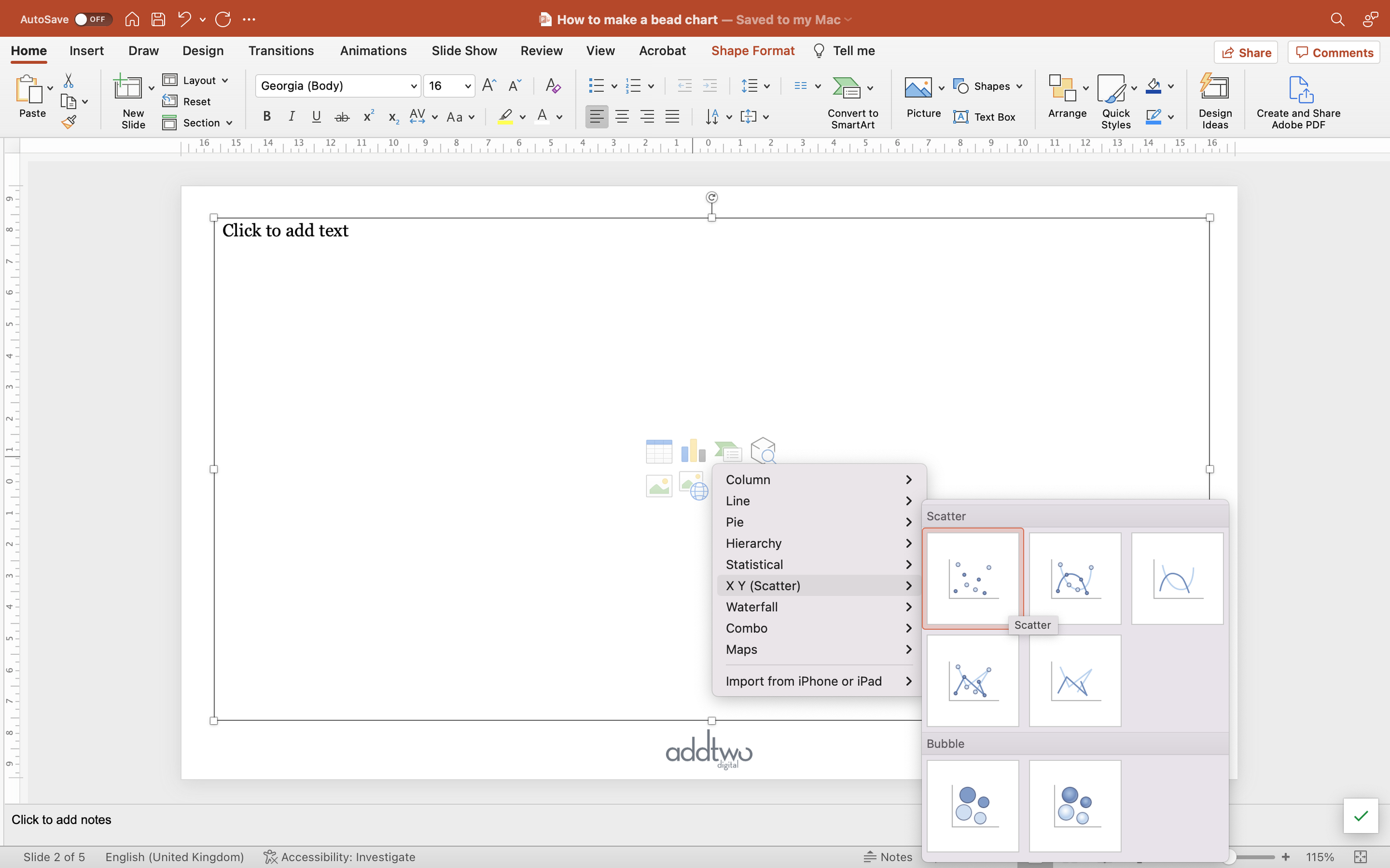
Add a standard Scatter Plot to the slide. You can find this under X Y (Scatter) in the PowerPoint chart options. It's the first choice - a plain scatter.
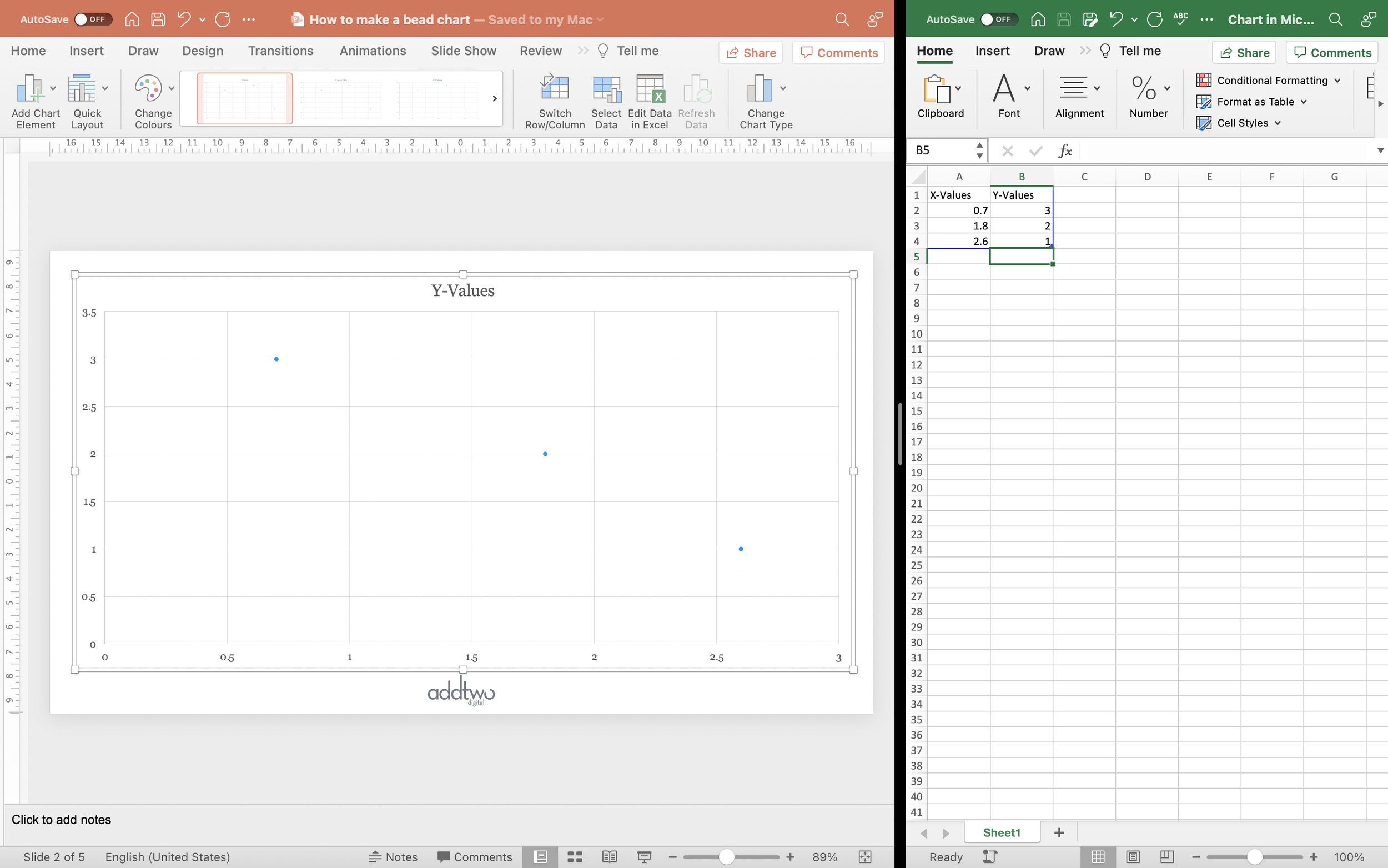
As usual PowerPoint will create an example chart, opening up Excel to show us the example data label, with three data points defined by X and Y coordinates.
Amend the data
We’re only going to need one axis to show the data - we only have one dimension. We’re going to use the other axis to layout the beads into even rows.
(You might want to copy the current Y-Values for later)
In the second Y-Values column, change the numbers for consecutive integers. It makes more sense if you do this in descending order, so the data point in the first row in the spreadsheet will also be the bead in the first row of the chart.
In this case, with three rows, we’re going to update the Y-Values to 3, 2, 1.
For the sake of an example, we’ll add a comparative data series. Add three more numbers to the X-Values (they can be anything, we’ve just pasted in the original Y-Values).
PowerPoint adds new data series to a chart based on columns of Y-Values. Add a new column and enter the same Y-Values - 3, 2, 1 - for the new numbers we put in the X-Values column.
You’ll see that this adds a new, differently coloured set of beads on the same ‘wires’ as our original set.
We can now close the spreadsheet.
Layout the chart
First of all, let’s tidy up the chart. We don’t actually need to show the y-axis, because it doesn’t represent any data, we’re just using it to make rows of our beads. But before we get rid of it, let’s get it set up properly to show our ‘wires’.
Open up the Axis Options in the Format Axis panel (you can do this by right-clicking on the axis and selecting ‘Format Axis’).
Set the Minimum and Maximum Bounds to the axis. Set the minimum to 0 and the maximum to the same value as the highest Y-Value. This case ‘3’.
We’re then going to set the Major Units to ‘1’. Because we set our Y-Values to whole numbers, this means we now have a horizontal gridline for each row of beads, giving us our ‘wire’ to string the ‘beads’ on.
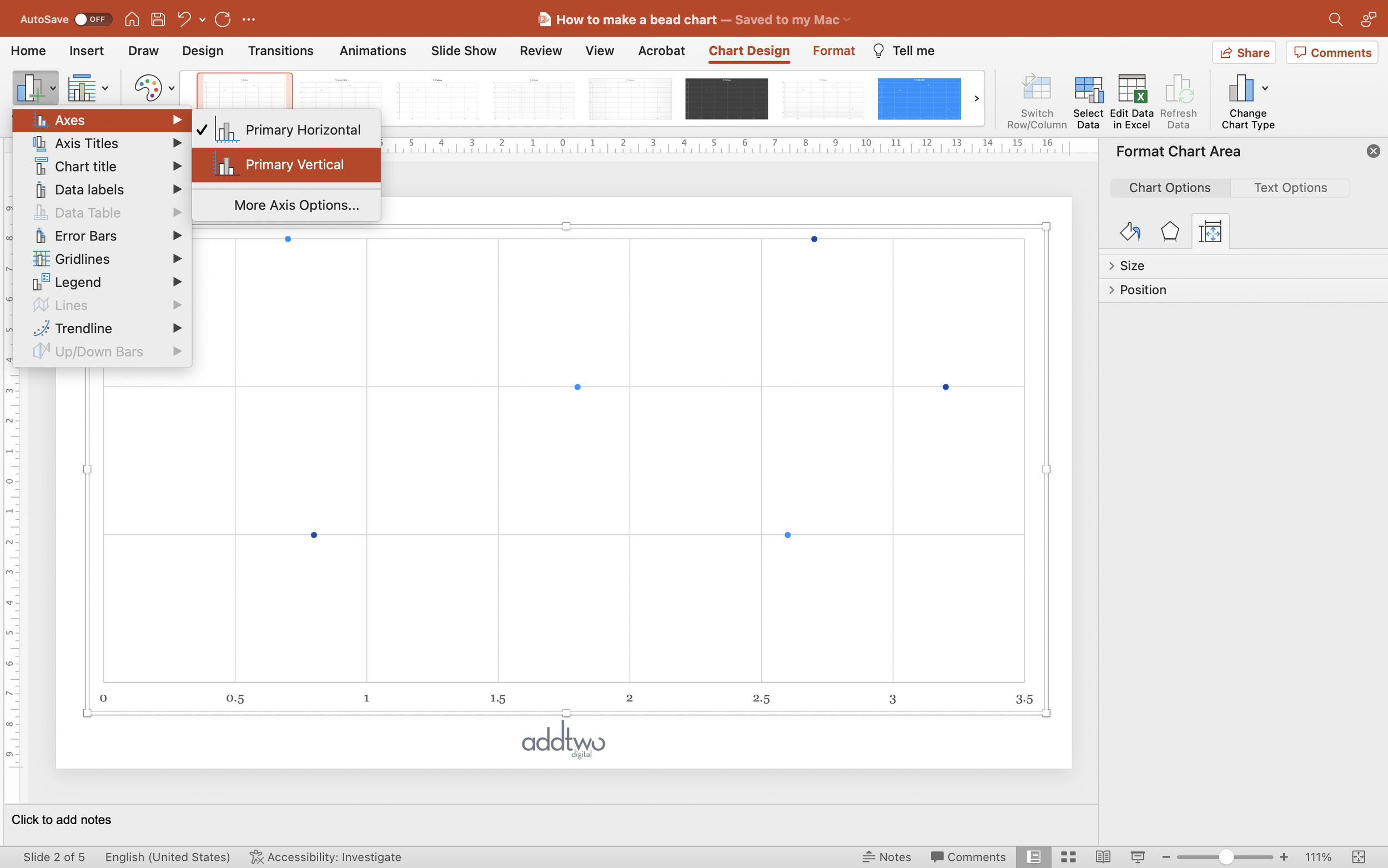
We can now delete the y-axis (you can just deselect it in the ‘Axes’ options in the ‘Add Chart Element’ menu). We also want to get rid of the vertical gridlines.
We can also tweak the x-axis. We’ll set the Major Units to ‘1’, just to make it a little easier to read.
Adjust the markers
We can now set the styles for the ‘beads’. Because we have two separate data series, we’ll have to do both independently.
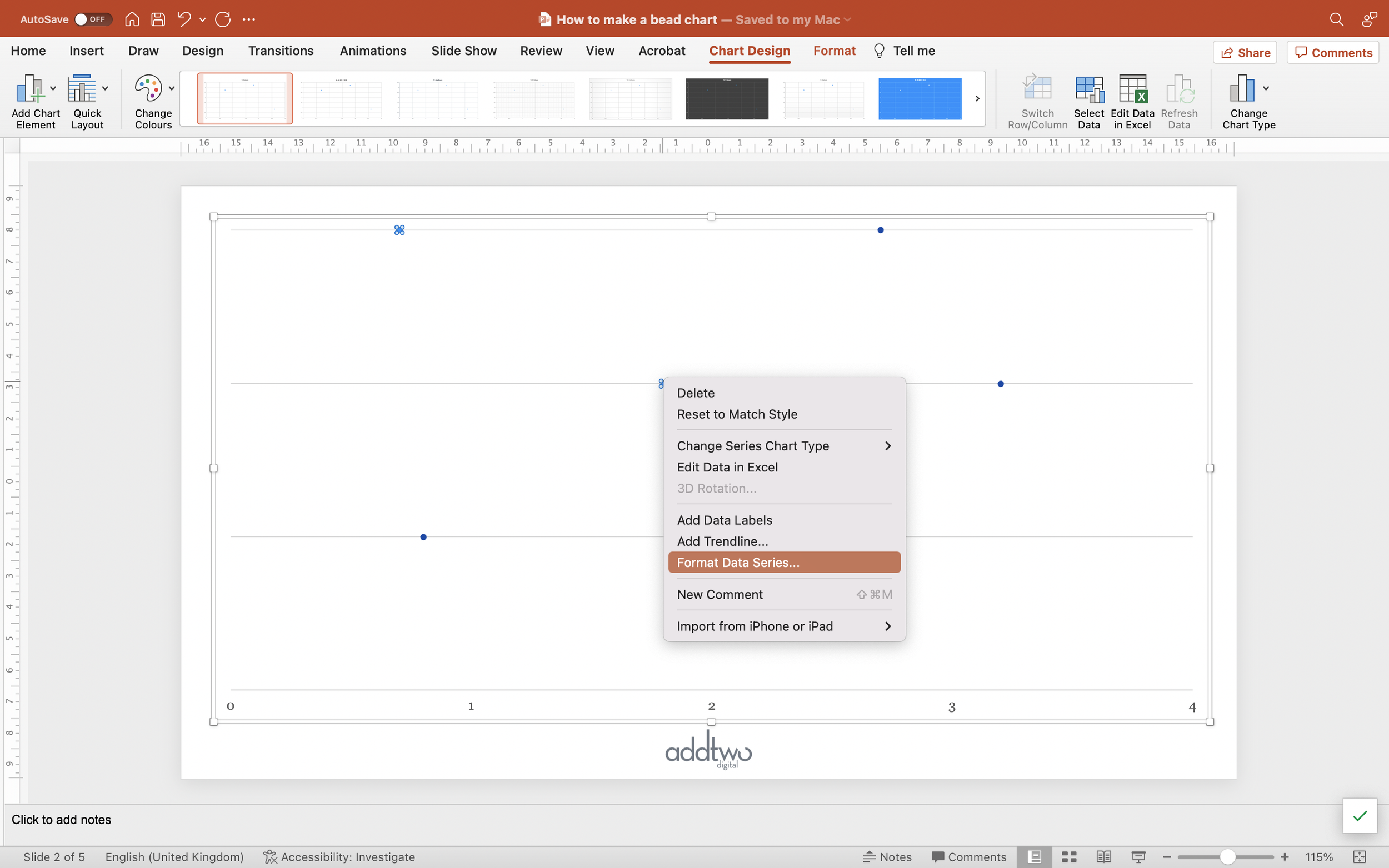
Select one series of markers (clicking once should select the whole series) and open the Format Pane (you can just right-click and select ‘Format Data Series’).
Under the Fill & Line tab (the paint pot icon), click the Marker option and then open the Marker Options panel.
Select ‘Built-in’, the circle Type and set the Size to something big enough to contain the data label.
You can also adjust the Fill Colour. We’re going to take the opportunity to set the Border to ‘No Line’.
We’re then going to add data labels. Under ‘Add Chart Elements’ select Data Labels and choose Centre.
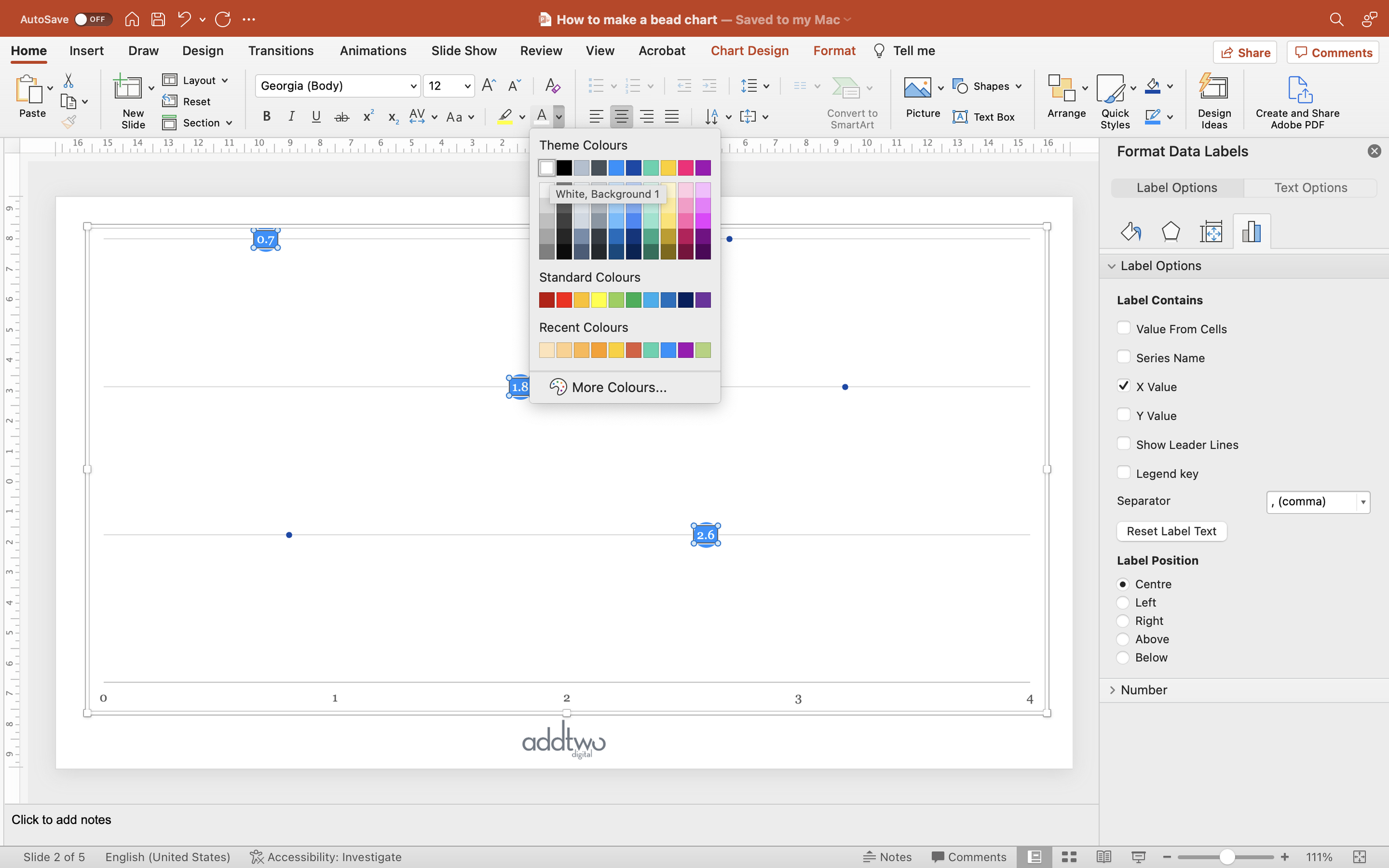
You’ll notice that, by default, PowerPoint labels with the Y-Values. Select the labels and, in the Format Pane, under Format Data Labels, change the Label Contains option to X Value.
While you’ve got the labels selected, make sure the text colour is legible against the marker fill colour.
Repeat this process for the other data series.
Label the chart
We can use the built-in chart legend to provide a key to the data series. Simply select Legend from the Add Chart Element menu and set it to Top.
However, we’ll have to label our rows by hand.
Add a 1 x 3 table to the slide. You can do this by going to the Insert menu and choosing Table.
Using a table makes it easier to evenly space and arrange our labels. This means, however, that we don’t want the table to be visible.
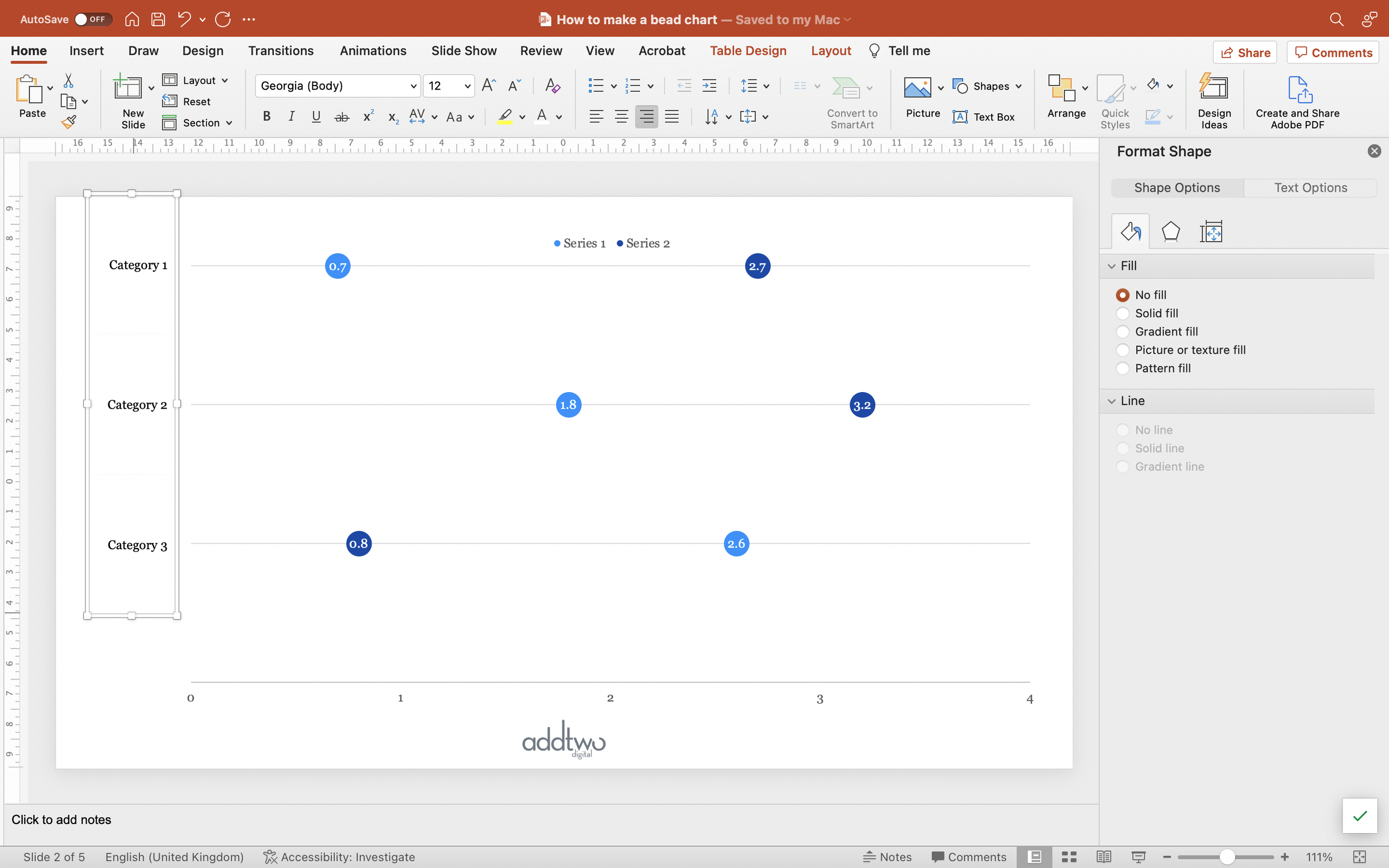
Select the whole table and under the Table Design options, turn off the Header and Banded Rows options, remove all borders and set the Shading to No Fill.
Now type your row titles into the table.
Set the font colour and size and set the text to be right aligned and vertically centred.
Align your table with the left edge of the slide and adjust the width until the labels fit neatly.
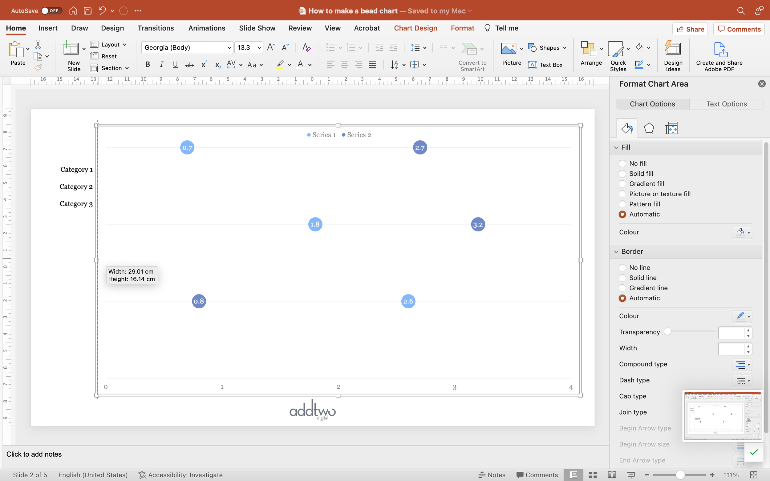
Adjust the width of the chart so that it’s neatly to the right of the labels.
Now adjust the height of the table so the labels line up with the rows of the chart.
So that’s how we make that in PowerPoint
You can, of course, just show one data series on an abacus and it’ll work really well, but where they shine is providing a much more legible and comprehensible alternative to clustered bars.
The trick, as ever, is not overloading them with data, but then you wouldn’t do that anyway, would you? You’re a nice person.

