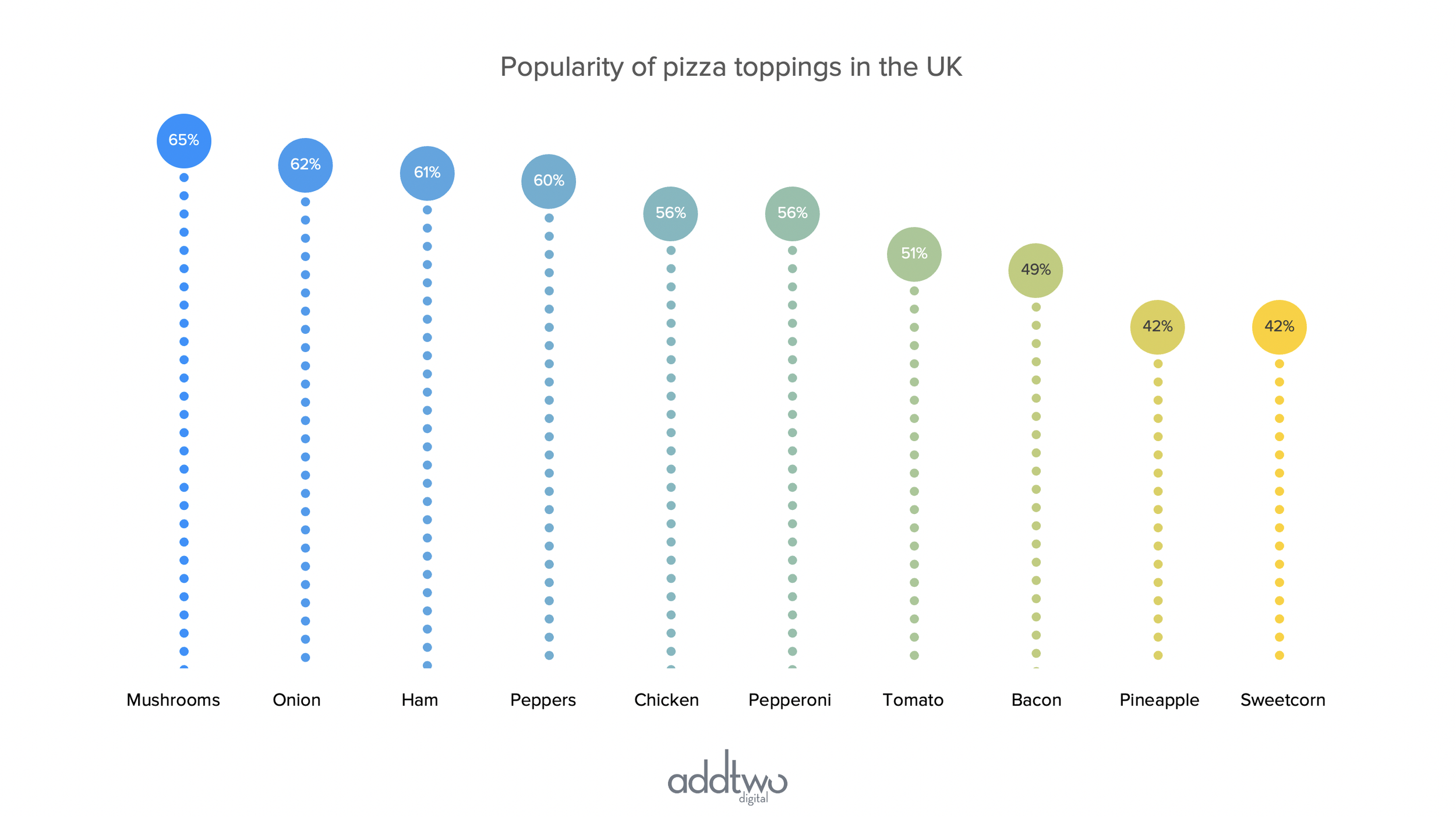
As the name suggests, Lollipop charts show data using circles on the ends of stems to show a single data series against a y-axis.
They are a useful alternative to columns or bars (we’re going to be making columns here). They concentrate on using the position against the y-axis as the key way of showing the data, but they still use the height of the bar too.
They’re less useful than bar charts for small, granular differences in value, but they’re still pretty accurate and easy to read.
[This tutorial assumes you’re reasonably au fait with PowerPoint and how it makes charts. If you feel you need a more indepth introduction, click here to find out more about the basics of the PowerPoint charting engine]
So, how do we make this in PowerPoint?
In this how-to, we’ll be using the default sample data PowerPoint gives you, so you can follow along without needing to download anything, but if you want to, click here for the dataset we used to make the example at the top, and a PowerPoint deck with that slide in.
What you’ll need
A connected scatter plot
Customized data
Specific chart settings
Design tweaking
Custom axis labels
How you do it
We’re going to use a PowerPoint connected scatter plot to make the circle/stem appearance, but this will need some editing. Some connecting lines will have to be deleted and then, by setting the minimum and maximum bounds of the y-axis, we will cut off one end of the plot, hiding one set of the markers and creating the ‘lollipop’ appearance.
The details
Insert the chart
Add a ‘Scatter with Straight lines and Markers’ chart - you can find this under the X Y (Scatter) options in the PowerPoint charts.
As usual, PowerPoint will insert a demo chart and open a spreadsheet to show the data behind that chart.
You’ll notice that the scatter is dots joined by lines, effectively making it a line chart. We’re going to use this to make the lines vertical, from the x-axis up to the dots. To do this, though, we’re going to have to tweak the data first.
Edit the data
First, we’re going to want to arrange our dots into regular columns, to mimic the layout of a column chart.
We’re going to do this by evenly spacing the values for the x-axis. The x-axis, after all, doesn’t show data here, we’re just using it for positioning. Just entering integers (1, 2, 3) will work perfectly.
Now we want to make vertical lines from the bottom up to each data point. To do this we’re going to add extra, low y values for each x value, so that each dot will have another dot directly below it.
We’ll do this by adding a new row in the spreadsheet between the first and second data points.
In that new row we’re going to repeat the x-value of ‘1’ but add a new y-value of ‘0’ to draw a line from our data point down to the x-axis.
We’re then going to repeat that process for all the values in our chart to get vertical lines for all the data points.
Add data labels
While we have the spreadsheet open, we’re going to create a column for our data labels — this is so we can use a hack revealed to me by Jane Kendall of the Bank of New Zealand, who’s come up with a brilliant way of labelling custom charts like these using the ‘Value from Cells’ functionality in the charting library label options.
Pick a blank column outside of the data — outside, that is, of the blue frame that indicates what part of the spreadsheet PowerPoint is visualising.
In the second cell of that column — parallel with the first of your data points — copy that data point.
In the row beneath that, add the name for this category — whatever you would want to show below the x-axis for this data point.
Repeat this process for all the data points, so you end up with a column with all the data points, each followed by their category labels.
Now select the markers in the chart and add data labels to them.
Then select the data labels and open the Format Pane (you can do this in multiple ways, including by double-clicking or by right-clicking and choosing ‘Format Data Series’ from the menu).
In the ‘Label Contains’ list in the Format Pane, select ‘Value From Cells’. This will pop up a dialogue box telling you to select a data range from your spreadsheet. Select the column you just made with the values and the labels.
Once you’ve done this, you can deselect the other options under ‘Label Contains’, turning off the Y Values and the Leader Lines.
We can now close the spreadsheet and concentrate on styling up the chart.
Style the Markers
First let’s style the Markers. Select the Markers (just clicking on one should select them all by default). Open the Format Pane and under Marker Options (you may have to click the Marker button at the top to switch to this, and also click to open the Marker Options panel) choose a Marker shape and size. Pick a size big enough to fit the labels inside.
While you’ve got the Marker panel open, switch off the Borders on the Markers, setting them to ‘No Line’.
Label the Markers
Now we’ll do the labels. Select the first label (this may mean clicking it twice — the first click will probably select all the labels, then you’ll have to click again to select just that one).
In the Format Pane, under Label Position, set it to ‘Centre’ over the Marker. Set the font colour to contrast with the Marker fill colour.
Repeat this process for all the value labels.
Make the Lollipops
Select the Marker for the second data point (again, you may have to click twice to do this, once to select the Markers, once more to select just this one).
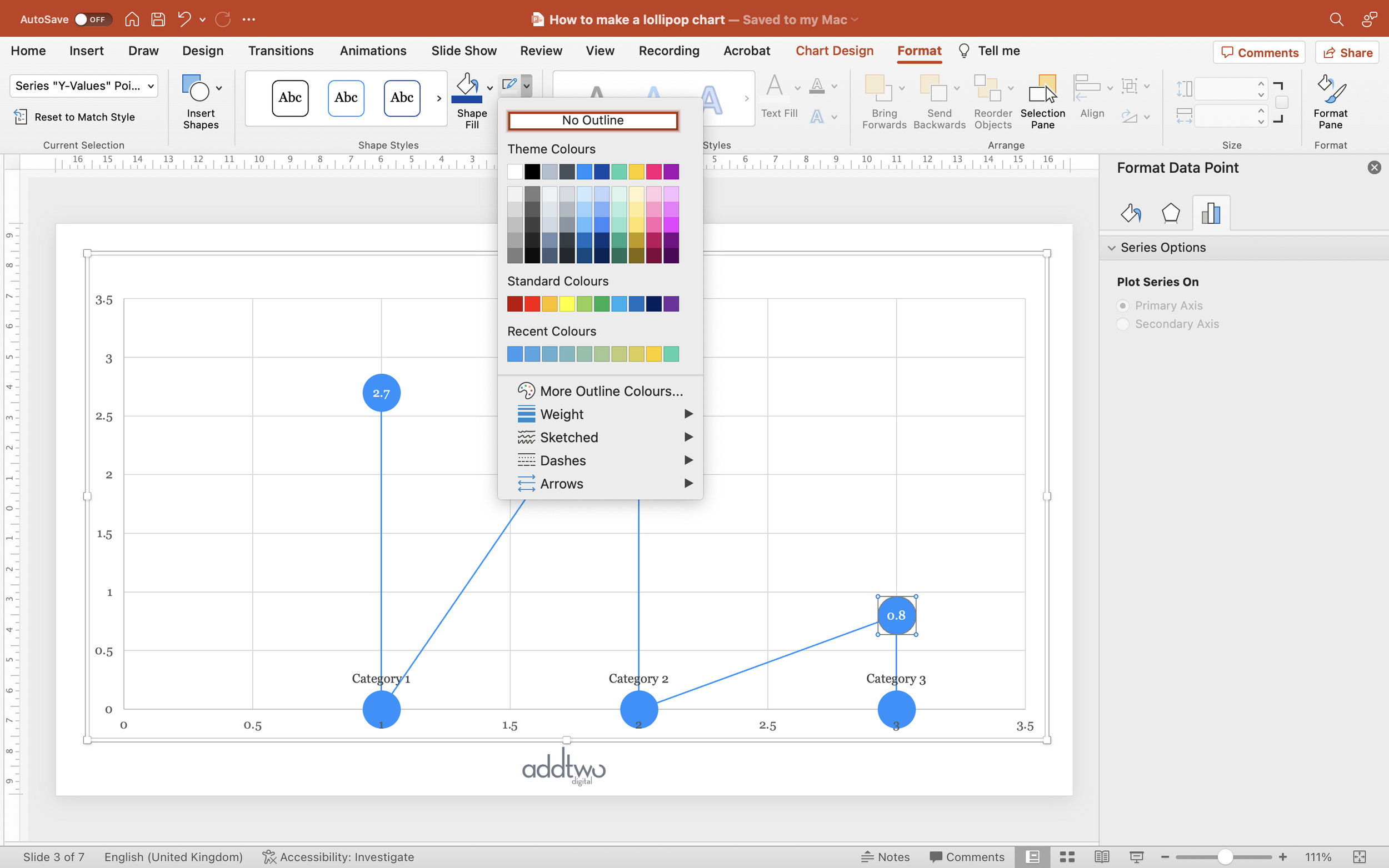
In the Format Pane, under the Line Options, select ‘No Line’, or, in the ribbon, under the Format tab, simply select ‘No Outline’.
This will delete the line coming from the previous data point, making this data point an element on its own.
Repeat this for the following data points.
TIP
This can also be achieved by making each data point a different data series.
PowerPoint assumes each column of y values is a different data series. By putting each pair of y values (the -1 & the value) in a new column in the spreadsheet, PowerPoint will plot them as separate data series.
This will mean that they’re no longer connected. However it will also mean that they are all different colours and will all have distinct settings for Marker size, line thickness, etc. When we come to edit these elements we will have to repeat any adjustments for each data series and for a big dataset that can get wearisome.
It depends on where you want your pain points to be, basically.
/TIP
Layout the x-axis
Now select the first of the category labels and in the Format Pane, under Label Position, select ‘Below’. Repeat this for all the category labels so that they now sit over the top of the x-axis labels.
Then select the first of the baseline Markers — the ones set to a y-value of ‘0’ and in the Marker Options in the Format Pane, set the Fill to ‘No Fill’.
Repeat this for all the baseline Markers.
We also need to even up that x-axis. Select the axis and open the Format Pane.
Under the Axis Options, set the Bounds so that they’re evenly spaced around the x-values. Since our example x-values are ‘1,2,3’, we’ll set the axis Minimum to be ‘0’ and the axis Maximum to be ‘4’.
While we’ve got the Axis Options open, set the Labels to ‘None’, as we don’t actually need them.
Style the chart
A few finishing touches. We don’t necessarily need a y-axis either, so you can delete that, if you like.
You can do this by selecting the axis and just hitting the ‘Delete’ key, or by turning it off in the Add Chart Element menu.
We can also get rid of all those gridlines.
The x-axis is still a bit cramped. We can give it more room by selecting the Plot Area of the chart (just click anywhere in the background of the chart, between the data points) and then clicking and dragging to make a little more space at the bottom.
So that’s how we make that in PowerPoint
Lollipop charts take a little extra work and finessing to get right in PowerPoint but they do give us a really useful alternative to column charts. They’re also really useful for showing change, given the impression of rising or falling that they give — like balloons. You can also always swap out the marker shape for an arrow for extra motion.
And, after all, William Cleveland, one of the most influential researchers in data vis, thought they were close to the perfect chart, so that’s got to be a recommendation, right?


