Pictograms are charts that visualise by repeating icons. Icons that represent the subject of the data are repeated in some kind of relationship to the values. It might be one icon per data point, or an icon might stand for 10, or 1,000 or a million.
They are extraordinarily useful charts, combining a great deal of the visual legibility of bar charts with the visual appeal of iconography with the simple ability to understand the data by counting icons.
[This tutorial assumes you’re reasonably au fait with PowerPoint and how it makes charts. If you feel you need a more indepth introduction, click here to find out more about the basics of the PowerPoint charting engine]
So, how do we make this in PowerPoint?
In this how-to, we’ll be using the default sample data PowerPoint gives you, so you can follow along without needing to download anything, but if you want to, click here for the dataset we used to make the example at the top, and a PowerPoint deck with that slide in.
What you’ll need
A standard bar chart
Iconography
Custom fills
How you do it
For once PowerPoint is here to help us out. The charting engine actually offers us the ability to repeat fills in relation to the data in the chart and there is now a stock library of iconography in PowerPoint. The two together means we can find an icon and then add it as a custom fill in a bar chart.
The details
Insert a chart
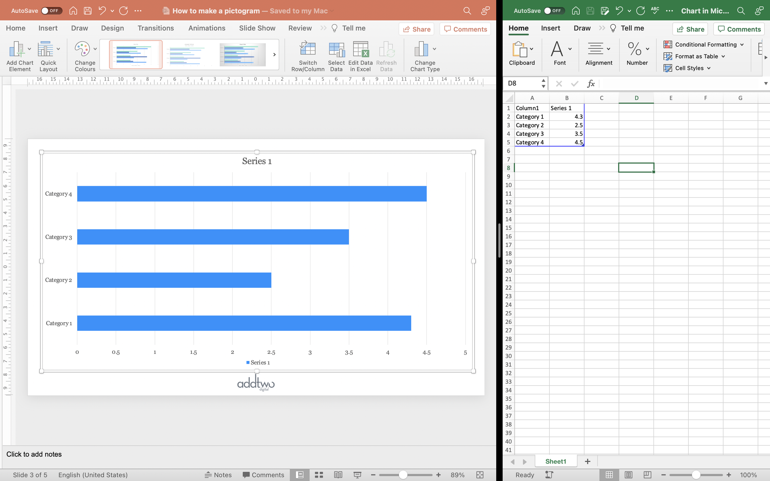
Add a standard clustered bar to the slide. You can find this under the Column chart options in the Insert Chart tools.
By default PowerPoint adds a chart filled with example data and also opens Excel to show that data in a spreadsheet.
We only need one data series for this chart, so we can delete the other columns.
That’s all we need to do with the data, so we can close that spreadsheet now.
Add an icon
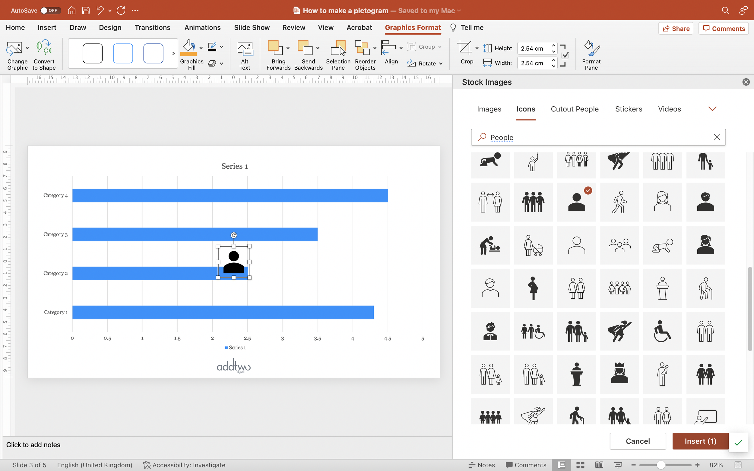
PowerPoint now comes with an icon library included. Under the Insert menu you will find a Stock Images option, or there is an Icons button in the Insert tab. Either will open the Stock Images panel.
There are actually multiple stock libraries now included: photography, video, illustration, even individual people and stickers. We want icons, however.
The icons are classified under general descriptions (Business, Nature, that sort of thing) and are available as solid and outlined versions. You can also just search for key terms.
The pioneers of the pictogram, the Isotype designers used beautiful, multi-coloured little illustrations in their charts, but we’re better off erring on the side of caution. Because we’re repeating icons, complex images can quickly get confusing and visually busy, distracting from the data.
Make sure the chart object on the slide is not selected (otherwise PowerPoint will insert the icon inside the chart object), find the icon you want to use, select it and choose ‘Insert’.
We can now close the icon library.
Use the icon in the chart
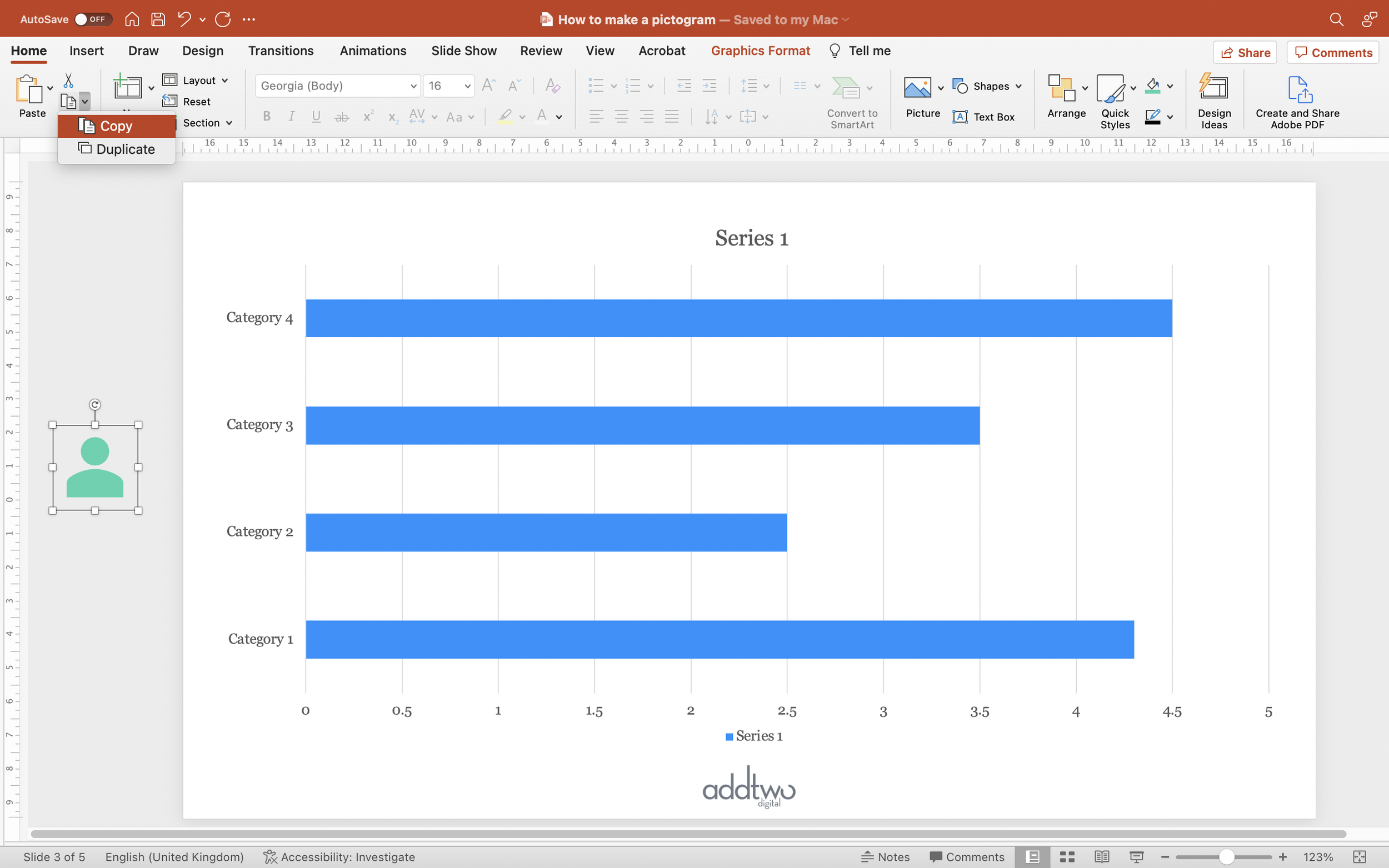
First, let’s get that icon out of the way. We can use the spaces outside of the slide to put things that we don’t want to be visible in presentation but which we still might want to keep around (designers will be used to this from the way that Artboards work in, say, Illustrator).
We can put the icon off the side of the slide because we’re just going to use it to fill the bars.
Set the fill colour of the icon if you need to.
Then copy it to the clipboard.
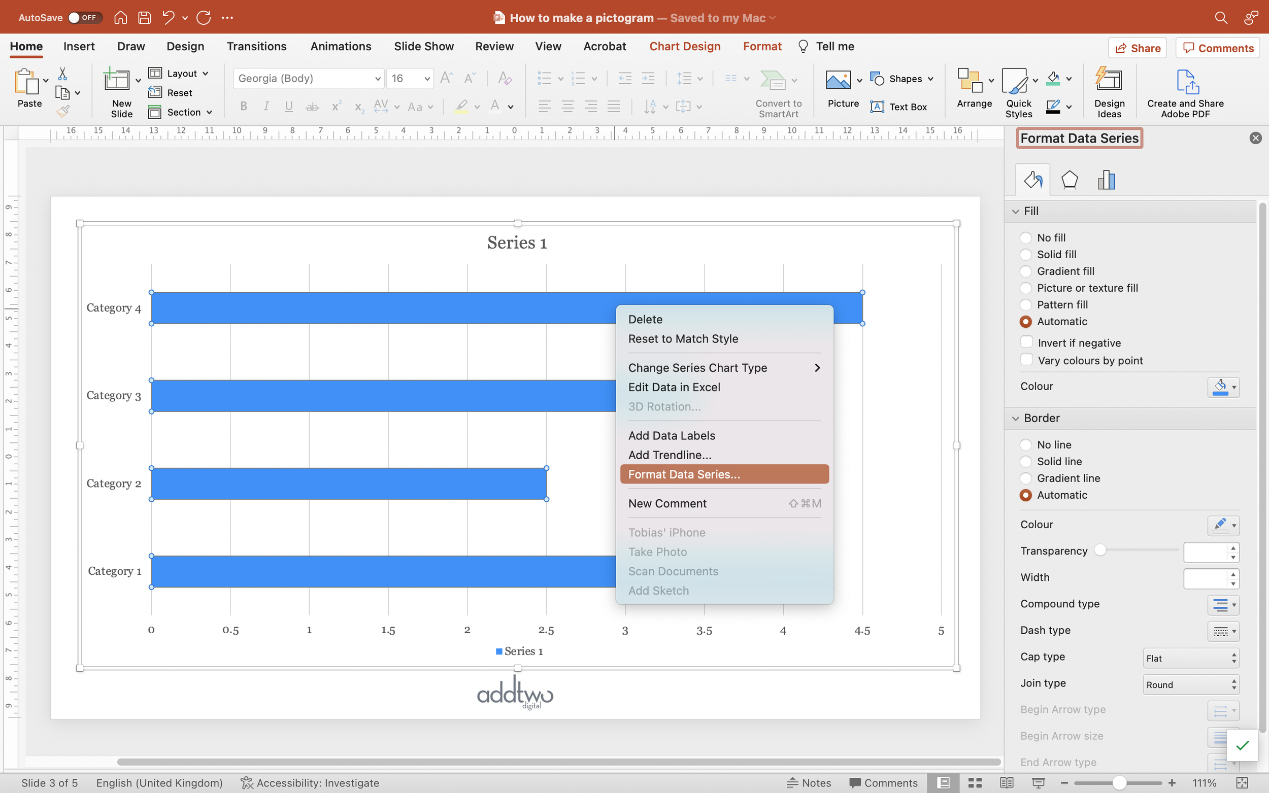
Now select the bars in the chart and open the Format pane (you can do this by right-clicking and selecting Format Data Series from the pop up menu).
In the Fill and Line options (the paint pot icon), set the Border to No line.
Then, under the Fill options select Picture of texture fill.
Under Picture options select Clipboard. This will fill each of the bars with the icon you just copied, only stretched out to fill the whole width of the bar.
Under the stretch options, select the ‘Stack and Scale with’ option. We can then set how many units in the data each icon represents. In this version we want a Units/Picture scale of 1, giving us a 1:1 relationship between icons and data.
Tweak chart layout
Everything still looks a little distorted, so we need to make some tweaks to the chart layout.
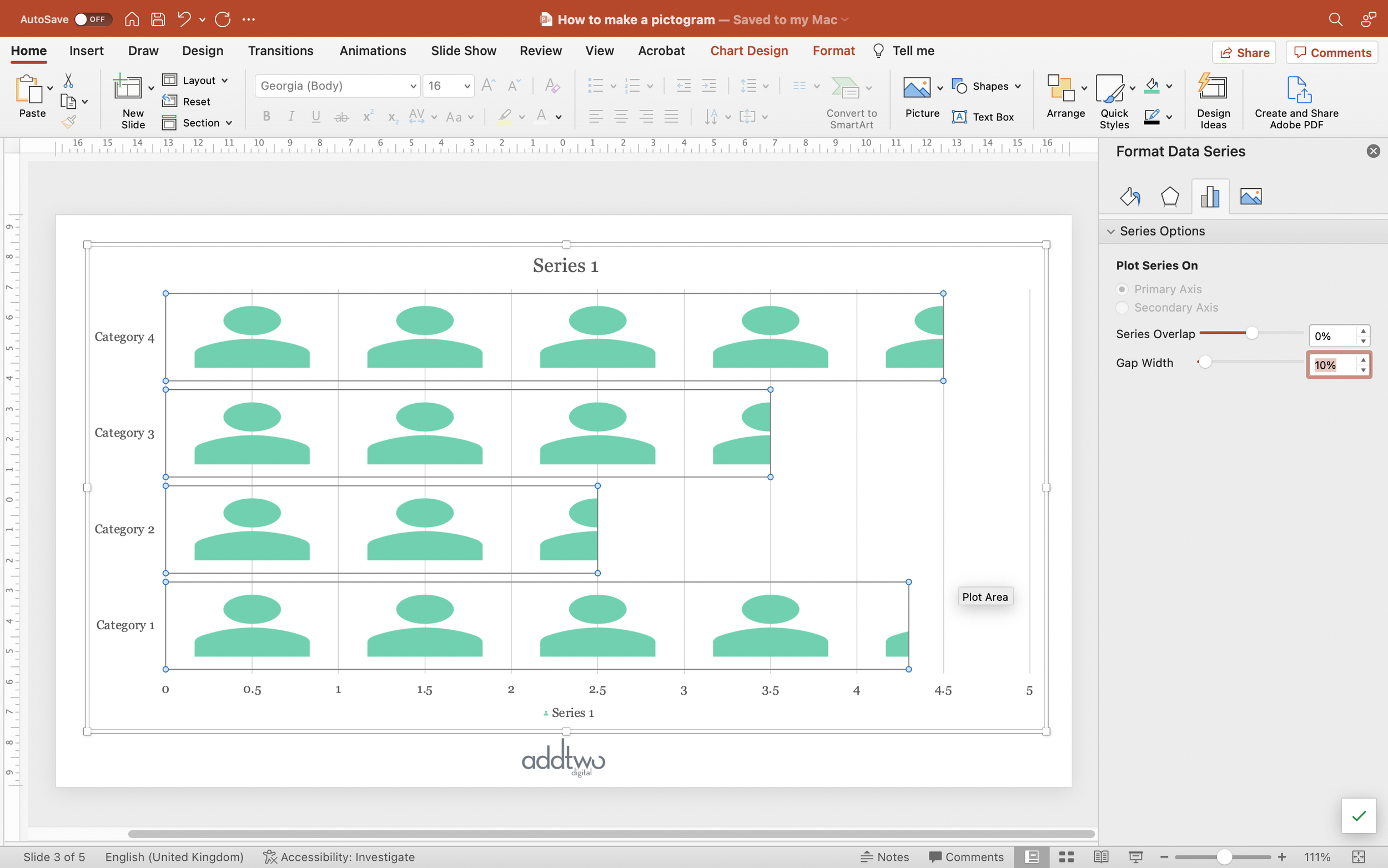
Under Series Options in the Format pane (right-click on the chart, select Format Data Series and then choose the little chart icon), bring the Gap Width down. You usually want to leave a little but it doesn’t have to be much.
We can also just adjust the width of the chart itself to get the icons to a state in which they look presentable.
Finish the chart
Once we have the icons in, we can treat our chart just like any other bar chart.
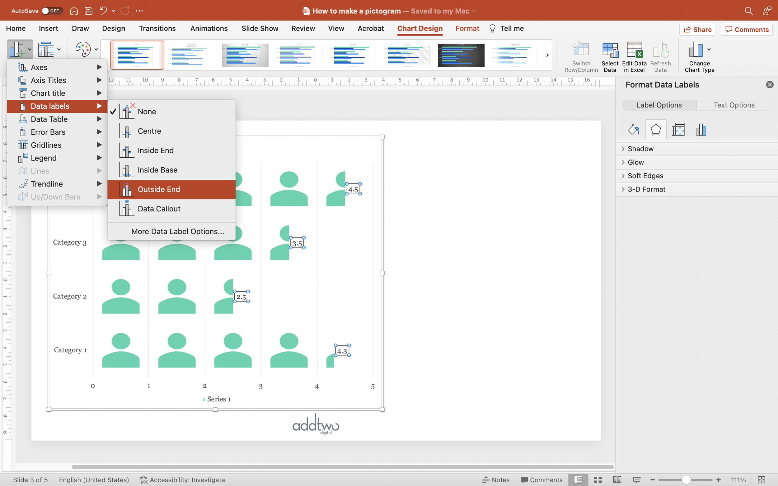
We can use the Add Chart Element options to add Data Labels.
We can also use it to remove elements we don’t need like Axes, Gridlines and the Legend.
So that’s how we make that in PowerPoint
We can also use multiple data series to create bars with different icons or, by setting the Serries Overlap, ‘total’ fills, showing unfilled or fainter icons.
Pictograms are great, but they have to be used with restraint — they’re very hard to pull off with multiple data series or large values — what they are invaluable for is replacing sized icons, which are awful and should never be used. NEVER. Hear me?
I’m serious.
Never.


