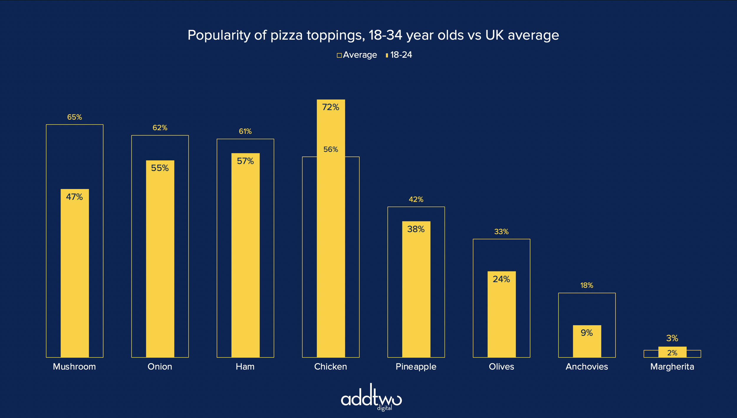
Overlaid columns are a great alternative to clustered bars. Overlaying columns is a useful way of comparing one main data series to a secondary one — an average, previous time period, contextual comparison etc.
They allow us to foreground one data set over another, making them easier to read than clustered columns and helping us show the information hierarchy clearly: one data set before another.
[This tutorial assumes you’re reasonably au fait with PowerPoint and how it makes charts. If you feel you need a more indepth introduction, click here to find out more about the basics of the PowerPoint charting engine]
So, how do we make this in PowerPoint?
In this how-to, we’ll be using the default sample data PowerPoint gives you, so you can follow along without needing to download anything, but if you want to, click here for the dataset we used to make the example at the top, and a PowerPoint deck with that slide in.
What you’ll need
Clustered column chart
Custom shape fills
Chart setting adjustments
How you do it
Short version: we’re going to make a standard clustered columns with two data series, then use a custom fill to make the key column narrower than the comparison. This means we can overlay the columns using the Series Overlap settings and so set one column in front of the other while keeping both visible.
The details
Create the chart
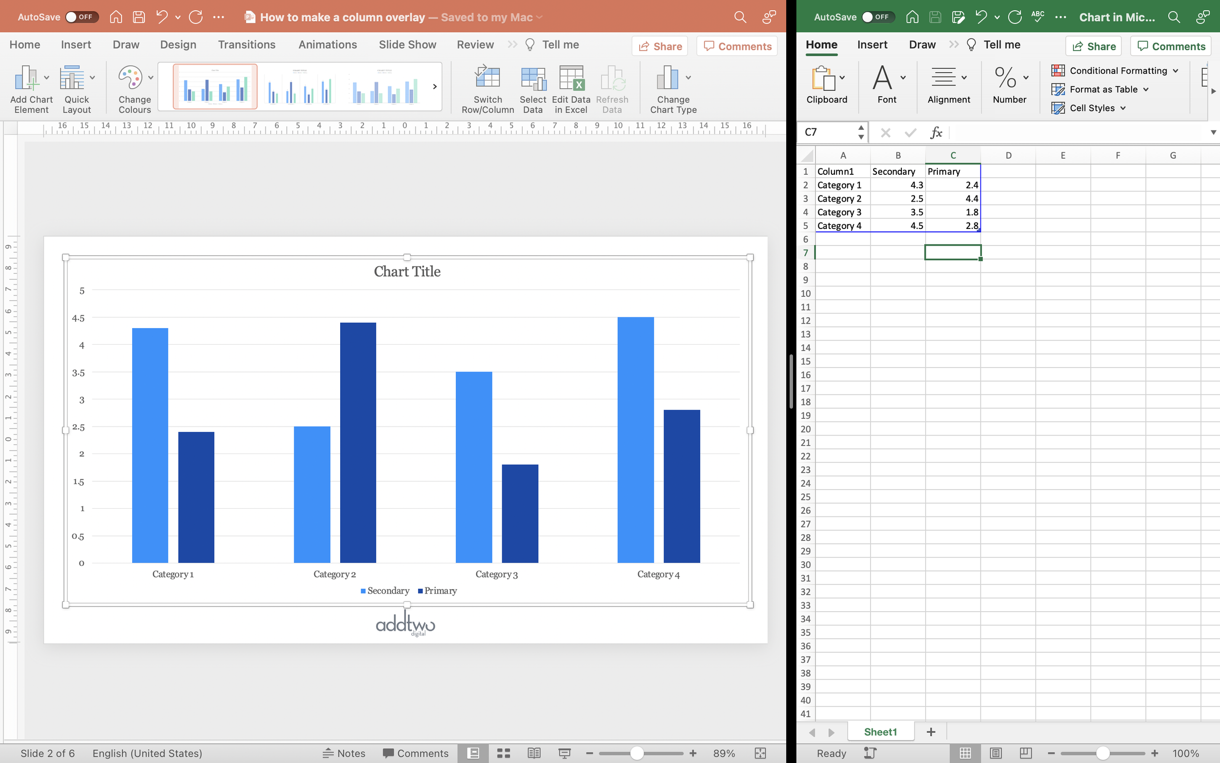
We’re going to insert a standard column chart. PowerPoint creates clustered columns by default, which is fine, because that’s what we want.
We only want two data series, though, so we’ll adjust the spreadsheet so there’s only two columns of data.
The one thing we want to make sure is that the key data — the series we want to highlight — is the final column in the spreadsheet. PowerPoint orders the layering of chart elements by placement in the spreadsheet — the last column of data will be on top. For this chart to work, we’re going to want the key data to be on top of the secondary series.
We can close the spreadsheet now as we’re not going to be doing any more with that data.
Style the columns
Now we’re going to give the main column a custom fill so we can overlay it and still have the column behind visible.
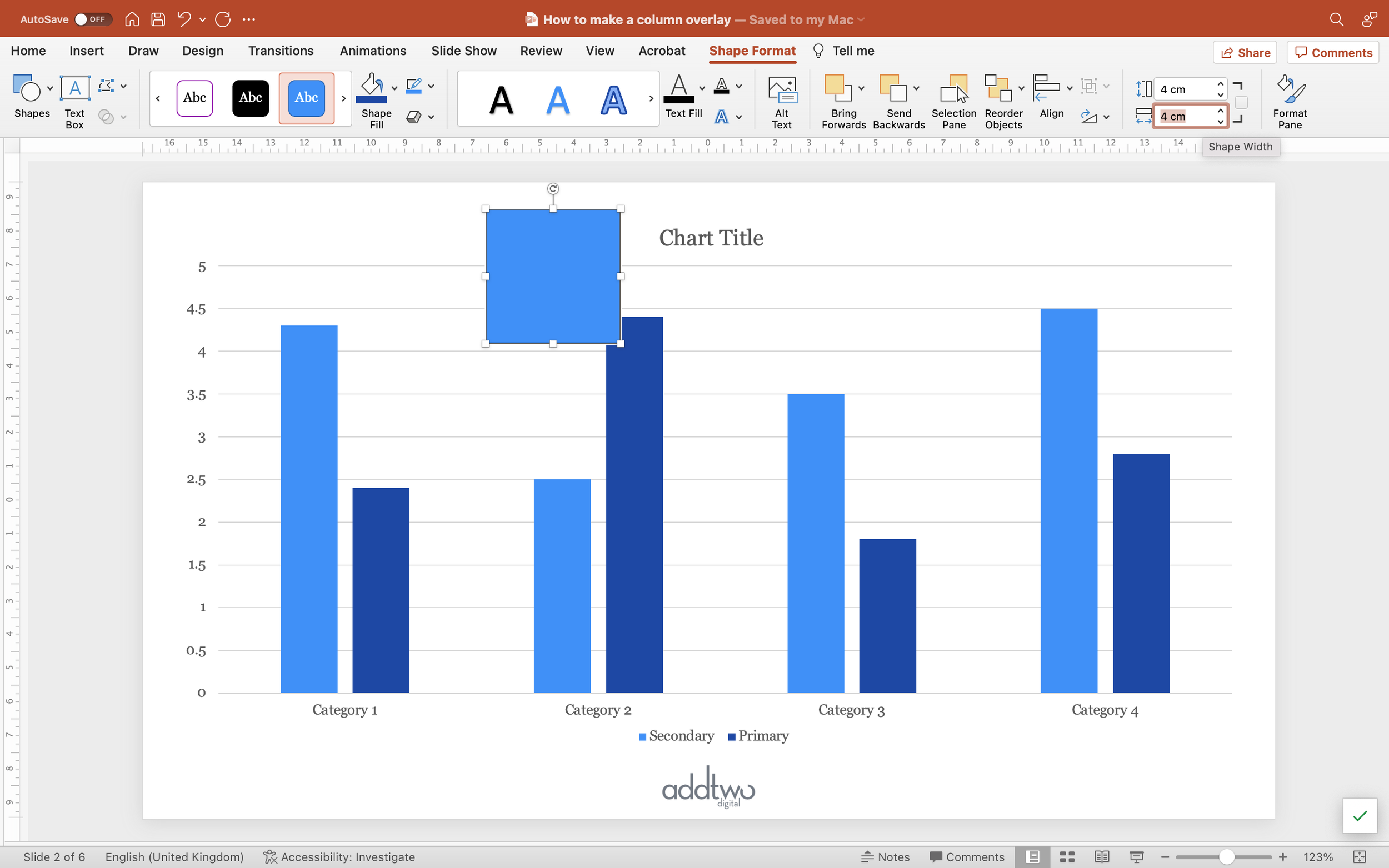
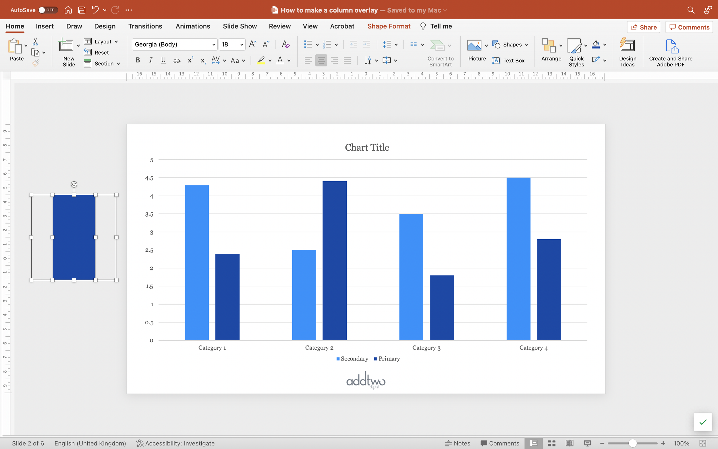
Add a square shape to the slide. Make sure it’s properly square by setting the width and height in the Shape Format tools. 6cm x 6cm allows us to divide by halves and thirds easily, so that’s something.
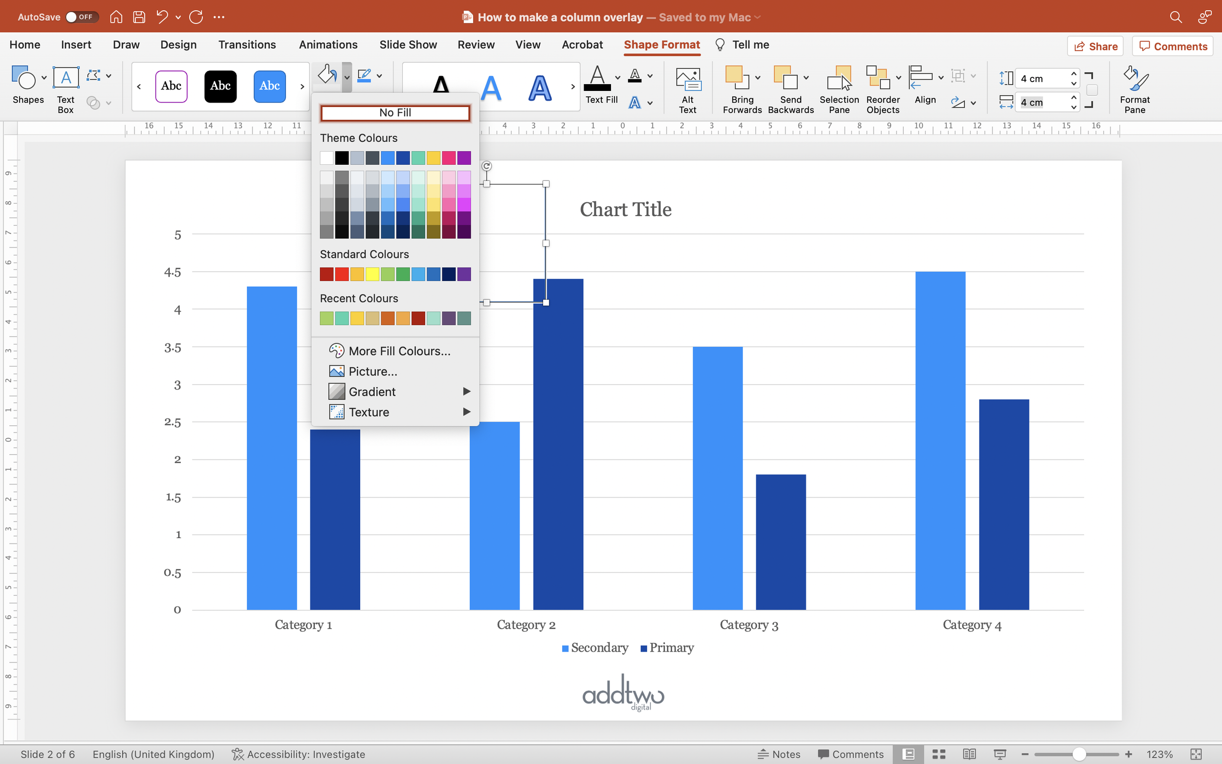
Set the Fill colour of the square to ‘No Fill’. This makes the Fill transparent. You can leave the border on for the time being though — it makes things easier to find.
Duplicate the square.
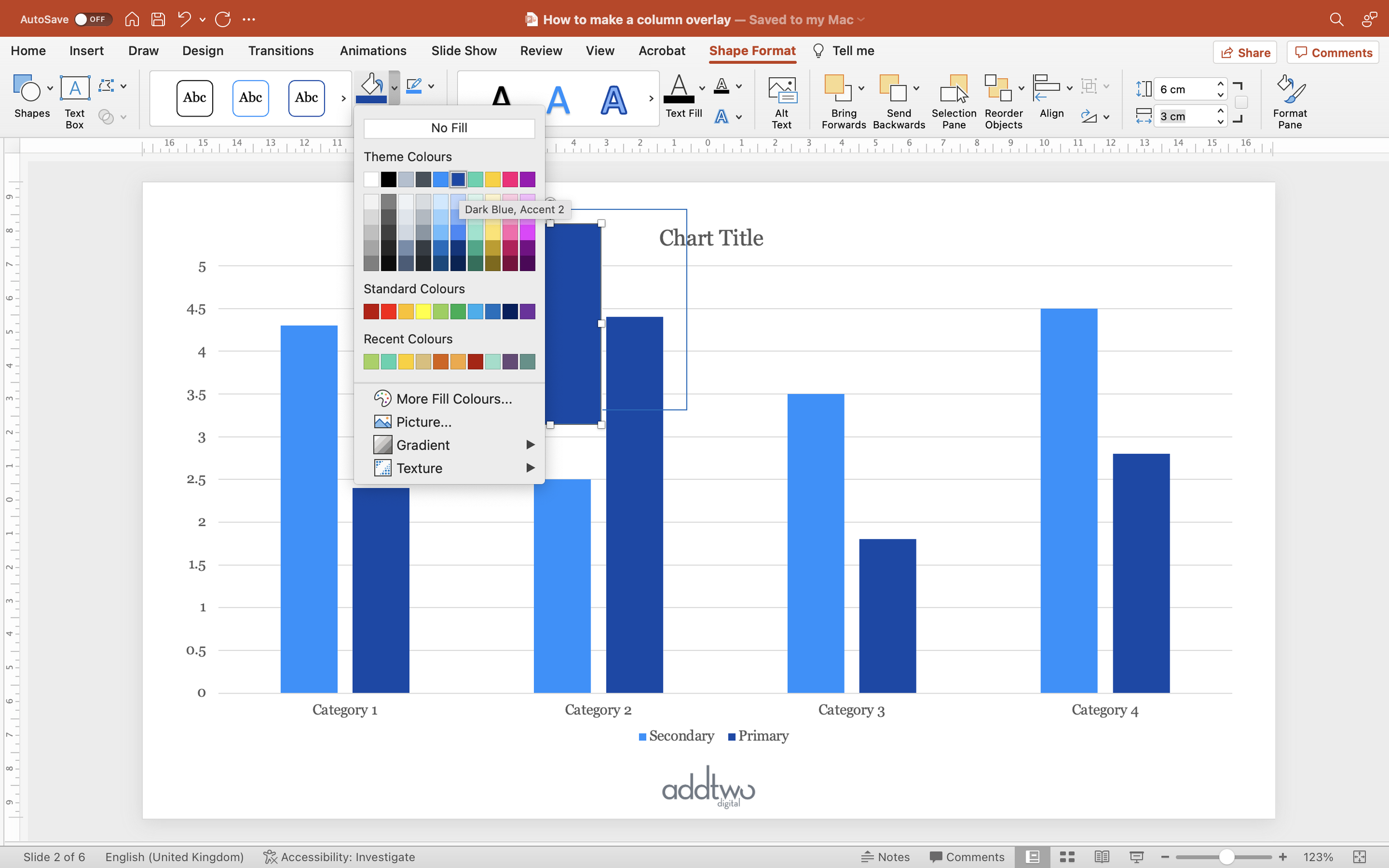
Set the duplicate to be of a narrower width than the square. Half width is a good start.
Give this new rectangle a fill colour that will stand out against the other column in the chart.
Now select both the rectangle and the square (shift-click will allow you to select them both) and centre the rectangle against the square both vertically and horizontally.
With them both selected set their outlines to No Outline. This will make the square entirely transparent, but still there as a notional shape, with the rectangle as a filled strip down the middle of it.
Now copy them both (Ctrl-C with them both selected will work).
TIP
To be able to see what you’re doing, try moving the shapes off the edge of the slide.
The shapes will still be there but they’ll be out of the way of your chart and they won’t show up in present mode.
(The slide works like an artboard in Illustrator, if you’re used to such things)
/TIP
Now select the main data series in the chart.
You now either open the Format Pane or right-click and select Format Data Series. Either way you want to open the Format Data Series tools and find the Fill options in the panel.
Select Picture or Texture Fill and for Picture Source select Clipboard. This will paste in as a Fill in all of the columns the combined square and rectangle we just copied.
Make sure that the Picture options are set to Stretch (PowerPoint should do this by default).
You can see, hopefully, that this gives columns that are transparent at the sides with a filled strip up the middle — a thinner column, effectively.
Overlay the columns
Now we’re going to overlay this thinner column on top of the full width one.
In the Format Data Series pane, got to the Series Options tab (it has a little chart as an icon).
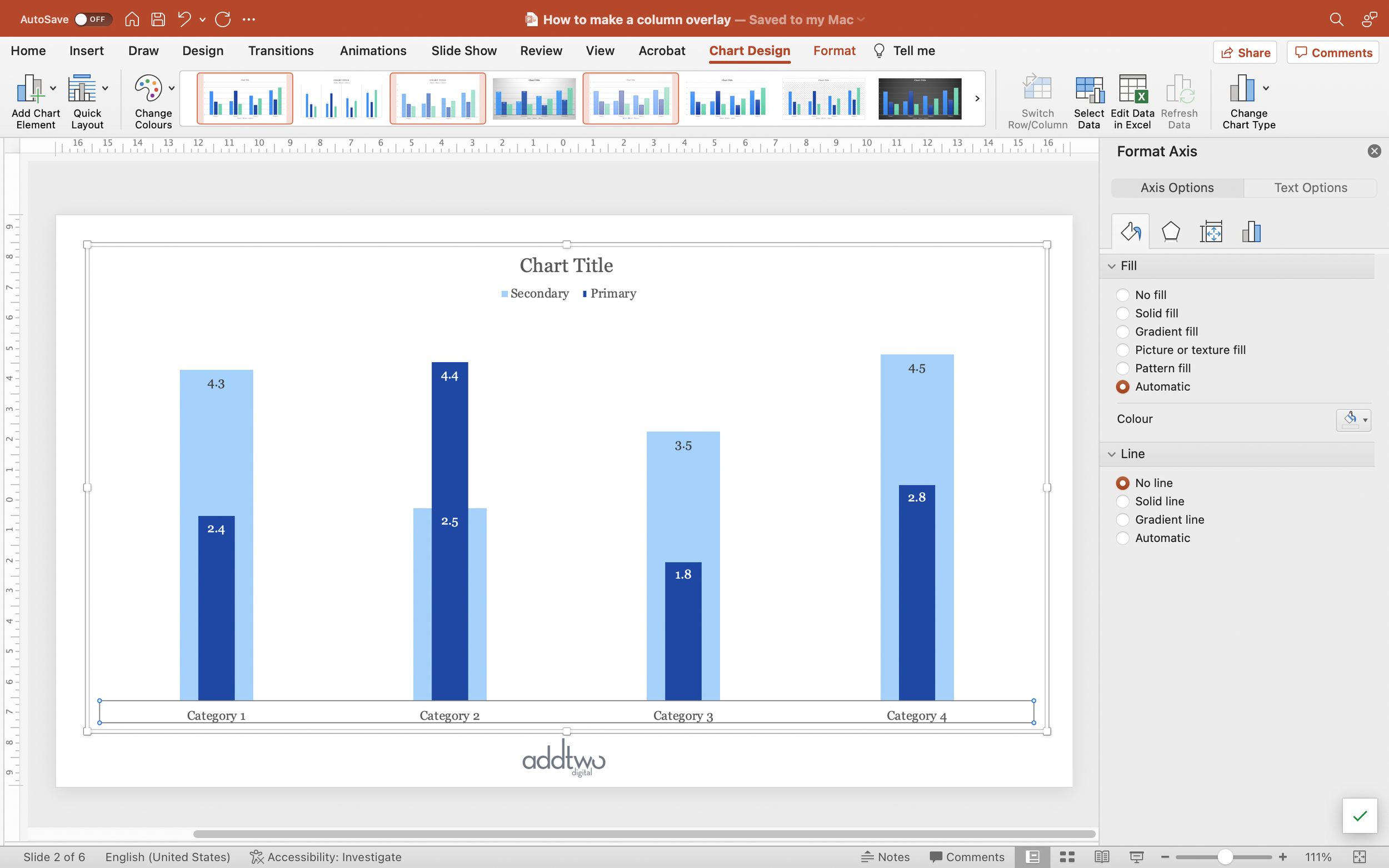
Set the Series Overlap to 100%. This puts the main data set over the top of the secondary one, because we ensured that it was the last column in the spreadsheet, and so ‘at the front’ in the layer order.
We might want to make the secondary data series a little lighter, just to make sure it isn’t overwhelming our main column.
Style the chart
Let’s tidy up a bit.
We can put the legend at the top, so it’s nice and obvious.
For this chart, since we don’t have many columns, we could label them directly.
Select the main data series and then, under Chart Design > Add Chart Element, select Data Labels to be Inside End.
Set the label colour to be appropriately contrasting against the column fill.
Do the same for the secondary data set.
Some labels we’re going to have to edit individually, because of the overlay , which might mean they’re going to end up against different coloured background with the overlay, or be uncomfortably close together.
You can select a single label by selecting the whole set of labels (clicking any of them will do that) and then clicking on the individual label you want to edit.
With the labels we probably don’t need a y-axis or gridlines, so we can delete them. You can just select them and hit delete or use the Add Chart Element tools to Remove Chart Elements, too.
I’m also going to remove the x-axis line because I don’t think we need that with column charts either. We can see where the axis is perfectly well. You can do this by finding the Format Axis tools (right click on the axis to see the option) and just selecting ‘No Line’ in the Fill & Line options.
As ever the secret is a useful chart is as much removing what is unnecessary as it is showing what is necessary.
So that’s how we make that in PowerPoint
Overlaid columns are far more legible and clear than clustered bars when it comes to that act of comparison, but they still contain a density of information that means they have to be used with restraint.
Obviously they only work with two data series and those data series aren’t presented equally — one is of a different quality to the other — so we need to be definite about information hierarchy and what’s most important in our data set.
We also need to be careful with the amount of other visual elements: labels, axes, etc and keep the visuals as simple and direct as possible.
But then, that’s what we’re always doing, isn’t it?
ISN’T IT?


