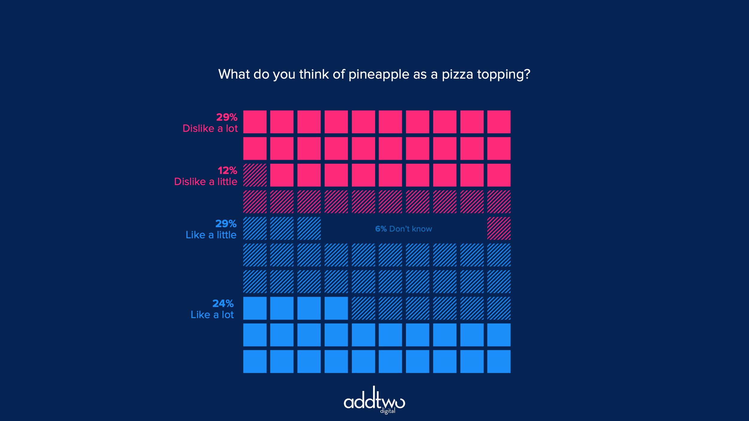
Waffle charts are a useful alternative to pie charts for composition data. We ten to use them for single values - one percentage out of 100% - but, like, pie charts, they can also be used to multiple series (although, again like pie charts, not too many)
There are multiple ways to make waffle charts in PowerPoint by using columns, stacked columns or scatter plots. In this case we’re going to make a multiple series waffle using a clustered bar chart - although you could make one using any of the other methods (with a little jiggery pokery)
So, how do we make this in PowerPoint?
In this how-to, we’ll be using the default sample data PowerPoint gives you, so you can follow along without needing to download anything, but if you want to, you can find the dataset we used to make the example at the top, and a PowerPoint deck with that slide in, and other examples, here:
https://docs.google.com/presentation/d/1HQ2oFKbMJAiKdeTY8v6mxFOL5OHGMYyt?rtpof=true&usp=drive_fs
What you’ll need
Clustered column chart
Data manipulation
Excel formulas
Design tweaks
Custom labelling
How you do it
We’re going to use the Stack and scale options for custom fills to make ten columns of ten squares: a waffle of 100 blocks. We’ll also use a quirk of the clustered column where, if you set the Series Overlap to a positive number, PowerPoint will stack columns up in front of each other, obscuring the columns behind. This means we can make columns for each of our data series and then arrange them one in front of another to make a grid.
Details
Insert the chart
Add a standard Clustered bar to the slide. This is the default chart in PowerPoint, the first in the menu when you click on Chart in the Insert menu.
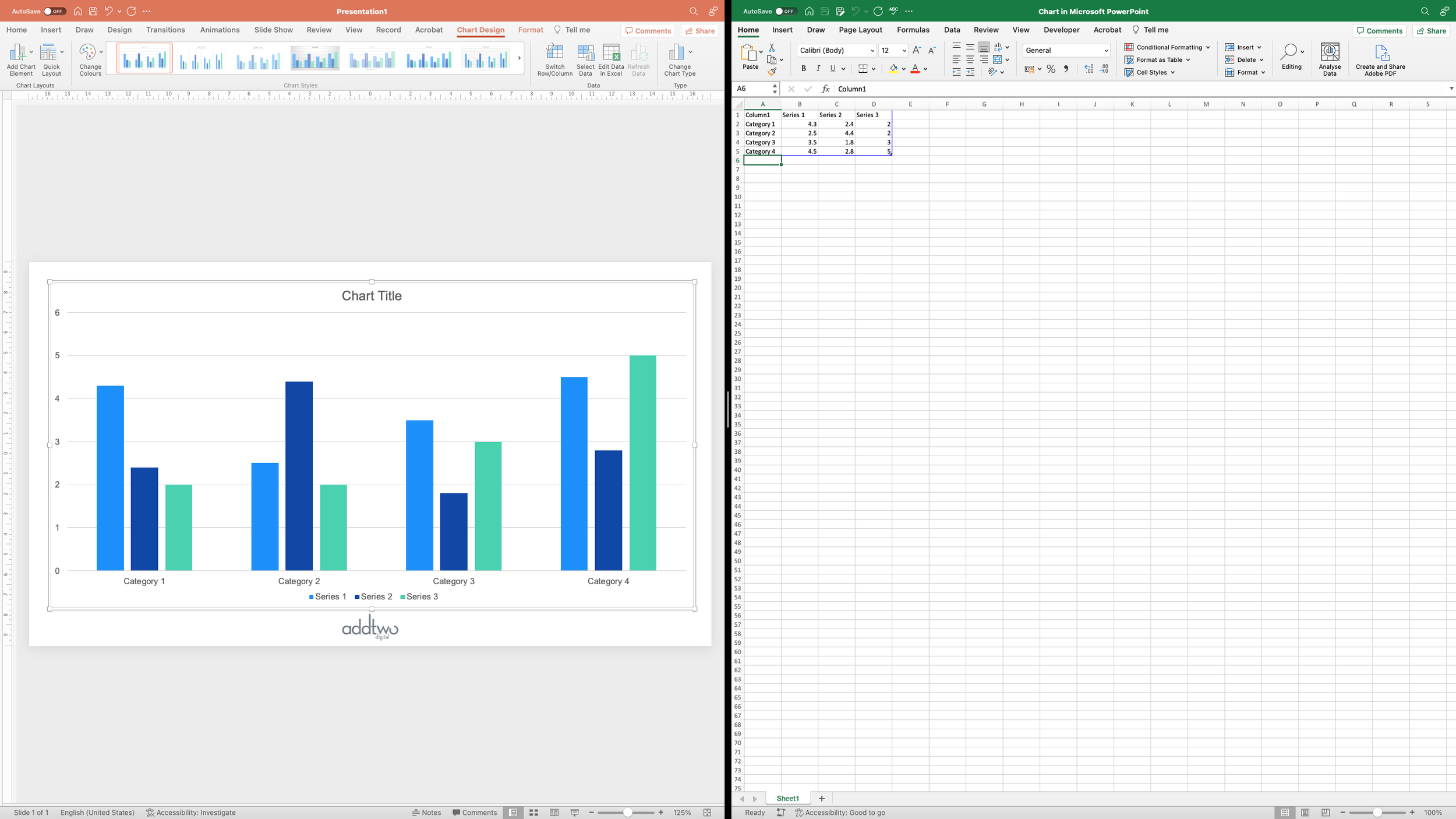
PowerPoint will create a dummy chart and open Excel to show the data behind that chart.
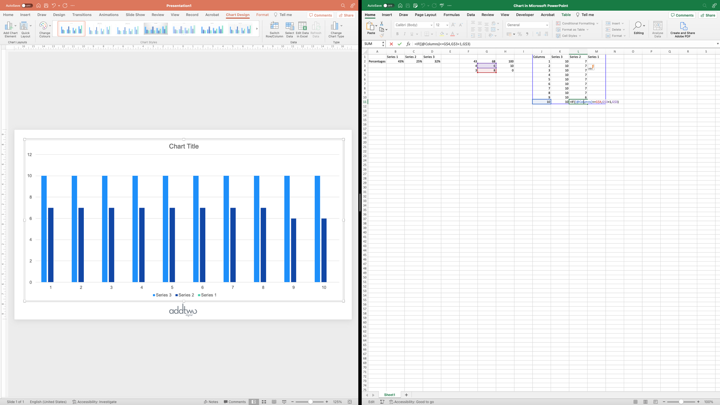
This helps us understand the structure of the data that the chart expects. Each Row is a cluster of columns, each Column, a data series. To create our grid, we’re going to need 10 clusters of columns, and we’re going to have 3 data series.
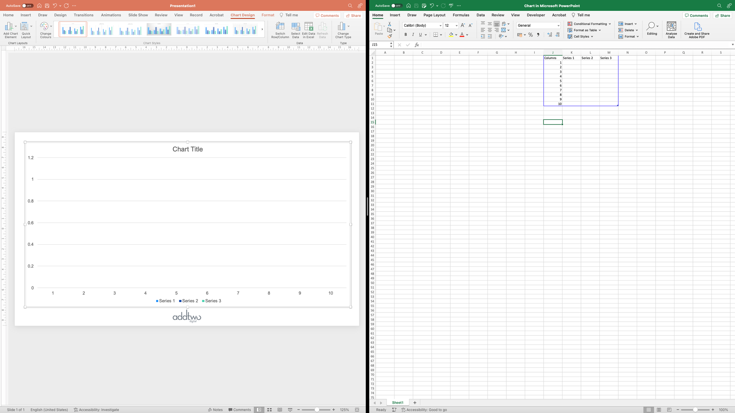
Let’s delete the dummy data and lay out our Rows and Columns.
However, the data we’re going to be putting in those cells is going to be generated by formulas based on the actual percentages, so let’s shift our cells out of the way to make room for our values and our calculations.
PowerPoint only visualises the data within the blue frame and will ignore everything else, but the rest of the sheet still behaves like a conventional Excel document, so we can add in numbers, formulas, anything we might ordinarily have in a spreadsheet.
Prepare the data
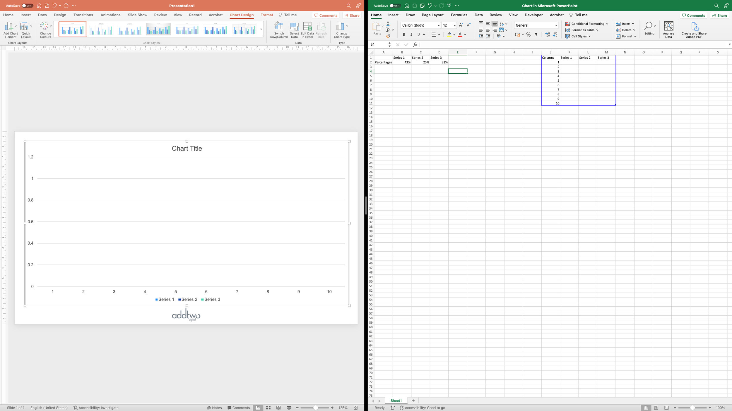
To start with, we’re going to drop in our dataset: three percentages that add up to 100%.
But we’re going to have to perform various calculations on these numbers to use them in our chart.
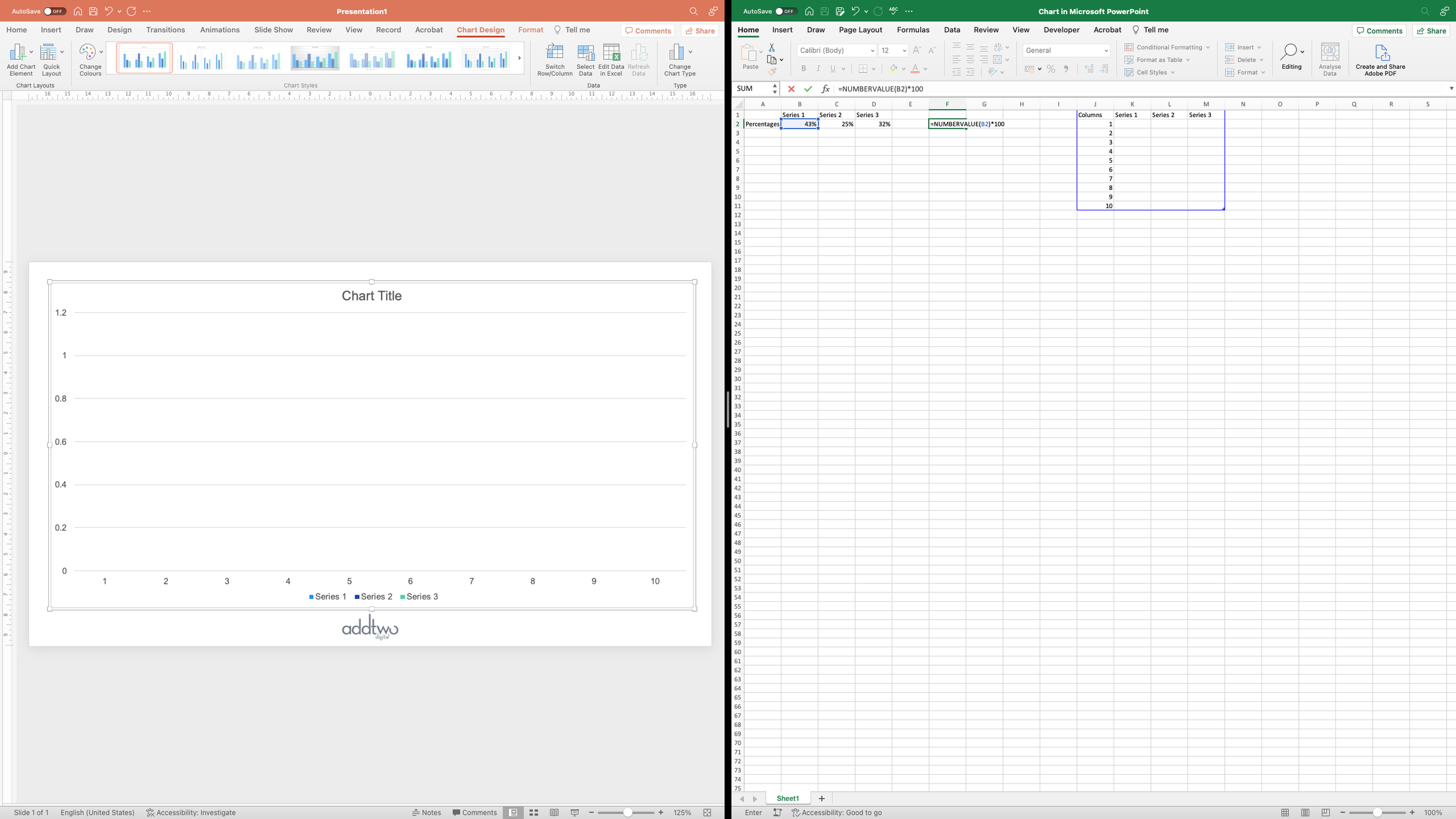
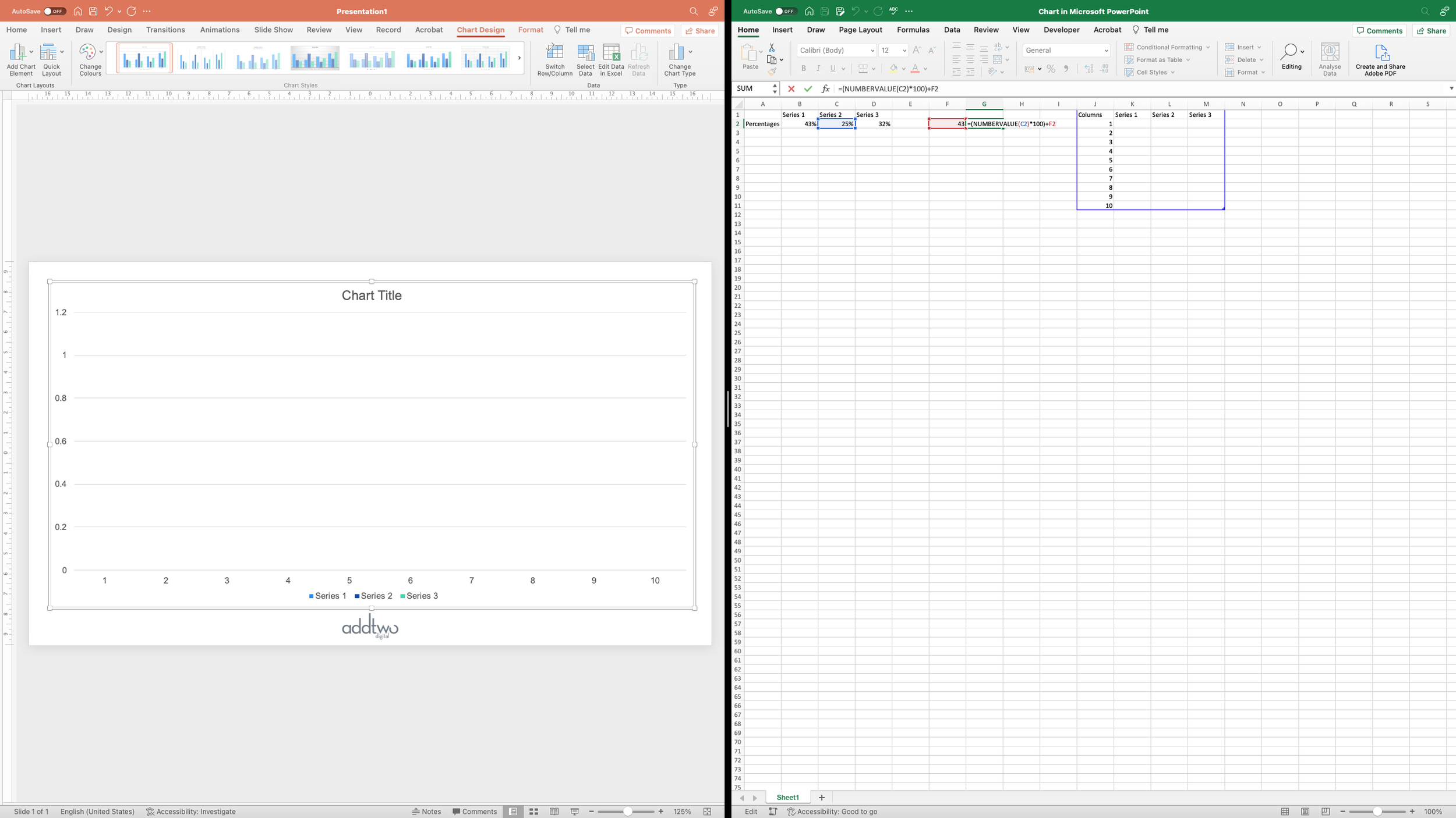
The first thing is, in fact, to turn them into numbers rather than percentages. When Excel formats a number as a percentage it treats it as a number between 0 and 1, with 1 equalling 100%. So, as far as most calculations we might do in Excel are concerned, that 43% is, in fact, 0.43. To make everything a little more comprehensible, we’re going to turn it into a number by multiplying it by 100. This means reformatting it from being a percentage first, which we can do using the NUMBERVALUE() formula. So our formula is going to look something like this:
=NUMBERVALUE(B2)*100However, for our other values, we want to do something slightly different. To make our grid, we’re going to make three series of columns overlaid on top of each other. This means our 25% column is going to be behind our 43% column. We actually want it to be 43 + 25 = 68% high, because the bottom 45% will be covered by the first column, leaving just 25% visible.
So our formula for the next value will be something more like:
=(NUMBERVALUE(C2)*100)+F2And then we’ll do the same for our final value, giving us values of 43, 68 and, of course, 100.
However, we’re not doing these values as single columns, we’re splitting them up over then columns. We can’t just divide the values by 10, though. We want to create a grid of 100 blocks. We don’t want to show 0.3 of a block, we want to show 43 by showing 43 individual, whole blocks. Split across ten columns that would mean ten columns of 4 blocks, giving us 40, and then an extra block on three of those columns to give us 43. In other words, because we start from the bottom left and go left to right, three columns of 5 blocks and seven more of four.
So we need to calculate how many ‘10s’ we have in our value, and then how many extra blocks we have to add on to that.
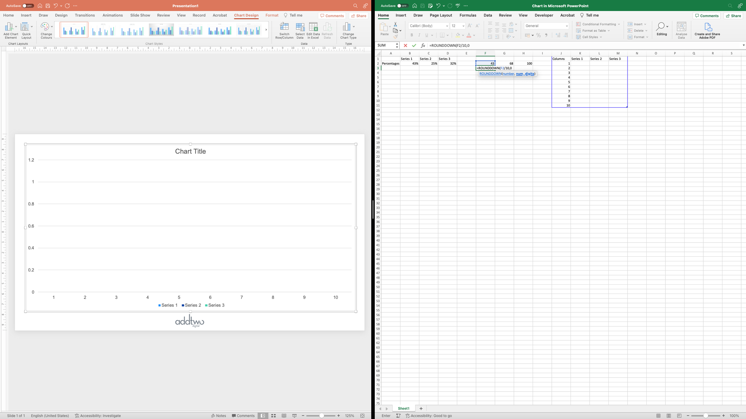
This, fortunately, is easy. First of all, we’re going to divide the value by 10 and round down to the nearest whole number, using the ROUNDDOWN() Excel function:
=ROUNDDOWN(F2/10,0)That trailing zero just tells the formula to return whole numbers. Then we’re going to repeat that for all our values
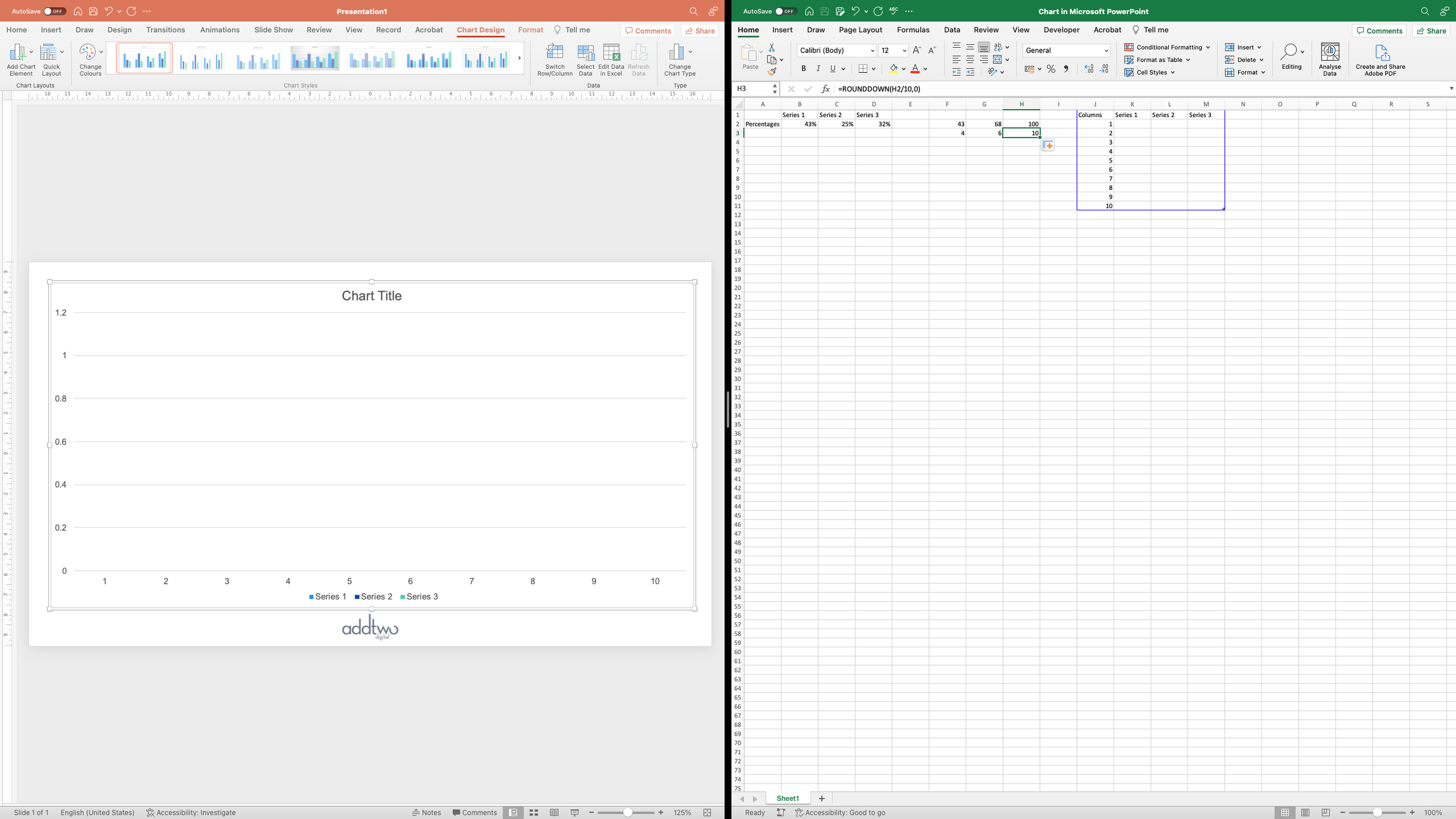
The next part is to figure out how many extra blocks we’re going to have to add, basically the remainder of the previous calculation, which we can find using the MOD() function:
=MOD(F2,10)And again repeat that for each of the remaining values
Finally, having done these calculations, we can use the values we’re derived to plot our chart.
Calculate the values
What we’re doing is calculating the individual values for ten columns for each data series. When rendered, each column will be filled with a number of blocks, a number in proportion to the underlying value. A column of value 4 will be filled with 4 blocks, for instance.
For our value of 43, we have calculated a minimum value of 4. Ten columns of value 4 will give us, in the end, 40 blocks. We need to add another 3 blocks to that total to give us our 43 blocks. That means we need 3 columns of value 5, which will give us 3 extra blocks in a row.
Each row in the dataset is a column in our chart, so what we can do is to test whether the current row we’re looking at is below or equals the remainder we’ve calculated. If it does, then we can add 1 to its value, to get our missing 3.
To express that as a formula, in this case: IF(This row <= 3), THEN (Value=4+1), ELSE (Value=4)
Because we’ve numbered our rows in the Columns column in the dataset, we can use that number to test - alternatively we could use the Excel ROW() function to find the row number (although we’d have to use ROW()-1, because our first row is our headers).
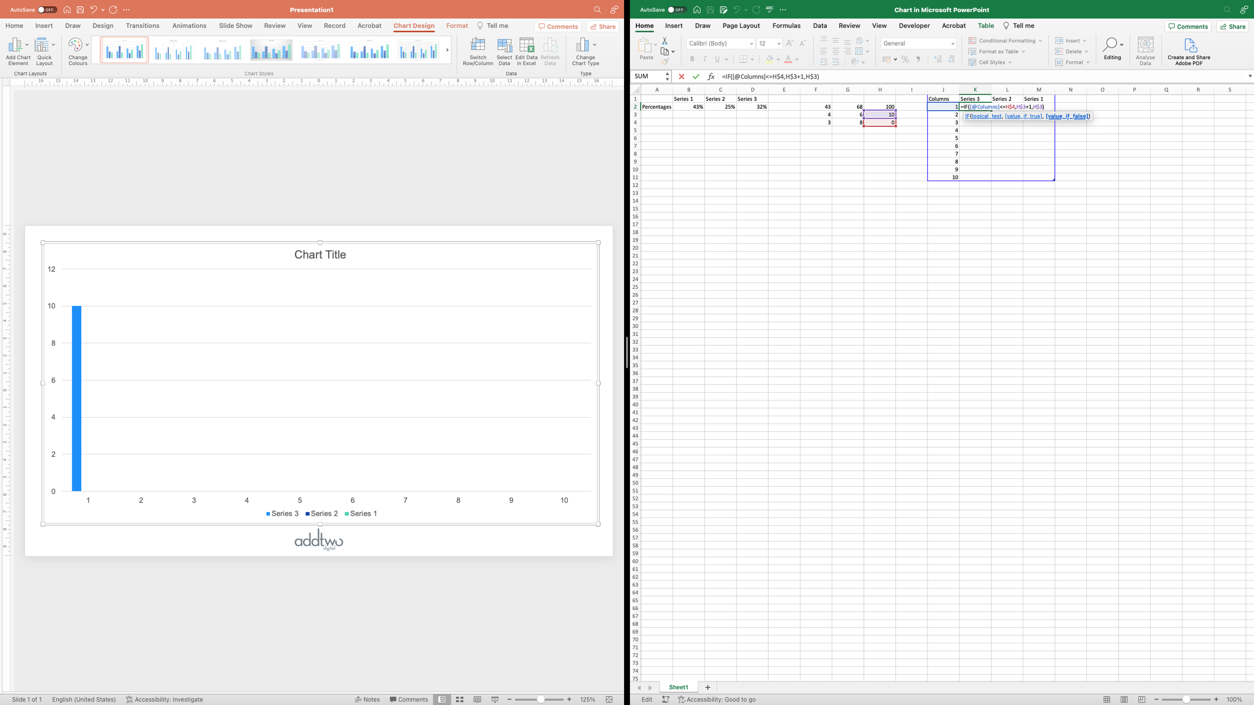
This gives us an Excel function something like this:
=IF(J1<=F4,F3+1,F3)However, because of how PowerPoint renders column charts, we have to start with the last data series, which would give us something like:
=IF(J1<=H4,H3+1,H4)Because that final value is 100, that just gives us 10 columns of value 10 - which is what we need.
The next data series shows us a little better how the calculations work:
And we repeat that formula for all our data series:
And we’re finally done with the data and can close the spreadsheet (for the moment)
Layout the chart
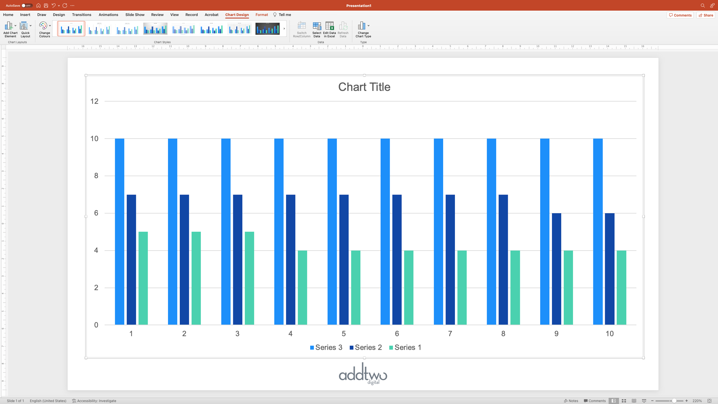
We now have a clustered column with three data series across ten columns
We want to turn this into a ten by ten grid of blocks, stacked up to show our different data values.
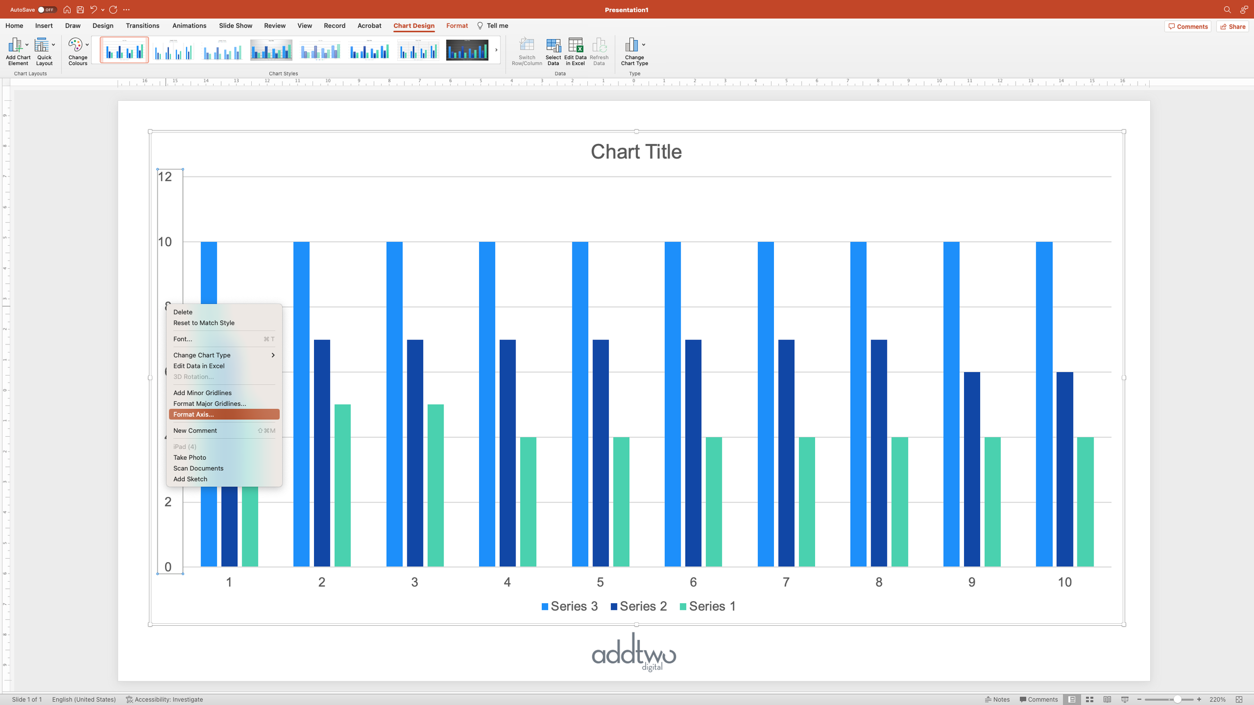
Let’s start by formatting our axes. Open the Format Pane - you can do this several ways, although the easiest is probably to right-click on the y-axis and select ‘Format Axis’
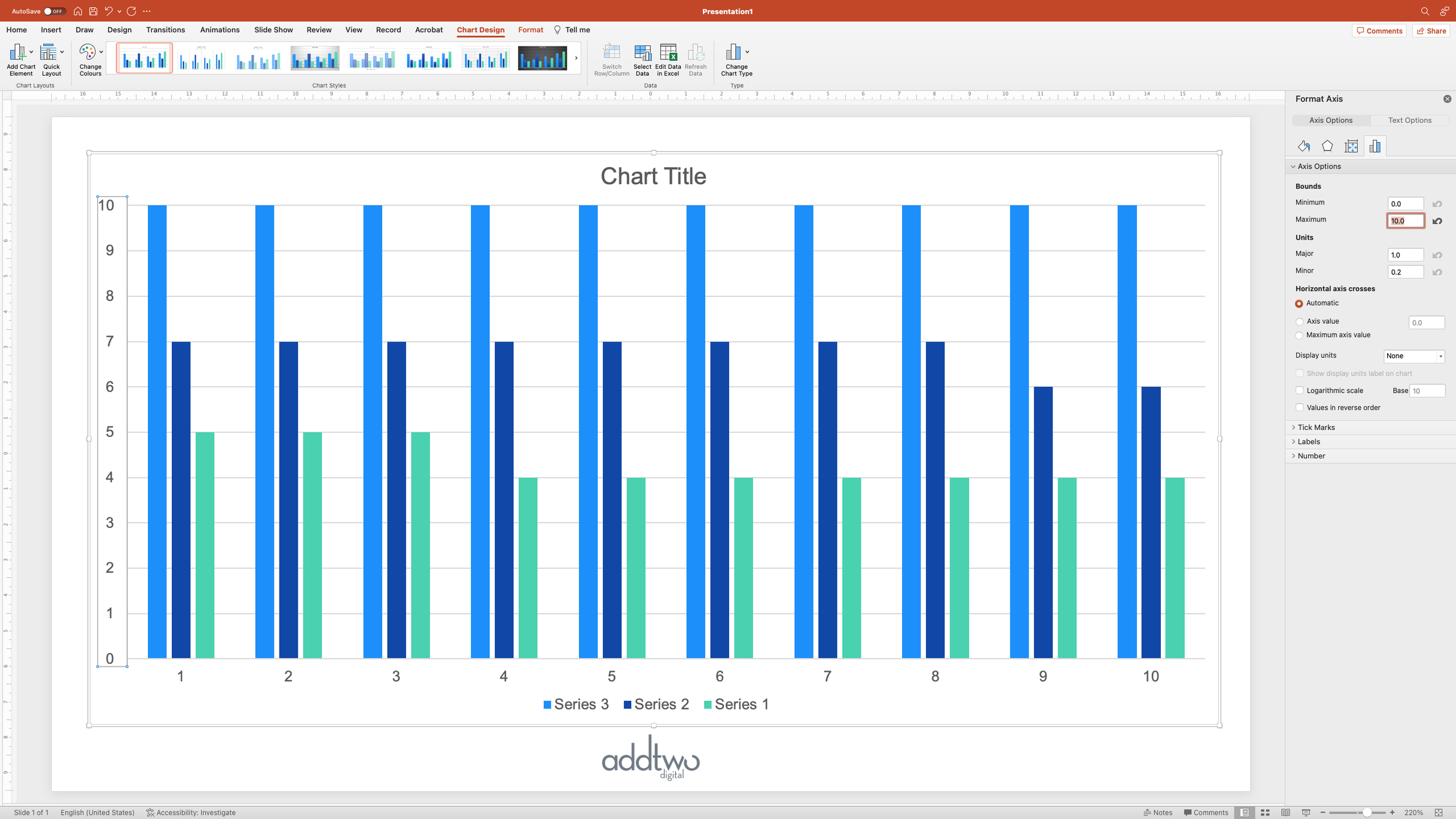
By default, PowerPoint adds a little give to its axes, so that y-axis extends up to 12. We don’t need that, so under the Axis Options, we can set the Upper Bound to 10.
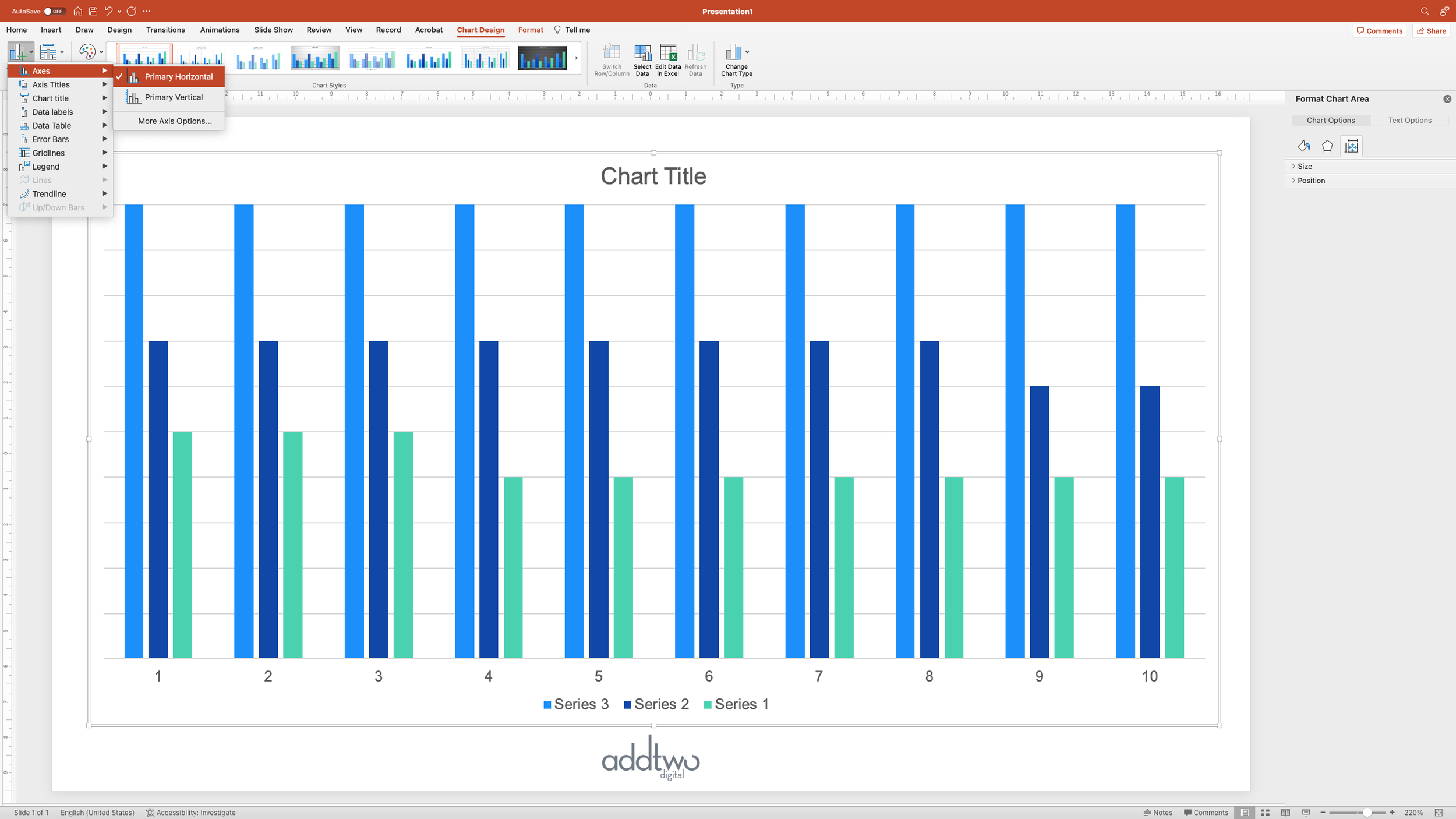
Then we can actually remove the axes, since we’ve manipulated the data to make our chart and they’re not telling us anything useful anymore. We can do this by unselecting them in the Add Chart Element menu.
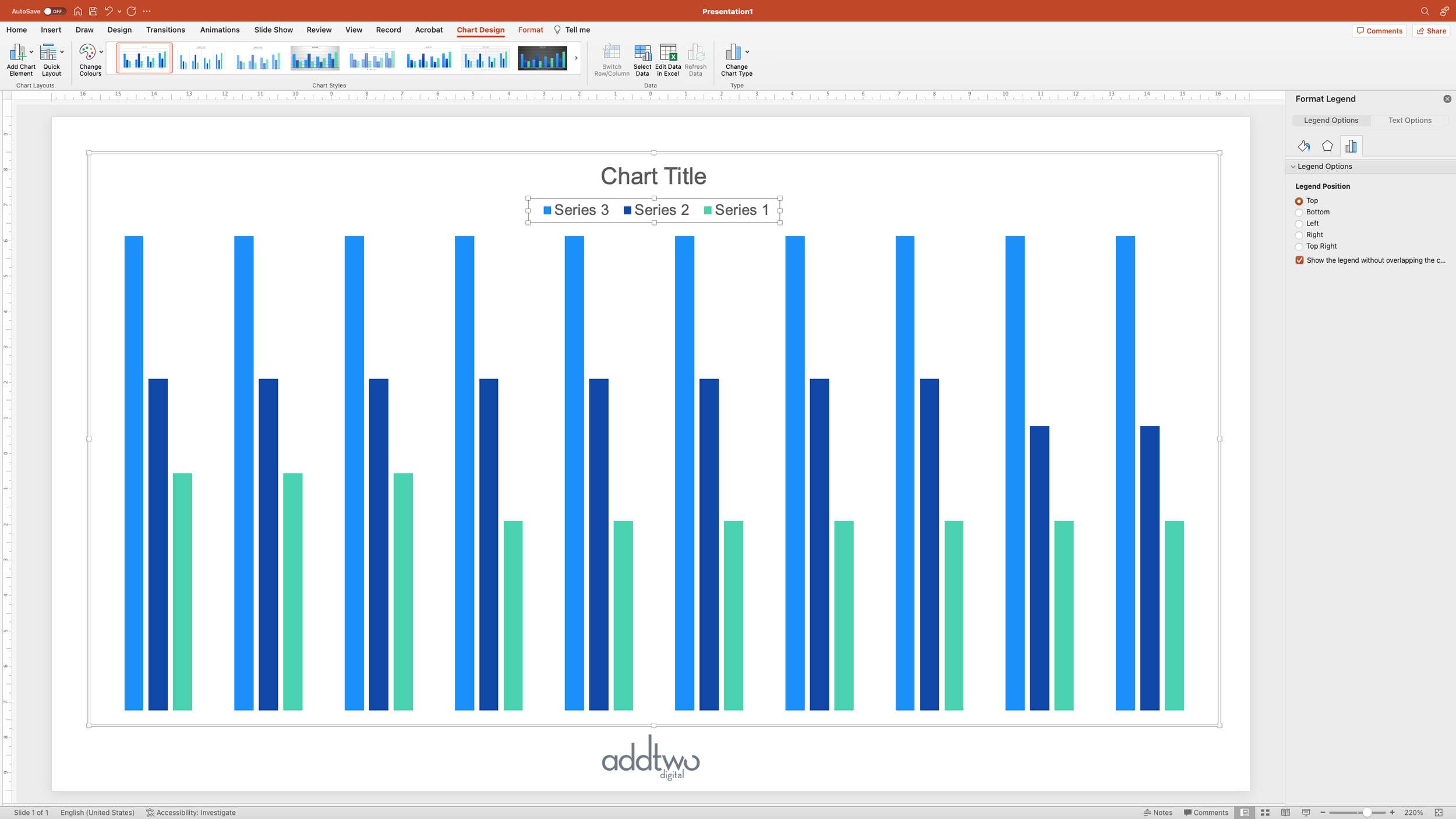
I’m going to leave in the Title and Legend, though, as they can be useful.
Now we’re ready to start making our waffle.
Make the waffle grid
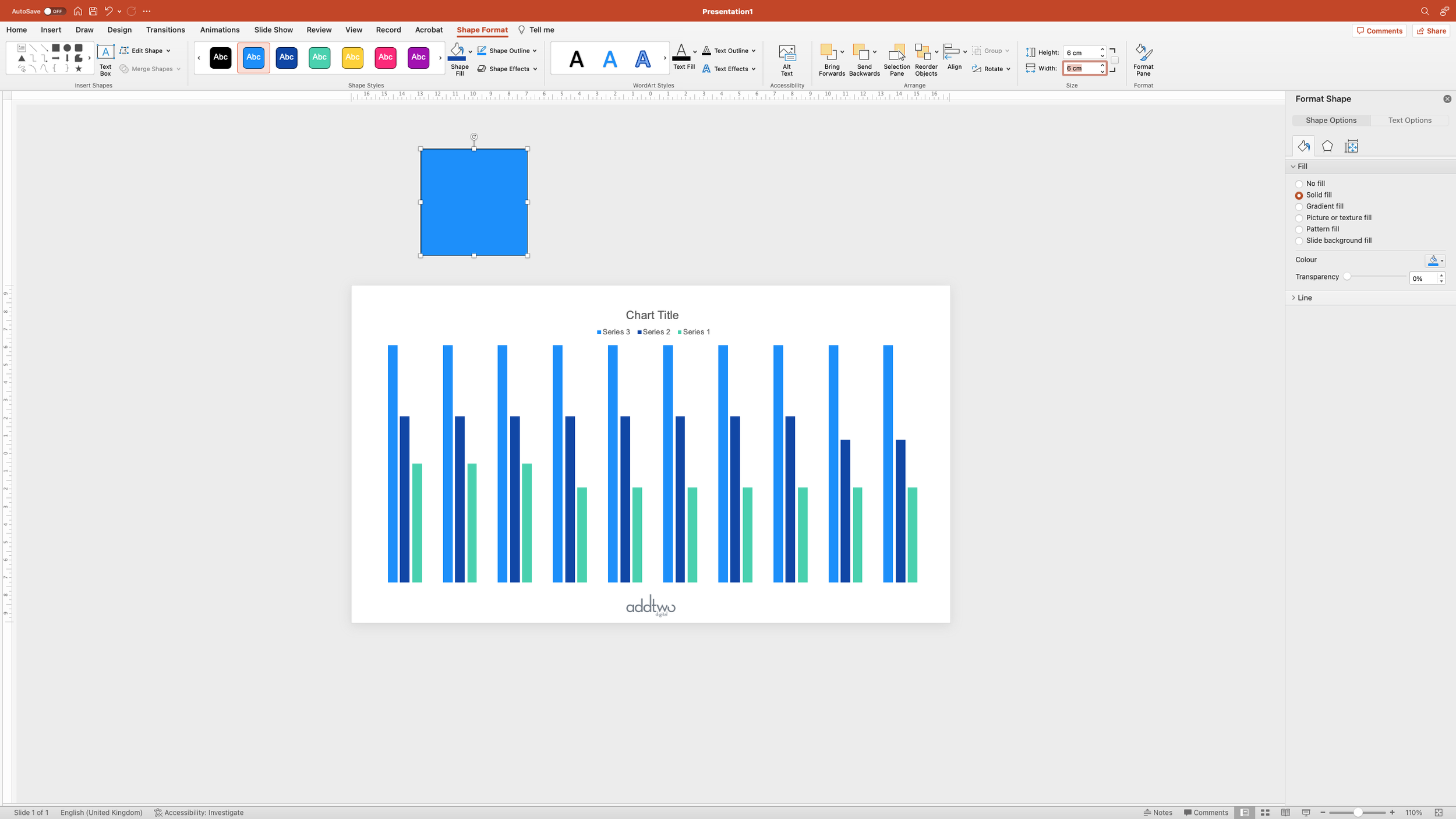
First we need to make the blocks out of which our grid will be composed. Add a square to the slide - you can do this from the Shape menu under the Insert tab on the ribbon:
Set the size of the square - I usually set them to 6cm x 6cm, just out of habit (yes PowerPoint still uses centimetres for measurements). Note that I’ve put the square off the edge of the slide. PowerPoint will save anything in that space, but not show it in Slideshow mode, so it’s a useful place to store elements you’re not using (like off of an Artboard in Illustrator).
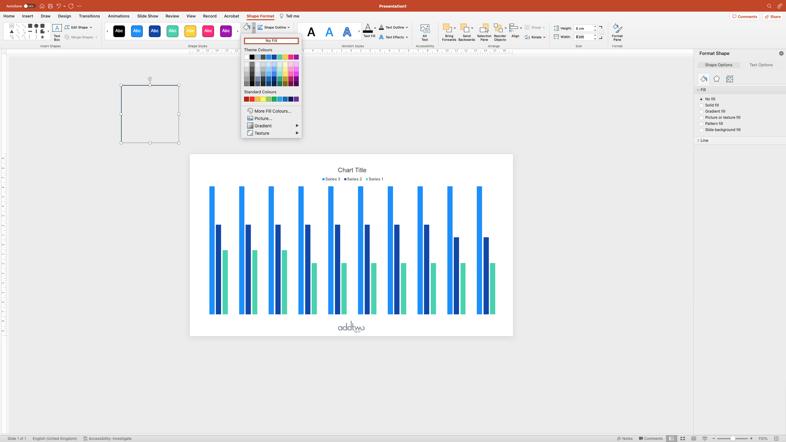
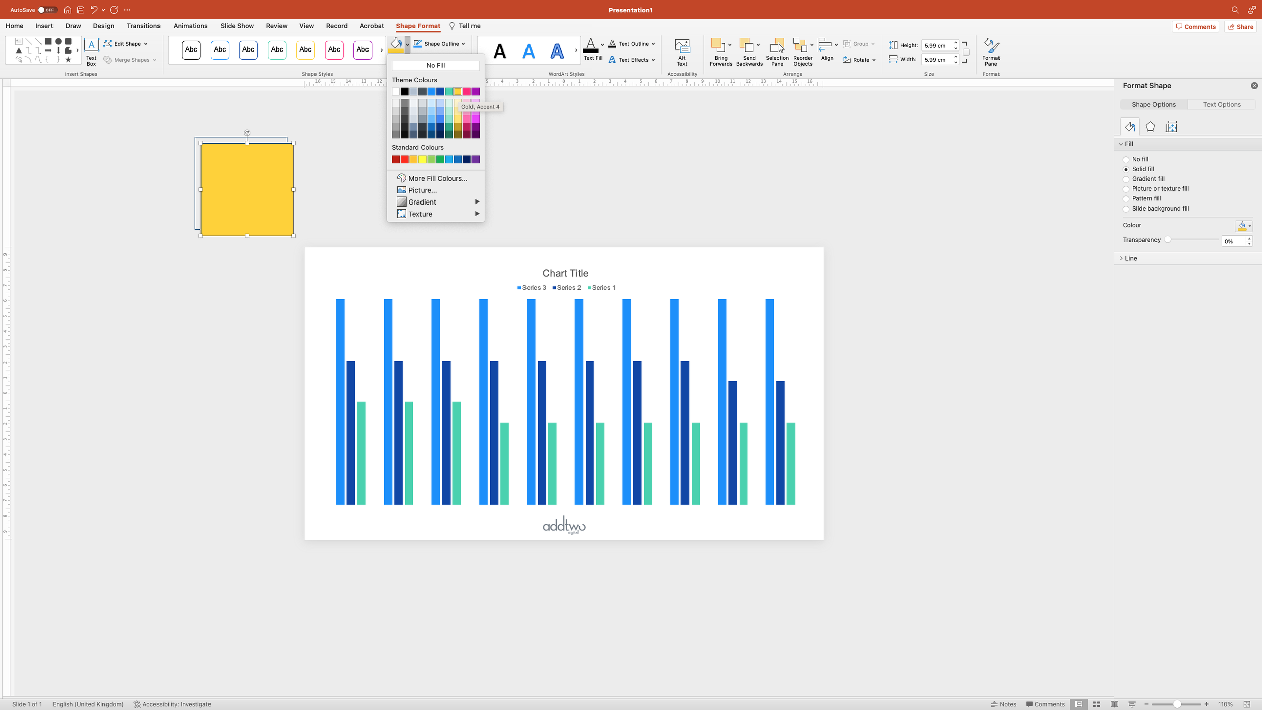
Set the fill colour for the square to ‘No Fill’, but keep the outline
This gives us a transparent square. Duplicate that square.
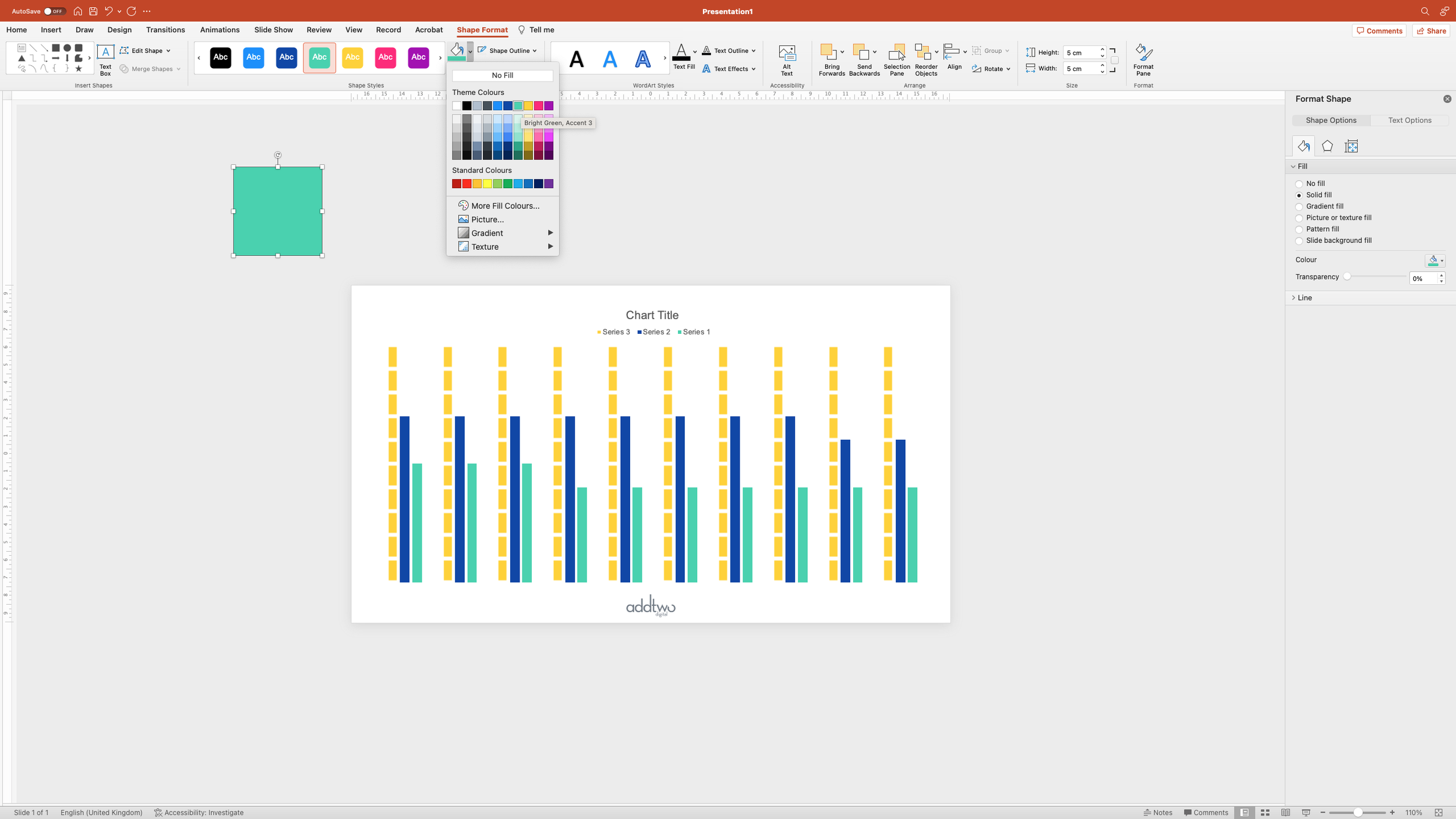
Give the new square a fill colour.
And then set it to be slightly smaller than the original - I’ve gone for 5cm x 5cm.
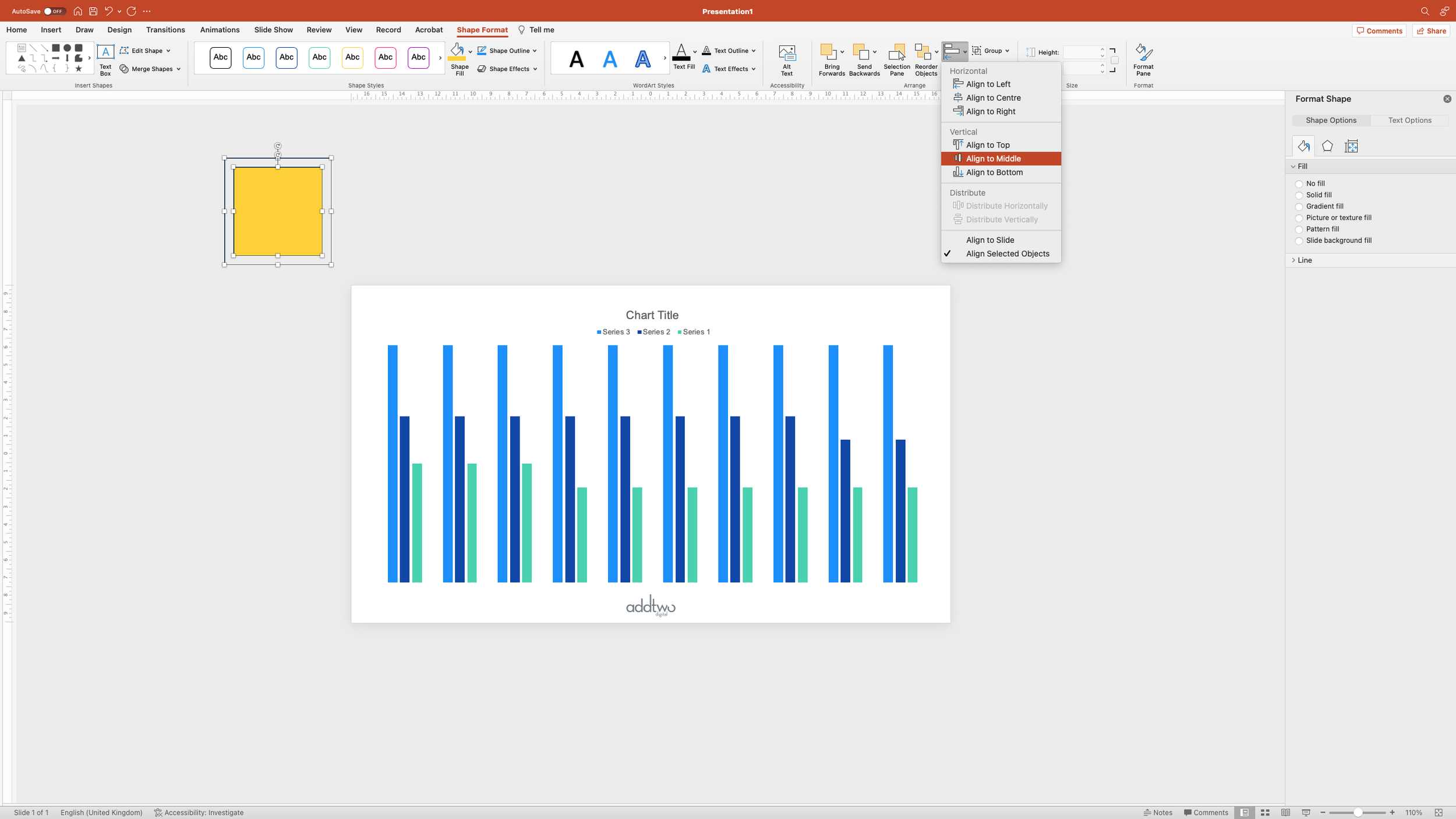
Then select both squares (by holding shift and clicking on them both) and make sure they’re vertically and horizontally centred.
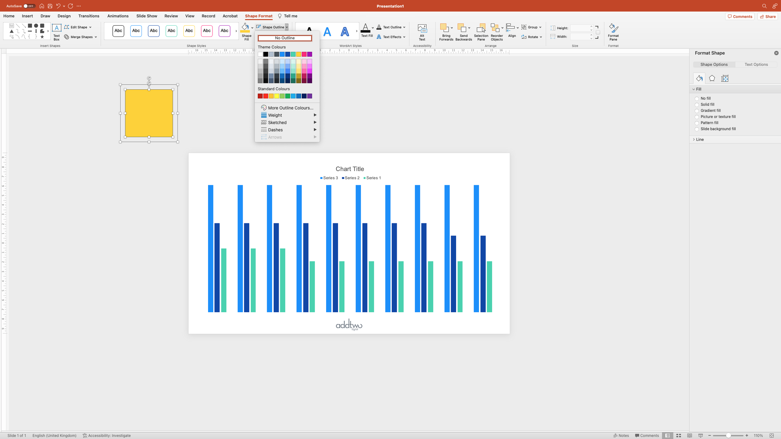
With them both still selected, turn off their outlines by selecting No Outline
Keep them both selected and copy the pair of them.
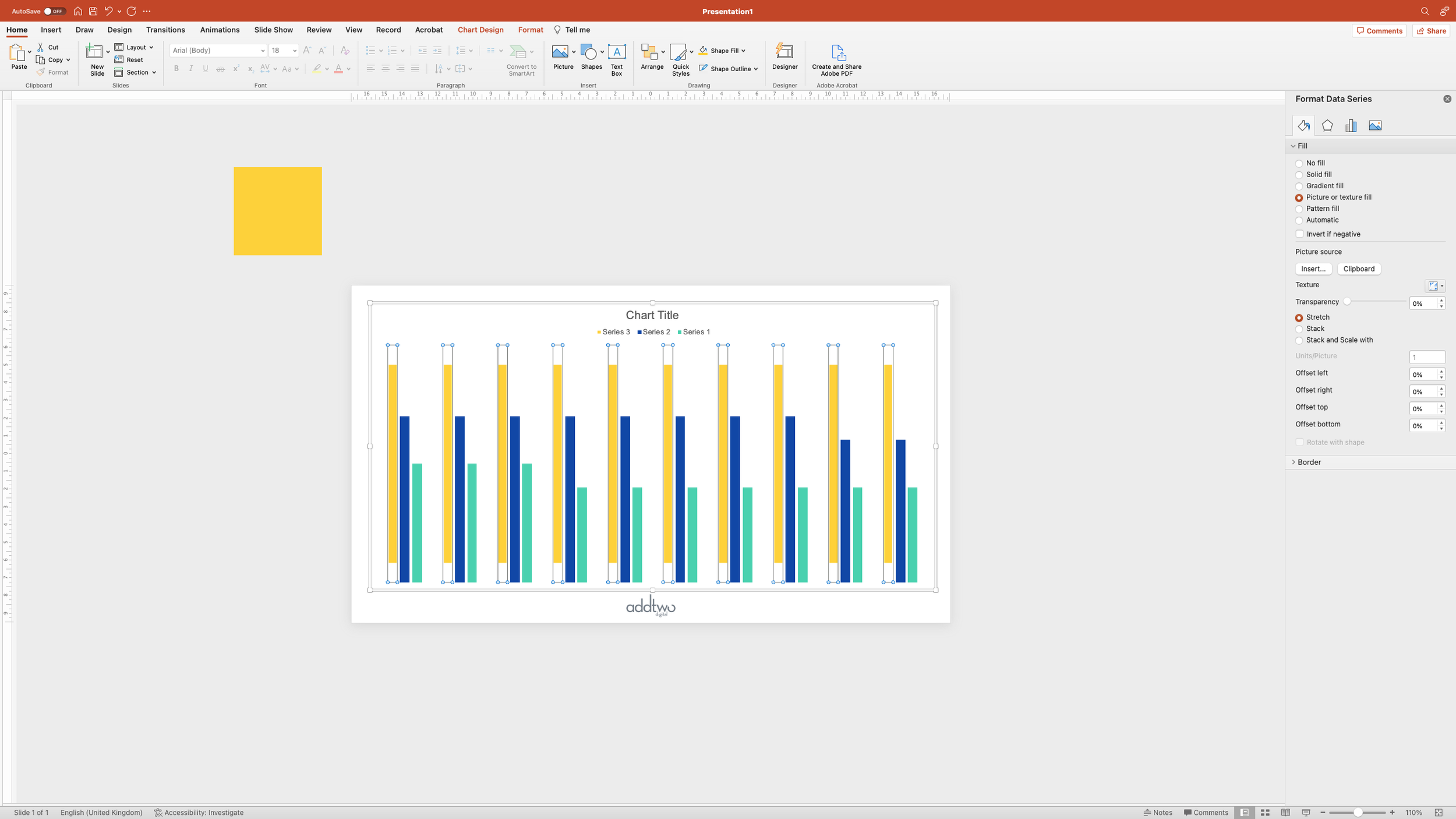
Now select the first data series in the chart by clicking on a column and open the Format Pane (if it's not already open)
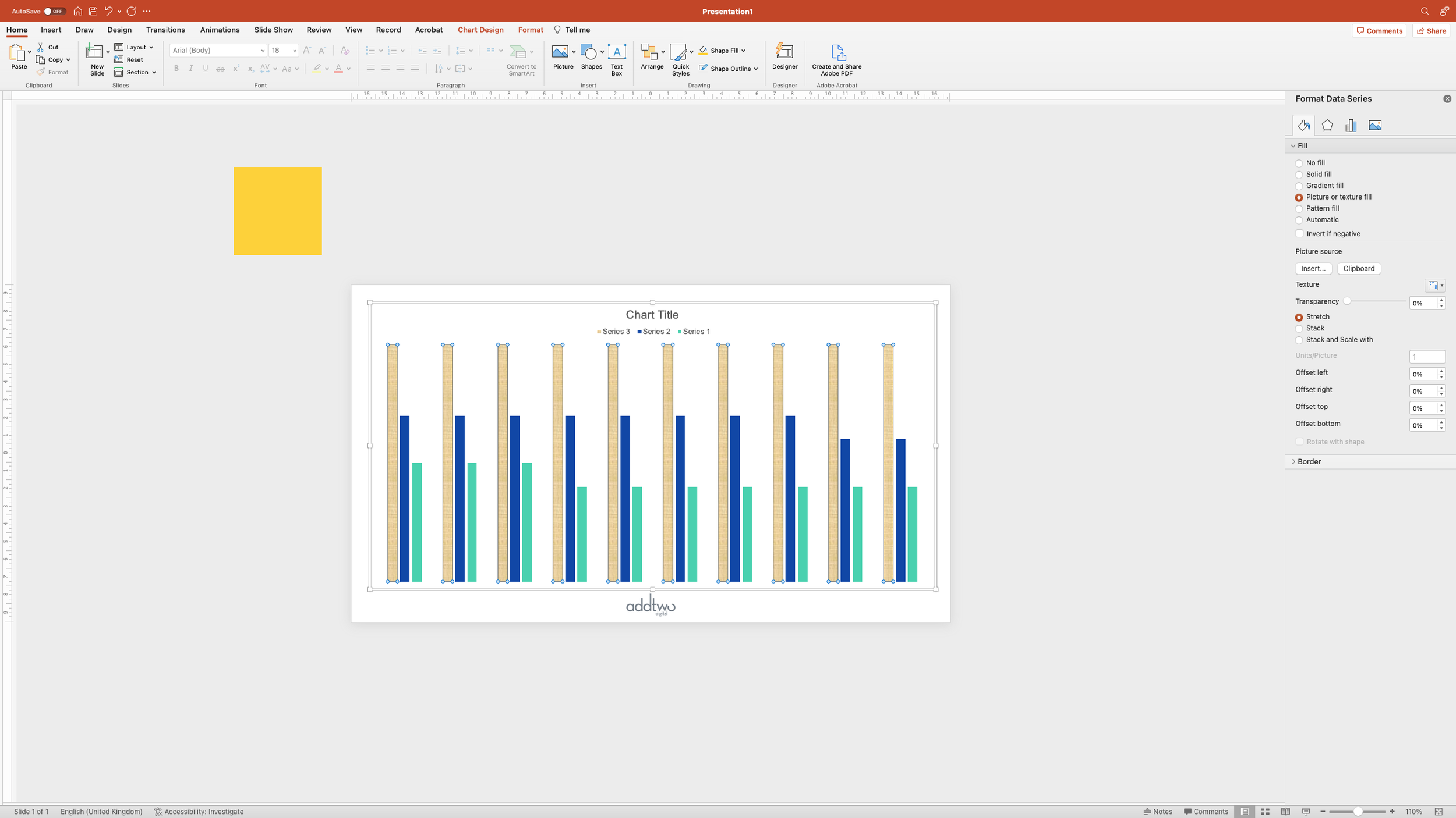
Under the Fill options for the data series, select ‘Picture or Texture Fill’. By default PowerPoint will fill the column with a canvas texture.
Below, under ‘Picture Source’ select ‘Clipboard’. This will fill the column with the squares we’ve just copied.
At the moment, the squares are all stretched to fill the column, and we want them repeated and tiled. Fortunately PowerPoint has a built-in way of doing this. Under the Picture options select ‘Stack and scale with’.
This stacks the image up within the column. You’ll notice that underneath there is a text box that allows you to set how the image stacks. By default PowerPoint sets this to Units/Picture: 1 - one picture represents one unit in our data - which is precisely what we want. One block represents one unit in the total for each column.
Then we want to do the same for our other columns. Set a different colour for the filled square.
Then select both squares and copy them, select the second column and fill that with the Clipboard, setting the Fill to Stack and Scale with 1 Units/Picture:
And then do the same thing for the last data series with yet another colour.
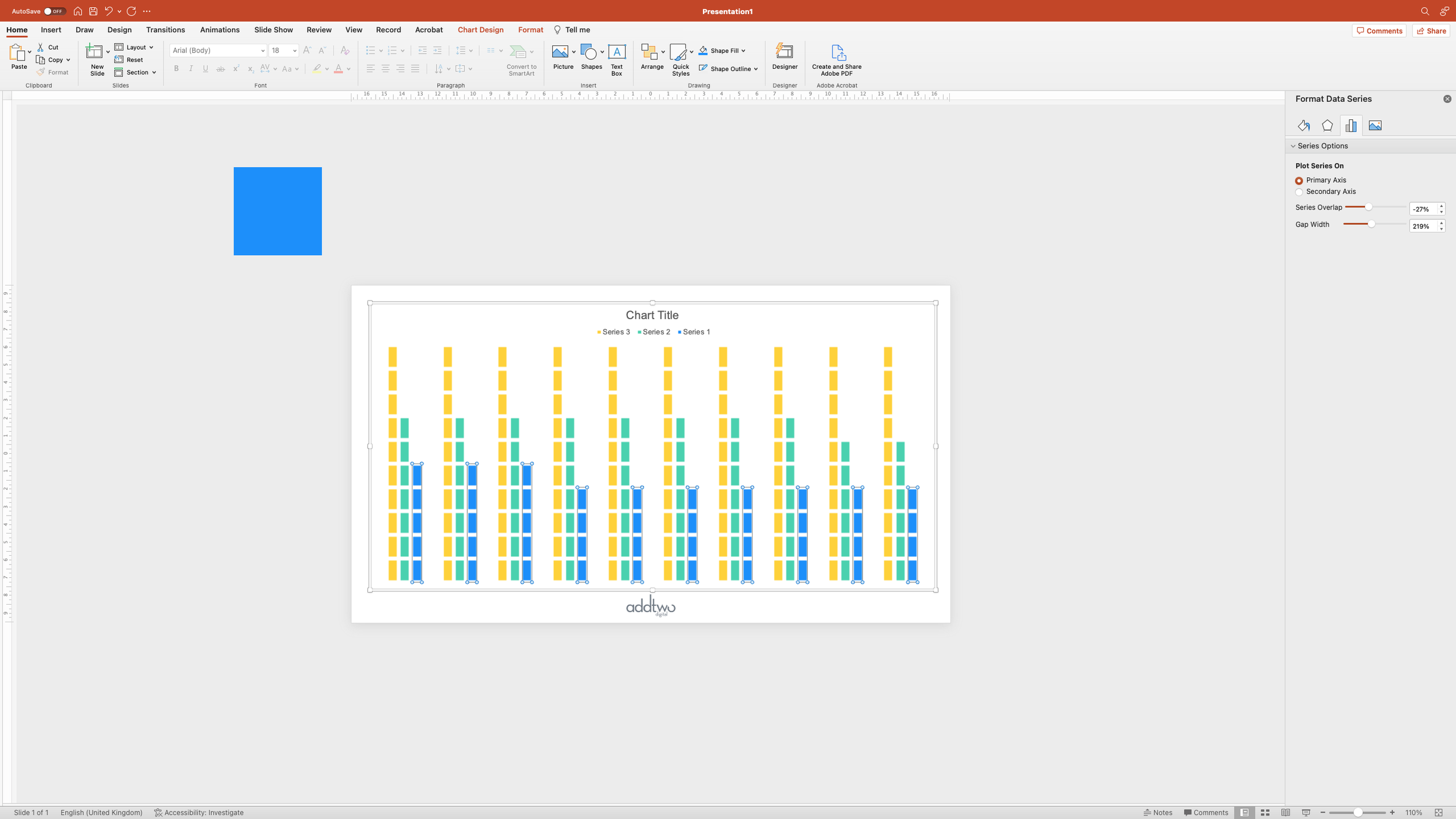
With that final column still selected, switch the Format Pane to Series Options - the little column chart icon.
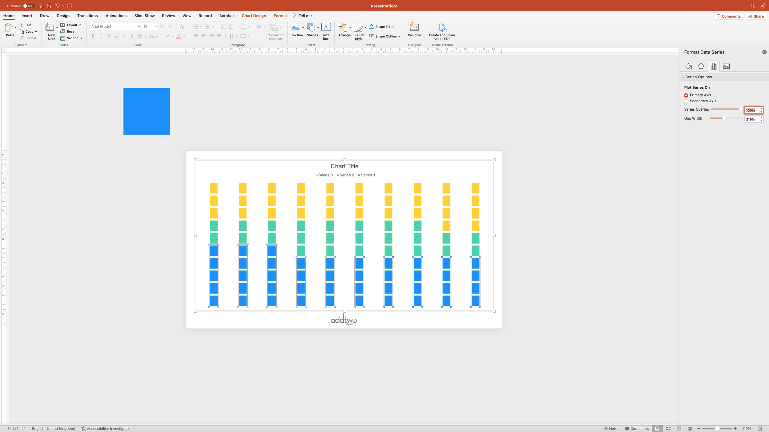
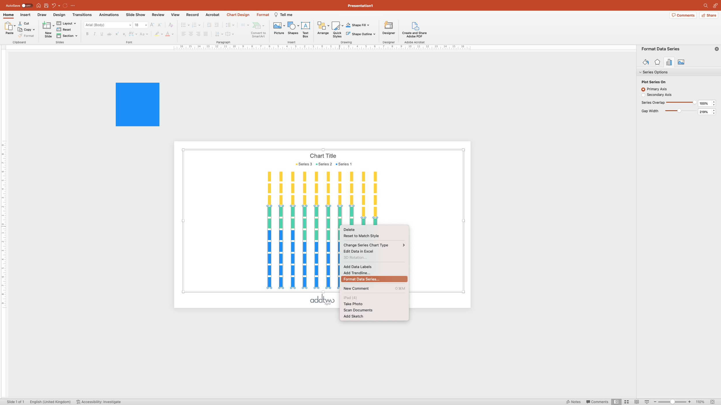
Set the Series Overlap to 100%.
This pushes each cluster of columns together, laying each over the top of the previous. You can hopefully see how this is now going to make a grid of squares.
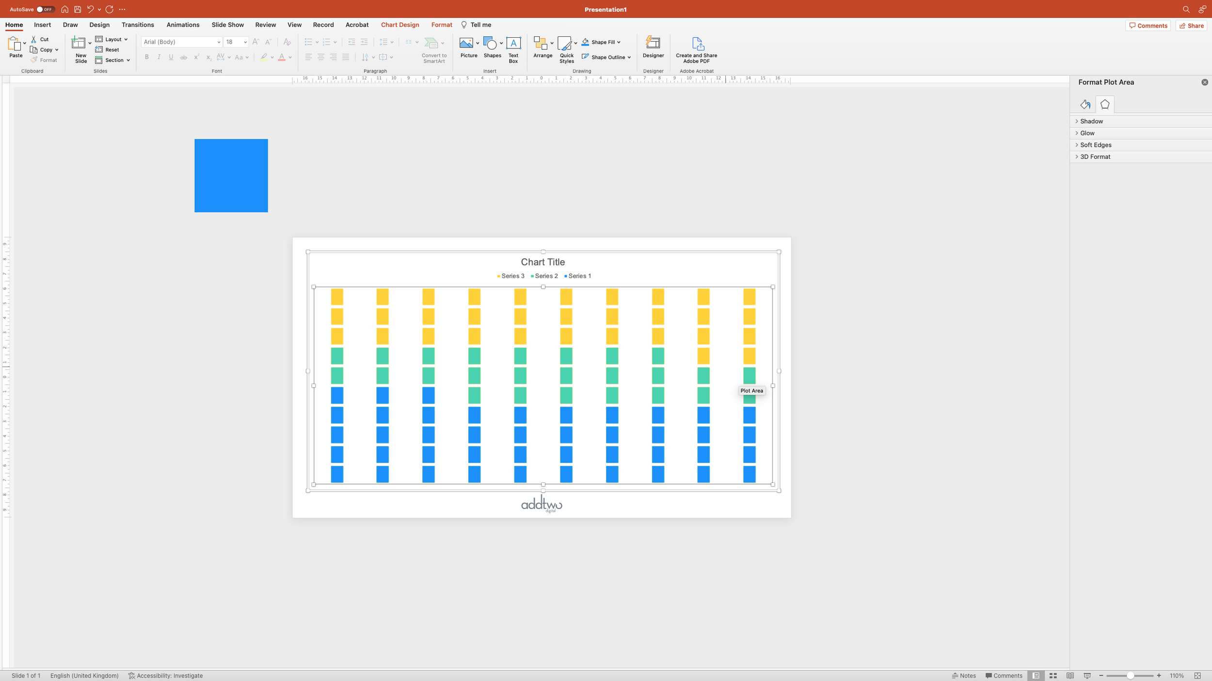
Now select the background of the chart by clicking between the columns. This will select the Plot Area, giving you handles to resize the plot within the chart object.
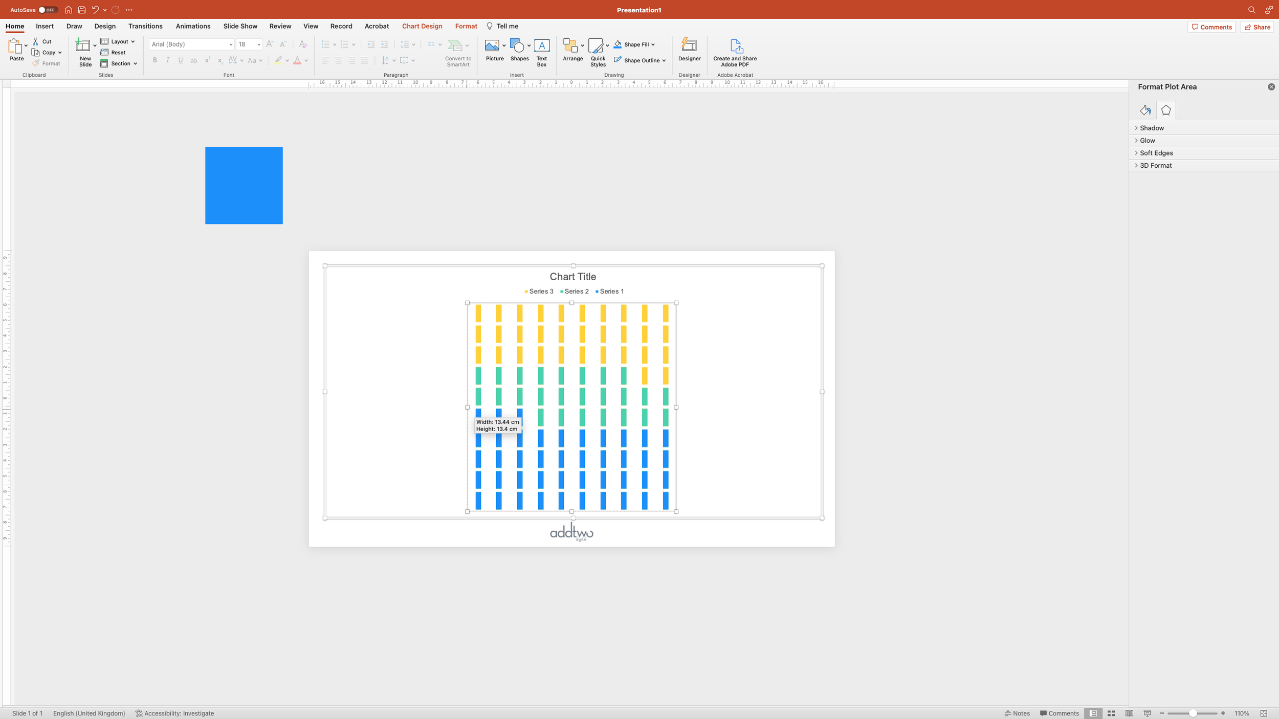
Resize the plot to make it square - it should give you tooltips showing you the height and width which will help in this.
Once you’ve got it reasonably square, go back to the Series Options in the Format Pane
And set the Gap Width to 0%
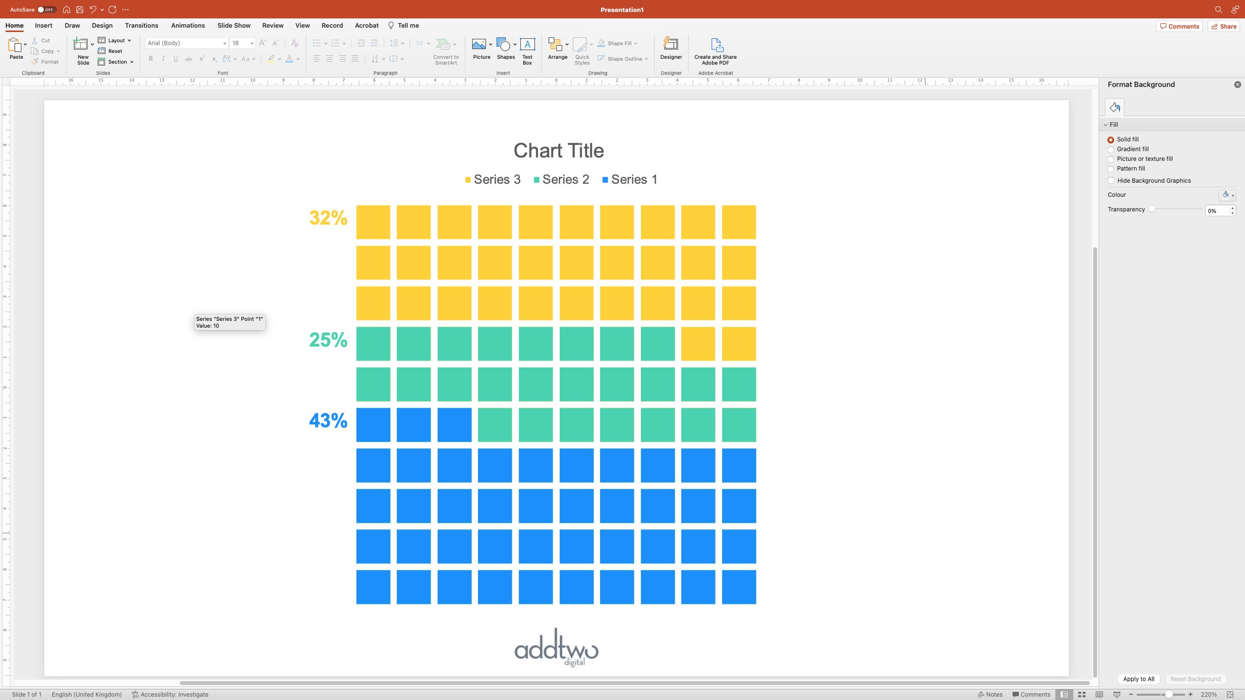
This pushes our columns together, giving us a square plot of 100 squares: our waffle grid.
Add labels
However, the data making that chart isn’t the data the chart is showing: the chart shows 43 little blocks all stacked up, the chart is ten columns, three of 5 blocks and seven of 4. We’re going to need custom labels to show our actual data.
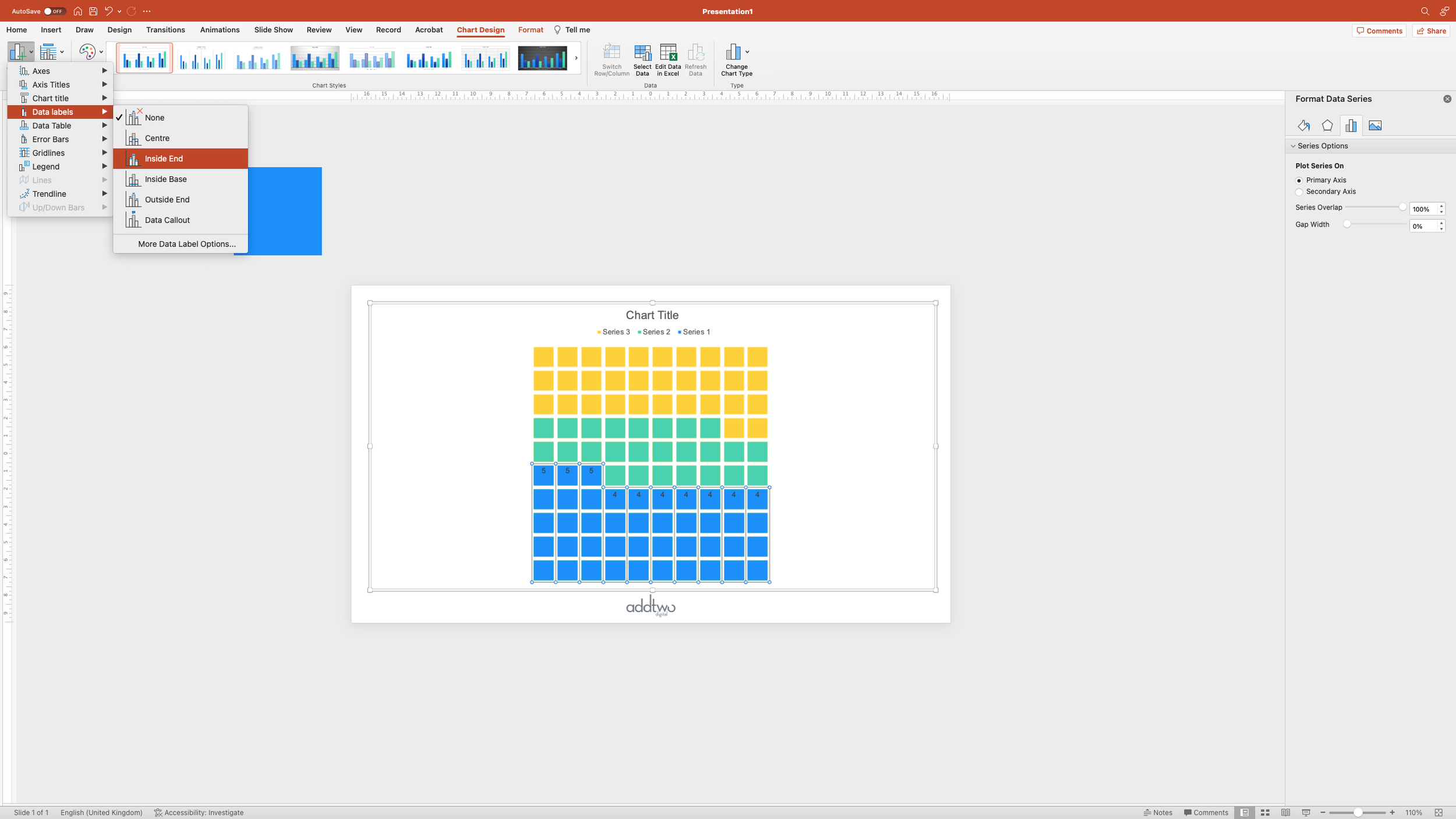
Select the first series and add data labels using the Add Chart Elements menu. We’re adding them Inside End, so they match the top of the data series.
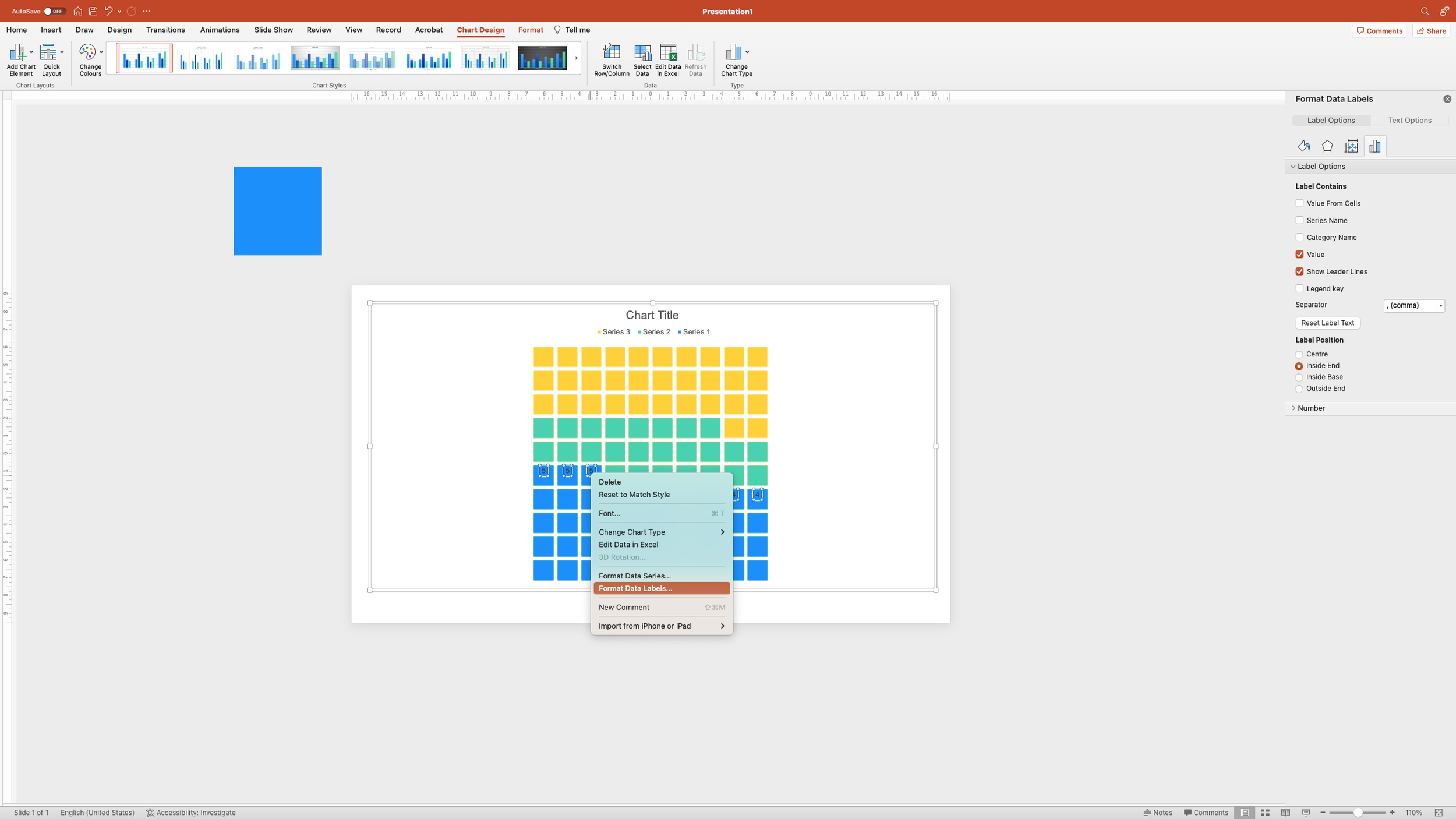
At the moment these labels are showing the actual values of those columns, which we don’t want, but we can change that. Open the Format Pane by right-clicking on the labels and selecting ‘Format Data Labels’
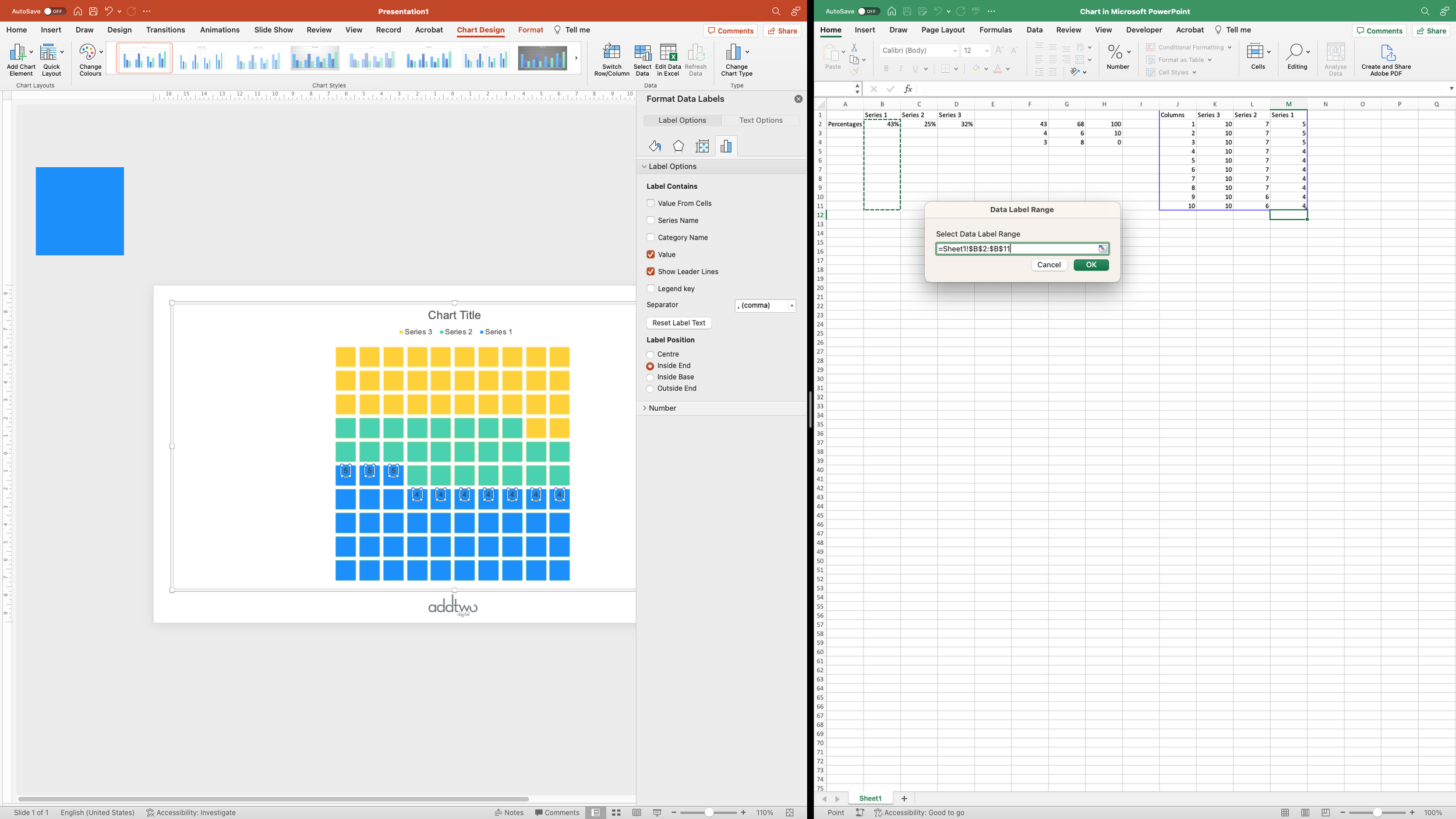
Under Label Options, click ‘Value from cells’. This will open up the Excel sheet behind the chart and ask you to select a range of cells to use as a label. We’re going to want to choose the source data for this data series.
Make sure you select ten rows to match the ten rows of data in the chart, even though nine of those rows are empty.
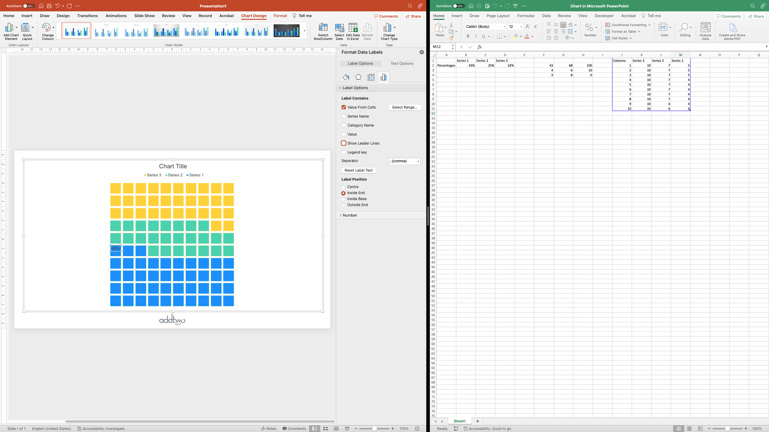
Because only one cell has any content, only the first label will have the 43% added to it, the rest will just show the values. We can remove those values by unticking them in the Label Options.
This leaves us with just that 43% label - the only one we need. Now we just need to style it.
The main thing we’re going to do is to push it outside of the grid by right-aligning the text and then giving it a huge right margin by switching to the text box attributes in the Format Pane (the tab with the little box on) and setting the right margin to 3cm. This pushes the label out to the left.
Using the margins like this means that the labels stay positioned ‘Inside End’ - if the value changes the label will move up and down to match it
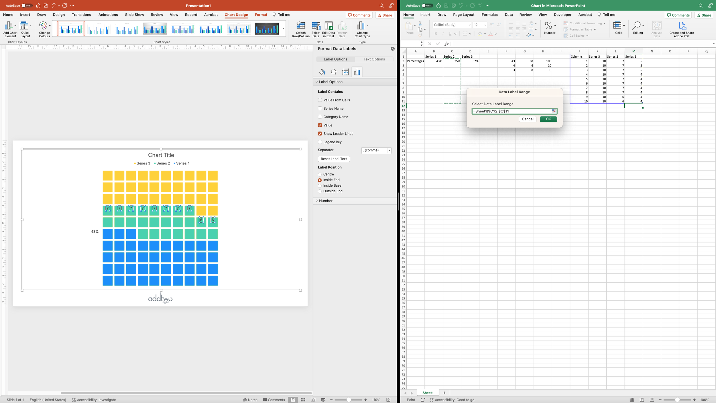
Then we do the same to the other data series; adding labels using the source data
And then positioning them to the side using the margins
Then we can style up the labels using the usual text styling tools
So that’s how we make that in PowerPoint
Now, these waffles use squares with a transparent margin, which means they’re easy to adapt to different coloured backgrounds, but that can mean that the colours behind the blocks on top can bleed through (even though those blocks are all technically the same size). One way round that is to fill the larger square in the background the same colour as your slide background, but that does mean you’ll have to update the fill more often.
The key thing to remember with multiple series waffles is that, like pie charts, they can’t take too much information - they can easily get too busy and hard to read - so use with caution.


