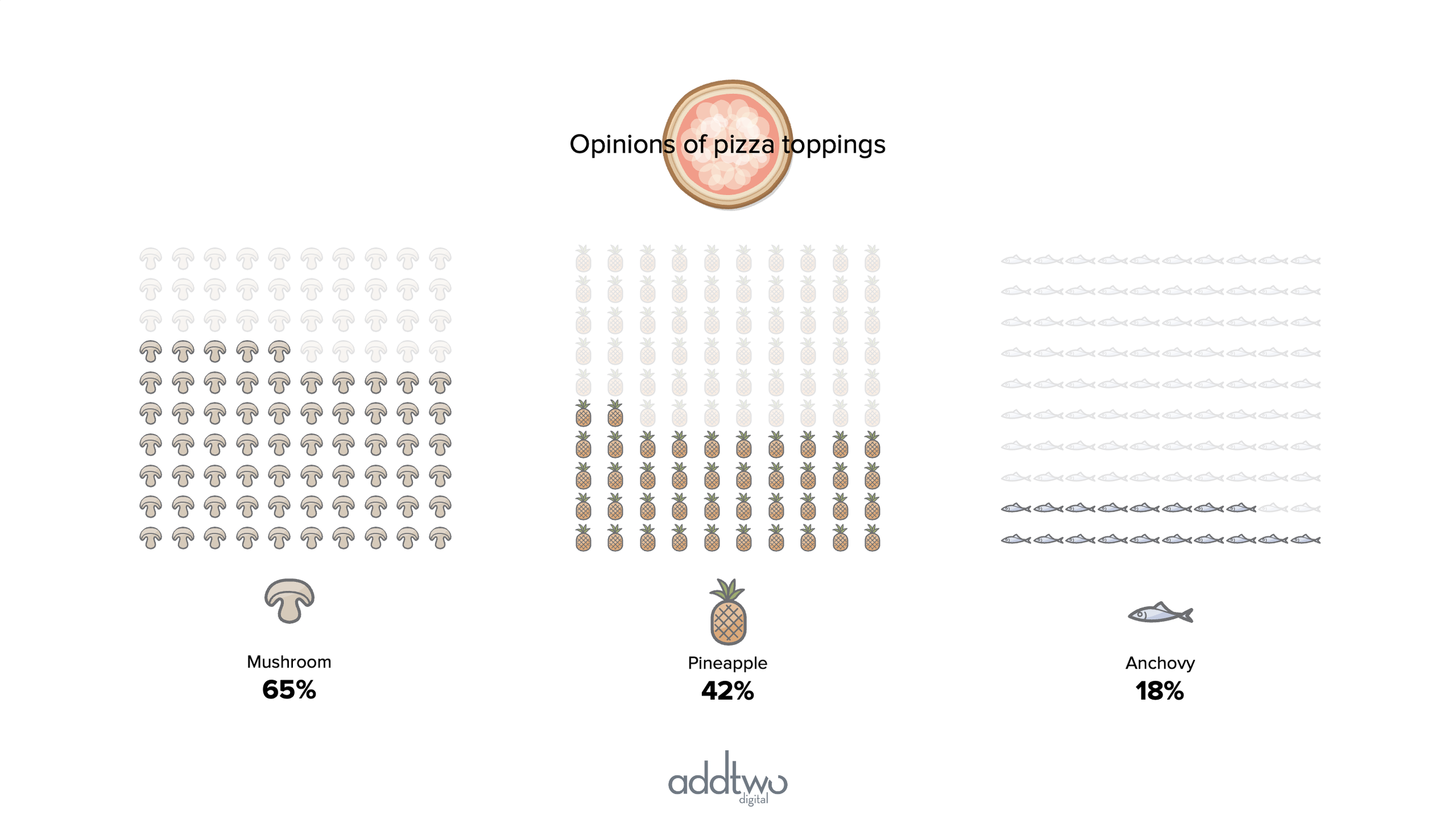
Waffle charts give us a striking alternative to pie charts for composition stories and they can be amped up visually further by turning them from a grid of shapes into a grid of icons.
There are multiple ways to make waffle charts in PowerPoint by using columns, stacked columns or scatter plots. In this case we’re going to make a waffle using a scatter plot, replacing all the markers with icons.
So, how do we make this in PowerPoint?
In this how-to, we’ll be using the default sample data PowerPoint gives you, so you can follow along without needing to download anything, but if you want to, you can find the dataset we used to make the example at the top, and a PowerPoint deck with that slide in, and other examples, here: https://docs.google.com/presentation/d/1HRjfX-m3Ik907bwgdW5eIu4nqrthuMos?rtpof=true&usp=drive_fs
What you’ll need
Scatter plot
Data manipulation
Excel formulas
Design tweaks
Custom labelling
How you do it
We’re going to use a scatter plot to make a 10 x 10 grid of 100 hundred dots, giving us our waffle. We’re then going to fill all the markers in the scatter with icons, make an icon grid.
Details
Insert the chart
Insert a standard scatter plot
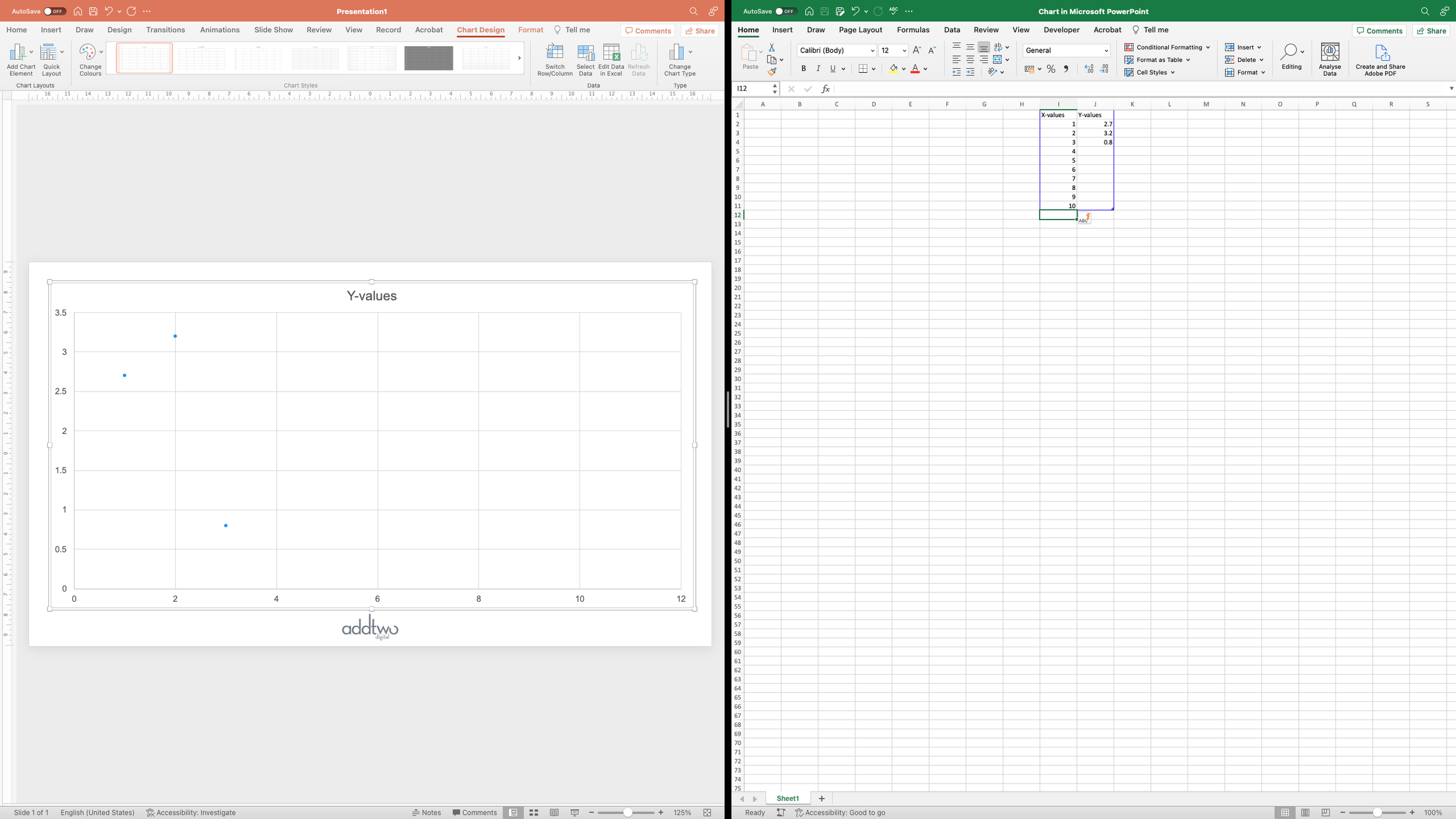
As usual PowerPoint will add a dummy chart to the slide and open Excel to show us the data behind that chart
In PowerPoint charts, the chart only visualises the data within the blue frame in Excel. We can move that data around and PowerPoint will carry on visualising it and ignoring the rest of the spreadsheet, which is very useful for messing about with the charting engine.
Structure the data
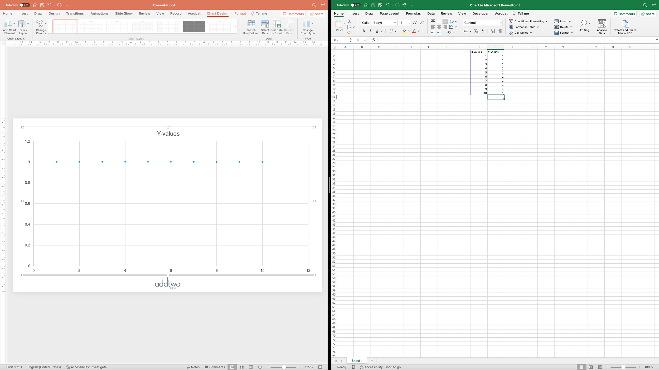
We’re going to use the data in that frame to make our 10 x 10 grid. The first column is the horizontal - x - values, the second the vertical - y -values. We’re going to make our first row of ten dots by creating 10 rows on the x axis, numbered 1 to 10.
And then giving each of those rows the same y value: 1 - creating a row of 10 dots across the plot at 1 on the y-axis.
We’re then going to do the same thing, but for the y value of 2, giving us two rows of dots.
Do this ten times and you end up with ten rows of ten dots, a grid of 100 dots.
Calculate the data
Now we’ve got our grid, we’re going to add in the values we want to show in that grid. Three percentages that add up to 100%.
Those values are currently formatted as Excel percentages, which means that, in reality, they’re fractions of 1 - Excel multiplies them by 100 to present them as percentages. We’re going to want to do some calculations with them and it would be easier to do them on the whole numbers, so we’re going to use the NUMBERVALUE() function to get the first value as a number and multiply by 100. As an Excel formula that would be something like:
=NUMBERVALUE(B2)*100For the other values, we’re going to want to create a running total, as this will help with the calculations we have to do to fill the grid, so we’re going to calculate the actual number and then add it to the previous value. This means the formula has to update to something like:
=(NUMBERVALUE(C2)*100)+F2We’ll do this for all the values (this will mean that the final value will be 100, the total for all the values in this case).
Now we’re going to use those values to create data series in our chart.
In most PowerPoint charts data series are differentiated by being placed in different series of y values, so our first data series is going to replace our current column of y values.
Basically we want to add values to the y series until we have enough dots to match the data point we want to chart. The values we want to add are the values that made our rows of dots - ten ones, followed by ten twos, etc. In this way we can build rows of dots, starting from the bottom left, until we have enough dots to match our data point.
To do this we basically want to work through each dot in our grid, starting from the bottom left, comparing the number of dots to the data point. Once they’re equal, we stop add dots.
This is made easier because our grid of 100 dots is made up of 100 rows of data - ten rows of ten dots. We can use the ROW() function in Excel, which returns the row number the cell is on, we can then use that number to compare the data point we’re looking at with the target value. The one wrinkle is that we have column headers, so our data starts at row 2, which means we’re going to have to use ROW()-1 to get the right number.
This also makes figuring out the right y value easier too. Everything under 10 needs to go in row 1, and so have a y value of 1; everything between 10 and 20, a value of 2, and so on. We can again use the ROW() function, this time dividing the number by 10 and rounding up to the nearest whole number, so everything between 1 and 10 will give us a value of 1, between 10 and 20, a value 2 and so on.
All of this can go in an Excel IF() statement. The format of these is: IF(thing to test, what to do is that’s true, what to do if that’s false), so that would look something like this:
IF(( ROW() - 1 ) <= TARGET VALUE <then> ROUNDUP( (ROW() - 1 )/100 ) <else> NA())The ROUNDUP() function in Excel is a little more complex than that. Since you have to tell it how many decimal places to include in the result. The NA() function just gives us an cell without a number in it, meaning PowerPoint won’t try and add anything to the chart.
In the case of the example, the final formula is:
=IF((ROW()-1)<=$F$2,ROUNDUP((ROW()-1)/10,0),NA())This should give us the right number of dots for our first value and then just empty space.
We can add a new data series by just adding a fresh column of y values - but the formula here gets a little harder.
We only want to add a dot in the next series if it’s below or equal to the target value AND above the previous value. This is why we created the running total earlier. Basically we want to add a nested IF() statement to our previous formula. If our initial test is true we then have to run another - is our ROW()-1 >= the previous value.
=IF((ROW()-1)<=$G$2,IF((ROW()-1)>$F$2,ROUNDUP((ROW()-1)/10,0),NA()),NA())But at least we can pretty much reuse this formula for all our other data series in new y columns
Once we’ve created a column for each of our data series we should have our complete grid of 100 dots, so we can now close that and concentrate on sorting our chart.
Layout the chart
We now have a chart of 100 dots, with our different data values in different data series but it’s all looking rather bare and inelegant at the moment.
The first thing we’re going to do is sort the axes.
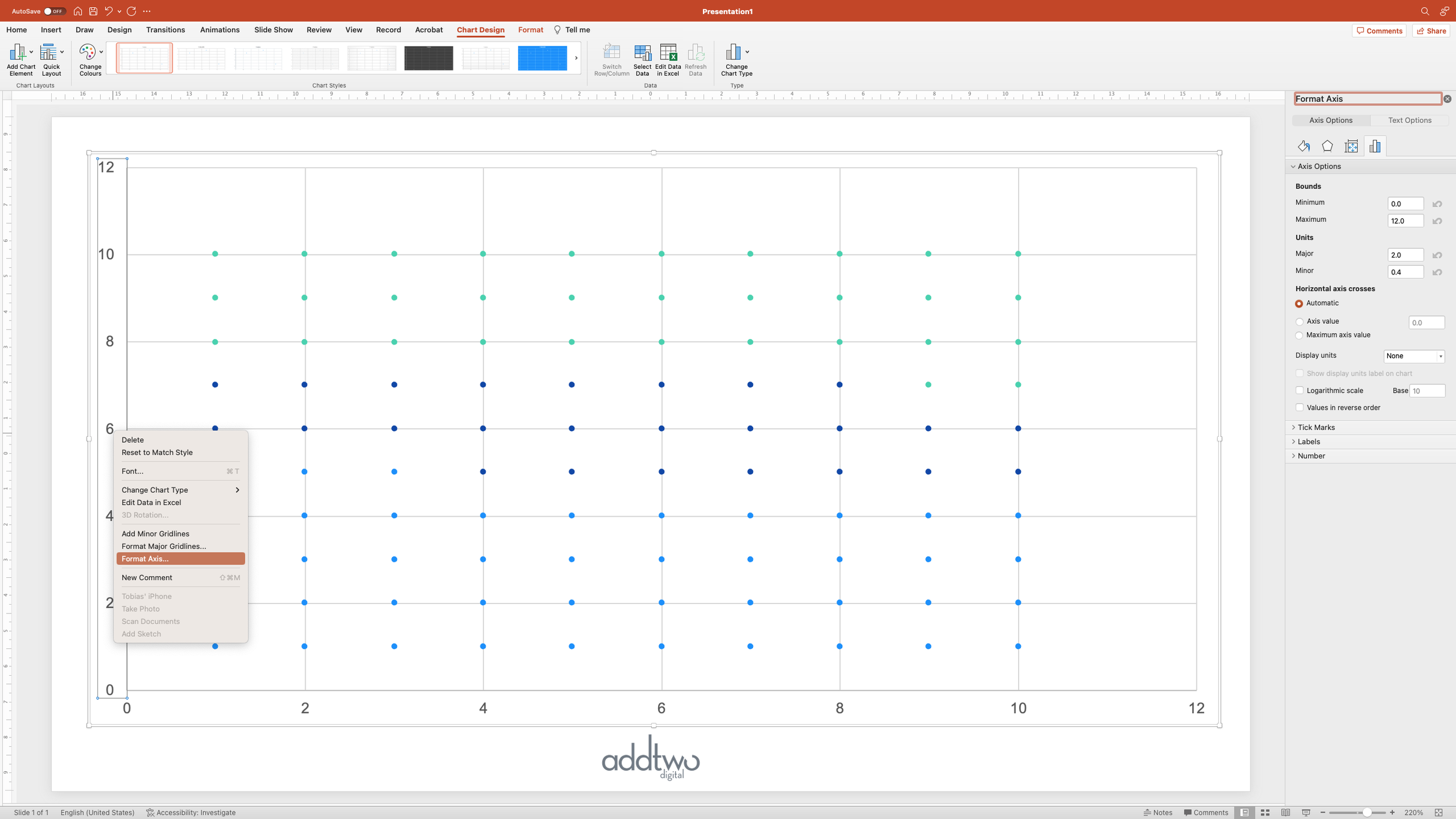
Open the Format Pane for the Axis options. There are many ways to do this, but the easiest is to right click and select the ‘Format Axis…’ option.
Our values only run from 1 to 10, so we can set the Minimum and Maximum values of the axis to match - in this case we’ll set them to 0 and 11, giving us a little margin at each end.
We’re going to do this for both axes and then we can delete them - and everything else apart from our dots - the rest of the chart: gridlines, tick marks, etc, doesn’t tell us anything useful about the data and is just distracting.
You can do this by just selecting the elements and hitting delete or by unticking them in the Add Chart Element menu.
This will leave us with just our grid of 100 dots.
We can then easily resize this to be a square, which is the shape we want our final waffle to be.
Now we just have to add our icons.
Add the icons
For the purposes of this walkthrough, we’re going to use icons from the built-in PowerPoint icon library, but you could use any image (SVGs - vector graphics - are best).
Once we’ve found all the icons we need we can just add them to the slide (make sure you don’t have the chart selected when you do this, otherwise PowerPoint will add them inside the chart object).
Because these are Microsoft icons we can easily style and recolour them.
Then we select the icon we want to use for the first data series and copy it to the clipboard.
We select that first data series in the chart by click on one of the dots and open the Format Pane (we can do this by right-clicking and selecting ‘Format Data Series’).
We need the marker options for the data series - these are under the tab with the little Paint Pot - you may have to click the ‘Marker’ button to open them.
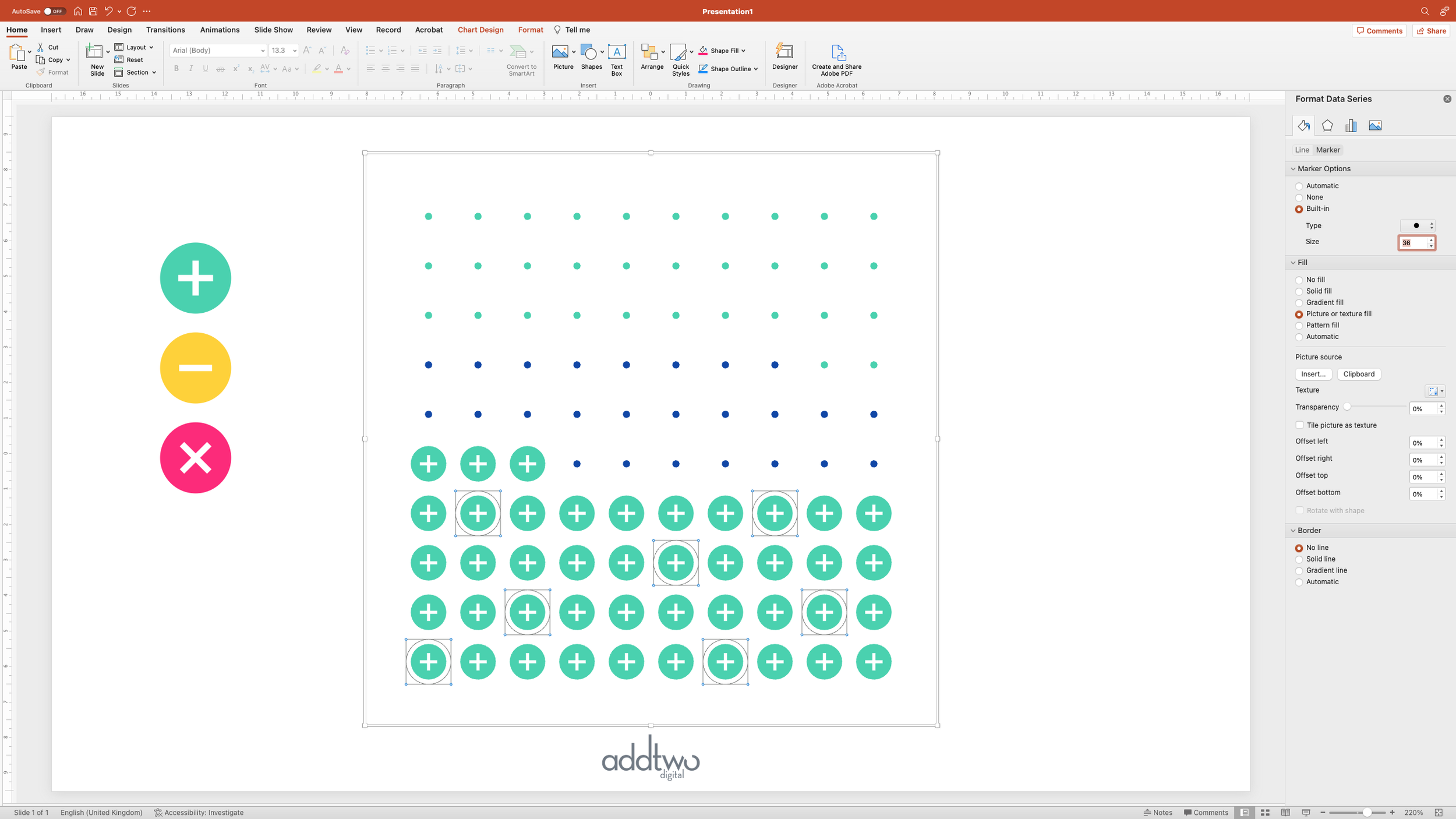
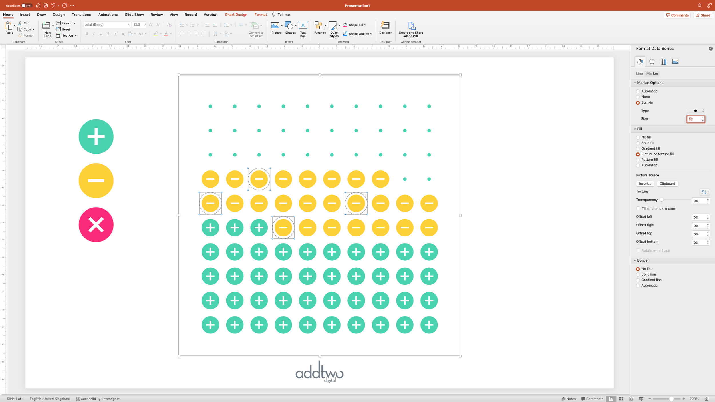
Under the ‘Fill’ options, choose ‘Picture or texture fill’ and then select ‘Clipboard’ as a Picture source. This will fill each of the dots with a copy of our icon.
But it’s tiny. We can fix that by adjusting the marker size. Under the Marker Options at the top, select a ‘Built-in’ marker to match your icon - we’re going to use a circle in this case - and then tweak the size up until you’re happy with how the grid looks.
We should probably also set the Border to ‘No line’ while we’re at it, so we just have our icon.
Now we just have to repeat that process with our other data series and their icons.
Until we have our full grid of icons.
However, now we have to label it.
Add the labels
Because of our mucking about with the data, it can be tricky to add chart labels that make sense - it’s possible, but tricky. We’re going to take the easy way out and just add our labels manually.
We’re going to use a table to help us with the layout, so let’s start by adding one: one column with three rows.
Then we want to make the table itself invisible, under the Table Design tab, set the Shading to ‘No Fill’ and select no Borders.
Now we’re just going to enter the data points in, one per row, matching the order of the data series in the chart.
Then it’s just a matter of arranging the table so that the labels line up with the data series - you can do this by just dragging the row dividers until they’re the right height. We’ve also coloured the labels to match the data.
So that’s how we make that in PowerPoint
Now, to be honest, this walkthrough is really here to demonstrate how to make multi-series waffle chart using a scatter plot. Icon charts can be incredibly effective, but they are also incredibly hard to pull off, and we tend to use them very sparingly indeed.
You can, though, use this technique to make nice, simple waffle charts with just plain shapes and one data point - which are much more dependable.

