
In this blog series, we look at 99 common data viz rules and why it’s usually OK to break them.
by Adam Frost
The idea of the bar chart as the ur-chart, the Überchart, the chart to end all charts has its origins in a 1985 paper by William Cleveland and Robert McGill which showed that charts using ‘position along a common scale’ like scatter charts and bar charts were read more accurately than those using angle and slope (pie charts), area (bubble charts, treemaps) or colour intensity (heatmaps).
Given that one of the principal goals of anyone making a chart is to convey the data accurately, why wouldn’t you use the most accurate chart? Elizabeth Ricks’s view of bar charts is pretty universal: ‘Use them and use them frequently.’
As well as being accurate, bars allow you instant access to every story at every level of your dataset. You can get a sense of the overall spread of your data, pick out clusters of similar-sized datapoints, or zero in on a single bar, and assess its relationship to the rest of the dataset. Few other charts allow you to move so frictionlessly from overview to detail and back out again.
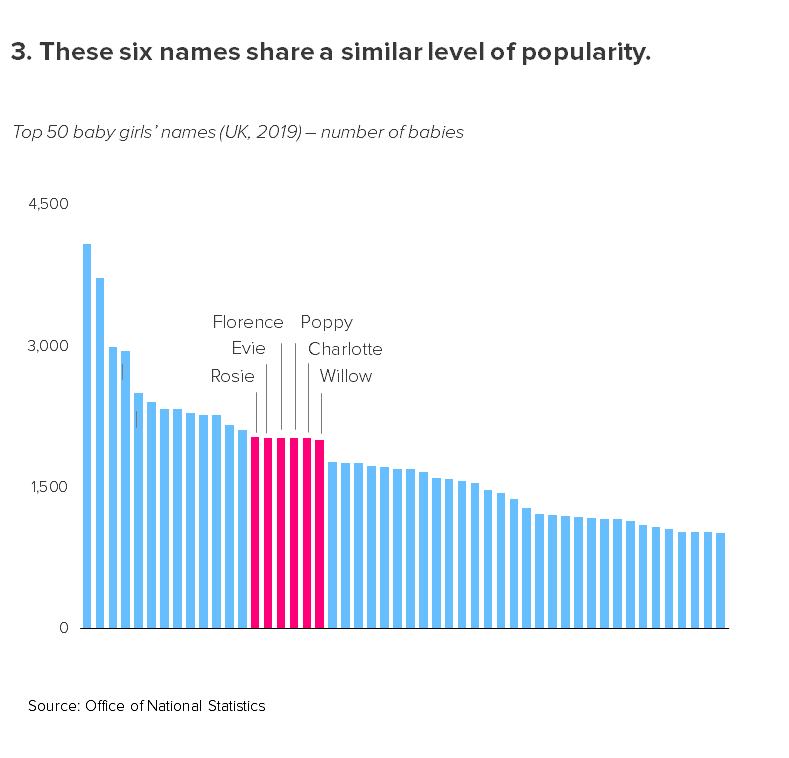
Look at the third chart above - the six names that have similar counts. Not only can you tell that the bars are similar sizes, but you can also make out the (tiny) differences between them.
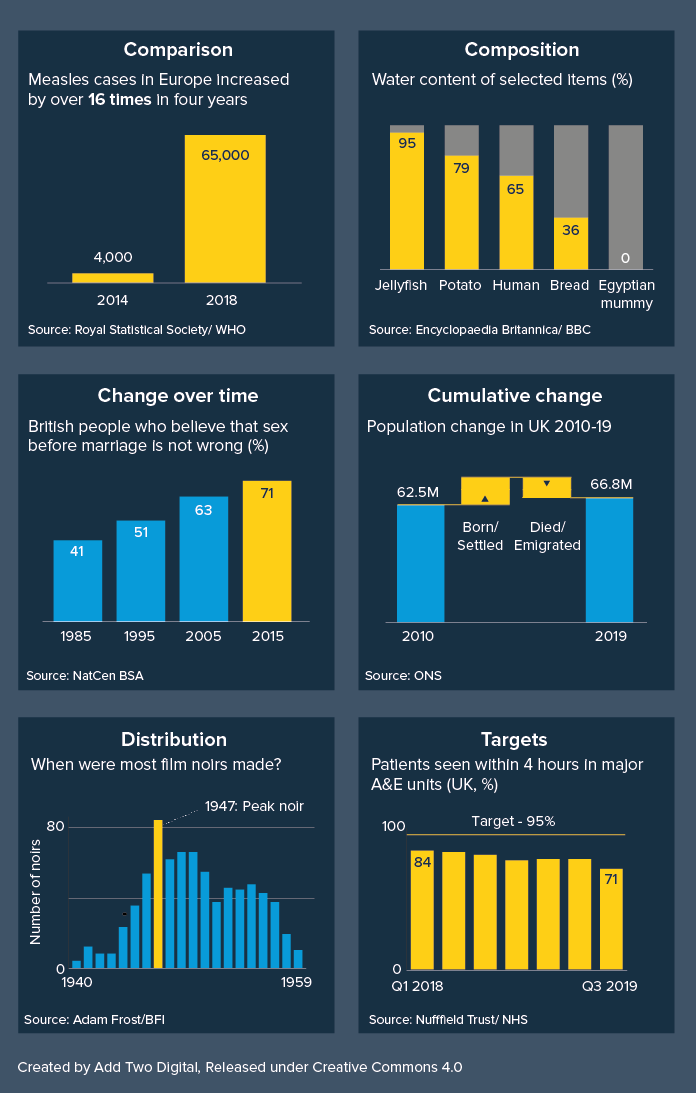
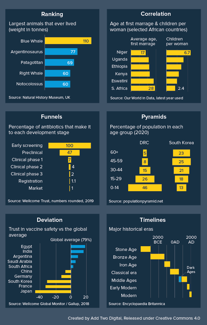
Bars are also astonishingly versatile, capable of taking almost anything you throw at them. They can tell stories of comparison, change over time, composition, geography, correlation, distribution, deviation, progress towards a target, and more.
Get this graphic as a hi-res, editable PDF here.
Finally, bars deliver all of this with exceptional efficiency, taking up not much more space than a data table, and indeed, when information density is a priority, bars and tables are often combined.
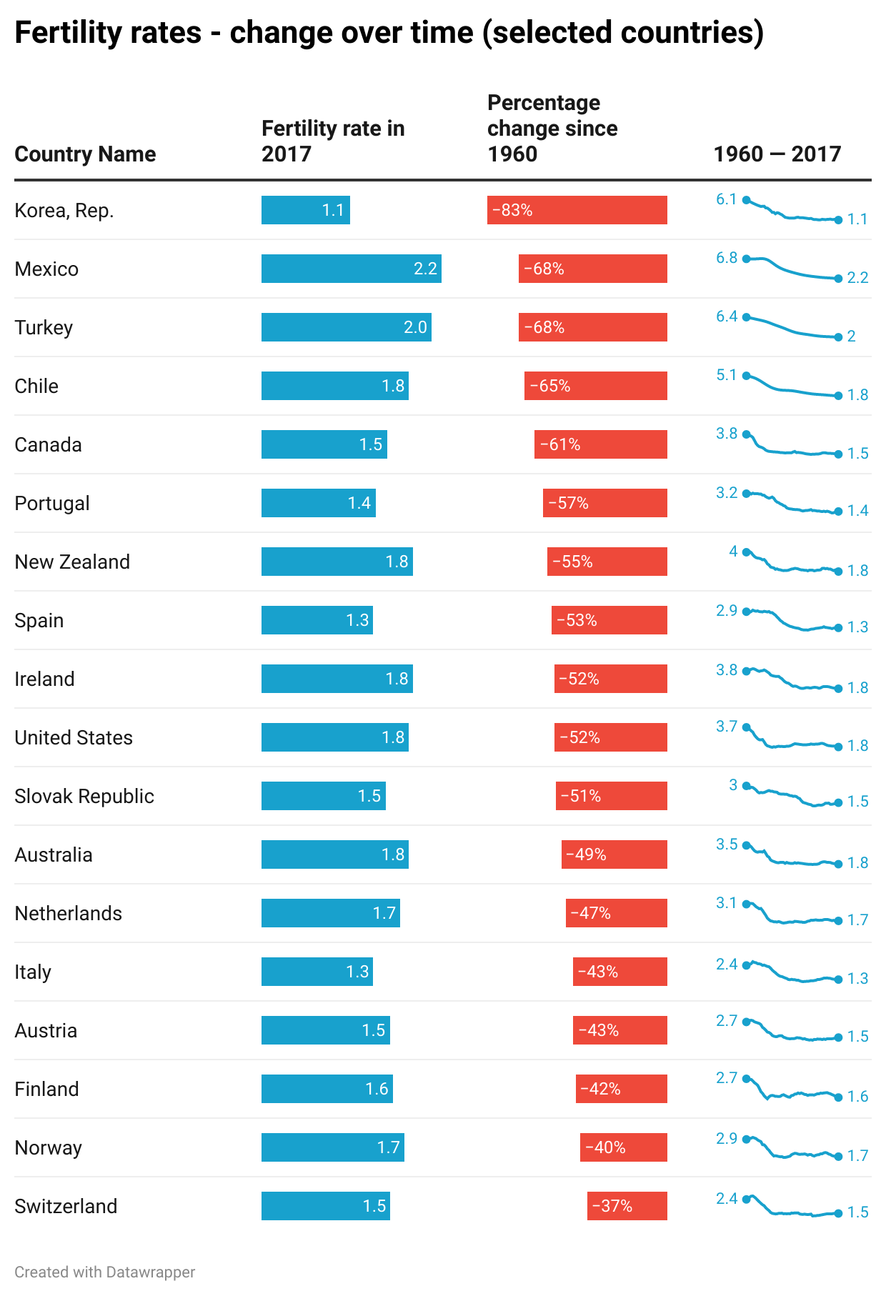
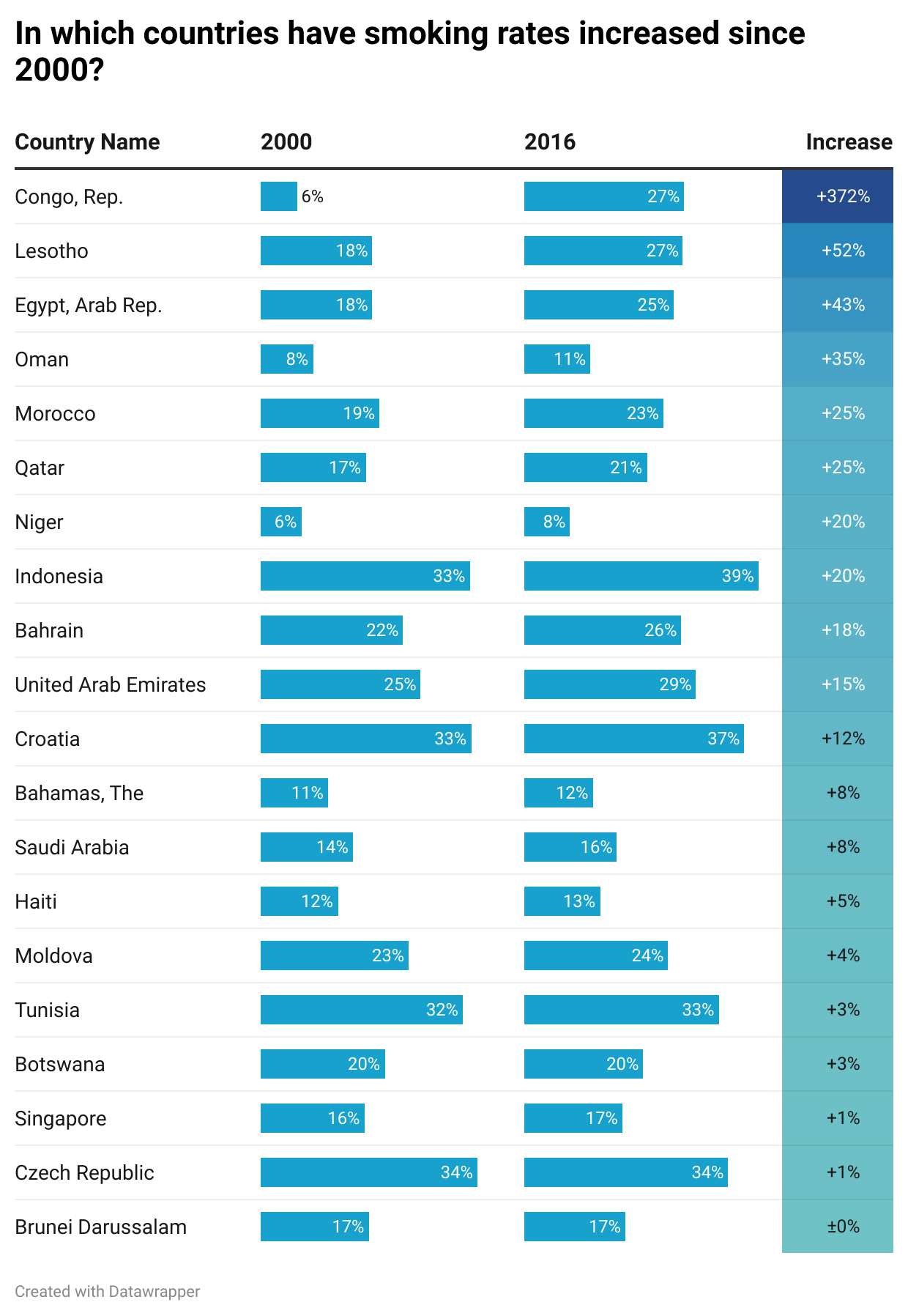
Image Credit: Charts made using Datawrapper, Data sources: World Bank, WHO
This is why, when you are experimenting with the right chart for your story, it isn’t a bad idea to start with a bar chart, because it will give you an accurate sense of what your dataset contains, you will be able to grasp both overview and detail, it will almost always suit your story, and you will be able to see everything in a relatively condensed area, usually without the need to scroll or zoom.
The key test is what happens next. Because although bar chart’s are an analyst’s dream, they can be an audience’s nightmare. If you don’t use them carefully, all the strengths listed above become weaknesses.
Their position as a default chart can mean that an audience doesn’t always engage with a bar unless the story is exceptionally strong or they are being paid to pay attention. It’s just a chart, a chart they have seen a thousand times before, why should they care about this one?
The fact that bars show overview, detail and everything in between, means that an audience can flounder a little without clear direction from the designer. This chart contains many stories, what am I supposed to notice first, second, third?
The fact that bars can take any data means that they don’t immediately advertise what kind of story they are. With a pie chart, you instantly know you are getting a story of composition, with a line chart, it is a trend over time, a scatter is correlation. But a bar chart - it can take a few seconds to work out which of the many possible story types you are being told. It could be a story of comparison, change, distribution, all of the above, none of the above.
Their efficiency, the fact that they can convey a lot of information in a small space, can also be a barrier to good storytelling. It can encourage analysts to cram lots of them onto a screen or slide, or overlay secondary stories on top of them. This comes in handy when you’re assessing a dataset, but not when you’re presenting what you’ve found to others (see dashboard below. Yikes).

Image Credit: Stephen Few/ Perceptual Edge
There is, for me, a more serious issue with bars too, particularly vertical bars. It concerns the small matter of the text. In fact, I would say that the only good thing about bar charts is the bars. Those clear, clean rectilinear shapes - so easy to read and compare. But when it comes to the other stuff, the stuff that tells your audience what the chart actually means, bar charts tend to shove it into the margins, leaving it tiny or rotated or overlapping or truncated so it’s difficult to understand. It’s one reason why data journalists - and others for whom text is a foundational part of any visual story - often seek alternatives to bars.
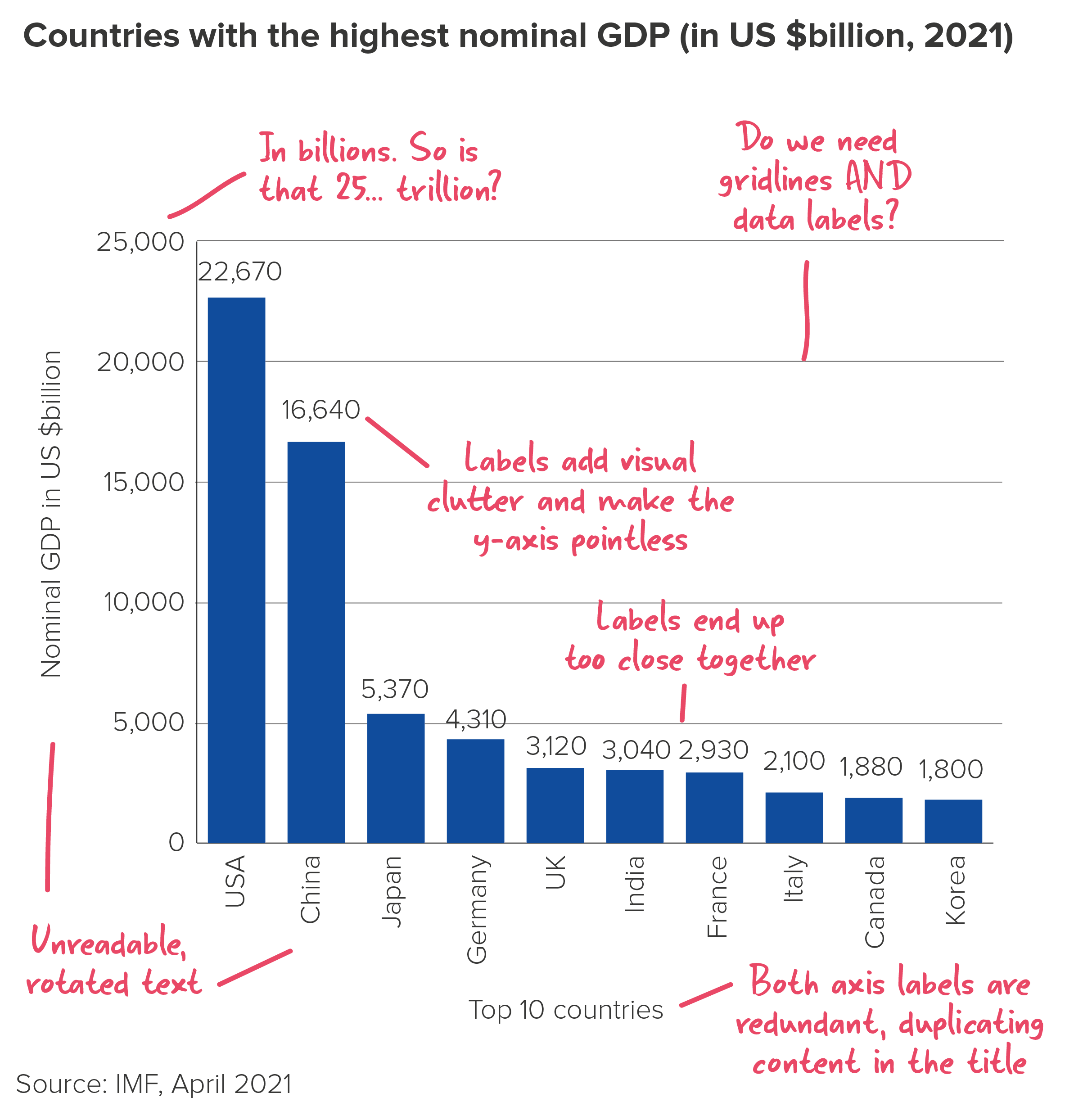
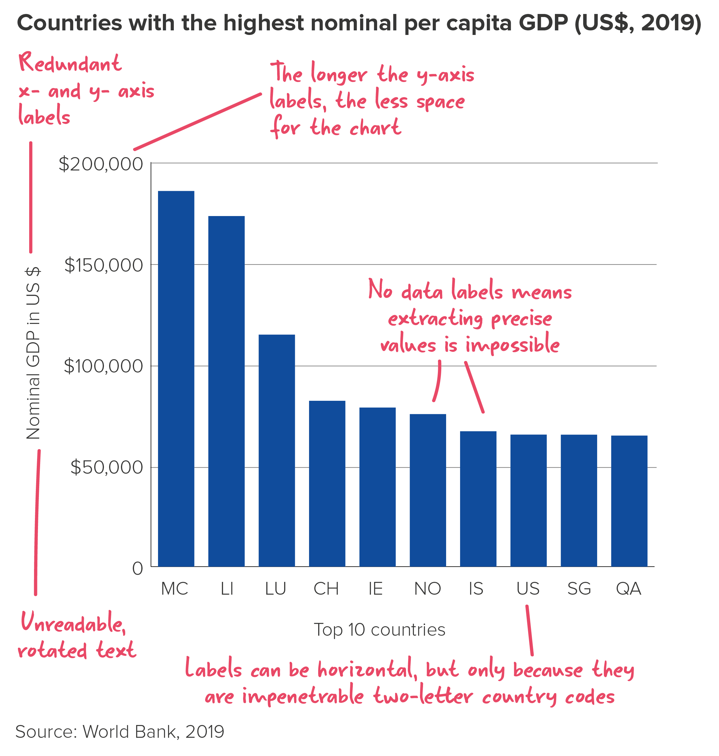
All of these shortcomings matter less when you are analysing. In fact, default bar charts with cluttered text are usually fine as a tool for spotting general patterns and trends. But when you are trying to persuade others to care about what you have found, a hard-to-read bar can be disastrous.
In the rules that follow, we’ll look at how you can fix some of these issues with bars. But for now, I’ll just say if you are trying to engage an audience, it is worth experimenting with other chart types, ones where the text is always horizontal and unabbreviated, and where the shapes dramatise your story in a more memorable way. Sometimes a (tidied-up) bar chart will be the right answer. But in many cases, a different kind of chart will help you to communicate the story that a bar chart helped you to discover.
I’ve put some alternatives to bar charts below. This focuses on one type of bar chart story (comparing different countries on a 0-100% scale). Some of these charts clearly work better than others. But hopefully it gives you a sense of the range of options available to you if your bar chart topples over.
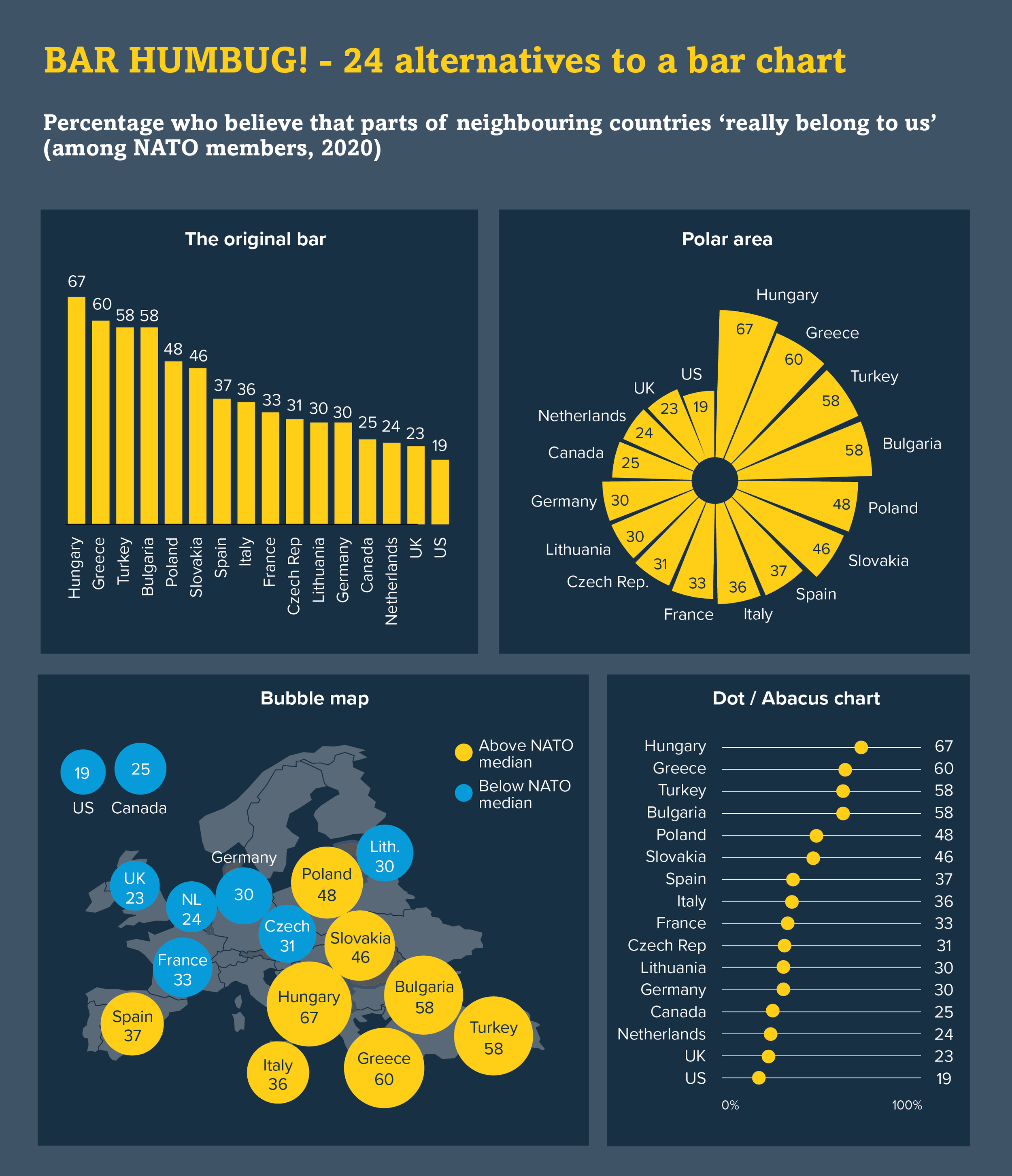
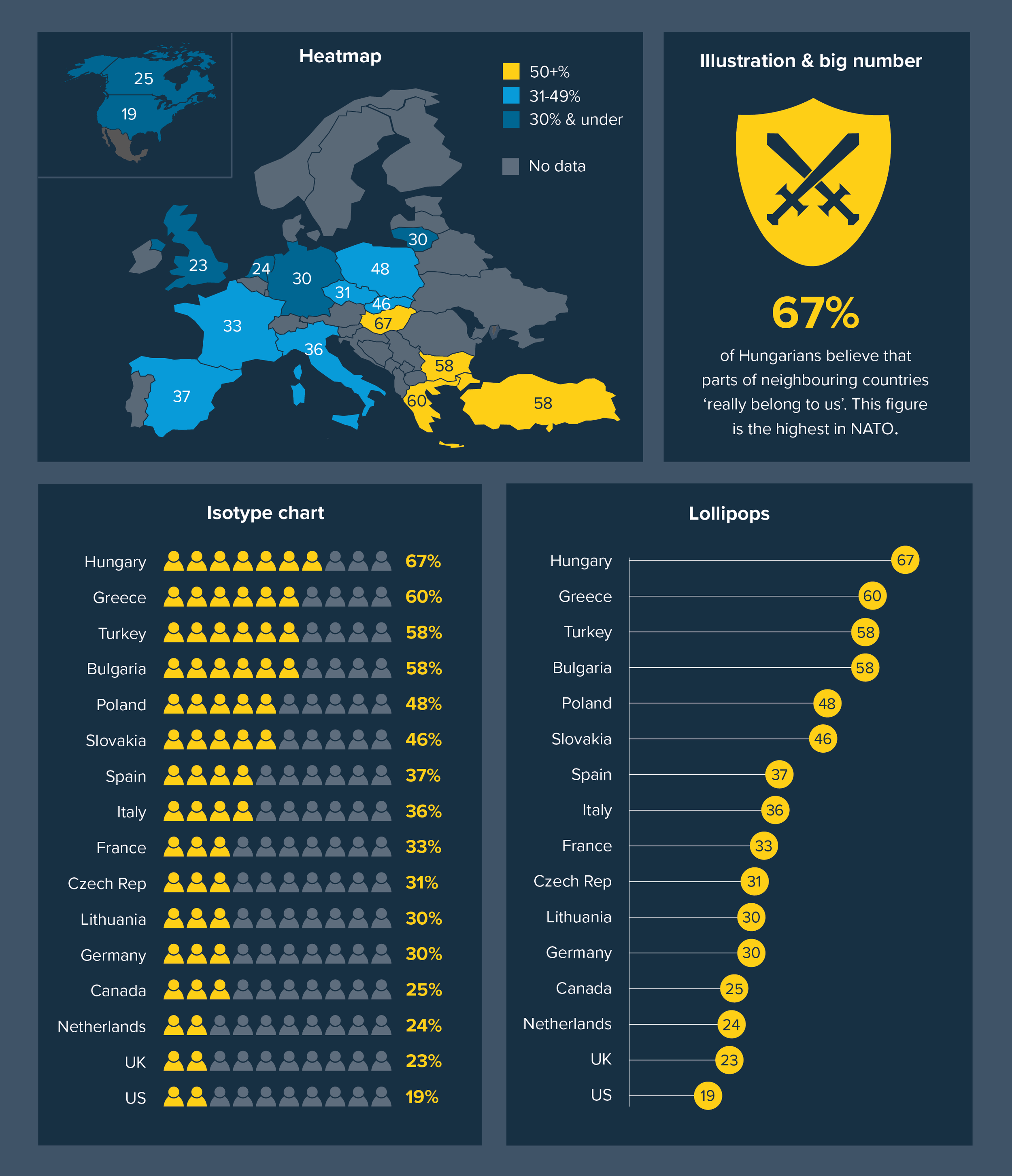
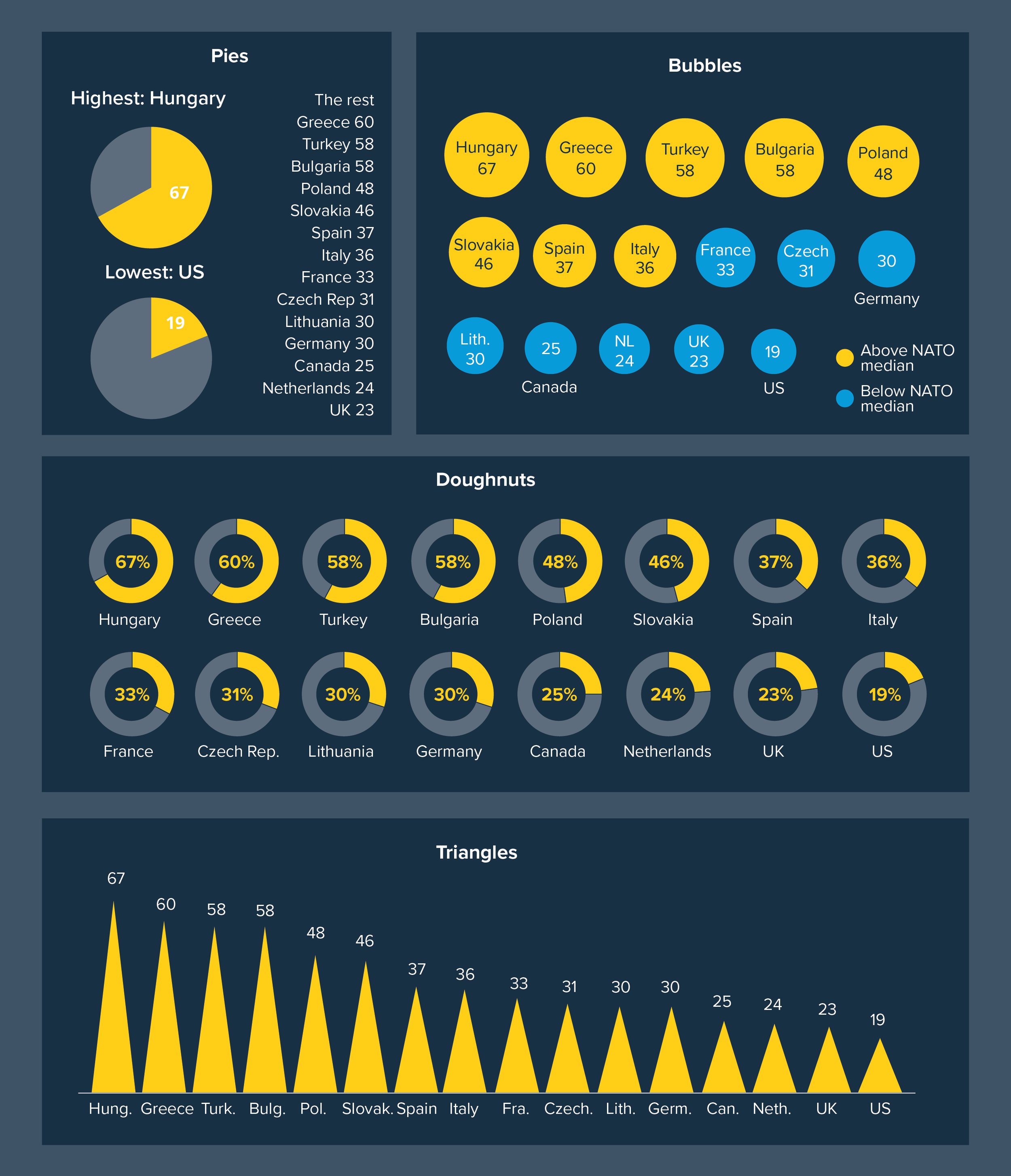
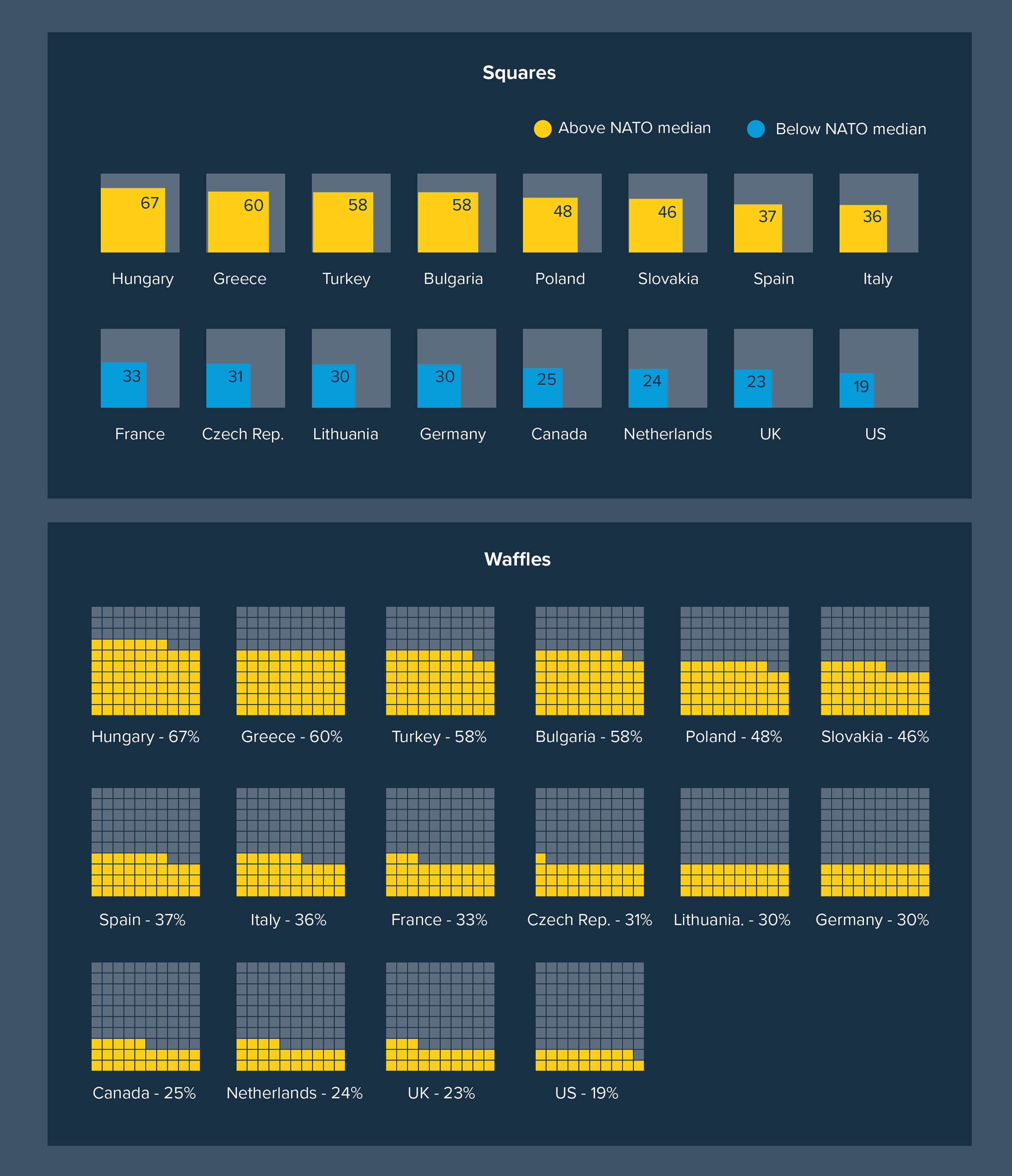
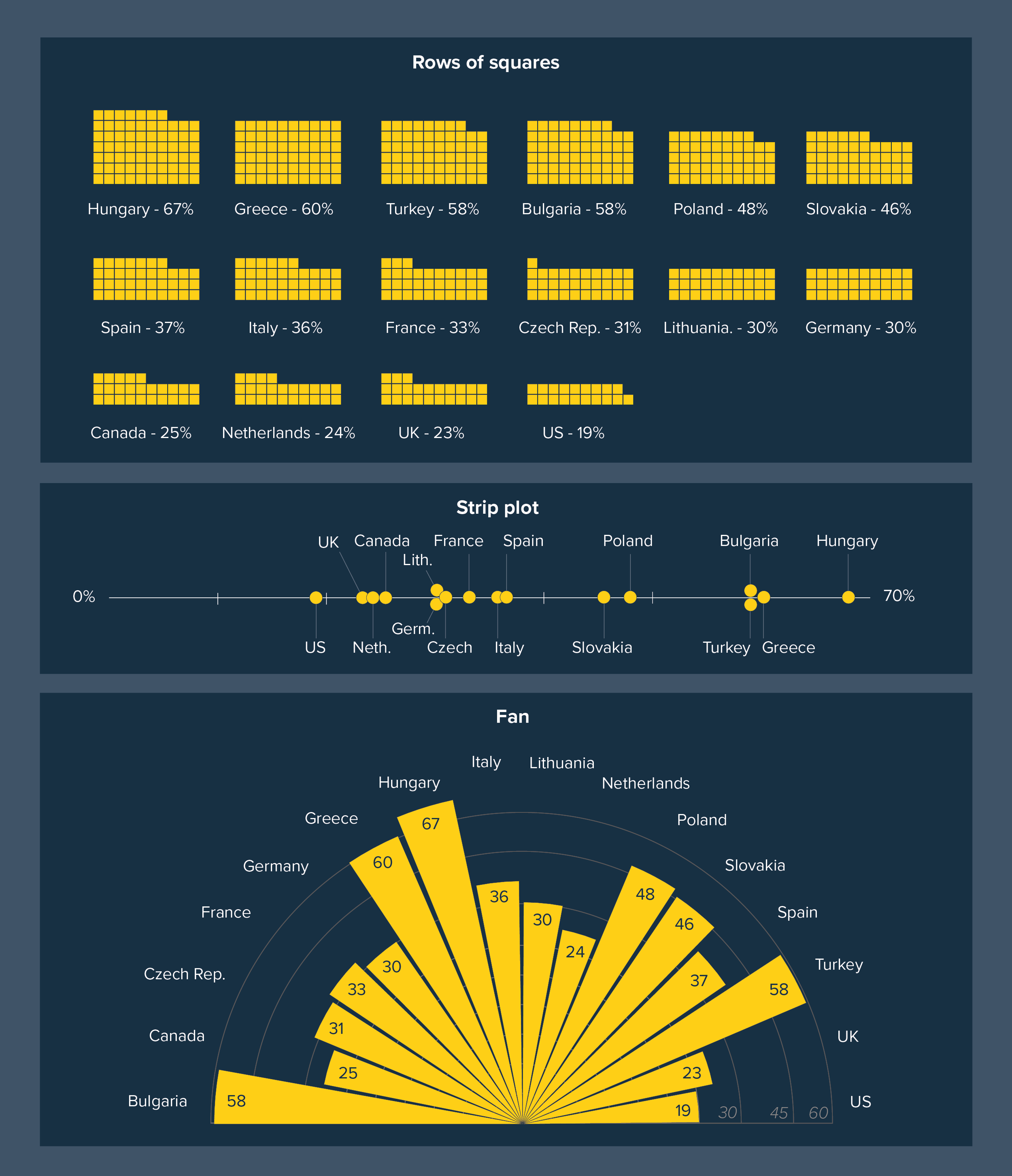
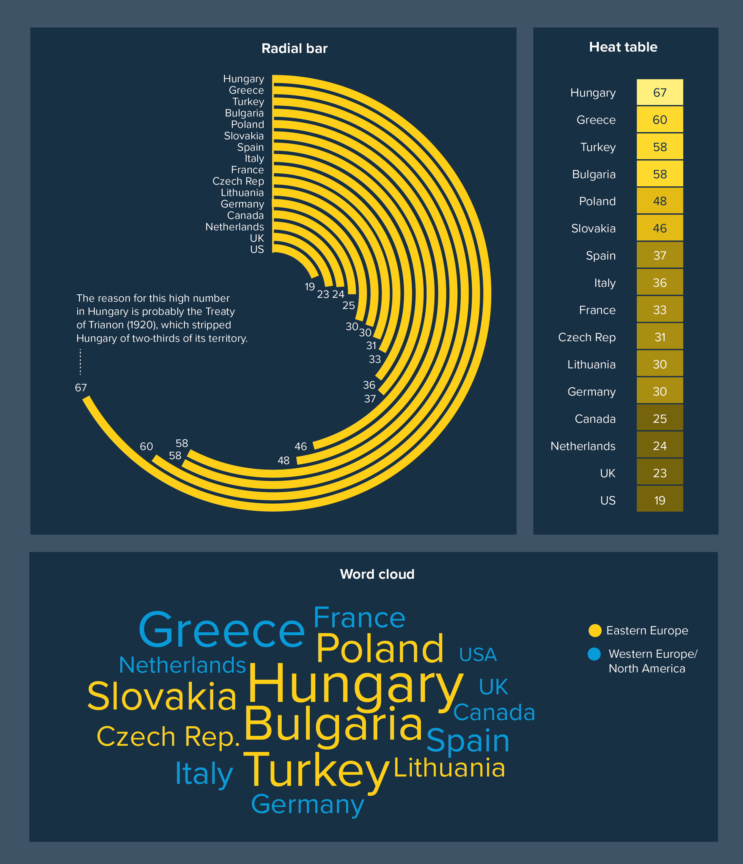
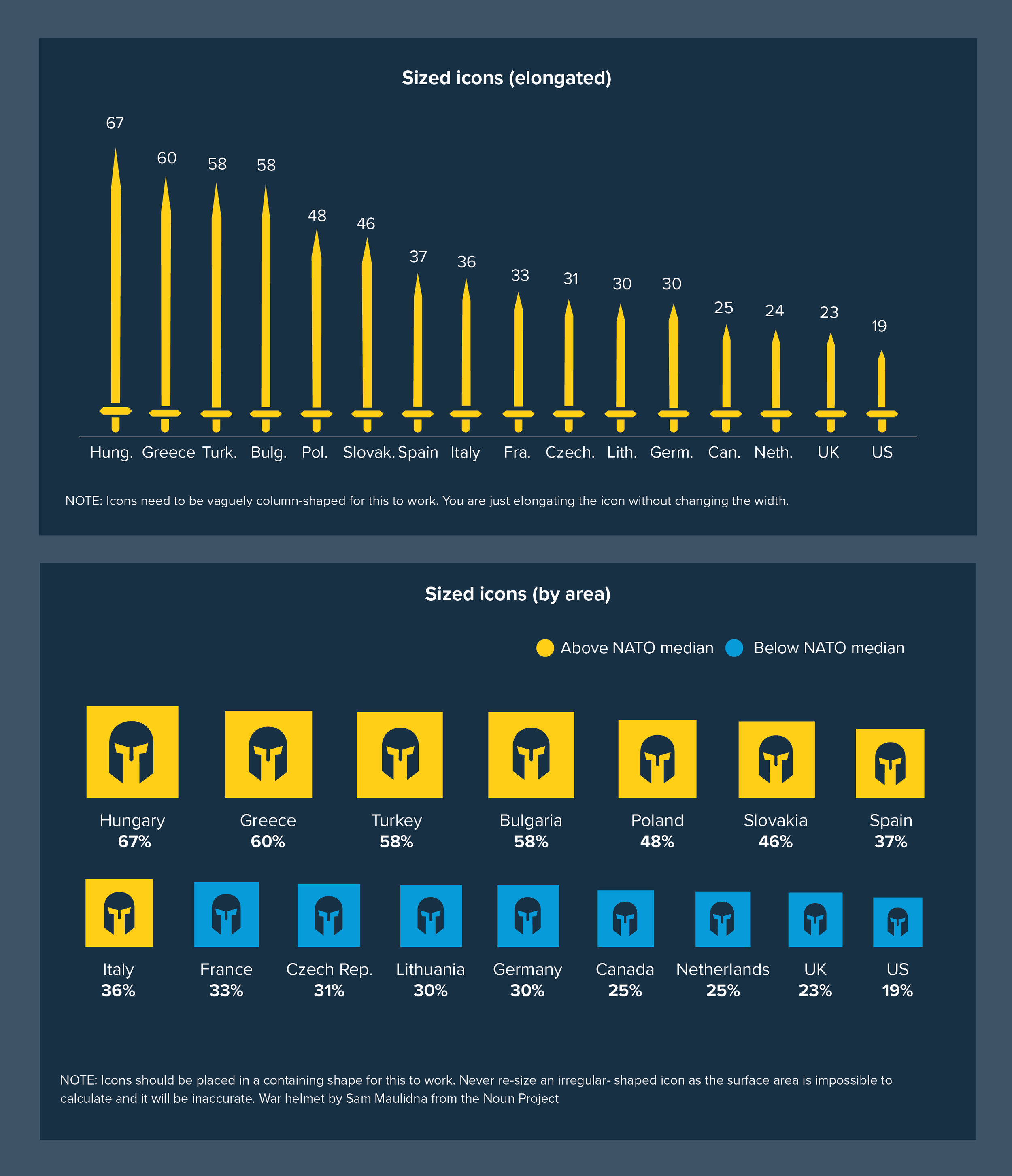
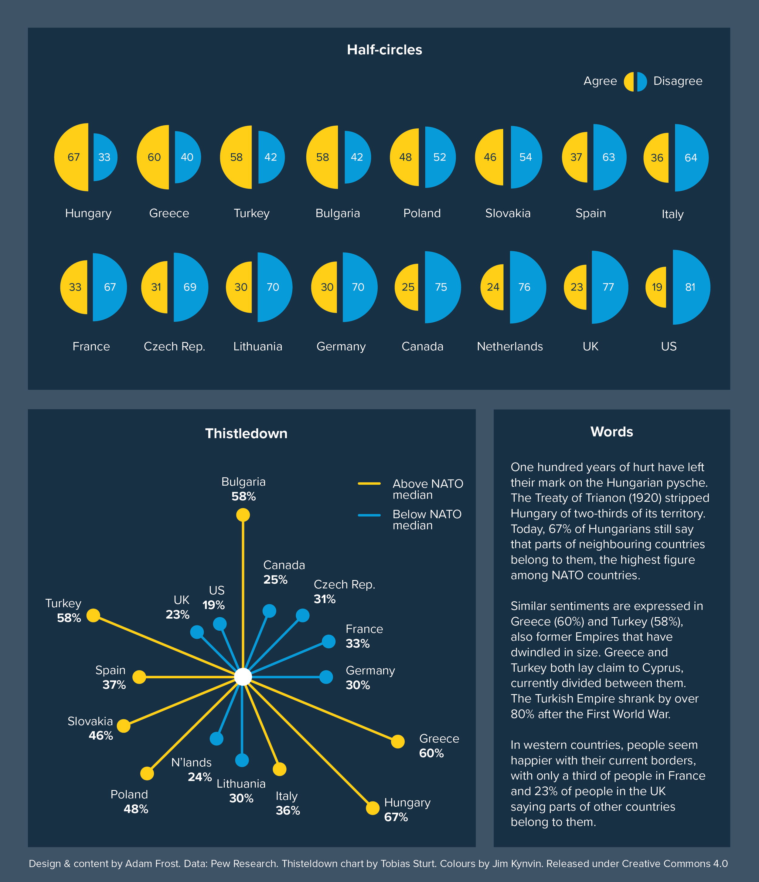
Get this graphic as a single, hi-res pdf here.
Get this graphic as a PowerPoint presentation here. (Note: uses svgs, might look weird in less recent versions of ppt).
VERDICT: Break this rule often
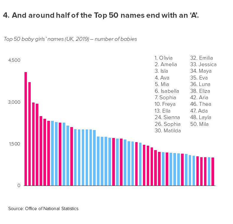
Data sources: UK baby names from ONS; Image Credit: Fertility rates, smoking rates from World Bank, nominal GDP from IMF, Hungarians believing parts of other countries belong to them from Pew Research, Global Attitudes Survey Q50f
More data viz advice and best practice examples in our book- Communicating with Data Visualisation: A Practical Guide