
In this blog series, we look at 99 common data viz rules and why it’s usually OK to break them.
by Adam Frost
Like most data viz types, I spend too much time on the Our World in Data website. It’s free, well-organised and endlessly fascinating. But because they provide maps and charts for every conceivable dataset, they have to rely on computers to generate a fair number of their visuals. Which can lead to some brave design choices.
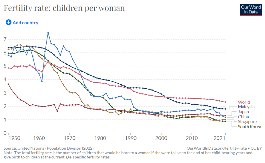
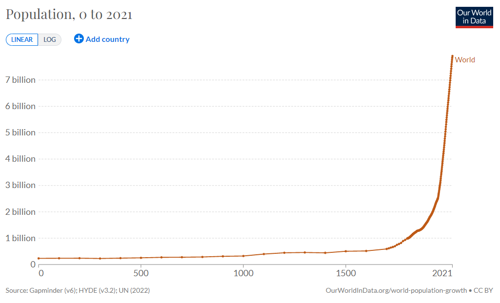
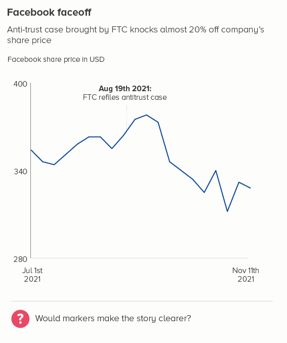
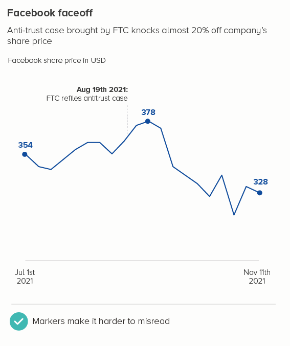
The charting engine has clearly been given the following instructions: Show where we have a datapoint with a circular marker. These markers are shown, presumably, out of a desire for full disclosure. Unfortunately, integrity can create self-sabotaging visuals.
In the first chart, those circles stop us seeing the actual lines. In the second, the markers get smeared together after 1750 where there is a datapoint for every year. A reader glancing at this might even think that the thickening of the line means something. This is the most exciting part of the story - the dramatic surge in population after 1800 - and it is undermined by those intermittent bulges.
Data markers should only be added if the story requires them, and that is not the case here. In fact, it’s almost always not the case. There are only a handful of instances where the use of data markers can be confidently recommended, and even then, I’d say this is optional, rather than compulsory. I’ll run through the key use cases here.
i) An interactive chart on a dashboard
This is why I suspect we have markers on the Our World in Data charts. They are interactive charts and OWID want to signal where people can roll over and get the specific datapoints. But couldn’t these markers appear on rollover, rather than as a constant deforming presence? Besides, what proportion of your users want to know where the specific datapoints are? If it’s a minority, their needs shouldn’t outweigh the majority who just want to see clear trends.
ii) Data at irregular intervals
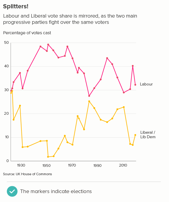
This is a legitimate use of data markers. One example might be if you are measuring party share in elections. Elections don’t always happen at regular intervals, and vote share doesn’t move steadily up and down between elections, but lurches based on policies, scandals, royal babies and so on. So accentuating the election dates rather than the connecting lines can be sensible (the first chart below).
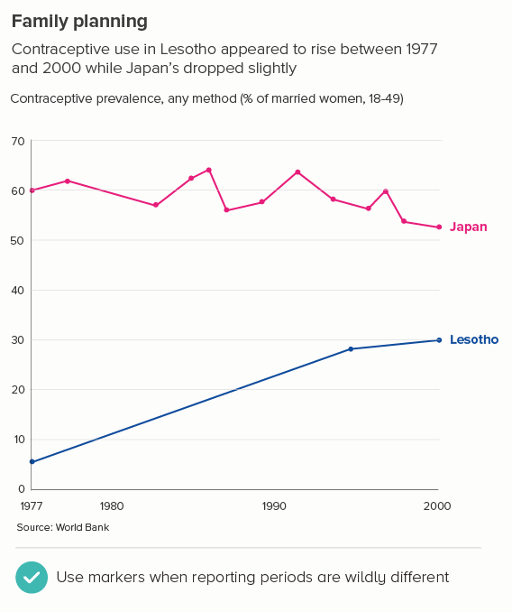
Similarly, you might have data at long, irregular intervals for one of your lines but not the other(s). To signal the difference in reporting frequency between these lines, you might choose to add markers to all of them. In the second chart below, comparing contraceptive use in Japan and Lesotho (1977-2000), it’s important that the audience knows that Japan collects this data regularly and Lesotho doesn’t, because it affects what you can say about the data.
iii) Not much data
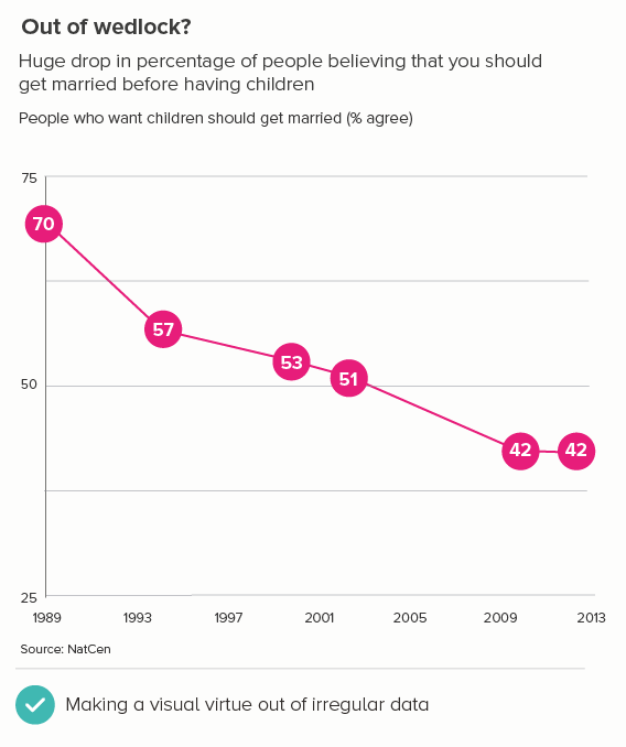
Lines suggest fluid, continuous change, so if you only have a few datapoints for each line, then the metaphor and the data don’t exactly match. In these situations, it’s better to visually signal that most of the line is guesswork. Sometimes, you can make a virtue of the paucity of your data by turning the markers into a feature, with a prominent number in the centre of each (the first chart below). Note that this obscures some of the line, so you have to be careful, but it can be effective as a ‘quick glance’ chart.
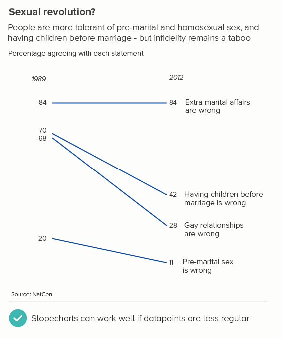
Another option when you only have a few datapoints per line is a slope chart (the second chart). The effect is often more dramatic and you’re only omitting a couple of datapoints in between the start and end dates, so it’s only a mild simplification of the story. Adding contextual data can help lift your story as well.
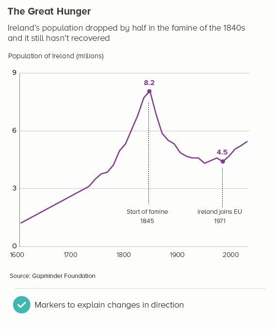
iv) If particular points in time are key to the story
Sometimes, you’ll want to clearly signal key dates, or flag sudden changes in direction in your lines. A marker makes that pivotal moment clearer. Often you’ll annotate these moments too (the first chart).
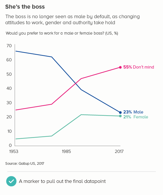
Usually the key datapoint is the last one, and it is sometimes a good idea to add a marker here, particularly because the y-axis and that final value will be so far apart, and specifying it means the reader doesn’t have to squint at the y-axis, track across, and guess (the second chart above).
v) if you start above zero
You’re certainly not obliged to add data markers when you start above zero. But if you feel that people might not notice the y-axis starting above zero, and it’s important that they do notice it, then adding markers - along with numbers - can be one way of making it crystal clear what the lines represent.
vi) aesthetic reasons
I’ve left the best till last. Sometimes your lines just look too boring. Particularly if you’ve only got a single line on your chart. You want to add something to make it catch the reader’s eye. A marker can be one option, if the story justifies it.
What should the markers look like
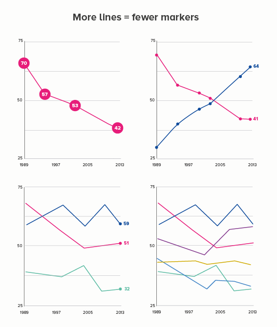
A lot of this depends on the story, the audience, and the number of lines you have. If you have one line, and just a few datapoints, you can go quite chunky, perhaps even bringing in the number too; but the more lines you have and/or the more datapoints you have, you will probably want to reduce the size and number of those markers until, when you get to more than four lines, you’ll lose them altogether (the first image below).
Shape-wise, almost always use circles. There’s so much literature on how much humans like circles, and how we associate them with importance (draw a circle round this paragraph if you agree). Think hard before you turn that marker into a square or a triangle or a dodecahedron. A circle offers perfect visual contrast to the sharp angles of your line, whereas a polygon competes with it. And metaphorically, a circle just works - this is a datapoint and what shape is a point?
I’d also stick to a solid fill for your circles rather than any kind of texture or photo.
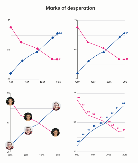
Finally, I’ve been talking a lot about using shapes as markers, but of course it’s also possible to just use data labels (numbers) as markers. This can sometimes work with single lines, but with multiple lines, the result is usually a mess. Again, the clarity and cleanness of the lines is obliterated. If the exact numbers are that important, maybe a table is the best option, or separate the lines out, and go for small multiples.
Conclusion
This rule is another one to treat with intense suspicion. Markers on line charts are usually overkill. The audience rarely wants or needs them. Your story should be strong enough to leave a mark without them.
Verdict: Break this rule often
Sources: Party vote share - UK House of Commons Library, Contraceptive use - World Bank, Social attitudes - NatCen BSA, Irish population - Gapminder, Gender of boss - Gallup, Facebook share price - Nasdaq