In this blog series, we look at 99 common data viz rules and why it’s usually OK to break them.
by Adam Frost
Area charts don’t get a lot of love, but I love them nevertheless. 'We rarely (but not never!) find ideal use cases for the area graph.' declares Storytelling with Data, comparing it to 'such controversial visualizations as bubble charts.' (Which I also like). Datawrapper describes area charts as 'not easy to read.' And in a post titled 'I hate stacked area charts', Dr Drang argues that the stacked kind are ‘often misleading’, and clinches his argument with: 'Here’s a fictitious example to show what I’m talking about.'
Ah, ‘fictitious examples.’ So much more manageable than the factual kind.
So, without (I hope) resorting to fictitious examples, I'm going to argue that there are many good reasons for using area charts. It's why they are deployed regularly and brilliantly by data journalists - for example, here, here and here by The Economist, here and here by The Guardian or here and here by the Financial Times.
Those bold, fluctuating slabs of colour can be the perfect fit for change over time stories, particularly if the change is dramatic, or you want to show the changing proportions of one important part compared to the whole. Yes, area charts can be misused, but so can bars, pies and lines, as we've seen in previous rules. Used well, they are as powerful as any other chart type in your toolkit.
When not to use them
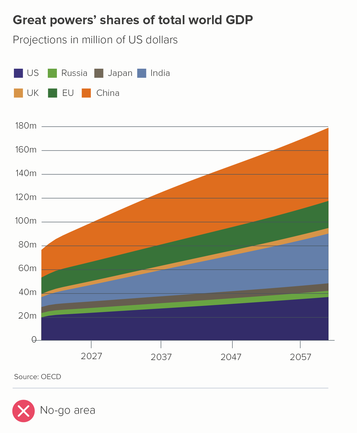
I’ll start by acknowledging that area charts are sometimes a bad idea. Take a look at this chart that appeared in a UK current affairs magazine in September 2023 - I’ve recreated it below (the first chart).
There are many things that don’t work in the first chart (the x-axis labels, the colours, the legend, the title etc). But let’s focus on the three core problems that are specific to area charts.
It is telling several stories at once. The change in the total, and the changing composition of that total, and the changing total of each individual country. Which is most important?
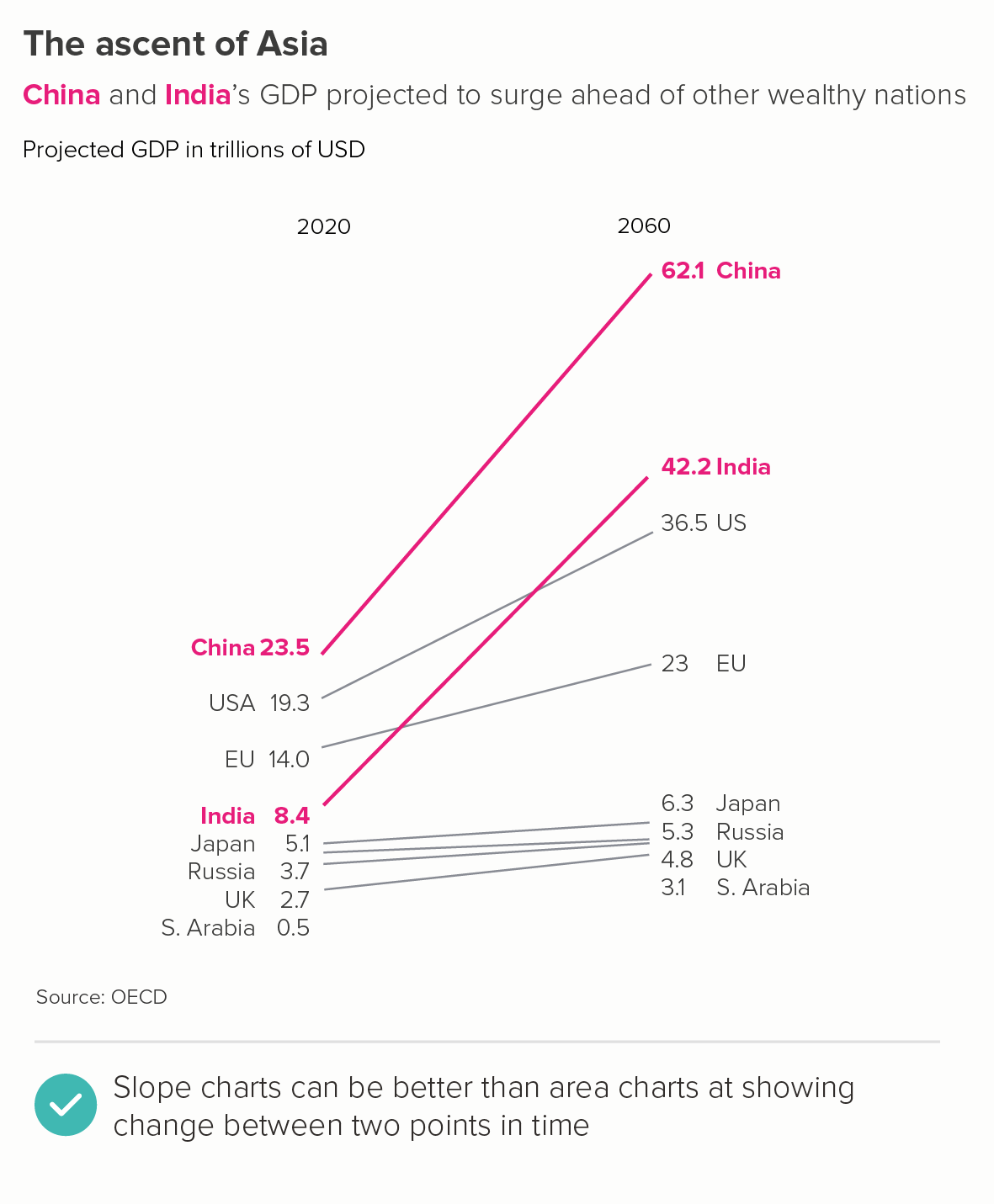
It is hard to read. Try to work out by how much the EU or Russia or India or any of the middle values have changed. Is it clear that China’s GDP will almost triple between 2020 and 2060?
It is visually ambiguous. Are those wedges stacked on top of each other, or is the China wedge sitting behind the others, like the highest mountain in a mountain range?
A slope chart (the second chart above) has none of these issues - it draws on the same dataset and tells a clear story.
When to use area charts
But the three problems mentioned above are also an important clue, because they can help us to work out when area charts can be used. If we can bypass or minimise their potential clarity and legibility issues, then we can start playing to the chart type’s strengths and telling the sorts of stories that area charts excel at.
i) a single line
If your area chart just has one line, then all the perceptual confusion mentioned above instantly disappears - you are telling one clear story and there is no visual ambiguity.
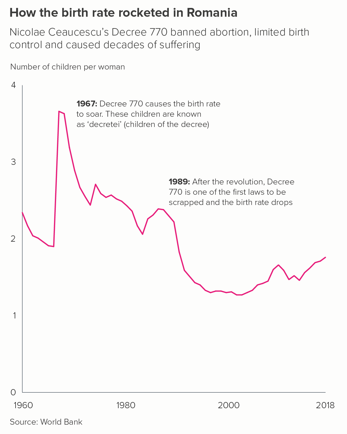
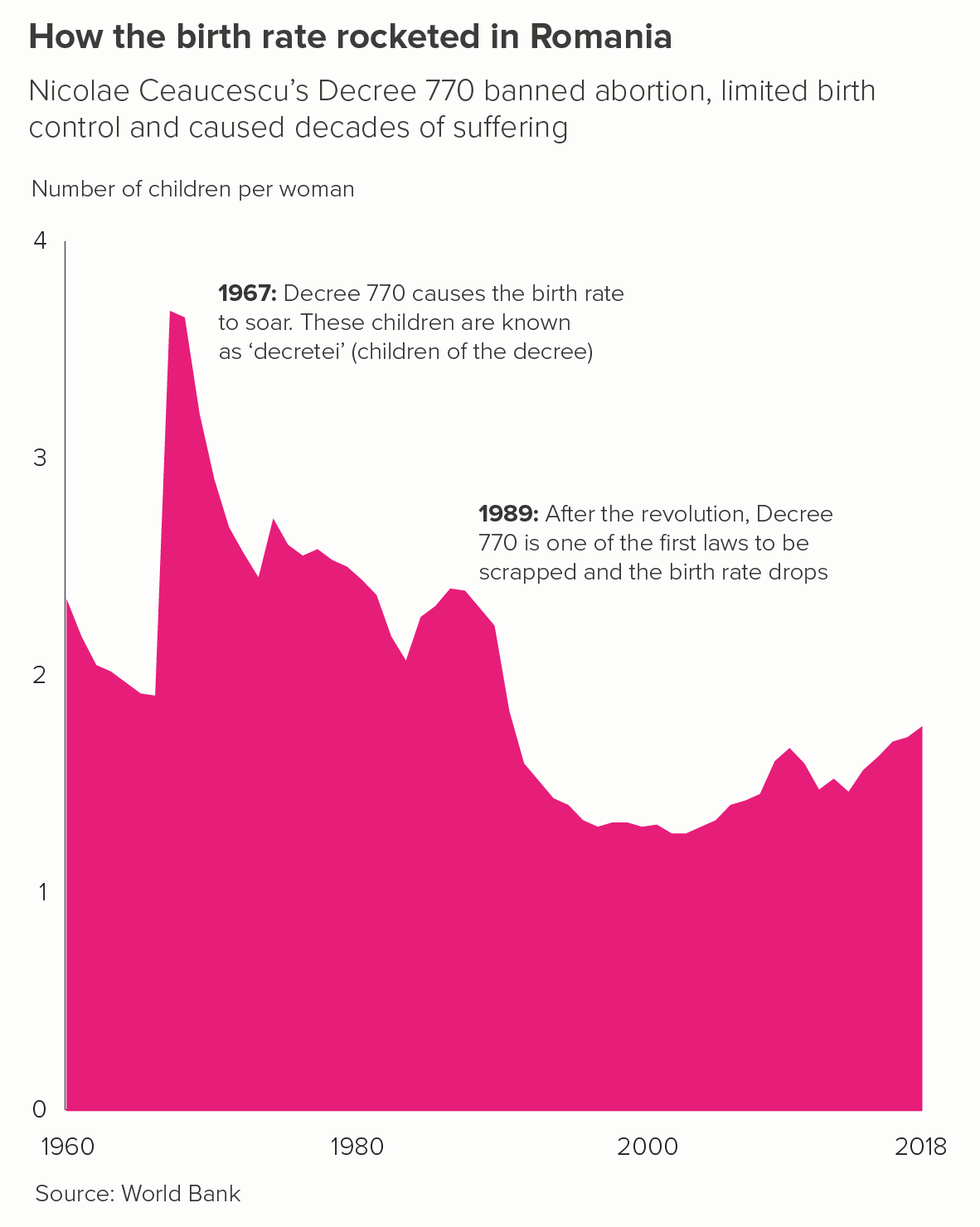
Some critics are not keen on using area charts in this way. Mike Yi of Chartio states: ‘an area chart is typically used with multiple lines to make a comparison between groups’. If you have a single line, consider using a line chart, he argues. But, with the right data, I think filling the area below the line makes any movement in the line clearer and also draws on colour’s ability to evoke drama and emotion.
I like the line charts above well enough, but I find the area charts more engaging.
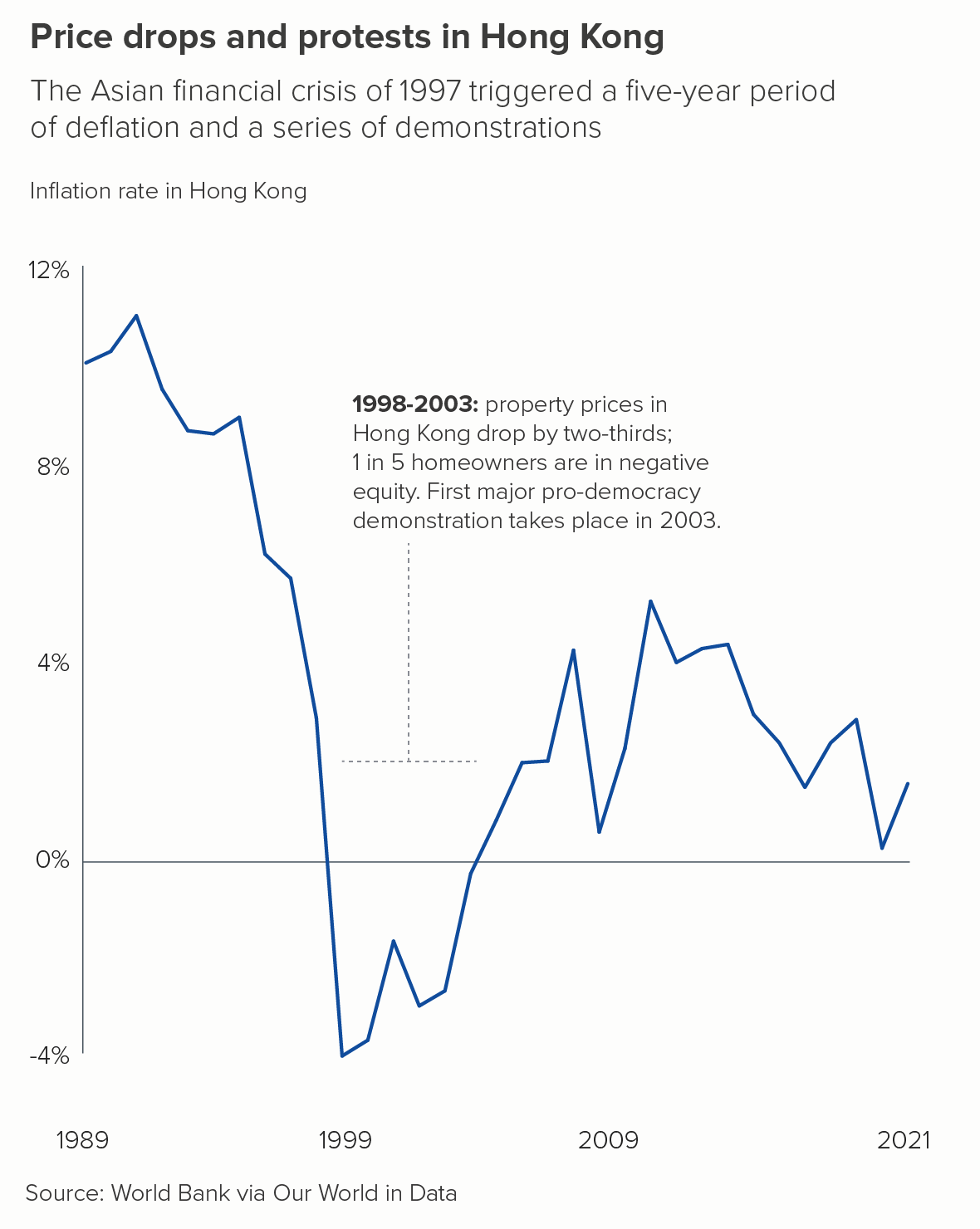
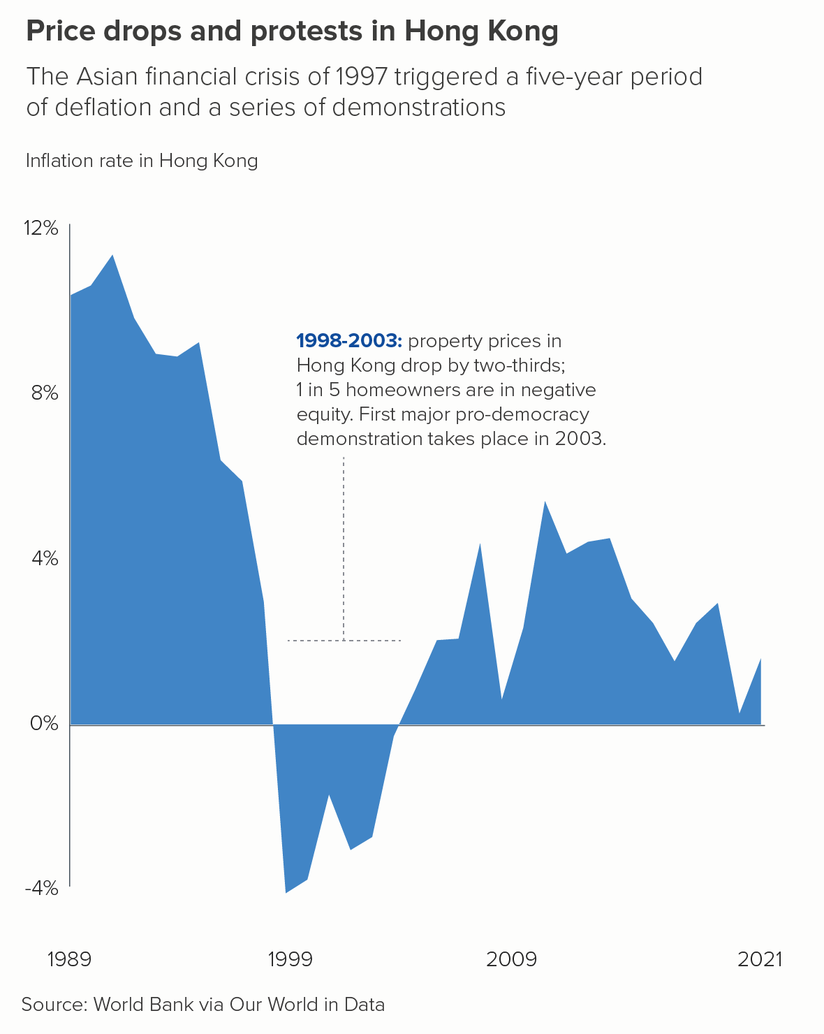
There are caveats though. Take another look at the two charts above - birth rates in Romania and inflation rates in Hong Kong. They both have these elements in common.
Both y-axes show zero clearly. It is deceptive to start an area chart above zero, just as it is with a bar chart. Any filled, base-aligned shape will be seen by your audience as sitting at ground level and moving above (or beneath) it.
They both have a key moment or key moments of dramatic change that the colour helps to make clear - Romania’s spike in birth rates in 1967 and Hong Kong’s long period of deflation between 1998 and 2003. A flat area chart with few datapoints and/or minimal change ends up looking more like a rectangle.
As long as these conditions are met, then a single line area chart can be a good choice. For other examples, take a look at this chart about Facebook break-up times by David McCandless, this from the Financial Times, or these from the Washington Post.
ii) small multiples
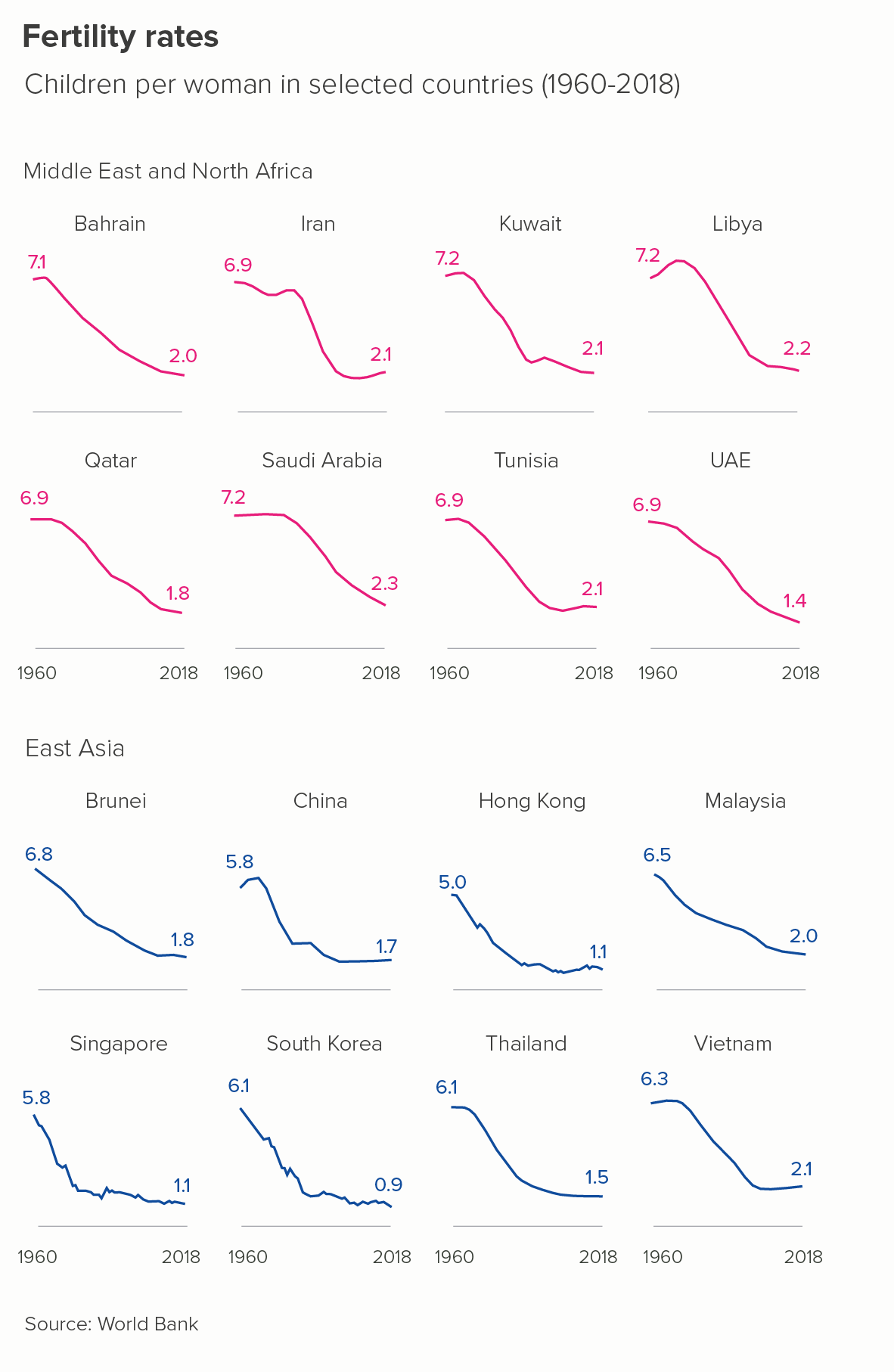
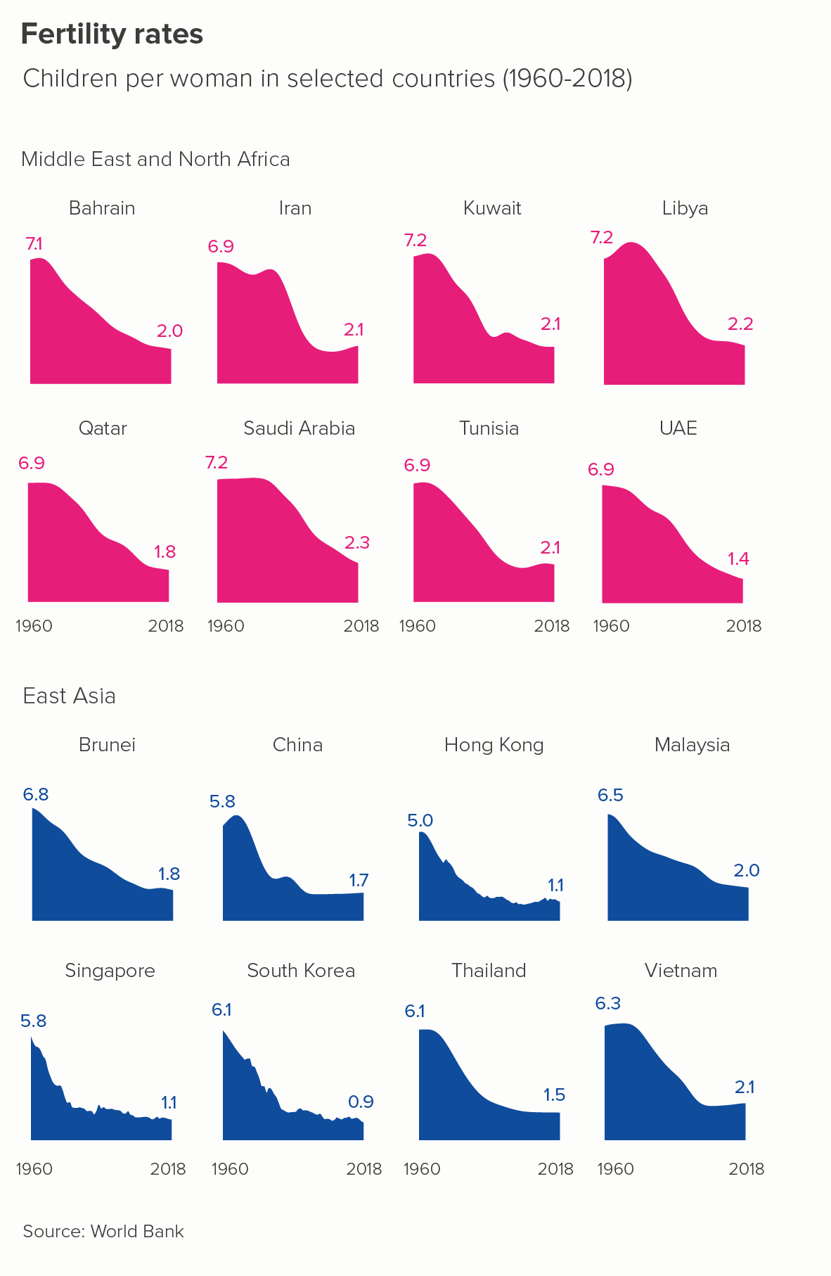
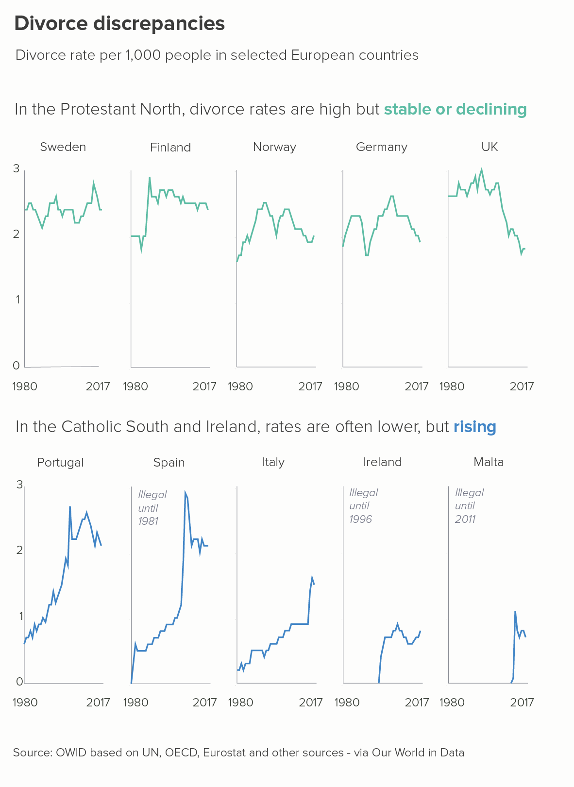
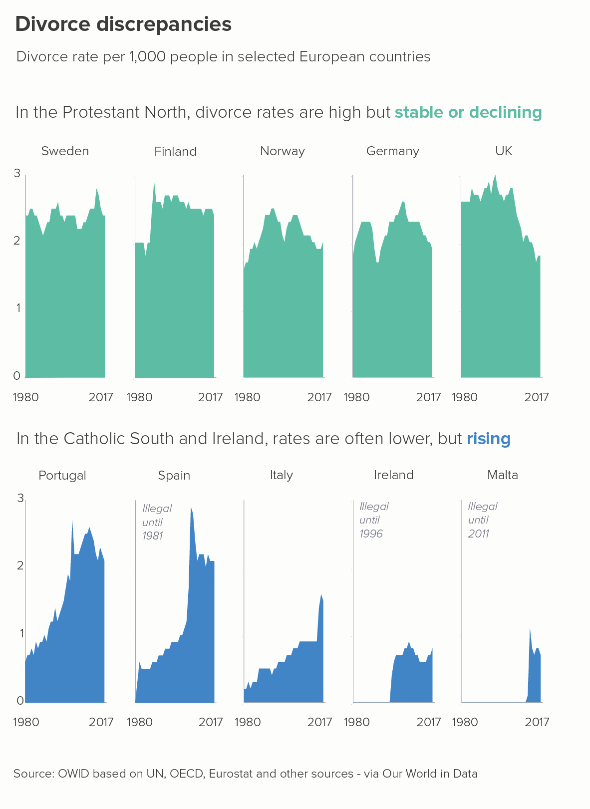
Just as a single line area chart can be the right answer, so too can several. Small multiple area charts are more eye-catching than single floating lines. This is particularly the case when you want to use colour to highlight particular elements of the story, or group the charts in some way - perhaps by region or sector.
I find the area charts above clearer and more visually persuasive. Notice that, once again, we have zero represented clearly on the y-axis and we are illuminating stories of clear and dramatic change.
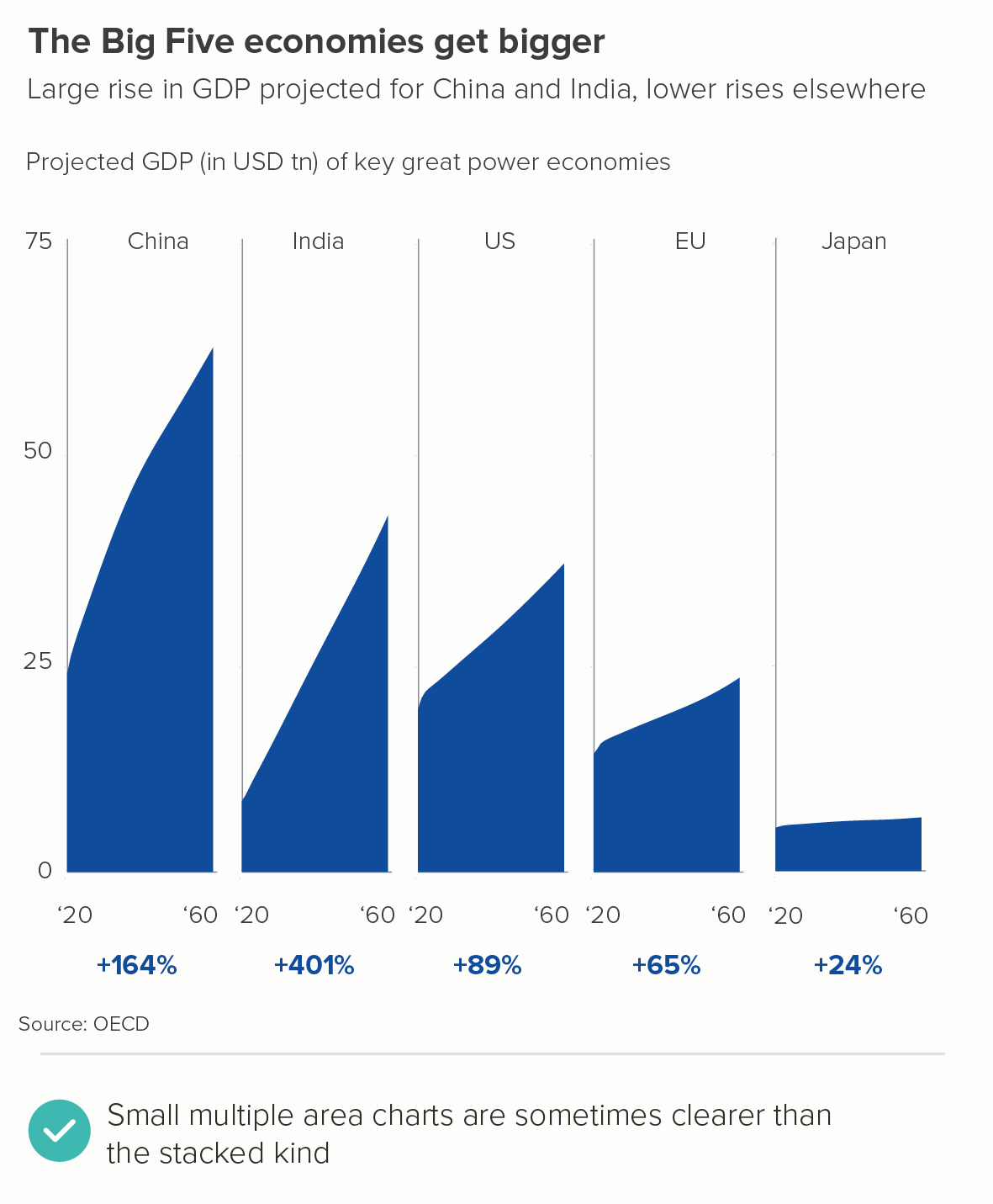
Even the confusing GDP share story mentioned at the start of this article works just fine as ‘small multiple’ area charts. It is easier to see the sharpness of China and India’s rise and Japan’s flatness.
A related kind of small multiple area chart is the ridgeline plot. I’d think of these as half-way between small multiples and the overlapping area charts I’ll be discussing below. The overlap doesn’t mean anything in this case, it’s purely aesthetic. They are quite a niche chart, usually used to tell distribution stories and rarely seen outside of academic circles. That said, here’s a good example from Henrik Lindberg via Visual Capitalist. And this is a stunning one from National Geographic. (The original, larger version is on the National Geographic site, but it’s behind a paywall, as websites owned by Disney tend to be).
iii) Overlapping areas
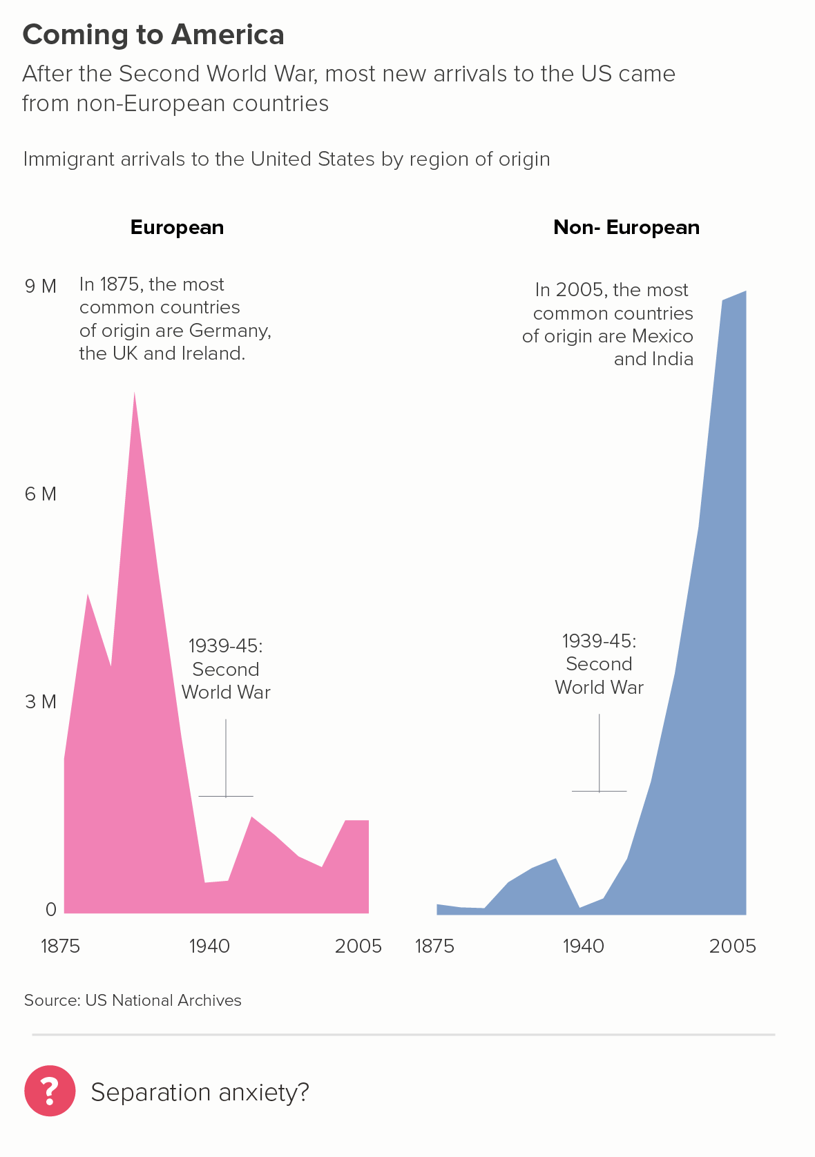
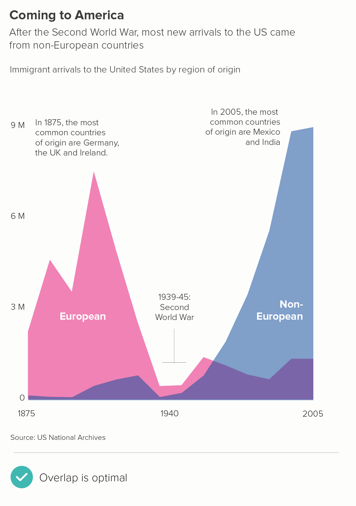
Above, I mentioned that area charts can be misread, as it is not clear whether the categories are stacked or sitting behind each other. One way round this is to tell clear stories of overlap. This approach works when you have related data series which cover different points in time and/or which peak at different times.
For me, the first chart above isn’t as effective - it’s the fact that the two series overlap which is the point of the story, one wave of migration dropping away as the other one ramps up. Also note how we have reduced the opacity of the fill. This is always essential for these stories - a solid fill of course makes any overlap invisible. 50% opacity is usually a good starting point and then adjust down or up accordingly.
There are other effective overlapping area charts here from Pew Research.
iv) A walk-through
Another way around the potential ambiguity of area charts is to walk through the different stages one slide or screen at a time. This can be done manually - in a PowerPoint presentation, for example - or in an interactive with transitions.
For example, if you have a stacked area chart, you can start with the total (a single line area chart), and then effectively ‘x-ray’ the component parts of the chart, using your titles and subtitles to make what you’re doing clear.
v) 100% stacked area
Another way of removing the confusion that can occur when you’re trying to show the changing composition of a fluctuating total is to remove the total from the equation. Instead, just tell the changing composition story.
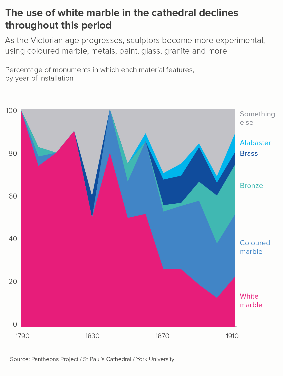
We had this recently with a project we worked on for York University, cataloguing and visualising the sculptures in St Paul’s Cathedral.
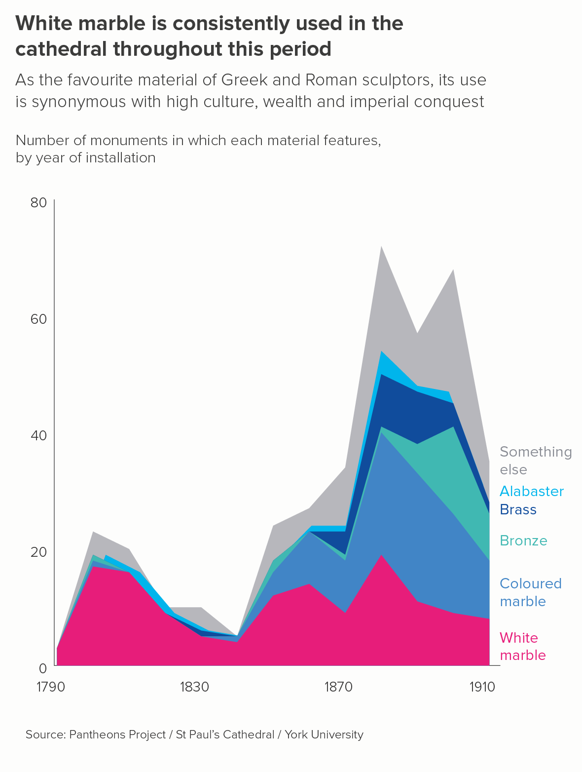
Initially we tried a conventional stacked area chart (the first image below) but, not only was it confusing, it seemed to tell a counter-intuitive story. The curators knew that sculptors were using less white marble as the nineteenth-century proceeded, but the chart seemed to show the material’s enduring popularity.
So we switched to a 100% stacked area (the second chart above). The chart became less confusing - we’re telling just one story, and people are less likely think those shapes are overlapping, they are clearly stacked up, like geological strata. But the chart also tells a clearer, more truthful story. Sculptors were using proportionately less white marble, as more experimental materials became available.
There are other examples of excellent 100% stacked area charts here from the Economist, here from the Wall Street Journal, here from Flowing Data and here from Our World in Data.
vi) use text, colour and layout to direct attention
There’s one final option. If you use a standard stacked area chart, you can make it clear using text, colour and layout where your audience should look first. This doesn’t infallibly remove all confusion, but it definitely diminishes that sense of ‘too many stories at once’.
a) highlight only the key category (or categories)
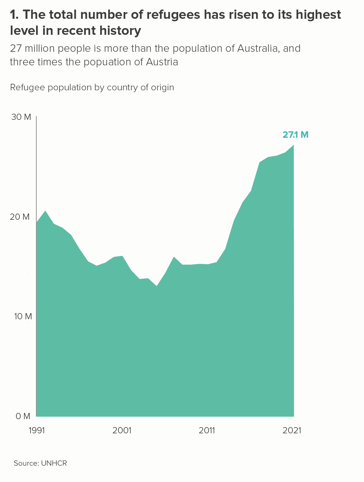
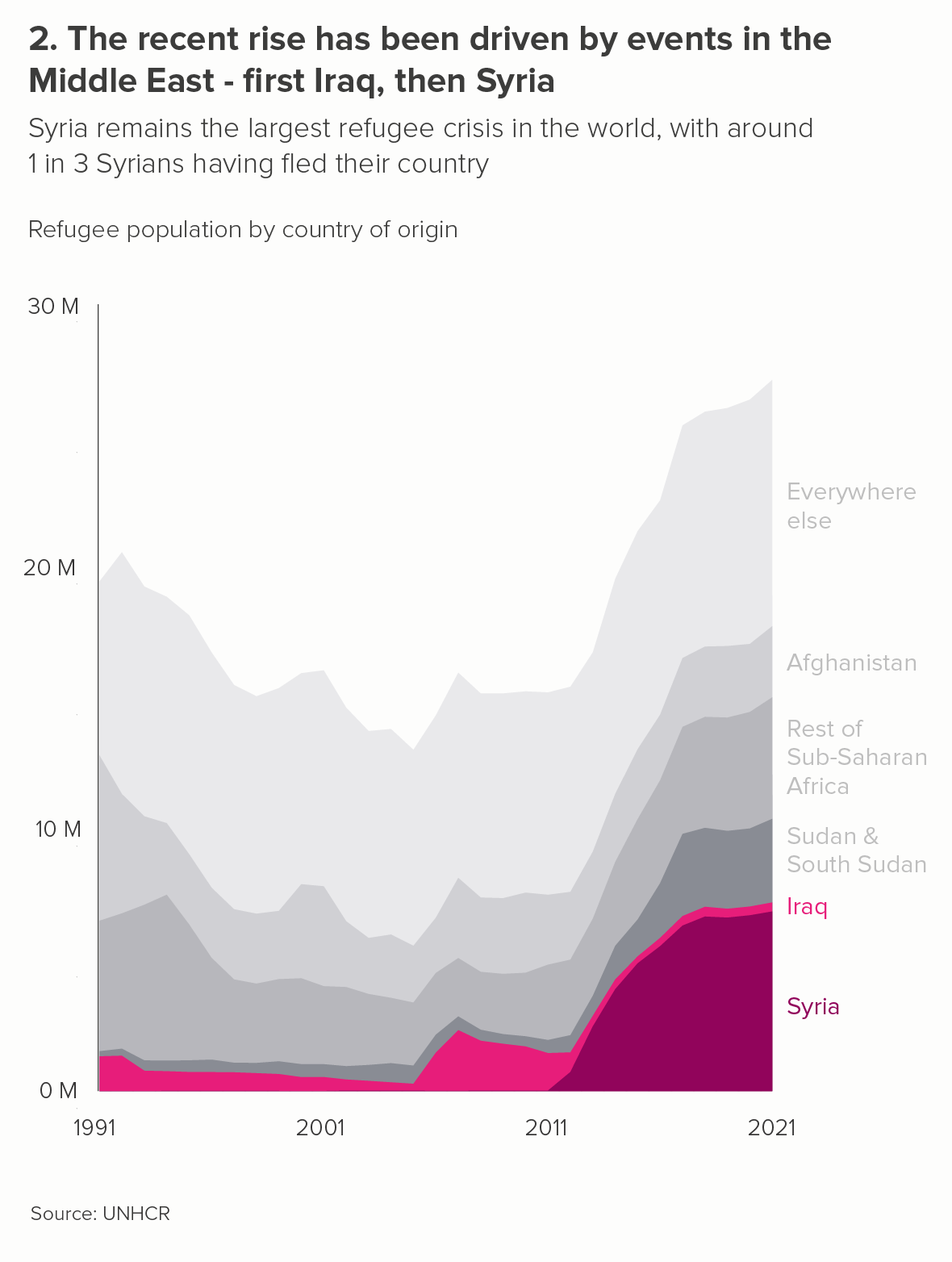
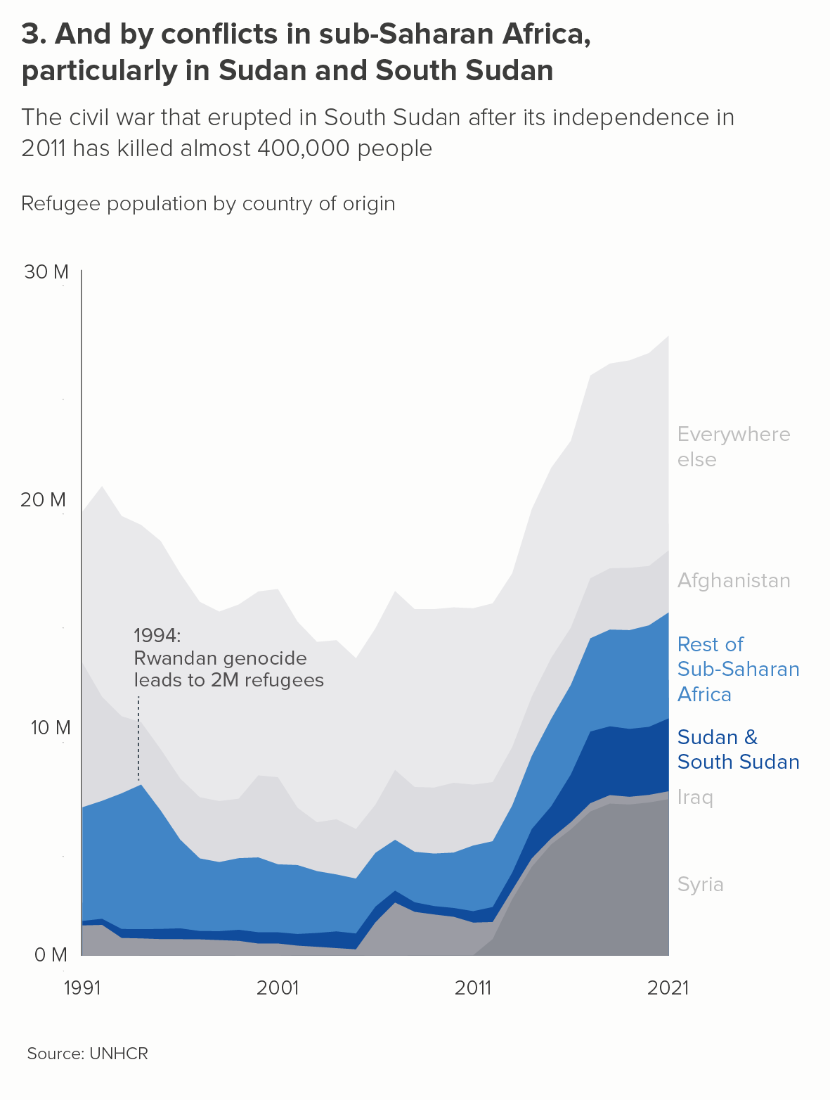
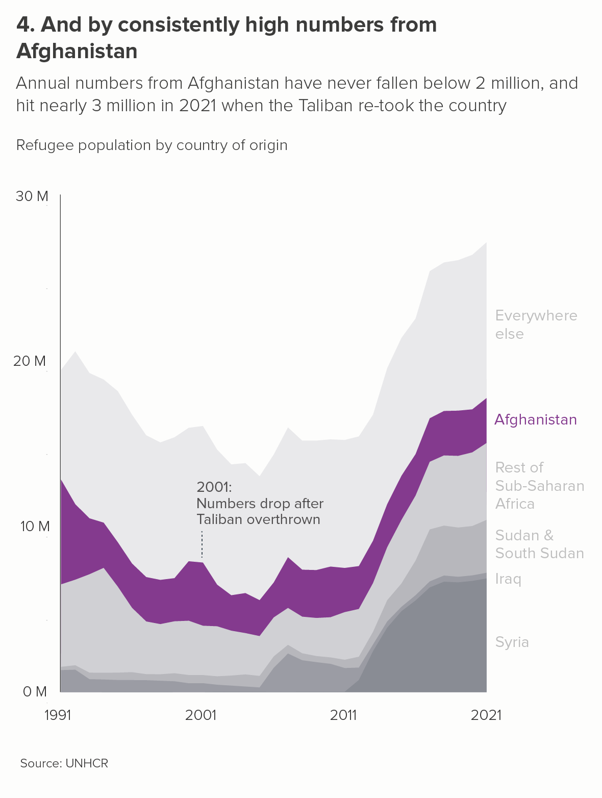
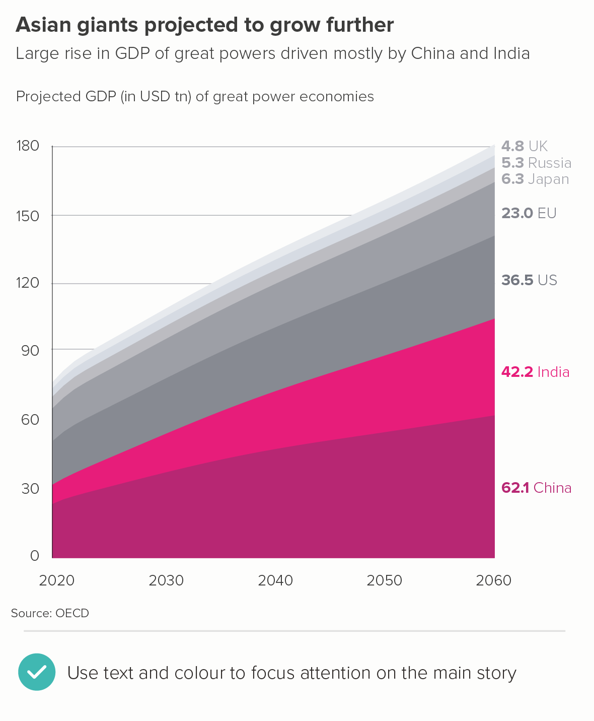
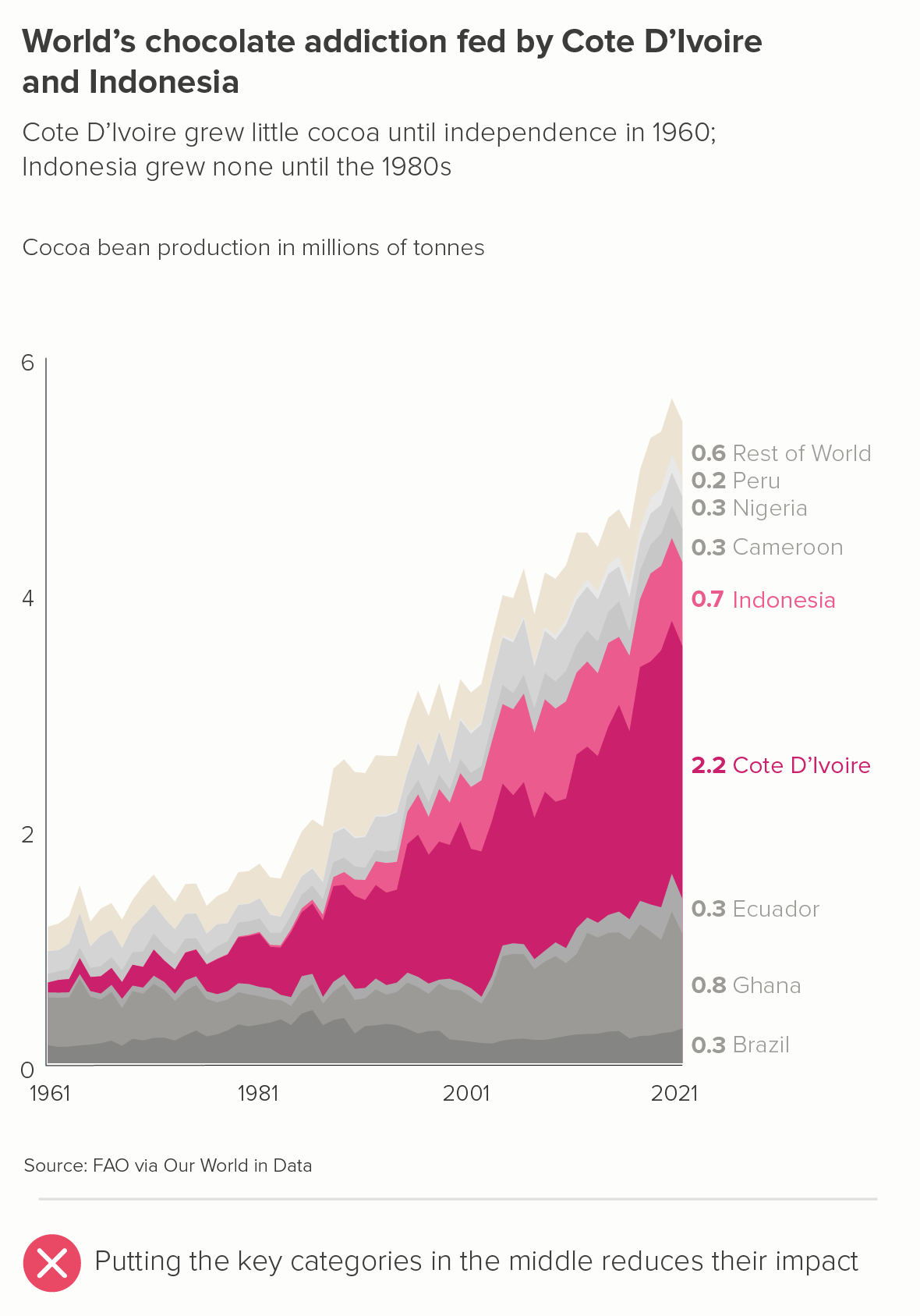
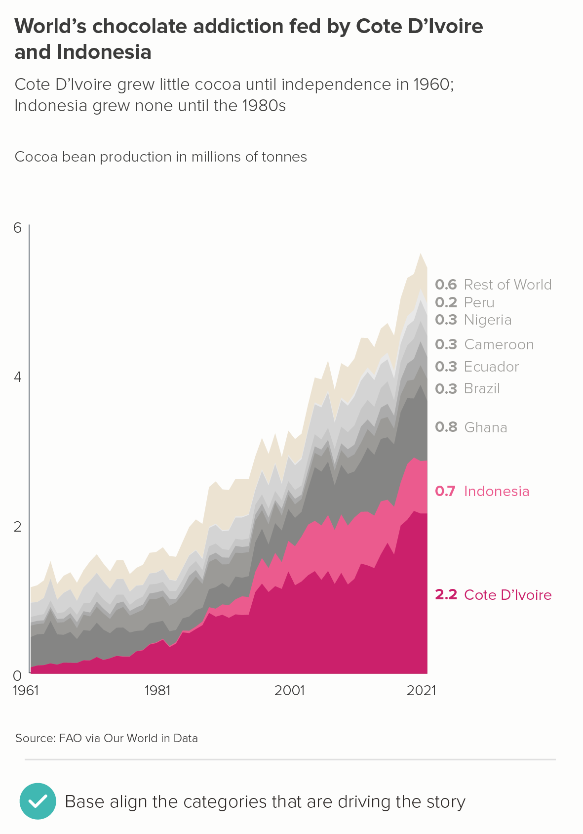
This is the most common use case - there are one or two categories which are the most interesting or important. Let’s return to our original GDP chart. Instead of trying to show everything (the total and all seven different countries), we could zero in on the most dynamic part of our dataset, and rebuild the chart around it.
Notice that in the second chart, I have:
made it clear with my text that I am telling one key story - the growth of China and India relative to the others
put China and India at the bottom - not in the middle and/or at the top - so we can see how their growth is driving the change in the total
used highlight colours to make China and India stand out
put the final value for each country on the right, which should make it clearer that these are stacked-up categories, not overlapping
put the country names on the right, not in a separate key
There’s another example below, where I’ve kept the colours the same in both charts, to accentuate the importance of base aligning the key categories.
b) highlight the total first
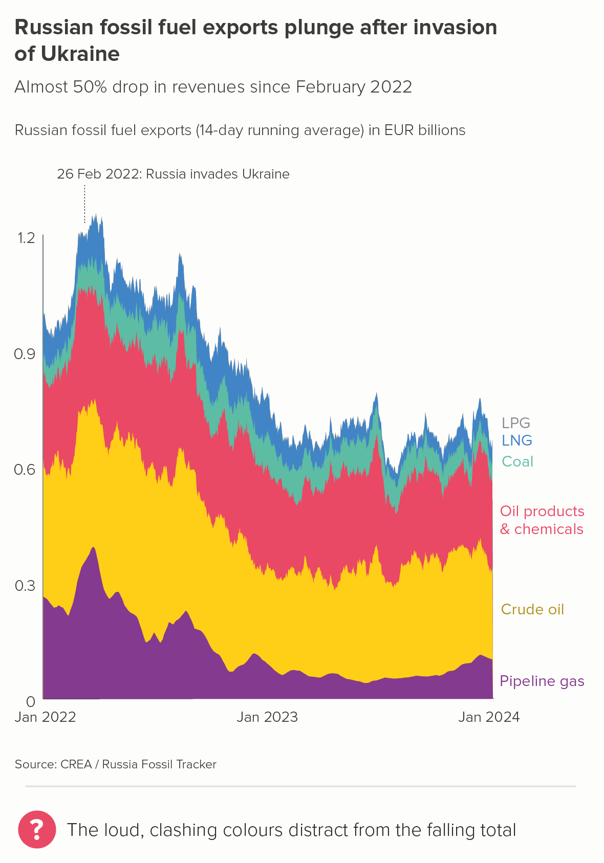
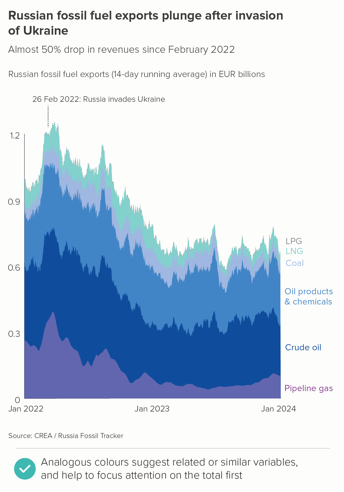
Sometimes you don’t have a highlight category - it’s the total that’s the main story. So in these cases, you’re looking to knock the individual areas back.
For example, say I wanted to talk about the effect of the Ukraine invasion on Russia’s fossil fuel exports. The first chart below would definitely not be ideal, as I’m now seeing this as a story of warring fuel types, with crude oil dominating because of that bright yellow colour. This clashes with the title which seems to want me to focus on the overall fall.
In the second chart, by using different shades of purple/blue for the different fossil fuel types, I’m keeping my audience focussed on the overall fall first, and then (if they’re interested) inviting them to study the individual fuel types. This also emphasises the similarity of the categories - they are all part of a single dataset (fossil fuels).
c) highlight all the categories
Finally, there are cases where you do want people to focus on all of the constituent areas, as they are all of equal importance. You want all the areas to be seen at once - before the total.
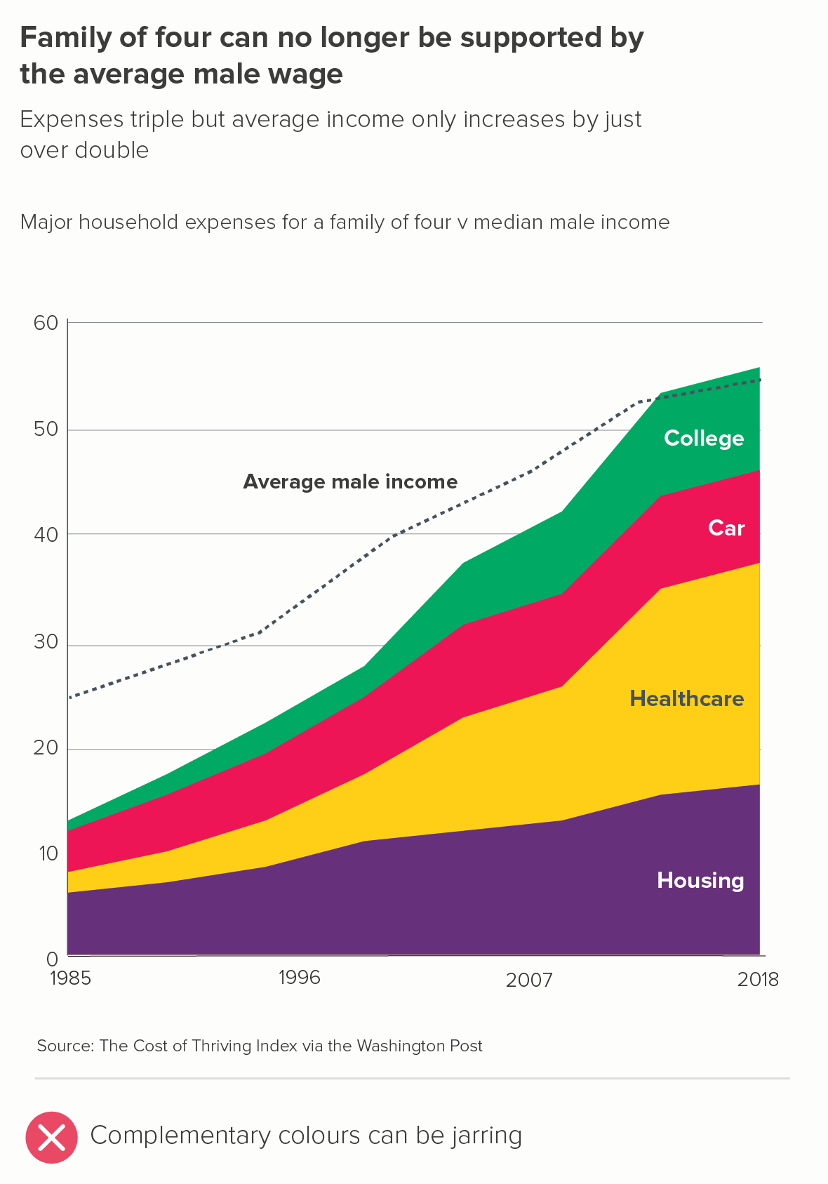
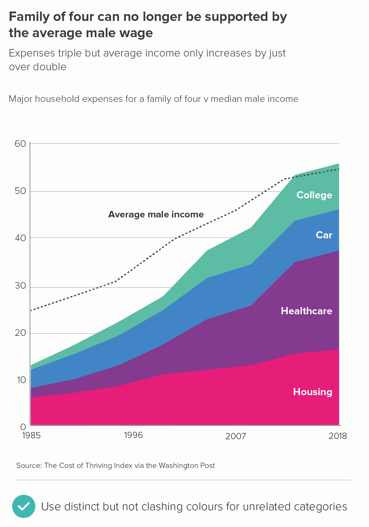
In these cases, to avoid jarring colour choices, it’s a good idea to move around the colour wheel, rather than across it. In the first chart below, we’re zigzagging across the colour wheel and creating clashing colours; in the second, we’re moving two steps at a time - red, purple, blue, green. This signals that the areas are distinct categories but are all equally important drivers in the story.
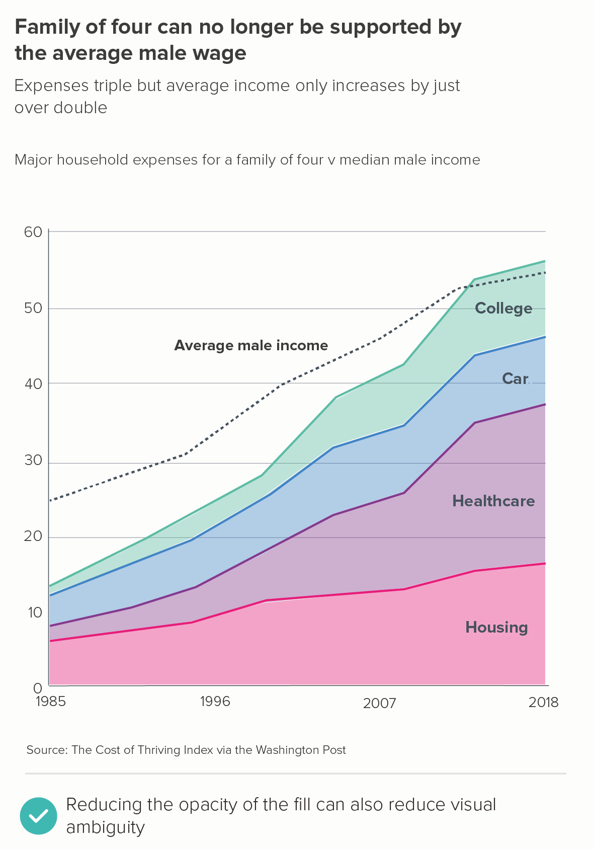
If you are concerned that the areas look like they are overlapping, then there are a couple of design tricks that can mitigate this effect too.
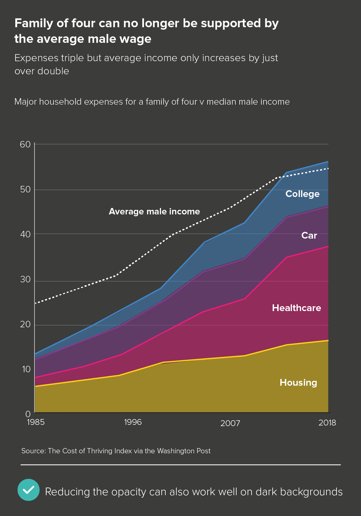
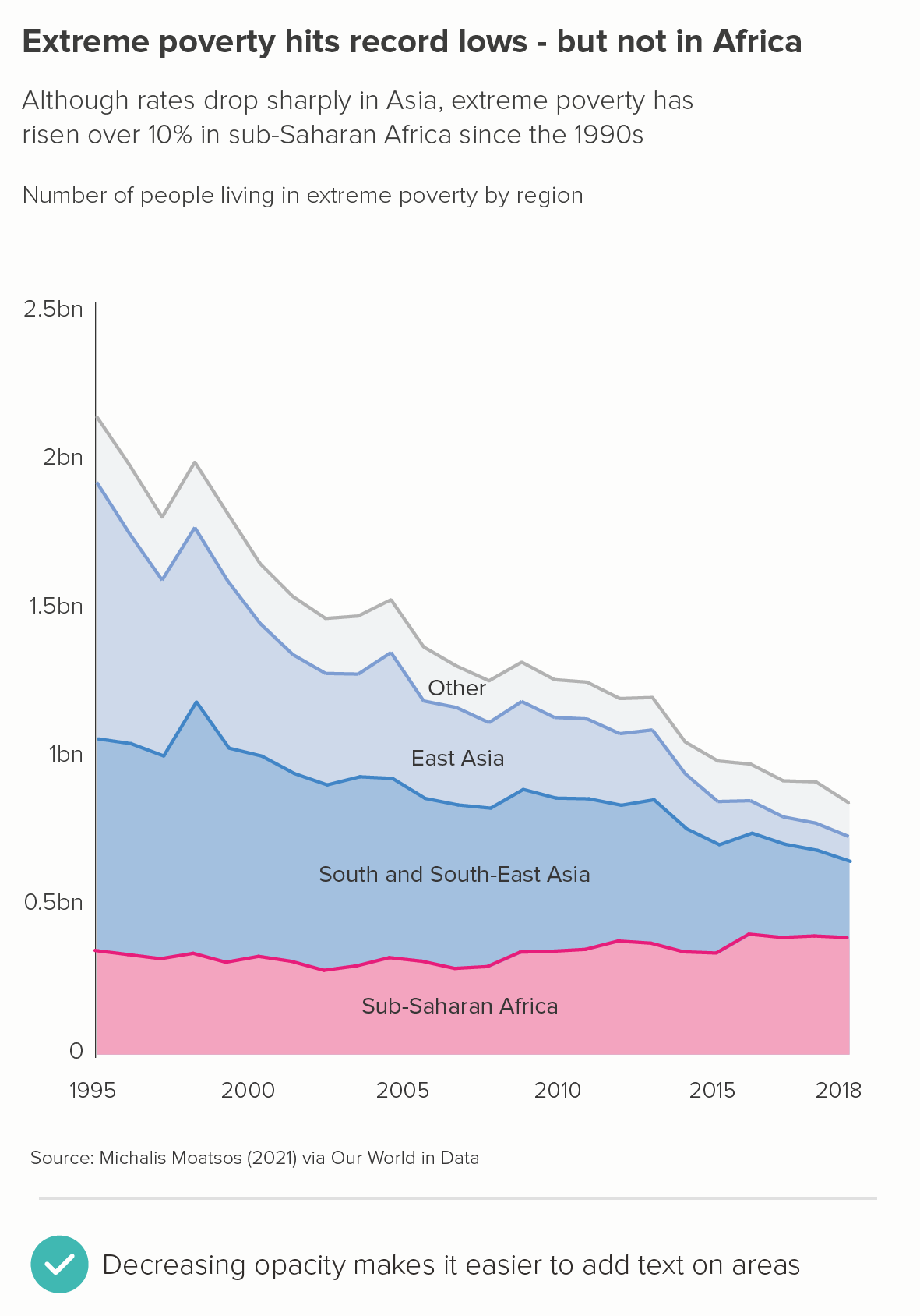
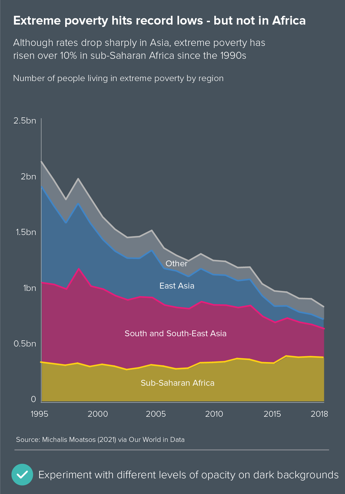
The first is to keep the lines solid, but reduce the opacity on the fill (the first chart below). This works particularly well on dark backgrounds (the second chart below).
Neither of these completely get rid of an area chart’s visual ambiguity. But where it’s the right chart for the story - and in the example above, I think it is - then an intelligent use of text, colour and layout can usually reduce that ambiguity to acceptable levels.
Note how reducing the opacity also makes it easier to sit labels on the areas (rather than next to the chart), without damaging legibility. I’ve included another couple of examples of this below.
d) Colouring by the object or category
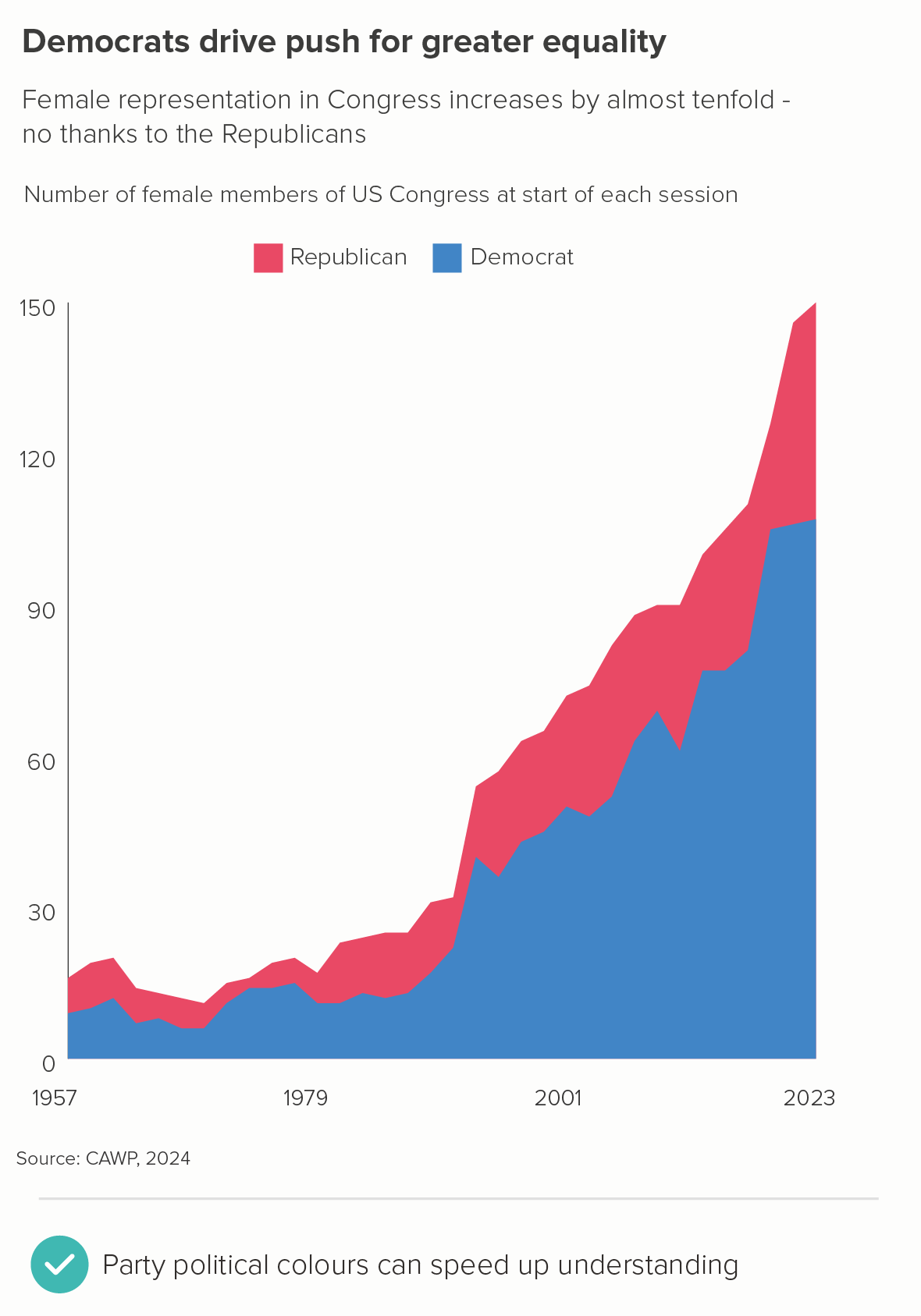
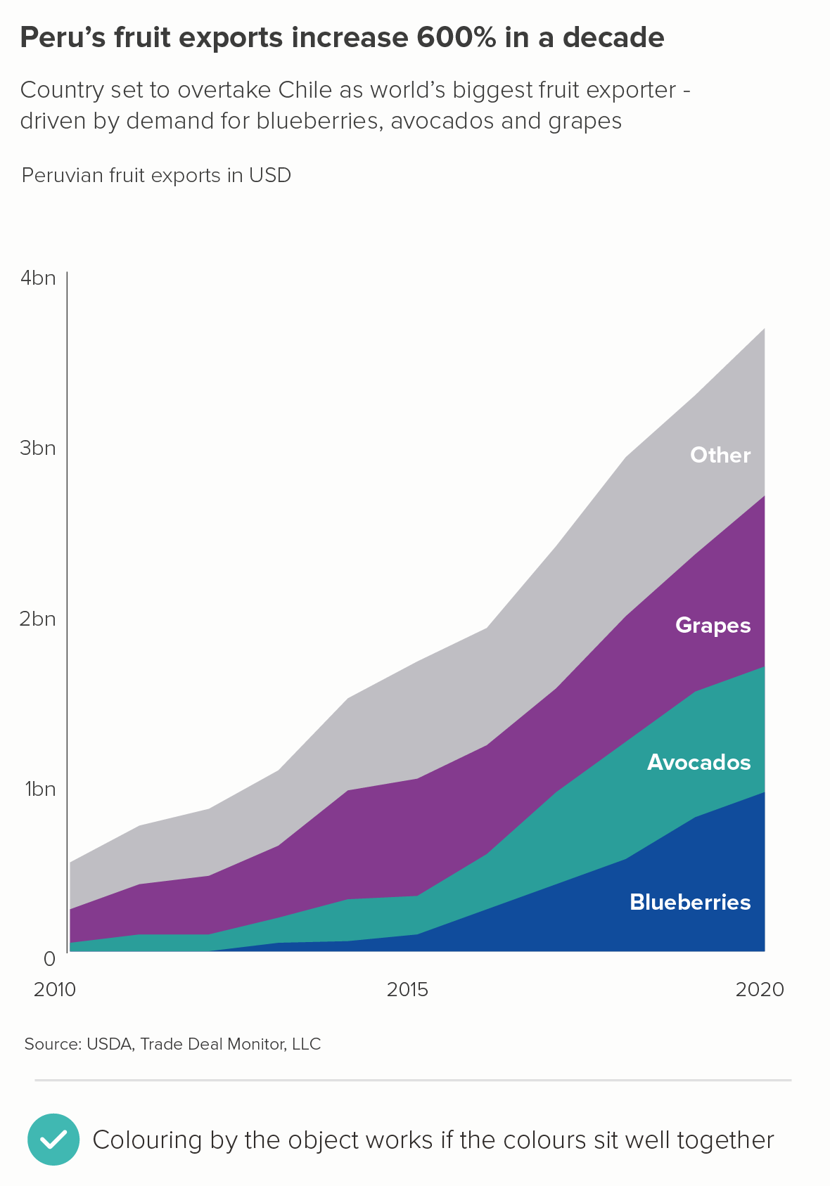
Sometimes you just have to accept that groups have such clear colour associations that not using the appropriate colour would be strange. One example would be political parties (the first chart below), another would be fruit and vegetables (the second chart). But I’d still choose harmonious palettes if you can - in the second chart, grapes are never that shade of purple, and avocados are a darker green, but these colours sit better with the blue of the blueberries. Refer to the colour wheel advice in section c) above to avoid jarring colour choices. And try to use your title and subtitle to reduce any visual confusion.
CONCLUSION
To conclude then, area charts can work wonderfully, and are often a great alternative to line charts, stacked bars, side-by-side pies and other charts that you might be tempted to reach for when telling either composition or change-over-time stories. The fact that you can add a fill makes them eye-catching, and using your fill colours intelligently can help your audience perceive the chart’s meaning more quickly. (Nobody likes grey areas). They need to be handled with care, but which chart type doesn’t? Keep laser-focussed on your story, make sure your area chart only tells that story, and watch as those bold slabs of colour help your message to find its perfect shape.
VERDICT: Break this rule regularly.
Sources: Fertility rates - World Bank, Divorce rates - UN, OECD, Eurostat via Our World in Data, Migration to America - US National Archives, Refugee numbers - UNHCR, St Paul’s statues - the Pantheons Project, Cocoa growing - FAO, Russia’s fossil fuel exports - CREA Fossil Tracker, Living costs in the US - The Cost of Thriving Index via Washington Post, Extreme poverty rates - Michael Moatsos (2021) via Our World in Data, Women in politics - CAWP 2024 data, Peru fruit exports - USDA
More data viz advice and best practice examples can be found in our book- Communicating with Data Visualisation: A Practical Guide


