
In this blog series, we look at 99 common data viz rules and why it’s usually OK to break them.
by Adam Frost
In most data viz software, the bars in a bar chart will all be the same colour, the wedges in a pie chart will all be different colours. Which isn’t a bad starting point for these chart types. But what about a line chart? What should its default state be?
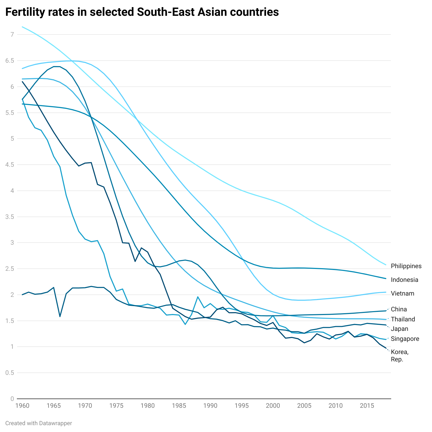
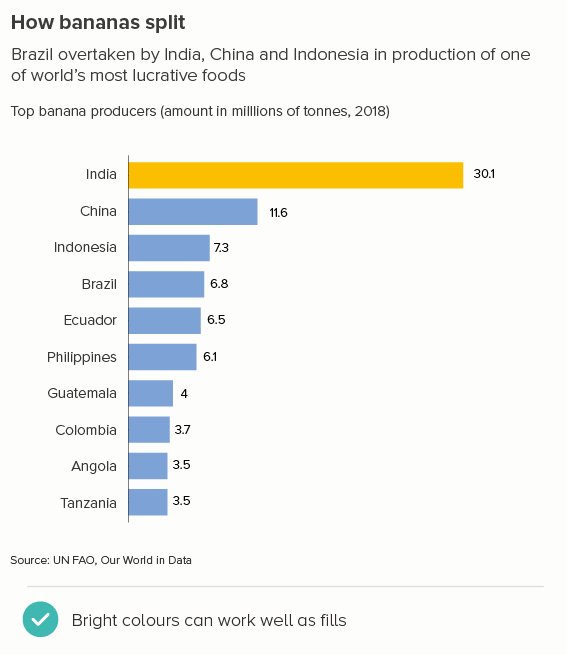
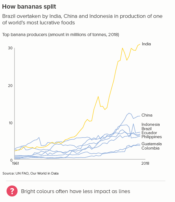
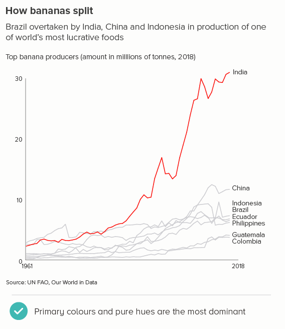
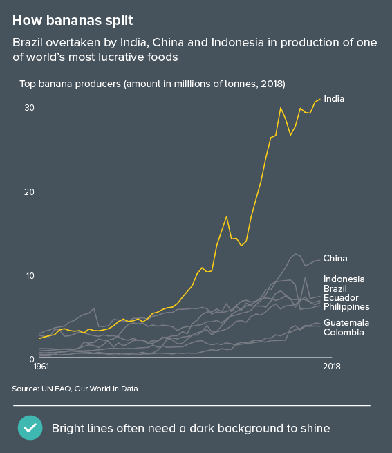
Almost every data viz tool I’ve used makes every line a different colour regardless of how many lines you have (the first chart below is made in Powerpoint, but ggplot, Flourish and Power BI do the same thing). One notable exception is Datawrapper which makes the lines shades of a single colour (the second chart below).
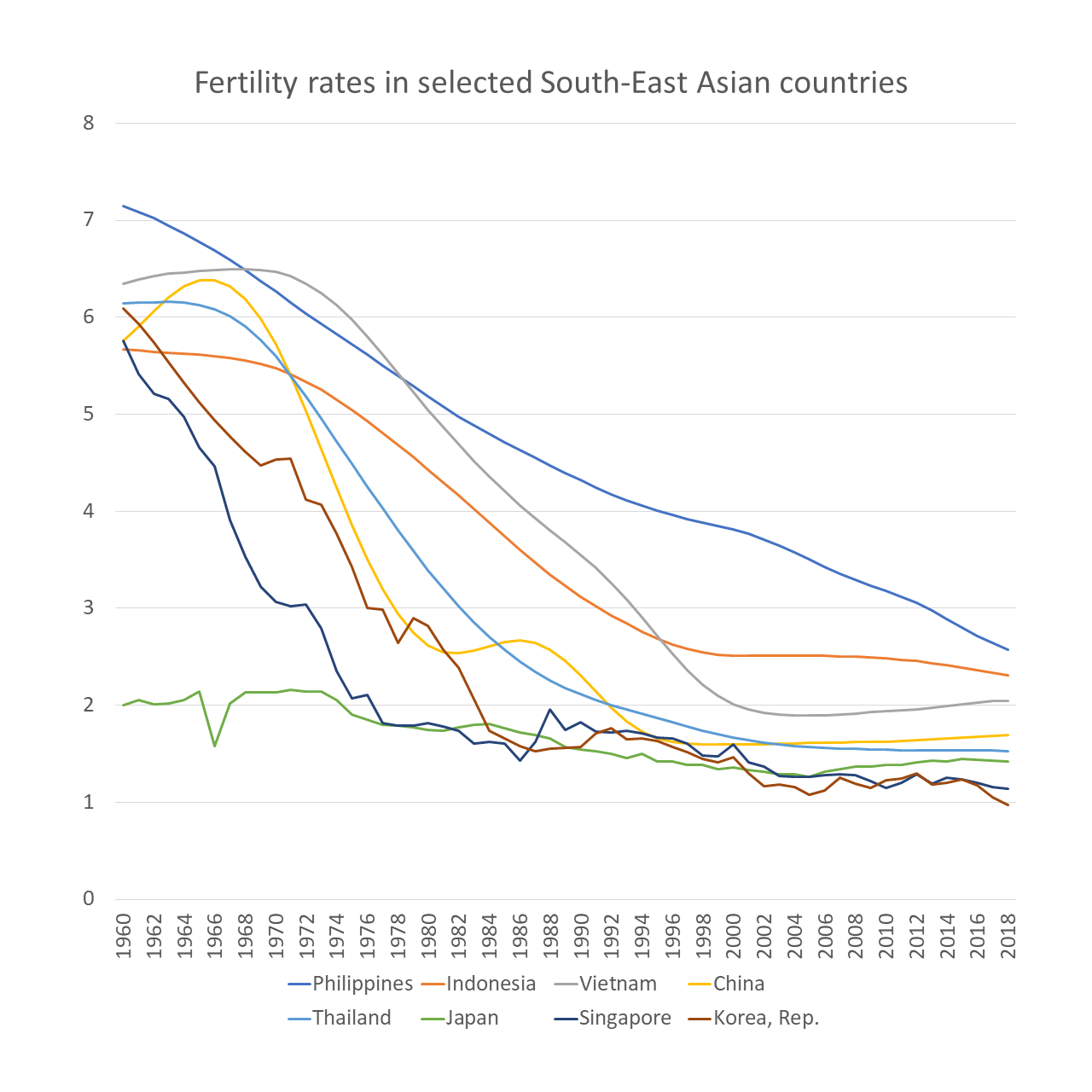
As far as I’m aware, no tool makes all the lines the same colour by default, even though - as we’ll see below - there’s no reason why this shouldn’t be your starting point.
Anyway, of the defaults above, I’d recommend the second option (Datawrapper is usually right about colour), but it’s still not the right approach for every story.
The fact is, although the default colour options can sometimes work fine for bar and pie charts (especially if you are using a brand template), this is rarely the case for line charts. You almost always need to make manual adjustments to whatever the software serves up. After all, a computer can make an intelligent guess that the first wedge of a pie chart is the most important, or that the bars in a bar chart should all be the brand colour, but lines? How can a charting tool know which line to highlight? The one that rises the fastest? Drops the quickest? The one with the most fluctuation? The one that starts with an A? Or are none of the lines more important than the others? The colour and the story can start to fight, so you need to step in and break it up.
The different story types
i) four or five lines - all the same importance
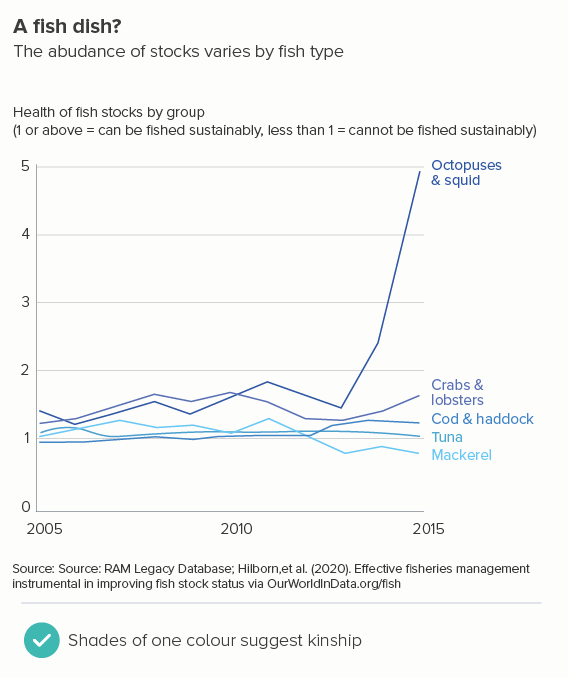
If you only have four or five lines, and they are all equally important, think about whether you want to present them as similar or different categories. For example, if you’re comparing animals living on land, sea, and rivers, maybe you keep the lines distinct, to emphasise the three different habitats (the first chart below). But if you’re comparing different kinds of sea creature (the second chart), maybe you’d go for shades of a single colour to indicate their similarity as a group.
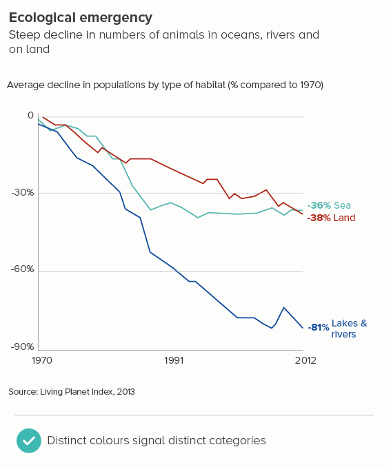
Notice also that, where there's an obvious association between colour and category, it's sensible to exploit it - for example in the first chart, land is red-brown, lakes are blue, sea is turquoise. It’s not always possible (what colour is 'fruit', or 'Paris' or 'women under 35'?) but if you can, try to match the line colour with what it represents.
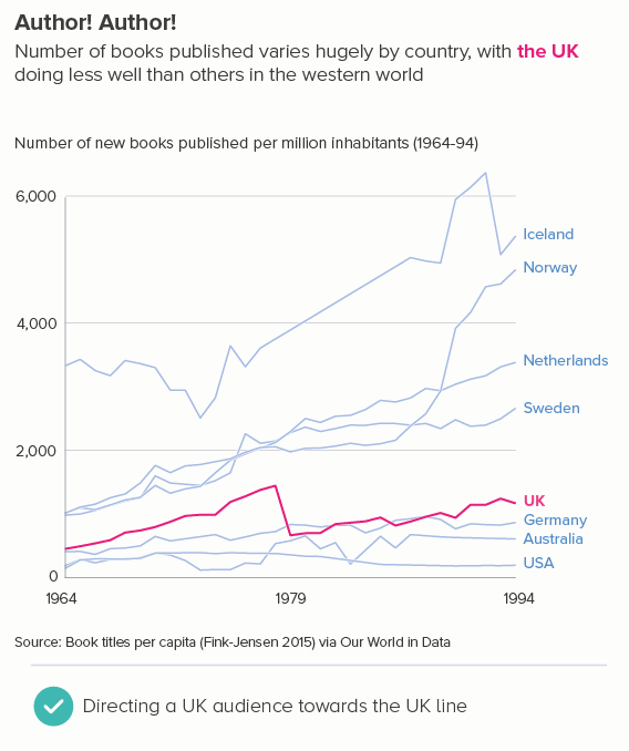
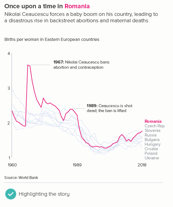
ii) four or five lines - one hero line
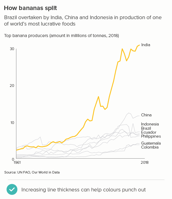
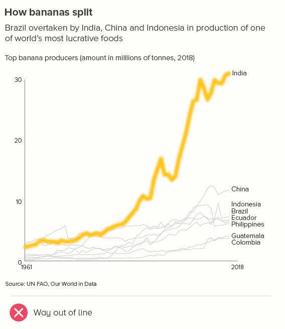
Usually you are presenting to an audience with a vested interest in one of those lines. Here you’d want to use a highlight colour on the hero line, and shades of a more recessive colour or even grey on the others. In the first chart below, I’m imagining that my audience is in the UK. Alternatively, your audience might not have a vested interest, but the story definitely does - one of the lines is behaving differently or atypically, and you want your audience to notice it first (the second chart).
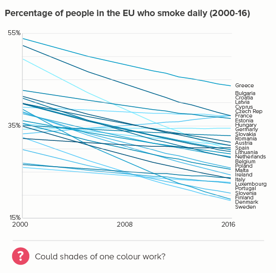
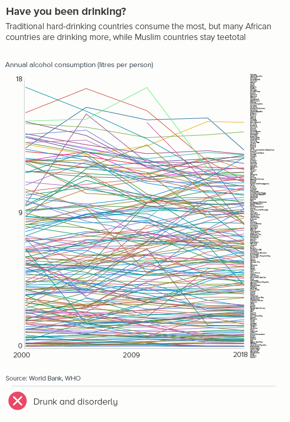
iii) many lines - all equally important
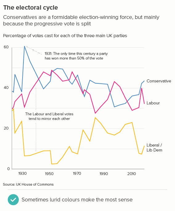
Sometimes you have to show many lines, but you don’t want to suggest that one line - or one group of lines - is more important. Perhaps I work for the EU and don't want to suggest that Italy is more interesting than Luxembourg (even if it patently is).
I should be upfront and say that this is totally impossible: any colour (even shades of grey) introduces a hierarchy of interest, and you’ll need to experiment to work out which of the approaches below gets closest to the neutral overview you’re aiming for.
It’s usually best to start with the Datawrapper approach - make all the lines different shades of one colour (here, I’ve gone for blue, because it’s the EU colour). Some of the lines will inevitably be darker shades and they will stand out more, but not as starkly as, say, putting a red line next to a yellow one.
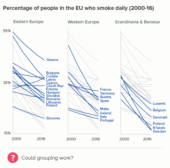
If this doesn’t work, is it possible to organise your lines into groups, and repeat the chart with each grouping highlighted in turn? Of course there is bias here too - which group is shown first, which is last - but at least you’re not subjectively choosing which lines are most interesting.
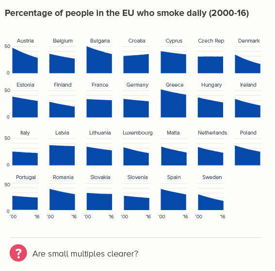
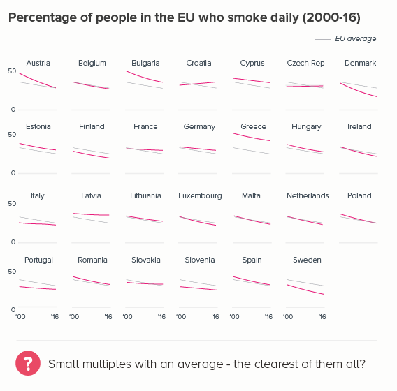
If this doesn’t work, do you have enough space to create rows of small multiples? Usually these charts are ordered alphabetically - which again is biased, as the data for Austria, Belgium and Bulgaria will always be seen first - but at least there is no other obvious favouritism. You can show just the country line on each chart or (my preference) the line against a useful benchmark.
If this is too busy, could a different chart choice work? Perhaps side-by-side maps? Or should it stay as a table, with differentiated colours based on the value in each cell? Have a look at some of the options in rule 31.
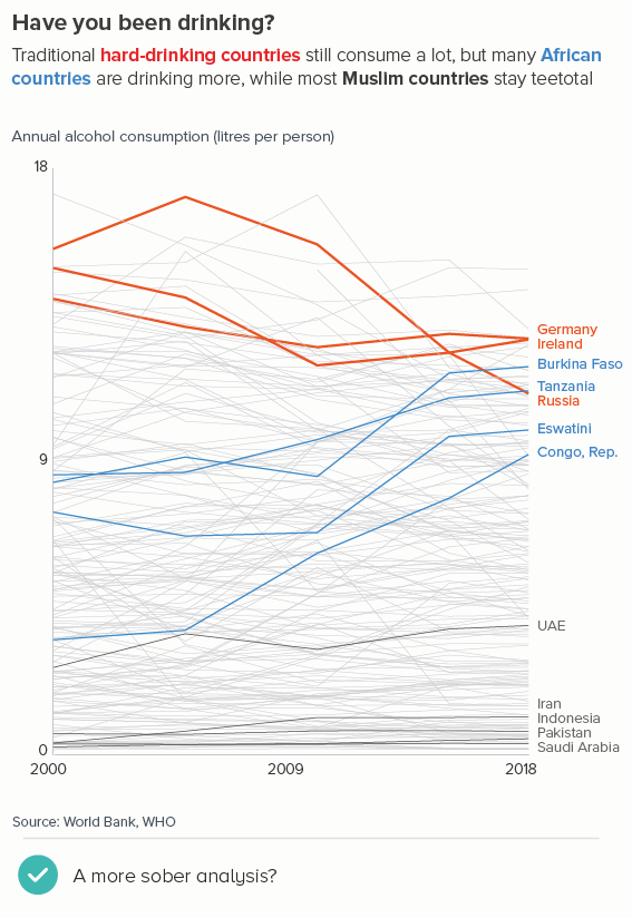
iv) many lines - a hierarchy of importance
This is another common predicament when you are making a line chart. Too many lines that you can’t delete, but a definite order of importance in those lines - your audience cares about one (or some) more than others. Here it’s a good idea to combine the different types of advice above. A strong colour for your most important line(s), then a recessive colour for the next most important - usually a shade of blue. Then a strong grey and thicker line for the third-level countries. And thinner grey lines (and no labels) for all the others.
v) colouring by meaning
Sometimes you don't want to colour lines by what they represent, or how important they are, but by what they mean (is the thing increasing or decreasing?). This should of course be implicit in the line's orientation, but when you have a lot of lines, colour can help to emphasise a performance story that might otherwise be missed.
Which colours to choose?
As for which colours to choose to differentiate your lines, have a look at Rule 8, where I discussed colour in pie charts and how colour wheels and other tools can help you make sensible decisions. Your brand guidelines should also make it clear which colours to use in specific cases - and how to use them accessibly. (If they don’t, Rule 8 also includes some advice about how to devise your own rules).
What I’d add about line charts in particular is that you will need to experiment with your brand colours because colours that are eye-catching as fills (e.g. in bar or pie charts) don’t always work as well when they are thin lines. For example, yellows and oranges on a white background - which can punch out as solid fills - sometimes disappear as lines.
Often you need to try stronger colours, or put those brightly-coloured lines on a dark background.
You might also need to experiment with line thickness (see Rule 35 for more on this) - making the hero line thicker as well as a strong colour. But don’t go too thick, or your lines turn into sea slugs, and certainly avoid drop shadows, glows, borders or any other visual effects. It makes the line harder to read, and it looks cheap and nasty too.
Without bold slabs of colour to help you, line charts can sometimes be underwhelming, and if you feel that those lines are failing to make your story sufficiently dramatic, then a chart that encourages a more liberal use of colour - like an area, bar or polar area chart - can be more effective at drawing an audience in. I have included examples of these in rule 31.
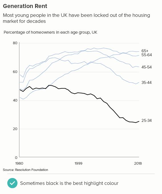
What I would say generally is that remember that the more aesthetic elements you add to a change-over-time chart, the more the underlying metaphor of ‘a line equals time’ can get lost. The simplicity of a line chart is its greatest strength and it’s best to use colour in a way that accentuates this. Start with every line a shade of grey, and then give the lines a colour one by one - the most important line first - until the chart makes sense, and then stop. You might find that the story is only clear with all the colours turned on (the first chart below) or you might find that one colour is all you need. Or maybe keeping the most important line black - devoid of all colour - is the best way of creating a chart that cuts through.
VERDICT: Break this rule often
Sources: Annual alcohol consumption - World Bank, Fertility rates - World Bank, Living Planet Index, Fish stocks by fish group - Our World in Data, Smoking rates - World Bank, Number of books published - Our World in Data, Election results - House of Commons, Homeowners data - Resolution Foundation
More data viz advice and best practice examples in our book - Communicating with Data Visualisation: A Practical Guide