
In this blog series, we look at 99 common data viz rules and why it’s usually OK to break them.
by Adam Frost
Whenever people complain about bad data viz, 3D pie charts always feature heavily. And fair enough. But in my view, 3D line charts are worse, as they take perhaps the clearest, cleanest, most useful chart, and take a sledgehammer to it.
It’s partly a misunderstanding of the metaphor. Although I dislike 3D pies (rule 12) and 3D bars (rule 23), you can at least make a justification for that third dimension on metaphorical grounds. You are turning piles of stuff into bars so we can compare them, or dividing stuff into pie slices so we can understand its composition, and actual bars and actual pies are 3D objects in the real world, as are (often) the things they’re standing in for. But a line? Representing change over time? A 3D pie remains a pie, but a 3D line is no longer a line - it’s a shape. A strange, crooked, tilted shape that no longer looks like it signifies passing time (linear, a timeline, across date lines) or like a quantity rising and falling.
But even if 3D line charts did work as metaphors, they would still fail because of their unintelligibility. Let’s put a 2D and 3D line chart side by side.

Both charts were made using Microsoft’s standard charting library.
The 3D version fails all the basic criteria of data representation. Namely:
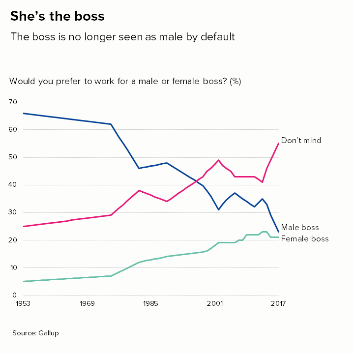
The lines seem to start at different points, first green, then (possibly?) blue, then (maybe?) pink
The lines seem to end at different points, first pink, then blue, then green
The pink and the blue lines seem to be running in parallel between about 1986 and 1992 even though the values for the blue (male boss) line are much higher.
In 2017, the blue and green lines are only 2% apart, but they look much further apart than this.
The gridlines become useless. The green line finishes at 21% in 2017, but the gridlines suggest a value of about 5%.
Needless to say, the 2D version has none of these issues. Note that the only thing different about the second chart is the addition of the third dimension - the colours, typeface, axis intervals etc are all identical in both charts. The use of 3D alone obliterates what is otherwise (in my view) an interesting story.
Even if we just use a single line, there are still serious problems.
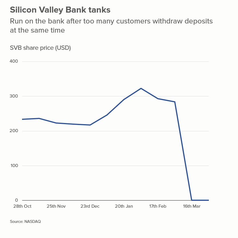
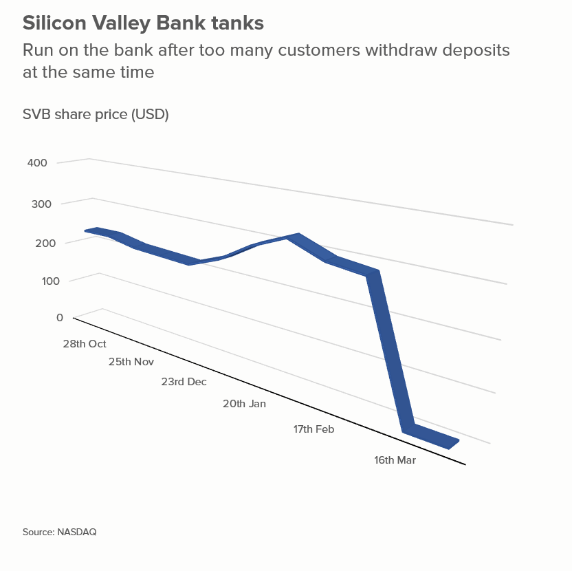
The dive to zero is obvious in the 2D version, but in the 3D version, the line seems to hover above the axis. And in the 2D version, the fact that the bank collapsed quickly (in just 48 hours) is clear, whereas in the 3D version, it is more of a gentle glide. More generally, the line has become a ribbon, something a gymnast might twirl, devoid of the clarity and precision we usually get from a line chart.
So it’s almost never a good idea to use 3D in line charts. The only exceptions I’ve seen are when all of the following apply:
the third dimension represents something (another dimension in the data)
this third dimension is explained - either by user interactions or animations
the interactive designer is expert enough to walk through the story in a succinct and intelligible way
the audience is sophisticated enough to follow the various stages of the walkthrough
The only example I’ve ever seen of all of the above applying is the New York Times’ 3D yield curve by Gregor Aisch and Amanda Cox. It’s a fantastic piece of work, precisely because they have made a chart work that shouldn’t work. It also takes an incredibly dry subject (bond yields! hell yeah!) and invigorates it, by placing it in a wider economic and political context. But if you’re not Gregor Aisch and Amanda Cox (the ‘and’ is important), and I’m definitely not, then stay in flatland and keep your lines 2D. If your story is good enough, it will have multiple dimensions anyway.
VERDICT: Almost never break this rule.
Source: Gender of bosses - Gallup, SVB share price - NASDAQ