add two digital
A digital agency specialising in data storytelling and training, headed up by Adam Frost and Tobias Sturt.
PORTFOLIO
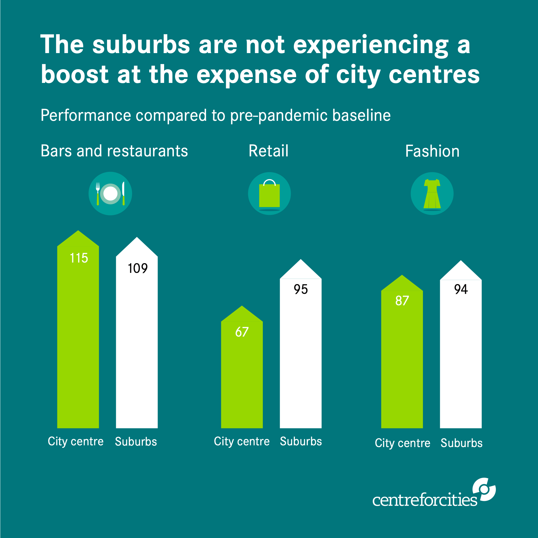
CENTRE FOR CITIES
Cities Outlook 2022 takes an in-depth look at the state of the UK’s high streets in the wake of the Covid pandemic. Add Two worked on the report charts and illustrations.
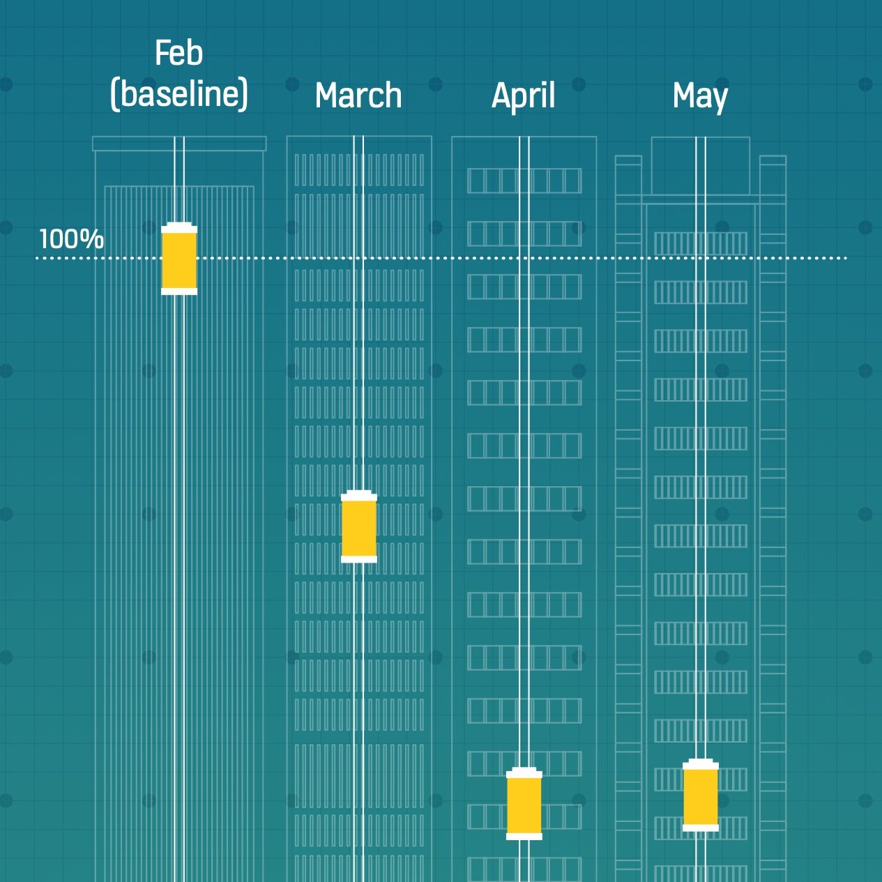
Financial Times & kone
This project looked at how lift use and travel within cities changed during the pandemic and what this data might tell us about our working lives after Covid.

ST paul’s & York university
The Pantheons project documents the 19th century monuments in St Paul’s Cathedral and also explores their cultural and political impact.
training

intro to data storytelling
Based on our Guardian Masterclass, this one-day course covers the fundamentals of finding stories in data and creating engaging charts in both static and interactive formats.

advanced data storytelling
Our advanced courses range from two to five days, and explore the data visualisation process in more depth, walking students through the creation of a specific project, based on their own data.

data viz in powerpoint
In most organisations, PowerPoint remains the data visualisation tool of choice. We have a range of courses focussing on how to make PowerPoint an effective storytelling and visualisation tool.
RESOURCES

Communicating with Data Visualisation
Based on our long-running Guardian masterclass, our book provides an accessible, nuts-and-bolts exploration of how to turn a spreadsheet into a clear and beautiful visual.
99 DATA VIZ RULES - & WHY IT’S OK TO BREAK THEM
Adam Frost sense checks every data viz rule he can find to see if it holds up under pressure and tries to suggest best practice when they don’t.

HOW DO I MAKE IT IN POWERPOINT?
Tobias Sturt walks through a series of tutorials on how to manipulate the Microsoft Office charting engine to make bespoke, non-standard charts.