
In this blog series, we look at 99 common data viz rules and why it’s usually OK to break them.
by Adam Frost
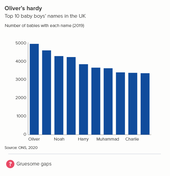
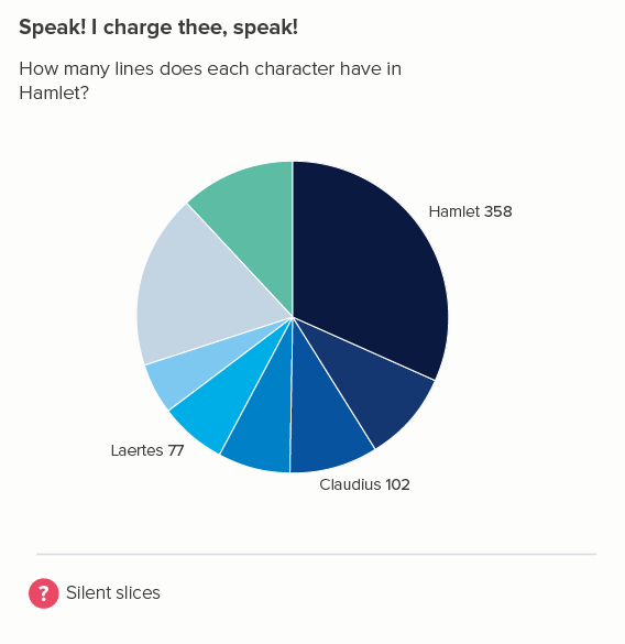
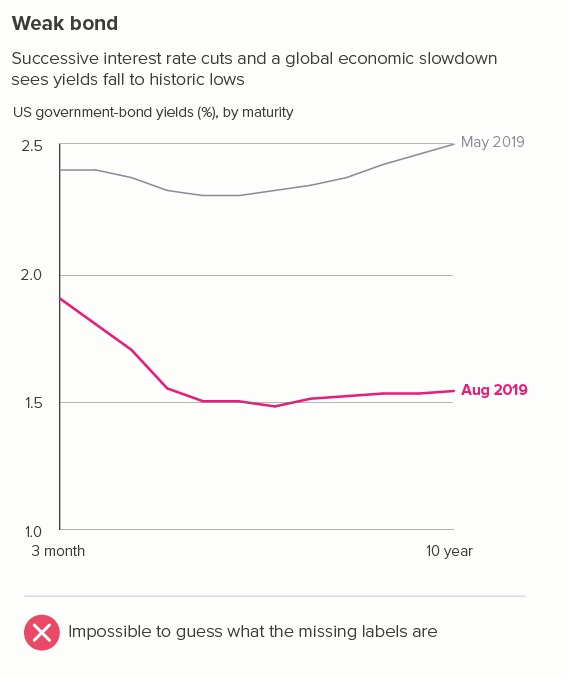
On a vertical bar chart, an x-axis usually contains critical information about your story. You can't just drop x-axis labels because otherwise those bars could mean anything (the first chart below). Even if your chart doesn't have an x-axis, as in a pie chart, it's still unusual to leave categories unlabelled (the second chart).
This logic is sometimes carried over into line charts. If you have a datapoint, you should have an x-axis label to go with it.
Source: Business-Q
But, unless you're Marty McFly, time moves in one direction, and clocks tick at regular intervals, so labelling every minute or month or year is often overkill. It's a good idea to start with just two datapoints- the start and the end of your series, and then check if the story is clear. Sometimes it is (the first example); sometimes it isn't (the second).
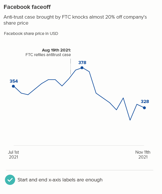
In charts like the second example, keep adding x-axis labels until the audience has all the key information.
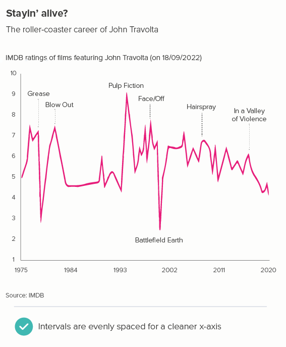
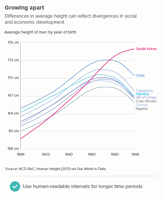
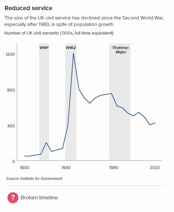
And I would add them in regular intervals - just because it makes the axis cleaner, even if those intervals are every three years, or seven years, or something that’s not especially intuitive (the first chart below). But with longer time periods, it’s better to use more human-readable intervals e.g. every 20 or 50 years rather than, say, every 37. If you've got, for example, 2,017 years of data (or any other prime number), go for big leaps, and then just put the final label at an irregular interval e.g. 1800 1900 2000 2023. If there’s not much of a gap between the last two labels, you can make that final interval wider, e.g. 1800 1900 2003. Or sometimes the first label also needs to be irregularly positioned to make the chart comprehensible - 1896 1920 1940 1960 1980 1996 - as in the second chart below.
You can also assume a certain level of intelligence in your audience (they are choosing to spend time with a line chart, after all). If your first label is 2005, the next can be ‘06 ‘07 ‘08. You don’t always need to repeat the first two digits - 2006, 2007, 2008. Particularly if you’re short of space.
Try to always remember what the point of your x-axis labels is. How vital are they to the story? How many are vital?
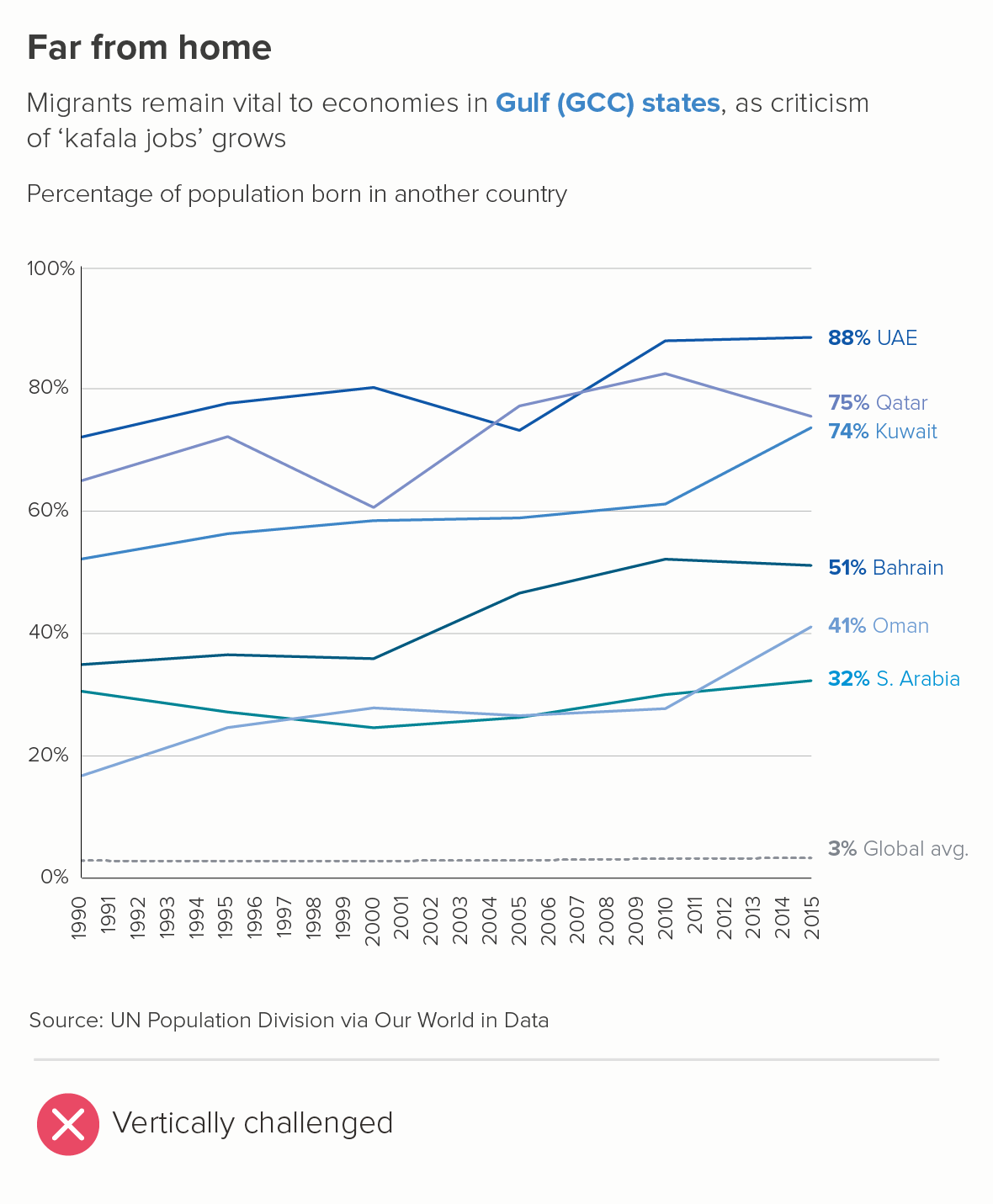
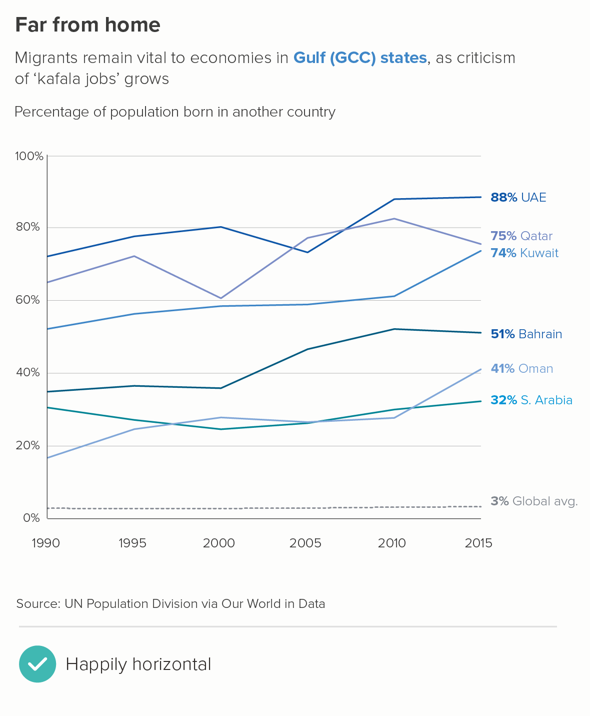
A couple of other notes. Horizontal labels only. If you're going diagonal or vertical or hyphenating, you have too many labels. Abbreviation is fine (Jan or J for January), but never rotation. When, as a reader, do you ever yearn for text to be positioned diagonally? Or vertically? Remember this is about making life easier for your reader, and we prefer text to be horizontal and legible. So if you can't abbreviate, delete.
Finally, I know a lot of software (e.g. Powerpoint, Illustrator) leaves a mysterious and unhelpful gap between the y-axis and your line’s first datapoint. Like there’s a strange lacuna in time, before your data starts. Override the default, position your first x-axis label at the bottom of the y-axis and make those lines run edge-to-edge.

VERDICT: Break this rule constantly
Sources: England and Wales baby names - ONS, Bond yields - CNBC, John Travolta films - IMDB, Human height - Our World in Data, Migration data - UNDP via Our World in Data, Civil service numbers - Institute for Government