
In this blog series, we look at 99 common data viz rules and why it’s usually OK to break them.
by Adam Frost
Few maxims have been as widely abused as Edward Tufte’s: ‘Graphical excellence is that which gives to the viewer the greatest number of ideas in the shortest time with the least ink in the smallest space.’ Similarly his mantra: ‘Above all else, show the data.’ Unfortunately, this is often interpreted as ‘show as much data as the chart can bear.’ The result: line charts that look like this.
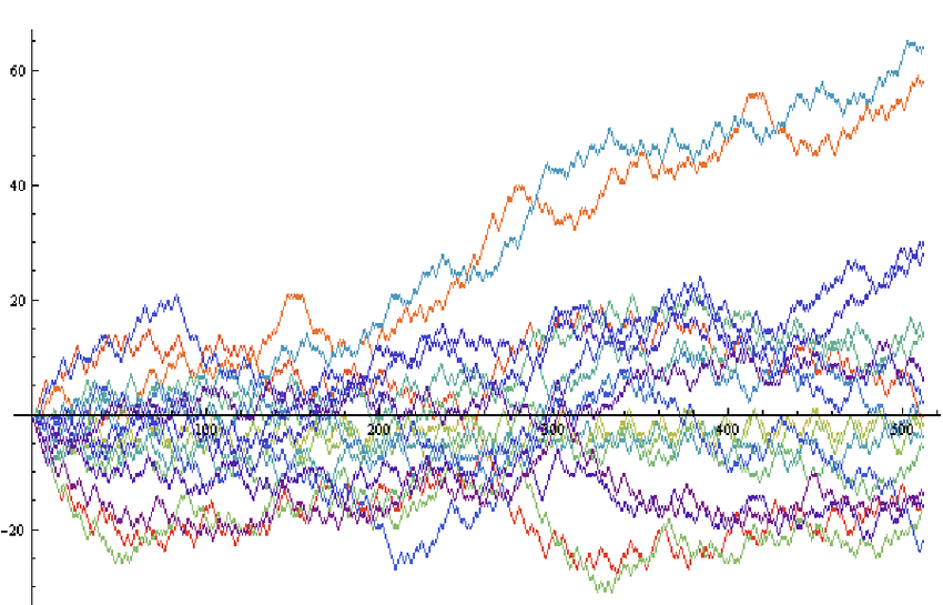
Source: Philip Maymin/Researchgate, PLOS ONE
When you’re analysing data, you may well create a line chart like this, especially in an interactive dashboard where you can roll over those lines and extract specific numbers. After all, those tiny changes of direction might yield critical information. Perhaps you are monitoring sales for a specific product and your lines show second-by-second changes. As a result, you notice that a surprising number of sales came between 1:30 and 1:32pm last Tuesday just after a TV ad campaign. If you had a datapoint for each hour, you might see that sales went up on Tuesday lunchtime, but not exactly when. Or aggregating might flatten the line out and show nothing at all.
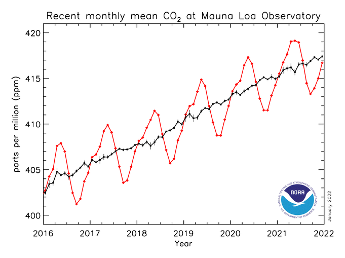
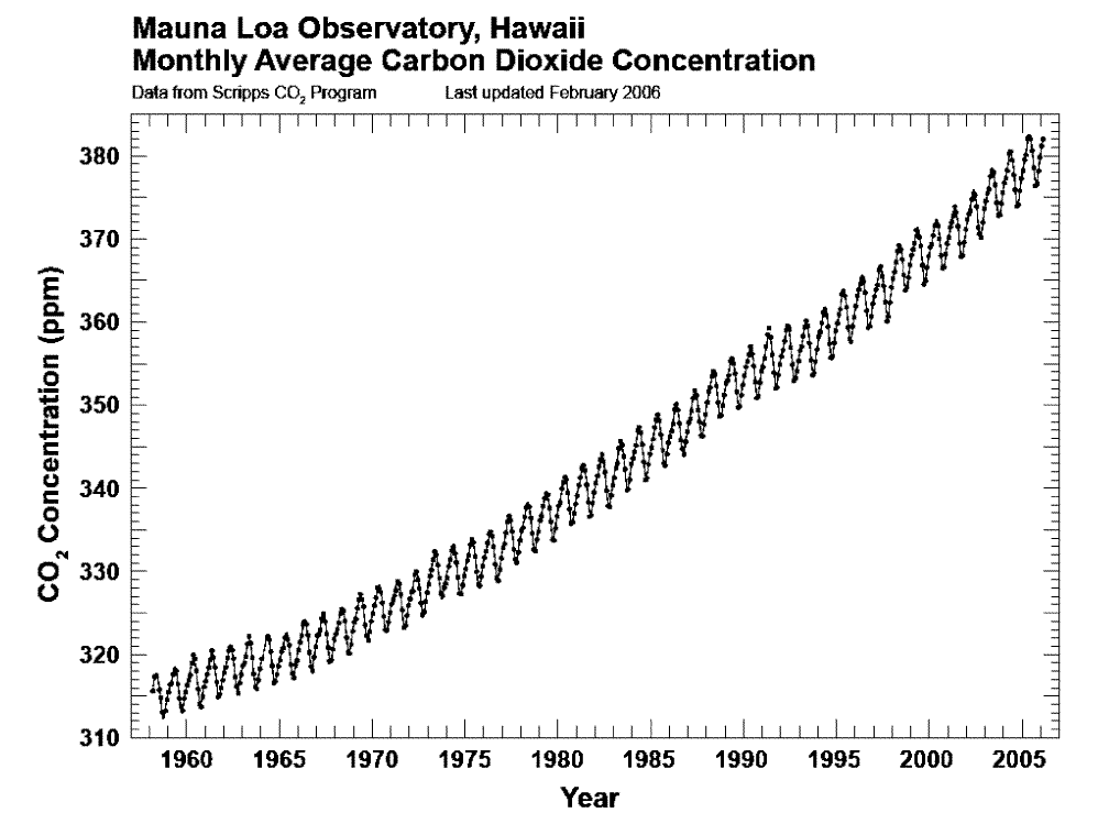
Academic and scientific publications often feature complex or busy lines too, although this is usually because of a wish to be fully transparent. For example, charts about carbon emissions frequently show prominent seasonal fluctuations - as in these examples from NOAA.
And when you are an expert talking to other experts, a busy or overcomplex line can be absolutely the right answer, reassuring your audience of your credibility and vigilance. But for any other audience, it is the wrong choice: it reduces every single story to one of wild fluctuation. They just see noise, instead of a trend.
For this reason, it’s often worth aggregating your data into wider time intervals or using other statistical methods to cancel out noise. When the clearest or most interesting story emerges, visualise only that, don't worry about putting the 'true' noisy line over it, it's just confusing.
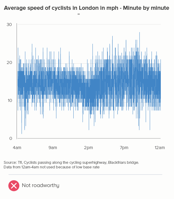
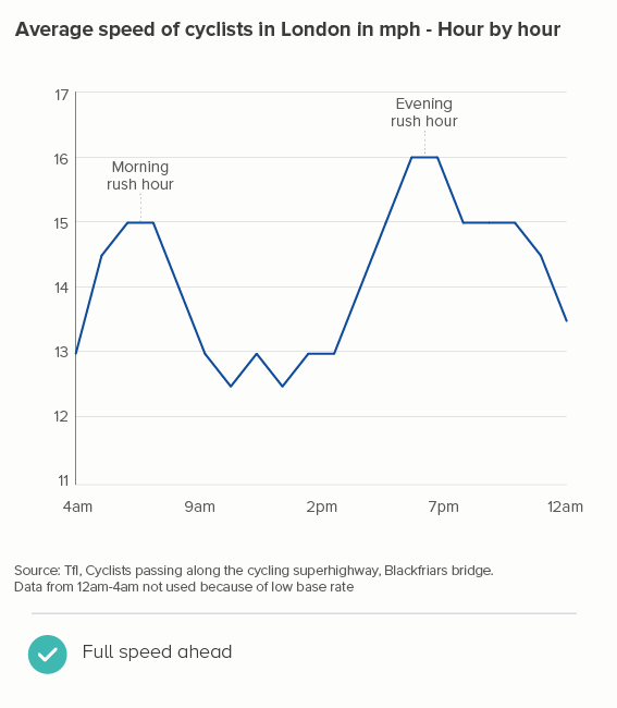
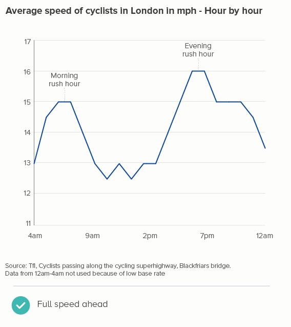
Here’s a recent example I worked on. I’m a keen cyclist, and I was interested to know how cycling patterns varied in my home city of London. Creating an average speed datapoint for every minute revealed little (the first chart below), and aggregating the data into five-minute intervals didn’t help much either. It was only when I used hourly data that a pattern emerged (the second chart below) - people cycle faster in the morning and evening rush hours, and much faster in the evening, presumably because you are more likely to cycle excitedly home than cycle excitedly to work.
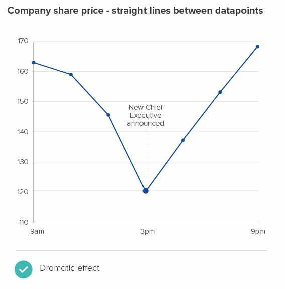
What if I’d smoothed those lines instead? Most charting tools let you do this, just by clicking a checkbox. The argument usually runs that at least you keep the integrity of the full dataset behind your chart. Plus smooth lines apparently look nicer.
Well, not to me. Personally, I think that turning those jagged lightning bolts into limp noodles sucks all the drama out of the chart. It reminds me of Harry Potter losing all the bones in his arm during that Quidditch match in the Chamber of Secrets.
I also find smoothed lines harder to read. The beauty of line charts is in those sharp turns from point to point, the orientation of the line making the degree and pace of change obvious, something that vanishes when you use Bezier curves.
In fact, these curves inevitably overshoot each datapoint, which is no more or less deceptive than our straight line (after all, the values between each datapoint could be literally anything), but the curves are definitely a more creative interpretation of what the data might be, suggesting that time-series data naturally undulates, changing direction slowly like a supertanker, which it sometimes does, but often doesn’t - in fact, frequently when you use a line chart, it’s because specific events have triggered specific changes, and the chart needs to make those flashpoints visible.
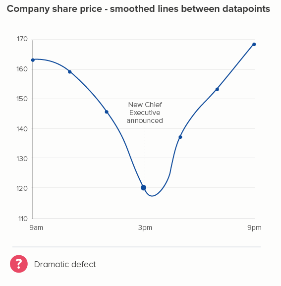
OK, this is a fictional example, so I’ll return to my cycling data. Again, I think smoothing kills the story. In the second chart below (where I’ve used Flourish’s ‘Curve (Natural)’), the plateaus between 6am and 8am, and 5pm and 7pm now have an artificial peak at 7am and 6pm which is both untrue and - for me - less interesting than showing the consistently higher speed during the two rush hour periods.
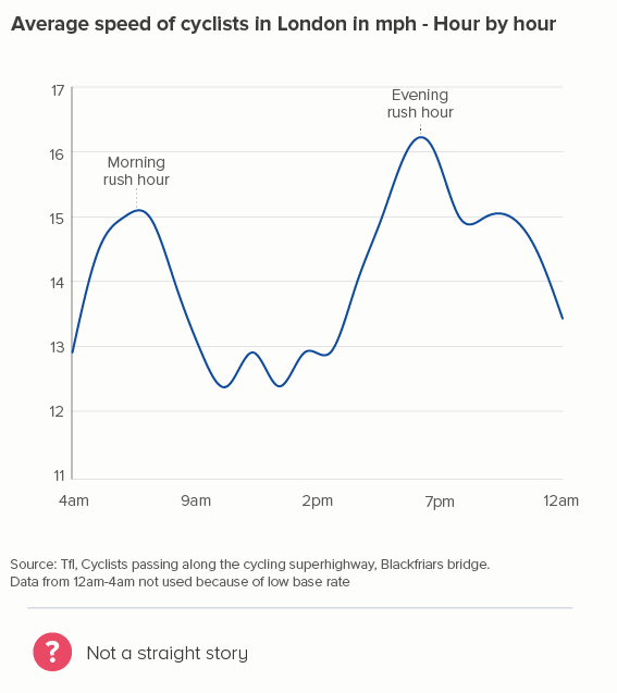
Worse than that - look at how, between 7pm and 10pm, when the average speed stays at a consistent 15mph, our smoothed chart creates a deceptive bulge, peaking at 8.30pm! If anything, average speed would start to decrease slightly at that point - not go up - but how could a smoothing algorithm possibly know this?
Most of all, I think smoothing is often a cop out. If your cursor is hovering over the ‘smoothing’ checkbox, ask yourself why. Why have you got a chart that needs to be smoothed out? It might be because you haven’t finished designing it yet. Deciding how simple or complex your lines are should be down to you, not a computer. If the story is clearer when you aggregate daily data into a rolling seven-day average, or a monthly total, then it’s best if you make that decision and then state what you’ve done clearly in any chart title. (You smooth, you lose).
Here’s one of the best examples of a designer manually deciding on the correct time intervals: David’s McCandless’s Peak Break-up Times, created from scraped Facebook data. By aggregating his datapoints into one daily total (and not smoothing), McCandless breathes life back into this dataset, filling it with human stories: that canyon on Christmas Day, that cruel peak on April Fool’s Day, the regular peaks every Monday, and more. ’
Image credit: David McCandless, Information is Beautiful
Conclusion
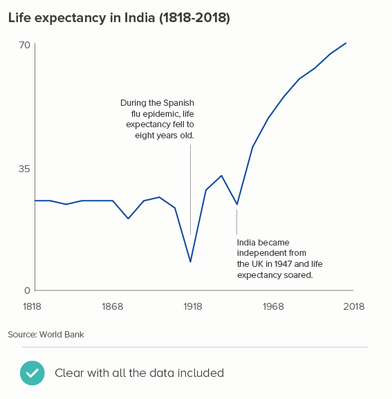
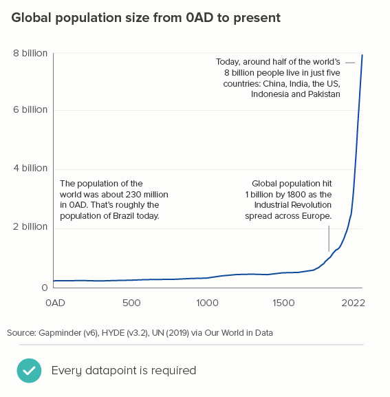
I should conclude by saying that all of the issues above are nice problems to have, because they indicate that you have more data than you know what to do with. A lot of the time, you may only have data for every year, or if it’s Census data, for every ten years - in which case, of course each line should show every datapoint you have. The charts below tracking life expectancy and population size don’t need to omit or aggregate datapoints, because the lines make perfect sense with all the data.
But the rest of the time, you need to experiment. The data can’t speak for itself if it’s trying to say too much at once. Figure out the story in the data, and then create time intervals that allow the lines to blaze their own trail.
VERDICT: BREAK THIS RULE OFTEN
Sources: TfL - Cycling data, Population of India - World Bank, World population - Gapminder via Our World in Data