
In this blog series, we look at 99 common data viz rules and why it’s usually OK to break them. Here are all the rules so far.
by Adam Frost
In rule 27, I mentioned that most of the lines on bar charts are superfluous (borders, grid lines, axis tick marks and so on). This is doubly the case with line charts, because these unnecessary lines fight with the necessary lines on the chart.
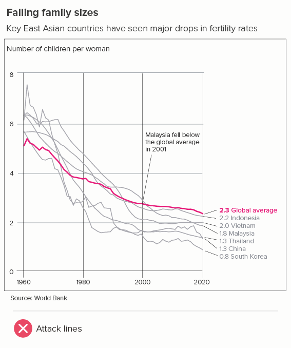
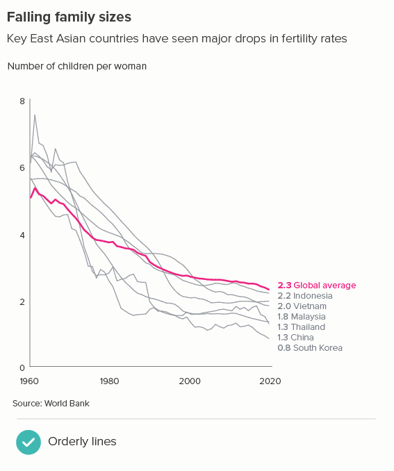
With a line chart, I’d recommend starting with just the (data) lines, the y axis line, and the start and end x and y axis labels. Then slowly add elements until the story is clear.
Gridlines
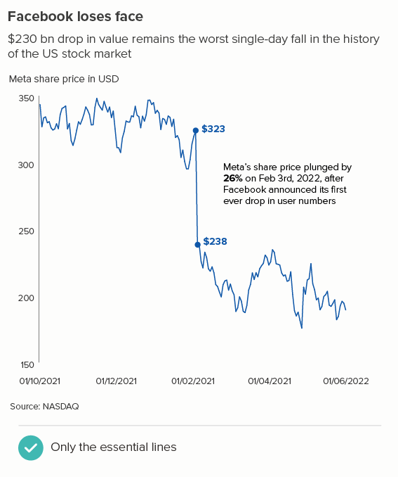
With one line, you often need to add almost nothing, as in the stock market example below. When you have a few lines (as in the second chart below), sometimes gridlines are good reference points, just because their clear horizontal orientation can act as a helpful visual contrast to the curving or zigzagging lines.
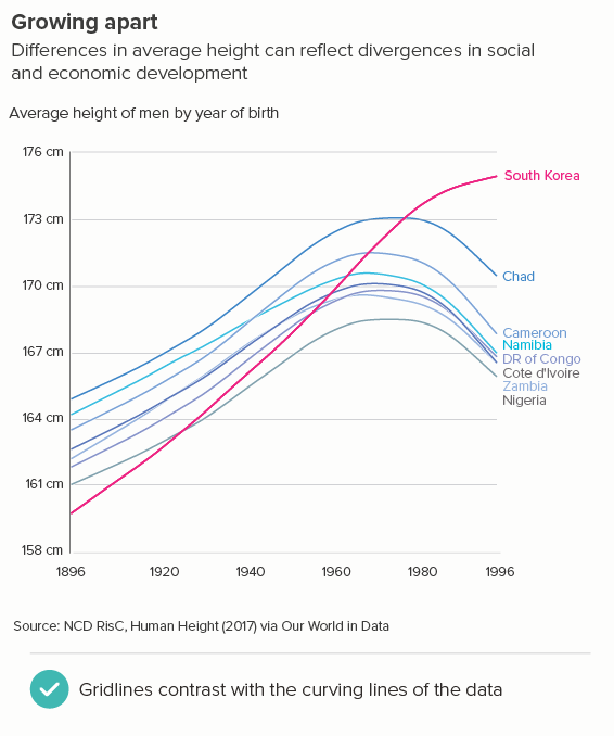
I’ve used horizontal gridlines above, as these tend to be the most useful kind for line charts. The key story is almost always the direction and degree of change, and horizontal gridlines emphasise this. Vertical gridlines emphasise the values on the x axis (the time axis) and these are usually of secondary importance. (the story order is usually ‘What’s changed? By how much? When did it change? Why did it change?’).
X-axis line and tick marks
For your x-axis, if your y-axis contains zero, it’s good practice to have an x-axis line. This is especially the case if it starts below zero. Tick marks are not needed though - in most cases, they just look fussy.
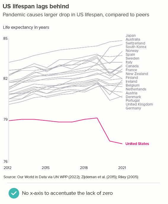
If your dataset doesn’t contain zero (or if zero isn’t a meaningful reference point), consider making your x-axis line fainter (the same line weight as your gridlines - if you have them). This accentuates the fact that the chart is showing a selected range of values, not everything from zero upwards. Alternatively, in these cases, you can just have x-axis data labels - no axis line - and let the line(s) on the chart float.

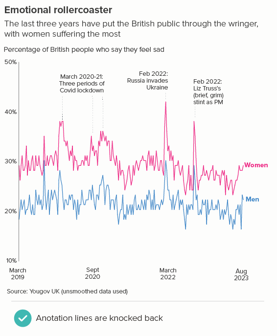
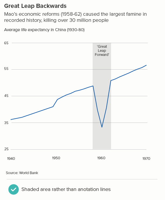
Annotation lines
When you annotate line charts, you also have to be careful for all the reasons mentioned above. Use a thinner line, a dashed line, a more recessive colour or all three at once to ensure that there is no confusion between the lines on your chart and any call-out lines.
If there is the option to use a shaded box (perhaps you are talking about a historical period), consider using this option rather than call-out lines as it neatly avoids any visual conflict between line types.
Error bars
There’s one final kind of line that gets superimposed on line charts: error bars representing confidence intervals, standard errors, standard deviations, upper and lower estimates, or related quantities.
There are two decisions to make here:
i) are the error bars necessary for your audience?
ii) if error bars are necessary, how vital are they? In other words, is the uncertainty of the data your main point? Or a secondary point? Or are the error bars simply a signal to your expert audience that you are being fully transparent about the limitations of your dataset.
Regarding the first decision, if you are talking to non-experts, then error bars should almost always be omitted. Expressing uncertainty about your story is never a good look for a general audience, plus most of them will have no idea what the error bars mean (in fact, a fair number of experts will have no idea either). Instead consider putting any data limitations or uncertainties in a footnote or link through to the source paper with the warts-and-all academic chart.
If you do have an expert audience, and/or if uncertainty is a key part of your story, then error bars should be used. However, wherever possible, avoid using those strange horizontal lines that look like TIE-fighters. So not this:
The error bars are like graffiti, obscuring the main lines.
Conversely, grey lines (the first example below) or a shaded area (the second example) complement your main data line more effectively.
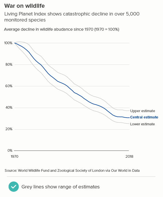
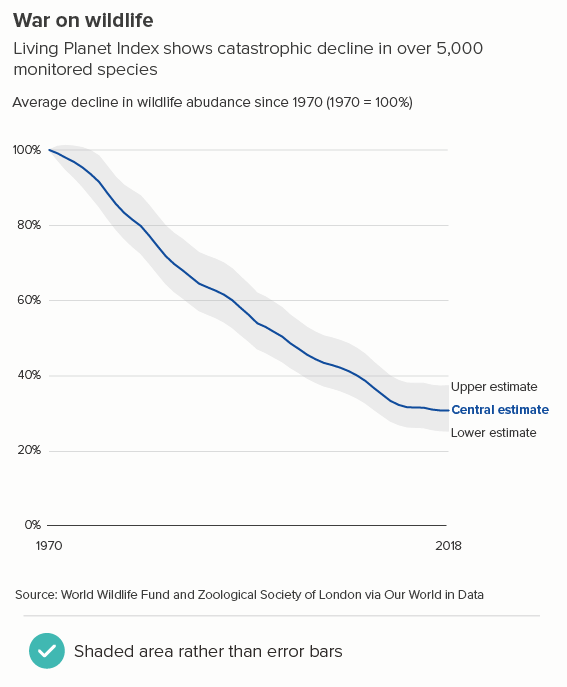
Note that this only works if you have a single line. Error bars with multiple lines always look terrible and, in these instances, think about placing the charts side by side or, for lots of lines, use small multiples instead.
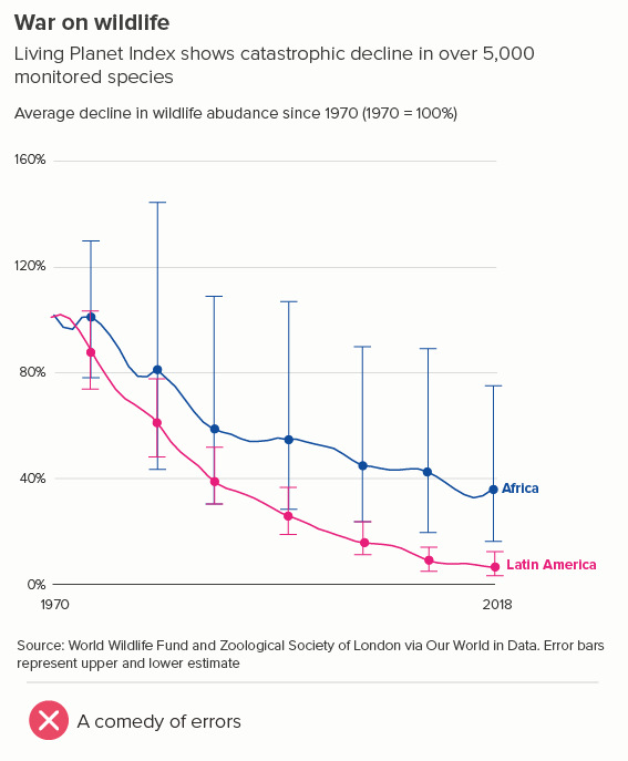
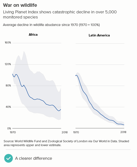
You can see that, in the second chart above, not only is it clearer that Latin America’s wildlife abundance has dropped further than Africa’s, but also that the Latin America numbers are more reliable, as the upper and lower estimates are much closer to the central estimate.
So this is a rule to stick to most of the time. With line charts, you’re looking for any excuse to delete non-data-bearing lines. When you do need to add ‘unnecessary’ lines, keep them subtle and minimal, never upstaging the shapes drawn by the data.
VERDICT: Break this rule rarely
Sources: Fertility rates - World Bank, Human height - Our World in Data, Guyana GDP - Our World in Data, Life expectancy - Our World in Data, Happiness index - Yougov UK, Historical life expectancy at birth - World Bank, Living Planet Index - Our World in Data,