
In this blog series, we look at 99 common data viz rules and why it’s usually OK to break them.
by Adam Frost
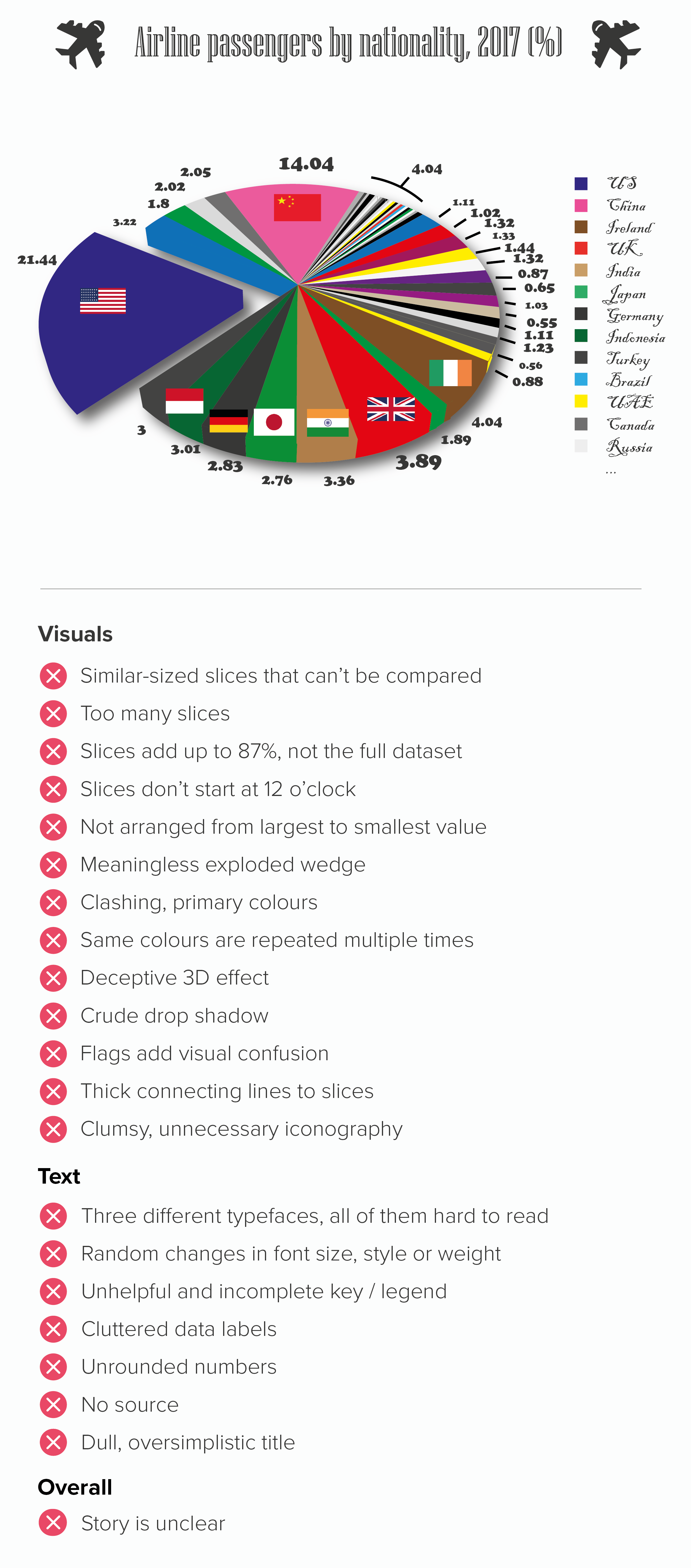
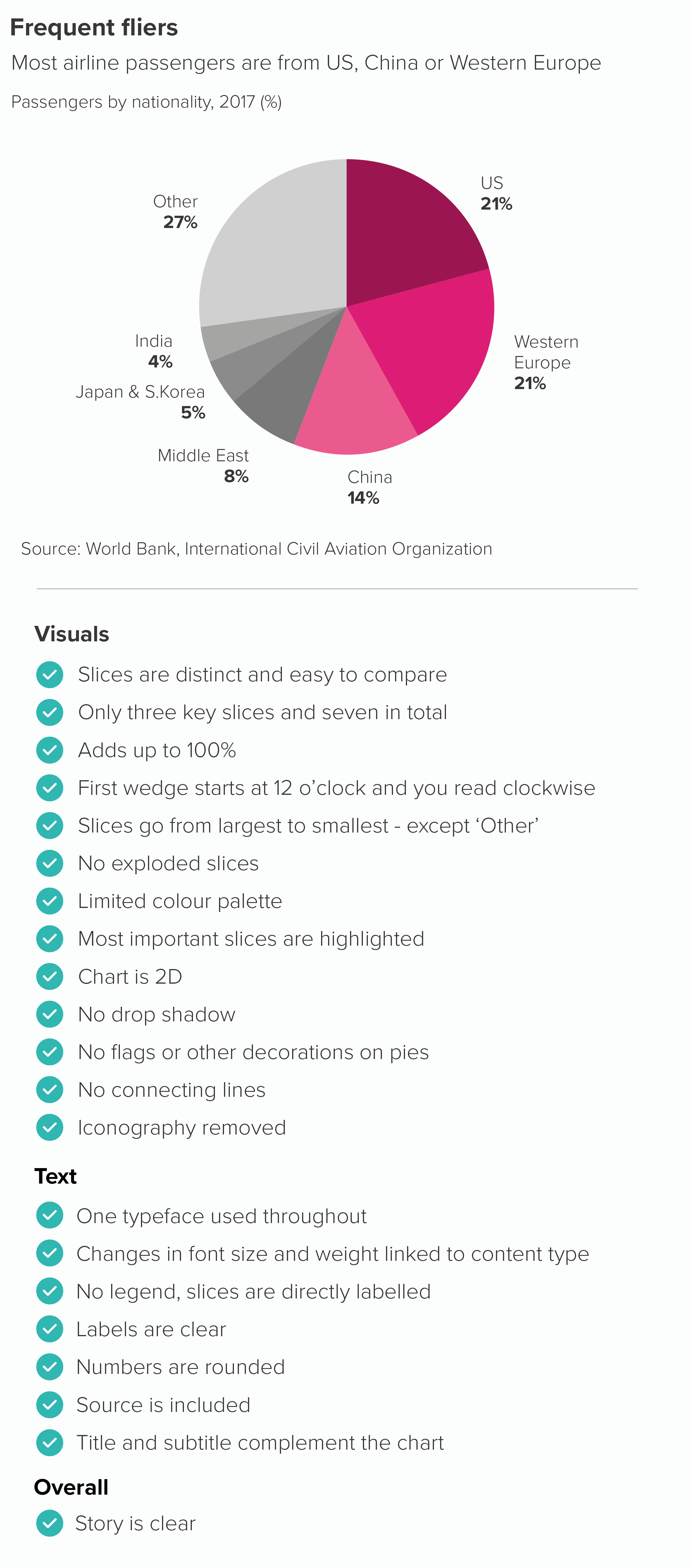
The animation above contains a quick summary of the key steps to work through when you’re ‘fixing’ a broken pie.
I’ve also included two static graphics below which contain side-by-side lists of the main issues that crop up when pies go rogue. All of these have been explored in the main 99 rules blog.
I’ve included a recap of individual pie chart rules below. If you read the individual blogposts, you will see that the degree to which you follow or break these rules always depends on your role, your story and your audience.
Rule 1: Pie charts should never be used
Rule 2: Avoid pies when your values are similar
Rule 3: Not too many pie slices, not too few
Rule 4: A pie chart should add up to 100%
Rule 5: Start a pie chart at 12 o’clock and go clockwise
Rule 6: Arrange your pie slices from largest to smallest
Rule 7: No exploding pies
Rule 8: Limit the number of colours in your pie chart
Rule 9: Give your pie chart a key (or legend)
Rule 10: No multiple pies
Rule 11: Don’t chain or nest pies
Rule 12: No 3D pies
Rule 13: Don’t decorate pies
Rule 14: No proportionately-sized pies
Rule 15: Don’t use doughnut charts
More data viz advice and best practice examples in our book- Communicating with Data Visualisation: A Practical Guide