
In this blog series, we look at 99 common data viz rules and why it’s usually OK to break them.
by Adam Frost
In rule 9, I discussed keys in pie charts and in rule 21, keys in bar charts, and how they usually make life harder for the audience. It’s doubly true for line charts. Let’s look at the default line chart in PowerPoint, for example.

Source for data: ONS UK
A key gets dropped in, even if you just have a single line. The key is also placed at the bottom of the chart, the least useful position imaginable. Of course you should remove this: it duplicates information and it adds clutter.
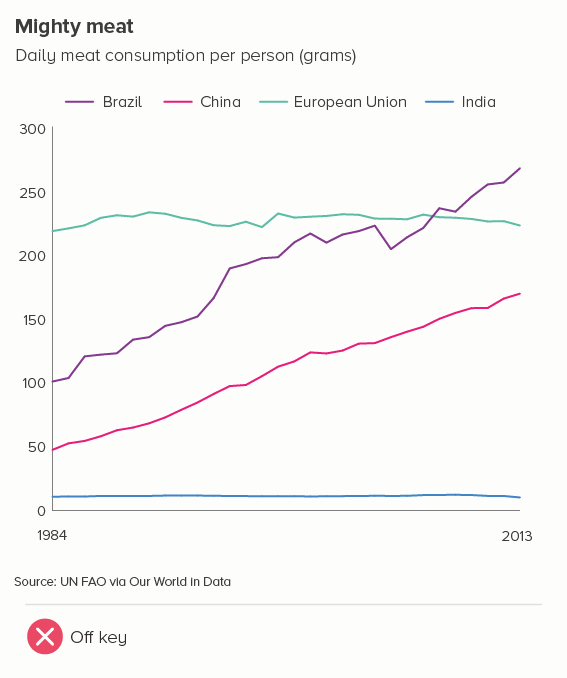
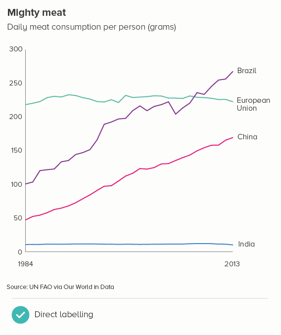
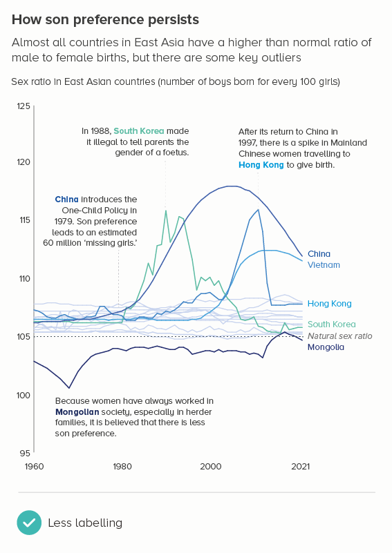
With multiple lines, is a key more useful? Compare the two charts below - with the first, you expend cognitive effort tracking back from chart to key and back again. By directly labelling the lines, as in the second example, your audience has less work to do.
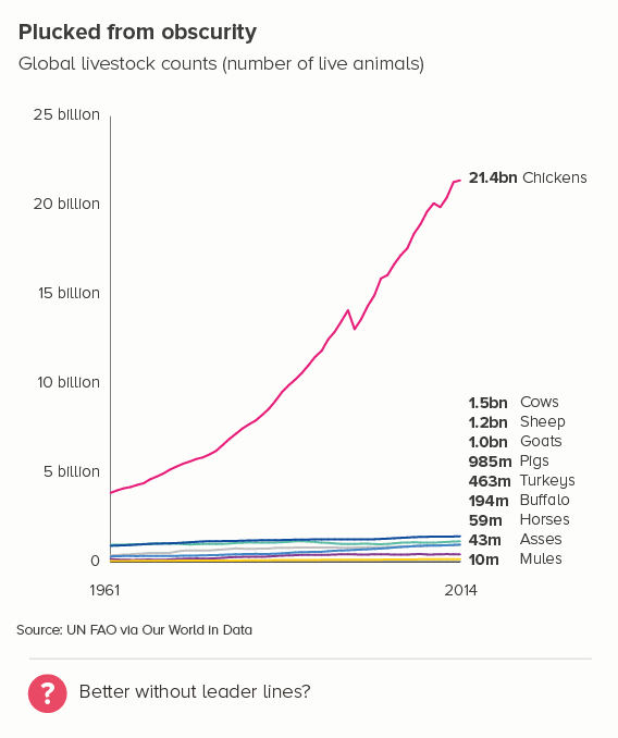
But what if the end points of some of your lines are similar values, and their labels sit closely together? Is it easier for the audience to decipher the information in a key? I’d argue that as long as you nudge up/down any labels that actually overlap, direct labelling is still preferable, as the Our World in Data example below shows.
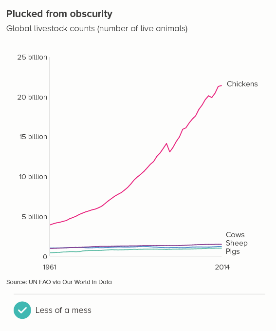
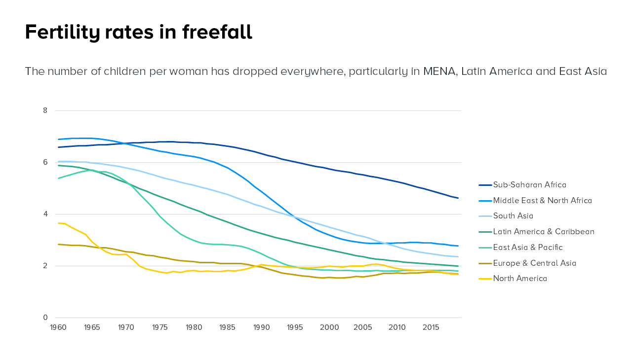
The only thing I’m not convinced about in this chart is those angled leader lines - are they strictly necessary? It’s not like they help us disentangle the six visible lines into those nine named categories. For me, leader lines are almost always redundant. In this instance, the order of the labels clearly indicates the highest to lowest final value. So I’d consider either losing the leader lines - and possibly add the final value to the label (the first example below). Or even better, reduce the number of lines, which makes leader lines redundant, the labels more legible, and it improves the clarity of the story too (the second example).
It’s also fine to keep all the lines but delete some of the labels, if some of the lines add useful context, but are not vital for the story.
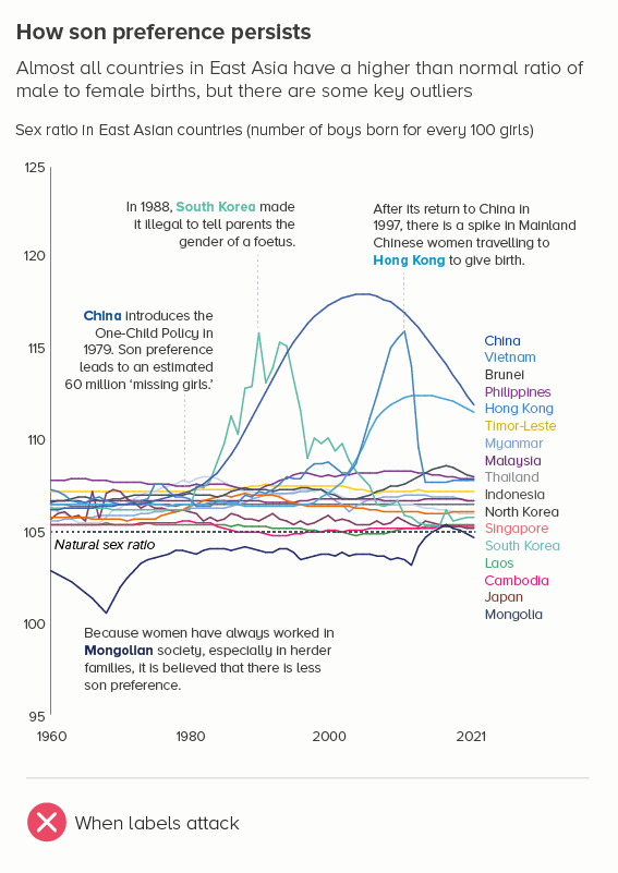
The fact is, keys are bad enough in pie and bar charts, but in lines, there’s an extra challenge. In bars and pies, you have a solid fill in the chart, and a clear bright square in your key. Still not as good as direct labelling, but at least you have a fighting chance of matching colour to bar (or slice). With a line chart, the colours are harder to distinguish, particularly once you get past six or seven lines, and matching the thin line on the chart to the thin line on the key is like having an eye test with a particularly sadistic optician. (Played, ideally, by Steve Martin)*.
So should a line chart ever have a key? I’d say No, always directly label and if you find there’s something stopping you from adding labels, then check your chart - is something else broken?
But if you absolutely have to add a key - maybe it’s your organisation’s house style - then check those defaults. PowerPoint, as we’ve seen, puts the key under the chart, but also orders the labels by the order the categories appear in the spreadsheet (the first chart below). This is unhelpful, to say the least. Your key should go on the right, and the order of the labels should match the order of those final line values (the second chart). There’s no need to make the chart any harder to unlock than it has to be.
VERDICT: BREAK THIS RULE WHENEVER YOU CAN
*If you haven’t seen Steve Martin’s hilariously twisted dentist in Little Shop of Horrors, then brace yourself.
Sources: Baby names - ONS UK, Livestock counts - FAO via Our World in Data, Gender ratio at birth - UN via Our World in Data, Fertility rates - World Bank.
More data viz advice and best practice examples in our book- Communicating with Data Visualisation: A Practical Guide