
In this blog series, we look at 99 common data viz rules and why it’s usually OK to break them.
by Adam Frost
In Rule 25, I argued that you should always start bar charts at zero. In fact, any base-aligned chart with a solid fill (e.g an area chart) should also start at zero. That filled shape will be interpreted by your audience as sitting at ground level. Nobody looks at a bar or area chart, and imagines the shapes are the top of a glacier, with hidden depths below the axis.
So surely the same applies to all charts? Isn’t the x axis always interpreted as a horizon, as ground zero?
Not necessarily. In a standard bar chart, each bar stands in for a fixed amount of something: a pile of money, a mound of food, a bunch of people. The metaphor only works if the bar representing 200 people is twice as tall as the bar representing 100.
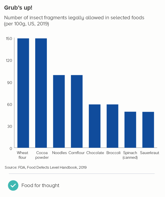
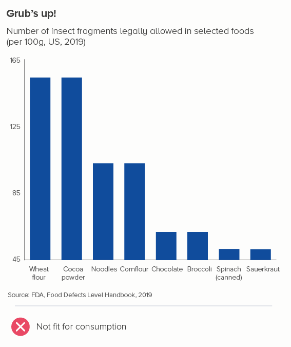
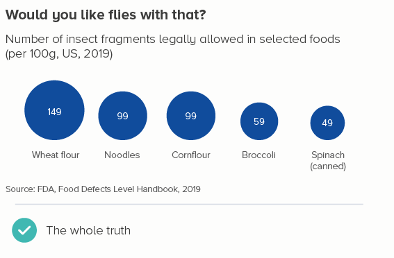
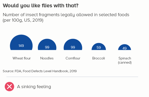
The bars in the second chart make a mockery of using shapes to represent numbers. Would anyone guess that you’re allowed twice as many dead insects in noodles as you are in spinach? It’s as bizarre as chopping the bottom off of a bubble chart.
But a line chart isn’t like this. Think about that line rising, diving or flatlining. The chart’s job is to communicate whether those changes in orientation matter.
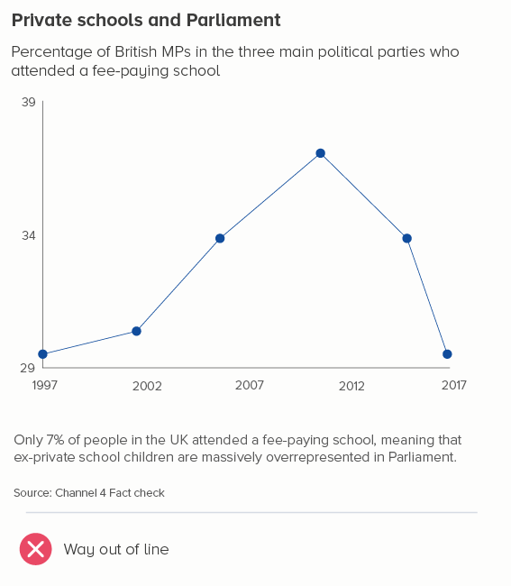
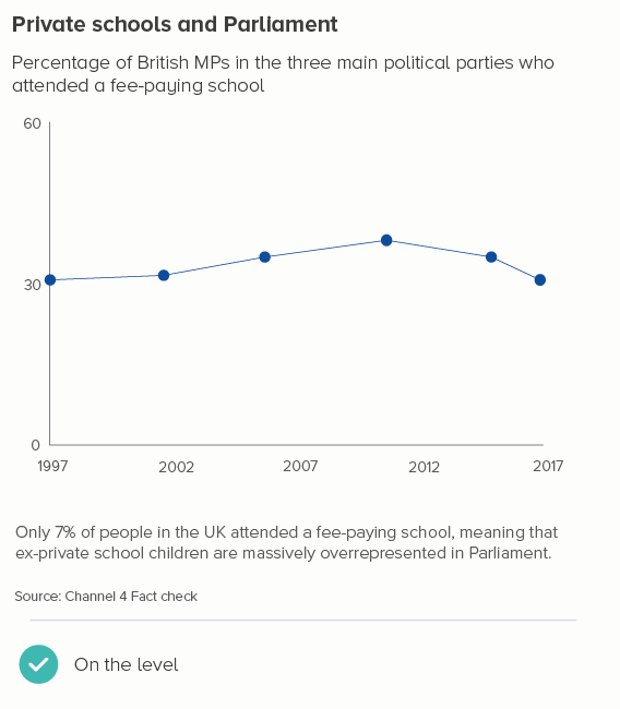
Often this does mean starting at zero. For many datasets, to get a sense of whether a change is important, you need to understand the change in the total amount. The first chart below is as deceptive as the sunken bar and bubble charts above, because it makes it look like lots has changed when it hasn’t. The percentage of British politicians from a privileged background has remained depressingly consistent - and the second chart makes that clear.
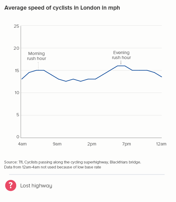
But this isn’t always the case. Look at the first chart below, which I also used in rule 33, showing average speeds of cyclists in London. The y-axis goes from 11 to 17 miles per hour. In the second chart below, I’m using the same data but, this time, I’ve run the y-axis from 0 to 25. Now those cyclists look like their speed is barely changing at all. Is that accurate, useful, interesting?
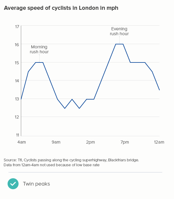
One objection might be: by starting the y-axis at 11, doesn’t the first chart exaggerate the rush-hour peaks? Well, not really. Cyclists really are going a lot faster on the way to and from work (20-30% faster than at lunchtime).
What I’m doing in the first chart is removing the values that are meaningless for this dataset. Why start at zero, when zero miles per hour can’t feature? If that’s your average speed, you aren’t cycling. The full dataset shows that - apart from one outlier going at 2 mph (puncture?) and one going at 43 mph (nutter) - people cycle at between 5mph and 28mph. Given we’re talking about average speeds, showing anything below 10mph on our y-axis is just visualising dead space where no data will ever live.
So is this a helpful mantra? Use your y-axis to show the feasible range of the data.
Not quite. For instance, often you do show zero on your y-axis even if it’s not present in the data. Let’s say instead of showing cycling speeds in London today, I was showing the change in average speeds since 1900 (I’ve made up this dataset). Starting at 3 miles per hour - as in the second chart below - looks odd.
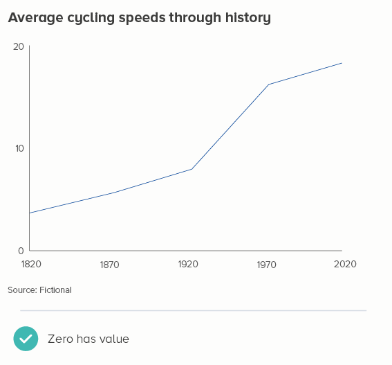
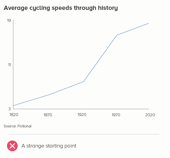
It’s not just about showing the numbers that work for the dataset, it’s about showing numbers that work for the story. The change in cycling speeds is about the story of bikes going from very slow to fairly fast. And if you want to represent very slow, then showing how close the speed is to zero makes narrative sense.
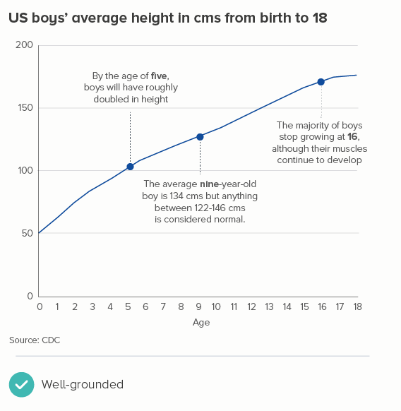
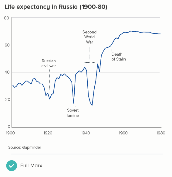
It’s also why you often include zero in, for example, charts showing life expectancy or people’s average height as they grow. Yes, average life expectancy hasn’t ever been zero and nobody has ever been 0cm (except in a Warner Bros cartoon). But zero is an important part of these stories - our lives start at zero, a child’s height is measured from the ground up: the y-axis becomes a height chart on a door frame.
So the questions to work through are:
Does starting the y-axis above zero exaggerate a trivial change?
Could zero realistically feature in this dataset?
Is zero a helpful frame for the story?
If you can answer no to all of the above, then zero can go. But if you can answer yes to any of them, it should stay.
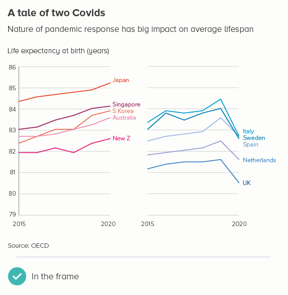
If you decide to start above zero, then there are a few more principles to bear in mind. Let’s return to life expectancy data, but this time use an example where you could start above zero. In the first chart below, it’s fine to start at 79, because your dataset is not all life expectancy data, just the last six years of data in ten specific countries, where you would expect life expectancy to be high. In addition, you are telling a story where a small dive in some countries represents major political failure. Starting at zero would have buried this story.
What it’s not OK to do is what I’ve shown in the second chart - making the line hit the x-axis.
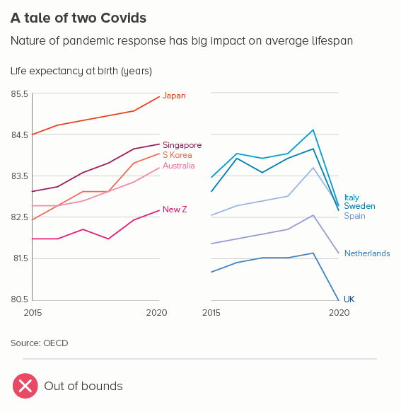
If the line intersects with the axis, it looks like a dive to zero. If you’re cropping your chart to focus attention on a meaningful change, you should avoid cropping this tightly, just as you would never crop any other image this tightly. You should leave space at the top and bottom, so the lines float, the story is properly framed, and there is no confusion about the highest and lowest possible values in this dataset.
(The only exception to this is perhaps when the line hitting the bottom of your chart is an important visual metaphor - like this from the Economist. Sea ice extent is so far ‘below normal’ that they have no wish to frame it aesthetically or to suggest that the decline can or should go lower. We are well below the ‘acceptable’ range of the data).
Another tip I’ve found useful: if your y-axis doesn’t start at zero, it’s often good to make the x-axis a lighter shade (or even invisible), just to make it clear that this does not have the same weight as the y-axis, it is closer in meaning to a gridline. In fact, if you have gridlines on your chart, I’d make the x-axis the same thickness and colour as your gridlines - as in the first Covid chart above.
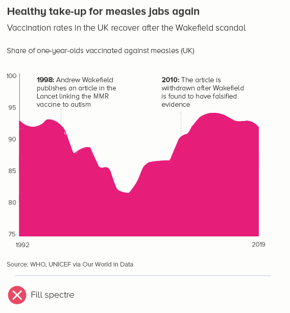
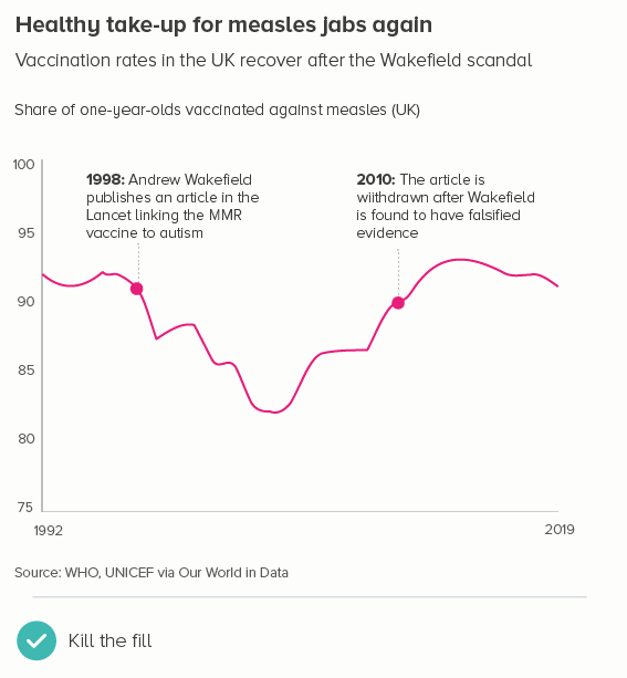
A couple more no-nos. One that I touched on at the start: if you’re going to start above zero, don’t fill the area below the line (this is known as an area chart). As with a bar chart, this filled shape will be interpreted as sitting at ground level.
Secondly, if you’re starting above zero, try to make those start and end numbers on your y-axis human-readable, ideally a multiple of five or ten. It’s not always possible, and it might give you slightly too much space above and below those lines, but it’s always easier to read an axis going from 20 to 40 than one going from 23 to 37. It makes the increments easier to read too: 25, 30, 35, 40, rather than e.g. 23, 26.5, 30, 33.5, 37.
There’s one final (and slightly obvious) point to make. The start at zero mantra is definitely to be ignored in datasets where zero doesn’t mean ‘nothing’ in your dataset- for example, with data on an interval scale. Let’s say you’re charting temperature change. It’s not like there are no temperatures below zero, or that zero means ‘no weather’. When you are talking about a change in temperature, you might well start at -50°C or even lower - it totally depends on the story. (If it were human temperature, you’d probably start around 33°C).
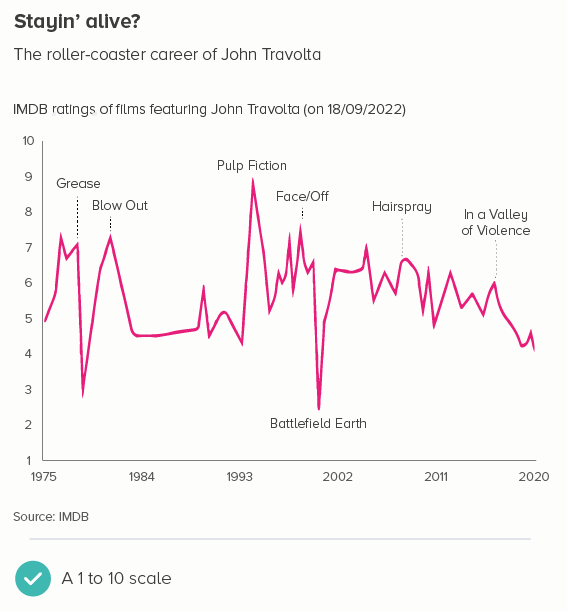
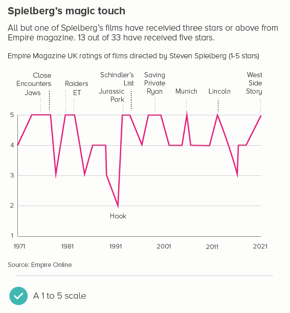
It is the same with some kinds of survey or rating data. You might have asked people to rate how happy they feel from 1 to 10. Most websites with a star rating system (e.g. Tripadvisor, Amazon, IMDB) start their scale at 1, because zero is reserved for ‘no rating’. So once again, using zero is plain wrong.
So this is another rule with multiple exceptions. In fact, it’s a rule that can often lead to misleading charts, as starting your y-axis at zero can hide small but vital changes. Use your judgement to work out whether the story needs a tighter frame and, if it does, snap to it.
VERDICT: Break this rule often.
Sources: Insect fragments allowed in food - FDA, MP’s education - Channel 4 Fact check, Cycling rates - TfL, Average heights - CDC, Russia life expectancy - Gapminder, Life expectancy - OECD, Measles jabs - WHO/Our World in Data, Film scores - IMDB and Empire Online
More data viz advice and best practice examples in our book - Communicating with Data Visualisation: A Practical Guide