
In this blog series, we look at 99 common data viz rules and why it’s usually OK to break them. Here are all the rules so far.
by Adam Frost
If you want to show how something has changed (or stayed the same), then a line chart is usually where you start. And often it’s where you end too, because nothing conveys the passing of time more effectively than a line moving left to right across a page.
Metaphorically speaking
Why should this be? After all, aren’t lines usually used to indicate distance and direction? Think of the line representing the journey to a destination on a sat nav, or even the motion lines behind a character running away in a comic strip. Don’t we instinctively see a line on a page as representing movement through space not through time?
Certainly lines are used in this way in charting. Maps most obviously - perhaps I am showing trade routes or flight paths or the migration pattern of the Arctic tern.

Image credit: Flight paths by Michael Markieta/ Arup; Arctic tern from ‘Communication with Data Visualisation’ (Sage, 2021)
Or perhaps, like Nathan Yau in this excellent piece about food deserts, I want to show how far people live from fresh food outlets.
And those distance lines are not just placed on maps. Sometimes they are extracted from a geographical backdrop and treated as a more conventional chart, so we can more easily compare their lengths.


Furthermore, these distance lines don’t have to stay straight. We can get creative, and make those lines parabolas. Perhaps we are talking about things flying through the air.
Or perhaps we're not talking about things literally flying through the air, but we want to draw on that metaphor of ejection, as in this piece by Shirley Wu and Nadieh Bremer which visualises the expulsion of homeless people from US cities.
Sometimes we are not talking about physical distance, but a distance between two attitudes or viewpoints. Again, lines work to signal proximity - or a lack of it.
Occasionally this taps into a broader positional metaphor - for example the New York Times often place lines and arrows on maps to show the degree by which voting patterns have shifted left (Democrat) or right (Republican).
The space-time continuum
So lines are clearly effective at showing the change in something's physical (or psychological) position. So why are they so good at showing change over time too?
Probably because, as Lakoff and Johnson argue in their seminal book Metaphors We Live By, we have to convert things into metaphors in order to understand them. And in the case of time, the most baffling concept of all, the only metaphor that really helps us to grasp it is the idea of time as a physical journey.
Think about the language we use to describe it. If I ask you how long your journey was, you are more likely to say five hours than fifty miles. Time seems to have length, physical extent, like a rope or a racetrack. When I tell my children that Christmas is in two weeks' time, they might say: 'That's too far away' - like it's a physical object in the middle distance. Forwards, ahead, next becomes onwards in time too, and backwards becomes the past.
It's no surprise, then, that our visual metaphors mirror these verbal metaphors. The line that tracks distance can be used to track time too.
The metaphors merge in other ways as well. The charts where I tracked distance above went left to right. If you imagine a race on the TV, the athletes will usually be filmed starting left and ending right. Why? Sometimes this is seen as a consequence of western handwriting being left-to-right but it seems to exist in right-to-left cultures too - think of Super Mario always going left to right across the screen. When we flatten 3D journeys into 2D, forwards tends to be right and backwards left.
We borrow this convention for time too - the future is always right, think of Play buttons or Fast Forward buttons. Or the Next/Forward arrow on your browser. (Those of you old enough to remember music and video cassettes will know that the tape always started on the left-hand reel before being passed across to the right). And what about the pulse on a heart monitor? How can a heart rate have a direction? But it does. Left to right. All of this means that we cannot help but see a line moving left to right across the screen as a metaphor for time as well as distance.
In fact, I'd argue that if anything we see time first. A journey after all has plenty of stops and detours; that line can wiggle and U-turn. Time, on the other hand, is always moving - and always moving in one direction. You cannot stop it. It can be spent and wasted and saved, but it is always fluid. Even when we talk about possessing it ('How much time do we have?'), it is with a sense that it is slipping through our fingers ('Ten seconds, no - nine, no - eight!'). A line moving left to right then is the perfect metaphor for time, as it evokes continual, unstoppable, irreversible motion.
Don't mess with the timeline
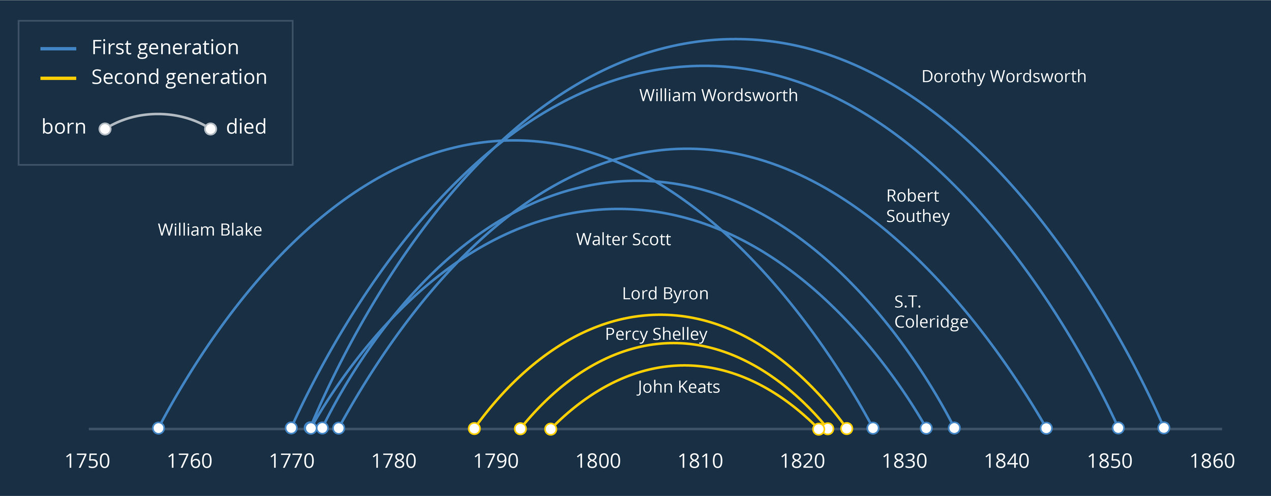
When it comes to charts, we can see the time = line metaphor most clearly in (surprise, surprise) timelines. They are such a universal feature in newspapers, museums, school textbooks and everywhere else because they are so clear, so useful, and so impossible to misunderstand. The examples below show the lives of selected Romantic poets.

These timelines lean into all the metaphors we discussed above:
The lines are straight and unbroken
Dots/markers are distinct events
The length between markers corresponds to the amount of time that has passed between events
The line moves left to right. Sometimes in mobile portrait, this is rotated and the timeline runs top to bottom. But it can never go 'backwards' - right to left or bottom to top.
Having said this, it is still possible to create more innovative timelines. As with our distance charts above, where we had arcs and arrows representing journeys, timelines can also be refracted into parabolas and spirals. However the way the line is read - left-to-right along the line, space between dots representing duration or time elapsed - remains the same. It's the only way the visual metaphor can work.
Another dimension
When we create line charts, we add a second dimension to our timeline - this is (usually) a y-axis which (usually) represents a quantity of something.
This combines our initial metaphor - the timeline running left-to-right - with another - the orientation of a line representing something getting bigger or smaller. Up means better, greater, rising; down means worse, less, decreasing. As Lakoff and Johnson argue, this association of higher/lower with better/worse is an obvious result of our relationship with gravity - up is physically harder for us to achieve and things soaring into the sky always cause our pulses to race.
This is why, as I said at the start of this article, often when you experiment with a change-over-time story, you will find yourself searching in vain for a better visual metaphor than a line chart. It takes all the instinctive ways we structure time and space and quantity and value and merges them all into a single lucid shape.
Even when the thing rising is bad - and therefore not ‘better’ at all - the up/down metaphor is still effective, because then the line chart taps into our association of ‘higher up’ with power, importance and even threat. The rising line that represents rising unemployment, inflation, Covid cases or something else bad now means ‘worse’ in the same way that a big tidal wave or explosion or monster is worse than a small one.
When we need to foreground changing rank rather than value, a type of line chart called a bump chart works well for the same reason - change over time is tracked by a line moving left to right, change in importance is represented by a dot moving up or down. I’ll talk about these charts in more detail in a later blogpost. For now, I’ll just say that they are at their most effective in an interactive format, and if you are using them in a static format, I’d highlight the most relevant line(s) and knock back the rest.

In this example, made using Flourish, I’m looking at the most popular dog breeds in the US and highlighting how French bulldogs have (quite rightly) overtaken the English variety.
The perfect symbol
So line charts are one of the most popular charts in the world for good reason. They tap into our most fundamental thought processes.
However, there is an important catch. A line chart’s extraordinary strength is also its weakness. Just as a pie chart only works as a metaphor for a whole being sliced into parts, and a scatter chart only works to show the correlation between two variables, so a line chart is only effective when you are showing change-over-time - at least when you are talking to a general audience. Most people can’t not see those lines as timelines, they can’t not see each line’s rise and fall as representing a change in rank or quantity.
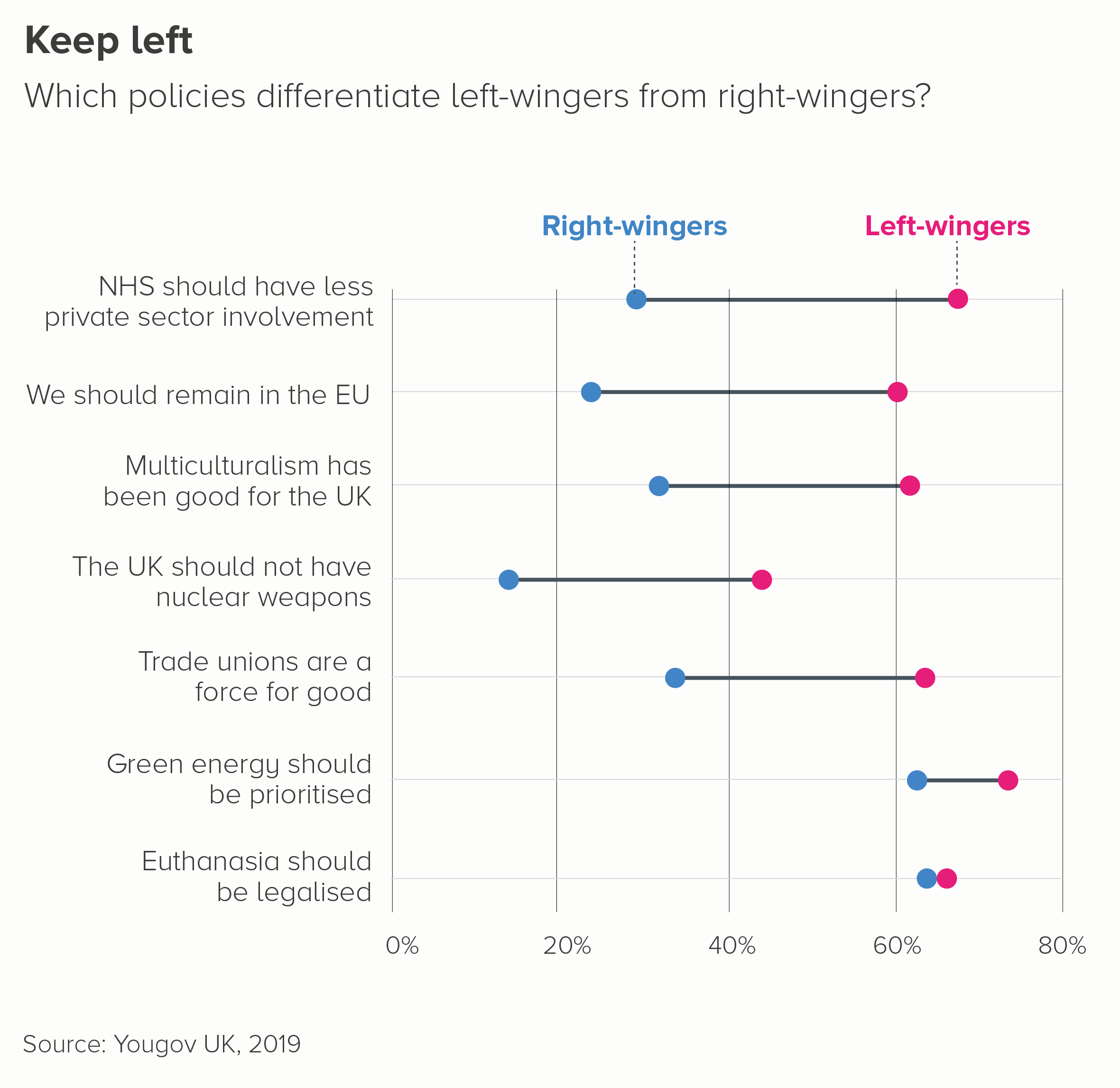
It means that if you want to use line charts to tell a different story, you can end up losing your audience. Yes, you can put lines on a map and tell a distance story. You can put lines on a diagram or flow chart to tell a connections story. But when it comes to drawing a line on a standard chart with an x and y axis, people will usually assume you’re talking about change over time even if you aren’t.
So I’d like to finish this article by outlining what happens what line charts are (mis)used in this way and by suggesting some alternative approaches.
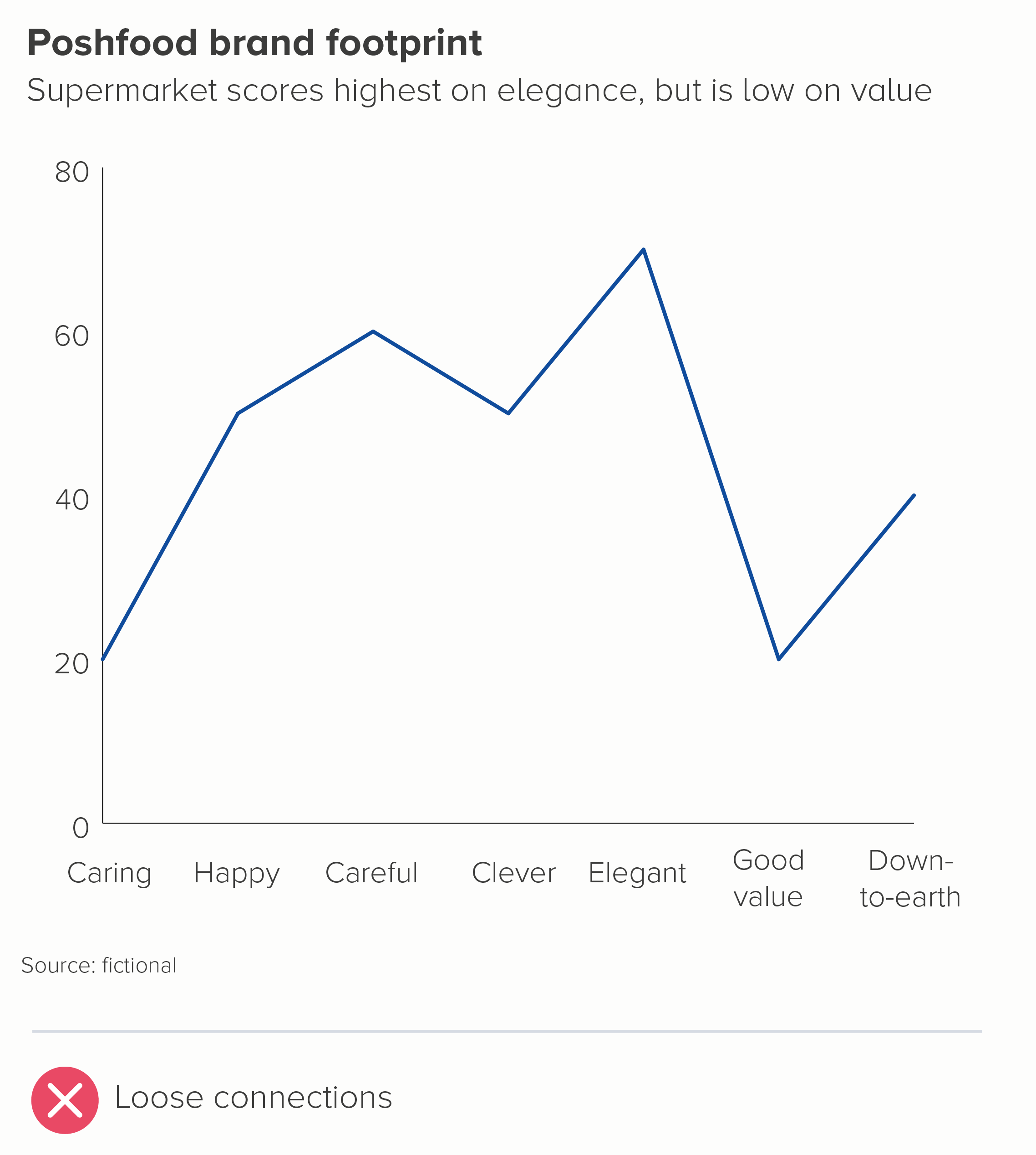
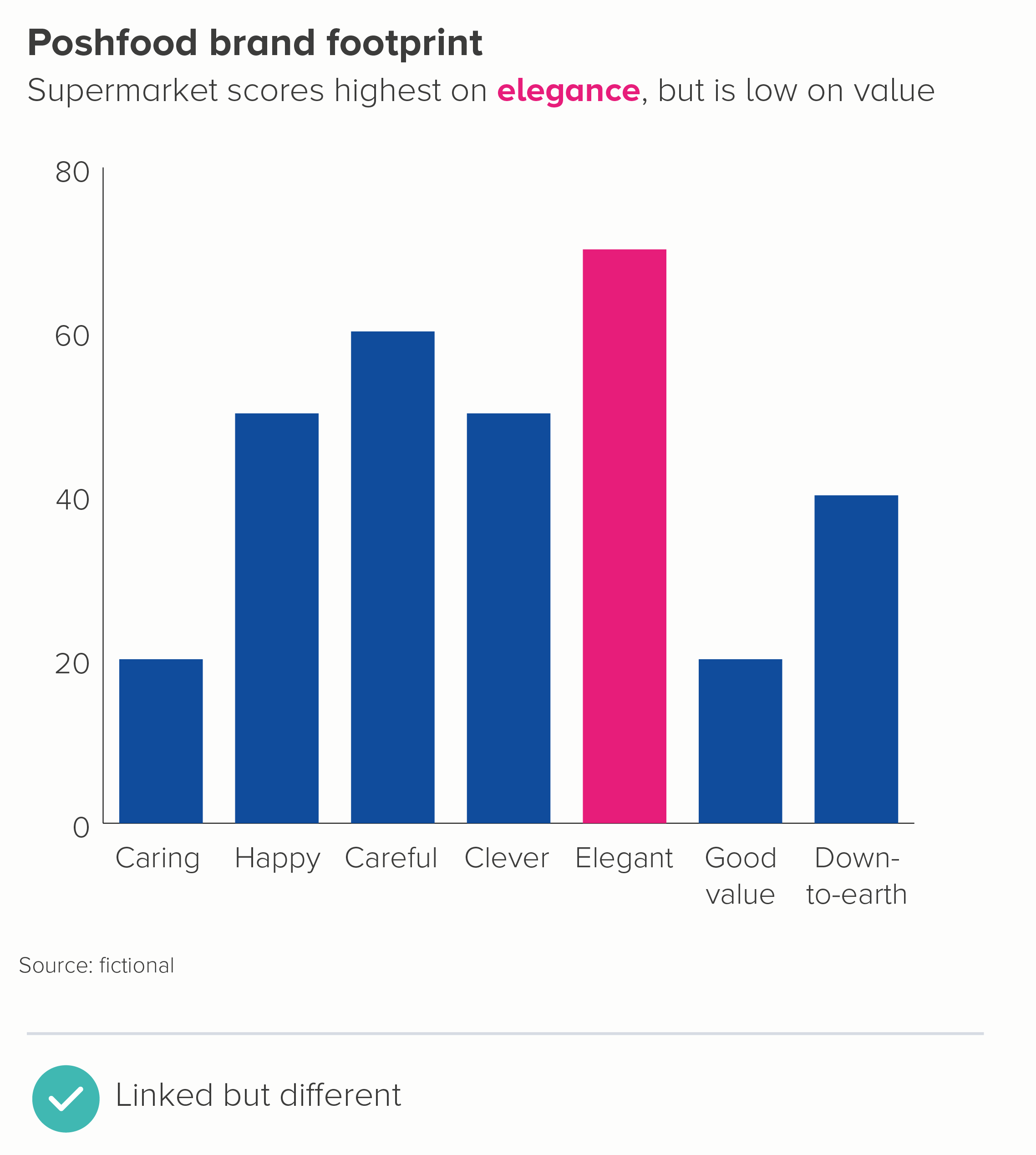
i) Comparing categories
Line charts sometimes get used in corporate presentations to link categories together, often in the name of giving a ‘product footprint’ or something similar. But I’d argue that this is deceptive, suggesting that one category is somehow flowing into the next, when it isn’t. A chart type designed to compare distinct entities - like a bar chart, a bubble chart or a polar area chart - is in my view a better fit for these kinds of stories.
ii) Comparing ages
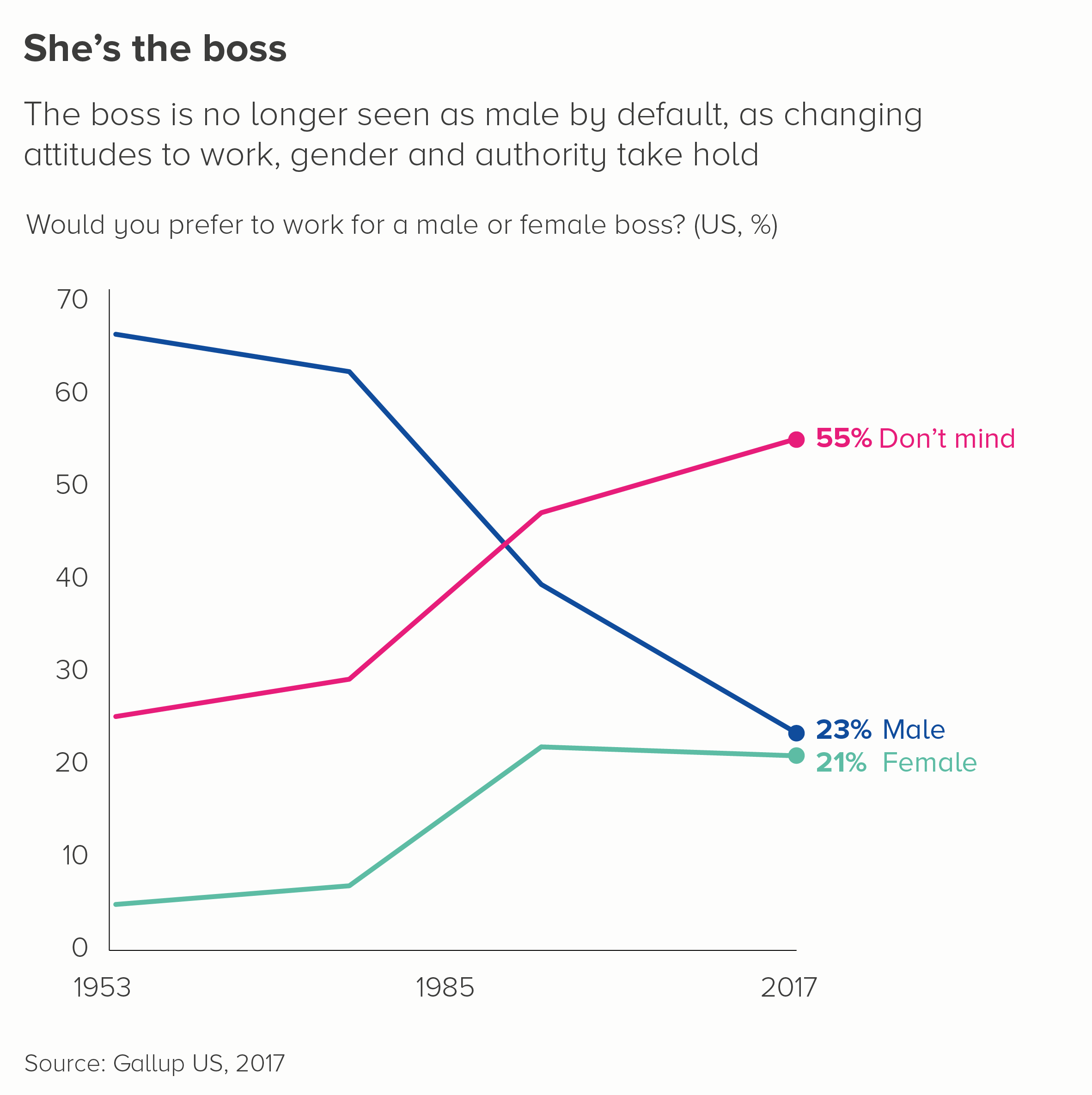
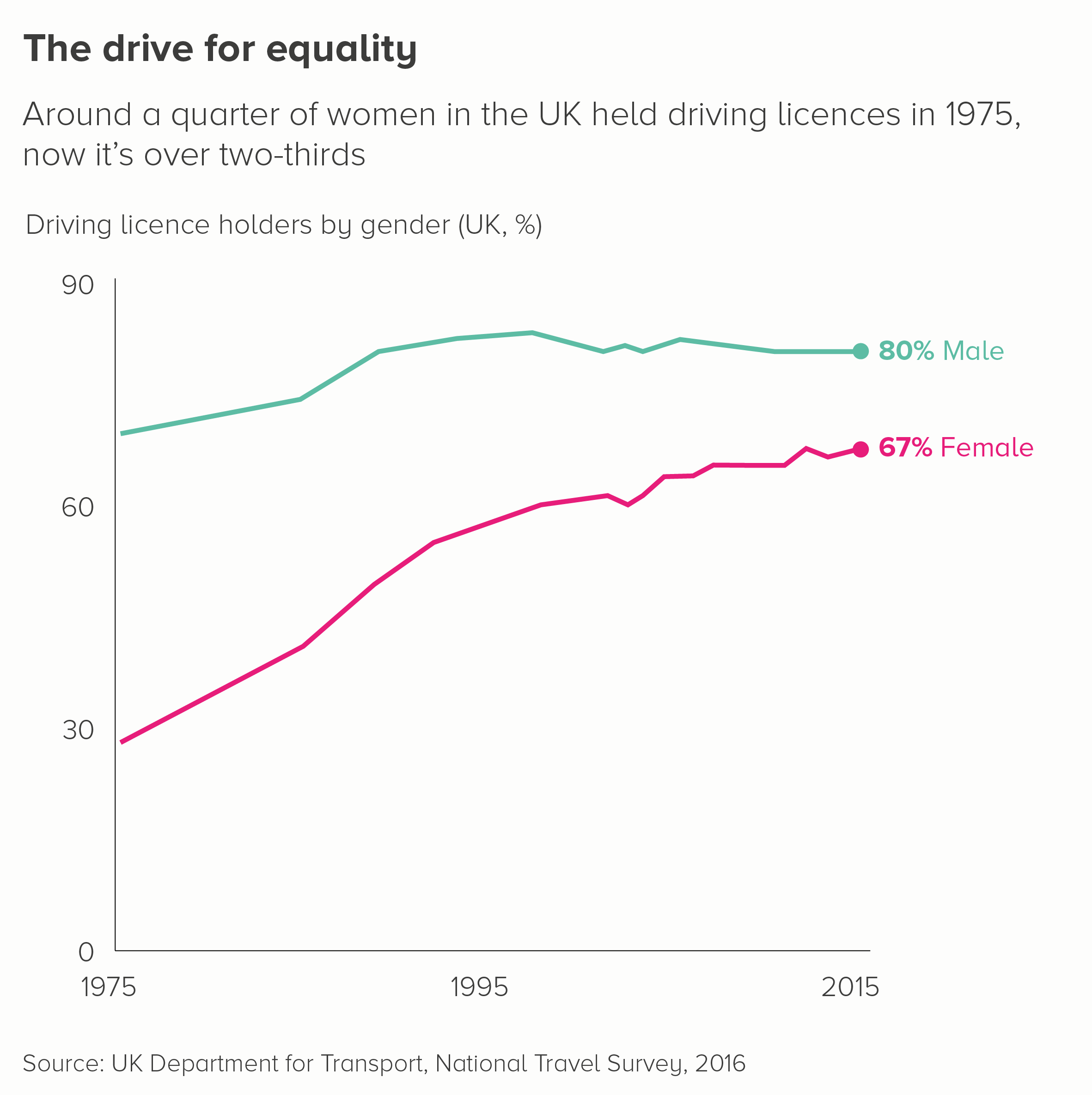
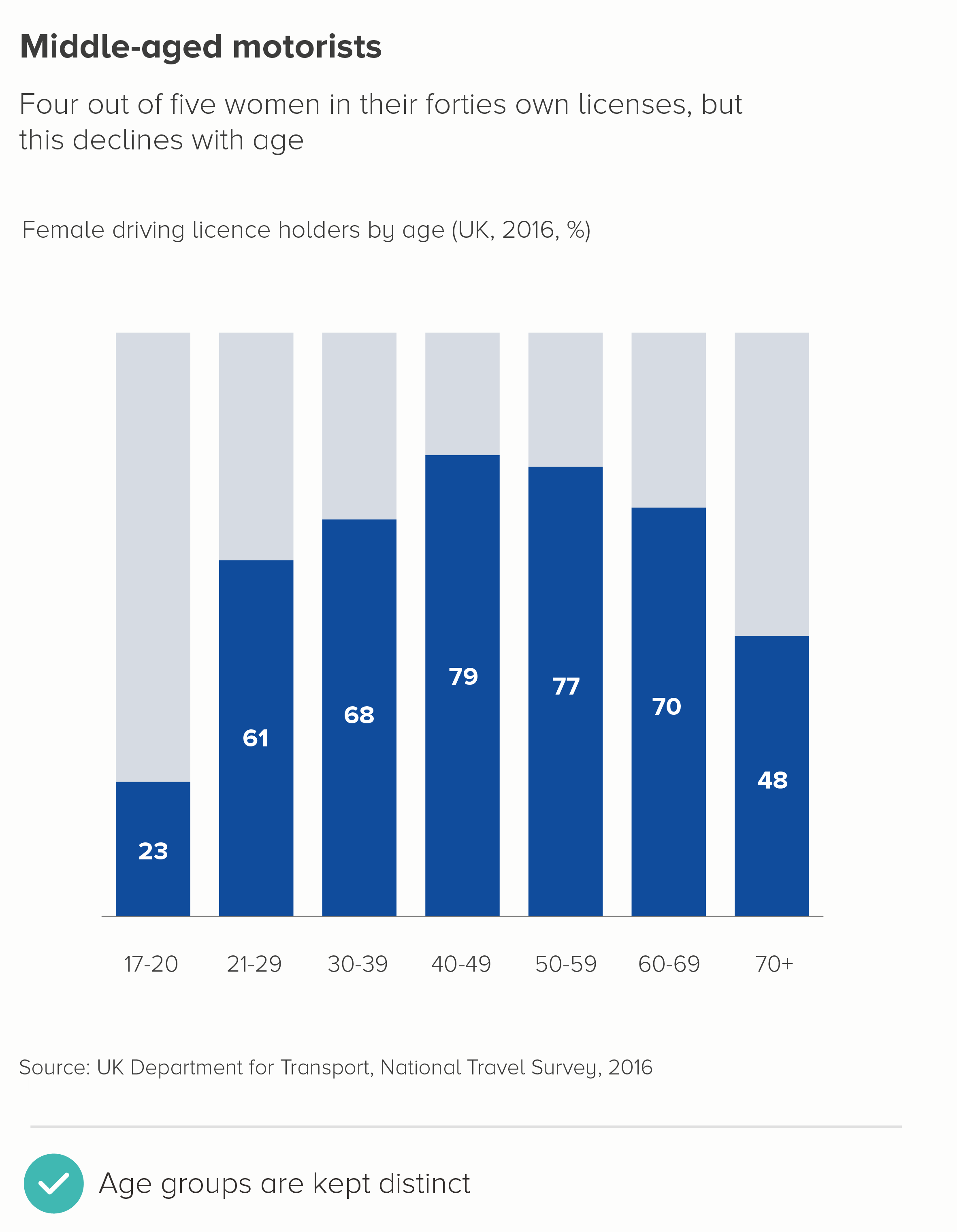
I can see why this is tempting. Age is a bit like time, right? The first chart below adapts a chart from a recent UK government travel survey on the gender of driving licence holders. I’ve also included one on pizza topping preferences - using Yougov data - and how this changes with age.


I think the line here is meant to suggest the arc of a life and how as you get older, you are less likely to a) hold a driving licence or b) like chicken on a pizza. But for me, this is confusing. We are not tracking people as they age, but different age groups right now, and it is perfectly possible (indeed likely) that the 72% of young people who like chicken on a pizza now will, in fifty years, become 72% of old people who also like it. Again, these are comparison stories - not change-over-time stories - and your chart should ideally emphasise that these are distinct age groups with distinct behaviours at a single point in time.

iii) Correlation
When creating a scatter chart to test whether two variables correlate, analysts often draw ‘a line of best fit’ through the middle of the datapoints to express the relationship between them. Often the original datapoints are removed and only the line is left, to make it easier for their audience to see the type and degree of correlation and to make predictions: if x changes by this amount, y will change by that amount.
In the examples above, adapted from a recent scientific study on the link between eating fruit and vegetables and the risk of contracting disease, the straight line represents negative correlation. The more fruit and vegetables you eat, the less chance you have of getting sick.
Now, here’s the thing. When we’ve shown these kinds of regression analyses to general audiences, and even some corporate audiences, they can miss the message. I believe it’s because they’re wired to see a line chart as representing change over time, and they just don’t grasp (without explanation) that this is a story of interdependence. Maybe it's that, or maybe it’s because this type of line chart still isn’t widely used by the media. Either way, I’d recommend thinking of the charts above as analytical tools, not something you should use to inform or explain. Consider what your underlying message is, and use clear copy or simple cause-and-effect illustrations to help audiences understand the relationship you’ve discovered.
Here’s one alternative to the fruit and vegetable charts above. There are no lines to be seen.
iv) Distribution
Another type of line chart that is constantly used in data analysis is a frequency polygon, which is used to show how your data is distributed. They are like histograms, except the output is a curve (in a normal distribution, this is a bell curve), rather than a series of locked bars with fixed bin widths.
As with the correlation story above, I’d think of these charts as tools for discovery, rather than communication.
In the first chart below, we have taken a dataset about the average age of male and female actors in key romantic movies, and turned this into a frequency polygon.


Why is this so hard to understand? Again, I suspect it’s because people see that line as representing something that’s changing over time, rather than something that’s changing based on the proportion of total movie stars that are of a particular age. I also think that data distribution just isn’t that interesting for most audiences. Knowing the average is enough. So most people have no interest in even trying to decipher this chart. Distribution is something an analyst checks, just to make sure the average isn’t hiding an important skew in the data. But for a general audience, it’s of secondary or no importance.
As a result, I think the second chart above is a better approach. Make the average the first thing the audience sees, ensure the distribution is a secondary element, and use annotation to make it clear what this unfamiliar chart means. More generally, I think a shower of dots suggests distribution, spread, dispersion more intuitively than a line.
v) Interrelationships
The Data Visualisation Catalogue states that a parallel coordinates plot is 'ideal for comparing many variables together and seeing the relationships between them.’ They use the chart above as an example of this chart type. So please. Look at the chart and tell me. What are the relationships between these datapoints?
Even more so than the other charts mentioned above, parallel coordinate plots are always always tools for analysis. Moreover, they are useless as static graphics. They can be more effective when they are interactive, because at least you have the option of rolling over a single line and isolating its path across the vertical axes. But even then, you have to be careful because overplotting can make it impossible to single out specific pathways.
I also think they get confused with bump charts- a type of (excellent) change-over-time ranking chart that I mentioned above. Once again, it’s the power of that line metaphor - moving left-right suggests time, moving up-down suggests rising-falling, and in a parallel coordinates plot, none of that applies. This chart is solely for assessing the strength of particular interrelationships.
So this chart is for your eyes only. Stephen Few has written a post about how to use these plots for effective interactive analysis. But that is all they should ever be used for; in any other situation, extract the insights and switch to an illustration or a clearer chart type.
Conclusion
In most cases, then, I think a line on a graph with an x and y axis should only be used to show change over time, particularly if you are talking to a mixed or general audience. Plenty of scientifc research backs this up, but I think studies of metaphor and narrative structure make the point even more convincingly. When it comes to that line tracking across a screen, the metaphor and its meaning are so perfectly matched that your audience is likely to see change-over-time even if you want them to see something else.
Of course, lines in themselves are used to tell other quantitative stories in data visualisation, most notably distance stories, as I mentioned at the start of this article. However, there the lines are either straight - and act more like a bar chart - or they are superimposed on a map, so it is clear we are measuring from point a to point b. As soon as we add those two visible axes and show lines zigzagging from left to right, those shapes tend to mean one thing and one thing only. A day in the life of your dataset.
So this is another rule that I would think twice before breaking. Yes, this only applies to using data visualisation for communication. Use lines however you wish when analysing, whatever helps you detect the most useful stories for your audience. And I’m also not saying you can only use line charts for telling change-over-time stories - area charts, bar charts, sankey diagrams, icon charts and many others can also work. What I am saying is if you do use a line chart, remember how little we understand about time, how invisible it is to us, and how we all seem to have alighted upon a line moving left-to-right through space as an ideal way of making it visible.
VERDICT: Break this rule rarely.
Sources: Gender of boss - Gallup US, 2017. Driving licenses - UK Department for Transport, National Travel Survey, 2016. Pizza toppings - Yougov, UK. Beating up animals - Yougov UK. Left-wing policies - Yougov, UK. Male v female actors - BFI Love graphic
More data viz advice and best practice examples in our book- Communicating with Data Visualisation: A Practical Guide