
In this blog series, we look at 99 common data viz rules and why it’s usually OK to break them. Here are all the rules so far.
by Adam Frost
In rule 26, we talked about how breaking your y-axis is usually deceptive and how you should almost always avoid doing it. A more scientifically-sanctioned form of y-axis tinkering is the use of a logarithmic scale (or just log scale - for short).
Edward Tufte, perhaps the most celebrated figure in analytical data visualisation, argues that ‘the world in general is probably lognormally rather than normally distributed’ so we should ‘use log scales for many kinds of variables’. Dona Wong, in her excellent guide to Information Graphics, provides a double-page spread on how and when to use them (Norton, 2014, p100-1).
Logarithmic gymnastics
So what is a log scale? And when should it be used?
Let’s deal with what it is, first. On an axis with a regular (or linear) scale, your numbers will go up in even intervals, so 1, 2, 3, 4, 5 or 100, 200, 300, 400, 500. On a log scale, they might go up 2, 4, 8, 16, 32 (that’s a base-2 log scale). Or 0.1, 1, 10, 100, 1,000 (that’s a base-10 log scale).
So why on earth would you do this?
The most common reasons are:
when you have a huge outlier that means differences in your smaller values are invisible.
when you have data where the percentage change between each bar is more important than its actual value. This is particularly the case when you are showing exponential growth - change over time data that is constantly leaping up by higher and higher amounts.
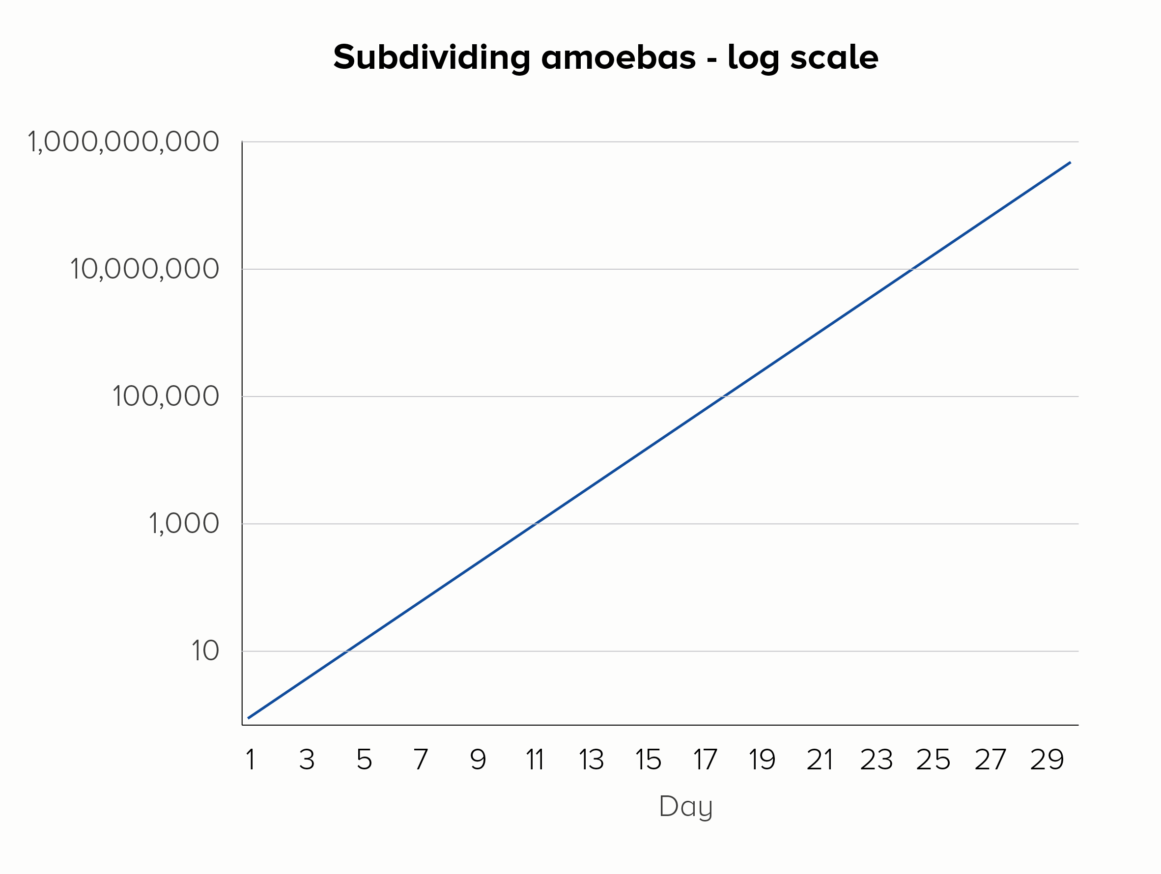
Imagine you were measuring amoebas subdividing into 2, 4, 8, 16, 32 cells - and so on. This is what we expect amoebas to do: they are reproducing at a constant rate. If we plotted this on a linear scale, we’d fail to see the important doubling in the early stages, the rate of reproduction would look alarming rather than normal, and within a few weeks our line would basically be vertical forever. For this reason, a microbiologist might choose to use a base-10 log scale (the second chart below).

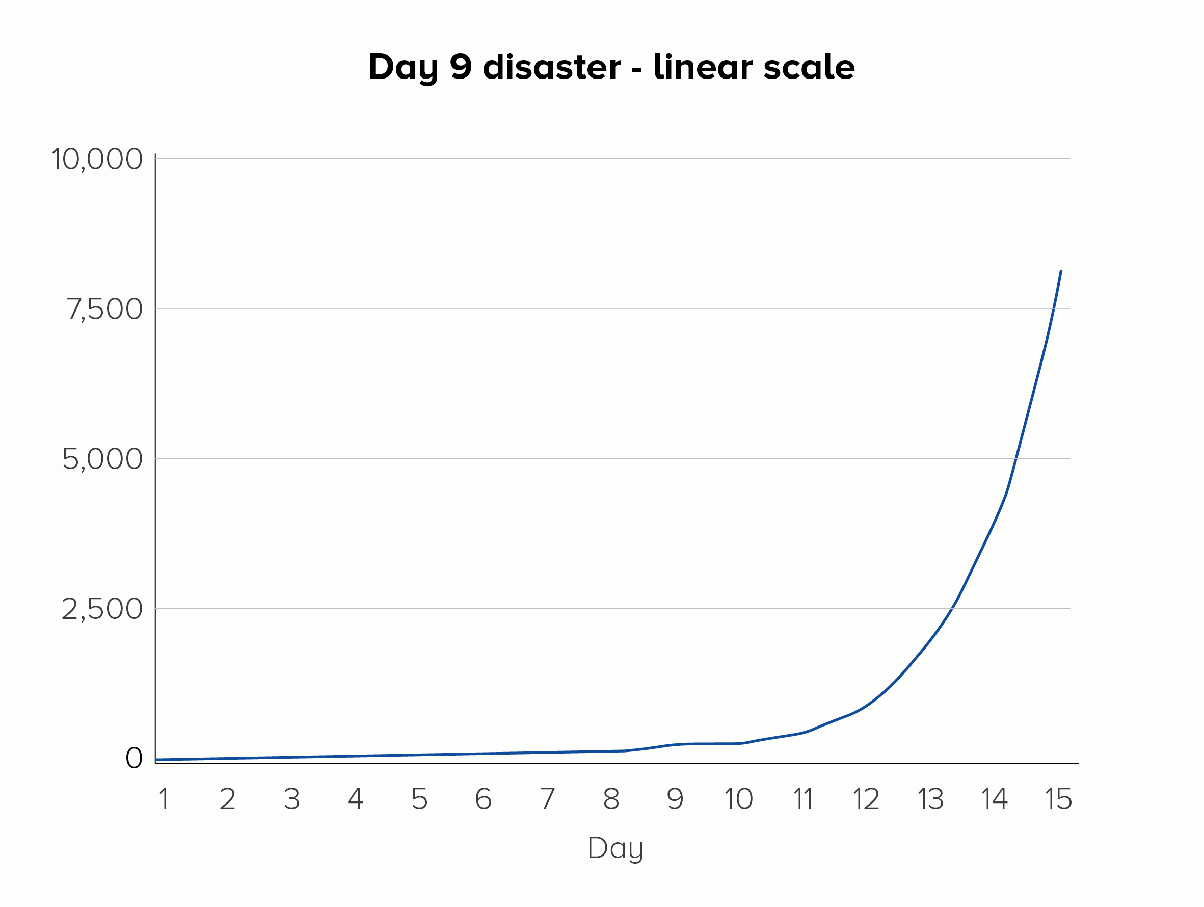
Furthermore, using a log scale means any deviation in this steady rate of increase is more visible. Picture a group of amoebas, subdividing once each day, over the course of 15 days. But on day 9 - disaster! - Dr Smith spills soup on the petri dish, the amoebas freak out, and no one’s in the mood for asexual reproduction that day. On a linear scale, the effect of this error could be missed, but on a log scale, the kink in the chart would be more obvious.

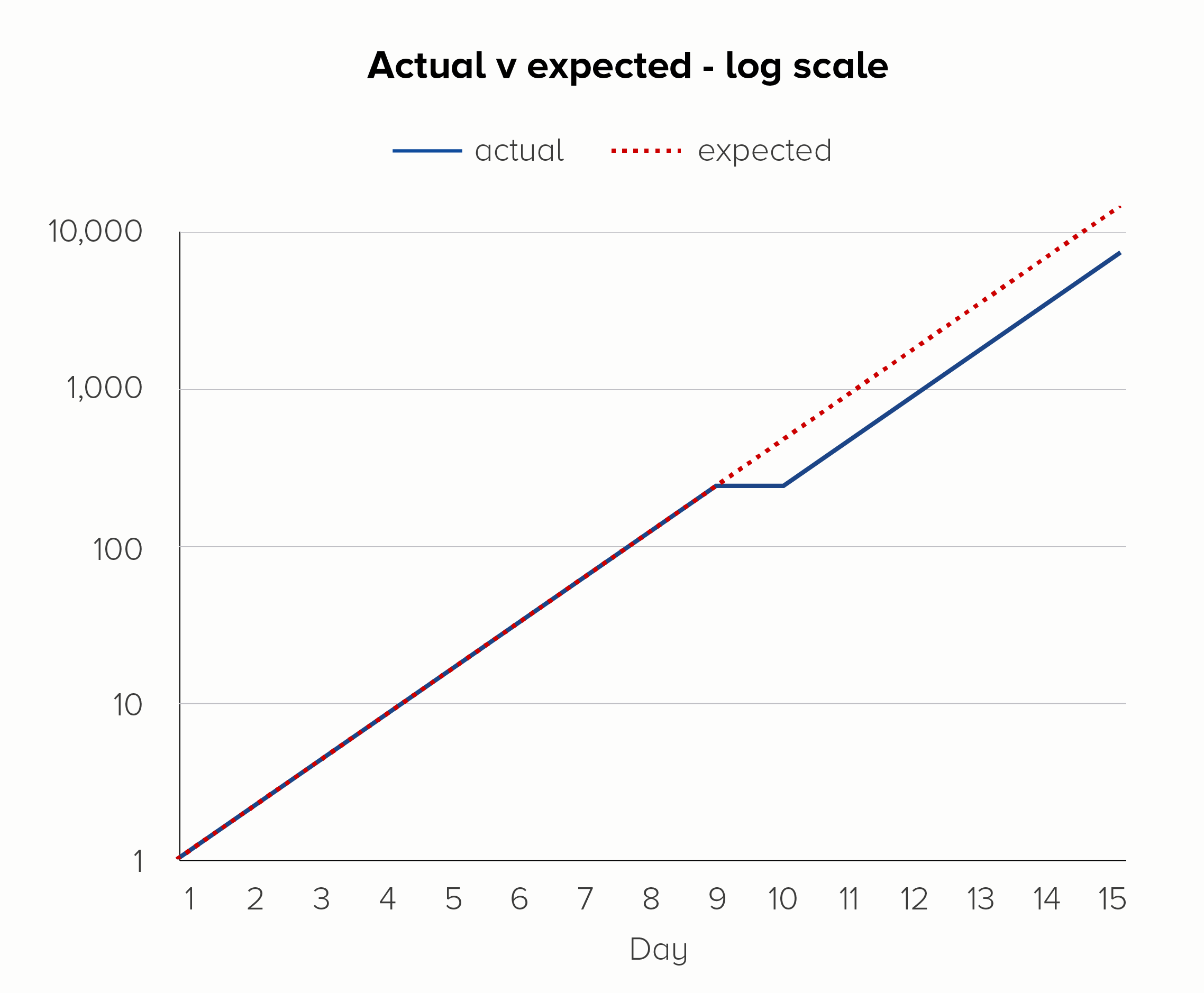
If you add a dotted line to show the expected rate of increase, you can see another strength of log scales. On the linear scale (the first chart), it looks like the day 9 glitch has thrown everything off. But on the log scale (the second chart), it’s clear that ‘normal business has resumed’ on day 10, and the steady rate of increase has kicked back in after the soup debacle.
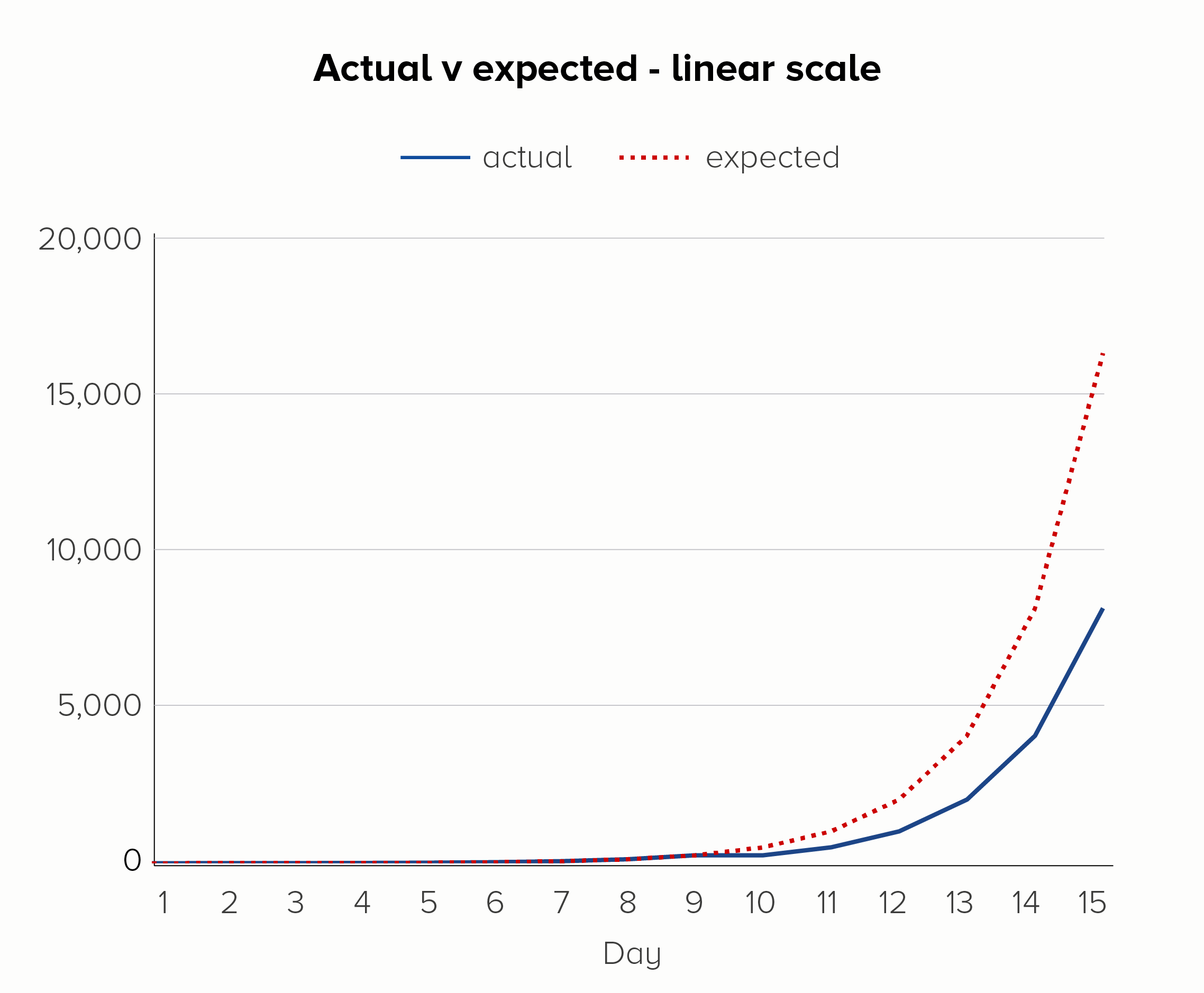
I’ve used an example of a bad thing happening here, but log scales can be used to show positive outcomes too. Imagine if the soup-nado on day 9 was a public health initiative to slow the exponential growth of a disease. Again, a log scale would show the impact of this more clearly - it worked! we should do it again! - before the resumption of the disease’s spread on day 10.
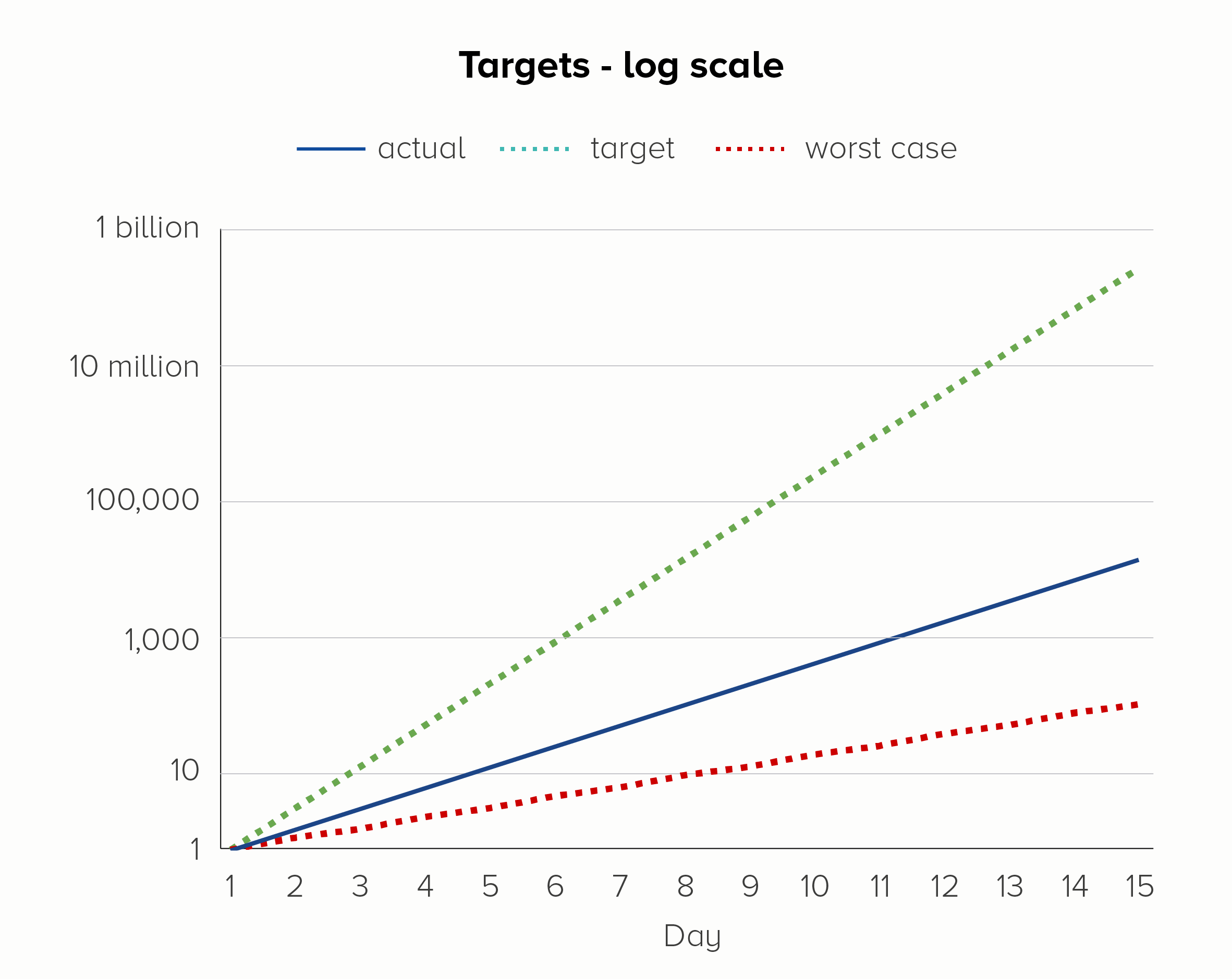
We can also add other helpful target lines and annotations. Say you decide to enter the lucrative amoeba farming business. To turn a decent profit, you need those unicellular scamps to reproduce twice a day, not once a day. On the other hand, if they start to reproduce less often - say, once every two days - then it’s game over for your transparent friends.
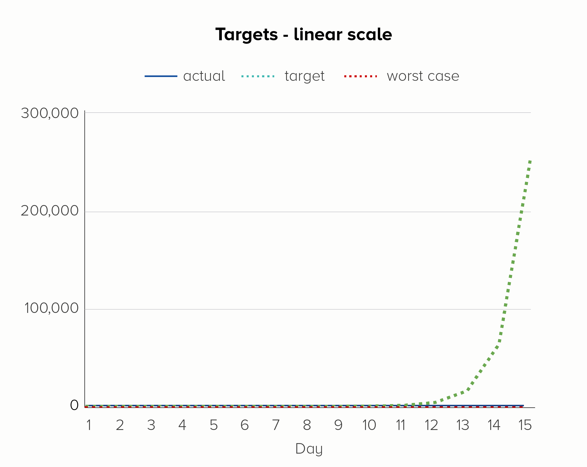
The first chart - on a linear scale - is hopeless at showing these upper and lower bounds. We only see the target line; the other two lines melt into the x-axis. Given that the ‘current’ line is going from 1 to 16,384 in 15 days, this is quite a significant trend to hide.
In the second chart, on a log scale, we see all three lines, even though the bottom line is going from 1 to 128 and the top line is going from 1 to 268 million. They all fit on the same chart, the trajectory of each is clear, and we do not jump to hysterical conclusions (we’re nowhere near our target!) simply because of the normal workings of exponential growth.
The scale of the problem
So I’m a big fan of log scales, right?
In the privacy of my own home, yes. They are an extremely handy analytical tool. Like the cryptic notes in a diary entry or the shorthand in a journalist’s notebook, they can help you to work out what happened; they are great at teasing out the story.
But just as a journalist would never publish their unintelligible scribbles and call it a story, neither should you.
Or at least, a journalist might hand over their shorthand to another journalist who understands shorthand. And an analyst might present their log-scale chart to another analyst who regularly uses log scales. But this is not a common use case for most of us.
In my experience, most reports or presentations are for a mixed audience (experts, novices and everyone in between). Or sometimes just novices. Either way, these are not people who commonly encounter logarithms.
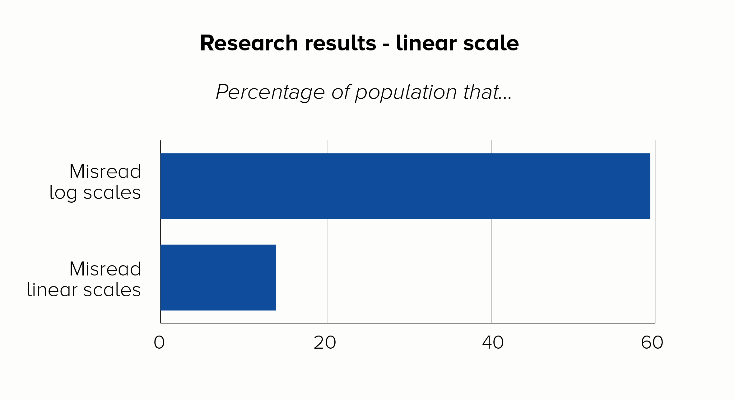
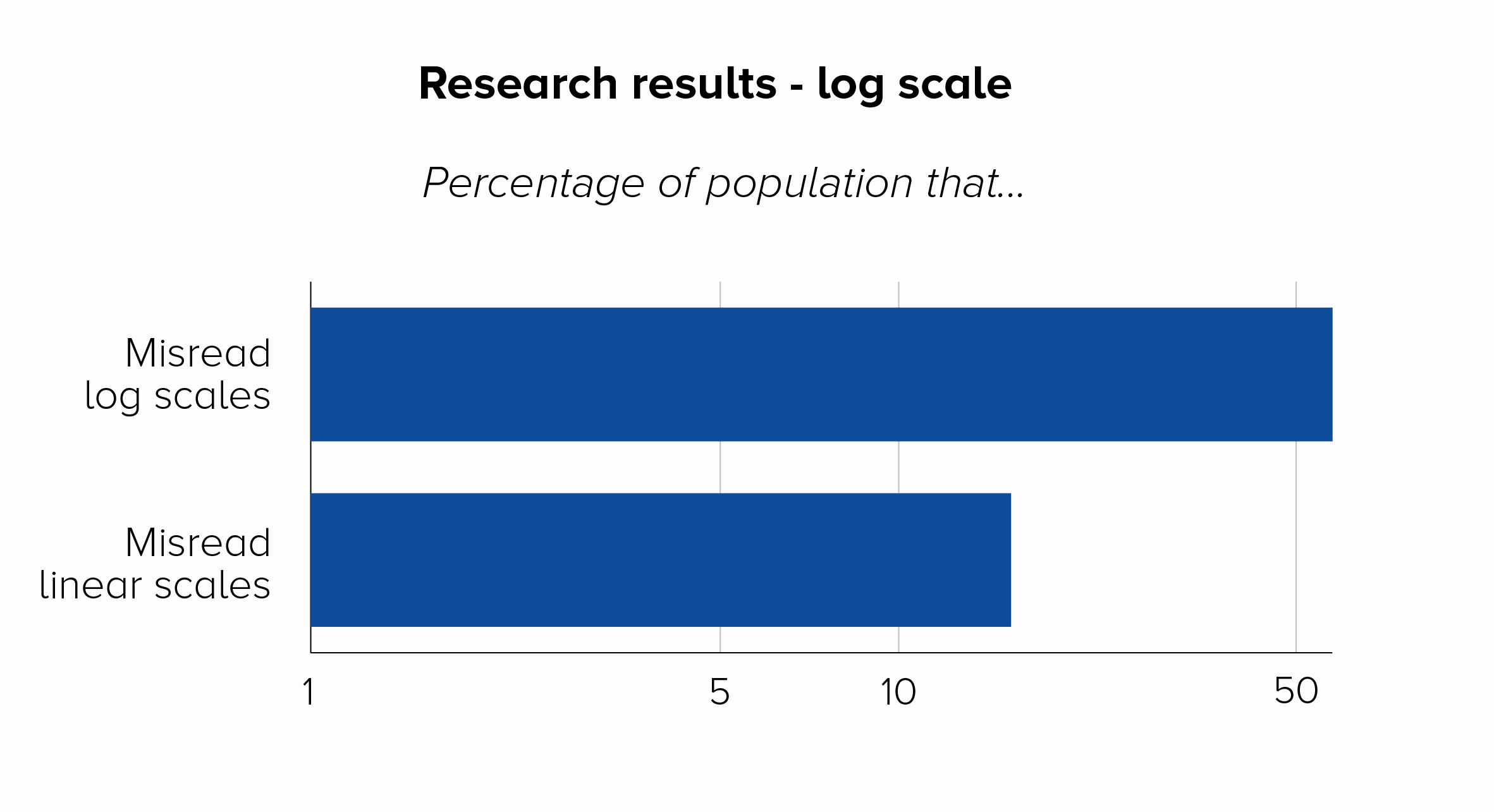
The title of a recent paper about Covid-19 data from the LSE says it all: ‘The public do not understand logarithmic graphs.’ After showing respondents a log-scale chart, around 60% of people got a basic question about the numbers wrong, compared to just 16% who got it wrong with a linear scale.
The log-scale respondents were also a lot worse about making predictions about what would happen to the data in the future. I mean, they were way off target. Perhaps more seriously, they were just as confident in their wrongness as the linear scale group were about their more accurate predictions.
I mean, that’s the end of the discussion, isn't it? I can only assume that log scale fans respond to data like this by simply putting it on a log scale.
There. Doesn’t look so bad now.
I’m joking, but the sad truth is that log scales do regularly get used to do exactly this - exaggerate good news or hide bad news. This is yet another mark against them: the public’s ignorance of what log scales mean is used to spread misinformation. There are so many examples of organisations doing this that I could fill this entire blogpost with them, but here is a classic from the early 2010s, brought to you by the British government.
In 2013, HM Treasury released a chart showing how much it had spent on infrastructure projects.
Such munificence! All that money spent on helping our country to function. And look how evenly spread it is! No way would the government be helping out their friends in the energy sector and neglecting vital areas like maintaining flood defences or safely processing waste.
In this example, the government relied on the public either not looking at the y-axis or not understanding it. Ordinary voters wouldn’t realise that - as we saw with our amoeba charts - log scales make small numbers look bigger and big numbers look smaller. Fortunately, an opposition Treasury minister did know this: he accused the government of ‘mathematical cheating’ and alerted the UK Statistics Authority. A new version of the chart was published, this time using a linear scale.
The degree of distortion in the original chart is now plain to see. Apart from Energy and (less so) Transport, the government has spent nothing on anything.
Some of the Covid charts in the early days of the 2020 pandemic did the same thing, in fact the LSE research we mentioned earlier was a response to exactly this. In the UK, charts from publications like the New Scientist, the Financial Times and the Economist often used log scales. I suspect the core readership of these publications (they are broadly for expert/specialist readers) would be more likely to understand log scales - so I can see why the authors opted to use them. Unfortunately, in a social media age, these charts often travel way beyond their intended audience.
Let's look at why this might be a problem. Here's a chart of cumulative Covid deaths, adapted from an original produced by the New Scientist in October 2020.
What’s the first thing you think when you glance at this chart? I’ll tell you what I think - that’s it’s a story of a disease rapidly rising and quickly hitting a plateau. Disastrous for a few weeks, but soon brought under control.
Worse, it looks like a similarity story. The pandemic affected all countries in pretty much the same way, some had slightly more deaths, some slightly less, but it was a global crisis that nobody handled particularly well. South Korea and China aren’t that far away from the UK and Italy.
I’m sure I don’t need to tell you that none of this is true. The problem is, by using a scale which models exponential growth, this chart flatters the governments that chose to let the disease spread exponentially. In other words, the worst performers.
This chart might use a more ‘scientific’ scale, but in no way does that mean it’s unbiased.
And for those that say - yes, but look at the y-axis, that makes it clear that Australia had far fewer total deaths on day 170 than the UK, I would reply: oh, does it? Remember, most people don’t understand log scales. That y-axis just baffles them - and rightly so. I mean, how many total deaths had there been in Australia on day 170? It was somewhere between 250 and 2,500, but how many exactly? And the UK had how many deaths by day 210? It’s above 25,000 but by how much?
And try to predict how many deaths the UK might have by day 280. Go on, I dare you.
(There’s also the fact that this chart would ideally be showing cases per million so the countries can be fairly compared. But that’s a subject for another blogpost).
The deeper problem with charts like this is that this isn’t what we expect shapes on charts to do. We turn numbers into shapes because they are easier for us to process. Imagine we have a spreadsheet showing these three numbers:
278
1,946
7,784
We don’t immediately understand that the second number is seven times bigger than the first, and the third is four times bigger than the second. But we are more likely to understand this if we encode these numbers as lines or shapes.
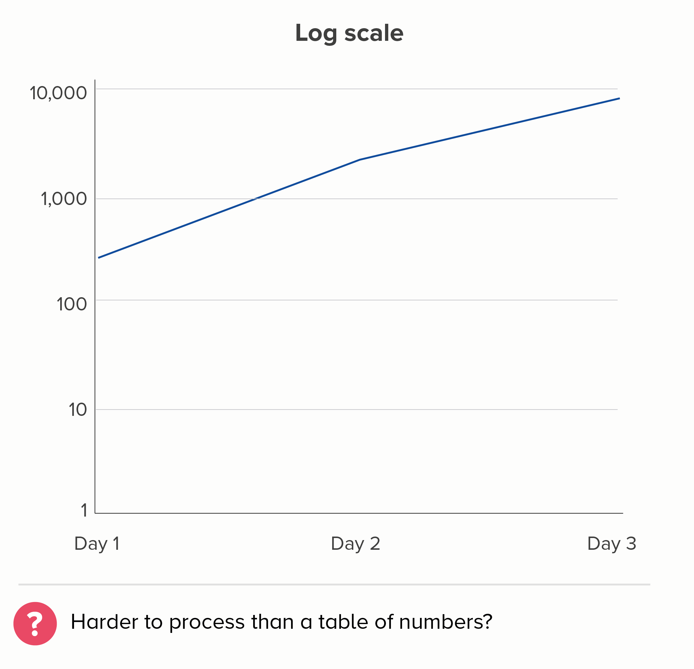
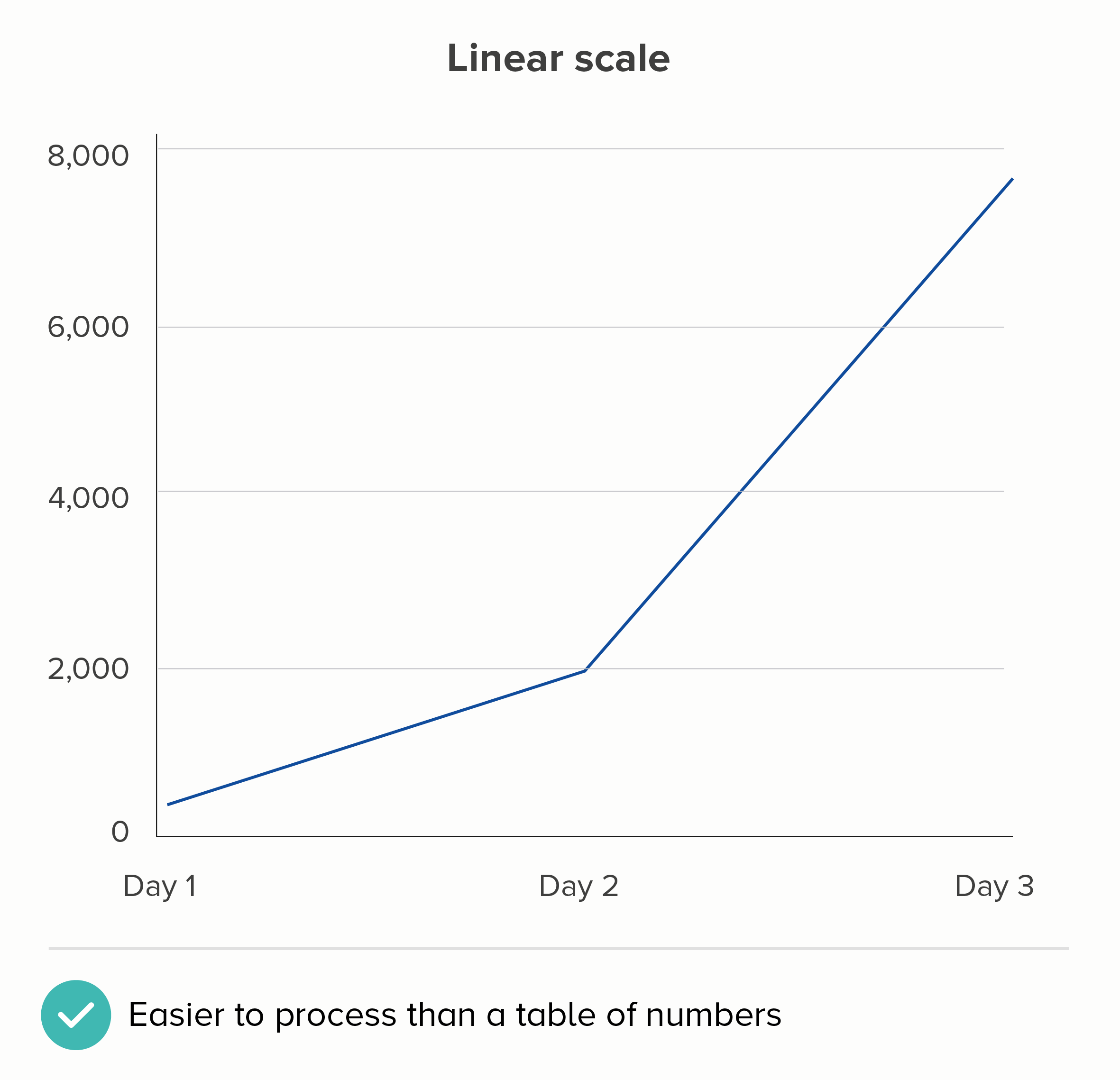
I realise the linear scale above isn’t perfect either. If this were showing the number of Covid cases, then the linear chart is more likely to make people think that the disease’s spread is accelerating when it isn’t. (Remember, 1,946 is SEVEN times 278, but 7,784 is only FOUR times 1,946).
But - but - on a linear scale, at least the fundamental relationship of number and shape is intact. We can estimate that the Day 1 number is roughly 300; on the log scale chart above, who the hell knows, it could be 350, it could be 800.
(The only number it can’t be on a log scale chart is zero because log scales can’t show zero - which is yet another reason why they confuse people).
The meaning of the story - the impact of Covid on people’s everyday lives - is also easier to see on a linear scale. Way more people have Covid on Day 3 than on Day 2. I need to take this seriously. I’m now much more likely to catch this disease. A 4x increase of a high number has a bigger impact than a 7x increase of a low number. It’s a story for the people at the sharp end of the pandemic rather than for the people coolly assessing whether its spread is exponential or not.
It’s just a bit more respectful too, isn’t it? Let’s look at that New Scientist chart again.
This is a chart about people who have suffered tragic and avoidable deaths. Does this chart tell the story of these people? In the UK, 7,113 people lost their lives to Covid between day 110 and day 190 of the pandemic. But the UK's line is totally flat over this time period. UK Prime Minister Boris Johnson reportedly said 'let the bodies pile high' - and so they did. But where has our log scale hidden all those bodies?
In her blog series about log scales, Lisa Charlotte Rost writes that linear scales ‘work best most of the time, especially when we present data about people.’ (emphasis mine). This sums it up, I think. Log scales are occasionally justified when you are charting something abstract - price rises, computer processing speed, amoebas in a petri dish - and particularly when you are talking to an expert audience. But people? Dead people? Every single one of them counts, and your chart needs to show that they count.
Leave log scales in the lab
Let’s look at some alternative approaches when you have stories of outsiders or exponential rises. Some of this covers similar ground as rule 26 - where we talked about broken y-axes in bar charts - so I’ll use different data here to minimise repetition.
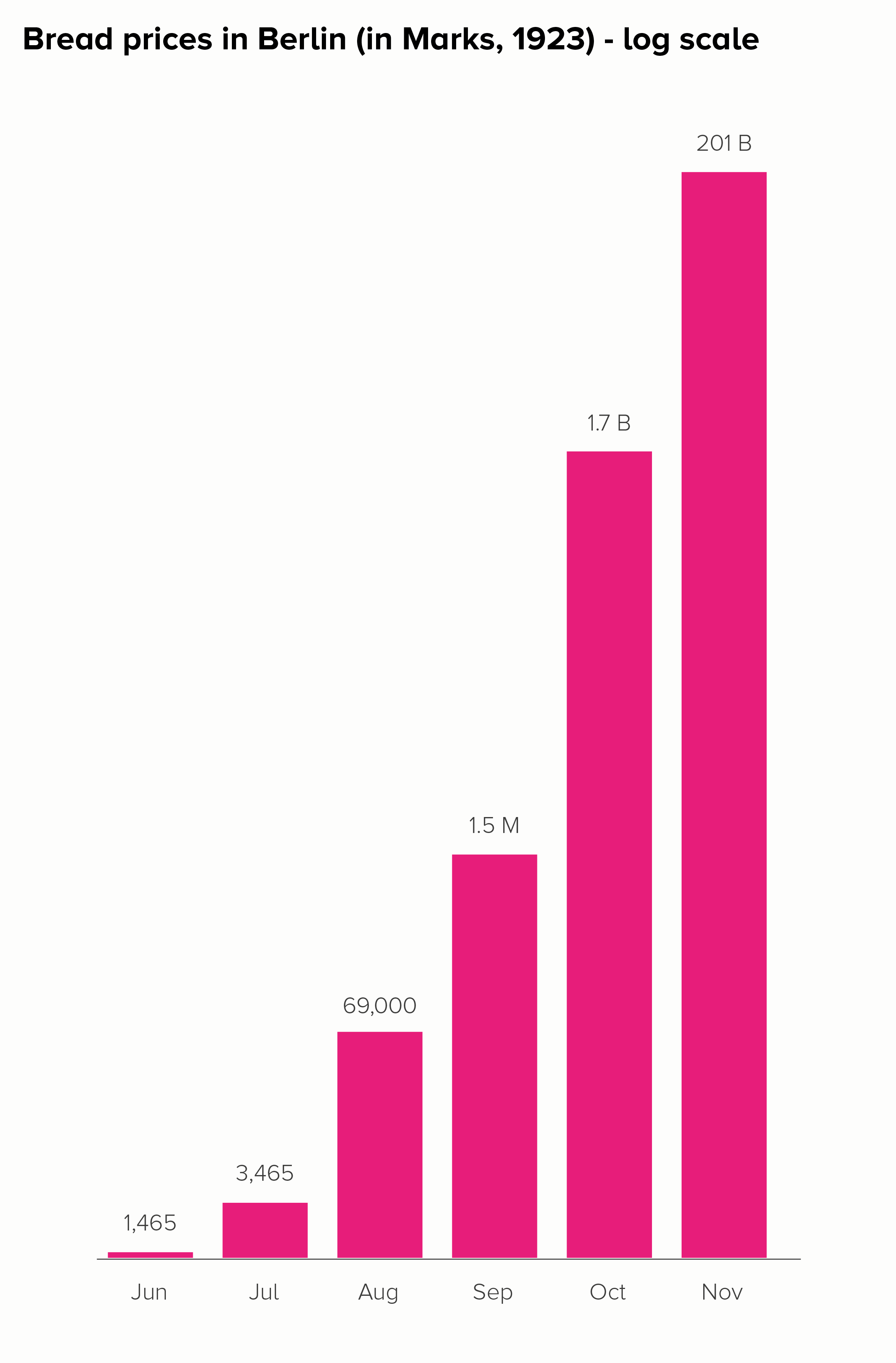
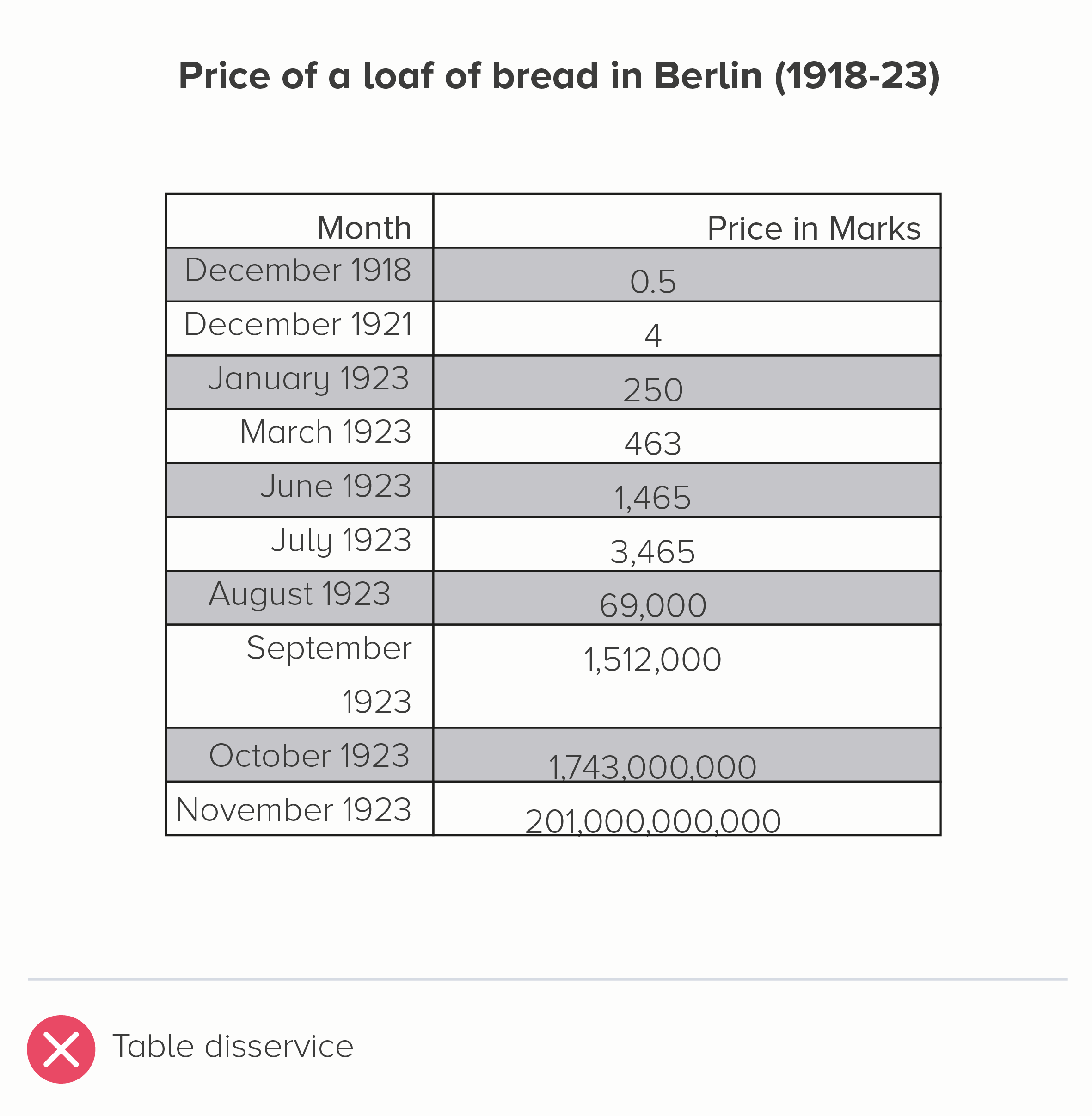
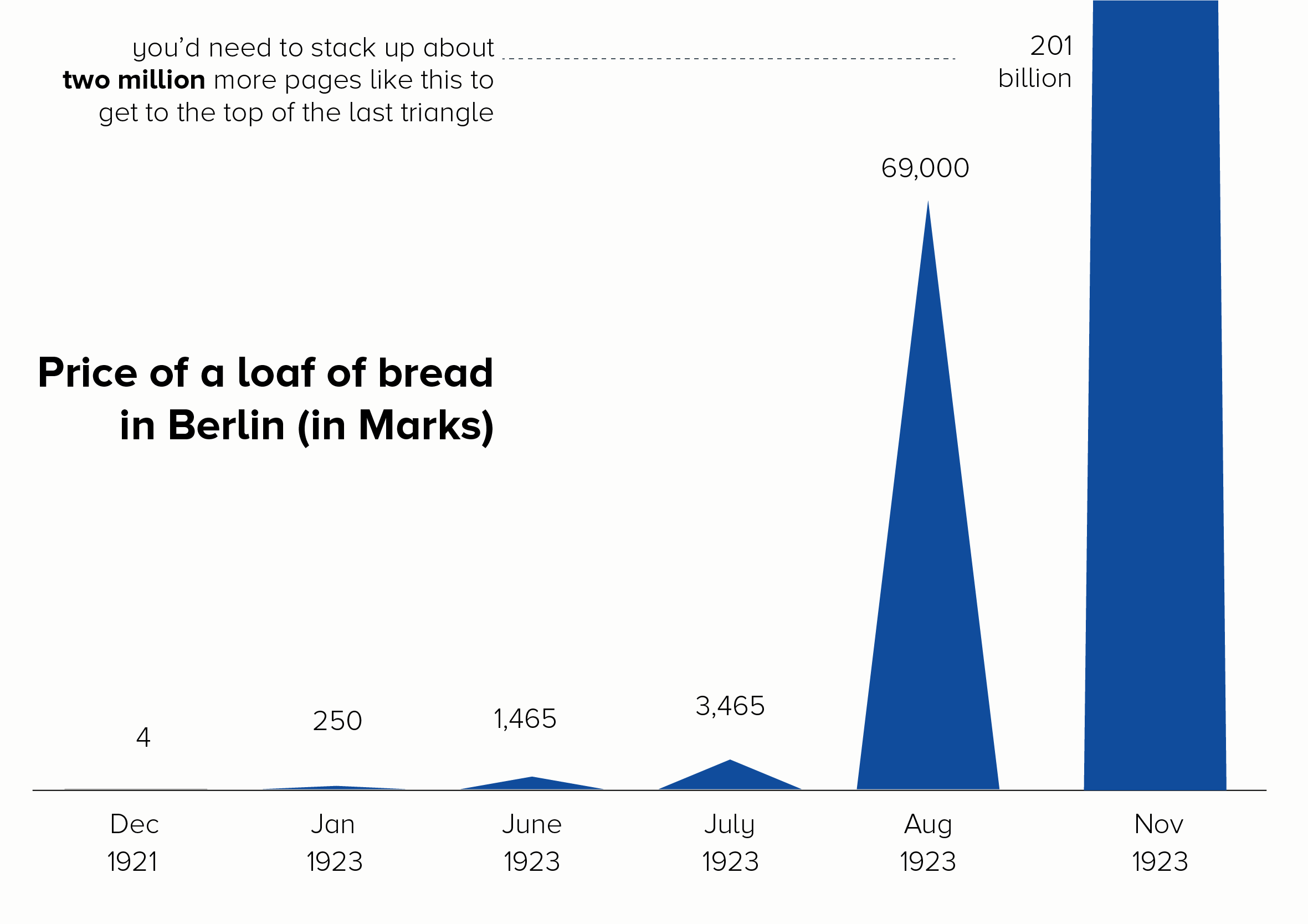
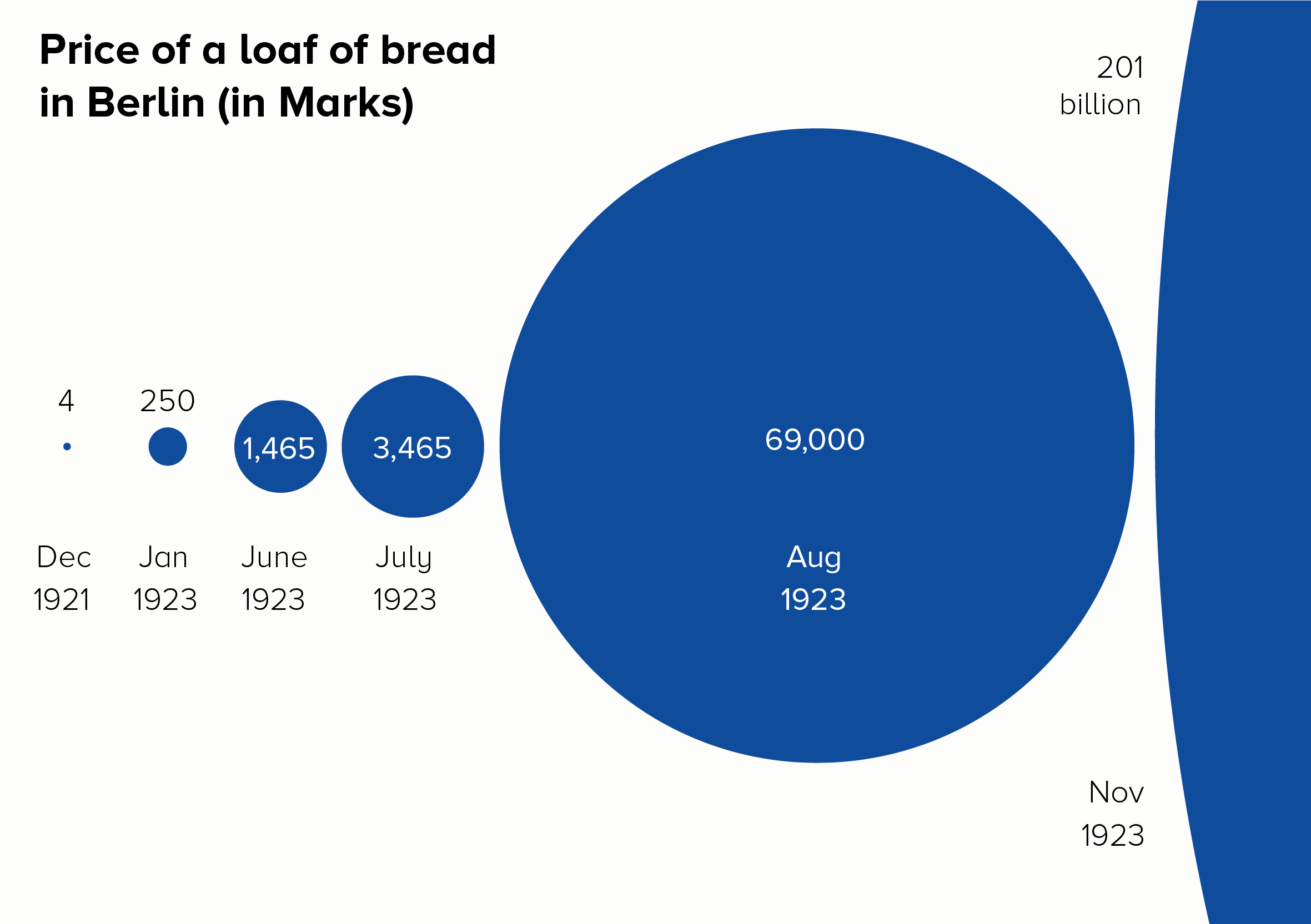
I’ll start with a chart that is often put in a log scale: the price of a loaf of bread in Germany during the hyperinflation crisis of the 1920s. Here is this data in a linear and log scale chart.
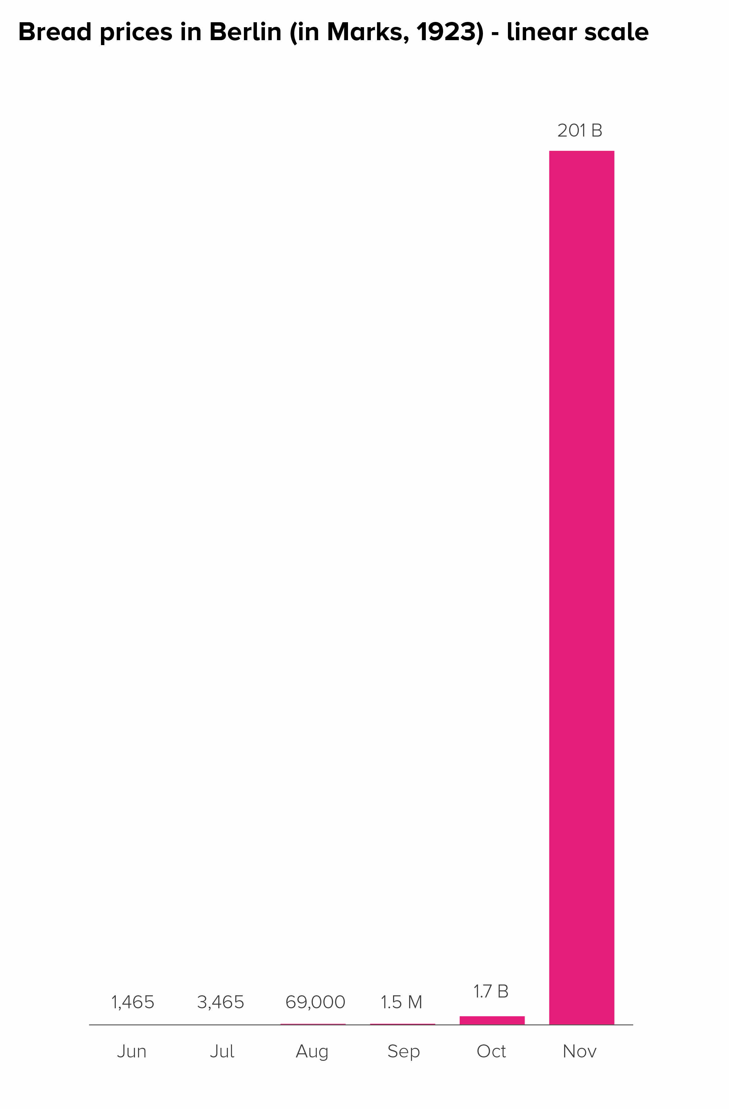
Neither of these charts work particularly well. In the linear scale version, the hugeness of that final datapoint (November - 201 billion marks) makes all the other bars shrink to almost nothing, even though the price of bread in October, for example, was a hefty 1.7 billion marks.
The log scale version is even worse. The 201 billion bar is only a little bit bigger than the 1.7 billion bar, when it should be 118 times larger. How is this helpful? Furthermore, the central story of unimaginably massive price hikes - which at least survives in some form with the linear version - utterly vanishes in the log-scale version. Yes, the bars get larger, but the rise is fairly steady and not particularly huge. Certainly you wouldn’t think that this was a country where, in a few short months, people went from handing over a few hundred Marks for a loaf of bread to needing a wheelbarrow full of banknotes to buy the same thing. The chart doesn’t do justice to a truly exceptional historical event.
Let’s look at some better ways of telling this story.
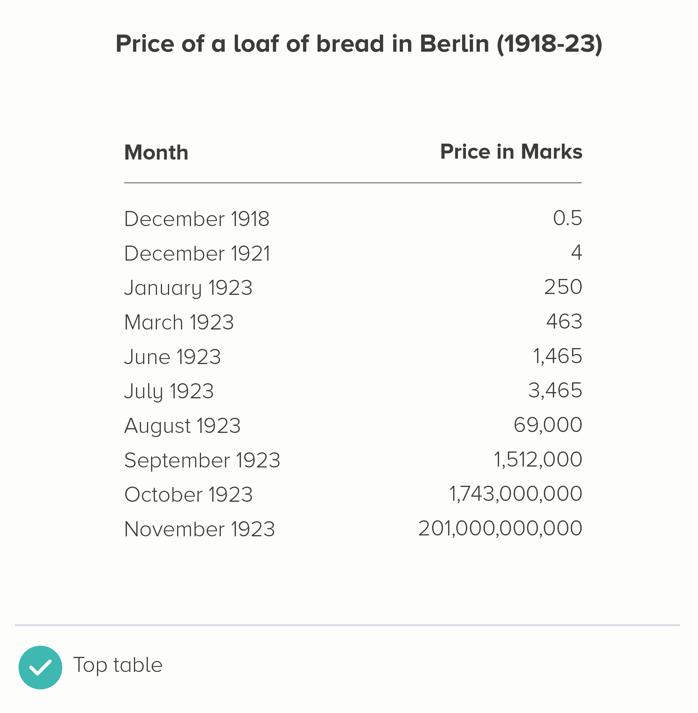
i) Use the original table
I mean, it needs to be clear and clean. Left-align the text, right-align the numbers. Minimal lines and borders.
But, given this is about small numbers becoming unfeasibly large numbers, the second table below conveys that pretty clearly.
ii) Convert it into a different measure
If you want to show how much something has changed, then charting the amount it has changed (percentage increase or decrease) can sometimes be more helpful than charting the raw numbers. For price rises, this would be the level of inflation.
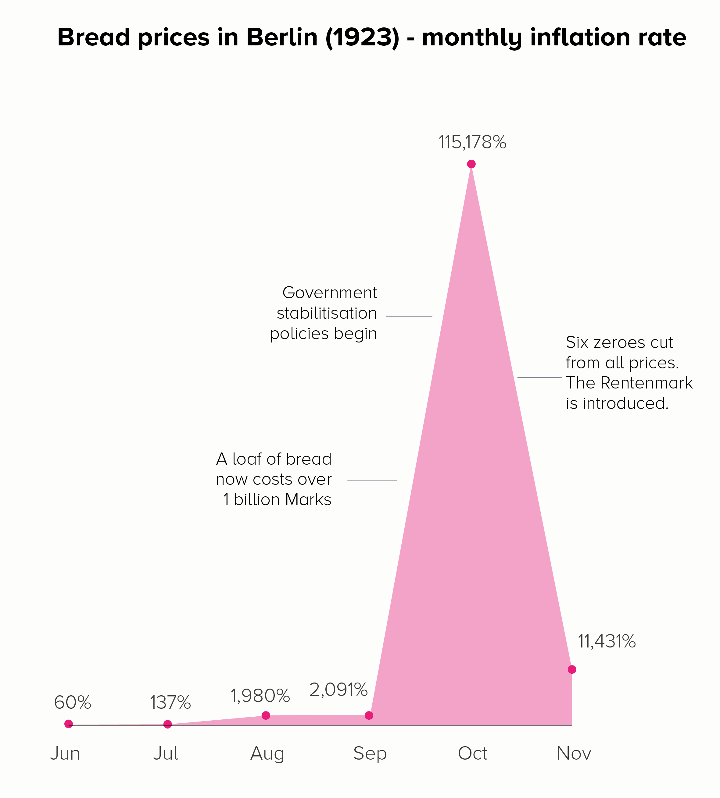
In the first chart, we get a different insight into those astronomical price rises. When we charted prices (in both a linear and log scale), the focus was on that final month - November - when a loaf of bread cost the most. By switching to inflation, we see that October was the critical month, and that by November, the rate of inflation had dropped somewhat - as a result of the Weimar government acting to stabilise the currency.
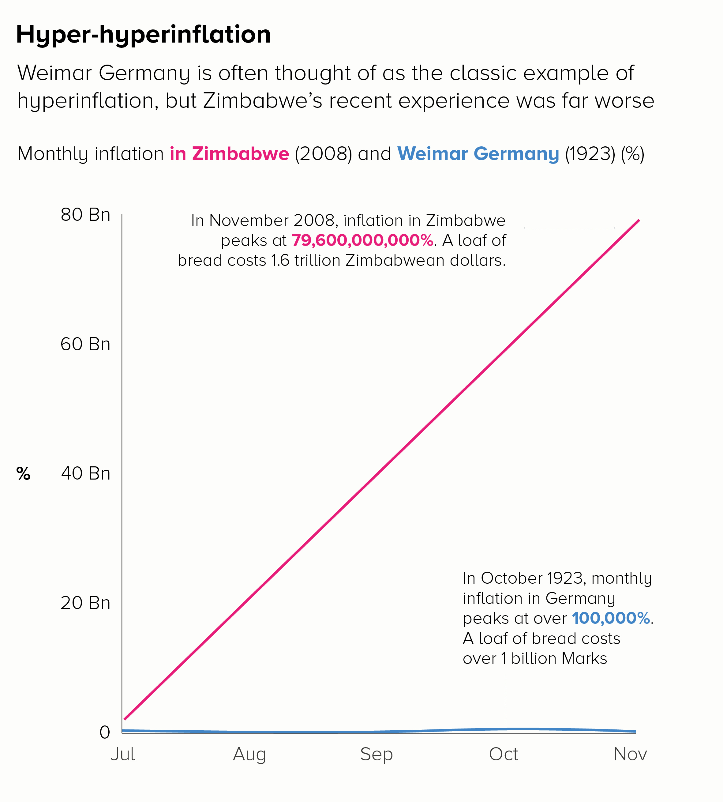
The second chart shows the benefit of introducing context or stepping people through a story of large rises. If we wanted to show the ‘off the charts’ price rises in Zimbabwe in 2008, we could start by charting the well-known German example and then overlay the Zimbabwe data to show how unprecedented it was.
Of course the issue with using inflation is that it doesn’t convey that human story of a loaf of bread costing a billion marks or two trillion Zimbabwean dollars. Inflation is a pretty abstract concept. So it could be worth keeping the ‘loaf of bread’ information on the chart as a call-out, as we have in the examples above.
iii) Play with format
If you’ve got a big number that is literally ‘off the charts’, you can always show it going off the charts. This doesn’t work with all audiences, but a playful approach can sometimes be the best solution for data that doesn’t work on a standard scale.
This is a particularly popular approach in animations and scrollytelling, as you are not constrained by a set frame size. Your first few datapoints can be visible on the first screen, but then you have a final huge number that requires the audience to keep scrolling (or for the camera to keep tracking). The chart seems to break out of its boundaries.
My favourite example of this in an animation is The Fallen by Neil Halloran: https://www.youtube.com/watch?v=DwKPFT-RioU&ab_channel=NeilHalloran
The effect is best shown between 4 minutes and 7 minutes when Halloran tries to convey quite how many soldiers were killed in the Battle of Stalingrad. You keep expecting the bar to stop growing, but it doesn’t.
For its use in infographics, check out ‘The Depth of the Problem’ by the Washington Post or ‘Gross Miscalculation’ by Melanie Patrick. Also the recent Covid front pages from the New York Times that I mentioned in rule 26.
iv) Experiment with different charts
Bars and lines are not always effective at telling stories of huge outliers. Fortunately, there are a lot of other chart types out there.
Bubbles are particularly good as you can show the edge of the circle and allow your audience to imagine the rest. Triangles can have the same effect, as they suggest mountains (mountains of cash, in this instance).
v) Use analogies
If a number is hard to picture, then help your audience picture it.
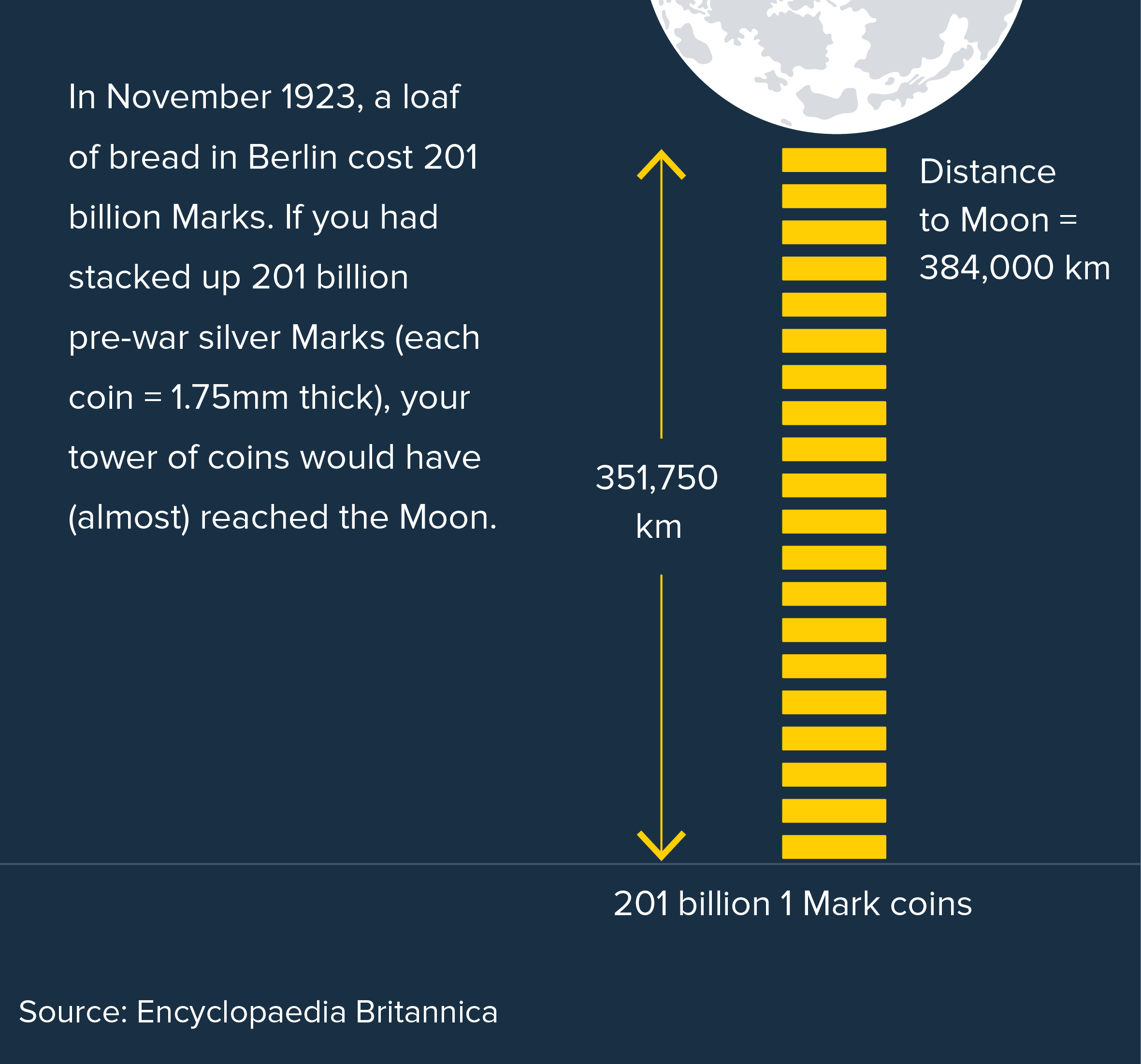

Image credit: Adam Frost/ Jim Kynvin
vi) No chart at all
Using photographs and illustrations can also be effective. They help to convey the human stories behind the numbers. In the case of hyperinflation, after all, it wasn’t that the value of bread had soared and nobody could afford it anymore. It was that the value of the German Mark had dropped to such a degree that how much money you had became meaningless. Conveying a concept like this is perhaps easier to do with words, numbers and photography, rather than with a chart.
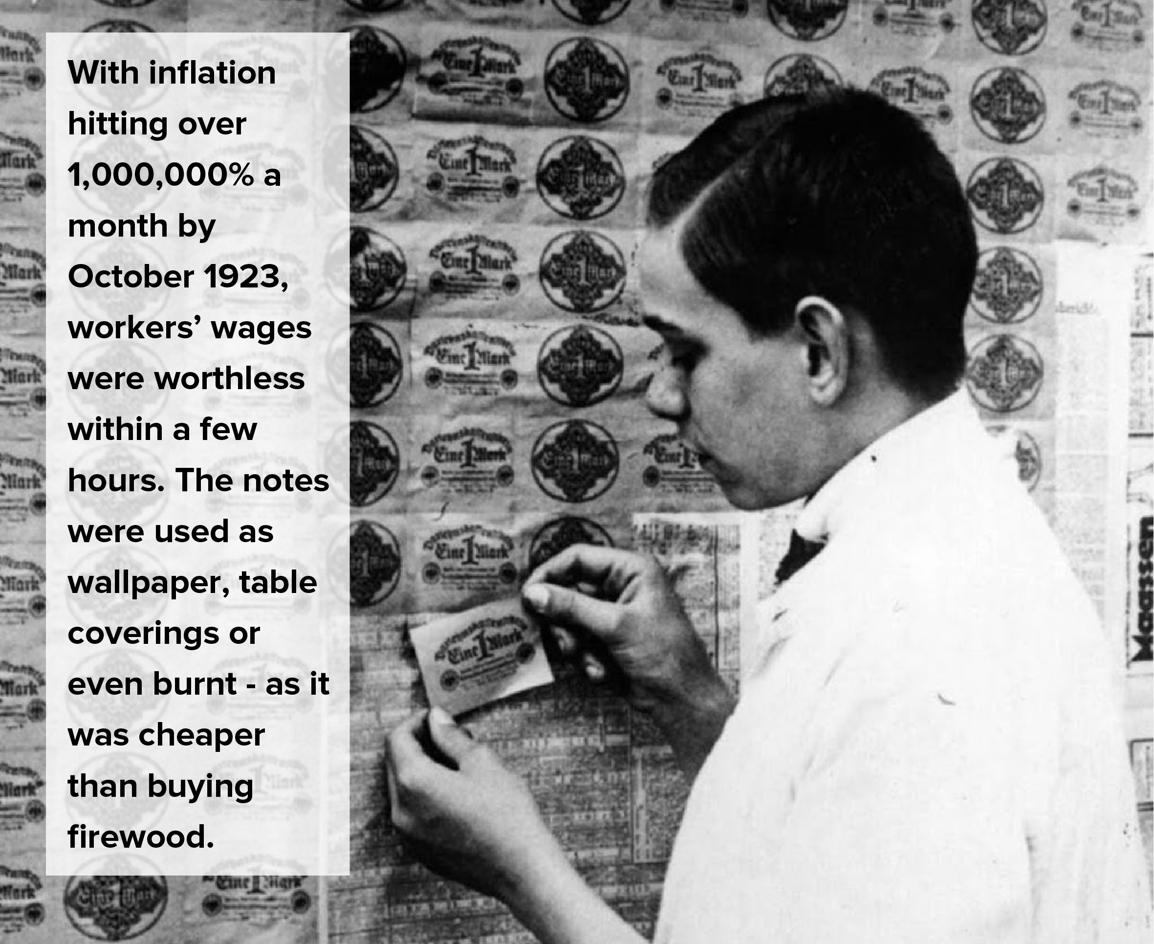
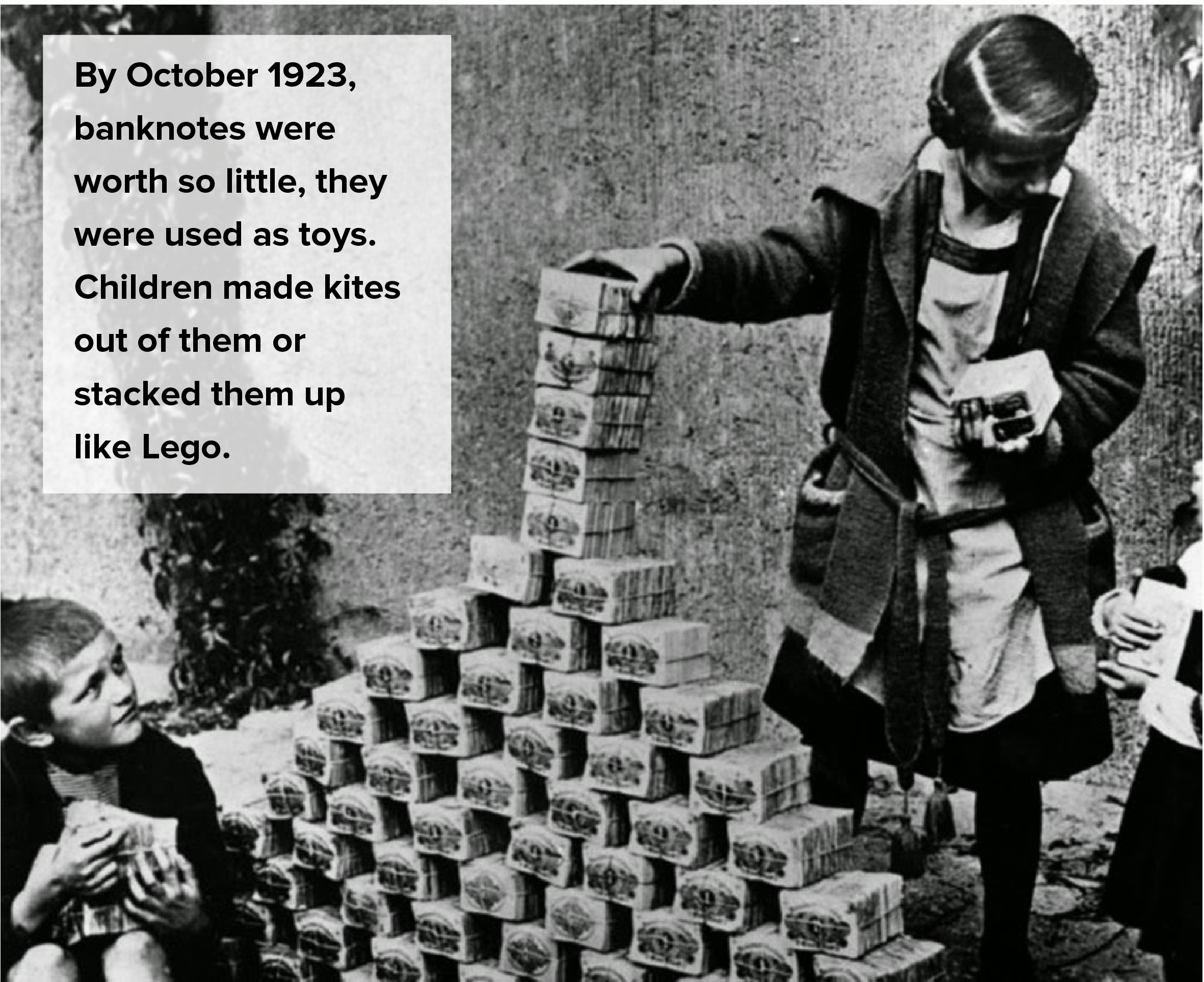
Image credit: Bundesarchiv
viii) *Sigh* A log scale
Last but not least, if all else fails, then very very occasionally, in the hands of a brilliant communicator, a chart with a log scale can be made to work. Not with the German hyperinflation data. But here are a couple of examples using different data that do work.
First, ‘200 years in 4 minutes’ by Hans Rosling from the TV series ‘The Joy of Stats’.
This is a walkthrough of rising global health and wealth over the last 200 years. Rosling puts income per person (the x-axis) on a log scale. If he didn’t, his story would die - most of the countries would slowly rise to the top left, rather than soaring to the top right. Not ideal. But I think the log scale is justified here - Rosling is talking about income, which doesn’t rise in a linear way (a $1 pay rise doesn’t mean the same thing in Sierra Leone as it does in Switzerland). More importantly, Rosling clearly explains what his chart means every step of the way, in case anyone is confused by the log scale. Finally, if you click through to his Gapminder tool, you can switch to a linear scale if you prefer it.
The second example would be Poppy Field by Valentina D'Efilippo, which I’ve mentioned in a previous post.

This chart commemorates deaths in twentieth-century conflicts. The size of the poppy represents number of deaths. The x-axis is a timeline. The y-axis is the duration of the conflict - on a base-2 log scale. As with the Hans Rosling example, D’Efilippo uses a log scale because a linear scale would kill her story. There is a huge outlier (Israel v Palestine, lasting 60 years and counting) that would make all the other poppy stalks look tiny and tangled. The poppy heads would overlap, and her field metaphor would be lost.
So I think a log scale is justified here too. D’Efilippo is talking about the duration of a war, which does strange things to time: large wars can be shorter but more catastrophic, smaller or local conflicts can drag on for decades. Her treatment is artistic, rather than 100% accurate, so we are not reading this chart to get exact numbers: those poppy stalks are not straight like bars; they snake across the page, to reflect the slippery nature of warfare, and to give us a beautiful sense of a breeze moving across her field of poppies. The y-axis scale is subtle too, barely noticeable, and it’s certainly not a precondition for understanding the chart, particularly as the duration data is also present on the x-axis.
Conclusion
Let’s go back to our rule then, the Edward Tufte formulation: ‘Use log scales for many kinds of variables.’ This is utter rubbish, and should be broken whenever possible. Log scales are suitable for a tiny sub-group of data stories (exponential rises and large outliers) and, even then, there are usually alternative charts or helpful analogies that will convey the information more effectively.
Research has shown that log scales are widely misunderstood, but common sense should also tell you as much. Look at a chart on a log scale, and it seems to undermine the entire point of turning numbers into shapes. In a standard chart, if one shape is ten times bigger than another, it represents a number that is ten times bigger than another. A log scale obliterates this relationship.
But you can never say never. It’s still worth knowing what log scales are and how they work because, as an analytical tool at least, they can help you find and organise stories. And as the final examples from Hans Rosling and Valentina D’Efilippo show, in the right hands and with the right data, they can sometimes reveal hidden stories and keep the bigger picture in view.
Verdict: Break this rule almost always
Sources: Log scales research https://blogs.lse.ac.uk/covid19/2020/05/19/the-public-doesnt-understand-logarithmic-graphs-often-used-to-portray-covid-19/. Others linked in the article text.