In this blog series, we look at 99 common data viz rules and why it’s usually OK to break them.
by Adam Frost
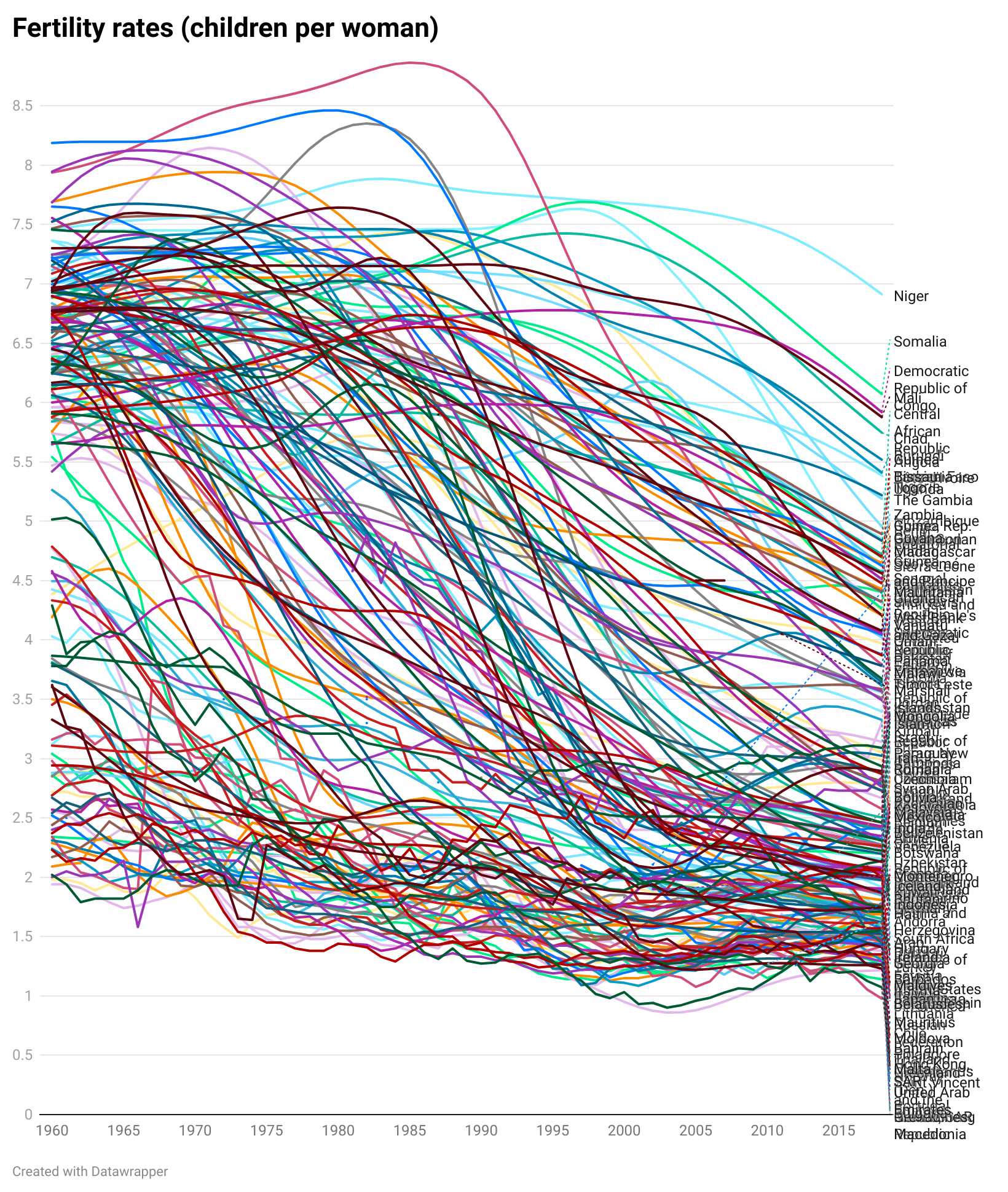
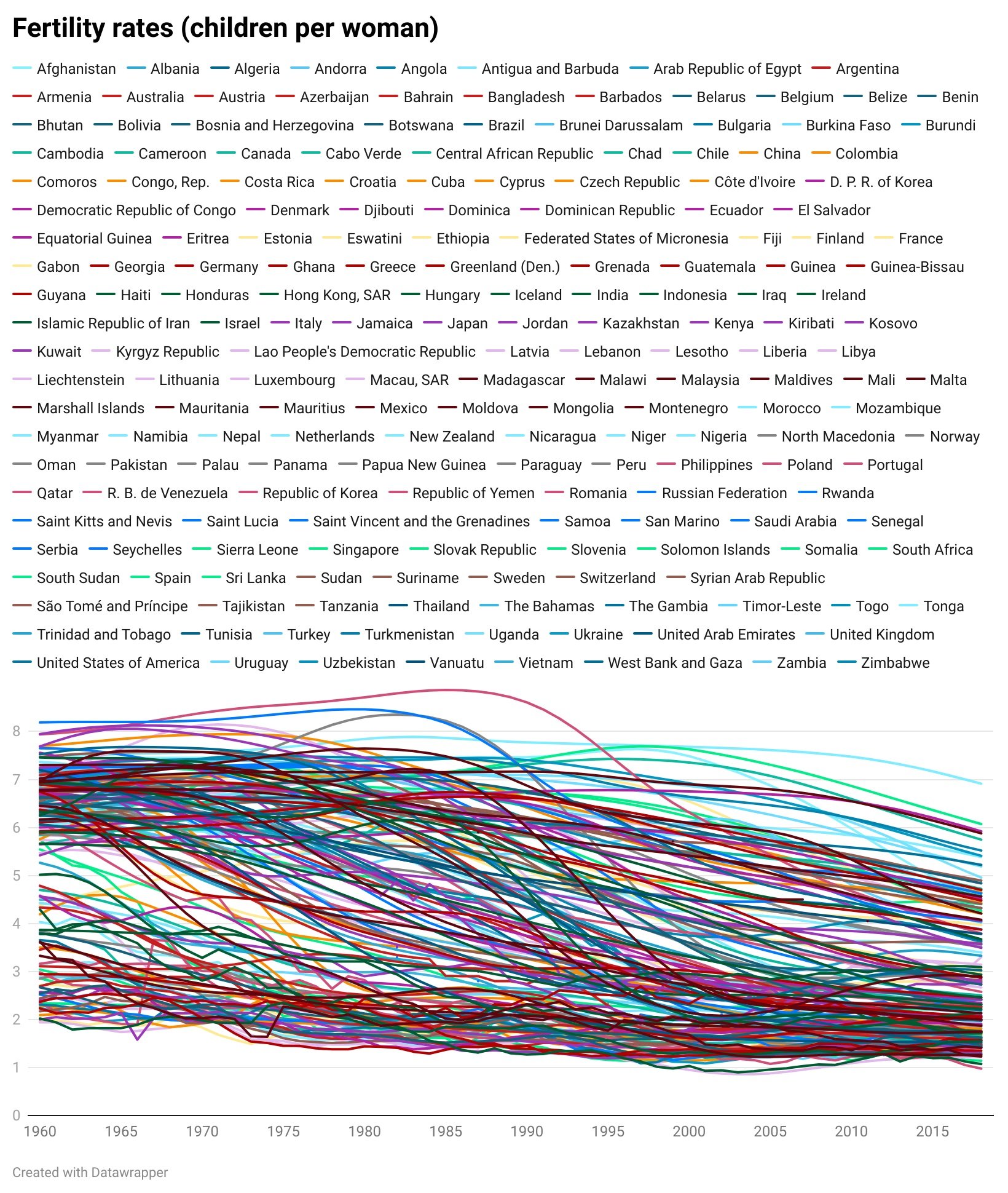
It’s pretty clear that line charts with too many lines don’t help anyone. In the two charts below, you can barely make out the main story - the extraordinary drop in fertility rates almost everywhere since 1960.
The trends have become tangled, the colours have become sludge, and the key has either become unreadable (the first chart above), an essay that fills the screen (the second) or you have to truncate it (which is pointless - so not bothering to show this).
But how many lines is a manageable number? Infogram say ‘no more than five lines’, Chartio also say ‘five or fewer’, Storytelling with Data stipulate ‘four or five’, Venngage recommend ‘two or three’ lines’.
And that’s pretty good advice in most cases. In rule 17, we discussed cognitive load theory and saw how human beings shut down when confronted with too much information. Four or five lines are simpler for us to process, just as a four-digit PIN is fairly easy to remember, but an 11-digit phone number is a nightmare. Having five close friends is ideal for most of us, having fifteen becomes unmanageable.
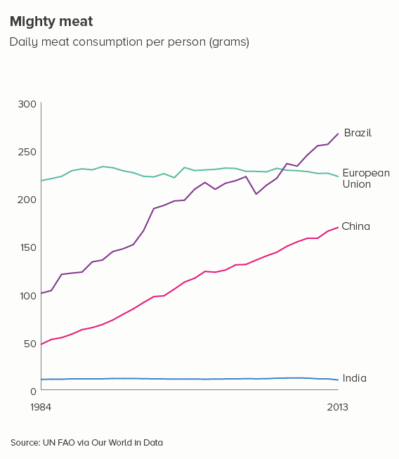
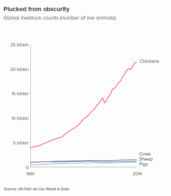
In the examples below, four lines give us a clear chart with an obvious meaning.
However, there are many cases when reducing our number of lines to four is dull or deceptive. Let’s return to the fertility rate chart we started with. Imagine having to reduce that to four lines - which countries do we choose?
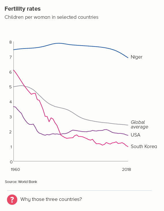
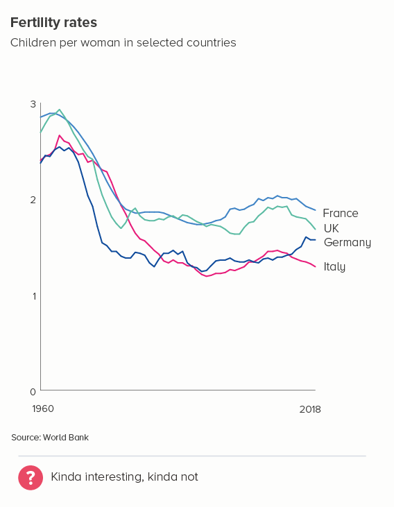
Even if we have a system of sorts - maybe we show the top, bottom, average, and US lines and omit others (the first chart below) - it still doesn’t allow us to see the global story. South Korea’s line is kind of interesting, but if we wanted to make the story about fertility rates in South Korea, would we pick these comparator countries? In the second chart, I’ve picked the UK and three of its closest neighbours - France, Germany and Italy. But, again, the result is - meh.
So what do we do in these cases?
i) knock back lines
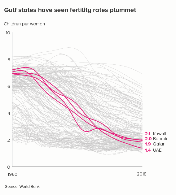
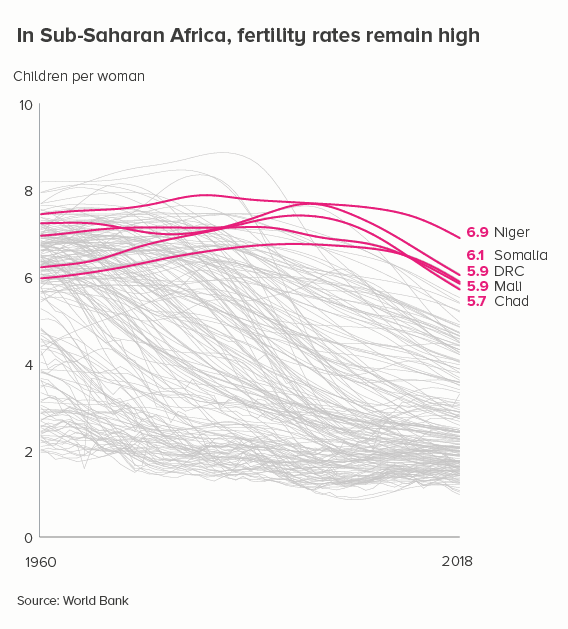
Grey out most of the lines - so we still get a sense of ‘everyone’ - and then emphasise the lines that are the most interesting or relevant for your audience.
ii) small multiples
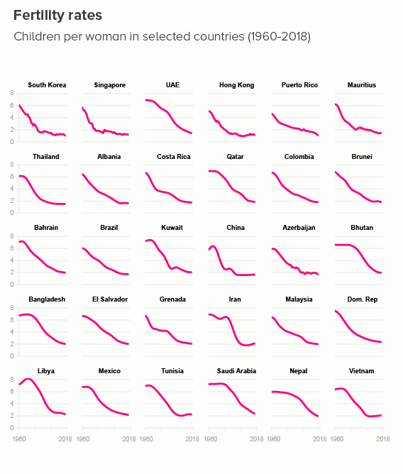
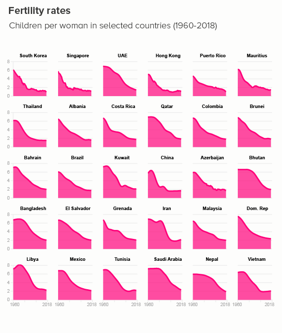
Rather than filling one chart with many lines, you can fill many charts with one line. If your y-axis starts at zero, these line charts can become area charts, which I slightly prefer, just because it gives you an excuse to use bold slabs of colour. (Small multiples are a bit fiddly to make in PowerPoint or Illustrator, but a cinch in Flourish, or - if you’re a coder - R/ggplot).
iii) group
It’s sometimes possible to group your lines into overarching categories, and then create a more manageable line chart for each. It’s still a good idea to emphasise only two or three lines on each chart, though.
iv) different charts
Because line charts are fantastic at showing trends over time, it’s easy to get tunnel vision and forget that there are a number of other chart types that also excel at showing change. When you have too many lines for a line chart, these chart types can sometimes ride to the rescue.
Slope charts
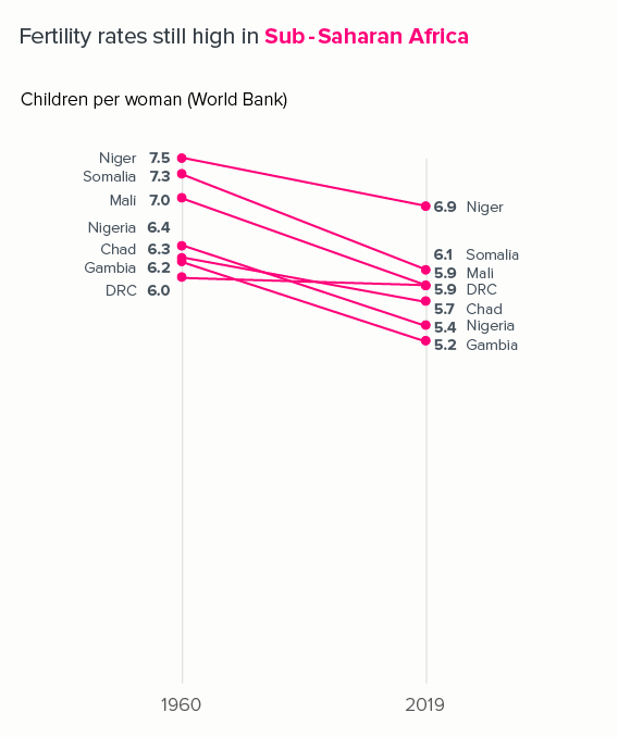
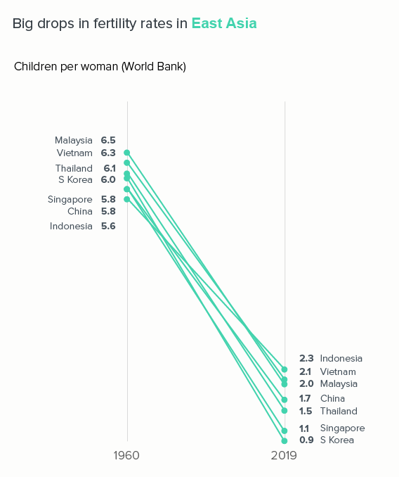
Because they only use two time periods - a start and end point - slope charts can usually take more lines than a line chart without sacrificing legibility.
If we used a standard line chart, plotting every year between 1960 and 2019, those lines would overlap and become unintelligible.
Proportionately-sized shapes
This approach works also best if - as with slope charts - you choose just two points in time - a start and end date - and remove the rest. The shapes could be side by side, nested, or two halves of the same shape.
I also like side-by-side polar areas, as they give a top-level ‘footprint’ of the data, but they also allow you to compare specific values.
We’ll talk more about half-circle charts and polar areas - and how to make them - in a later rule.
Join the dots
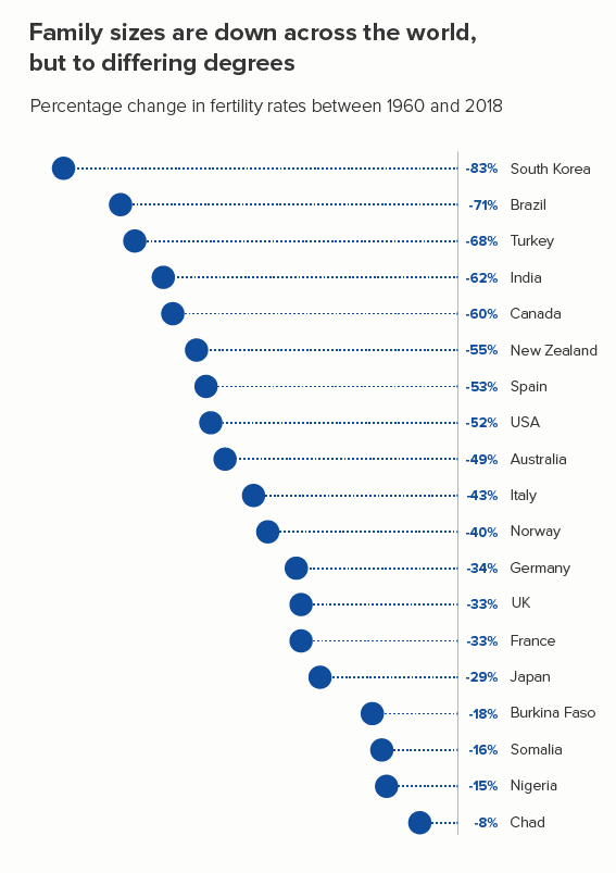
Once again, this involves just taking two points in time. You can then visualise the percentage difference between them - with arrows, or triangles, or (my favourite) a dot with a trail (the first chart below).
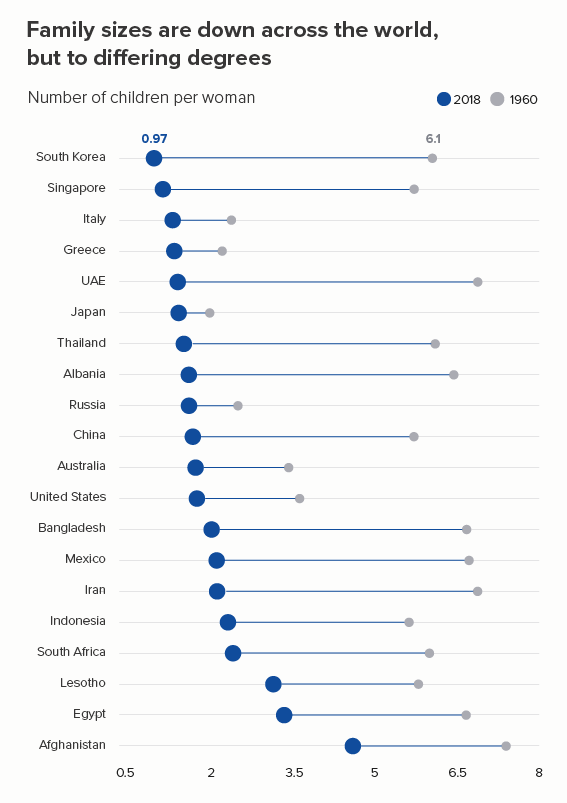
Dumbbells (or ‘connected dot plots’) work if you want to focus on the change between two points in time, without losing the fact that each category has a different starting value (the second chart below). I’m not sure they work as well with drops as with rises - because our urge to read time left to right is so strong, but they’re still a good chart to have in your tool kit.
With both these chart types, you can include more countries than in a standard line chart and still retain legibility.
Maps
If you have geographical data, then consider using a series of maps - placed side by side. I’ve used heatmaps here, but bubble maps can also be effective. This gives you all 200 countries, but of course extracting specific datapoints is impossible (unless it’s interactive).
Heat tables
Sometimes you can keep your data in a table, but use conditional formatting to create a heatmap. These work particularly well in an interactive format, as you can roll over each cell to extract the specific value, but even as a static graphic, they can make the trends more obvious than, say, a 15-line line chart.
The barcode strips for established economies like the US and Germany look radically different from those for emerging economies like India, Iran and Saudi Arabia.
Matrix plots
Instead of colouring each table cell, you can fill each cell with a shape that is proportionate to the underlying datapoint. I’ve used squares here, but bubbles can work too. Raw has a good (free) matrix plot maker.
A table of charts
A table might not seem an obvious choice for telling a change over time story. But by using a combination of text, bars and small line charts (sometimes called sparklines - after Edward Tufte), a table can often bear as much information as a line chart, but in a clearer and more readable format. These kinds of tables are relatively easy to create in Excel, but will look smarter if you use a (free, easy) chart-making tool like Datawrapper.
Conclusion
So this is another rule with so many exceptions that it can’t really be called a rule. In rule 3, we saw that pie charts shouldn’t have more than four wedges, except when they should, and in rule 17, we discovered that bar charts shouldn’t have more than 12 bars, except when they should, and it’s the same with line charts. They should ideally have no more than five lines, except when they should - you want to show change across 27 EU countries, or 50 US states, or the 238 flavours of ice cream available at La Casa Gelato in Vancouver (Roasted Garlic! Pear Gorgonzola!).
In these situations, consider the strategies above. Knock lines back, separate lines out, group lines together, or colour outside the lines - by choosing a different chart altogether.
VERDICT: Follow this rule some of the time.
Sources: Fertility rate data from the World Bank, Meat consumption and livestock data from the FAO via Our World in Data
More data viz advice and best practice examples in our book- Communicating with Data Visualisation: A Practical Guide

