
In an excellent blogpost, Nathan Yau writes about the importance of always starting your bar charts at zero. He concludes: ‘Every rule has its exception. It’s just that with this particular rule, I haven’t seen a worthwhile reason to bend it yet.’
Nathan Yau is usually right. So is this to be our second unbreakable rule, after no 3D pie charts? Is there ever a good reason for starting a bar chart above zero?
There are certainly plenty of bad reasons. Chopping off the bottom of your value axis is at best an error and, in this notorious Fox News example, actively deceptive. It’s typically used by people who want to make bad things look good or vice versa.
Here’s an example of my own, based on a recent UK news story, in which the Conservative government trumpeted an ‘increase’ in police officer numbers.
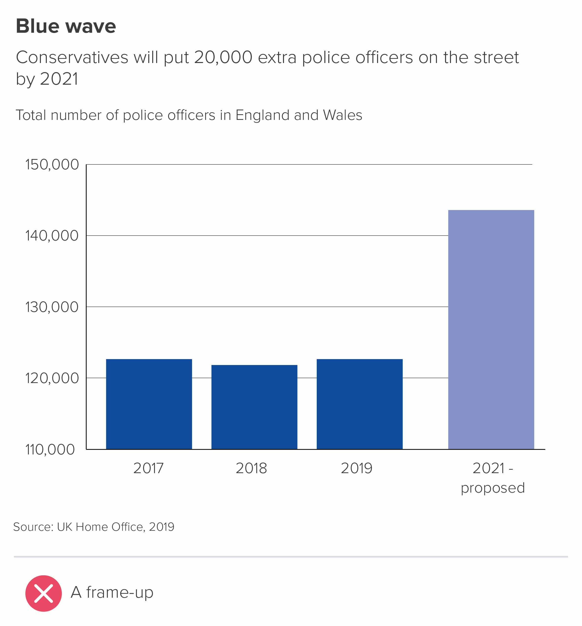
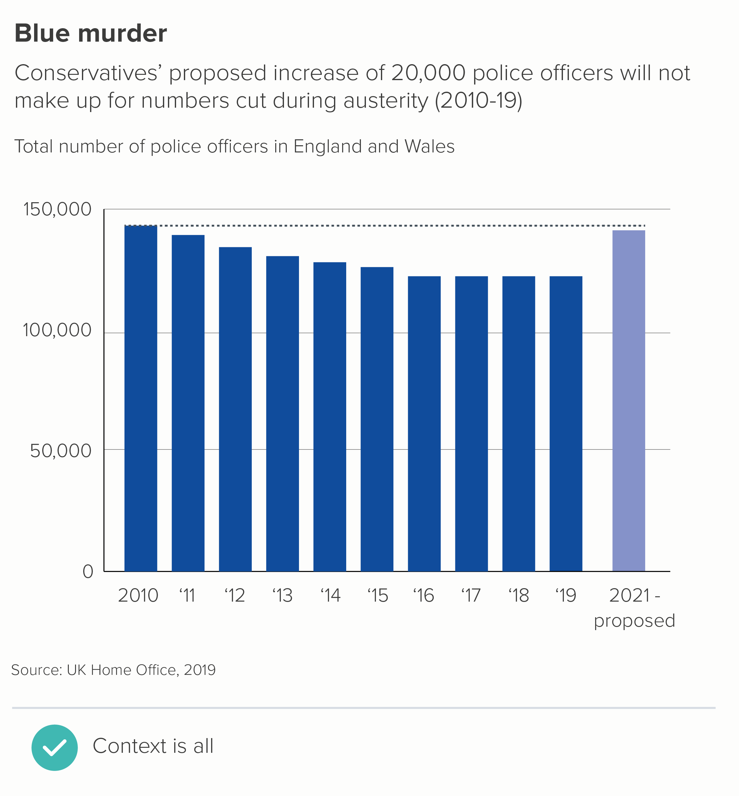
Notice how the story changes when I give the chart a y-axis starting at zero. I’ve also begun the story earlier, to further emphasise the deceitfulness of the first chart.
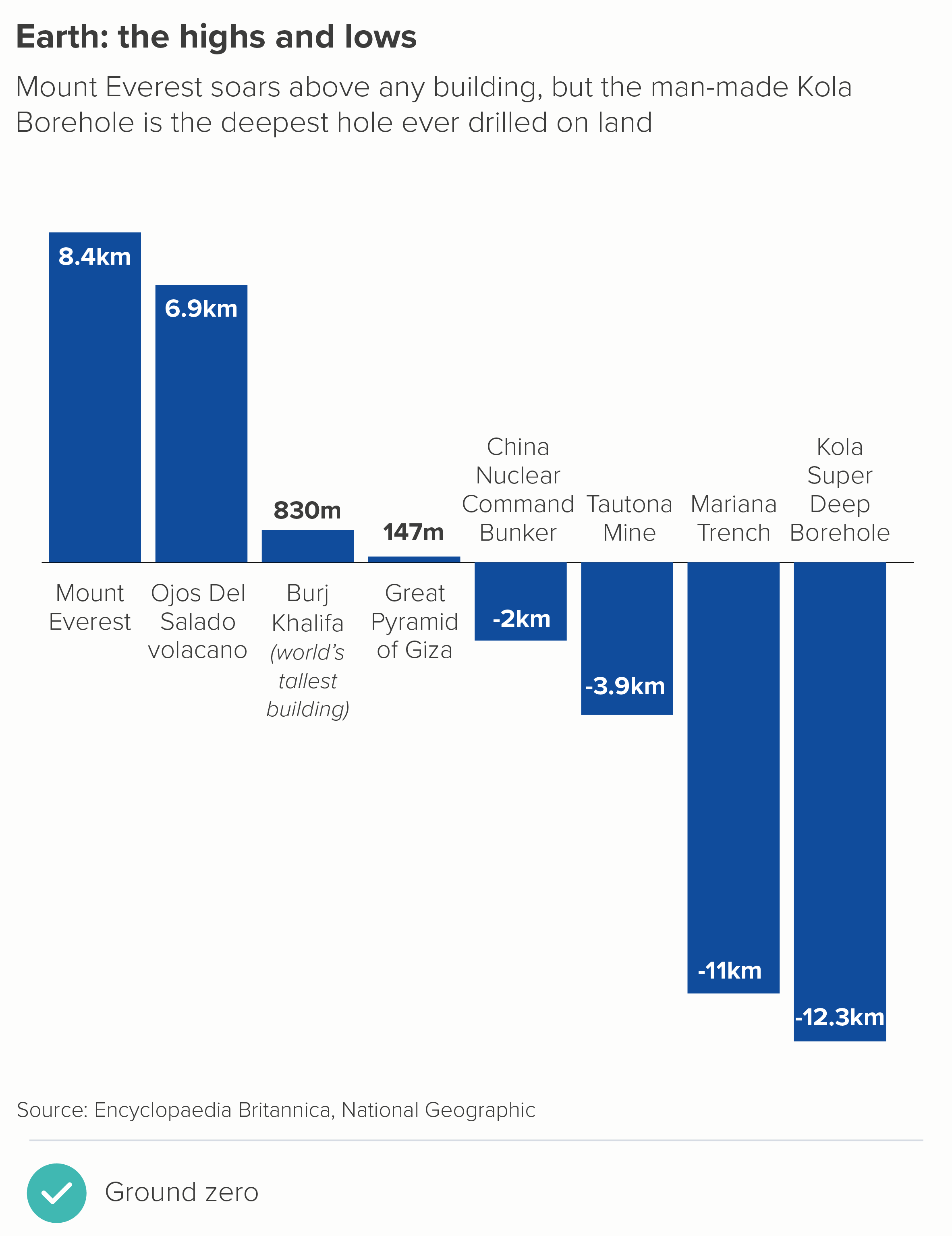
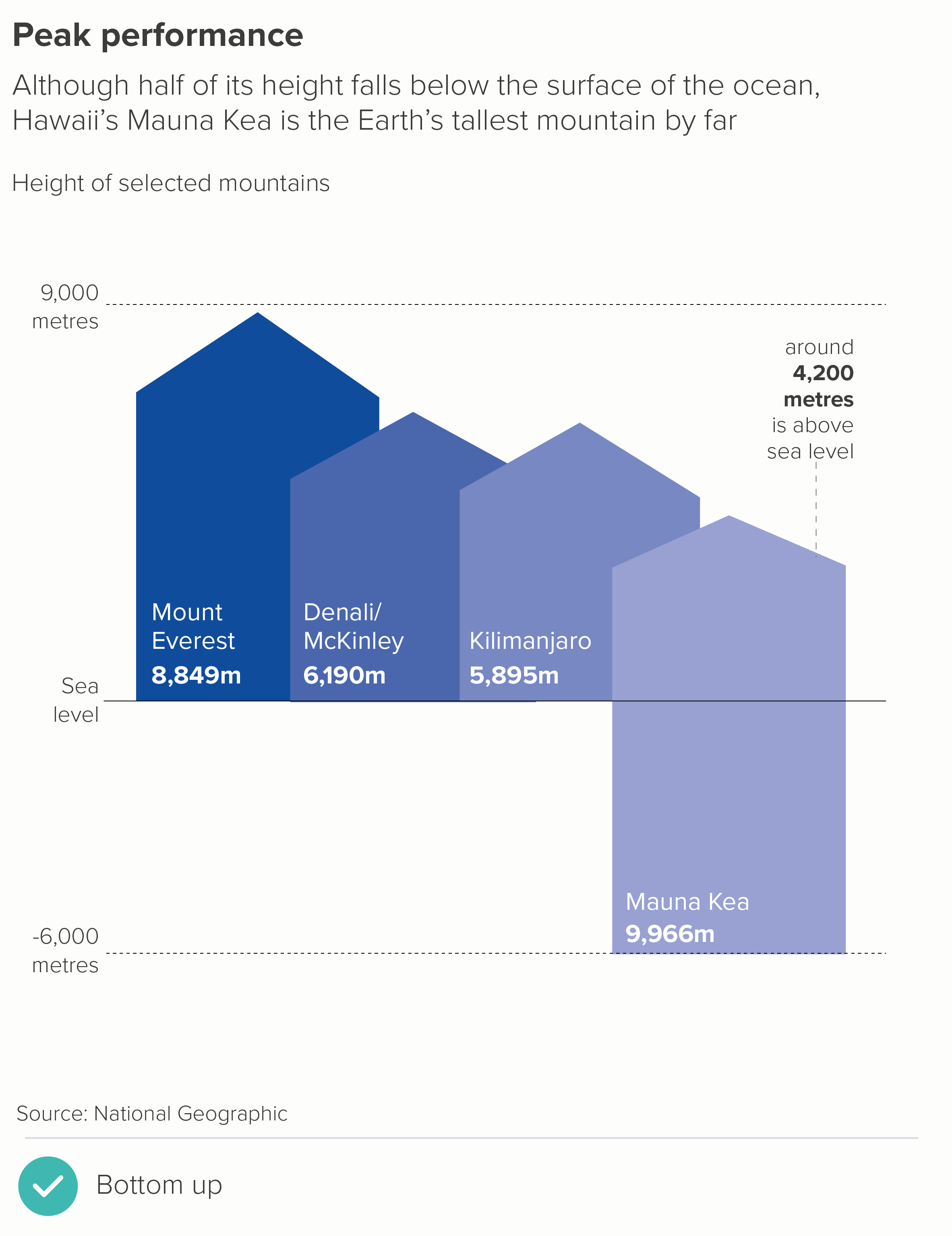
In fact, the only justification I can think of for not starting a standard bar chart at zero is if the lowest value in your dataset is less than zero. Even here, I would argue that the chart does actually ‘start’ at zero, you just happen to be reading down from zero as well as up (the first chart below). Or reading up from the bottom towards zero (the second chart). In both cases, zero is clearly shown, and used as a key reference point.
Why is not showing zero on a bar chart so problematic? It’s because those bars are solid, filled shapes, base-aligned and extended in one direction only (length or height) and therefore we instinctively see differences in their size as exactly corresponding to numerical differences in the data.
It is also why they work so well. They are a clear visual metaphor, obviously standing in for piles of money, or buildings side by side, or trees, or mountains, or people. Those bars are all individual things, clearly differentiated, but they share a common patch of ground, so they are also a group. And I’m saying ground deliberately. We perceive those filled shapes as reaching from ground to sky. Truncating the y-axis puts a barrier in front of the shapes, meaning our forest of trees now has a wall in front of it, our row of people have become faces peering over a wall. So how big are those trees now? How tall are those people?
Indeed, it could be seen as worse than this, because those bars are the same width and colour all the way up, so we are likely to miss the wall in front of them, and imagine that the ground is still the ground, and mistake the part of the bar we can see for the whole that we can’t. It’s a masterclass in misdirection.
But hang on. What about when starting a bar chart at zero masks an important change or a vital difference?
It’s true that both of these charts are deceptive. Returning to our bars as objects metaphor, we see that some of these mountains are slightly bigger than the others, but they’re all still mountains.
It’s worth remembering this when anyone tells you that starting a y-axis at zero is objective, and adjusting it is biased. Every visual decision in data visualisation involves bias. In fact, by using a bar chart and starting it at zero in the two instances above, you are discretely arguing that the status quo isn’t too bad, that there isn’t much to see here. China has slightly more baby boys than Malawi; most major emergency patients are still seen within four hours - so can everybody just calm down.
However, the solution to dramatic stories like this is not to chop off half of your bar chart’s y-axis. That is deceptive in the opposite direction. Instead, when a standard bar chart masks a large or important change, the solution is always: switch to a different chart.
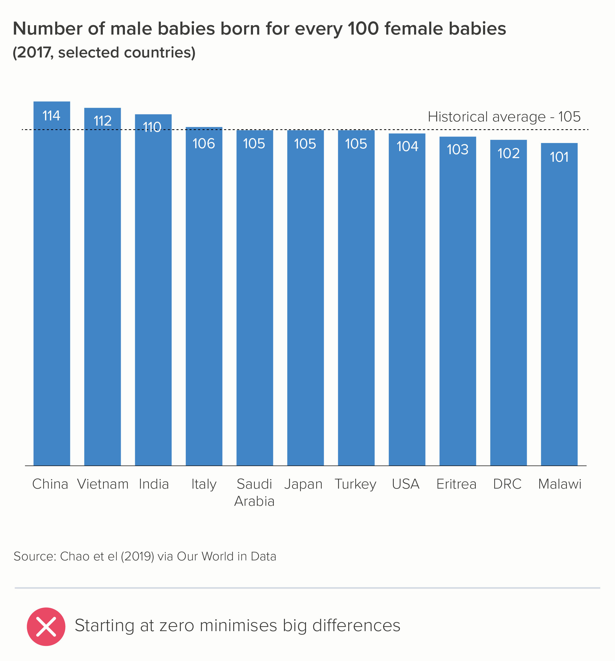
Let’s take a closer look at the first bar chart above: the baby gender ratio. As I’ve said throughout this blog series, whenever you create a visualisation, the first thing to consider is: what’s the story? The original author - starting their y-axis at zero - might have thought that the story is: I’m showing the number of boys born compared to number of girls. It’s a comparison story. But is it? I’d argue that you’re showing to what degree the number of boys is higher or lower than it should be. This is a different story - a story of deviation, not simple comparison.
In other words, what matters here is not the 114 boys born for every 100 girls in China. But the fact that it ought to be 105, and it isn’t, and this means that thousands of girls aren’t born.
Dot charts are a better choice in these circumstances. They are not a filled shape, they do not imply you are showing a whole, the full count; they are just a marker indicating the end point. So, with dot charts, it is not at all deceptive to leave zero off your value axis; in fact, it is often preferable, because these charts are designed to foreground the level of difference between final values (chart 1). Another option is a flagpole chart - a modified bar chart in which the level of deviation from a benchmark or past value is emphasised (chart 2).

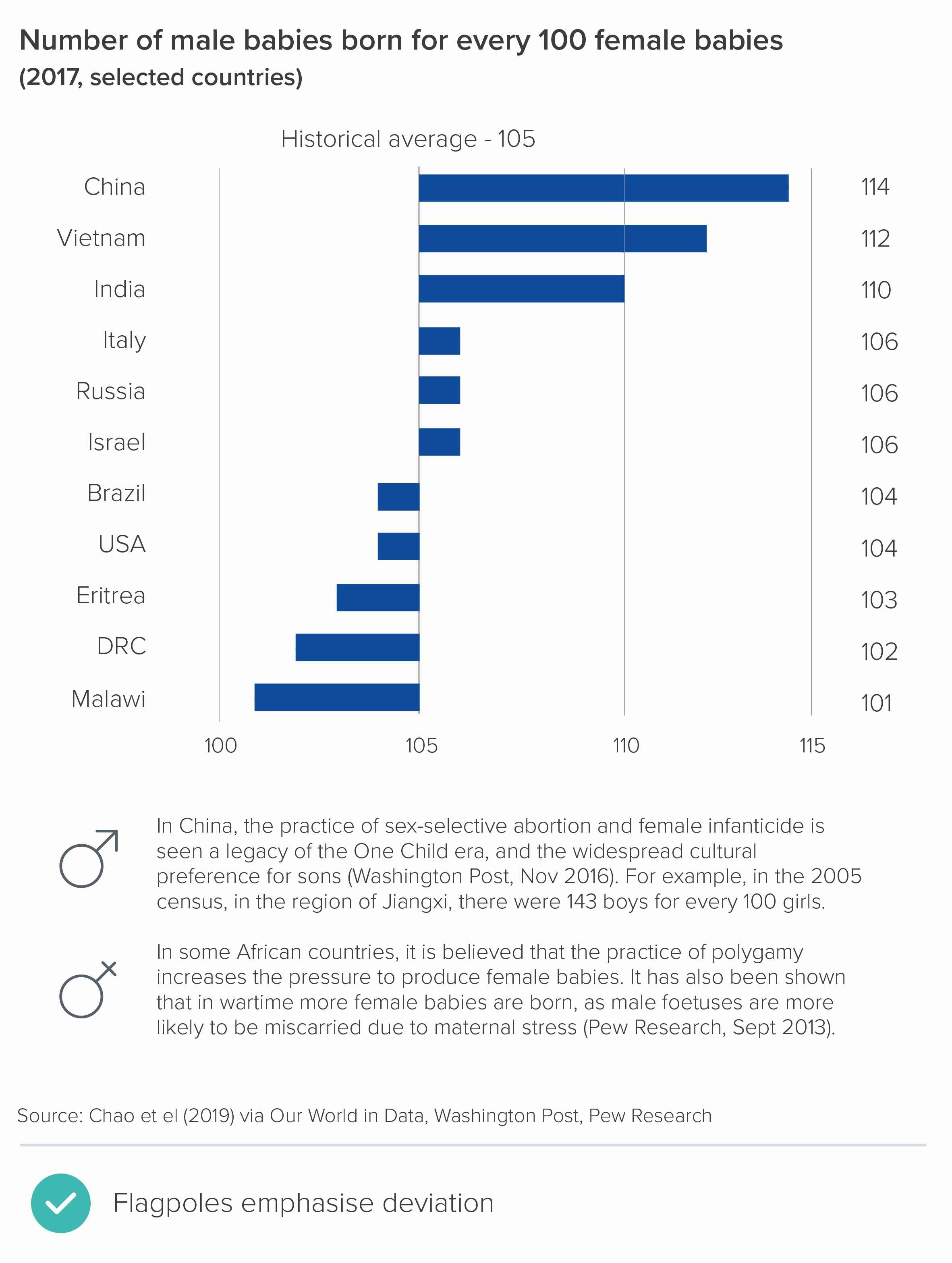
Note that I’ve rotated the charts too. Dot charts are more effective when they are horizontal - think abacuses. And flagpoles, well, the metaphor is obvious.
As this is geographical data, you also have the option of a heatmap. You can make your colours diverging or sequential. Diverging (map 1) works better in this instance, I think, because it’s clearer to see the countries that hover around the historical average (in green) and then those that skew female (yellow) or male (purple). Diverging colours for a story of divergence.
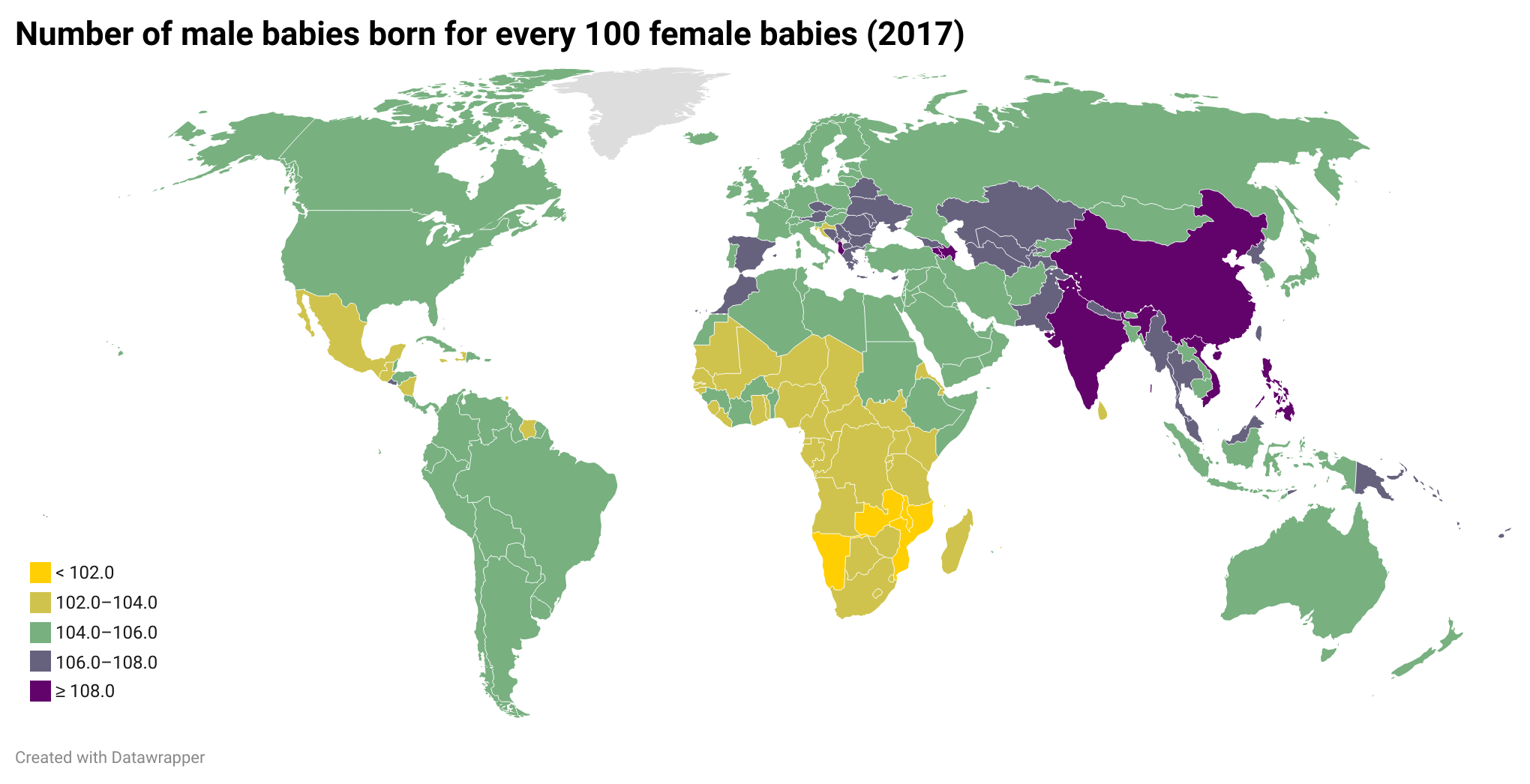
The sequential blues (map 2 below) are elegant, but we really only notice one end of the divergence story (dark blue for too many boys), and we risk losing the story of countries with too many girls (the lightest blue).
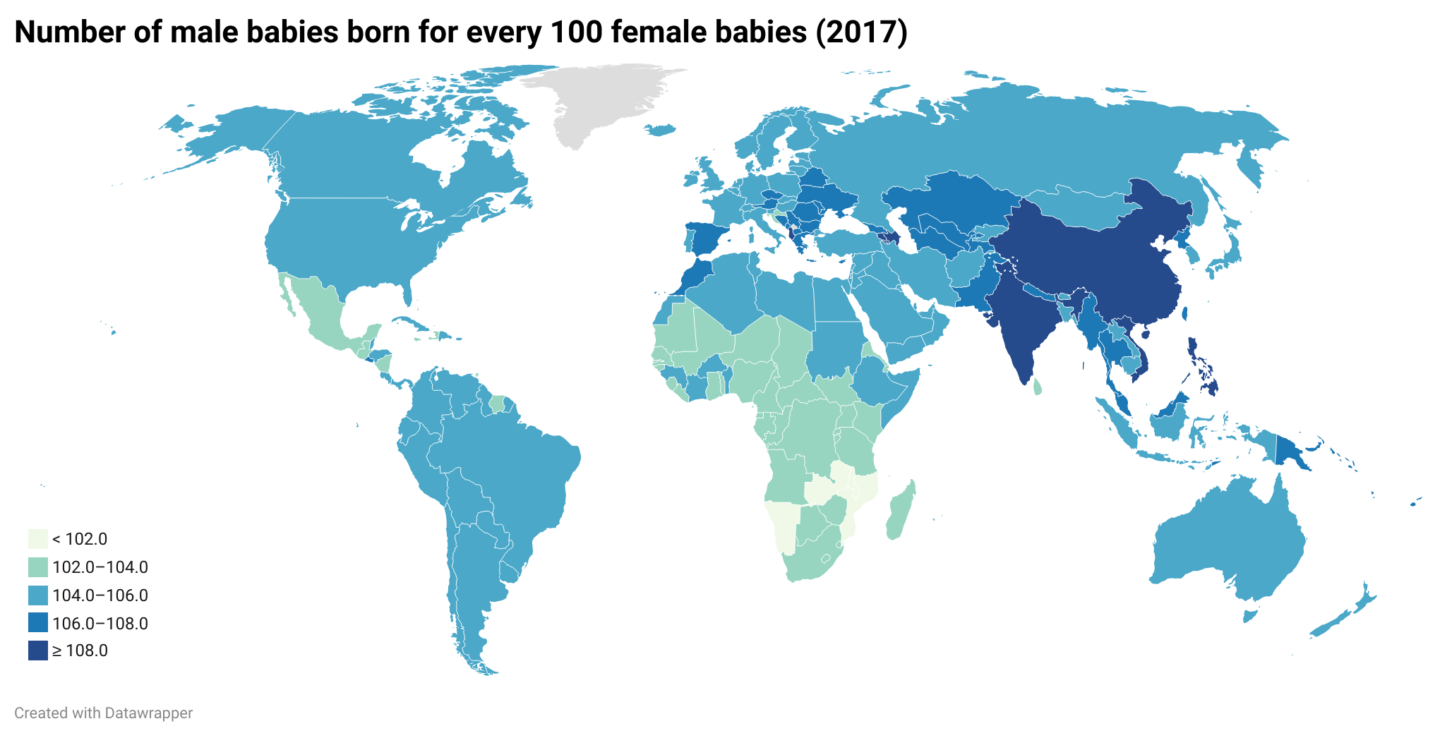
Note that with heatmaps, we are also able to add more datapoints than with our original bar chart - every country in the world, in fact. Now we can see, on a more profound level, what the desire to have a child of a specific gender is doing to the demographics of the planet.
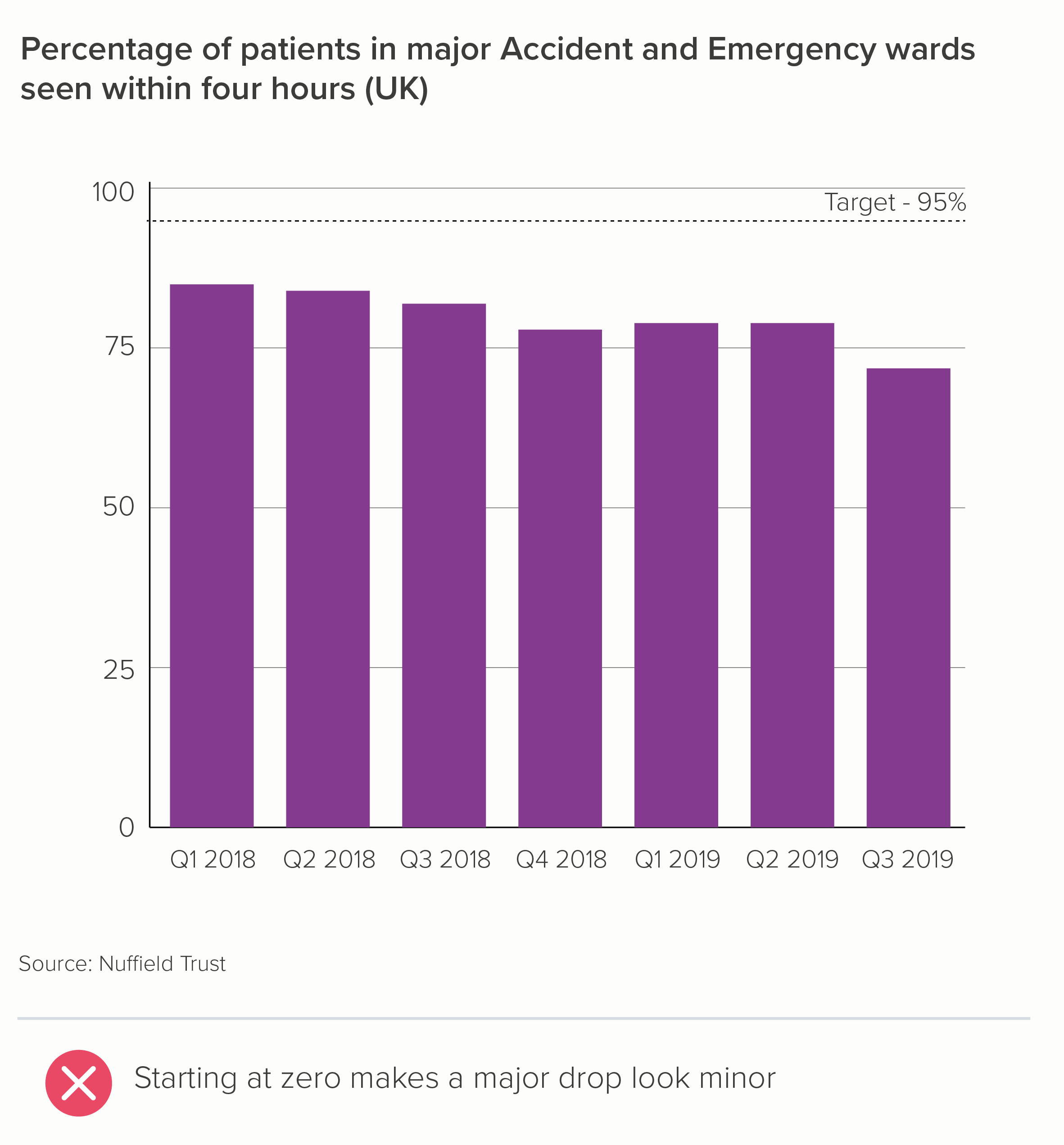
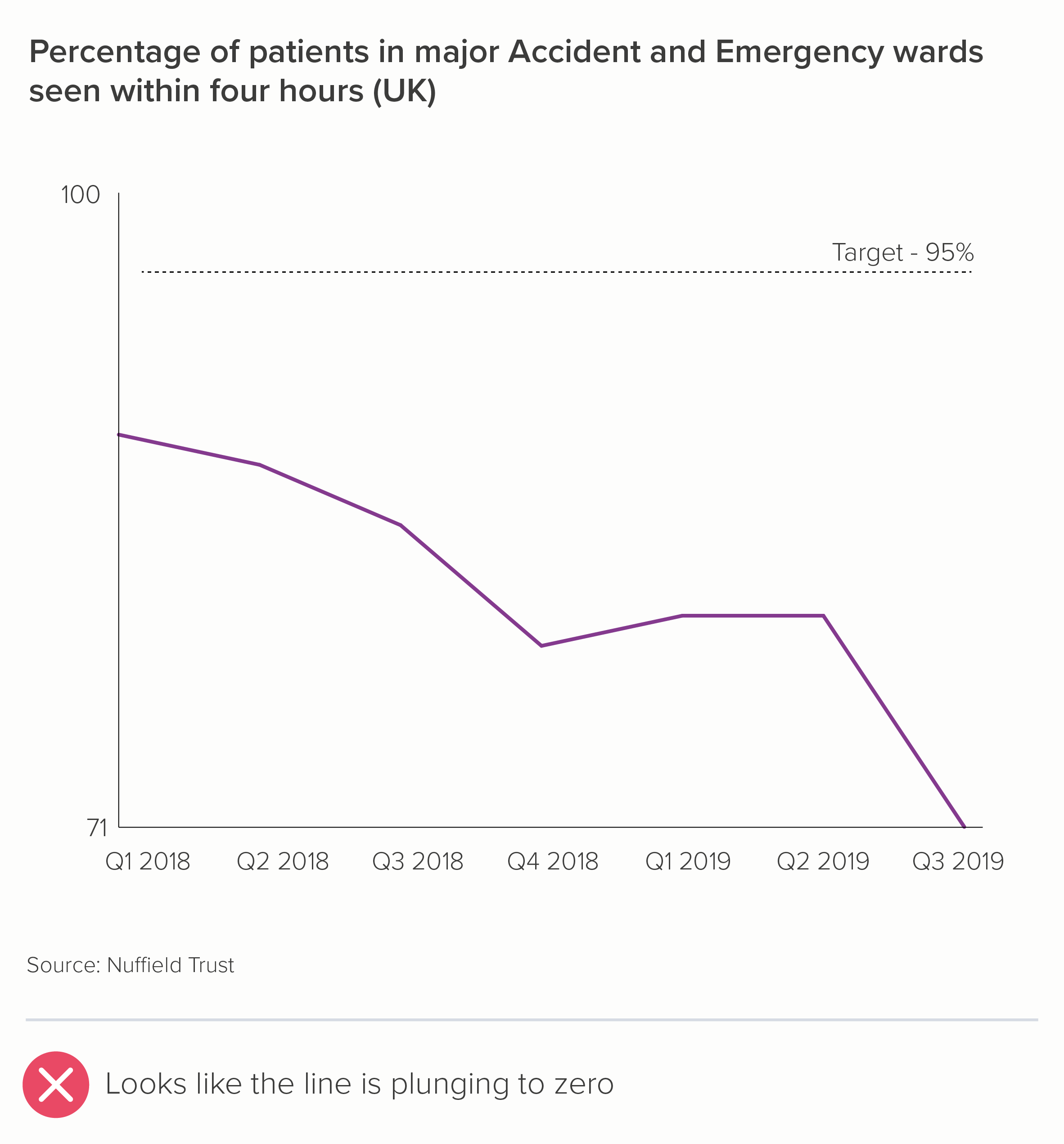
Let’s look at our second chart now - the A&E data, a change over time story.

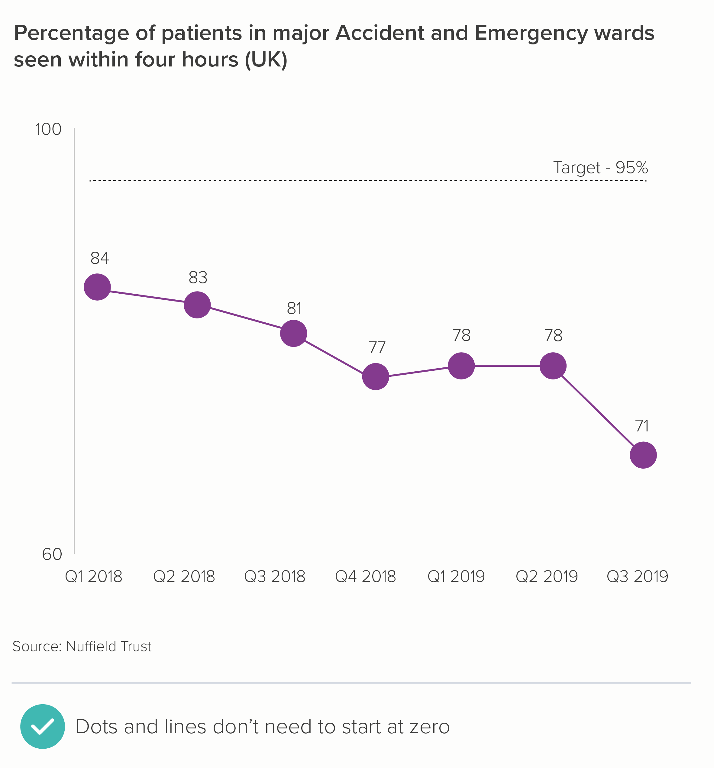
Once again, we can see that bars don’t work in this instance (chart one). They have to start at zero, and therefore we lose a story of dramatic change. A better option here is a line chart, which doesn’t need to start at zero (chart two).
Like dots, lines are not solid, filled shapes, we are not going to assume that the distance of an untethered line from the ‘ground’ represents a value starting at zero. It is more like a kite tail, or a vapour trail, a squiggle in the sky.
This is particularly the case if you drop the x-axis line (the ‘ground’) and just leave the axis labels (Q1 2018, Q2 2018 etc). This emphasises the fact that, in this case, we have zoomed in on the significant trend.
In fact, line charts that don’t start at zero only become problematic if you intersect with the x-axis (chart one below), which suggests a dive to zero, or if you fill in the area under the line (turning it into an area chart - chart two). We’ll cover this in more detail in a later rule, when we consider the proposition: ‘Always start your line charts at zero’.

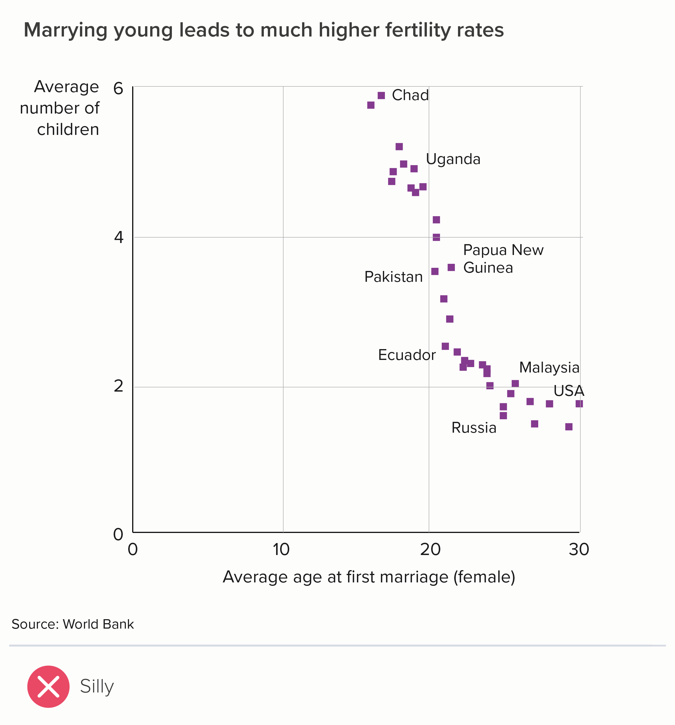
If we want to tell a correlation story, the same principles apply. If your bar chart doesn’t make small differences visible, switch to a different chart. In the case of correlation, this almost always means a scatter chart. Because they are floating dots, a scatter plot x and y axis need not start at zero either.

To go back to the start then: should you always start your bar chart at zero? Yes.
However, that doesn’t mean that a bar chart starting at zero is always a good chart. It can be highly misleading. Always remember that your job is to show your audience what the data means, and often that requires starting your value axis at 100 or 1,000 or 1 million and switching to a chart where the shapes are weightless.
A note on maximum values
One final note: I’ve been talking about where your bar should start, but just as important is where your chart ends. Most software automatically positions the maximum value for your value axis just above the highest value in your dataset. Which is usually what you want (the first chart below). Nothing is worse than deliberately putting all possible values on your y-axis (the second chart) - out of a mistaken sense of full disclosure.


By going from zero to 100% in the second chart, it now looks like we are saying that not that many children are at risk of poverty, after all. In fact, the majority aren’t at risk, so aren’t we doing well?
Furthermore, it doesn’t look like there’s much difference between Italy at the top and Iceland at the bottom. When, of course, there’s a vast difference (30.5% v 12.5%!). So - almost always crop to the top of your dataset.
However, occasionally the story does require you to override the defaults and specify a maximum that is way above your highest value.
Progress. The chart is showing progress towards a target, and we need to keep that target constantly in view.
Rating. There might be a zero to ten rating scale and we need to be continually aware of the lowest and highest possible score.
Performance. Perhaps you want to show the performance of someone or something on a dashboard. You can’t know what, for example, a score of 27.4 means, or whether high is good or bad, unless these outer bounds and their meanings are shown on the chart.
If this is the case, it’s a good idea to subtly indicate the unfilled remainder in your design, rather than just trusting to white space. It’s a bit like the empty four stars in a one-star Amazon review. Here are a couple of examples.
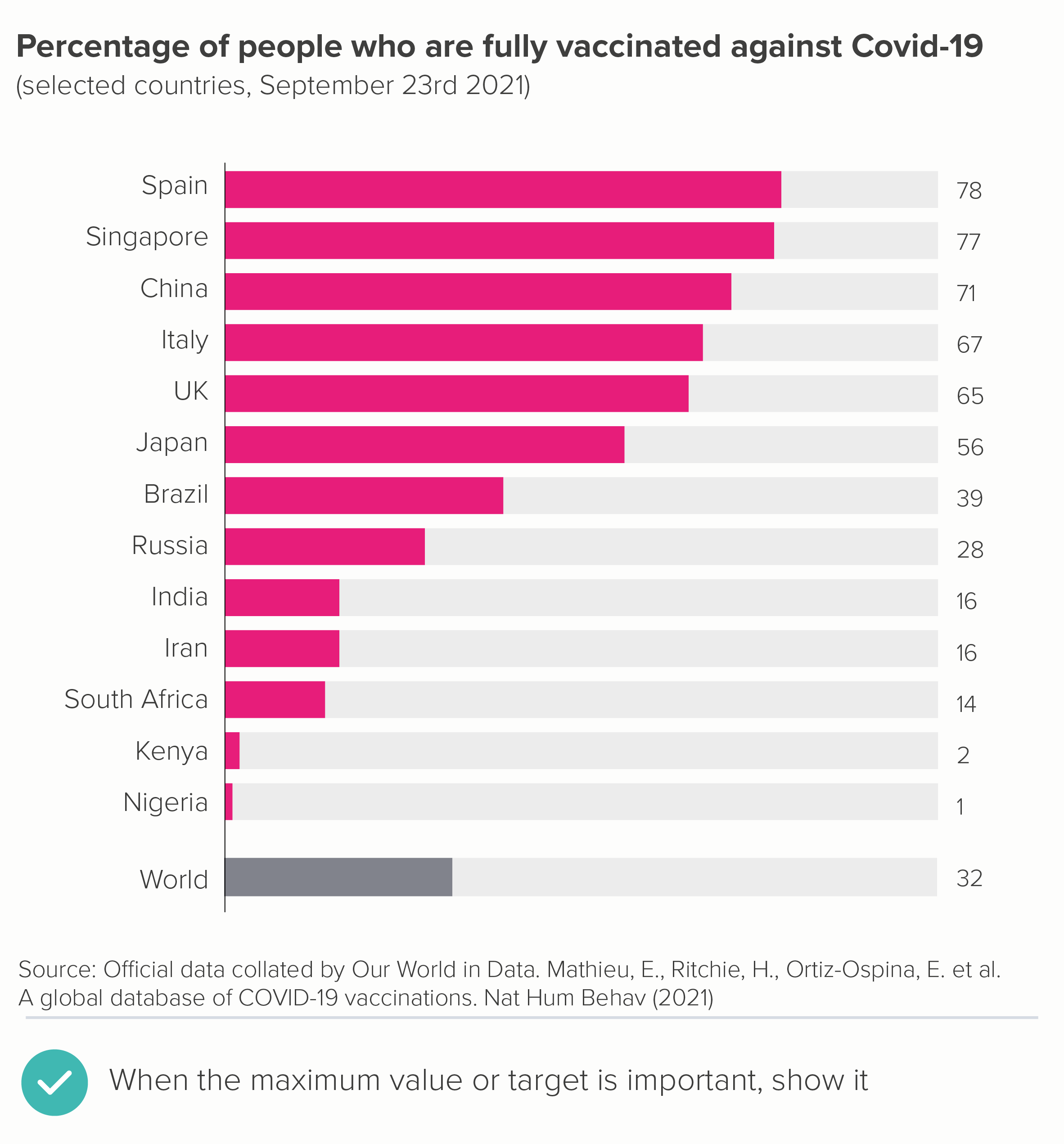
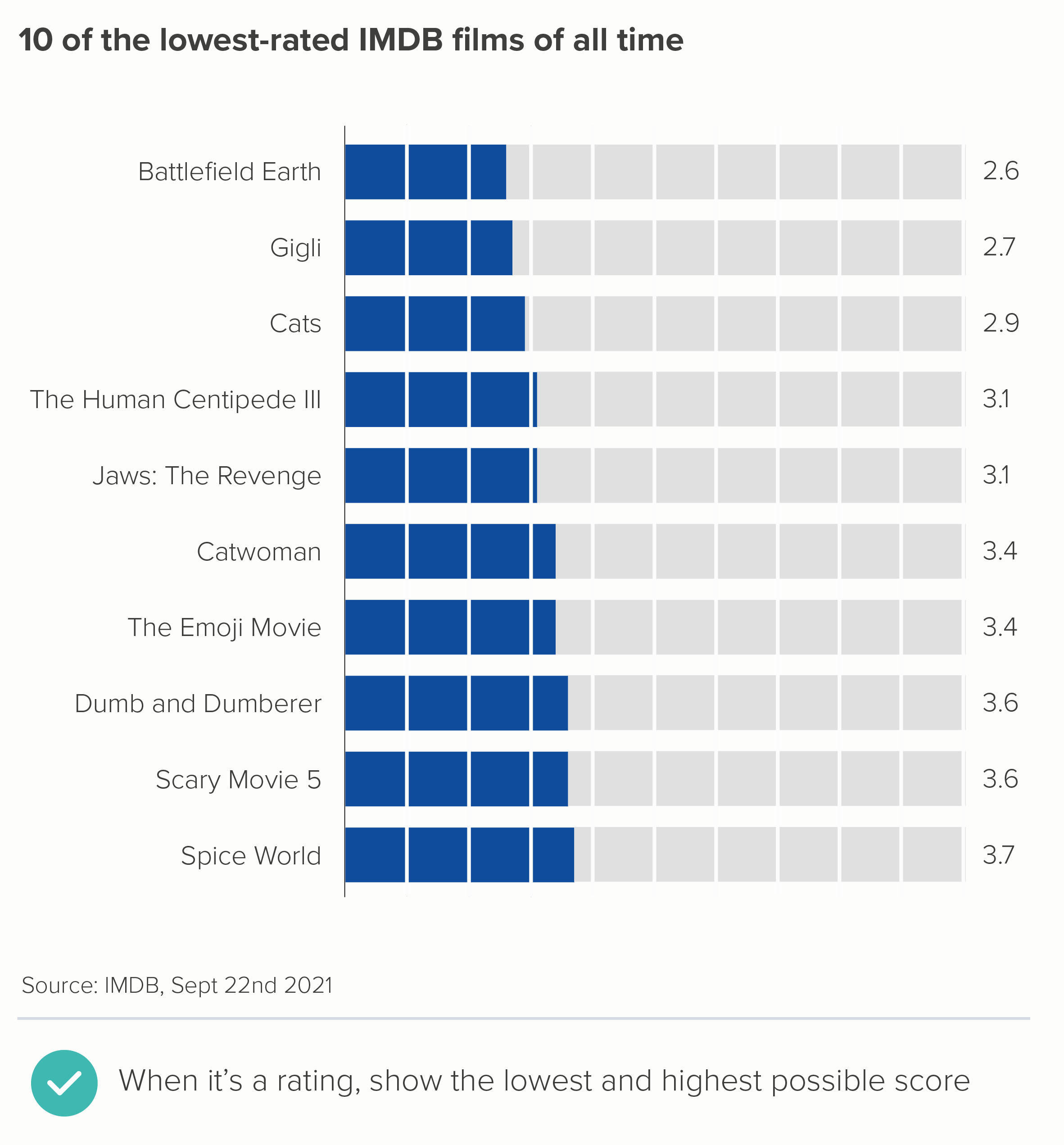
In the first chart, the goal is for (almost) everyone to be vaccinated so it’s helpful to see the gap between the end of the bar and 100%. In the second chart, it’s helpful to know that those ratings are out of 10, rather than, say, five - otherwise the ‘lowest-ranking’ title would make less sense.
These are rare exceptions though. In almost all cases, a bar chart value axis should start at zero and finish just above the maximum value in your dataset. This is what they’re built for: large rectangles, filling the available space, making comparisons easy and obvious. If you’re not telling this kind of story, consider a different kind of chart.
VERDICT: Don’t break this rule (the starting at zero part).
Sources: Number of police officers, UK Home Office/Gov.UK; Mountains from National Geogrpahic; A&E waiting times from Nuffield Trust; Male-female baby ratio from Our World in Data; Age at first marriage (female) from World Bank; Fertility rate (children per woman) from World Bank; Children at risk of poverty and social exclusion from Eurostat, Vaccination rates from Our World in Data; Lowest film ratings from IMDB.
More data viz advice and best practice examples in our book- Communicating with Data Visualisation: A Practical Guide