
In this blog series, we look at 99 common data viz rules and why it’s usually OK to break them. Here are all the rules so far.
by Adam Frost
In her classic guide to Information Graphics, Dona Wong advises ‘Use broken bars sparingly’ (2010, p69). Rosamund Pearce of the Economist says never use them: ‘because it breaks the relationship between the rectangle’s dimensions and the data.’
I agree: they are usually a big mistake.
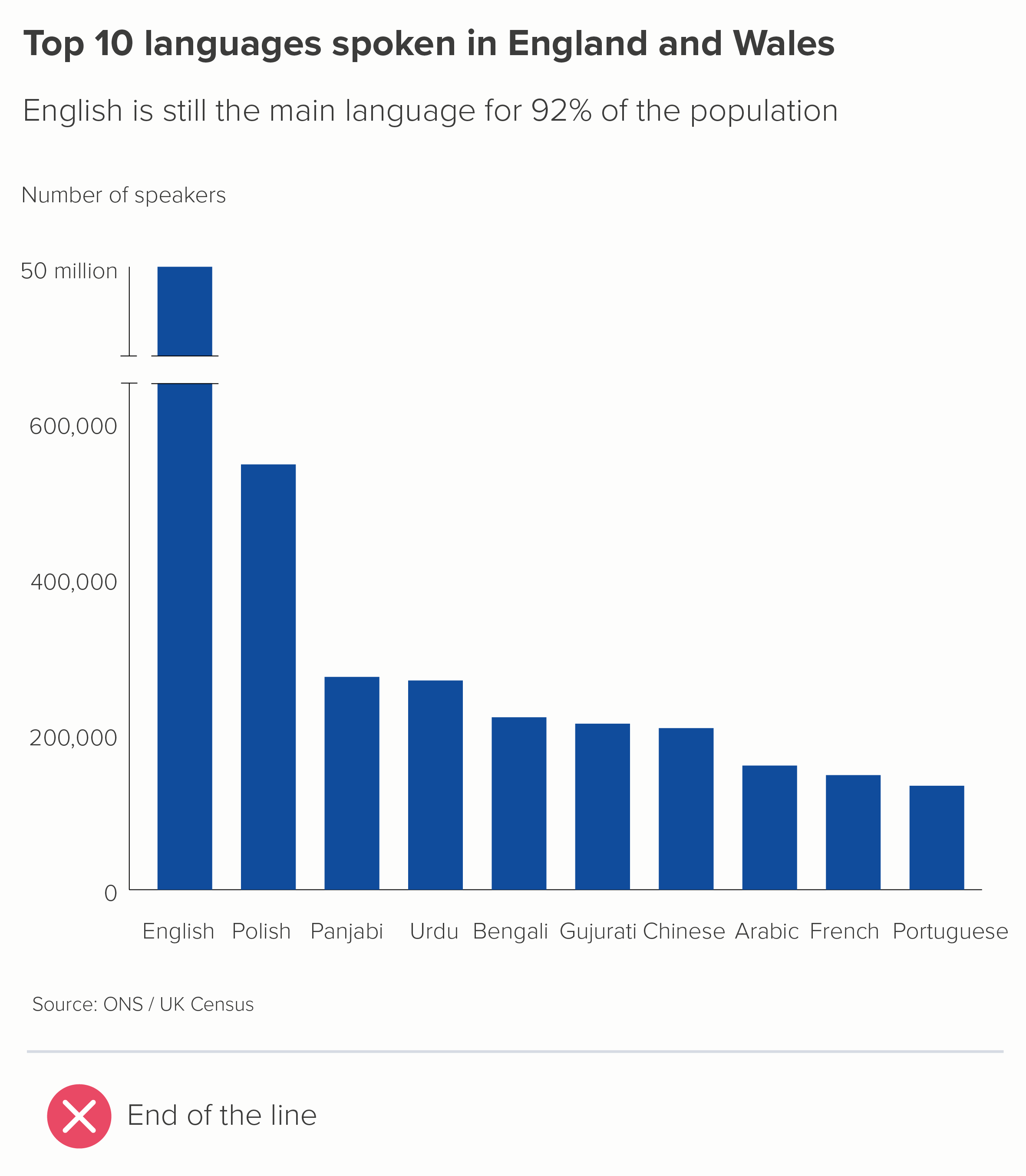

These charts show two of the most common ways of representing an axis break. The first uses two parallel lines - like an electrical circuit diagram. The second uses a zigzag or lightning bolt. Both are bad for similar reasons.
They are crude, unattractive shapes
Read order is disrupted. We notice the break point first, when we should be looking at the title or the chart first.
It hijacks the story. We might think that this is about broken data, or incomplete data.
It defeats the purpose of the chart. We cannot compare the size of the largest bar to the others. Are we supposed to imagine what’s in that gap in the largest bar?
It smacks of desperation, like the designer couldn't think of another way of fitting all the shapes on the same canvas. So they have just disembowelled the biggest shape and stuck the two ends together, like a conjurer trying to fix a magic trick that’s gone horribly wrong.
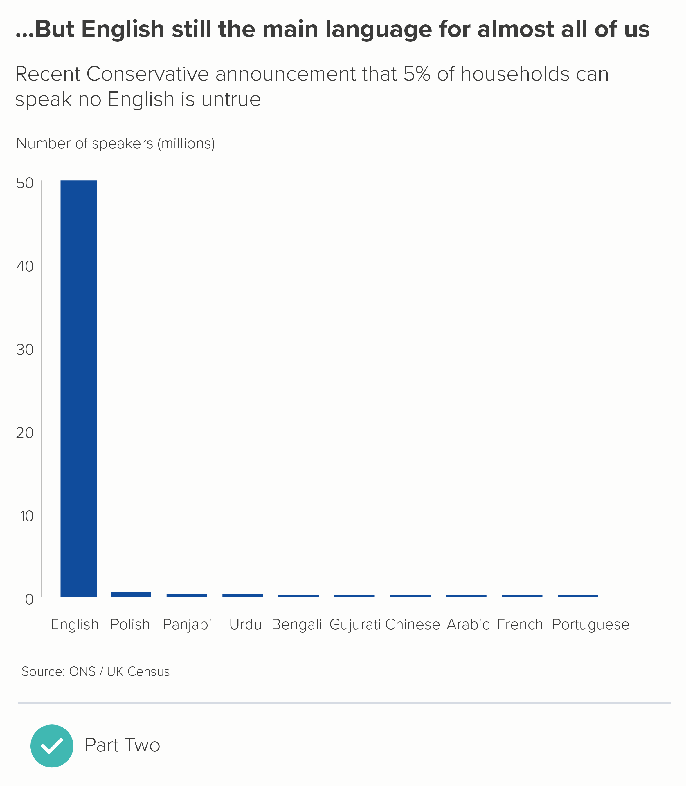
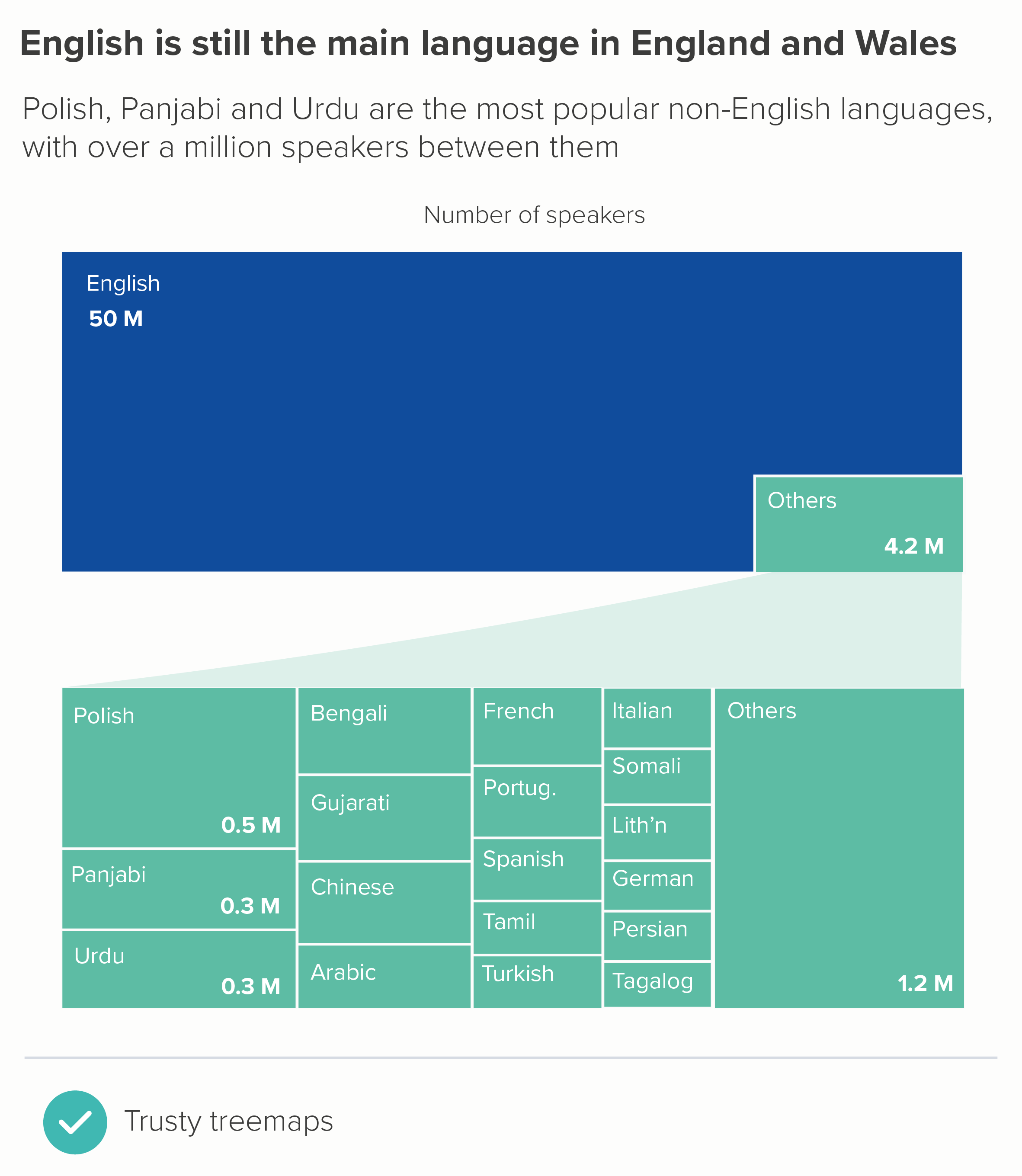
When faced with this kind of story, it's much better to go back to the data and work out what you need to chart and why. Axes and bars usually get broken when you have one or more outliers, and if you charted the data accurately, you'd lose the ability to distinguish between the other values. Here's the chart above, with the 'English' bar represented correctly. I’ve also included a chart about Covid - the UK’s wretched performance makes it harder to see the important differences between other European countries.
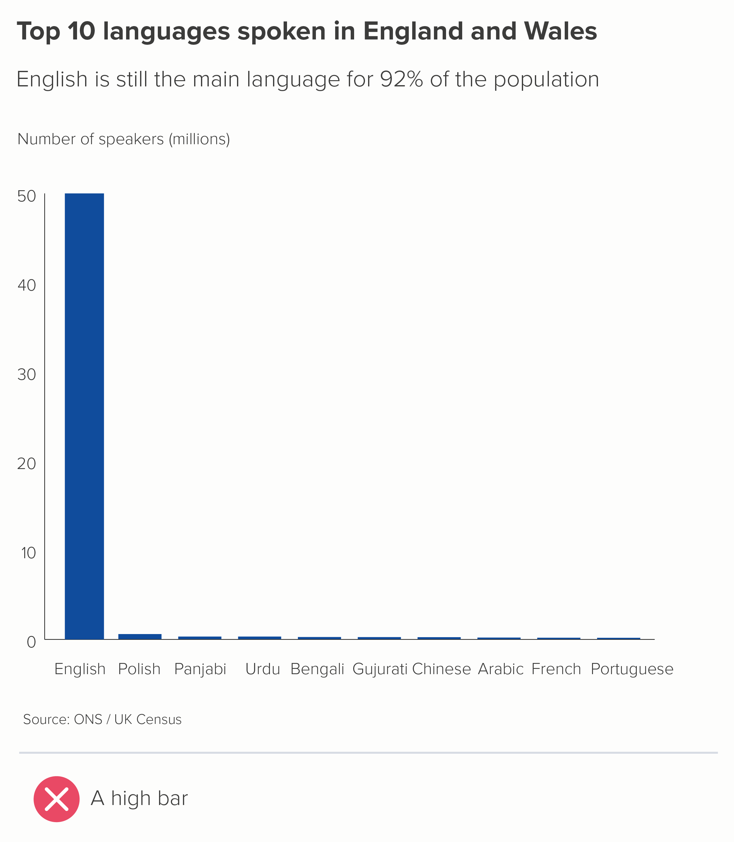
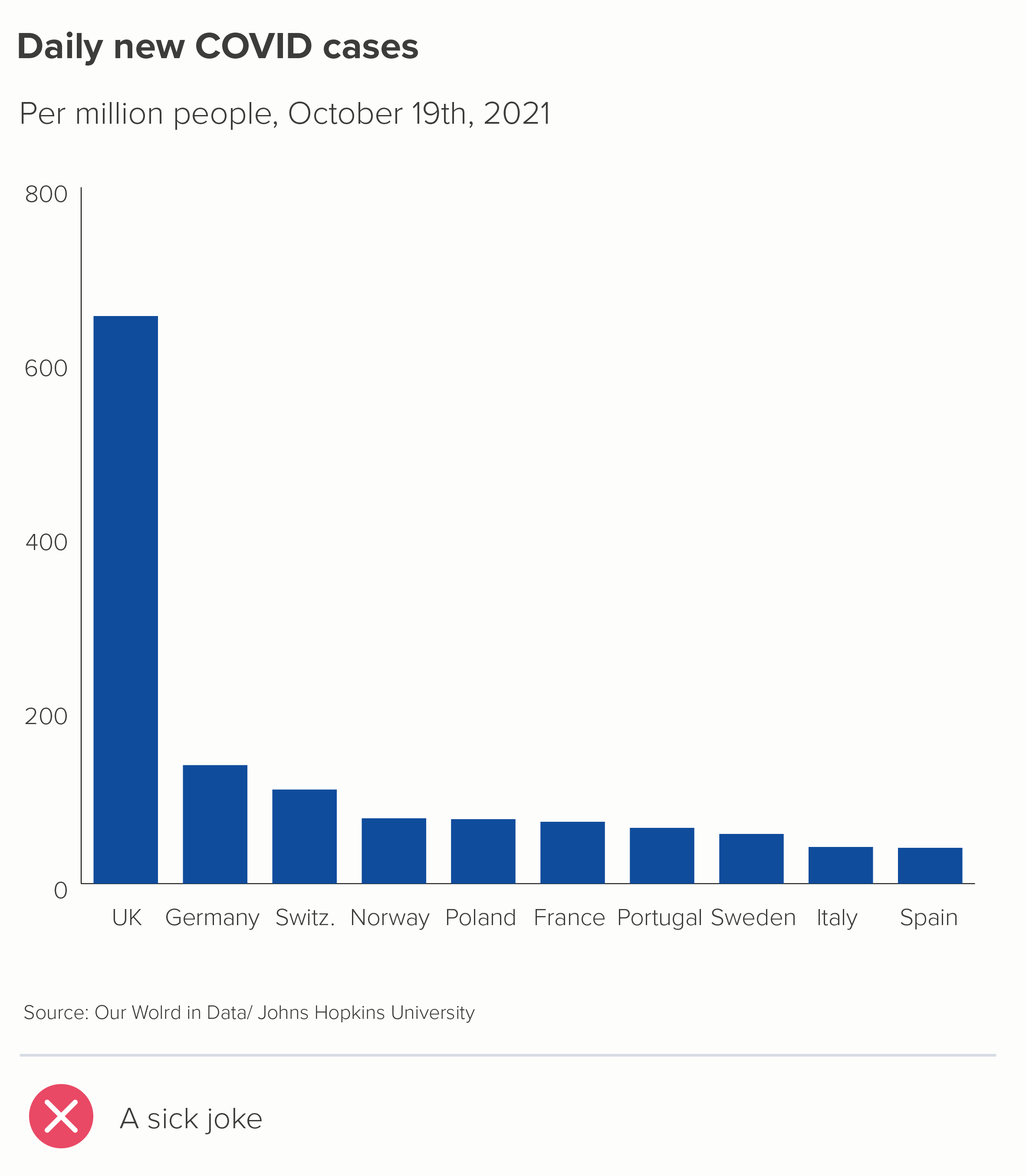
In both of these charts, you can see how the largest bar becomes the whole story. If this is what you want - and sometimes it is - then job done. But if you still want your audience to distinguish between those lower values, how do you achieve this without resorting to the slasher-movie methods above?
1. Turn one chart into two
There's no law that says you have to put all those bars on to one chart. You can walk your audience through a series of charts: showing them first the chart with the outlier(s) removed and then a second chart with the outlier included (or vice versa).
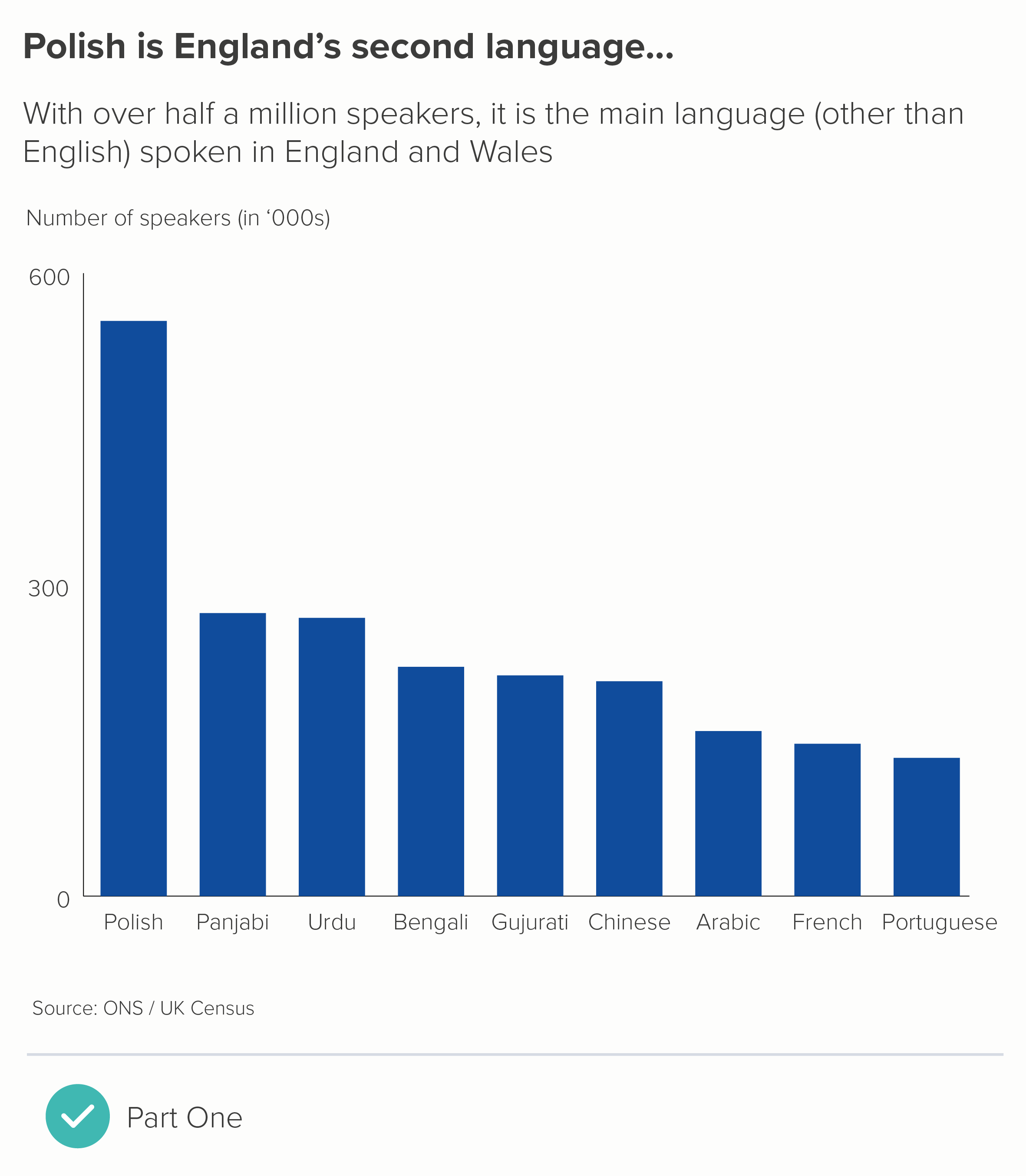
2. Merge bars together
If your story is about the size of the biggest bar, or how much bigger it is than the other bars, then lean into this. Add all the other bars together, and show how the largest bar still dwarfs all of them combined.
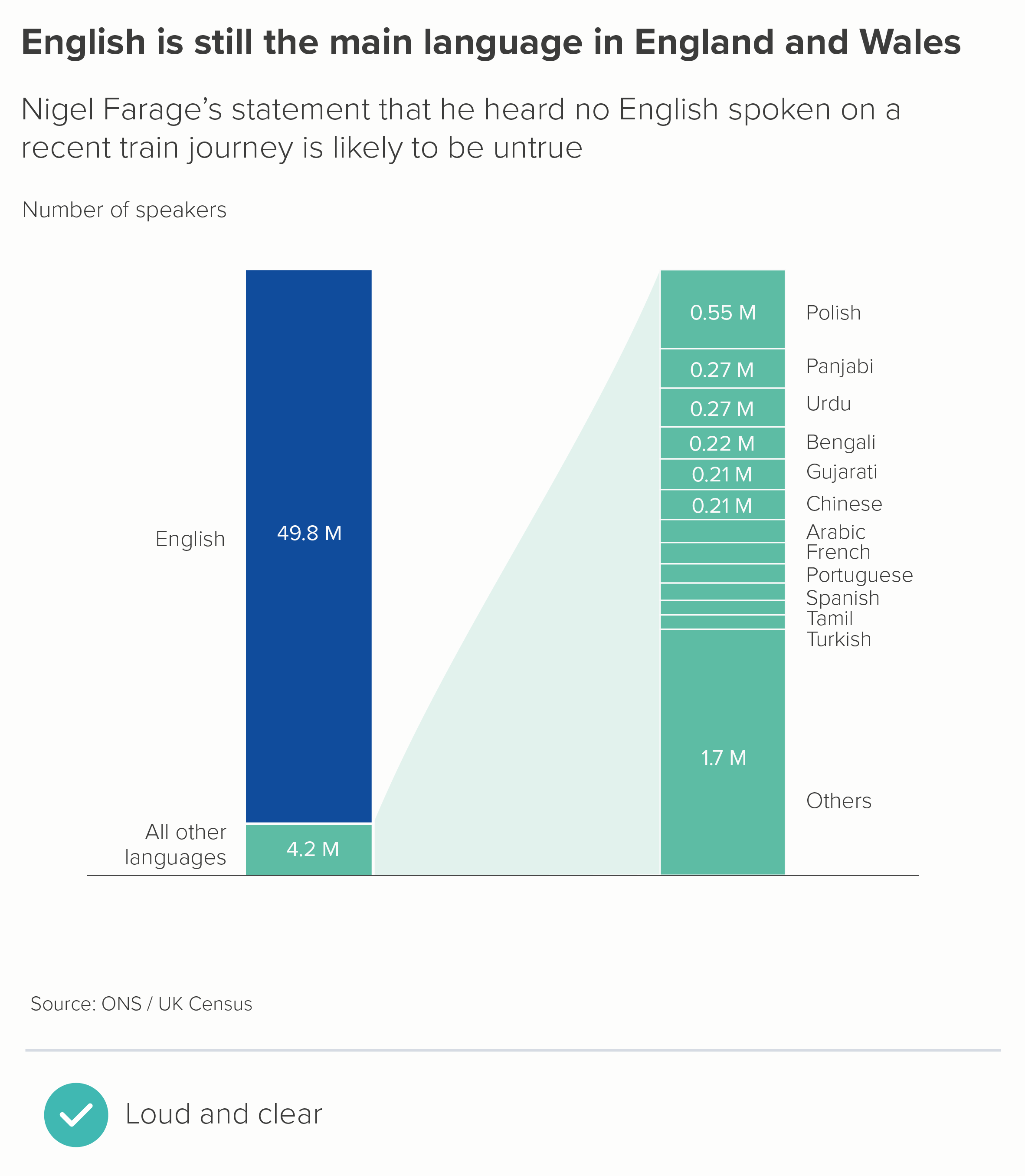
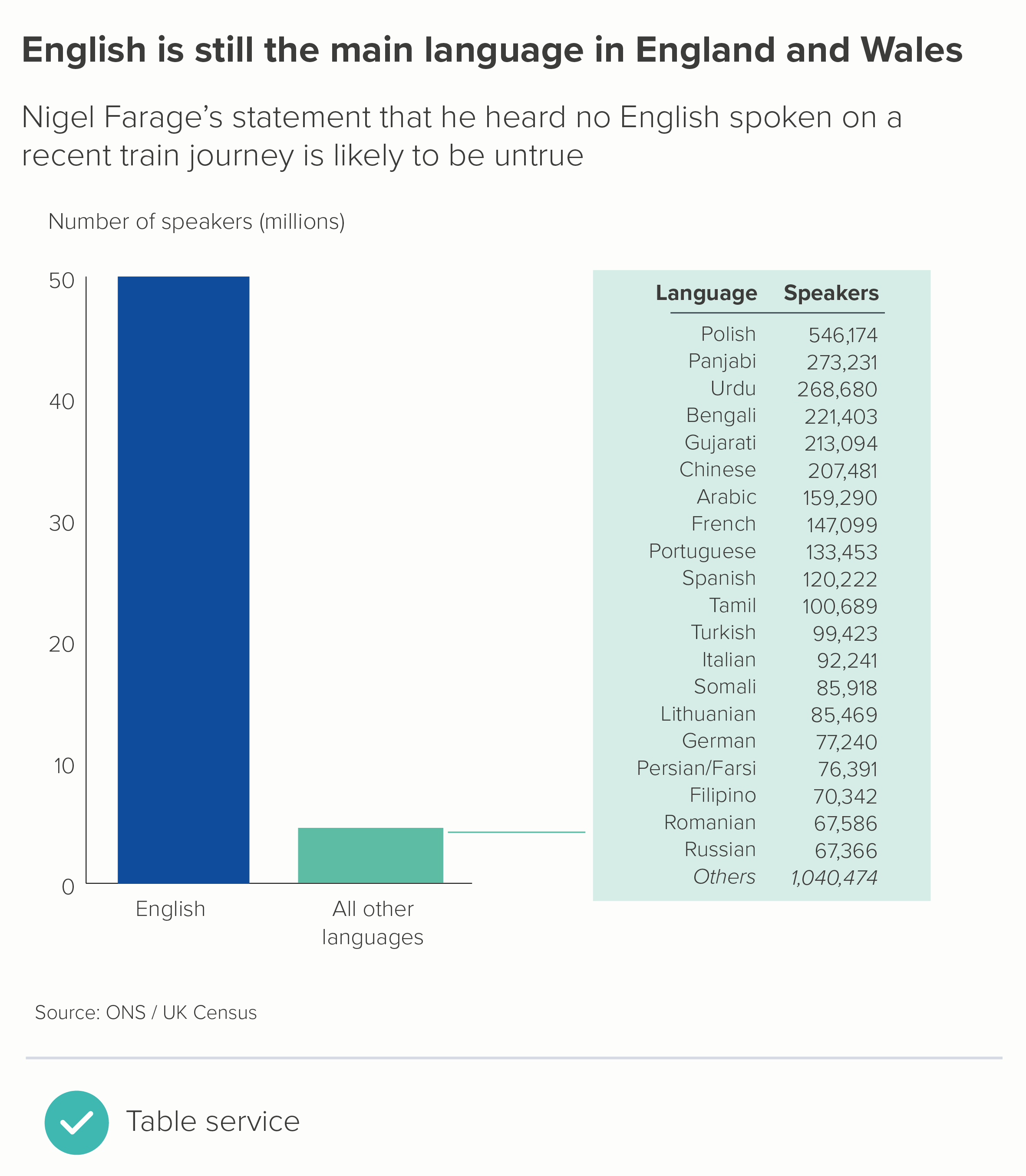
You do lose the ability to compare the other values, so if this is important, you can explode out that second bar, or include a data table (the second chart above). A table is a good choice if you want to knock the secondary story further back.
3. Use a different chart type?
It's worth saying that other chart types can be better than bars at telling outlier stories. Especially those that don’t have an axis to break, like bubble charts (the first chart below). Bubbles also work better when you have an ‘off the charts’ story as well. With a disappearing bar, you have no idea where that bar might end, but with a bubble, the curve gives you a better sense of how large that partly-visible shape is.
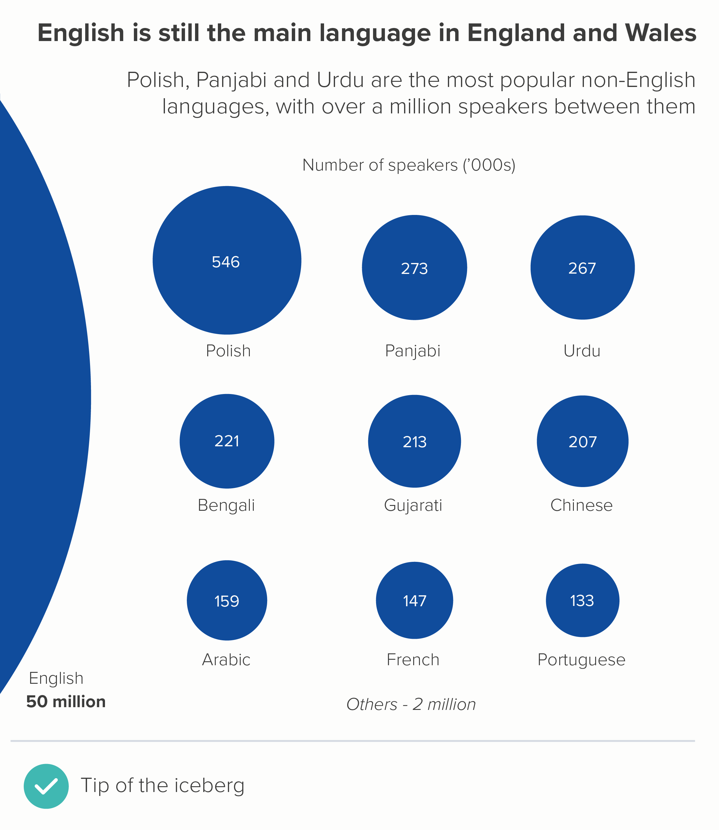
Circles also work well when you want to nest the smaller datapoints inside your giant outlier datapoint (circle packing). And treemaps can be a better use of the available space (the second chart below).
4. Play with format
Another approach that can work is to play with format. If your largest datapoint is off the scale, then show it disappearing off the scale or breaking out of its container. The most celebrated recent examples are from New York Times, when they were attempting to make their readers aware of the unprecedented impact of Covid.
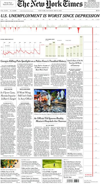
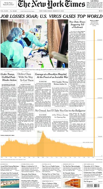
Image credit: New York Times
I like this approach with Powerpoint presentations, because your audience almost forgets the bar or illustration or shape that is persisting at the bottom of the presentation, until it ends several slides later, and they are surprised back into the story. Of course, if your data is deadly serious, or your audience is deadly serious, this sort of playful approach won’t be appropriate, but most audiences appreciate the fresh perspective.
A related approach is to have a graphic going on for too long, far longer than you would normally expect, as in Earth Temperature Timeline from Randall Munroe, or The Depth of the Problem from the Washington Post, or Gross Miscalculation from Melanie Patrick. The datapoint is huge, it goes on forever, so the chart lasts forever.
5. Don’t use a chart at all
If a number is large enough to cause a rift in your axis, then it’s probably important enough to warrant your audience’s full attention. Consider isolating that number and then focus on putting it into context for your audience, using icons, illustrations, analogies and real-world comparators. This is sometimes more helpful than a bar chart.
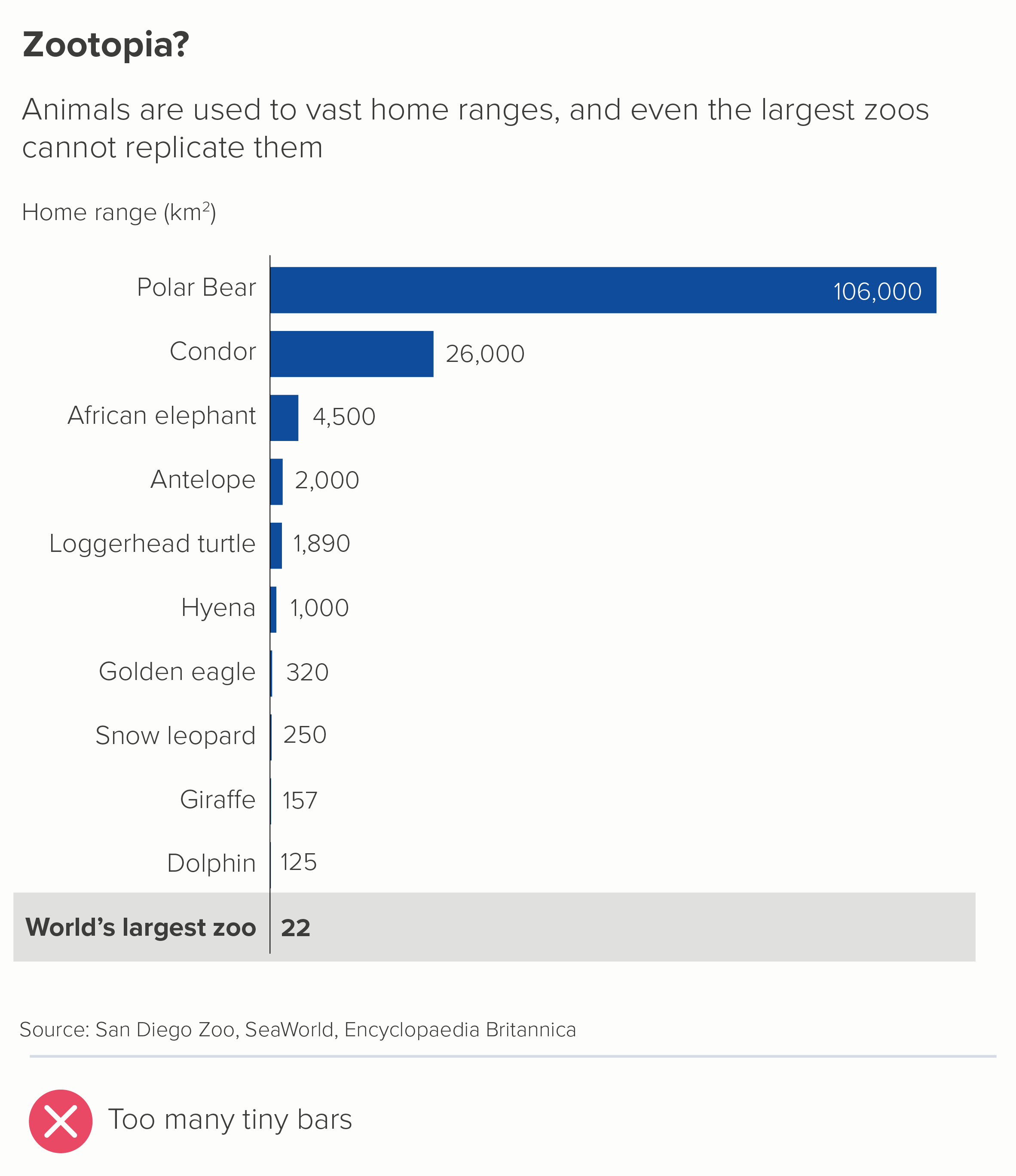
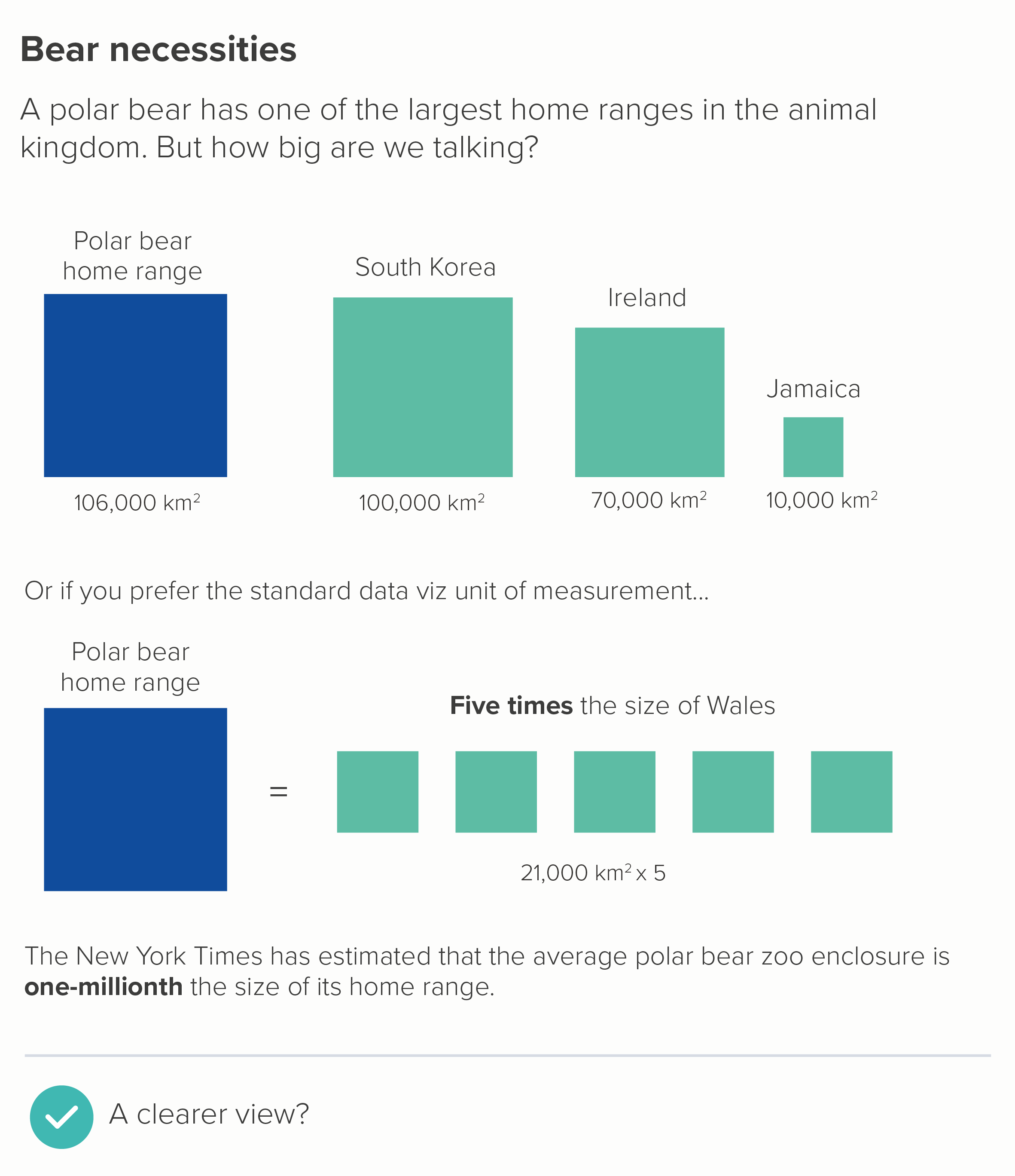
Look at how the the vast size of a condor’s home range is dwarfed in the first chart, because of the polar bear outlier. Even a giraffe’s 157km2 - which is invisible on our chart - is about three times the size of Manhattan. But we’re not going to solve this problem by breaking our axis: as we’ve seen, this introduces even bigger problems. Instead, in the second chart, we make our outlier the whole story.
I hope all of the above convinces you that breaking your axis and your bars is almost always a sign that something is rotten. You’ve got too much data, or too little space, or the wrong chart type, or you’ve not thought about how best to serve the story.
Never say never
So am I saying that you should never break your axis? I quoted Dona Wong at the start: ‘Use broken bars sparingly’. And sparingly is not never. I’m going to conclude then by taking another look at the David McCandless chart I mentioned in rule 21.
Image credit: David McCandless/ Information is Beautiful
It’s a masterpiece for many reasons. The fascinating story, the clear information hierarchy, the engaging copy, the excellent design. But right now, I want to point out the y-axis. Did you even notice the two breaks in it? One at 8 metres, one at 20 metres.
Let’s consider how important and necessary those two breaks are, and then move on to looking at how they are incorporated into the design.
So why are they necessary? McCandless made this chart for his book Information is Beautiful and then published it on the Guardian’s Datablog. His audience was primarily US/UK. This meant that he had to include cities with the most emotional relevance for his audience - we have Venice and Amsterdam first (for US/UK audiences, they are the most famous ‘close-to-sea-level’ cities). Then US and UK cities are overrepresented on the rest of the chart: Edinburgh, Los Angeles, San Francisco, New Orleans. Plus New York and London are depicted twice: there is London and South London, there is New York and Lower Manhattan.
Having intelligently chosen cities that would mean the most to his audience, McCandless then faces a quandary. This is the chart above with a standard linear y-axis. Brace yourself - this lasts a while.
Oh dear. This is now a chart about how much ice there is in the Antarctic ice sheet and how we will all be long dead before it all melts. The differences between the cities become invisible and irrelevant - there’s no chart left really. This is (sort of) an interesting story, but not as interesting as getting people to think about how soon their city might flood if they don’t take action.
So let’s put in the first of McCandless’s axis breaks - at the 20 metre point.
This is better, but our story is still distorted. Now it looks like it’s a chart showing how smug people in Taipei, London and New York can feel, because their cities will be above ground in 400 years, while the other 10 cities will be submerged. Not only is this unhelpful, it’s also untrue, because the exponential nature of sea level rises means that there are only a few hundred years between Edinburgh flooding and New York flooding, not to mention the fact that any cities still above sea level at this point will almost certainly be inundated with climate refugees and stricken with resource shortages. McCandless’s theme is ‘When Sea Levels Attack!’: how the sea will attack every city, one by one, making steady, relentless, lethal progress. So he needs to break his axis again.
Now his story is clear. We are all going to be living in Atlantis soon. This is reinforced by his other design choices - locking the bars together, so they share the same ground: they are a single entity with a common destiny. And the bands of blue for the levels of sea get lighter gradually - they do not dramatically leap shades to match those axis breaks.
If you are from an analytical background, it might make you uncomfortable to see so much authorial manipulation. Perhaps you’d be more in favour of a scientifically-sanctioned form of visual trickery like using a log scale (we’ll discuss those cognitive atrocities in a later rule). But even though I am usually against breaking a y-axis in this way, I am strongly in favour of it here.
McCandless understood that an unbroken axis would have painted an untruthful picture, foregrounding secondary aspects of his story (how much ice there is in Antarctica), or giving people in New York, London and Taipei a false sense of security. This would be a dishonest depiction of what the data shows.
So, as always, the story needs to come first. What can we learn from McCandless about how to represent axis/bar breaks, on those rare occasions when we need to use them?
Be discrete. Notice how subtle the breaks they are. No lighting bolts, no parallel lines. They are just white space. They serve the story, they do not become the story.
Be true to the story. The breaks are entirely motivated by making the message clearer. They do not solve a logistical issue (the bars don’t fit!), they solve a narrative issue (the bars don’t make sense!)
Use design strategically. McCandless uses other design techniques to further draw our eye into the main story and away from those axis breaks. The blue strips - representing the different levels of the sea - effectively camouflage the breakpoints, while also adding drama and depth to our story.
I’m aware that all of this is easier said than done. David McCandless pulls it off, but he is a world-class designer. Not all of us are. So I still think the rule is useful - don’t break your y-axis. Or at least, don’t break it until you have exhausted all the other options. But if your story insists on it, give yourself enough time to experiment, to figure out how to paper over the crack in your chart, because it’s all too easy for a broken axis to break everything else too.
VERDICT: BREAK THIS RULE RARELY.
Sources: Languages in England and Wales, UK Census and ONS; Covid data, Our World in Data; Home ranges data from Encyclopedia Britannica, San Diego Zoo, New York Times, various books and websites.
More data viz advice and best practice examples in our book- Communicating with Data Visualisation: A Practical Guide