
In this blog series, we look at 99 common data viz rules and why it’s usually OK to break them. Have a look at all the rules so far.
by Adam Frost
If your bars are too close together, they become a single shape, as in a traditional histogram. If they are too far apart, they no longer look like a group at all. So how do you get the balance right?
Looking at default bar charts in some of the most commonly used tools, there is no consensus.
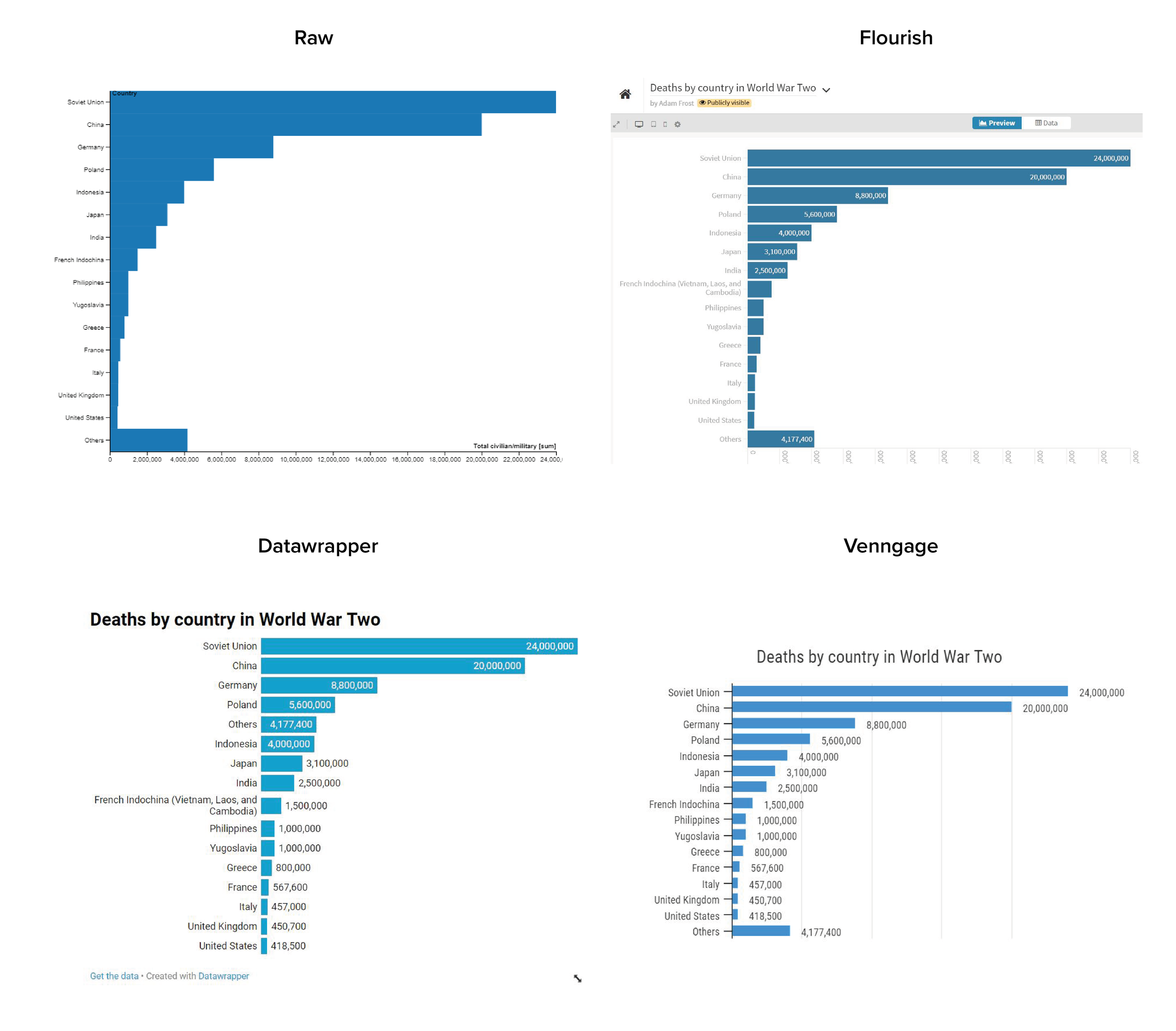
Image: Default bars in Raw, Flourish, Datawrapper, Venngage - as of 2nd May 2021.
Raw puts just 1 pixel of space between the bars; Flourish sets the default gap at 10% of the bar width; Datawrapper sets it at around 20%; Venngage is at the top end with a gap of around 50% of the bar width. Apart from in Datawrapper, you are able to change this default gap to whatever you want, but it’s interesting that these default charts - which many users will not bother to change - have such radically different designs.
So which is right? So much comes down to taste, but I think Datawrapper has it about right (they get most of their design decisions right, to be fair). 20% of bar width is a good starting point, and I'd say Venngage's 50% should be seen as a maximum. What you should always do is question the defaults. Don't just accept what your software prescribes. The space between your bars is a key part of how your audience experiences your story. (Just as the space between letters - the kerning - or between lines affects how they read text.)
We can see this most obviously in those instances where you might want one or more of your bars to be spaced out irregularly. Yes, most of your bars might have a gap of 15-30% bar width, but the story will work better if some don't.
(If you’re interested in the science behind these assumptions, then the Gestalt law of proximity is a good place to start).
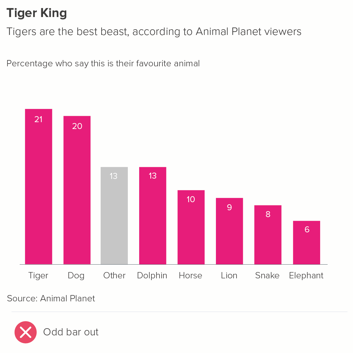
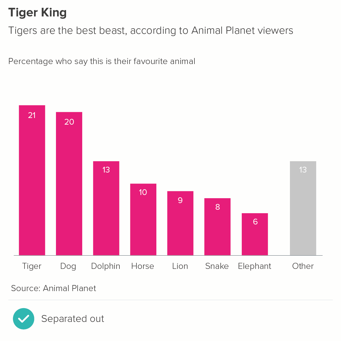
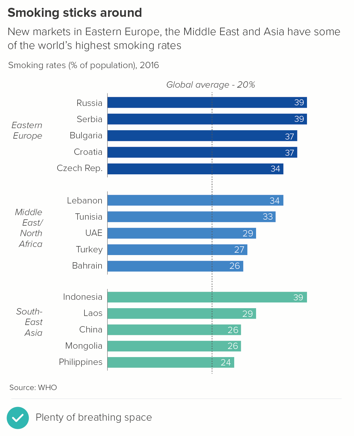
1. One of these bars is not like the others
Sometimes it makes sense to pull one of the bars away from the main group. You might want to signal this bar is different in some way: it represents 'other' categories, or 'don't knows' in a survey, or an average.
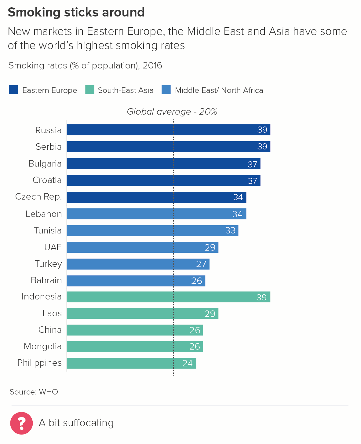
2. Some of these bars are not like the others
Although colour is the most common way of signalling that certain bars share characteristics, sometimes position can be used instead of (or as well as) colour to reinforce top-level groupings.
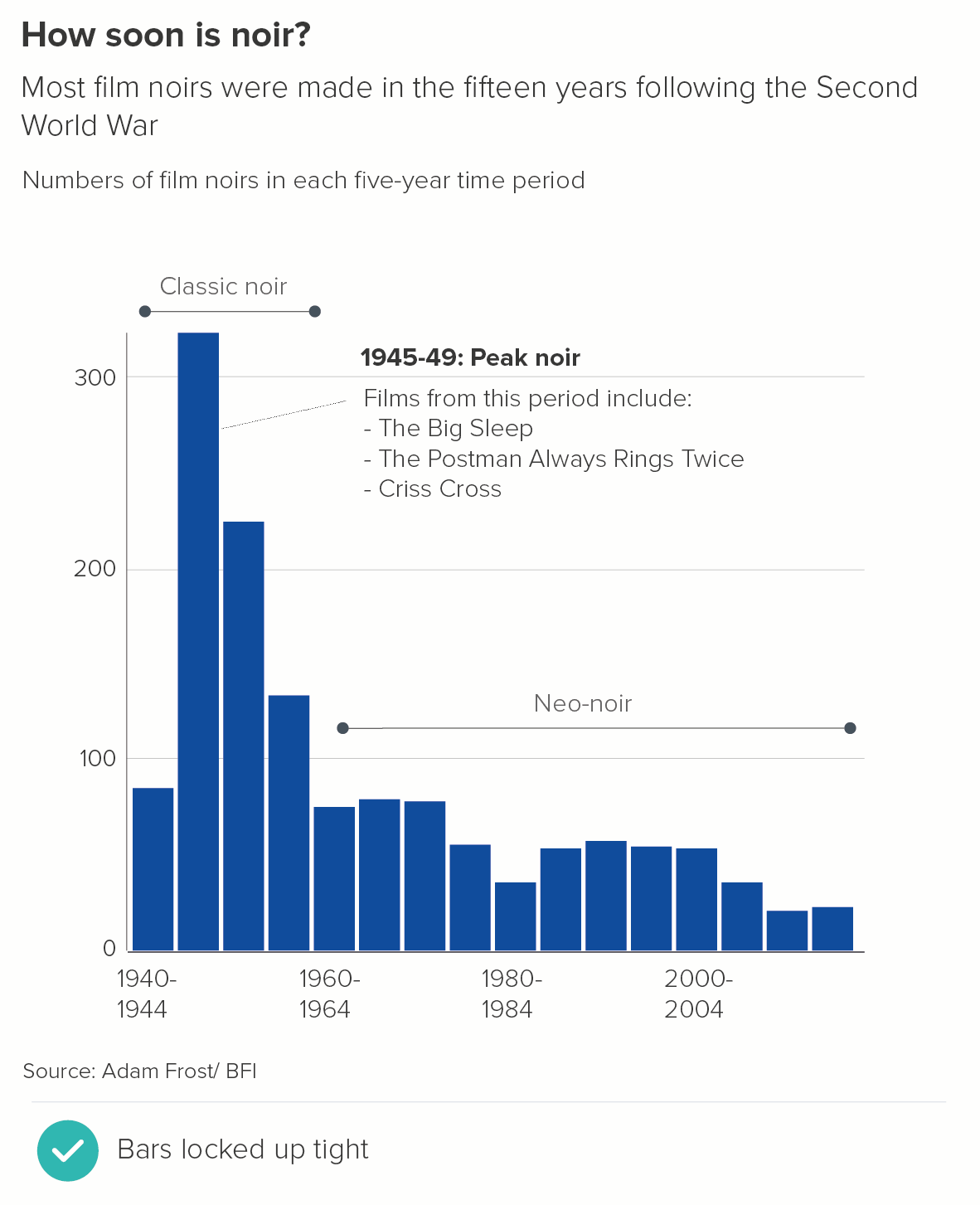
3. Distribution
In traditional histograms, no gap is left between the bars. But this can seriously confuse non-analysts. So when you are using a histogram to tell distribution stories, I would insert gaps between the bars. However, it can be a good idea to keep the gaps narrower than 20%, perhaps as low as 5%. It can help your audience to understand that this is a continuous, consecutive group of values and they are meant to stay in this order. Each bar is locked to its neighbour.
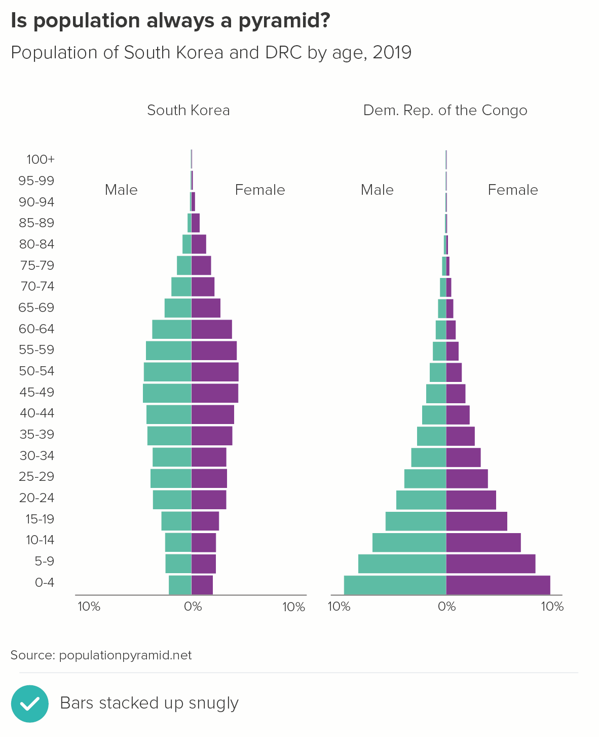
In the second chart, you can see one of the most common distribution charts, a population pyramid. Note how the small gap between the bars is vital to understanding it clearly (no gaps would just turn it into an ungainly Tetris shape). But note too that it is a narrower gap than you would usually find in a standard bar chart to emphasise the fixed, sequential nature of the age categories.
Conclusion
So those are the main exceptions. In all other cases, 20-40% is probably about right, and once you’ve set the width, keep it consistent across the chart and, if you have a series of charts, then keep the width consistent across the whole presentation. Nothing is more confusing than large jumps between bar widths from one slide to another - it makes the story look disconnected. If you treat the bars the same way, it’s clear that they are all part of the same story.
VERDICT: Keep this rule almost all of the time
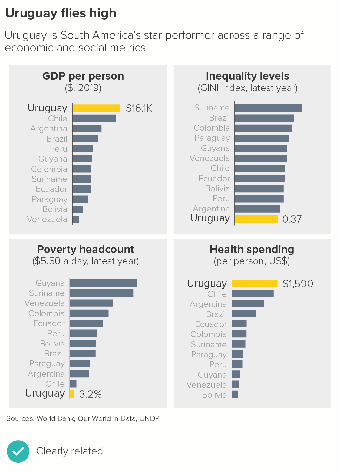
Data sources: World’s favourite animal - Animal Planet via Manchester Evening News, Smoking rates - World Bank, Film noirs - Adam Frost/BFI, Population pyramid data from populationpyramid.net, Uruguary dashboard - World Bank, UNDP via Our World in Data
More data viz advice and best practice examples in our book- Communicating with Data Visualisation: A Practical Guide