
In this blog series, we look at 99 common data viz rules and why it’s usually OK to break them. Here are all the rules so far.
by Adam Frost
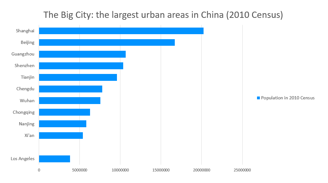
If you insert a regular bar chart in Powerpoint, you will get a default chart which looks something like this.
In Flourish, the default settings get you something like this.
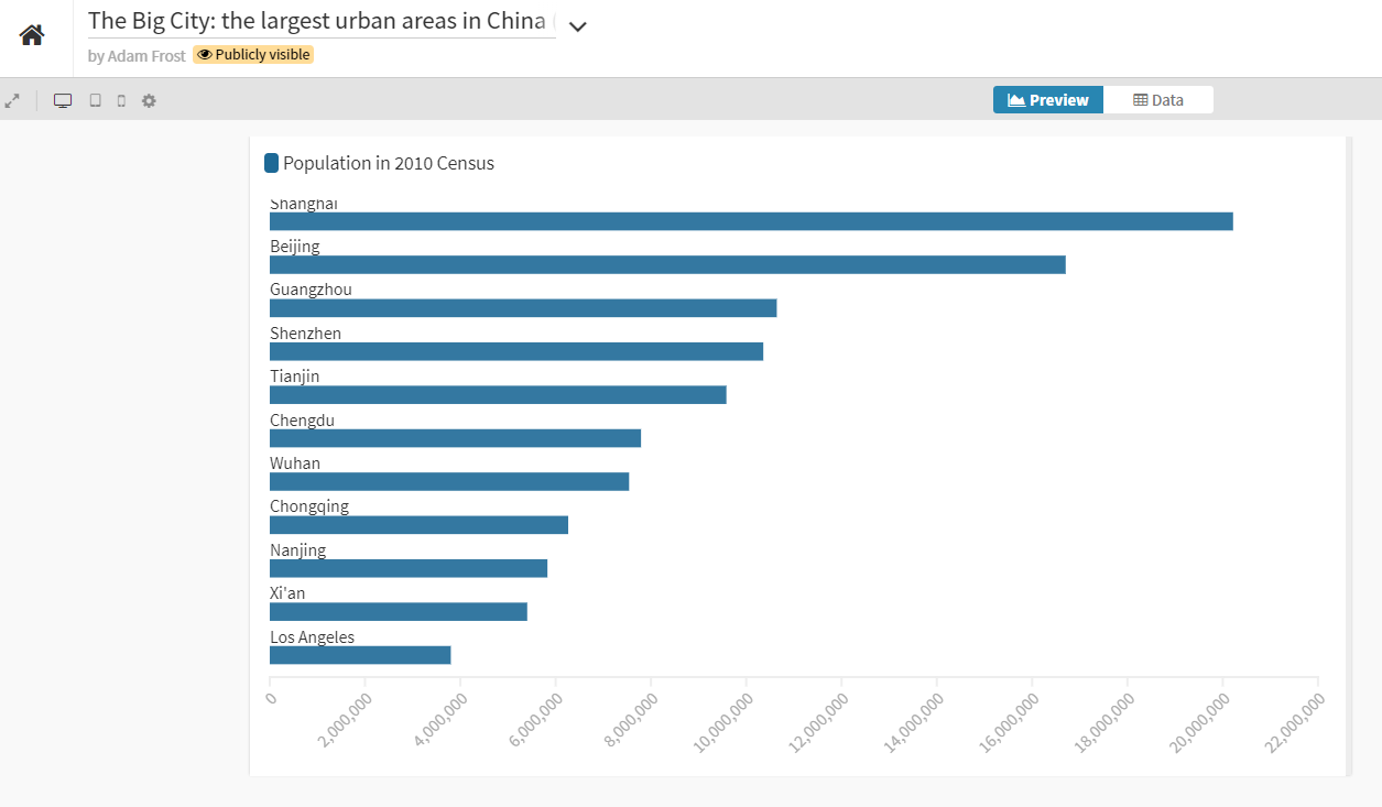
Look at how strange the key (or legend) looks in each case (‘Population in 2010 Census’). One obvious piece of guidance would be, if your key only has one entry, you probably don’t need it.
More obvious guidance: you only need to say things once - it’s an image, not a speech. So if your title makes it clear what the chart is showing, you don’t need to repeat it in a key, or in an axis label or in an annotation, or anywhere else. The repetition is confusing, because the information isn’t complex enough to need repeating, and the audience has to expend effort processing and discarding the duplicated material, which makes them annoyed. (Cognitive load theorists call this the ‘redundancy principle’).
In later rules, we will look at how clustered columns and stacked bars sometimes (but not always) need a key. But a regular bar chart - showing one series? Never.
Think back to Rule 9, where we saw that pie charts always work best when they are directly labelled. For a bar chart, this is doubly true, because to glean information, your eye already needs to rove across several key points on the image - title, x axis labels, y axis labels, x axis title, y axis title, data labels. Adding a key to this - a fifth zone - makes the process even more laborious.


The chart on the right strips the chart down to its essential elements. I removed the x-axis title and labels, the y-axis title, and a lot of the visual clutter. But the first thing I deleted was the key. All the other omissions are up for debate - after all, some audiences find gridlines useful, or like every axis to have a clear label. But no audience needs this chart to have a key, so out it goes.
VERDICT: Break this rule as often as you can.
Data: Chinese cities - citypopulation.de, Meat consumption - FAO via Our World in Data
More data viz advice and best practice examples in our book- Communicating with Data Visualisation: A Practical Guide