
In this blog series, we look at 99 common data viz rules and why it’s usually OK to break them. All the rules so far are on one page here.
by Adam Frost
As we saw in rule 6, arranging any chart from largest to smallest tends to make them more understandable.
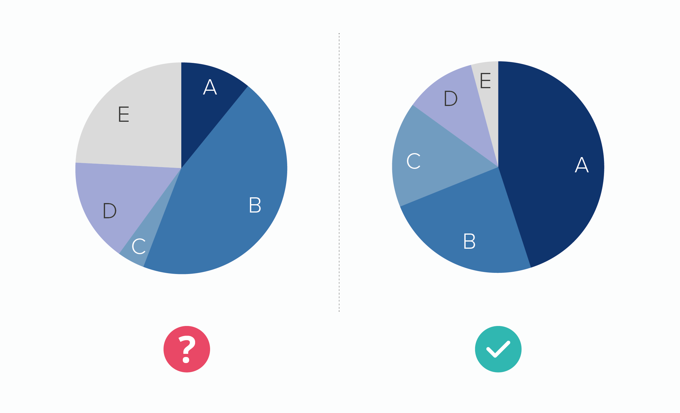
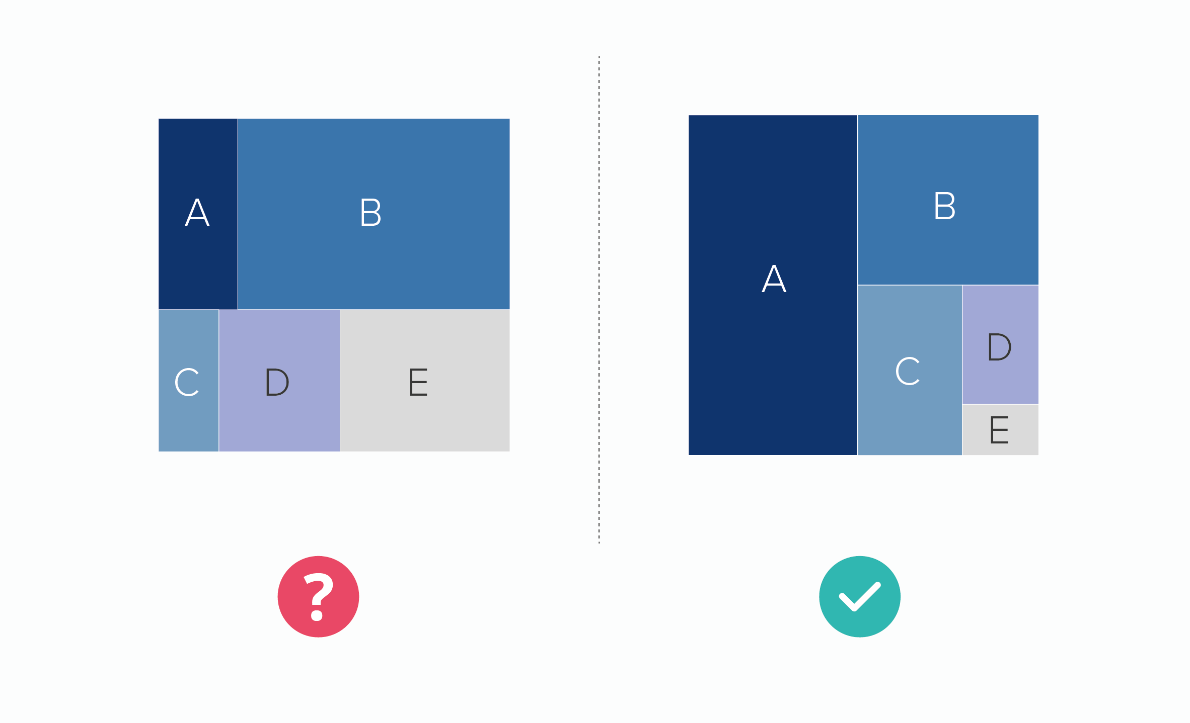
It makes them more interesting too. The essence of drama is conflict, and by emphasising the chart’s competitive element - who's best? who's next? who's worst? - you pique an audience’s interest.
Bar charts - especially horizontal bars - are particularly well-suited to ranking stories.
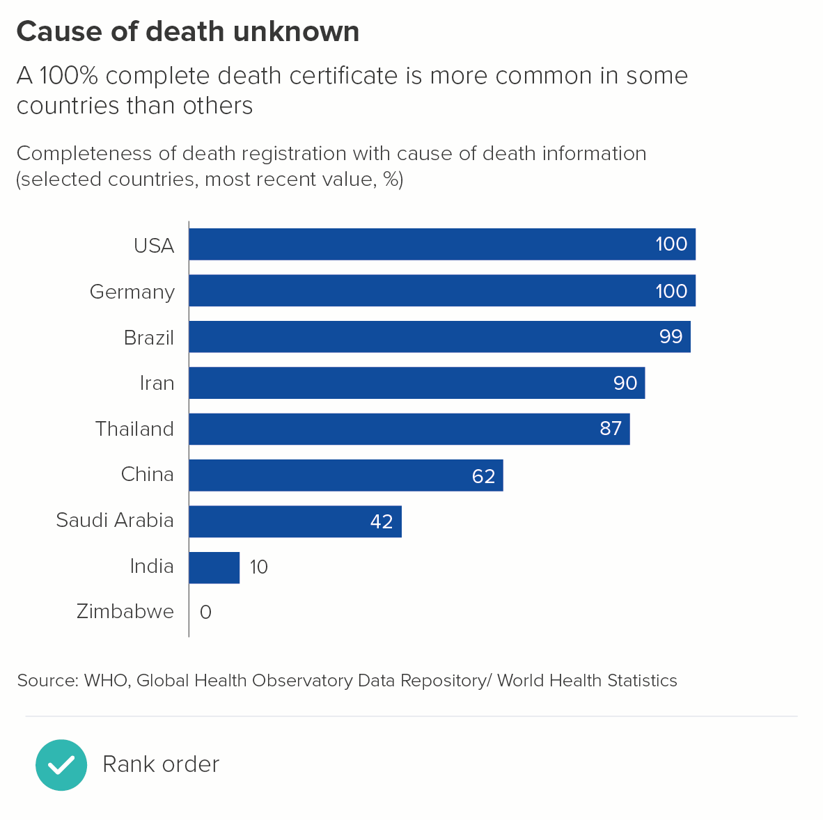
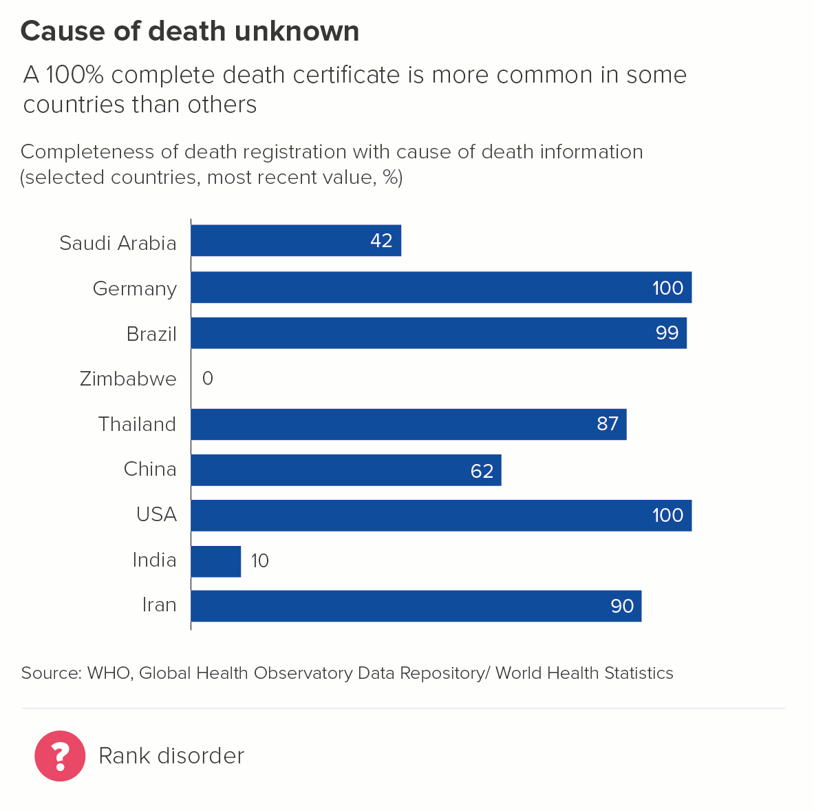
Notice how the first chart is more effective on a cognitive, narrative and aesthetic level.
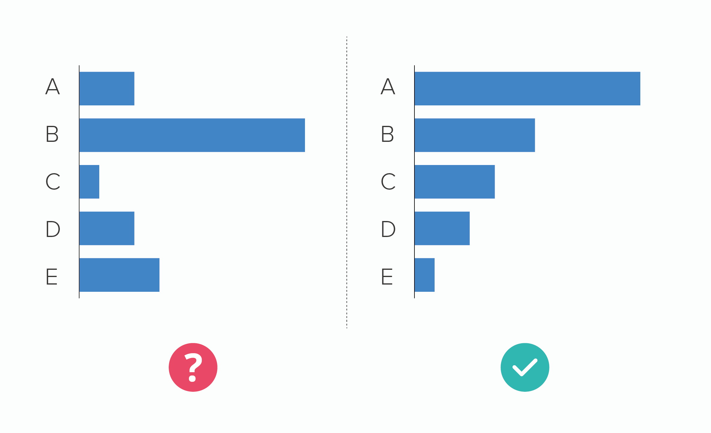
Vertical bars often benefit from placing the bars in rank order too, particularly if you have lots of bars with similar values. When similar-sized bars are spread across the chart, it’s hard to work out which is largest without holding a ruler up to the screen.
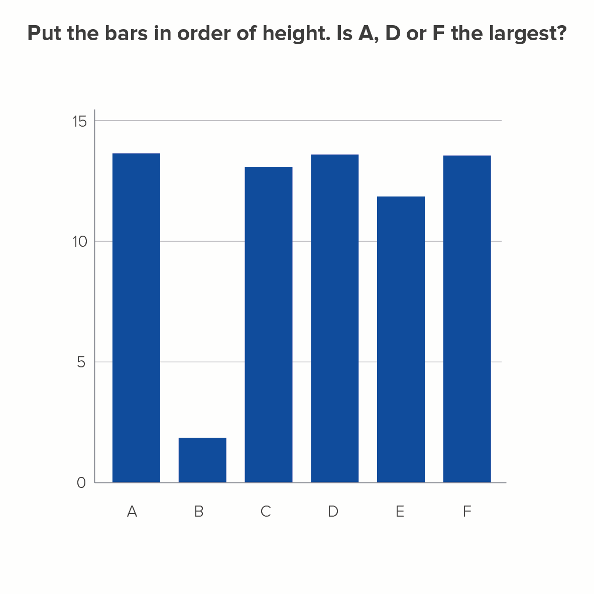
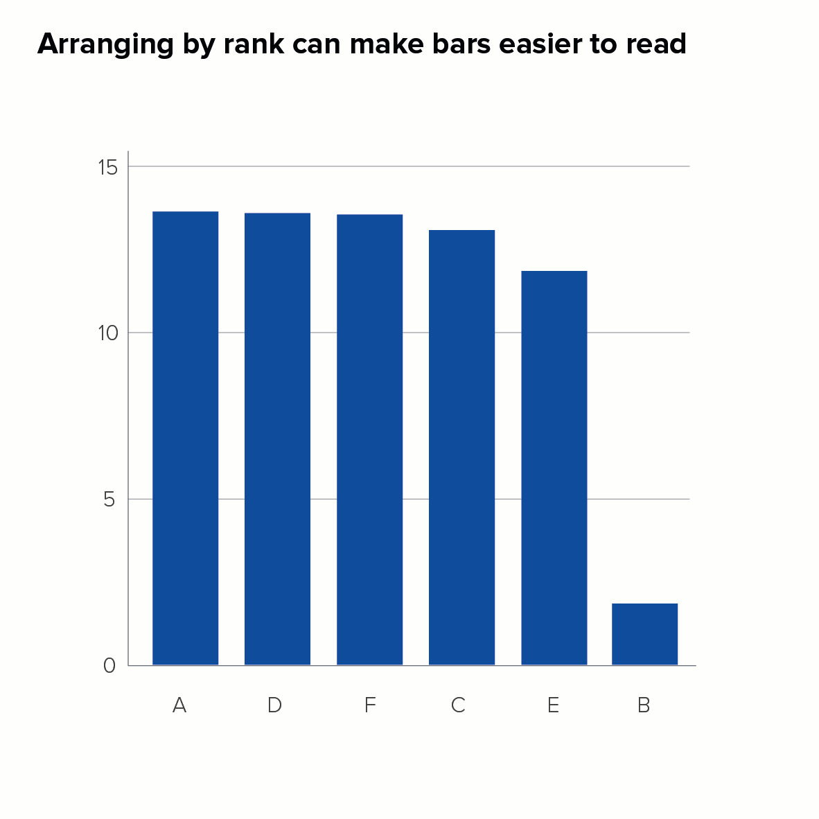
(Most people get it wrong and guess D is the largest. How did you do?)
Having said all of this, as we saw with pie charts in rule 6, there are some situations where arranging your bars from the largest to the smallest value is inappropriate for your story.
Let’s have a look at these exceptions now.
1. When you have an Other bar that is larger than the main bars
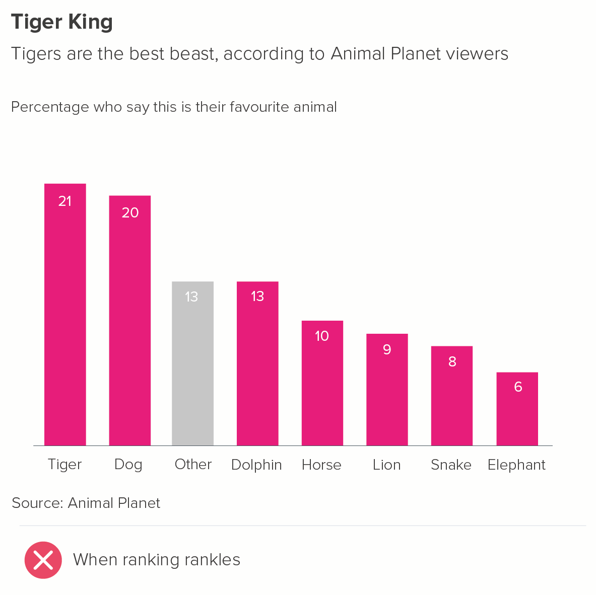
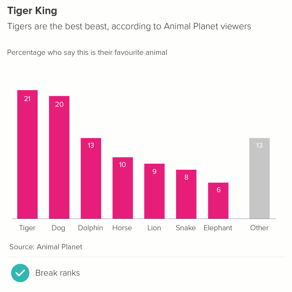
You tend to separate the ‘other’ bar from the ranked bars, and put it last.
2. Where your bars represent linked categories, e.g. days of the week
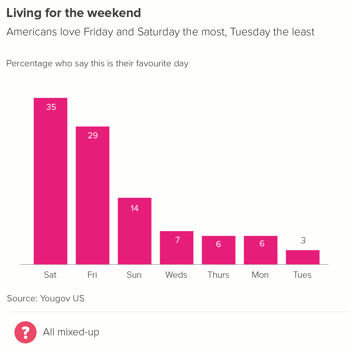
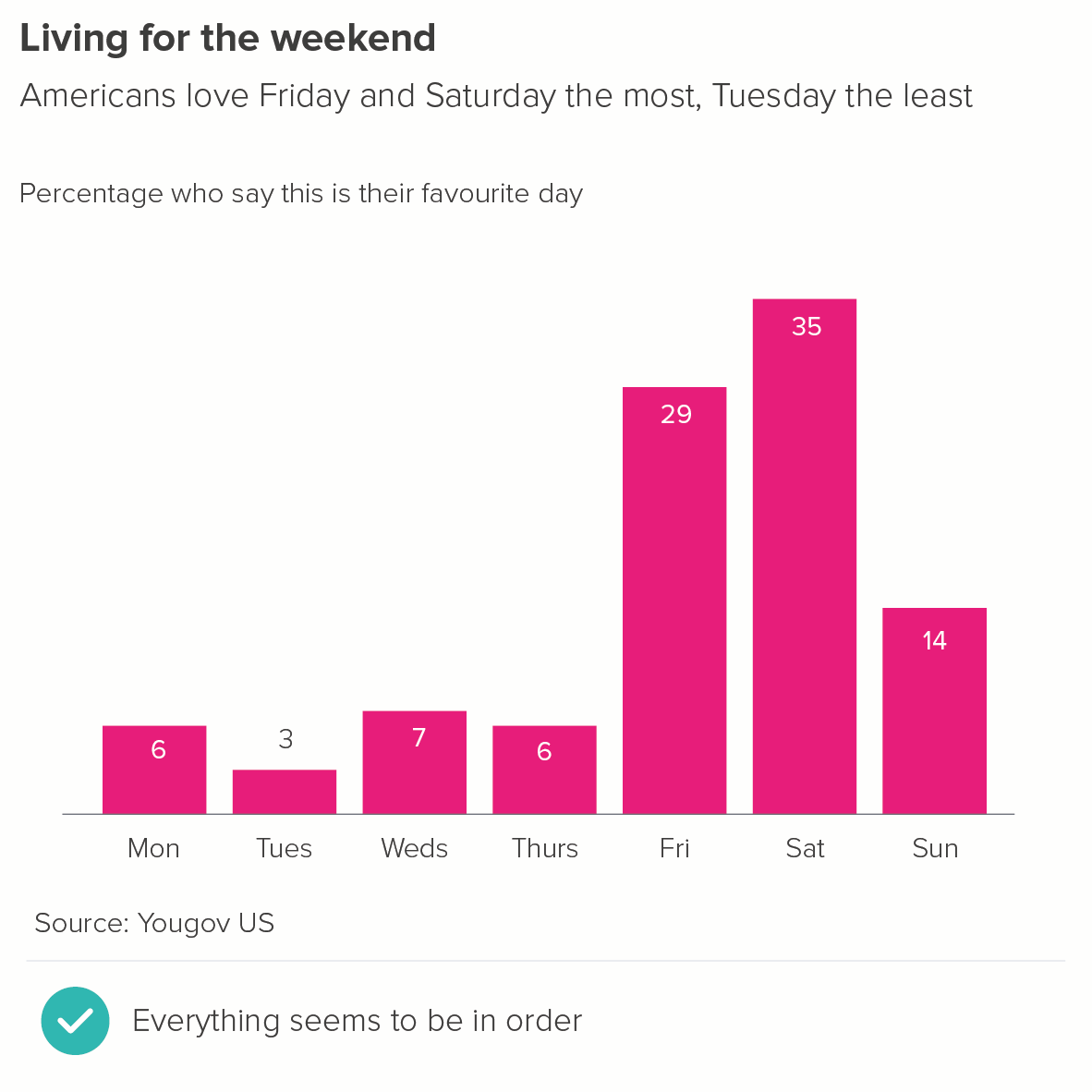
Change over time stories are the most obvious example of this - of course, you put hours of the day or months or years in order.
However, it can be any situation where your categories only make sense in a set order, for example, a restaurant breaking down average customer spend by starter, main meal, sides, dessert and coffee. You probably wouldn’t put the dessert bar first, even if it was the largest.
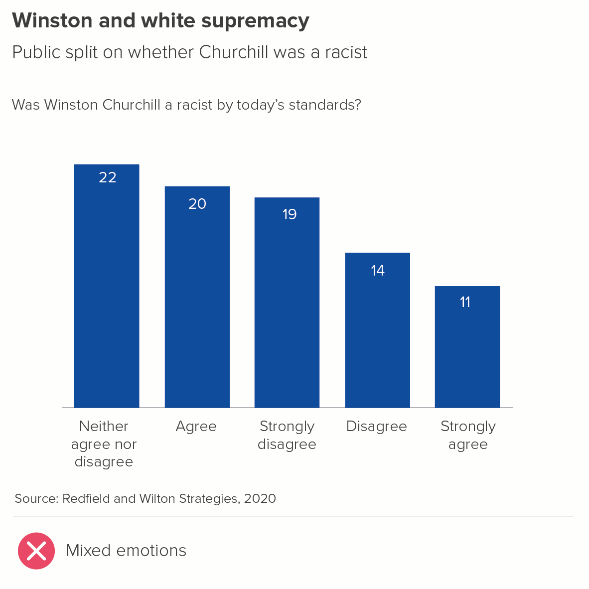
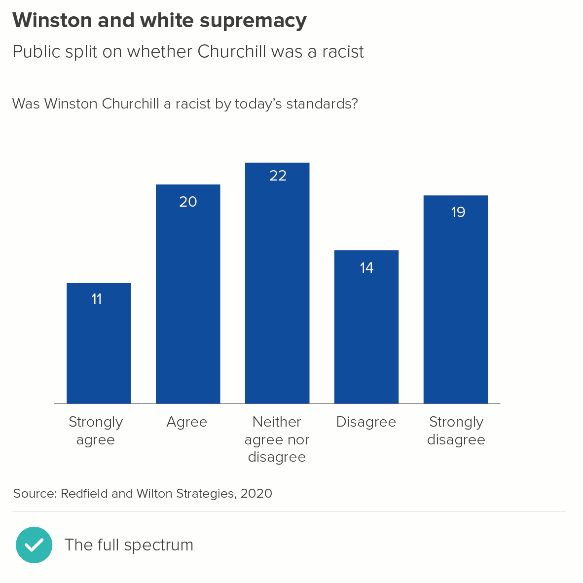
3. Where your bars represent a spectrum of opinion
4. Where your bars represent something spatial or geographical
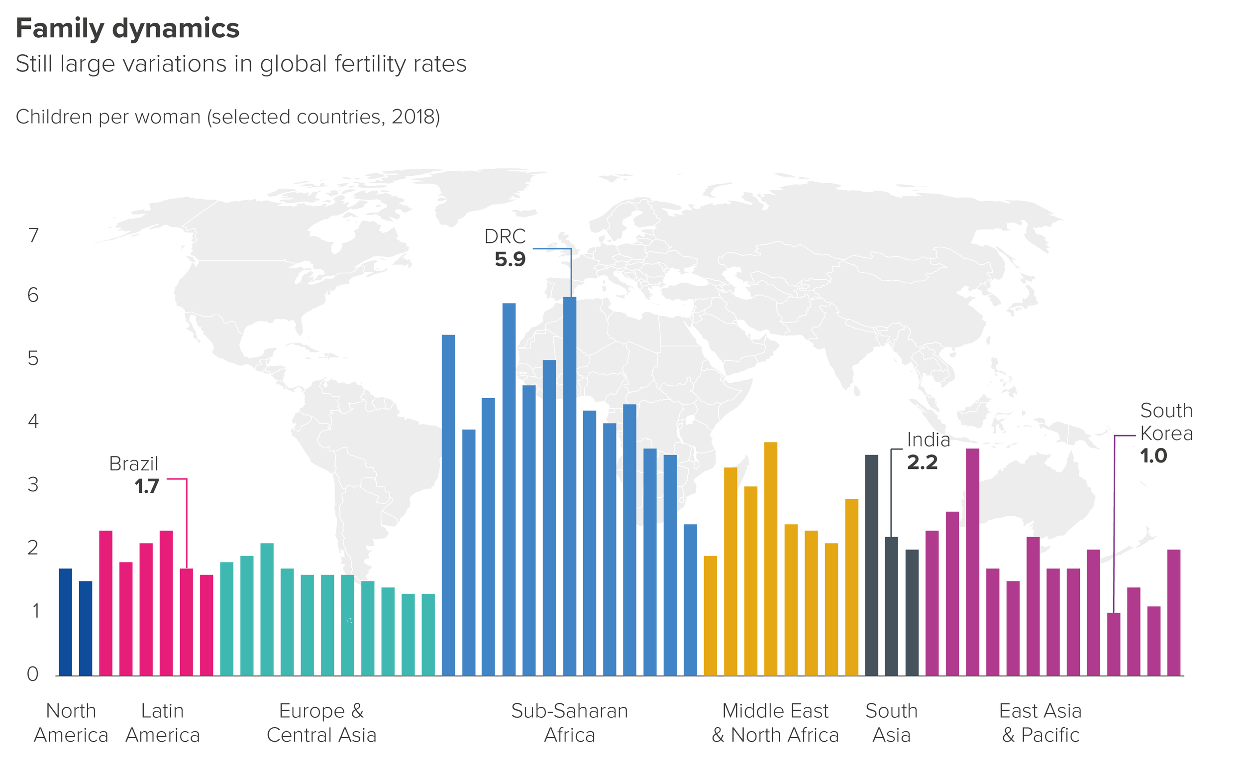
Based on an original design by Tobias Sturt
In this example, the bars are arranged roughly according to their position on a world map.
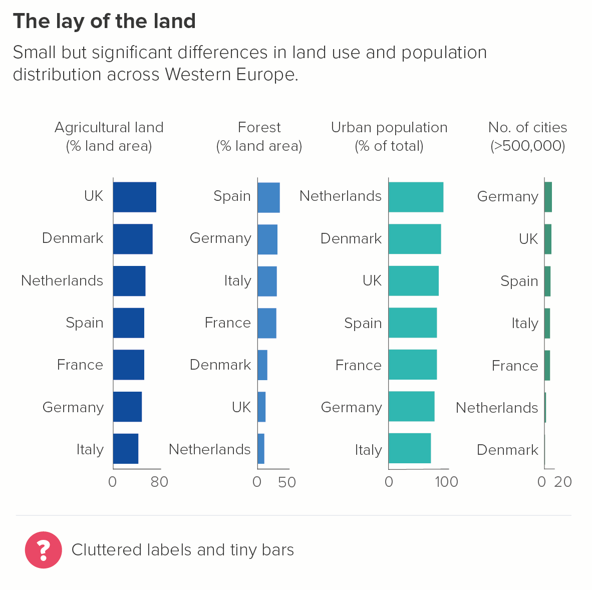
5. Where you want specific bars to stay in the same place across several charts
This is particularly the case in bar chart tables, where you want to put several measures side by side, and don’t want to keep shuffling the labels. In the second chart, it’s just neater to keep Denmark at the top throughout, for example.
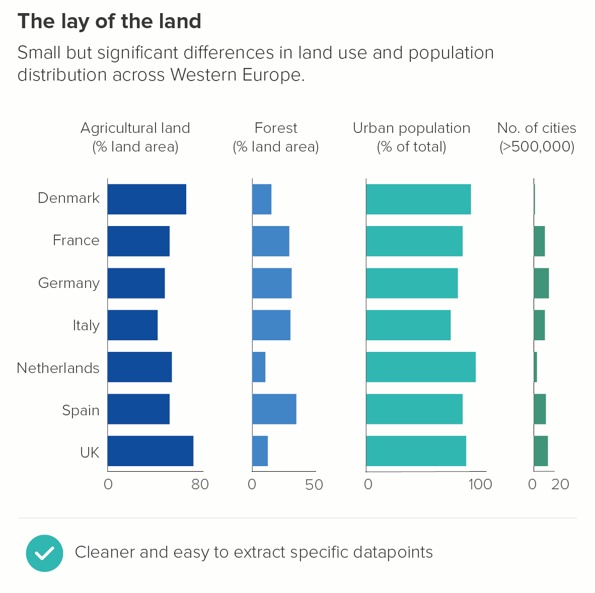
But it could also be a Powerpoint presentation, where you want to make it easy for your audience to track ‘their’ bar from one slide to another. So you might put their bar first in every chart.
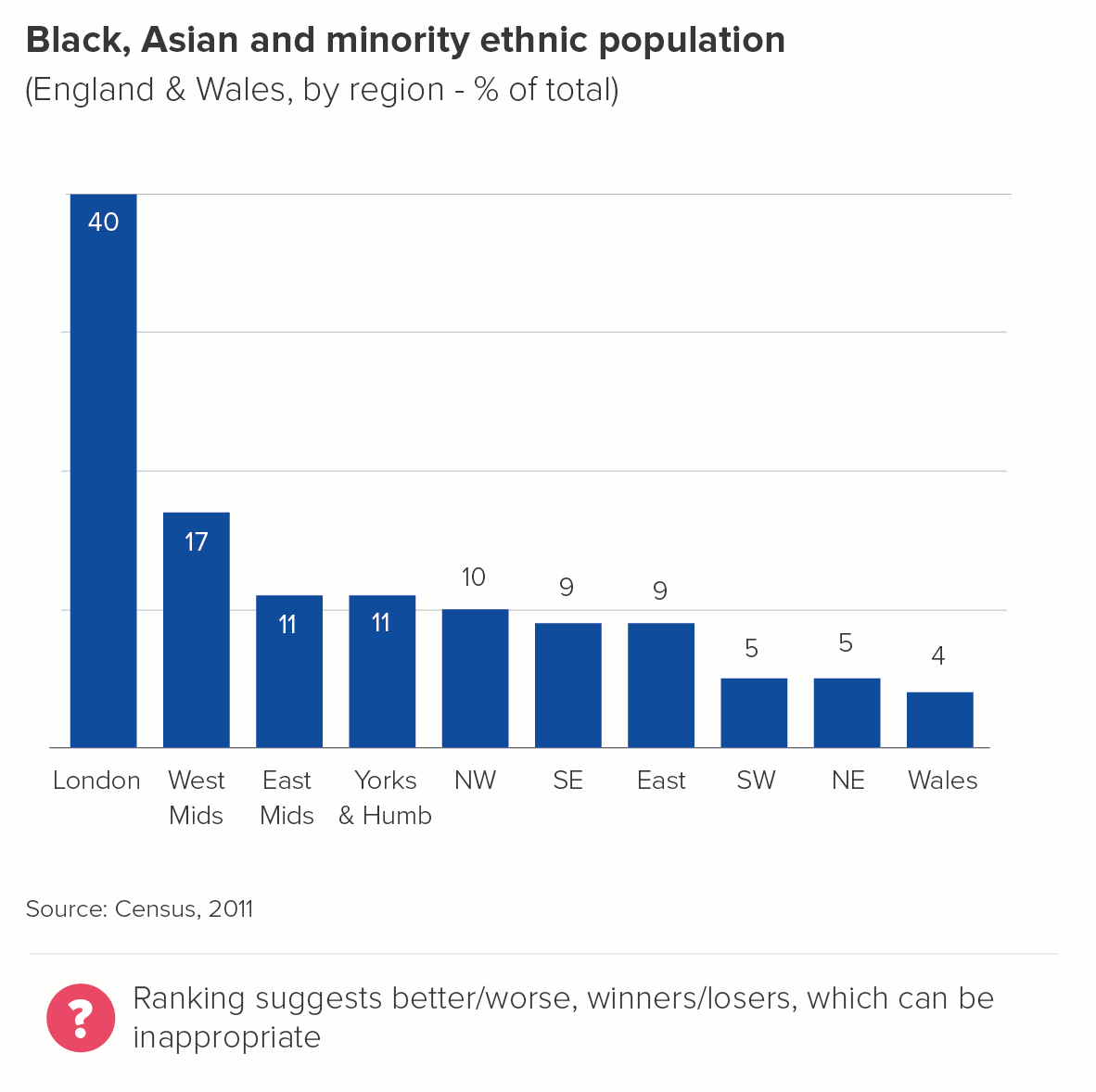
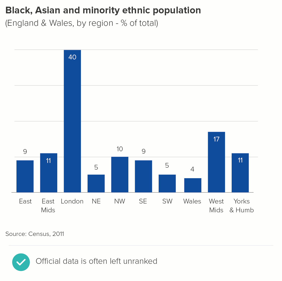
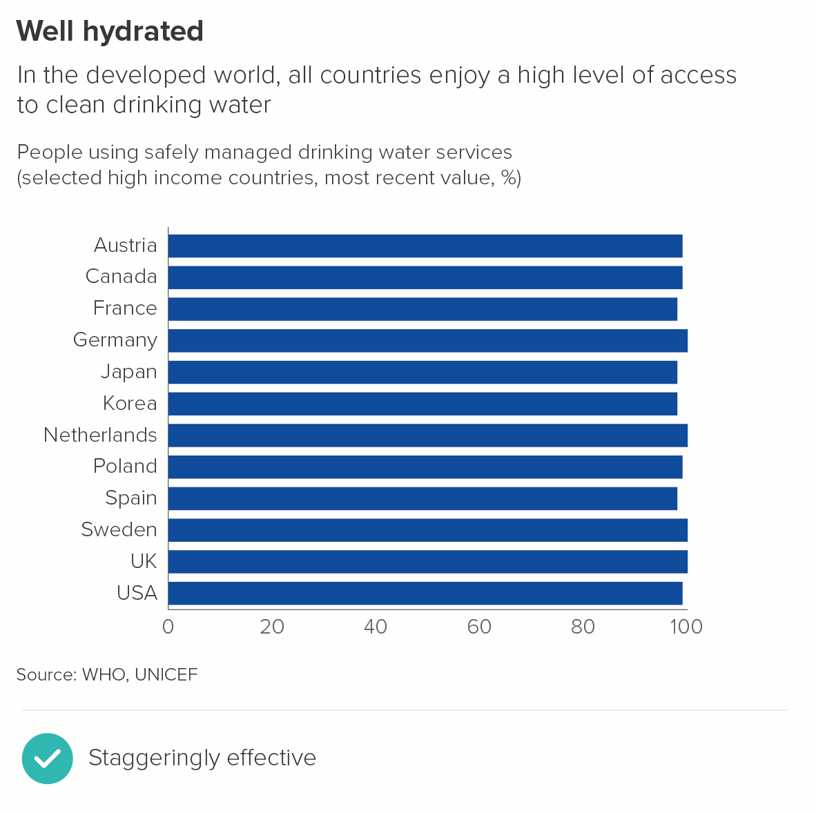
6. Where you don’t want to suggest that being the largest is better or worse
We often work with government departments, and they need to present neutral accounts of where money has been spent. The area that has required most funds isn’t always better or worse, it’s often just because it has a higher population.
Or perhaps it’s a metric where it’s critical that no value judgement is implied - say, percentage of the population that belongs to an ethnic minority, or the male-to-female ratio, or religious affiliation. There should be no suggestion of a ‘league table’ with these kinds of variables. Instead, alphabetical order is usually used.
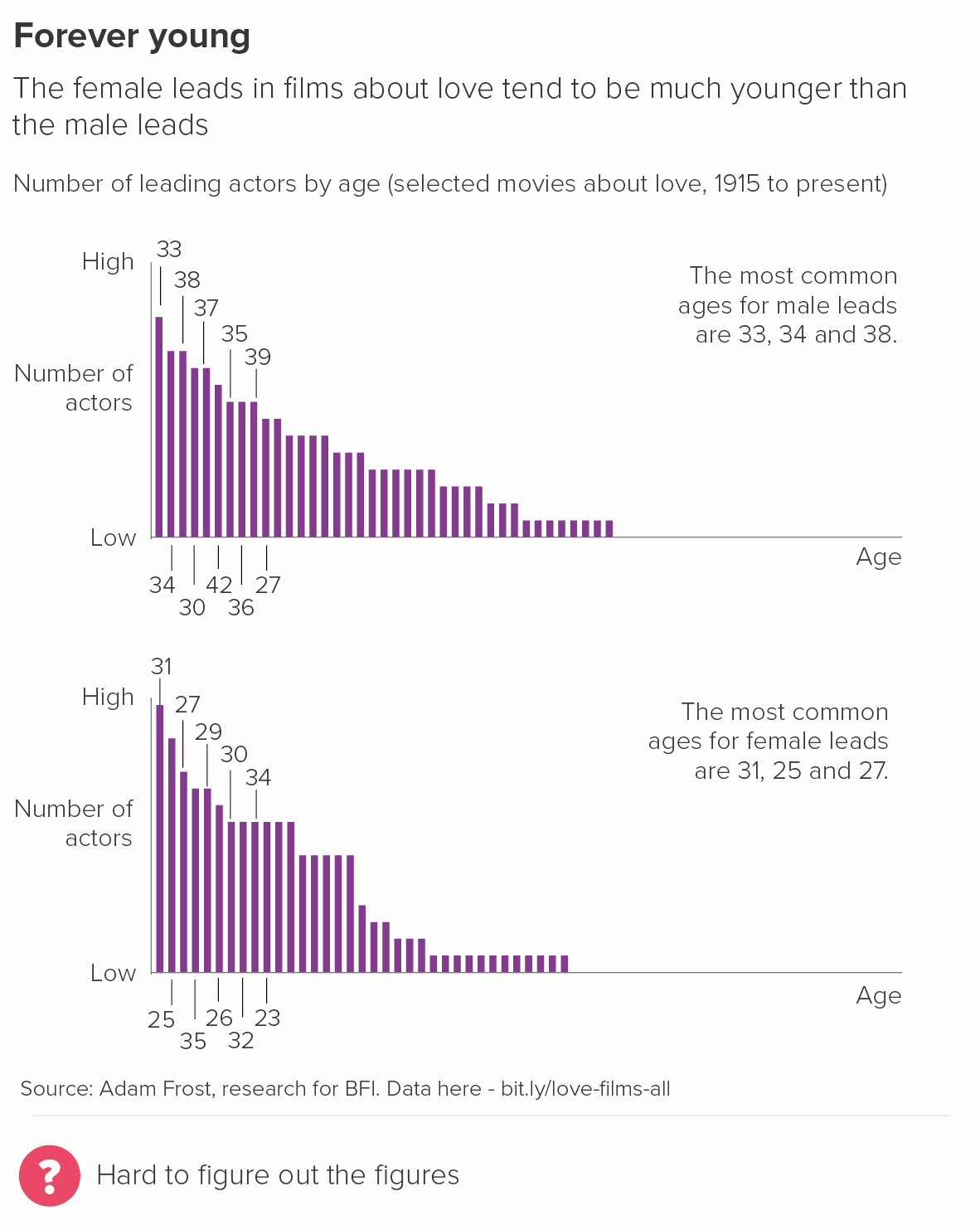
7. Where ranking looks silly
Where all your bars are basically the same length, or the differences are negligible, ranking can be counterproductive.
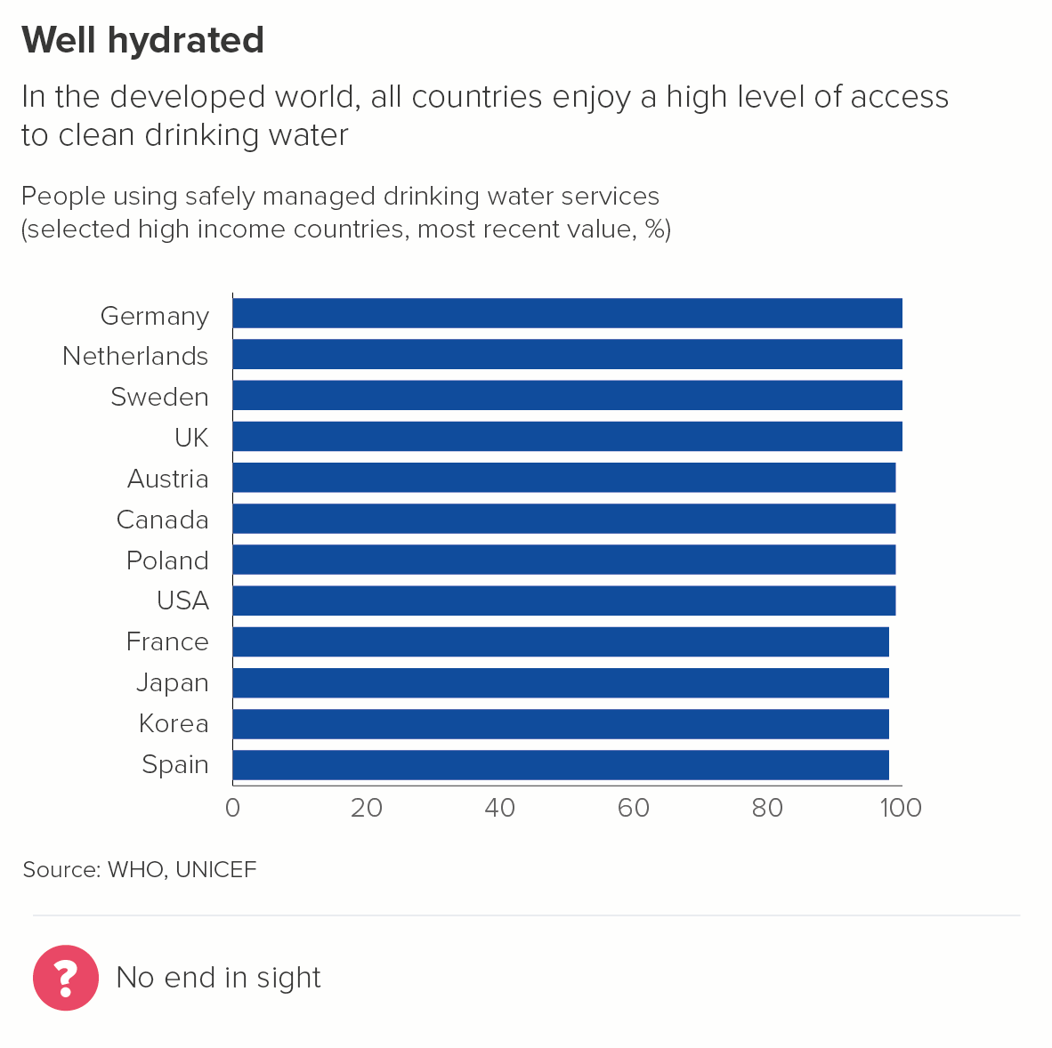
The first chart is much harder to read, all those bars merge and clump together. Your eyes play tricks with you: when do the values go down a notch and by how much?
In the second chart, where the countries are ranked alphabetically, the staggered bars are easier to distinguish, they are more aesthetically pleasing, and they convey the similarity story more effectively.
8. Where you are charting distribution
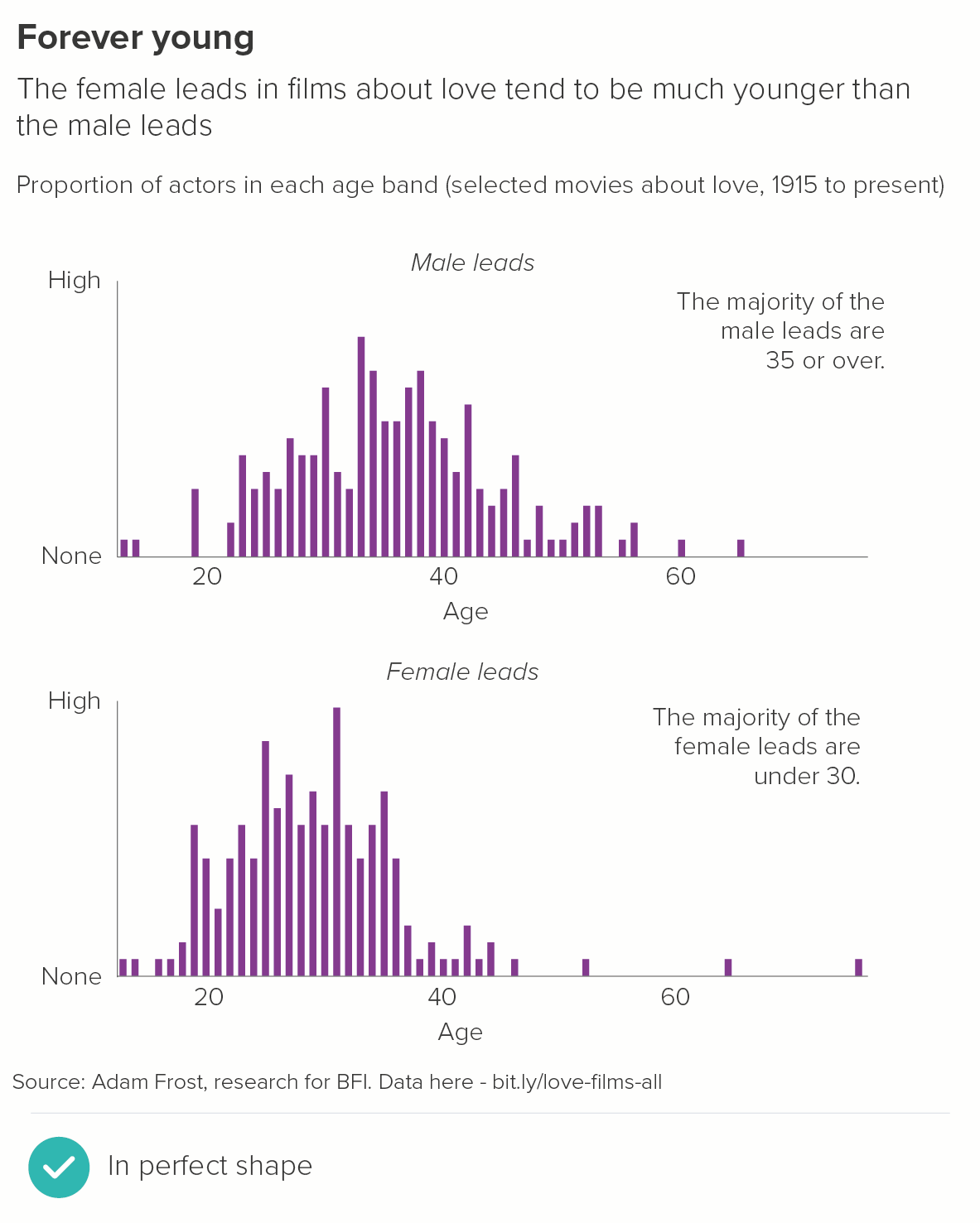
The clue is in the name: you’re showing how the data is distributed, its shape, its spread. Ranking imposes a shape from outside. (This type of bar chart is sometimes called a histogram and we’ll consider it separately in a later rule).
Conclusion
I’d still say that for the majority of stories, using rank order is the right approach. Typically you use a bar chart because you want to give your audience an overview of a dataset, but also the ability to compare the differences between individual values. Ranking the bars from largest to smallest helps deliver both outcomes.
However, as always, story comes first. If ranking confuses your key message, and disrupts a more intuitive system of ordering, then it’s completely fine to mix things up.
Verdict: Break this rule sometimes
Data sources: Cause of death on death certificate - WHO/Global Health Data Repository via World Bank, World’s favourite animal - Animal Planet via Manchester Evening News, Americans’ favourite day of the week via Yougov US, Was Churchill a racist? via Redfield and Wilton, Global fertility rates - UN Population Division and national statistics offices via World Bank, BAME data via UK Census 2011/Gov.uk, Access to clean drinking water from UNICEF/WHO via World Bank, Gender of actors in romantic films via Adam Frost - data is here.
All the rules so far are on one page here.
More data viz advice and best practice examples in our book- Communicating with Data Visualisation: A Practical Guide