
In this blog series, we look at 99 common data viz rules and why it’s usually OK to break them. All the rules so far.
by Adam Frost
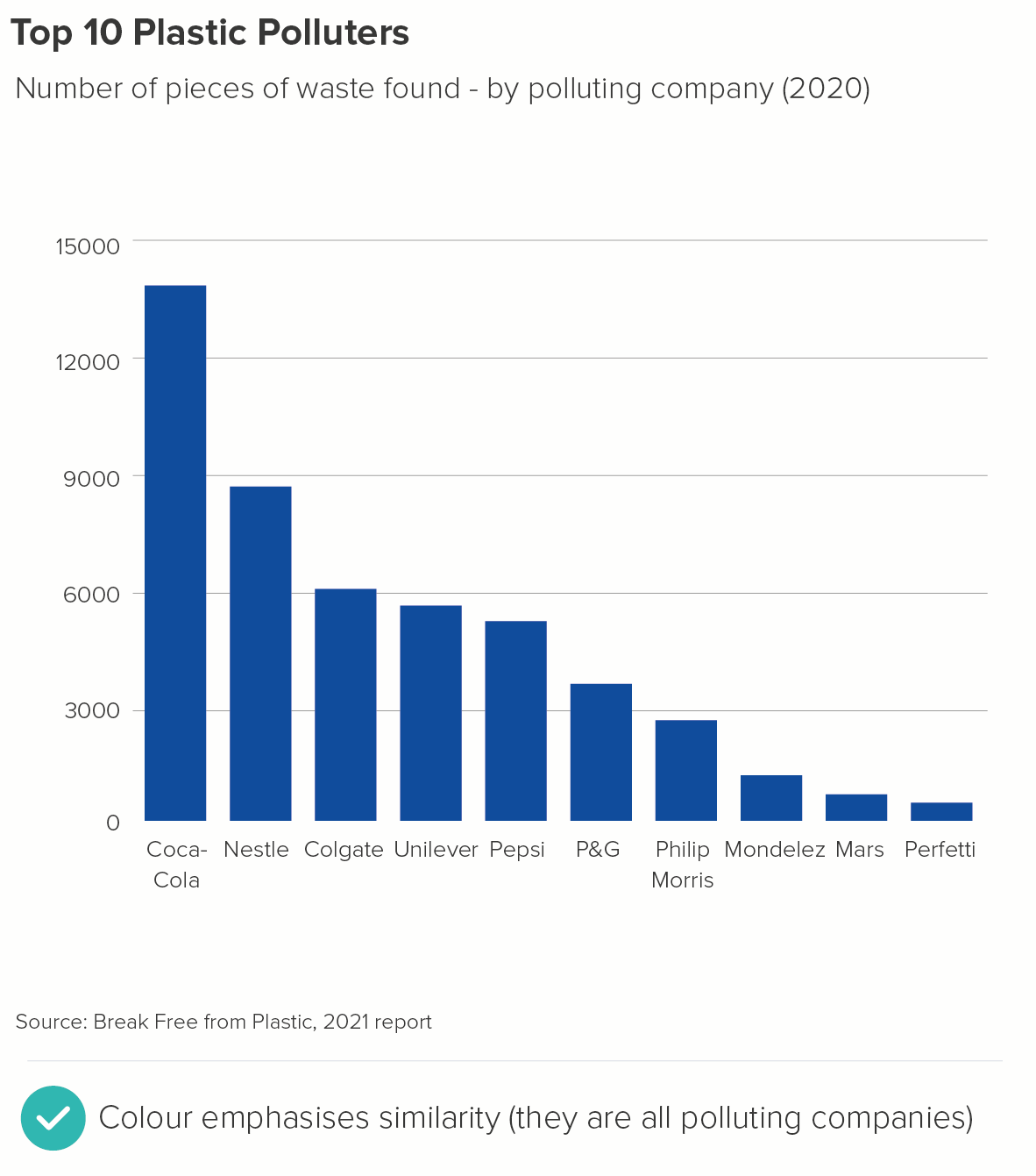
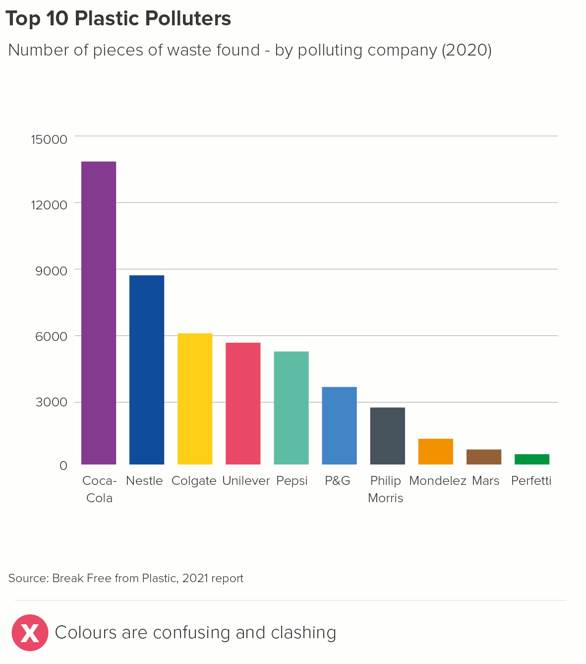
In most chart-making tools, if you make a bar chart, all the bars will be given a single colour. Whether it’s PowerPoint, Datawrapper, Flourish or something else, the eminently sensible consensus is: if it’s one series, it should be one colour.
Of course, it’s different if you have stacked bars or clustered bars, but we’ll cover those in later rules.
So far, so good. The data is about the same thing, so the colour should be the same.
The problem is, a Powerpoint presentation full of single-colour bars gets - quite literally - monotonous. So although you shouldn’t go full Austin Powers, it’s still a good idea to work out when you can brighten up your bars. As always, the guiding principle should be: does this illuminate the story?
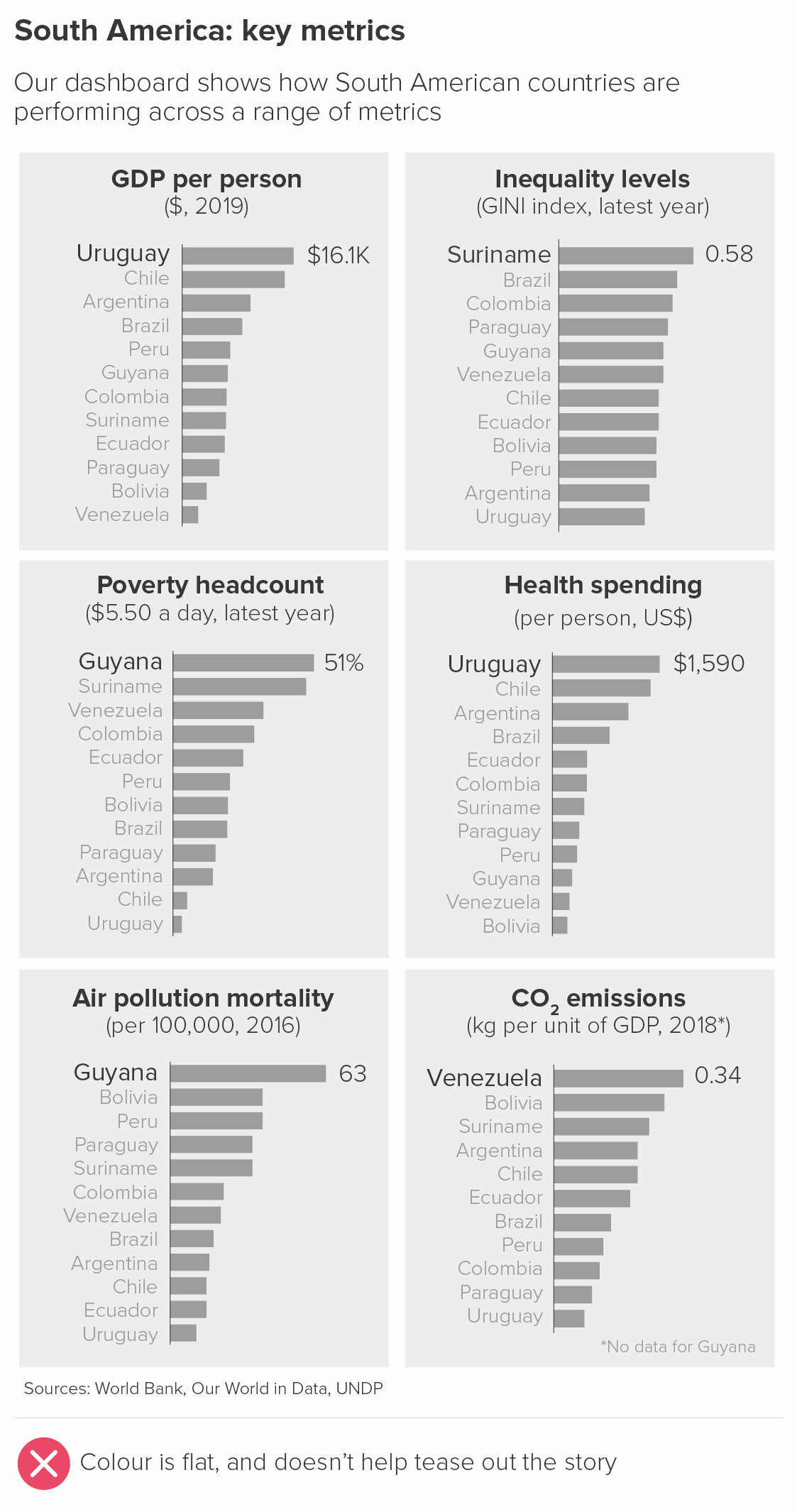
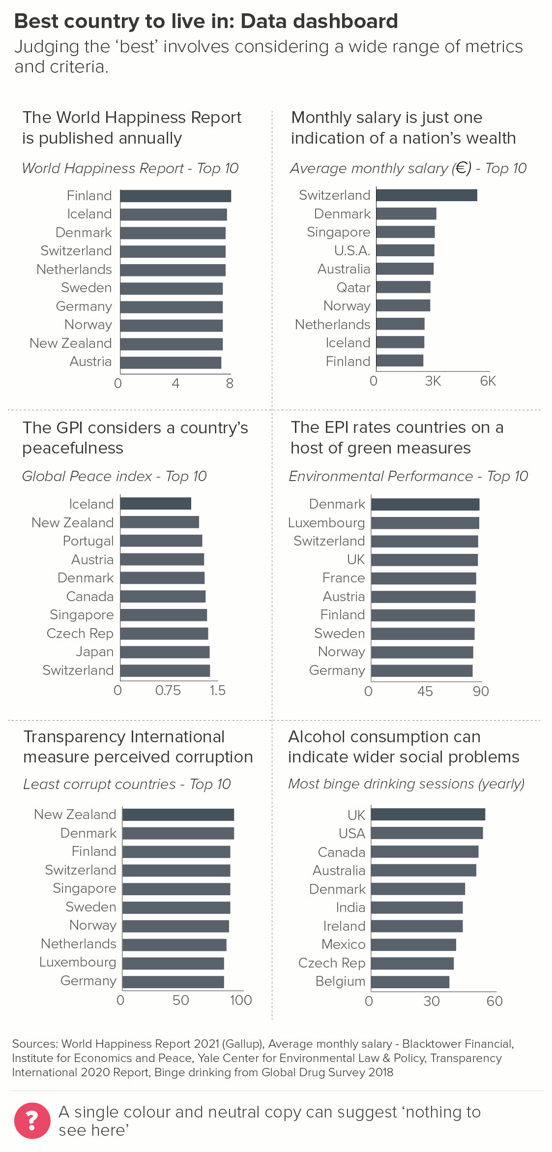
1. Single colour bars
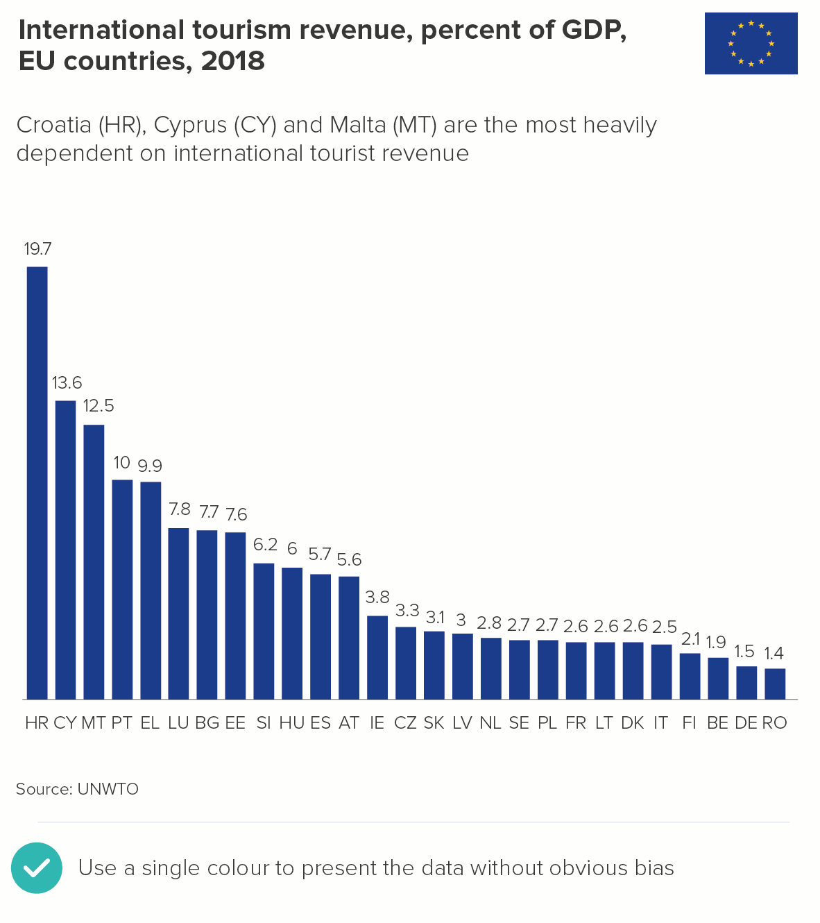
In many cases, one colour is definitely the right answer. You might be an organisation that wishes to appear as impartial as possible, with no strong view about the categories or countries shown. For example, say you work for the EU, it might be very important for all the countries to be treated equally from a visual perspective, and no value judgements to be implied by colour choices (e.g. red, amber, green).
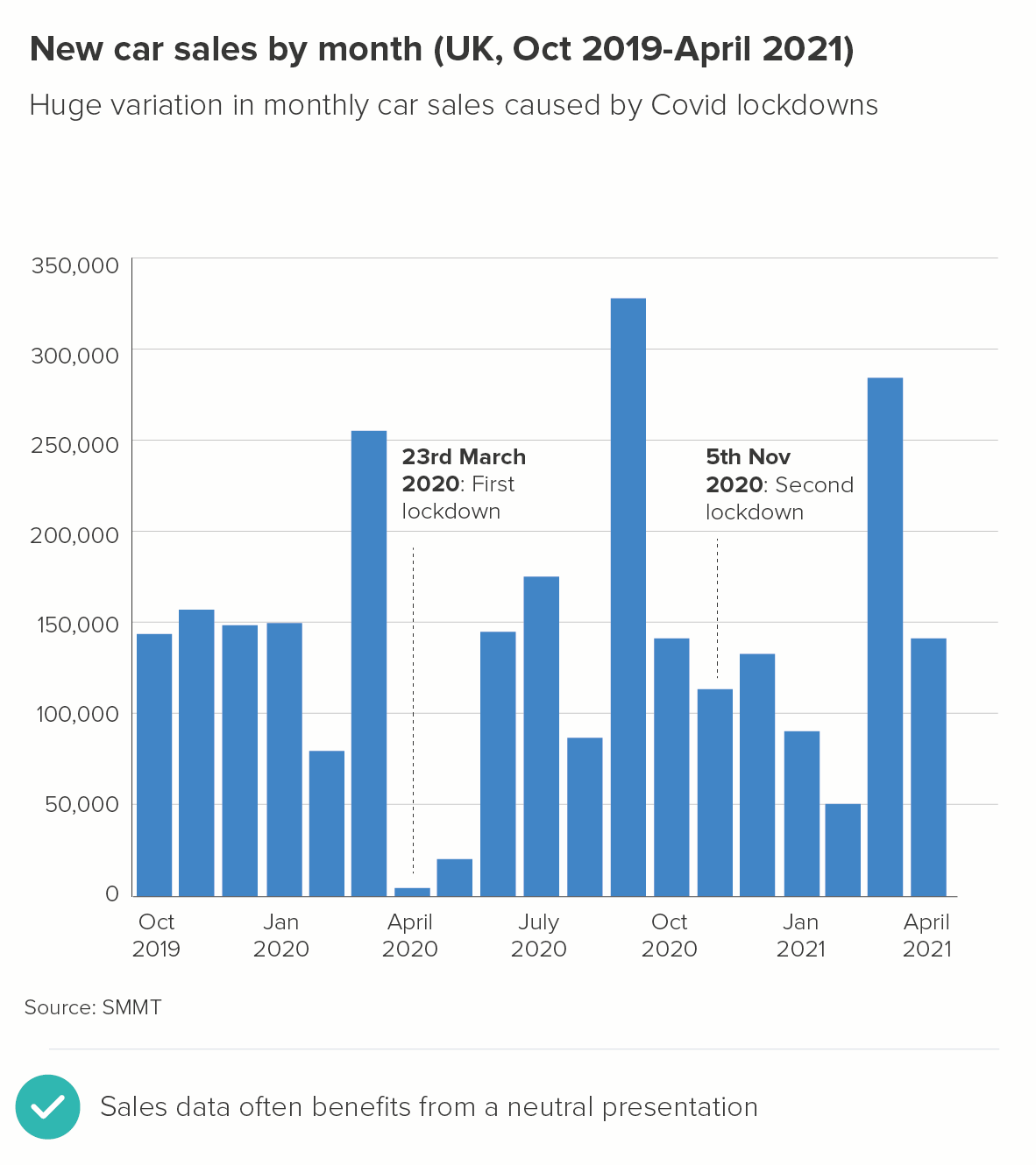
Alternatively, you might work for an organisation where all the categories genuinely are equal in significance. For example, you might be reporting monthly sales figures for the last few years. You don’t want to use colours to distinguish between the bars; they’re all equally relevant.
When you have these stories, use one of your brand colours for the bars, usually your main brand colour. If you don’t have brand guidelines, blue is often a good choice for neutral stories, just because it’s a cooler, less invasive colour. (As opposed to reds and yellows).
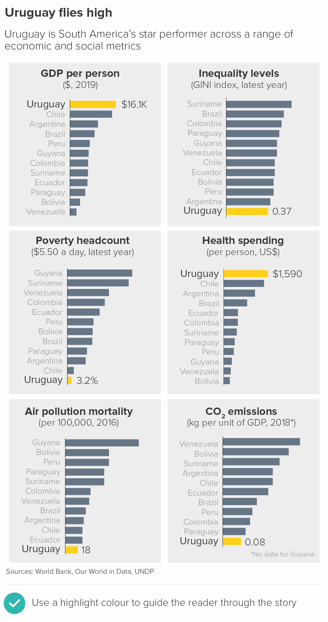
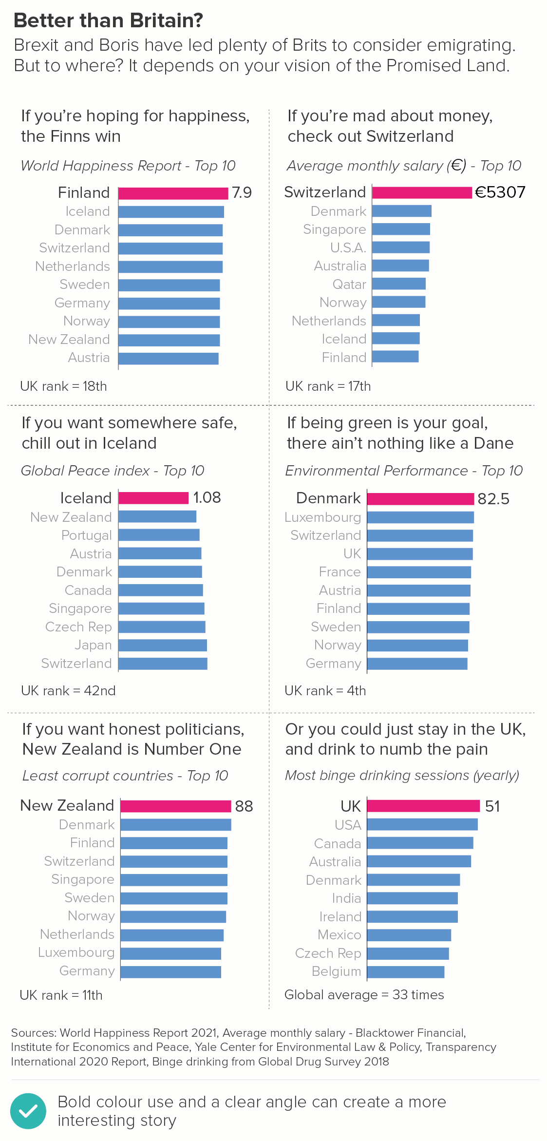
2. Highlighting: The hero bar
If you are talking to an audience in a specific company or country, then they will always be looking for ‘their’ bar anyway, so if you can speed up this process with your colour choices, so much the better.
Alternatively, it might be a story about a hero category that you want your audience to care about for the duration of the story. It might not be ‘their’ bar, but you want them to feel like it is. So again, you will use a highlight colour to indicate that this should be their primary focus.
Keep all of the bars but their one a neutral colour (perhaps blue, or sometimes even grey). Brand guidelines often contain a highlight colour that sets off the main brand colour. If they don’t, you’re looking for a colour that offers a high degree of contrast to your other bars, without being fully complementary. (If you choose complementary colours - like red and green, or purple and yellow - the contrast might be too violent). Using triads - moving in thirds around the colour wheel - can sometimes be more sensible, as it will give you colours that are distinct without being clashing. So perhaps blue bars with a pink highlight colour, or light green bars with an orange highlight. Your background bars will always be the cool, recessive colour, your highlight bar the warm colour.
3. Highlight: The winning bar
You can also use the principles above to call out the winning bar. This is when your audience is not invested in a particular category or country, but they are invested in the topic. They don’t care who wins or loses, but they’re interested in who the top performers are.
They could be investors, who are following the fortunes of companies in a particular sector. Or perhaps it is a newspaper based in a particular country reporting on countries in a different part of the world - say, a US newspaper reporting on Europe. Their US-based audience doesn’t have strong feelings about whether France or the UK or Italy ‘wins’, but it’s a more dramatic story if you add a competitive element.
4. Performance against a benchmark
Often you will want to add a benchmark to your chart - usually an average. Only sometimes is this the highlight of the chart, however, and therefore you will often want to make it grey or a similarly muted colour. Sometimes instead of a bar, a coloured line cutting across the bars is used (You need one or the other, never both).
Alternatively you might want to colour the bars depending on where they sit against this average. Are they above or below it?
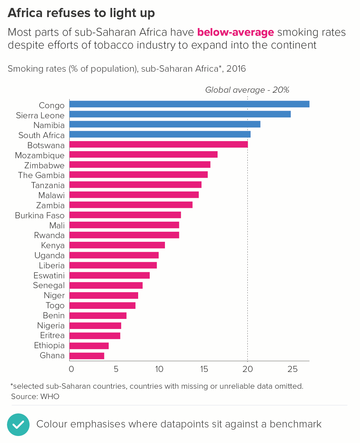
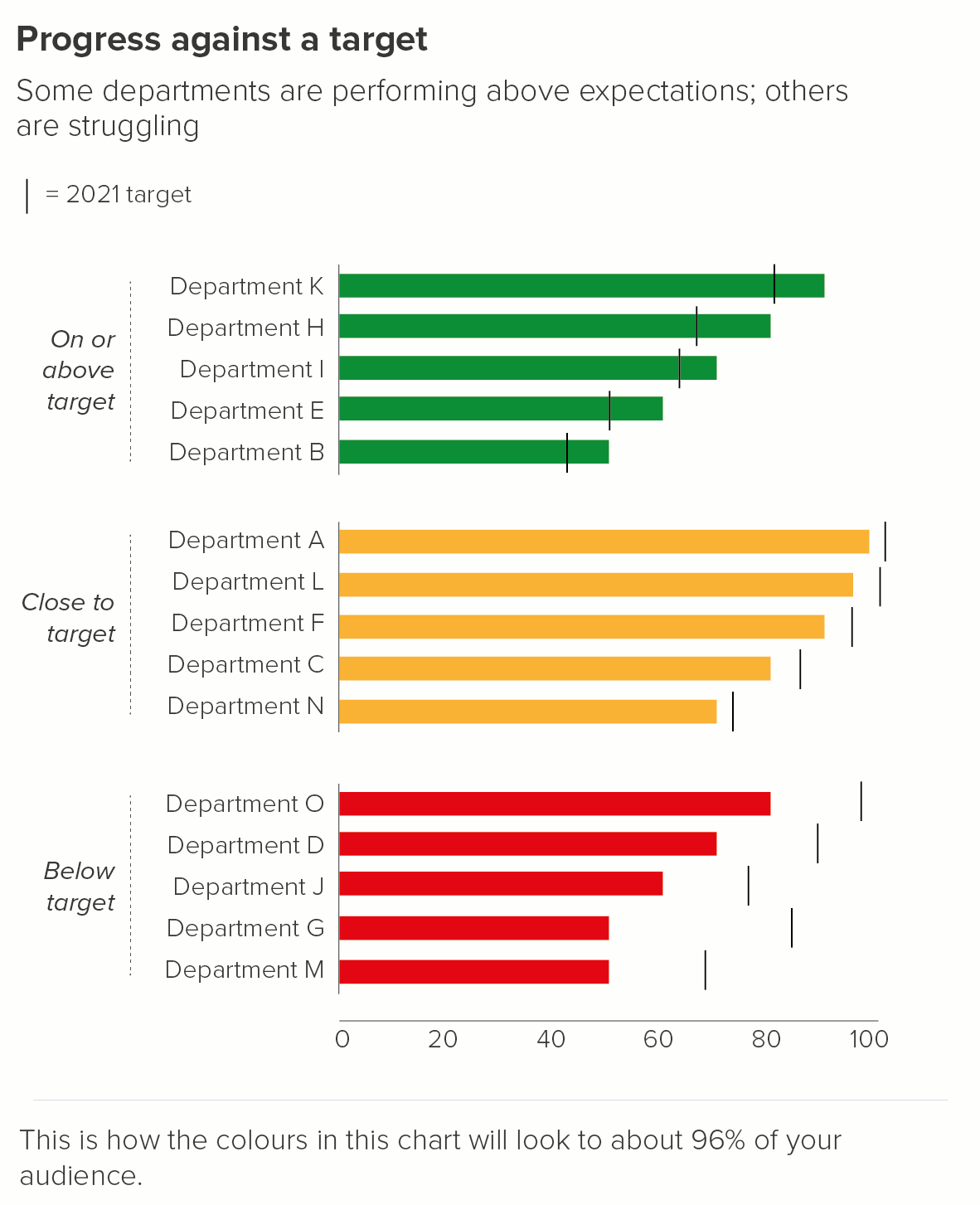
If you are measuring against a target, sometimes traffic-light or RAG scales are used. Most designers hate RAG scales, because they clash violently and break accessibility rules, particularly those that relate to colourblind-safe palettes. However I've seen no evidence that they're on the way out; on the contrary, managers appear to be more wedded to them than ever.
If you do have to use a RAG scale, I prefer grouping the bars by these top-level indicators, rather than jumbling them up in a single chart. (This tends to be corporate data, so it’s anonymised in this instance).
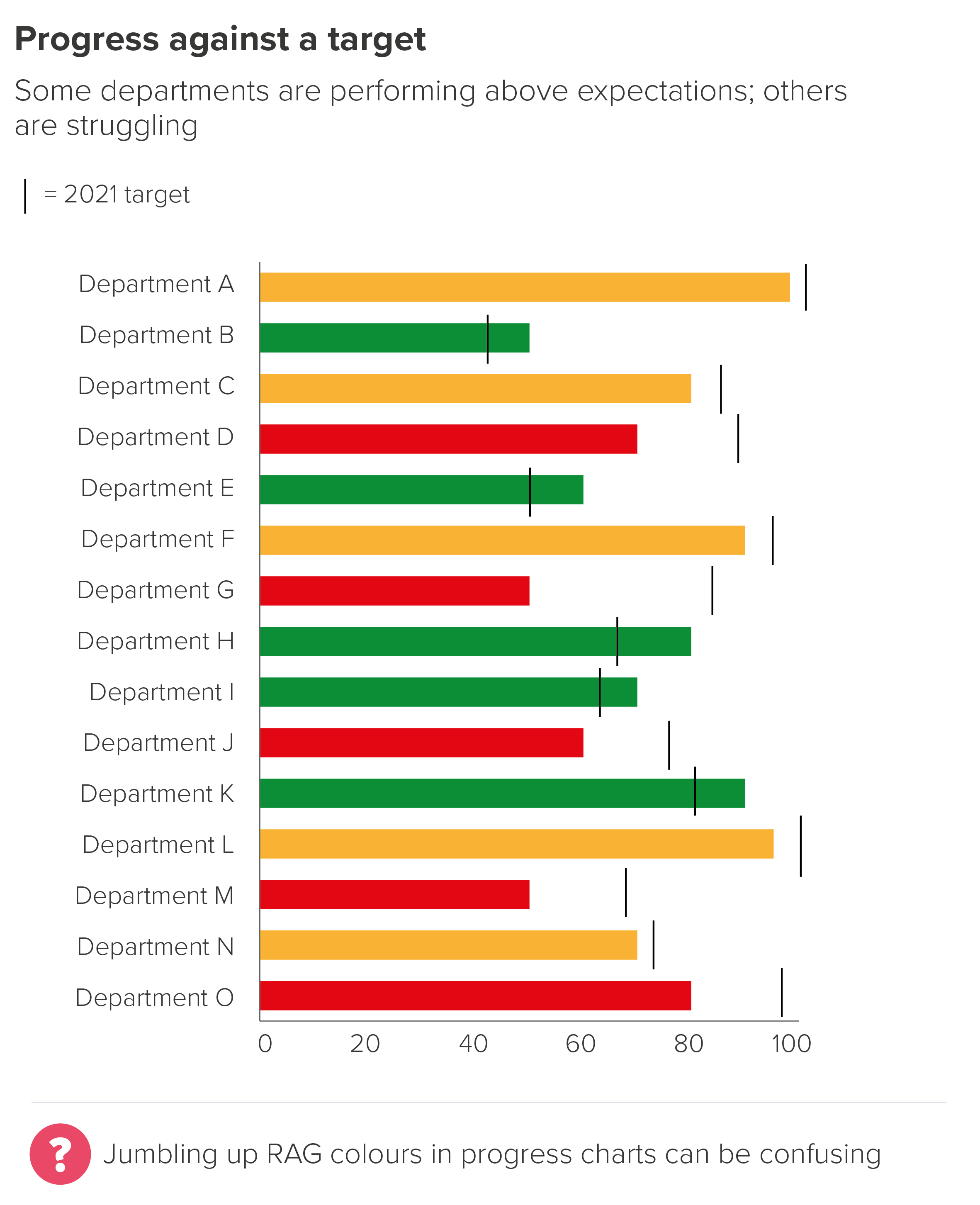
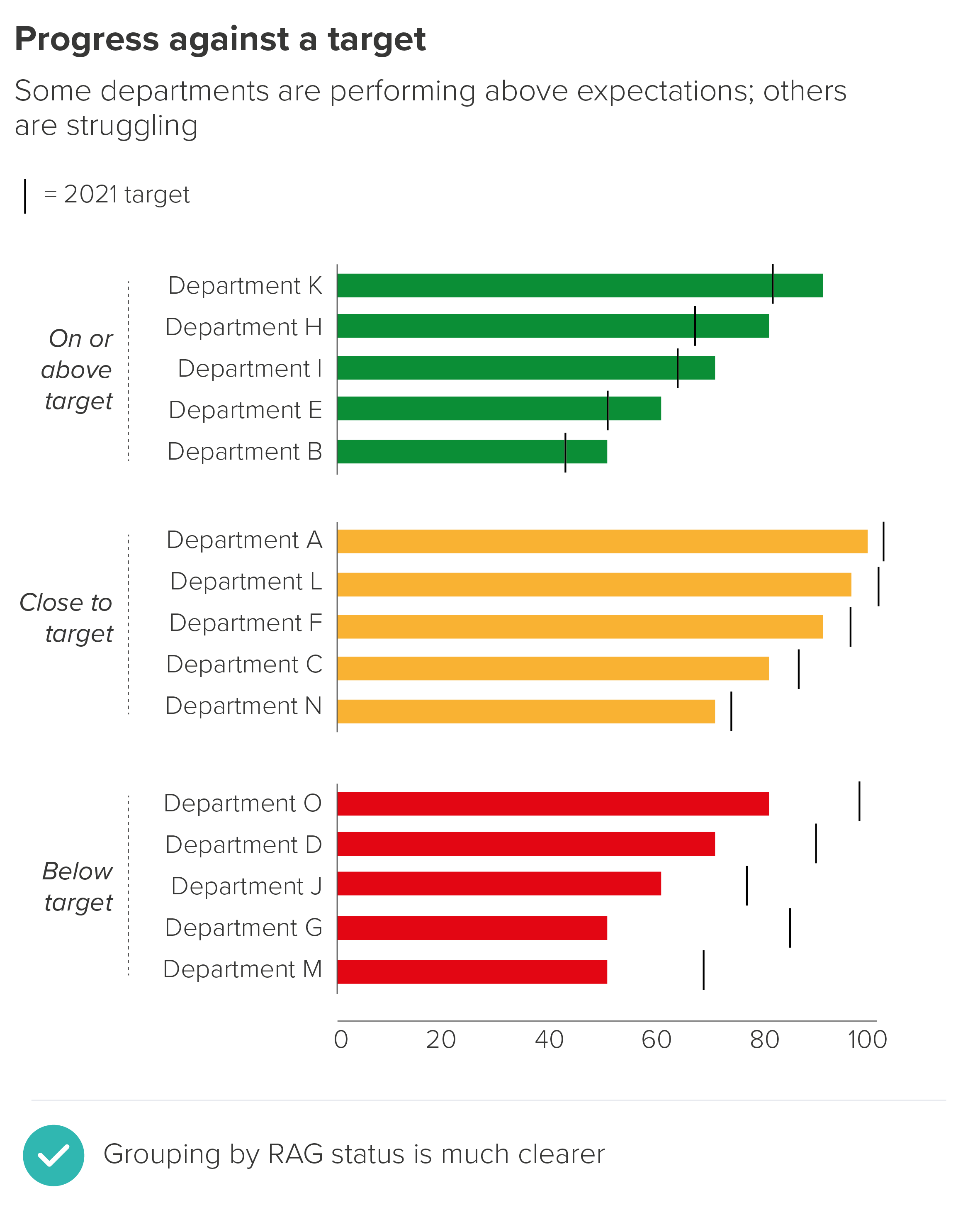
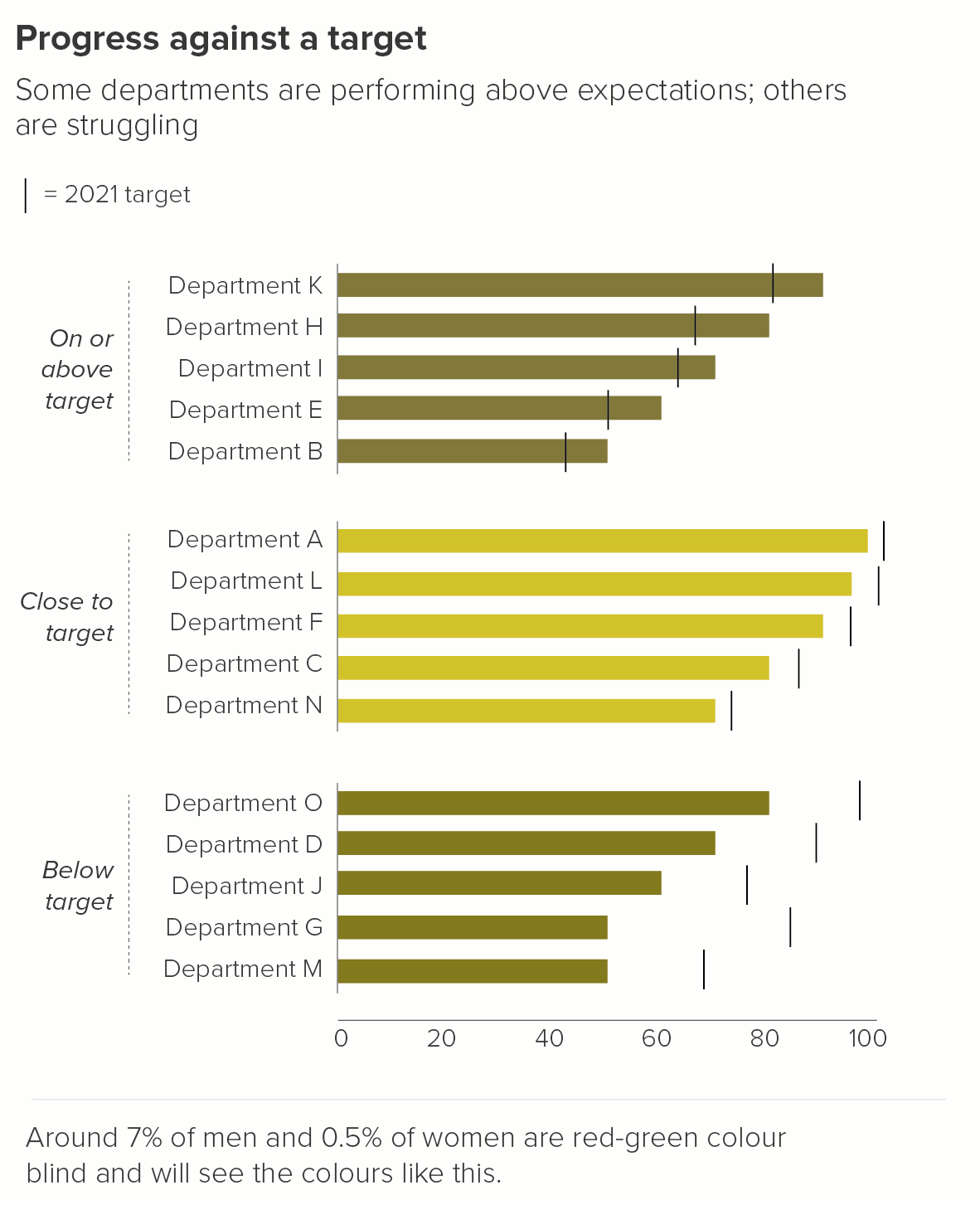
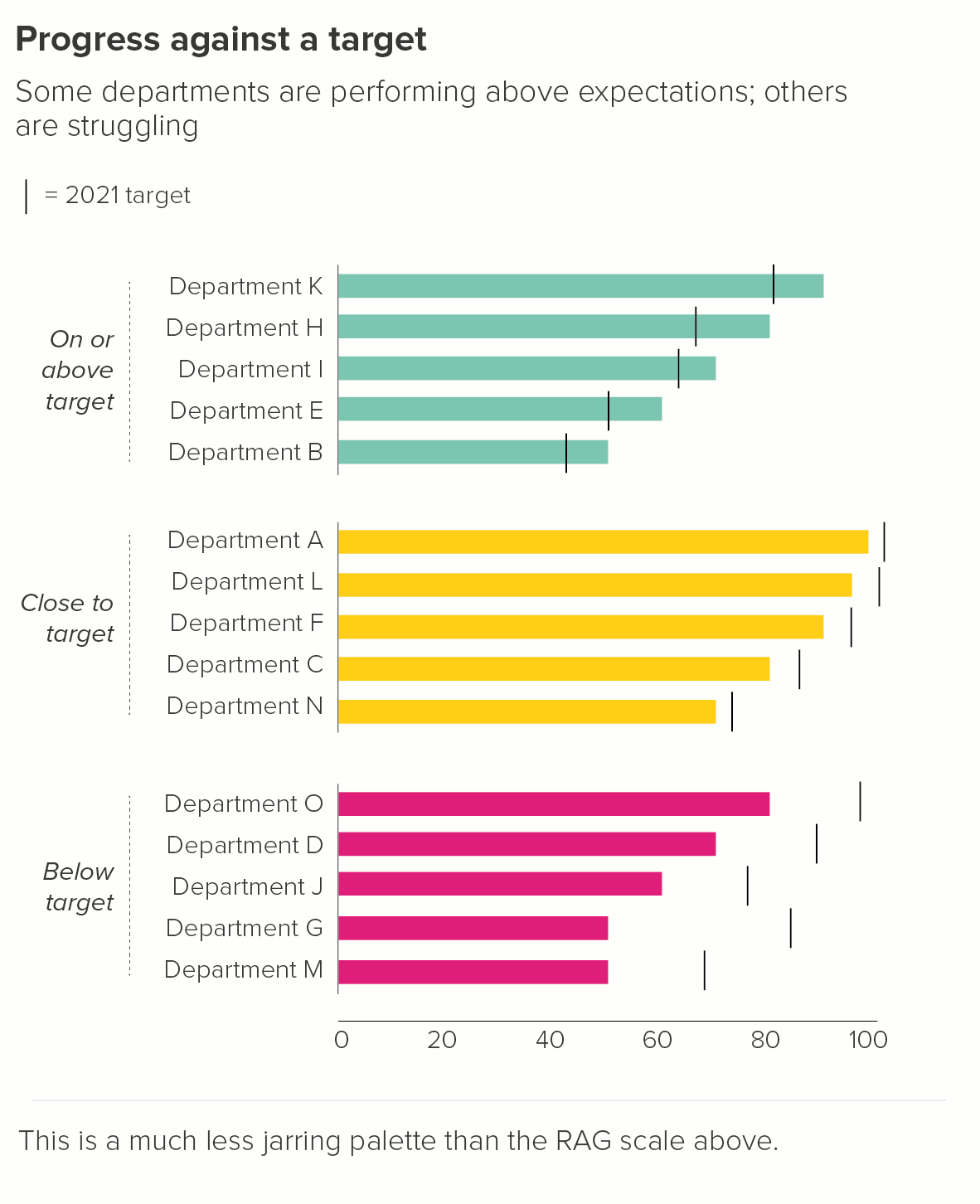
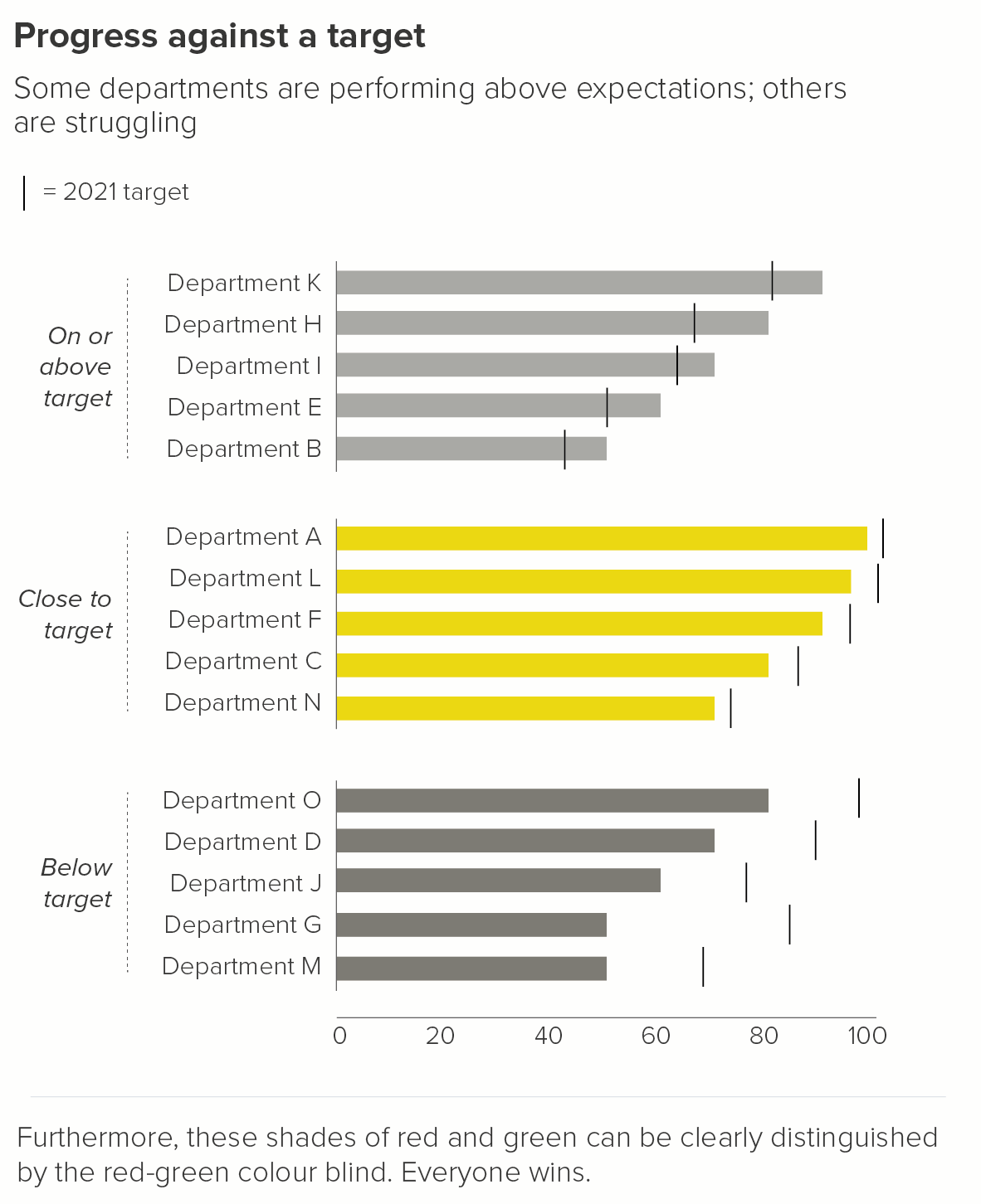
Once you’ve got the story and layout straight, it’s always worth having a second look at your RAG colours. By using a less jarring palette, you will make the chart more harmonious, plus it is likely to be more legible for colour-blind users. Tools such as Illustrator and Photoshop have colour-blindness checkers, or you can use an online checker like Coblis.
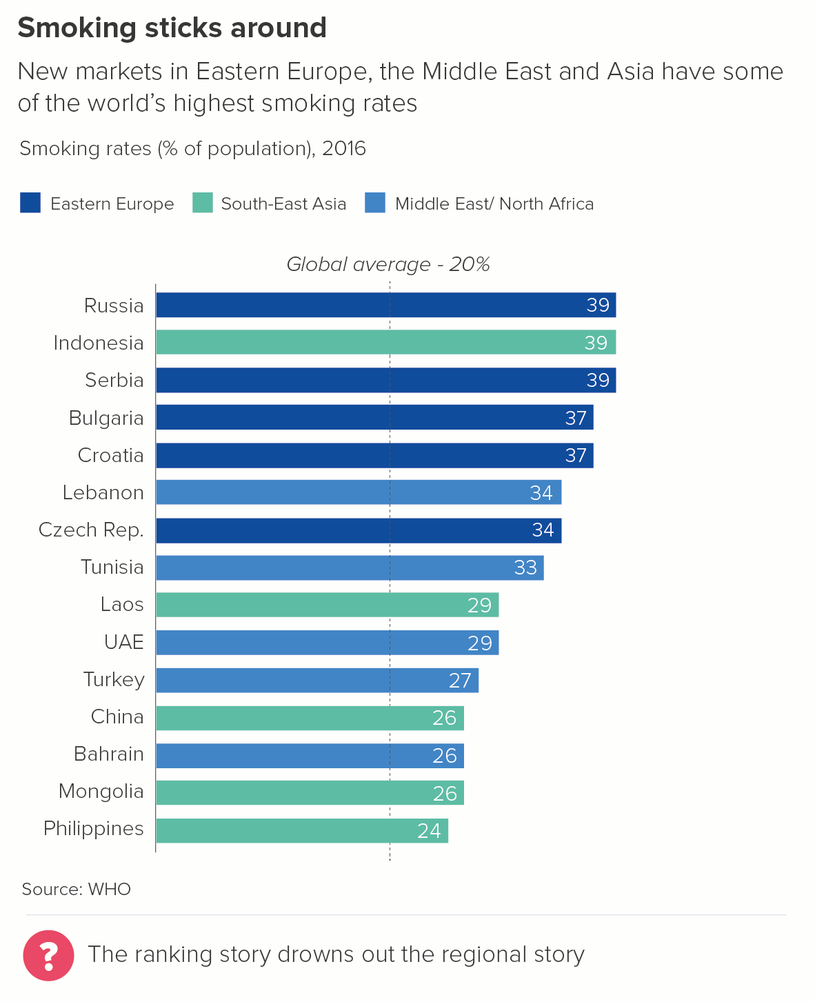
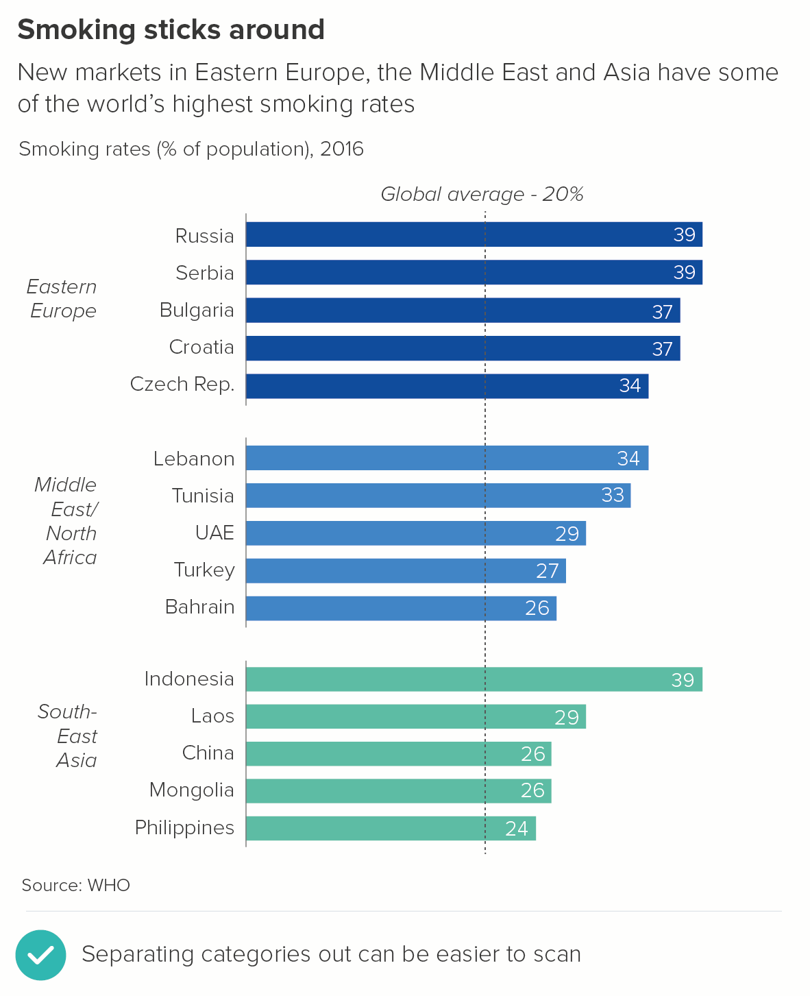
5. Descriptive groupings
RAG colours group the bars by a performance category, but sometimes your groups are purely descriptive. You are collecting together e.g. countries by region, or animals by class, or planets by whether they are terrestrial or gaseous.
Things to consider here:
Too many groupings can give you technicolour bars. Can you reduce or consolidate groups?
If the groups all need to be used, is the story clear enough when the bars are combined on a single chart? If not, as with RAG bar charts, consider giving each group its own smaller chart.
For advice on choosing the right palette for your story, see our colour in pie chart post. Also this chroma.js tool is indispensable.
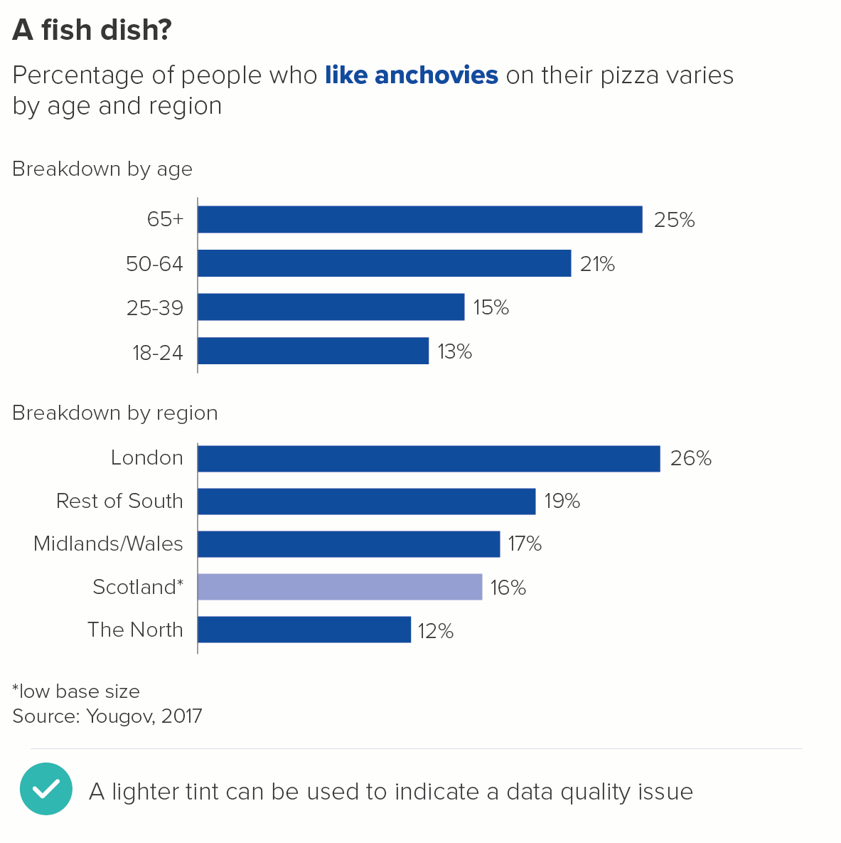
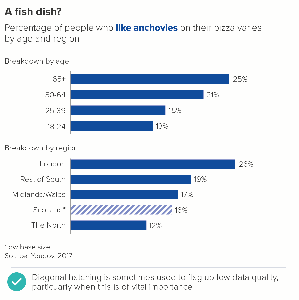
6. Data quality
Sometimes you have lower quality data that you still feel you have to show on a chart. This is particularly the case with interactive charts, where users can drill down into e.g. specific demographic groups. The base size can become very low very quickly.
In these cases, the most common way of indicating lower data quality is by knocking back the bar colour, usually by using a lighter tint. Sometimes hatching is used, although I personally use this less (too obtrusive). I'd also avoid greying out the bar (greys tend to get used for averages) or using a different colour (the data's category or story status hasn't changed).
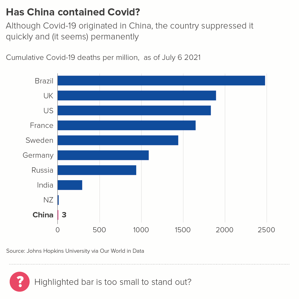
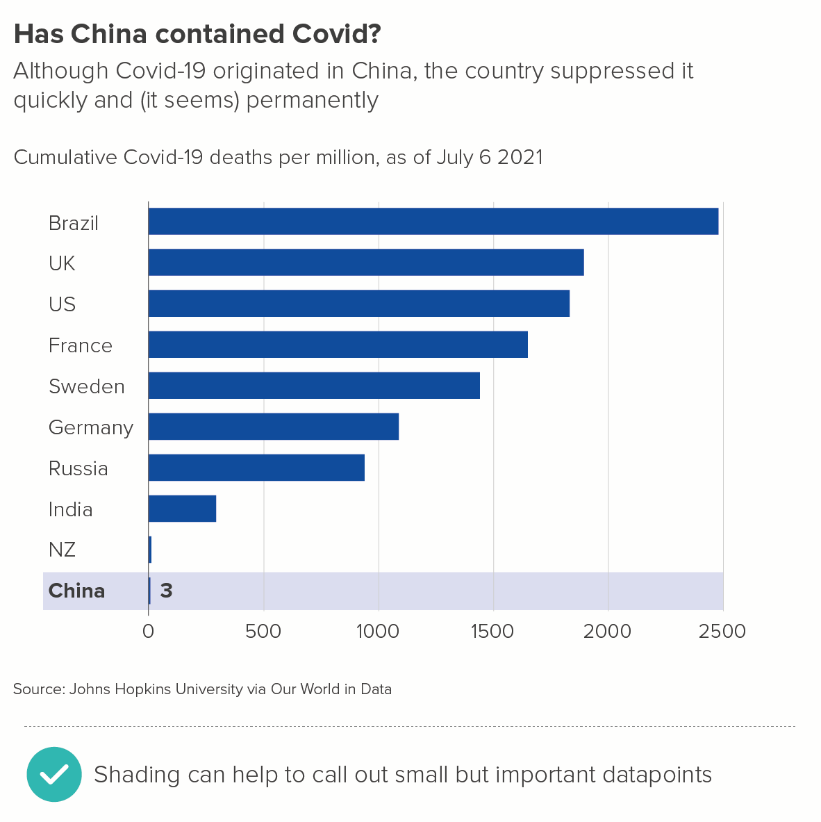
7. Shading
Sometimes you might want to highlight a single bar for one of the reasons listed above (my bar, hero bar, winning bar), but feel that a different colour might be too heavy-handed.
Or perhaps your story is about how short the bar is, and colouring it would be barely detectable.
In these cases, a more subtle visual effect - like shading the bar's background area - can work better.
8. FINE, USE ALL THE SHARPIES
In this example from Kantar's Grocery Snapshot, separate brand colours for the different supermarkets have been used. Occasionally, this will be the right choice for your story and your audience.
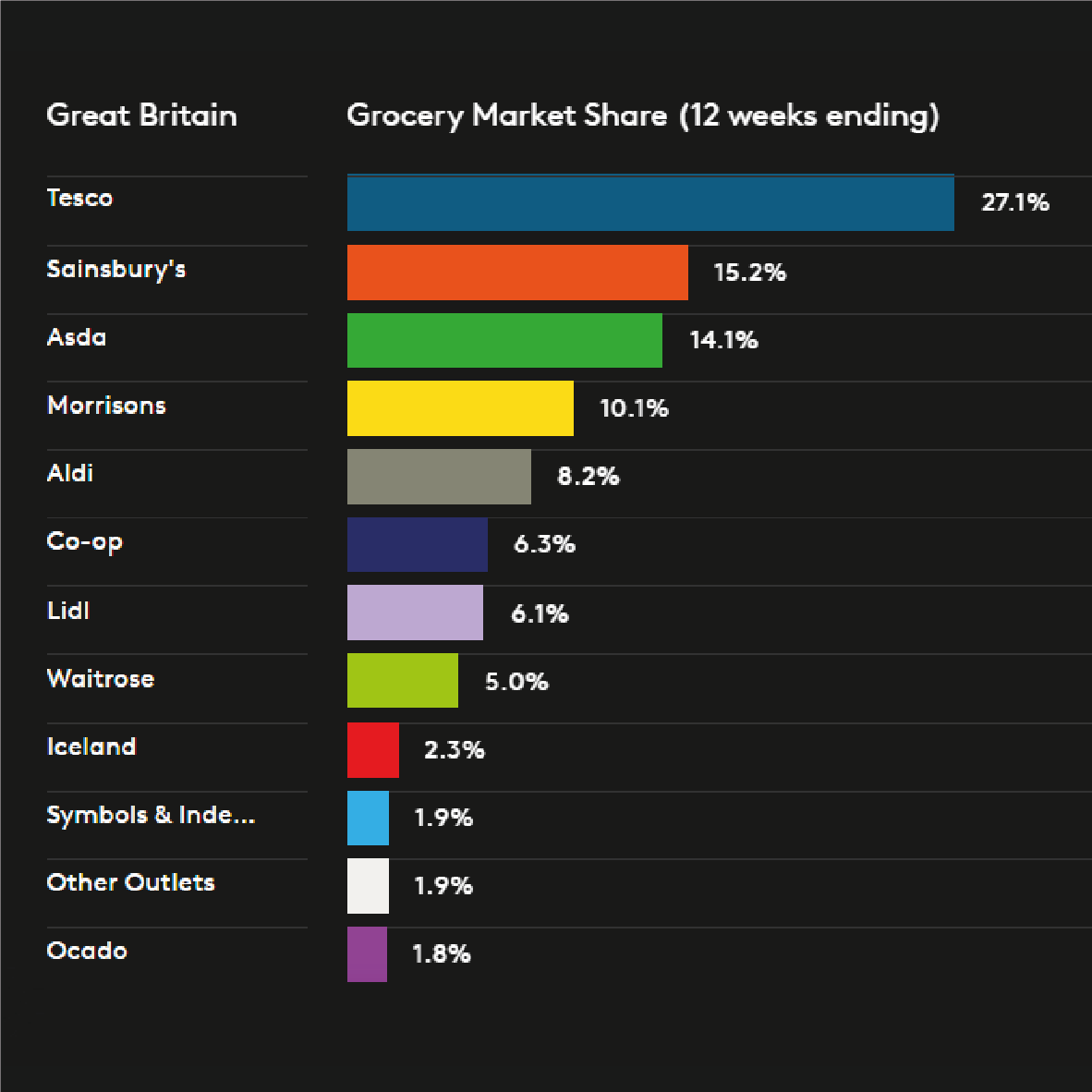
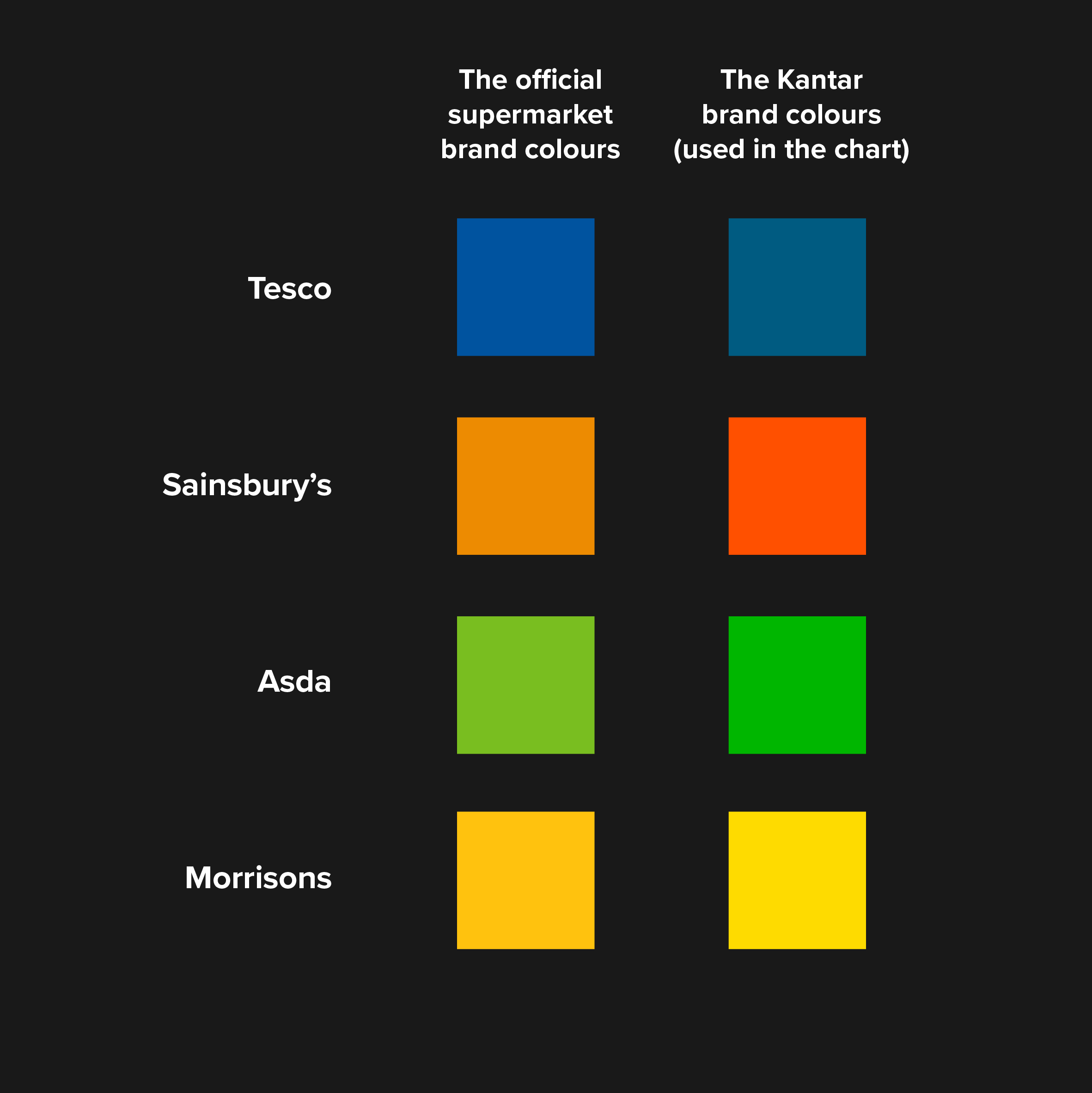
However, note here what Kantar have done. I said Kantar have used the supermarket brand colours, but they haven't - quite. They've used the closest Kantar brand colour to the supermarket brand colour. Not the Sainsbury's orange or the Asda green - which look unpleasant side by side - but the Kantar orange and green - which have been designed to complement each other.
Using political party colours is another example of this.
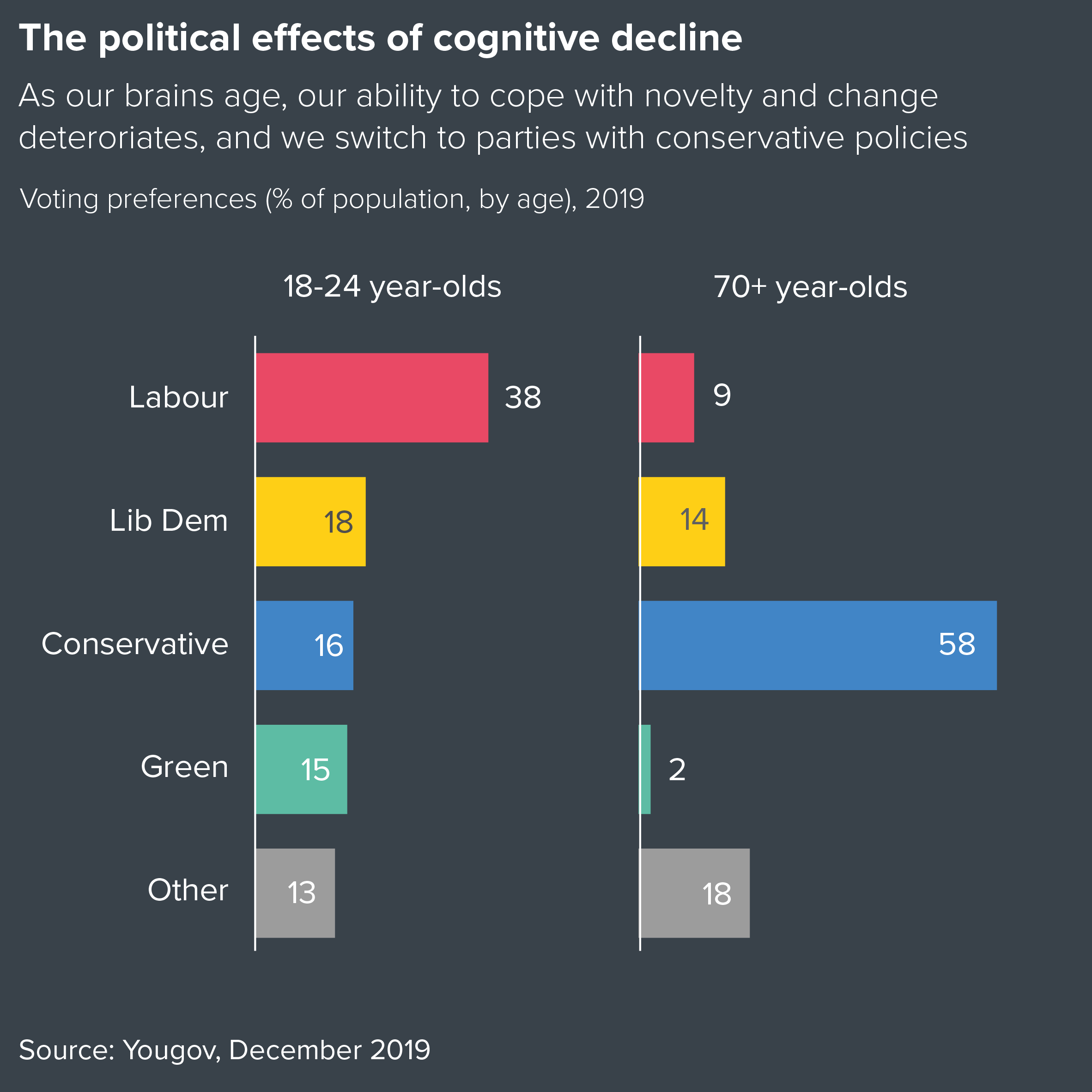
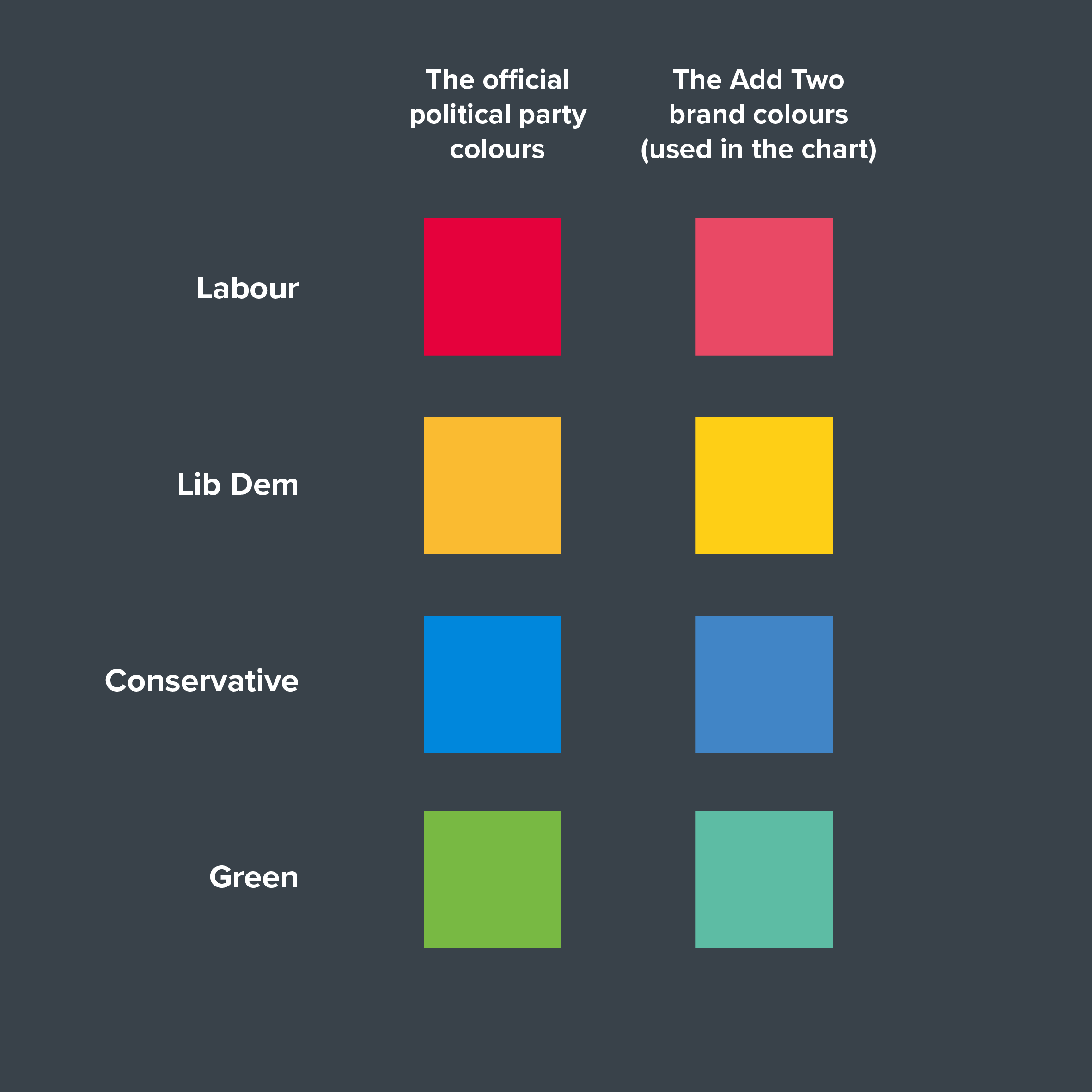
As with the Kantar example, we chose to ignore the official party branding in this chart, and instead used the closest Add Two colours instead.
So when you have a story like this, don't feel you need to ape the category's brand or team or national colour exactly. Choose ‘close enough’ colours that will harmonise well with each other. Your brand guidelines should have already done this for you. If they haven't, the palette generator mentioned above (chroma.js) can help you.
(A side note: the two examples above show the difference a dark background can make. It looks slick and stylish, and the colours really stand out. It might be a cheap trick, but it’s a useful one).
9. Special effects
I’ve been mentioning solid fill colours here, but bars get filled with all kinds of stuff: gradients, patterns, texture or photo fills. I discussed some of the problems with decorating pie charts in rule 13 and the same applies to bar charts too. It’s hard to get right, it often looks clumsy, and it tends to make the chart harder to read.
i) Gradients
If you are ever tempted to apply a gradient fill, first ask yourself if it is actually serving the story. Does the fact that one colour is slowly turning into another actually mean anything? Because gradients often are used to mean something, as in the heatmapped RAG bars below, so it is best to reserve them for these use cases.
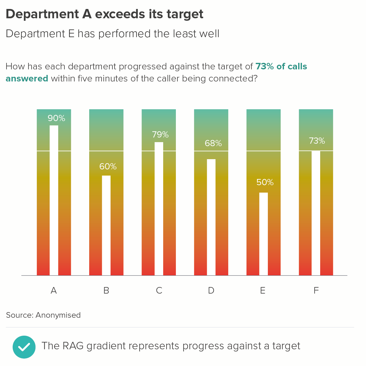
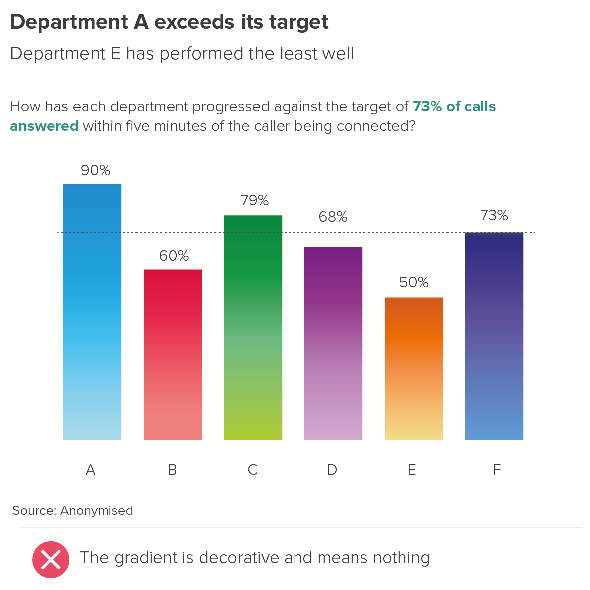
Image credit: Tobias Sturt
Another valid use case is when a light-to-dark gradient works metaphorically - for example, where it represents speed, or incredibly fast growth. The changing shade is technically not linked to the numbers, but it dramatises the subject of the story.
Although note the second chart below: gradients work best when all your bars are a decent size; too many tiny bars and the effect is lost.
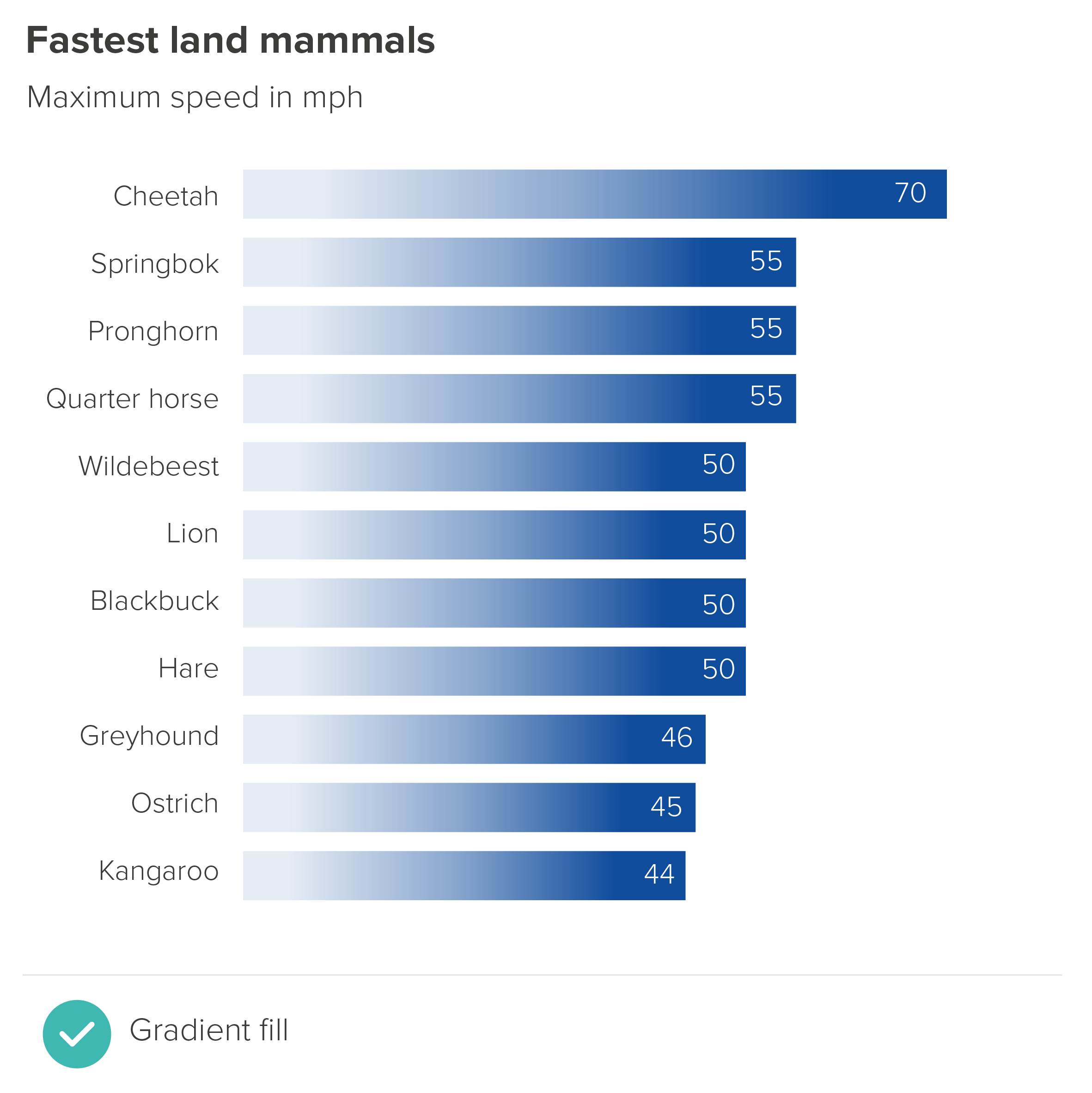
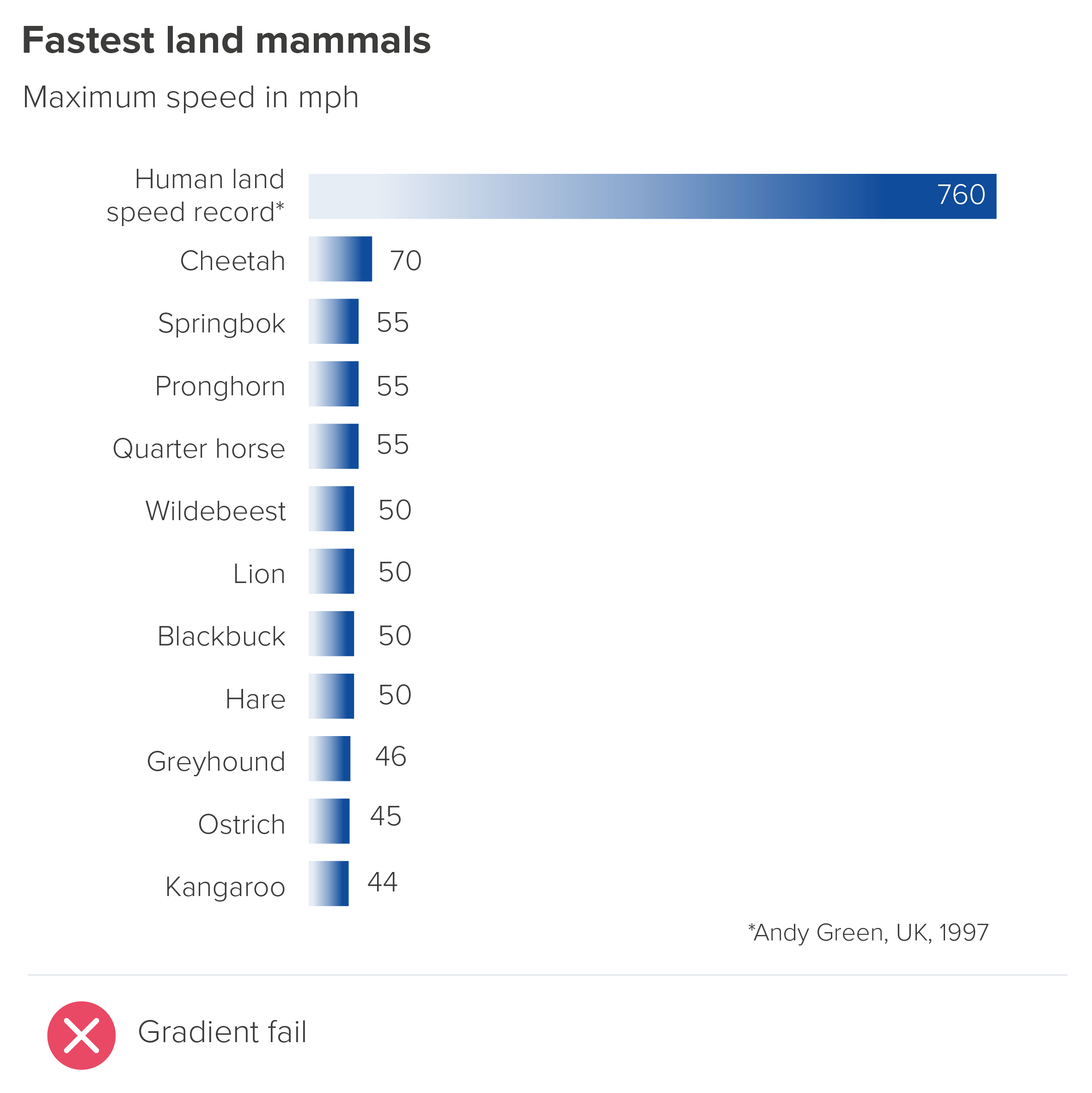
Of course it’s best not to use an effect like this with every ‘speed’ or ‘growth’ story - that will diminish its impact. In addition, it can sometimes give your chart a slightly slick, corporate feel, which isn’t right for every audience.
One final word of warning: if you do feel that a gradient is right, make sure that the eye is drawn to the end of each bar. Here’s an example from the designer Jim Kynvin. In the first part of his infographic, he uses a gradient fill to represent wine consumption in each country.

Image credit: Jim Kynvin
All fine so far. The gradient fill deepens the colour, giving it a liquid feel, and hints at the weighted bottom of the wine bottle. Kynvin then decided to use the gradient fill throughout the graphic - for the sake of visual consistency. This works pretty effectively in the bar chart below.

Image credit: Jim Kynvin
However, Kynvin then decided to experiment, and reversed the gradient for his next chart. And look what it does to the bars.

Image credit: Jim Kynvin
The country names now look more important than the data labels. (Unsurprisingly, Kynvin decided not to use this chart).
Gradients are easy to get wrong. It is also easy to overuse them. So in most cases, remember: special effects are for special occasions only.
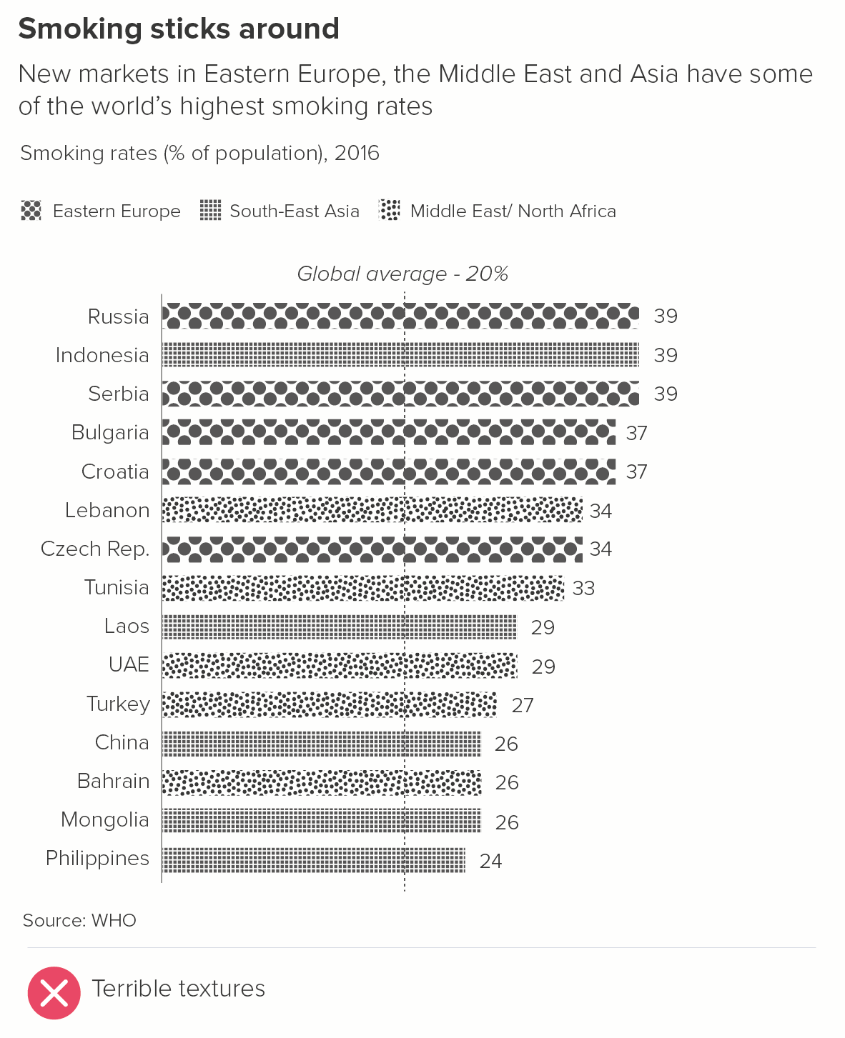
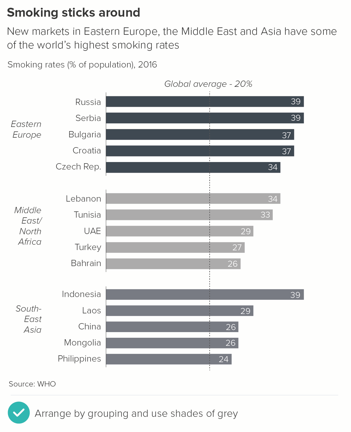
2. Pattern fills
Pattern fills I would never advise using, for the reasons I discussed in rule 13: they increase visual clutter with no compensating aesthetic benefits. They are often used when the palette is limited (e.g. to grayscale), but in these cases, consider shades of grey or change the layout so multiple fill styles aren’t required.
3. Photos
Photo fills can sometimes work, but you do have to be careful: picture research and selection is an art in itself, as is the correct editing and placement of images.
As a general rule, I would say that one photo per bar tends not to work, just because most photos are not columnar in shape, so end up oddly cropped. The photos are also likely to be taken by different photographers on different occasions, so will almost certainly be stylistically mismatched, as in the wtfviz examples below.

Image credit. wtfviz.net
If you wish to use photographs, a better approach is to have a single photo sitting across all of your bars, perhaps even spilling out over the edges. Your chart, after all, will be (broadly) photo-shaped. And if you have a clear, dramatic image that amplifies the subject-matter and emotional truth of your story, why not use it?
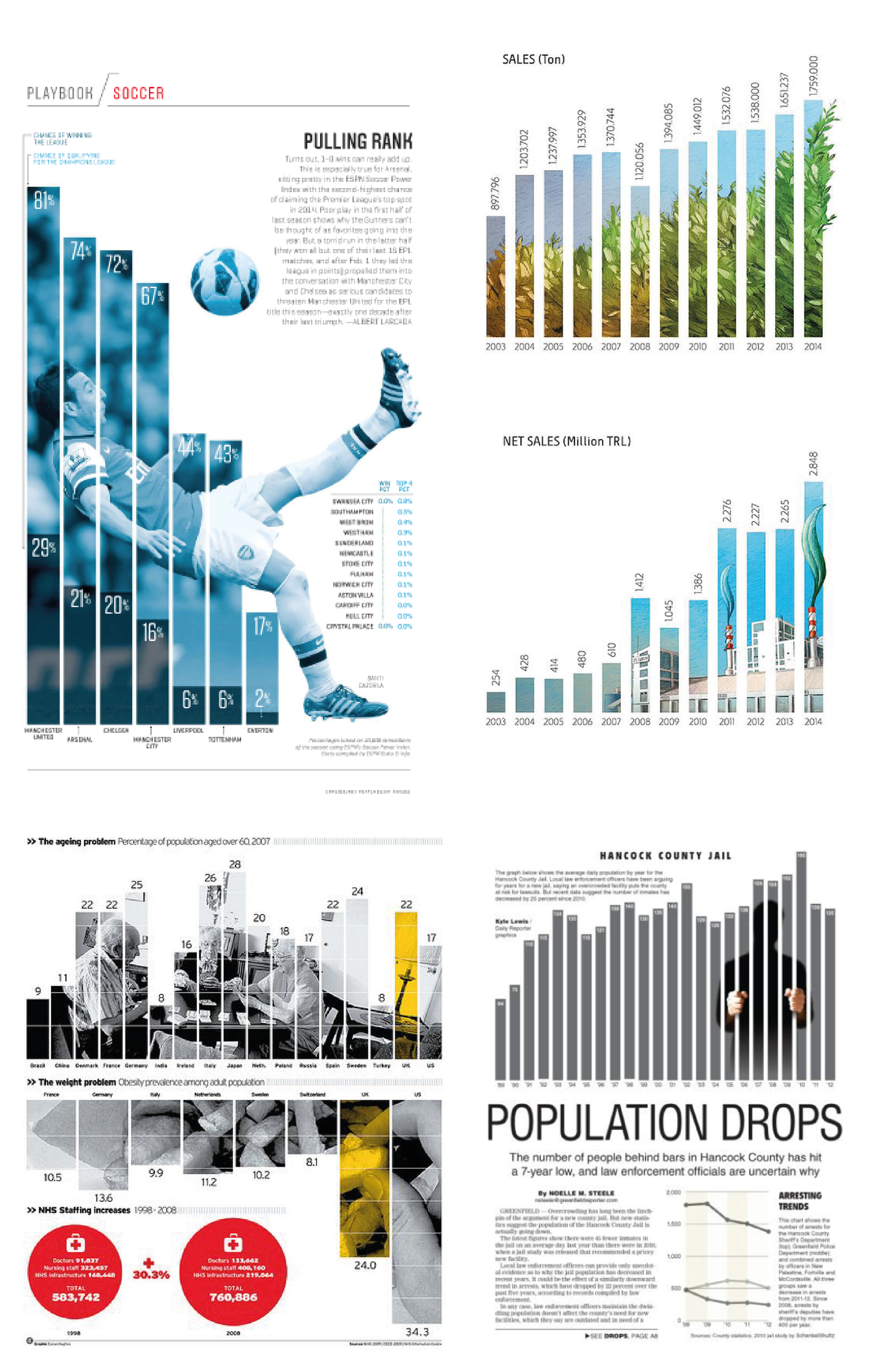
Image credits: Pulling Rank - Albert Lacarda, Fertiliser sales - Annual Report 2014 of Gübretaş, Turkey, The weight problem - Daily Telegraph, Population Drops - Greenfield Daily Reporter.
Image research and suggestions by Jim Kynvin
I should say the second example is technically an illustration rather than a photograph. And the fourth example is possibly too heavy-handed for some readers: the bars literally becoming bars. But I like it.
Note what these examples have in common.
Photographs that suit the subject matter
In most cases, this means using human beings. We are a social species, our mirror neurons knitting us together in an empathetic web. A human face will always draw us in (examples one and three above). In the second example, we have the next best thing: recognisable objects from our anthropocentric environment: a field of crops (to represent amount of fertiliser sold) and a factory (to represent the value of fertiliser sold). In the fourth example, we might only see the outline of the person in jail, but we can imagine what it feels like to be in that position.
Photographs that are intelligently manipulated
A blue tint has been applied to the footballer in the first example, so we don’t get distracted by the bright - probably clashing - colours of his football strip. Also, the point is that he played for various clubs (the seven clubs on the x-axis), so we don’t want to be thinking of a specific strip. The crowd behind him has been blurred out - again this minimises distractions: other faces, other colours and shapes.
In the third example, the colour photo of the old people playing cards has become grayscale except for the yellow tint on the highlight bar.
In the fourth example, the prisoner has become a silhouette and we just see their hands. This also helps to convey the idea that, in prison, this individual is erased from society.
The bars can be accurately read
If you use one photo per bar, there is a risk that the images will swamp the chart (see the wtfviz examples above), and make accurate comparisons difficult. However, filling the whole chart with a single photo means the chart still works. The bars can be compared. There is plenty of room for visible, legible labels on each bar (see all the examples above). The photo complements and enhances the chart, and amplifies the story that it contains.
I’ll be discussing other types of decoration - such as changing the shape of the bar, or putting icons on the top of your bars - in rule 22.
To summarise: how to use colour and fills in bar charts:
In most cases, stick to one solid colour for all your bars when you are just showing one dataset
If you add colours, make sure this is motivated by the story you are telling (one background colour and one highlight colour is usually enough)
Use colour consistently, usually within the parameters of your brand guidelines
If you do need your bars to punch out more, stick to solid fill colours unless you are confident that the visual effect - such as a photo background - is narratively and aesthetically justified, and you are experienced enough to execute it skilfully.
Verdict: Break this rule sometimes
Sources: Break Free From Plastic Report 2021 (Top 10 plastic polluters), UNWTO (tourism revenue), SMMT (car sales), World Bank, UNDP, Our World in Data (South American dashboard charts), World Happiness Report 2021, Blacktower Financial, Institute for Economics and Peace/ Global Peace Index, Yale Center for Environmental Law & Policy, Transparency International 2020 Report/ Corruption Perception Index, Global Drug Survey 2018 (Brexit Britain charts), WHO (Tobacco in Africa), Yougov (Anchovies on pizza), Kantar (Kantar Grocery Snapshot), Yougov (UK voting intention)
More data viz advice and best practice examples in our book- Communicating with Data Visualisation: A Practical Guide