
In this blog series, we look at 99 common data viz rules and why it’s usually OK to break them.
by Adam Frost
Clustered bar charts are horrendously common in corporate PowerPoints. I’m not sure why, because I’ve never found a clustered bar that wouldn’t be more effective if it was a different chart. Or just a data table.
The chart name itself is a warning sign. Why are you clustering things? Yes, when you analyse data, you often cluster datapoints because you have so many of them, and you're trying to identify patterns. But when you are communicating what you've found, the job is doing the opposite: separating out, deleting, directing the eye. Clustering is usually cluttering: cognitive and visual busy-ness.
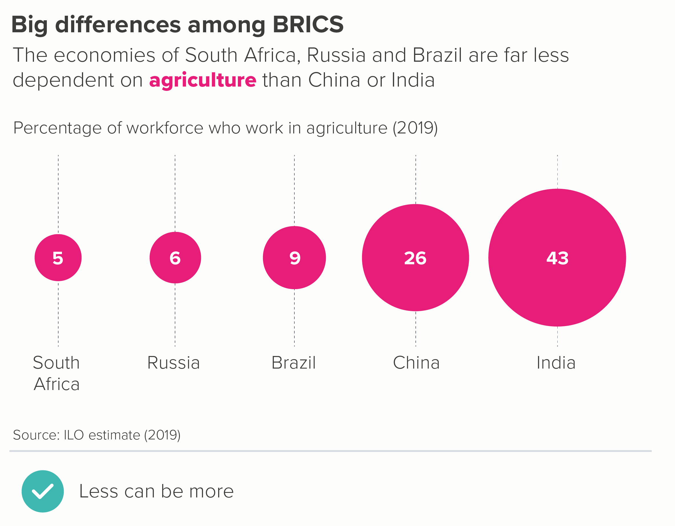
Let's look at a clustered bar and compare how other charts might fare with the same data. I'll use something neutral, the kind of thing you might find in a corporate deck: global employment data from the ILO.
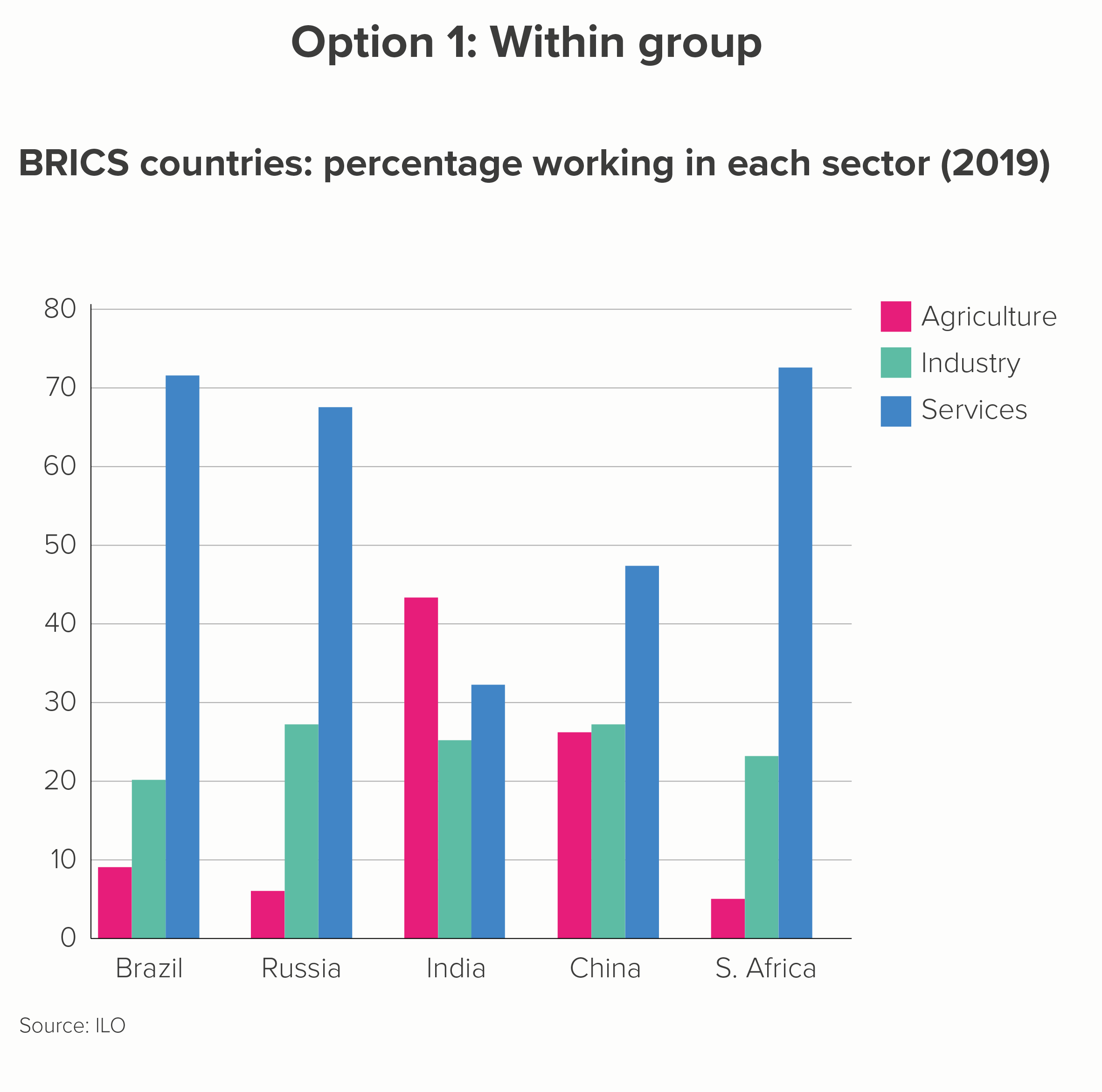
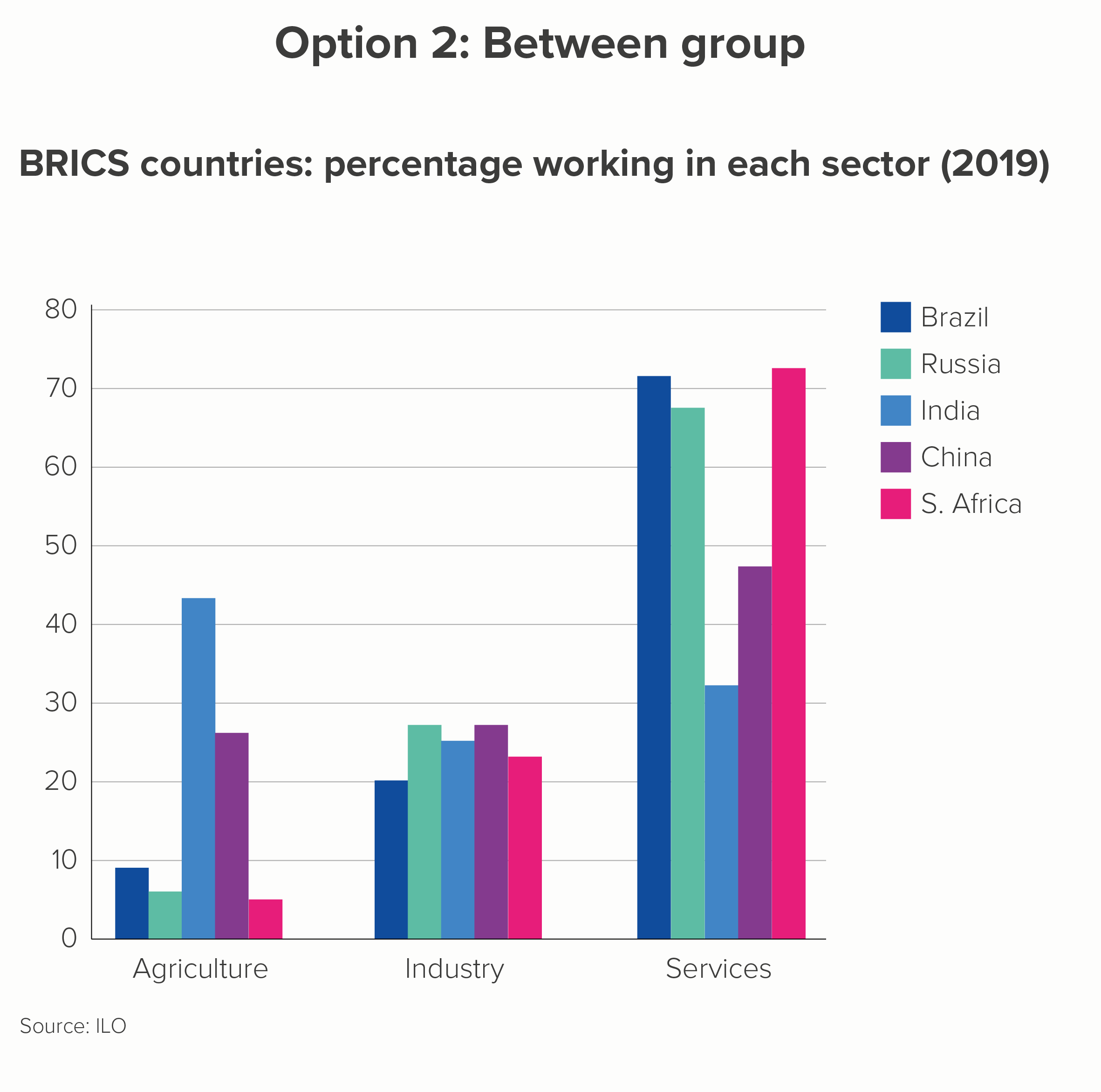
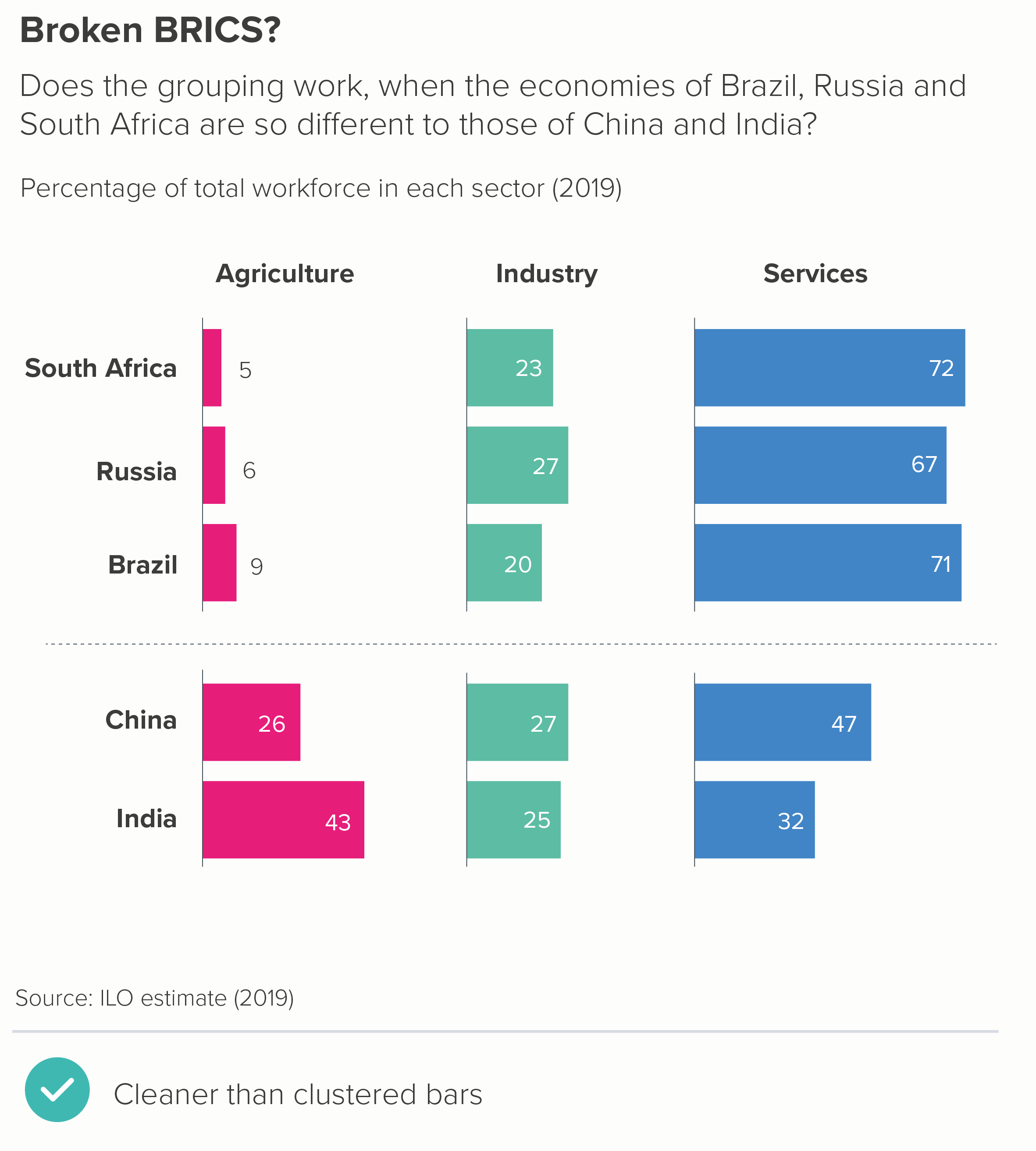
A clustered bar might be used to emphasise differences within each country (what percentage work in each sector? A 'within group' comparison) or differences between each country (which country has the most people in the services industry? A 'between group' comparison). Here are your two options.
The first thing to say is how poor both these charts are at telling an interesting story. The first is better, but only slightly.
I have done my best. I have, wherever possible, used text, colour and layout to tease out any potential stories. (Rules 16-27 on bar charts that we outlined above should help you if you’re forced to use clustered bars). So you can sort of see that Brazil, Russia and South Africa have a strong service sector (in chart 1) and that the five countries all have a similar percentage of the workforce working in industry (in chart 2).
But neither of these charts are properly fixable. The universal problems are:
you always have to use a key, which slows down understanding. Back and forth we go, between bar and key
you rarely have space for data labels - the bars are too narrow - so you have to rely on axis labels and gridlines to estimate values. Back and forth we go, between bar and gridline and y-axis
There are just too many bars, in no particular order. You can’t rank clustered bars in the same way as you can rank bars showing a single variable. So the clusters might be alphabetical (option 2) or some other ordering system (‘BRICS’, option 1). Either way, back and forth we go, between bar and x-axis.
The more specific problems are:
Option 1: Within group
When you foreground ‘within group’, the 'between group' comparison is difficult. Let's look at ‘percentage working in industry’ in that first chart. Try to work out the differences between Russia, India and China. Do Russia and China have exactly the same percentage working in industry or is one slightly ahead? Even if you managed to work it out, was it easy, quick, fun?
Option 2: Between group
When you foreground ‘between group’, the ‘within group’ comparison is difficult. Look at chart 2 above. Does China have more people working in agriculture or industry?
So let’s start again. First of all, is there anything interesting in this dataset? For me, it’s the fact that these five ‘BRICS’ countries are routinely grouped together, as if they were similar, whereas in fact they aren’t - at least if we look at how their population earns a living. We have to fight to see this story in the clustered column.
Instead let’s start by going back to basics - and work up from there.
So: a table, then a heat table. I’ll rank smallest to largest by the first column (agriculture) to see if that makes the story of difference more evident.
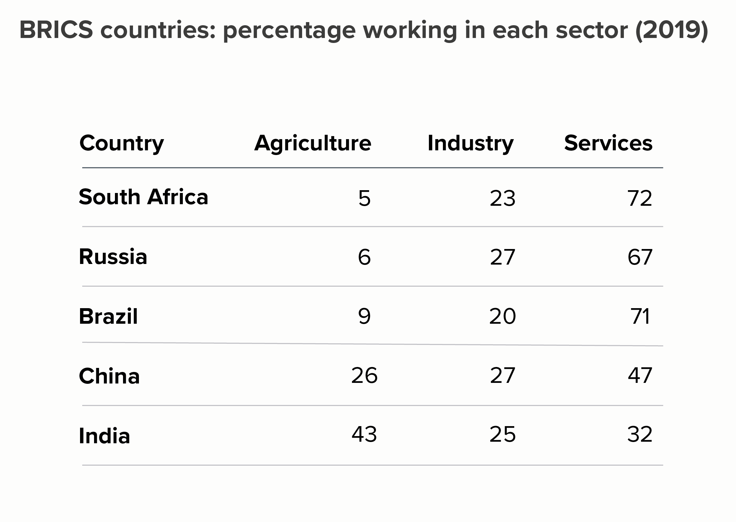
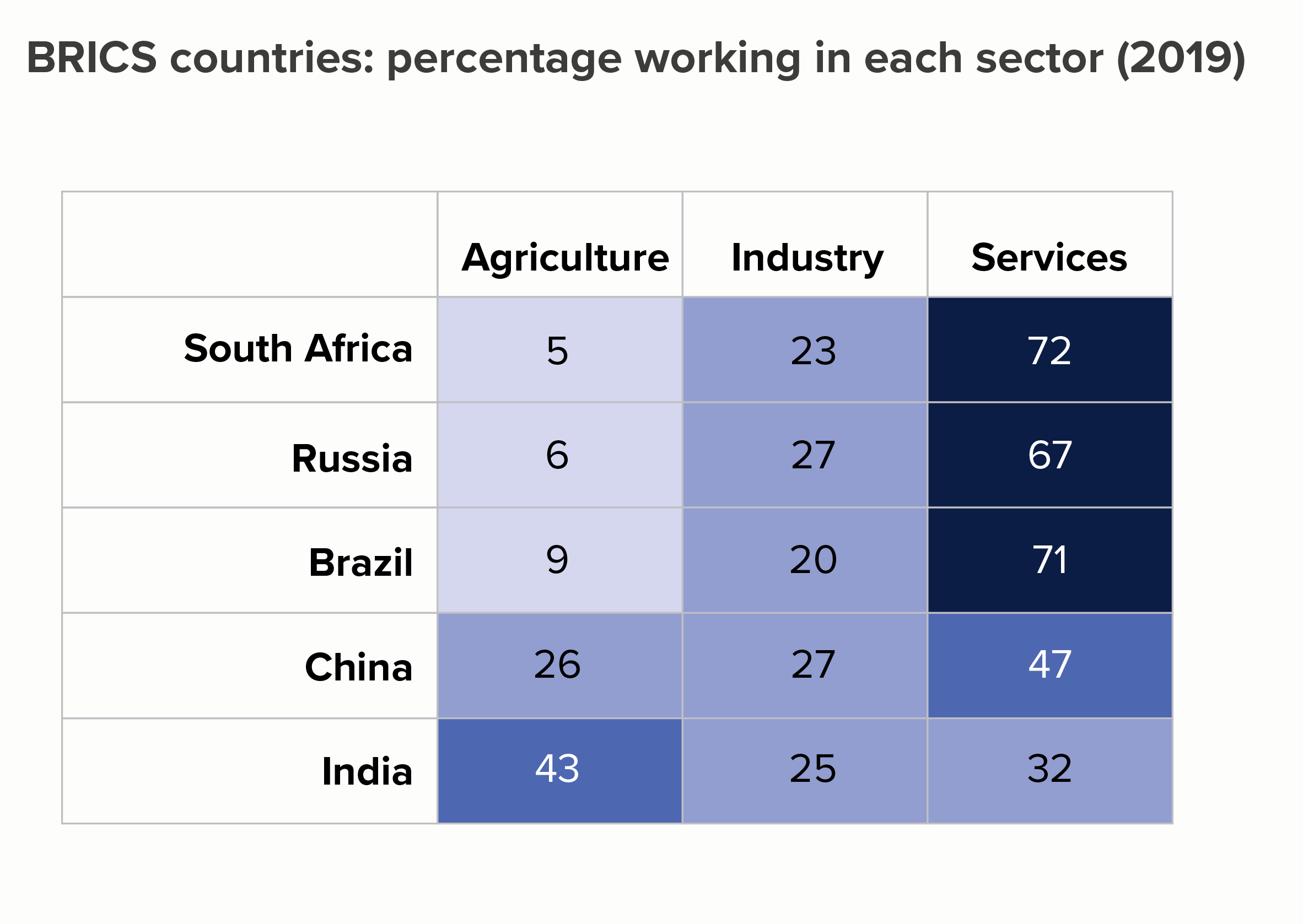
OK, the story still isn’t exactly leaping out but it’s already clearer than in the clustered bars. On the heat table in particular, the first three rows clearly share a kinship. And the fact that the values in the industry column share a similar colour is also clear.
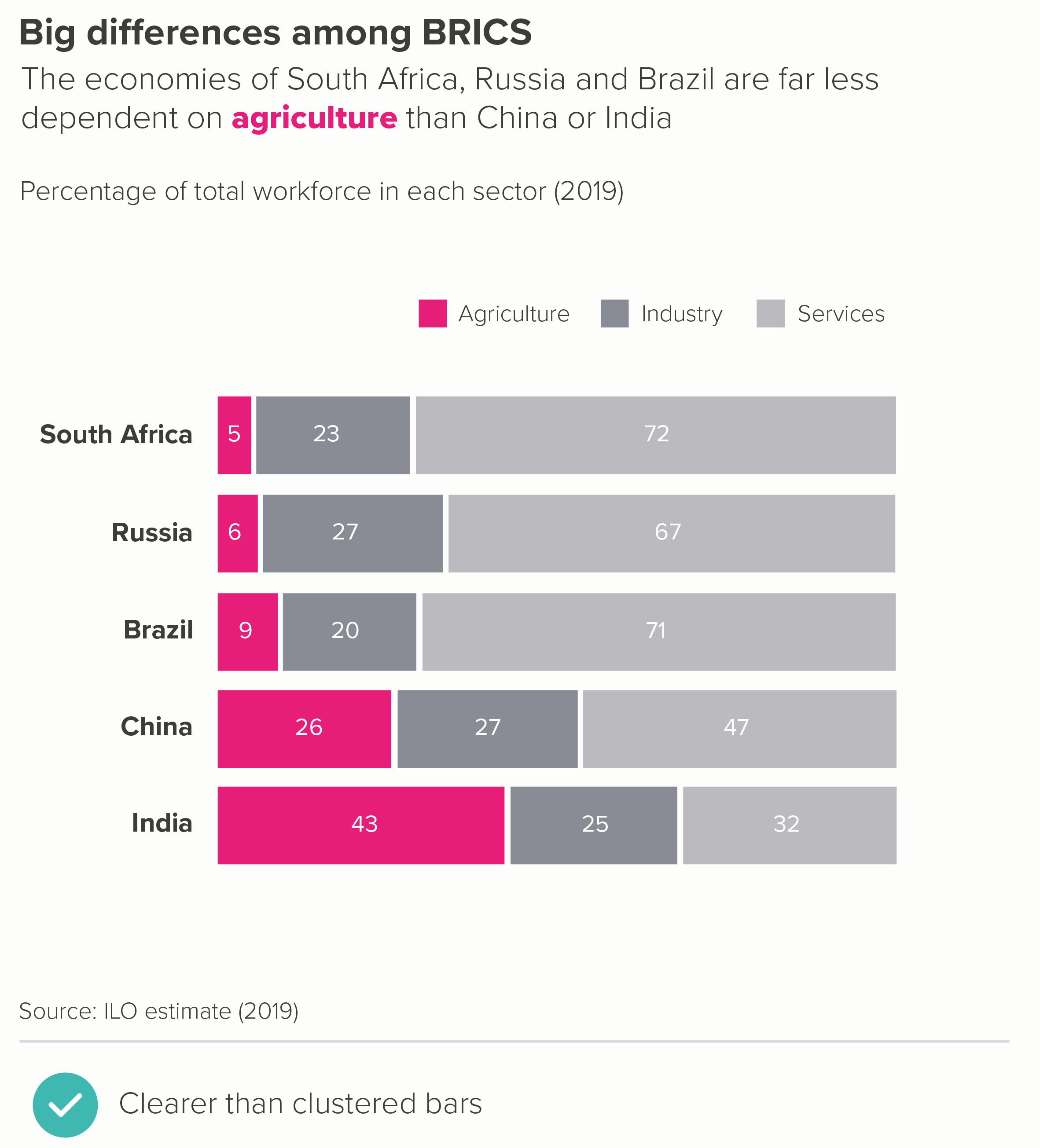
Let’s stick with the table format but see if we can further enhance the visuals. Perhaps turn those numbers into bars? That might help us see those differences - and we can lose the key too. Or we could try a dot chart - we’d need to bring the key back, but these charts are perfect for stories where there are big variations in value.

As with the heat table, the story is clearer than in the clustered bars, but now we have visuals to help it lodge in our memories too.
Alternatively, we could switch to waffle charts or stacked bars - although we’d probably want to emphasise just one of the sectors to stop the chart getting too visually busy. (For both of these chart types, it’s the first, base-aligned, value that you should be highlighting).

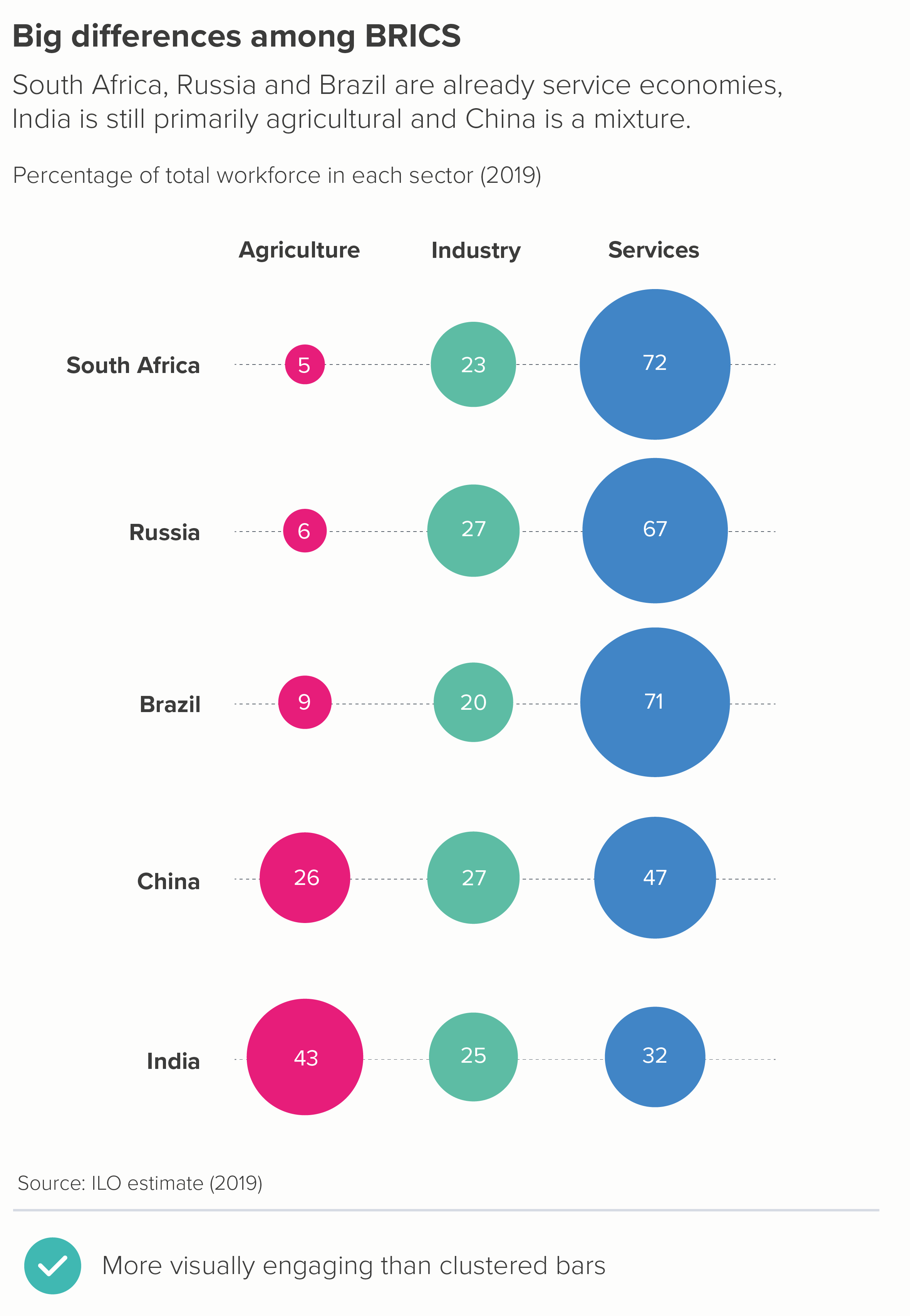
There are also options like bubble tables - where the numbers are perhaps only a little easier to compare than with a clustered bar, but at least they have visual impact. Isotype charts can also work, although you would probably just want to focus on one of those sectors (e.g. agriculture) and delete the others. 5 x 100 icons would just be confusing at this scale.
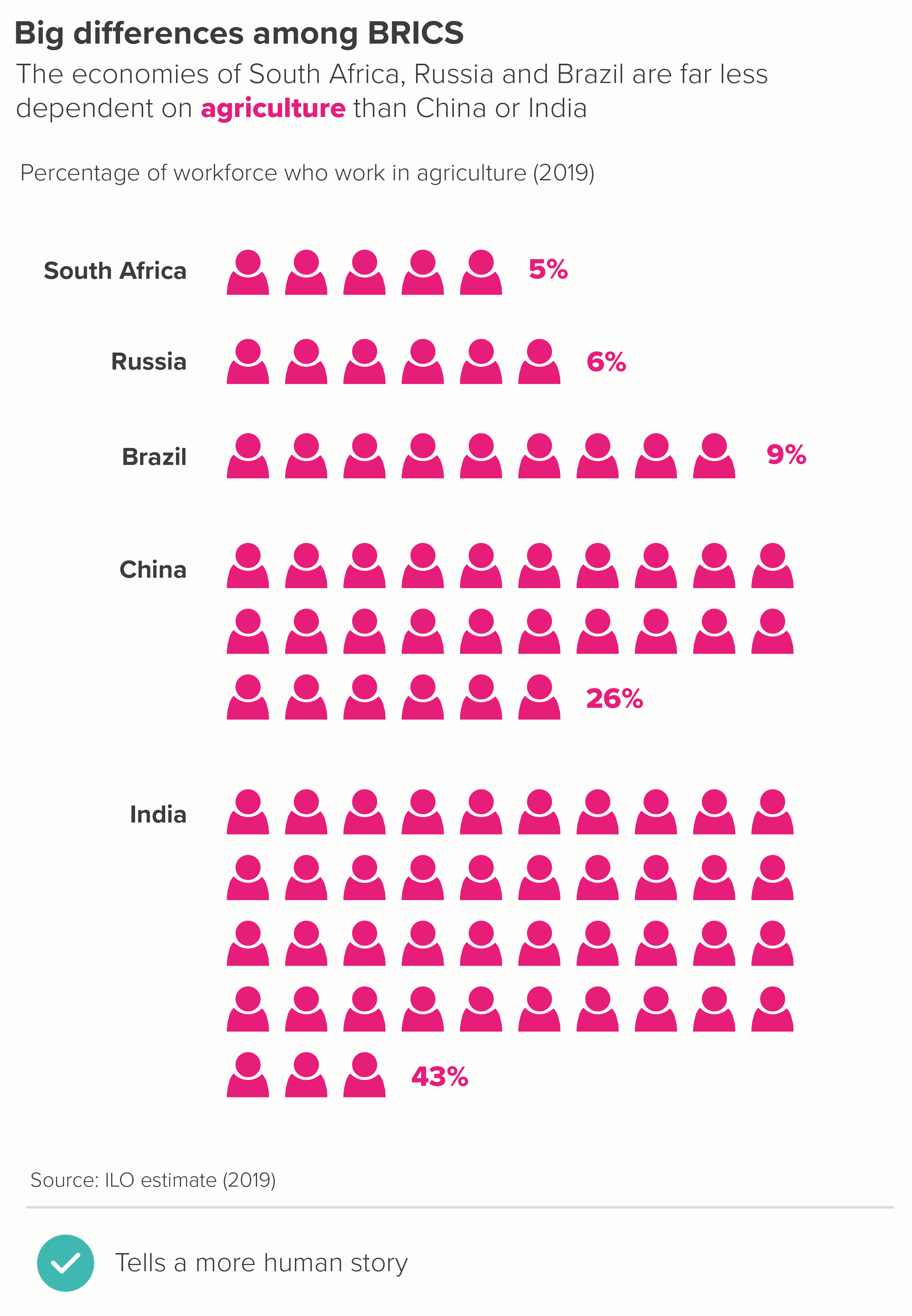
In fact, it’s worth remembering that deleting almost always makes your story clearer, and it would also be true here, with all of the chart types mentioned above. For example, here are the bubble and waffle charts with just agriculture shown.

So - is that the rule: never use a clustered bar chart? If you can, delete the less interesting bars and give more space to the main datapoint(s)? Pretty much.
One possible exception is when you have a large outlier, outperforming in all areas. In those cases, a clustered bar can give the audience that initial jolt, that sense of an unexpected ending.
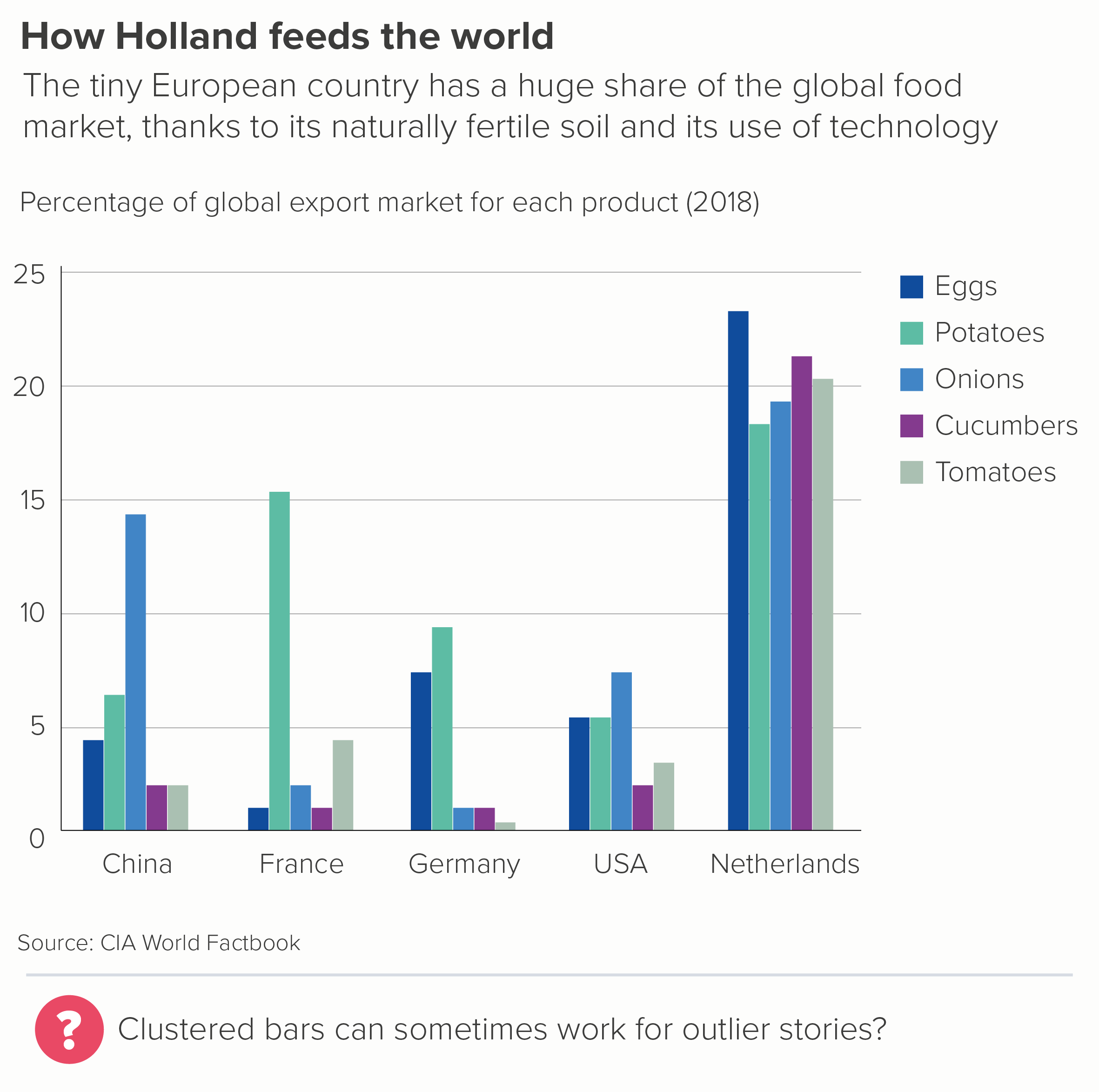
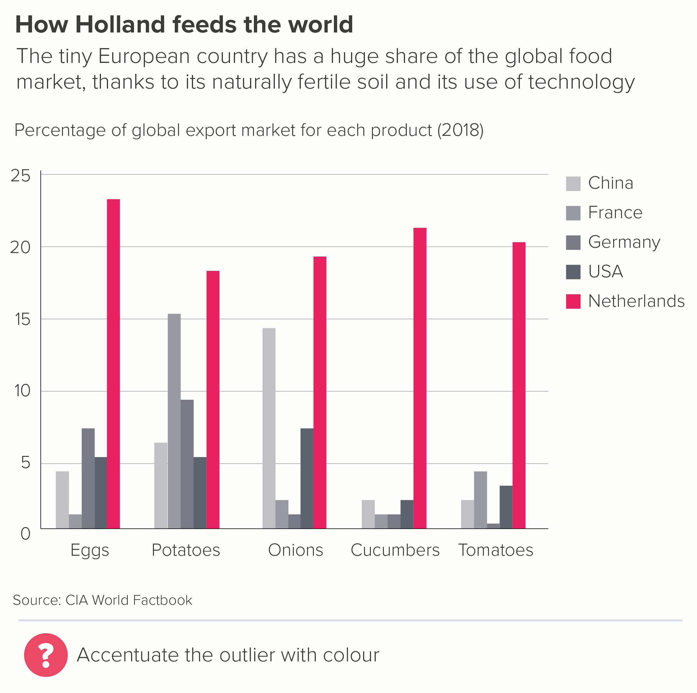
The Netherlands is a tiny country, geographically speaking. If it were a US state, it would be the 42nd largest, just ahead of Maryland and Hawaii. But it is clearly way ahead on exports for a whole range of fruit and vegetables.
But even with these stories, once you’ve got the audience’s attention, and convinced them to explore the detail, they are likely to get frustrated. It is hard to compare any of those bars above to others outside of their immediate cluster.
So even here, I’d try putting the data in a different chart, to see if it delivers on both the overall story and the necessary nuance. In most cases, it will. In the two examples below, we have been able to lose our key, include more data, and build a stronger story.


You might be able to think of even better alternatives. But I suspect that you will rarely conclude that the correct answer is to cluster the bars.
One final note: occasionally you see clustered bars used to tell change over time stories. I’d strongly advise against this. Clustering is bad enough when you are using bars properly - to tell a story of difference or ranking - but it is completely counterintuitive when you are telling a story of change - this datapoint has travelled from here to here. I’d always switch to a slopechart or a line chart or a similar visual trope that allows your eye to easily travel from start point to end point without interruption.


VERDICT: Break this rule whenever you can.
Sources: CIA World Factbook, ILO
More data viz advice and best practice examples in our book- Communicating with Data Visualisation: A Practical Guide