
In this blog series, we look at 99 common data viz rules and why it’s usually OK to break them.
by Adam Frost
In the preceding 12 blogposts, I’ve looked at which of the bar chart rules are essential (‘Always start a bar chart at zero’, ‘No 3D bars’), which are useful (‘No multi-coloured bars’, ‘Not too many bars’) and which are downright useless (‘Bar charts need a key’). But, as with pie charts, we saw that things are rarely that simple, and even the most sensible sounding rule (‘Don’t break your axis’) has important exceptions.
So even though I’ve summarised the key dos and don’ts in the video above, remember that the key to good visual storytelling is knowing when the rules should be ignored for the sake of your narrative.
I’ve also included static images below which outline the main principles.
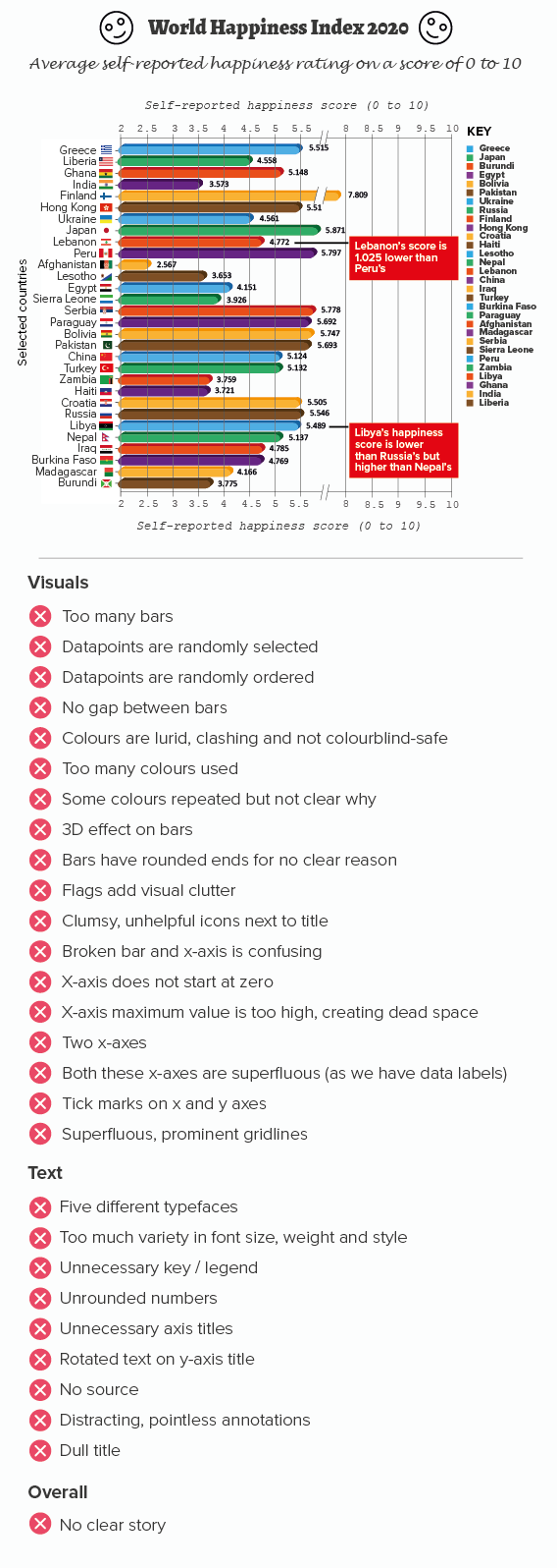
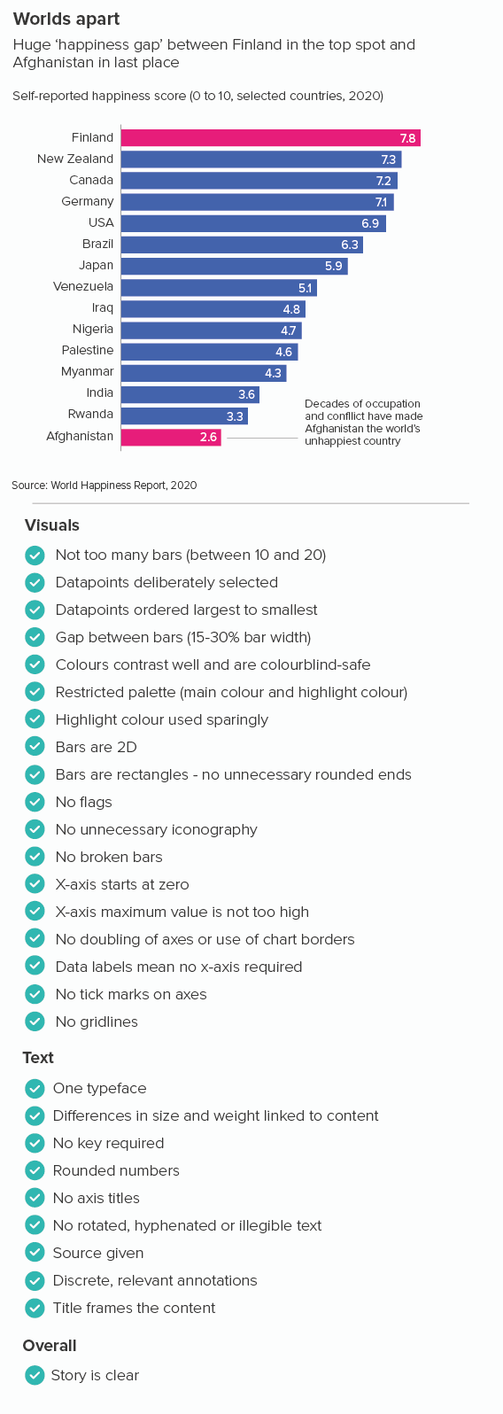
I’ve included a recap of the key bar chart rules below. If you read the individual blogposts, you will see that the degree to which you follow or break these rules always depends on your role, your story and your audience.
Rule 16: If in doubt, use a bar chart
Rule 17: Not too many bars
Rule 18: Don’t use multi-coloured bars
Rule 19: Arrange your bars largest to smallest
Rule 20: Keep a sensible gap between the bars
Rule 21: Bar charts need a key
Rule 22: No rounded, pointed or decorated bars
Rule 23: No 3D bars
Rule 24: Label your bars and axes
Rule 25: Always start your bar charts at zero
Rule 26: Don’t use broken axes and bars
Rule 27: No unnecessary lines on bar charts
More data viz advice and best practice examples in our book- Communicating with Data Visualisation: A Practical Guide