In this blog series, we look at 99 common data viz rules and why it’s usually OK to break them. Here are all the rules so far.
by Adam Frost
By definition, an unnecessary line is one that you don’t need. So of course, you should delete it. The hard part is defining unnecessary.
Let’s go through the line types you tend to find on bar charts, and work out whether they should stay or go.
The line types I’ll look at are:
i) chart borders
ii) gridlines
iii) axis lines
iv) axis tick marks
v) annotation lines
i) Chart borders
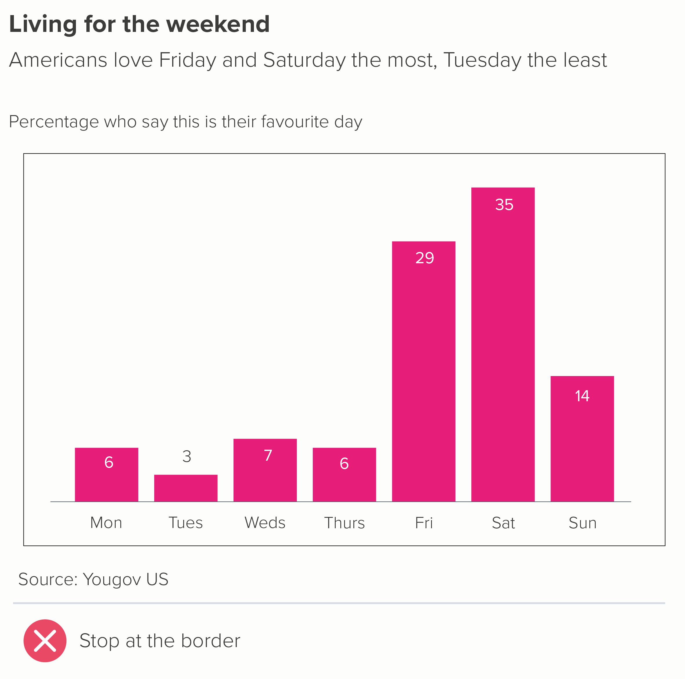
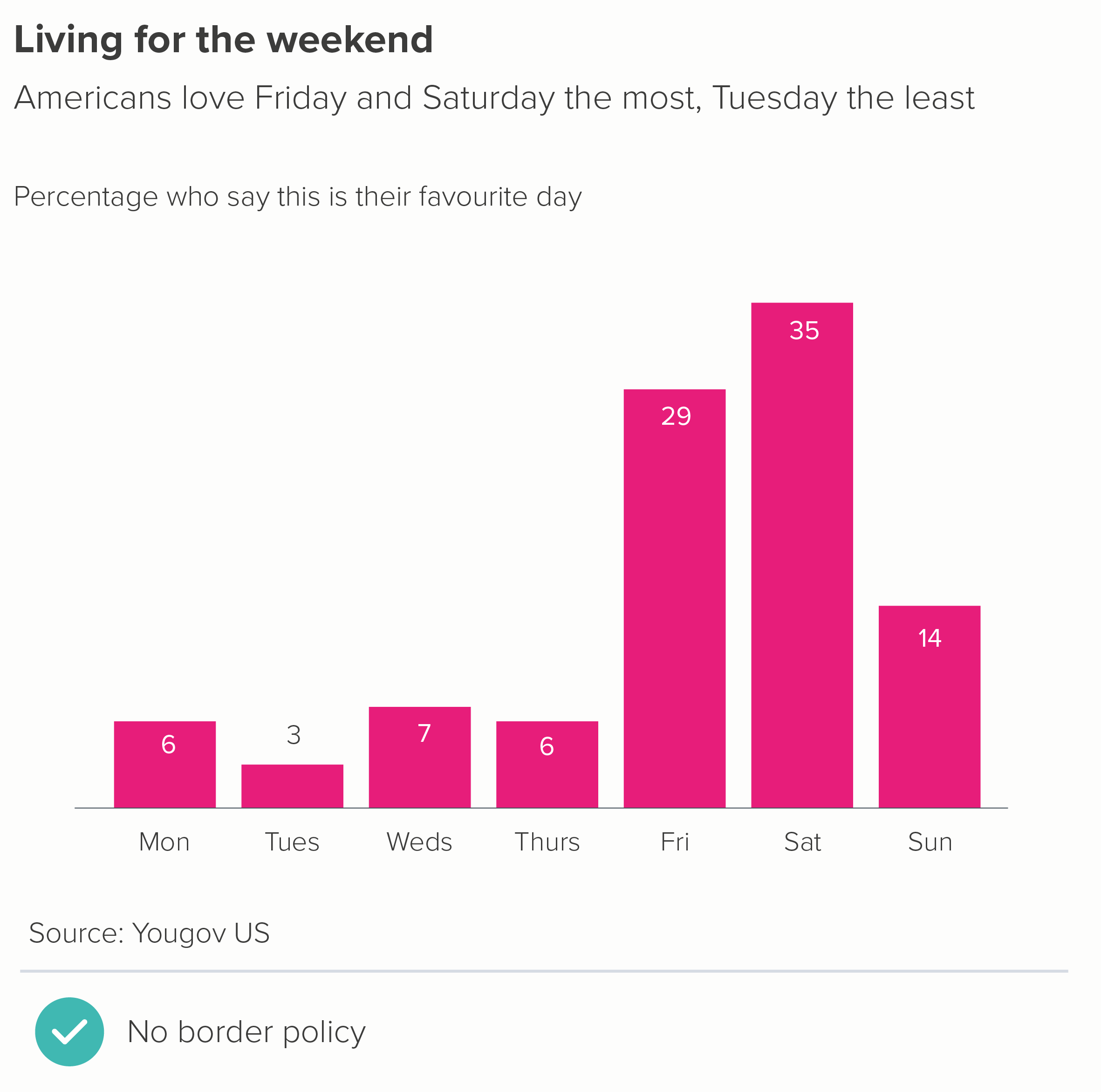
If you’re just creating a single chart on a single page or slide, then a border is rarely a good idea. You already have a frame - the edge of the page.
But sometimes your chart is one of several: perhaps it’s a panel in a larger infographic, or one section of a dashboard - so a container is a good idea. However, putting thick border lines around your charts - like you’ve dumped them in Word text boxes - doesn’t exactly show your audience that you care. Drawing lines around your chart distracts from the lines in your chart. Instead I’d recommend experimenting with a subtle background fill - usually a shade of grey (on a white background) or a darker shade of your background colour (if it’s a dark background).
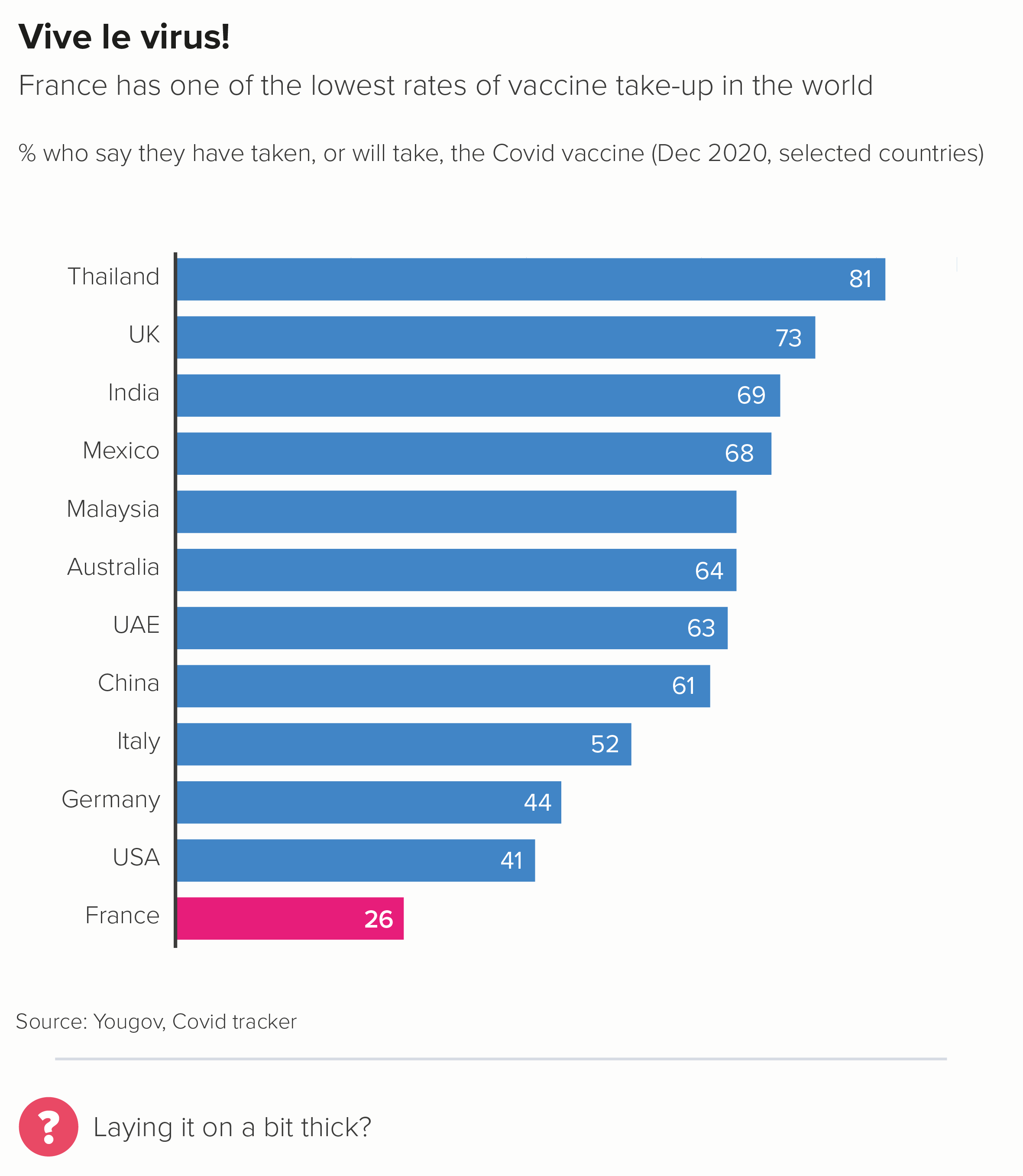
Another option is to just use a border on one or two sides of the chart (the second chart below).
If you have lots of bar charts - perhaps it’s a small multiples story - I’d lose any kind of frame and let white space work its magic, as in this wonderful example from Nathan Yau about the quality of movie sequels.
Source: Flowing Data
ii) Gridlines
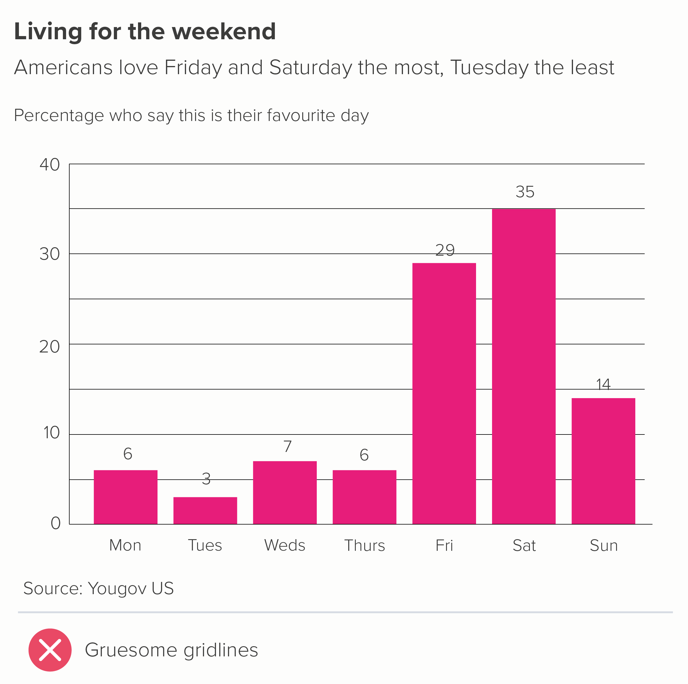
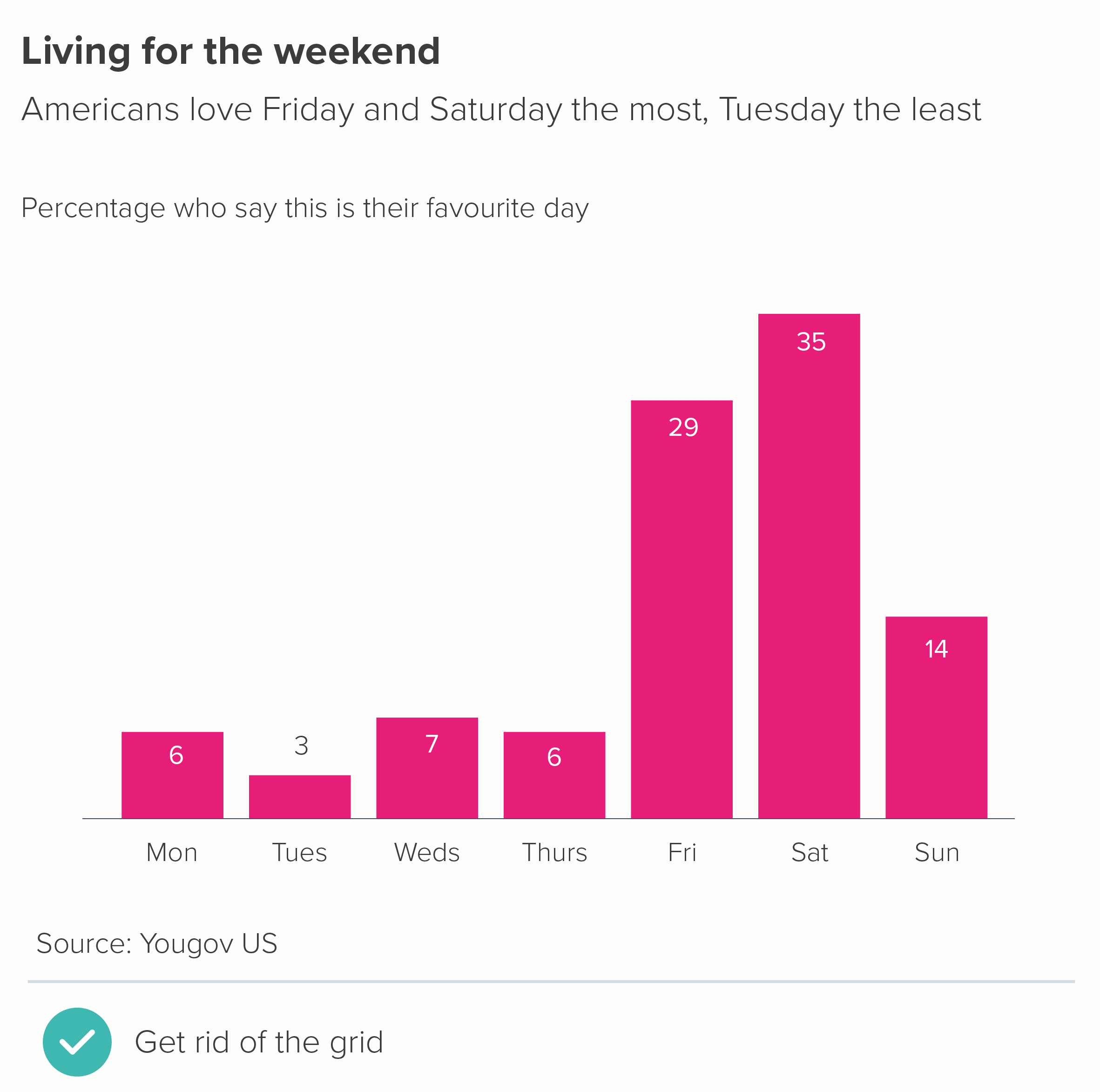
Edward Tufte argues that gridlines ‘should be muted or completely suppressed.’ Stephen Few states that ‘gridlines in graphs are rarely useful’. They were talking about all chart types, but with bars, I think we can go further. In an ideal world, you’d never need gridlines on a bar chart: they shouldn’t be ‘muted’, or ‘used rarely’, they should just be eliminated.
Gridlines are there to help an audience estimate the values in your bars. If you keep the number of bars low (say, 10 max - as outlined in rule 17), they should be wide enough to incorporate data labels. Data labels mean no gridlines. And you can usually get rid of your value axis too (y-axis for vertical bars, x-axis for horizontal).
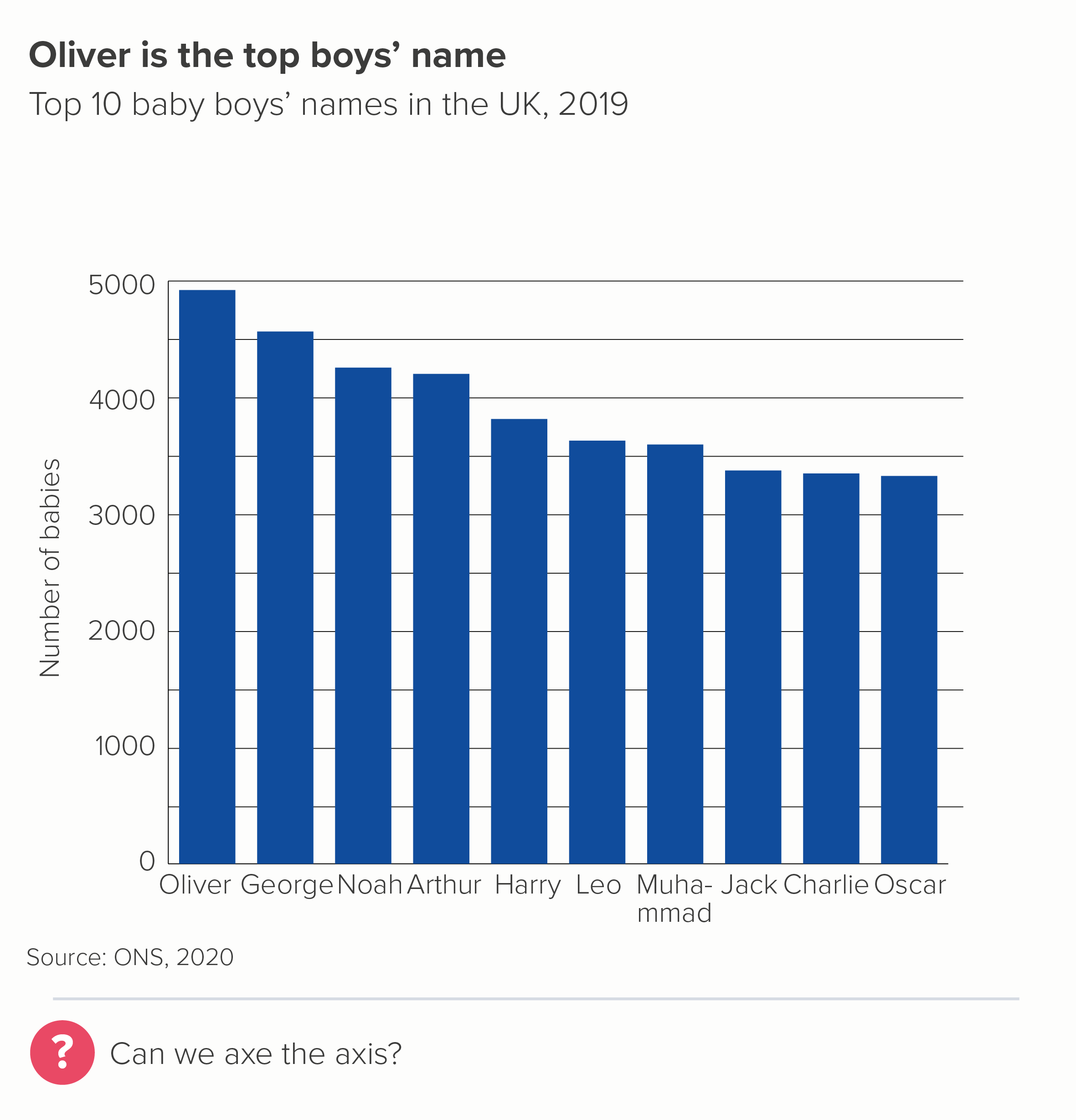
Look at the first chart - not only are the gridlines redundant but they fight with the labels, slicing through some of them.
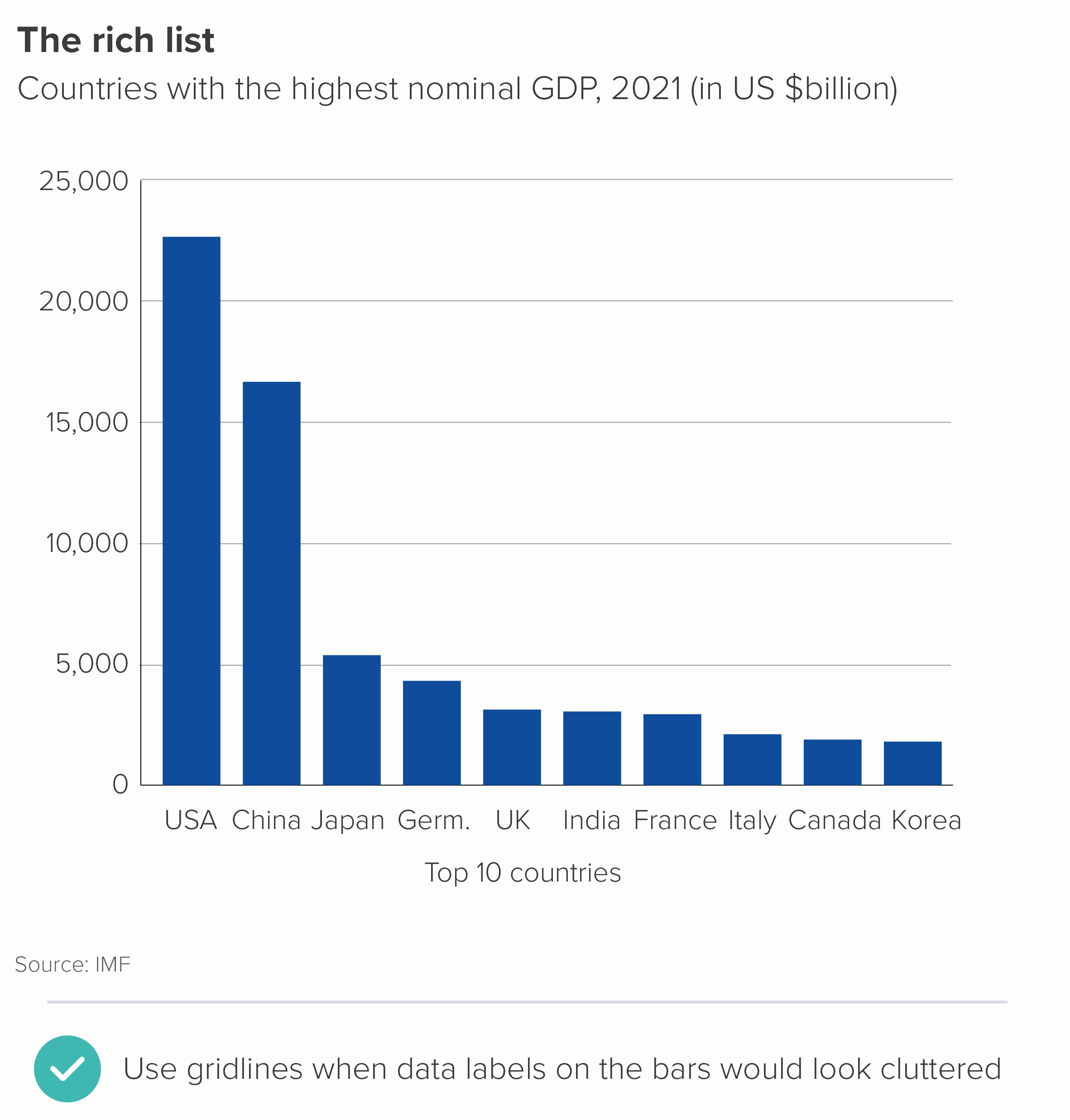
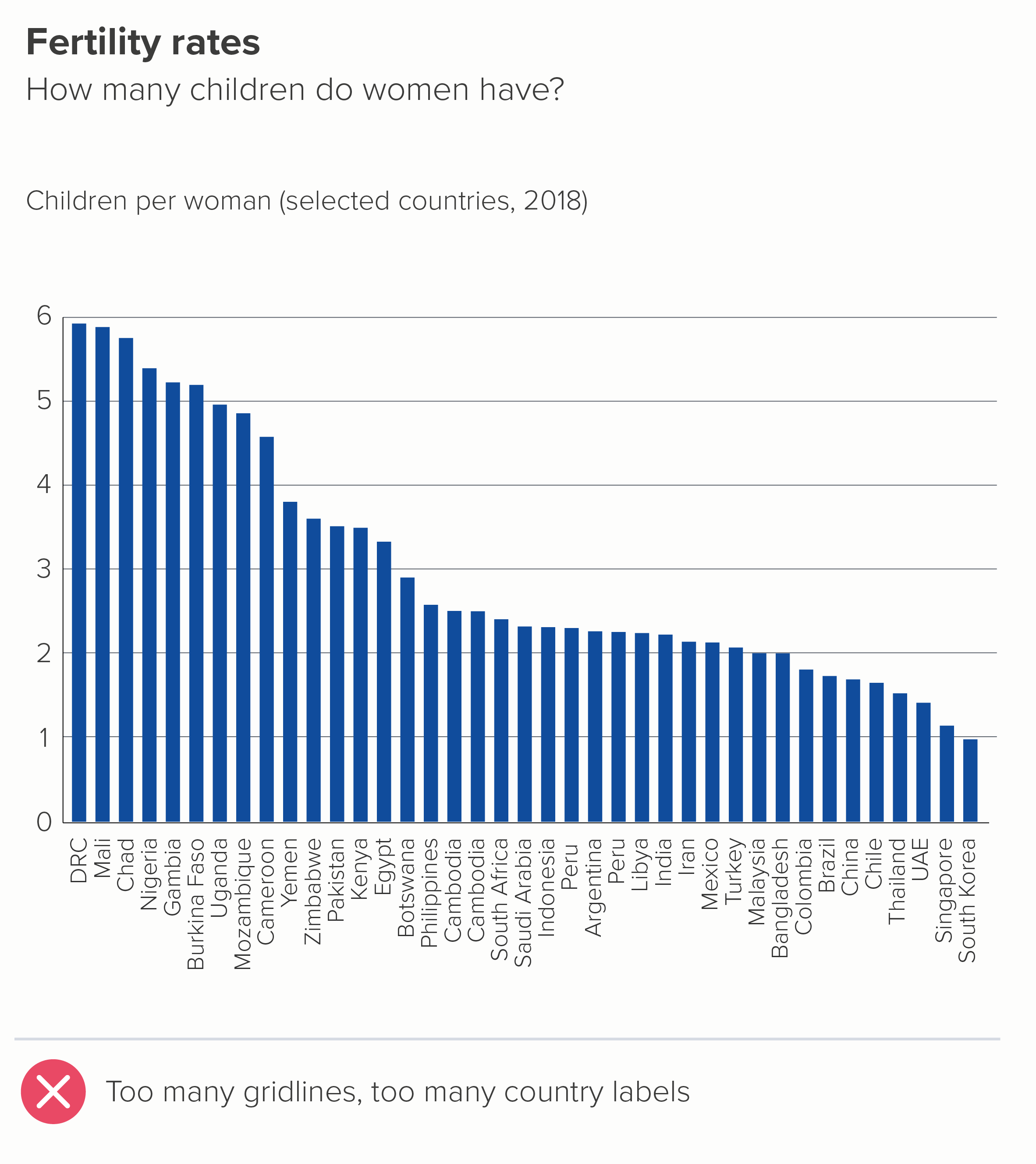
Gridlines are only required if your story makes data labels impossible - perhaps they would be too wide for the bars, or you have dozens of bars, and adding numbers would look cluttered.
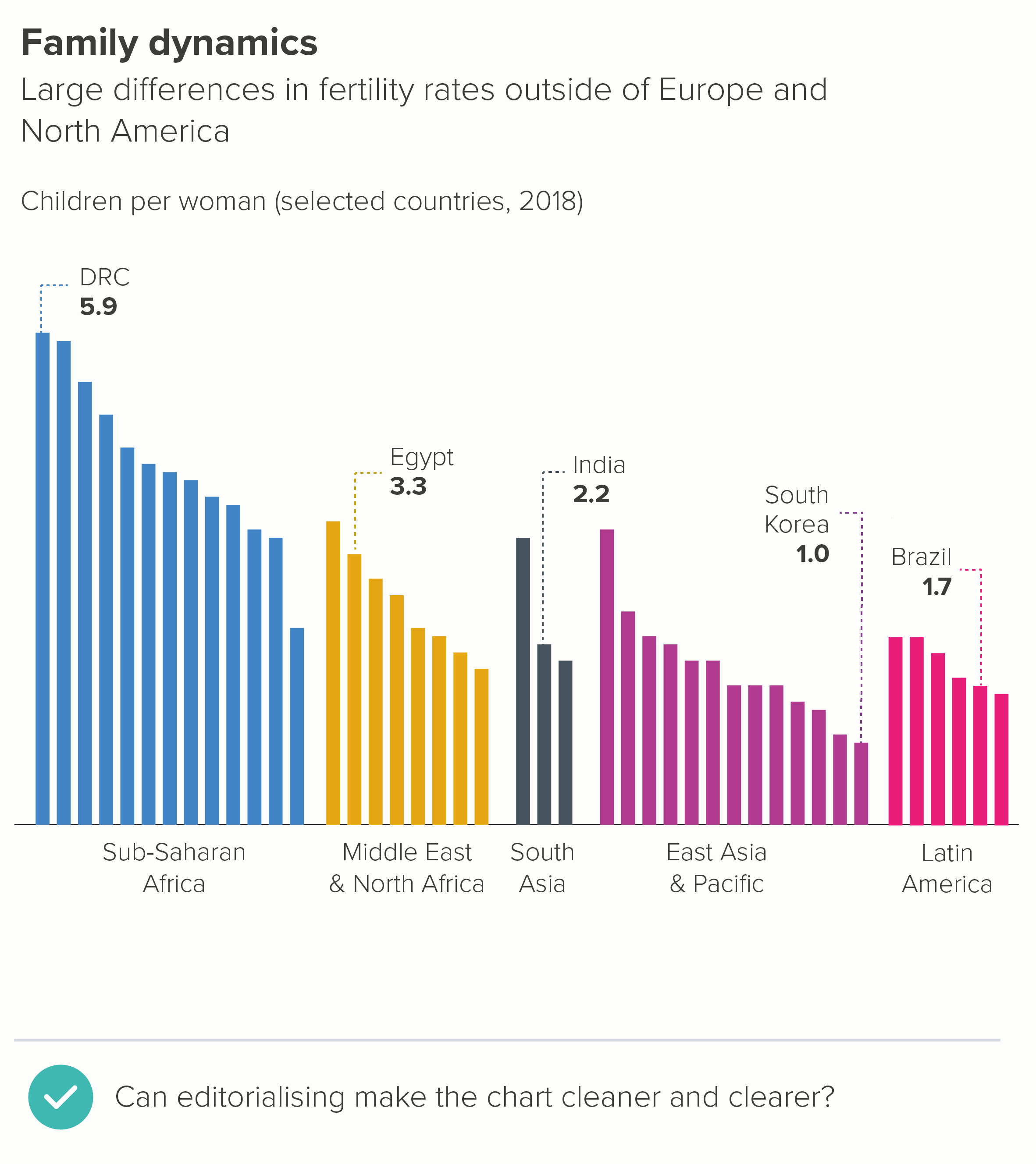
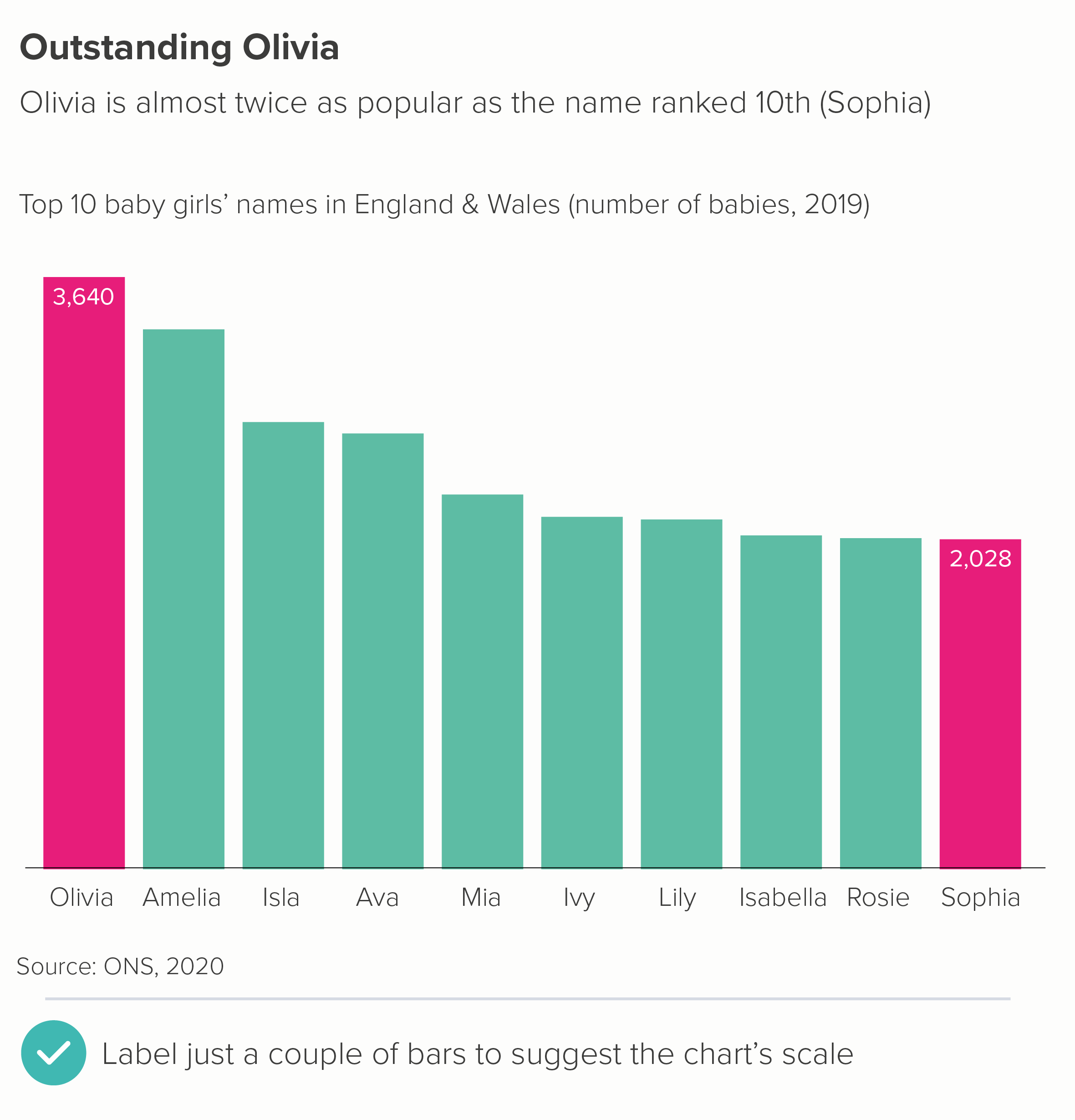
Even then, the presence of gridlines is often a warning sign that you have more story work to do. The primary job of a bar chart is rarely to give an audience a precise value (that’s what tables are for). Can a judicious use of text tease the story out and make any gridlines redundant? Is it possible for a handful of bars to be labelled, thereby acting as a kind of ‘axis’ for the others?
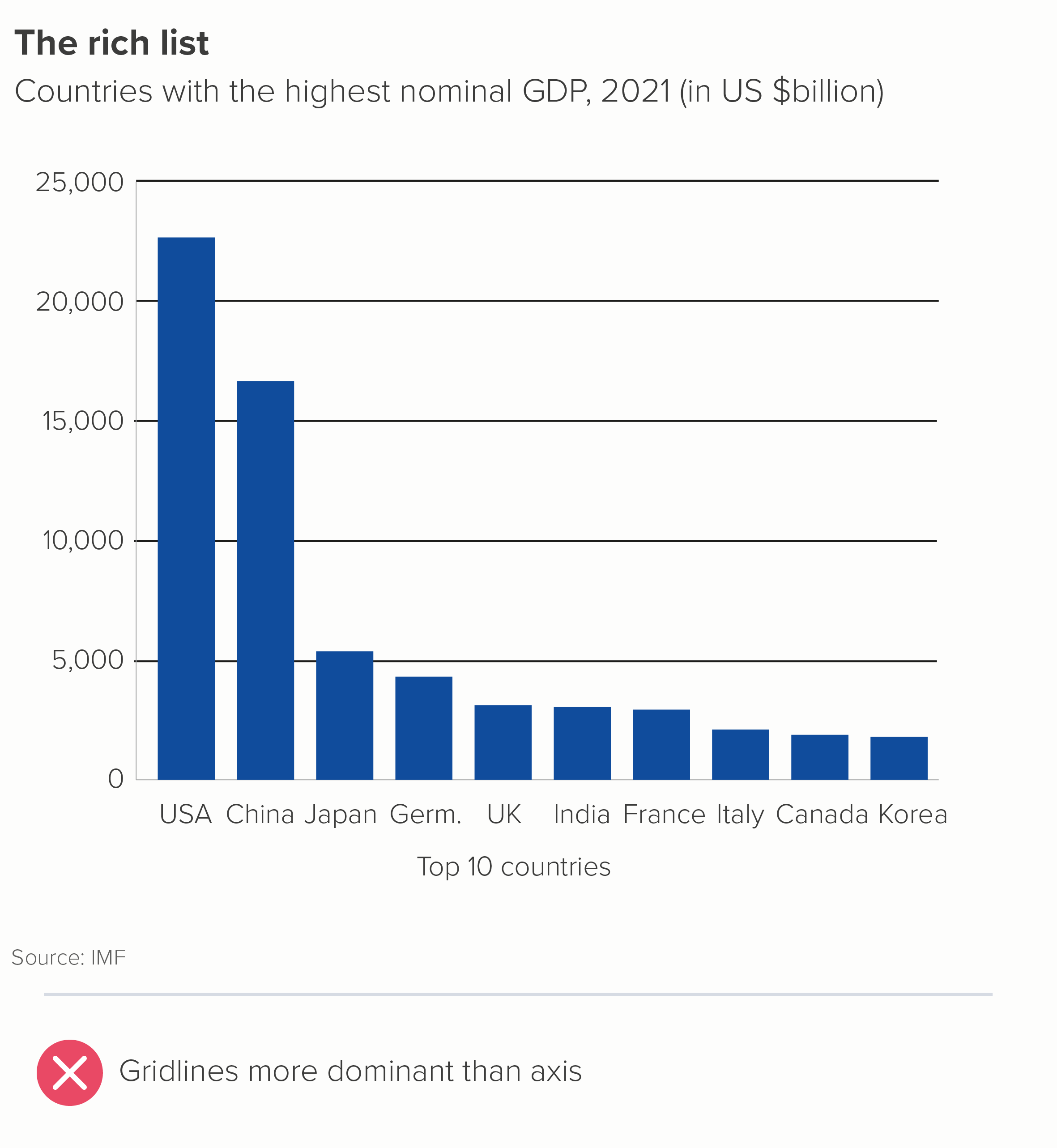
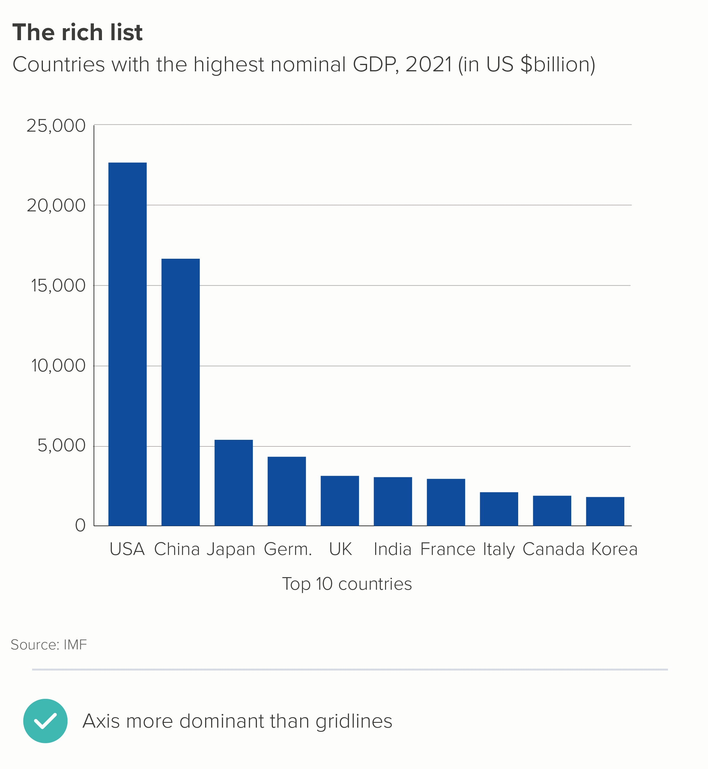
If you do have to use gridlines, make them as subtle as possible; they should always be less conspicuous than your axis lines.
iii) Axis lines
Above, I suggested that you could delete your value axis if your bars have data labels.
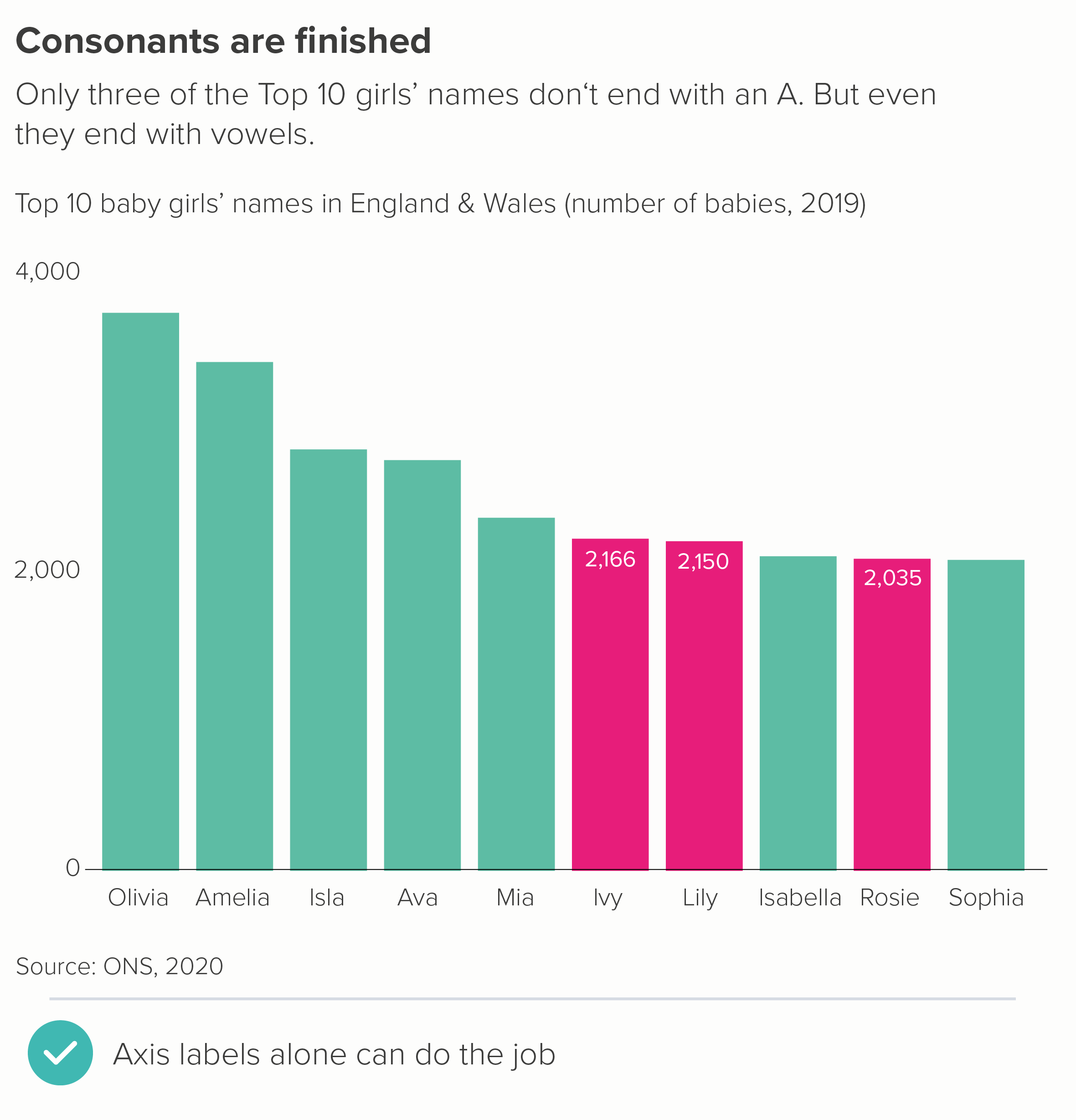
Sometimes you can delete the value axis, even if you only have a couple of data labels. The rough value of the unlabelled bars is perfectly clear from the two that are labelled (the first chart below). Or sometimes you might want to delete the value axis but leave the numbers to unobtrusively indicate the chart’s boundaries (and to reassure people you’ve started your chart at zero) - as in the second chart below.
What about the category axis line? (The x-axis for vertical bars, the y-axis for horizontal bars). In most cases, it’s helpful.
Vertical bars work as a metaphor because they are separate shapes sharing common ground, like houses or fenceposts or people standing side by side. Your x-axis is the ground beneath their feet.
Horizontal bars work because those shapes are running a race, and your y-axis is the starting line. In both cases, the category axis indicates clearly: I’m starting to measure all of these things from exactly the same point, although they will end in different places.
That said, most software makes the category axis way too prominent. You almost always need to knock it back. 0.5 pt is usually plenty, especially if it’s a dark line on a white background.
iv) Axis tick marks
I’m genuinely stumped as to why axis tick marks are ever required. They look busy and they don’t help you read or understand the chart.
On a category axis, I’d say never use them. Look at the first chart above - what are those tick marks on the category axis doing? On the value axis, if you absolutely need that level of precision, I’d favour gridlines over tick marks, as they are easier to incorporate subtly, and they actually help you to tie value to bar.
v) Annotation lines
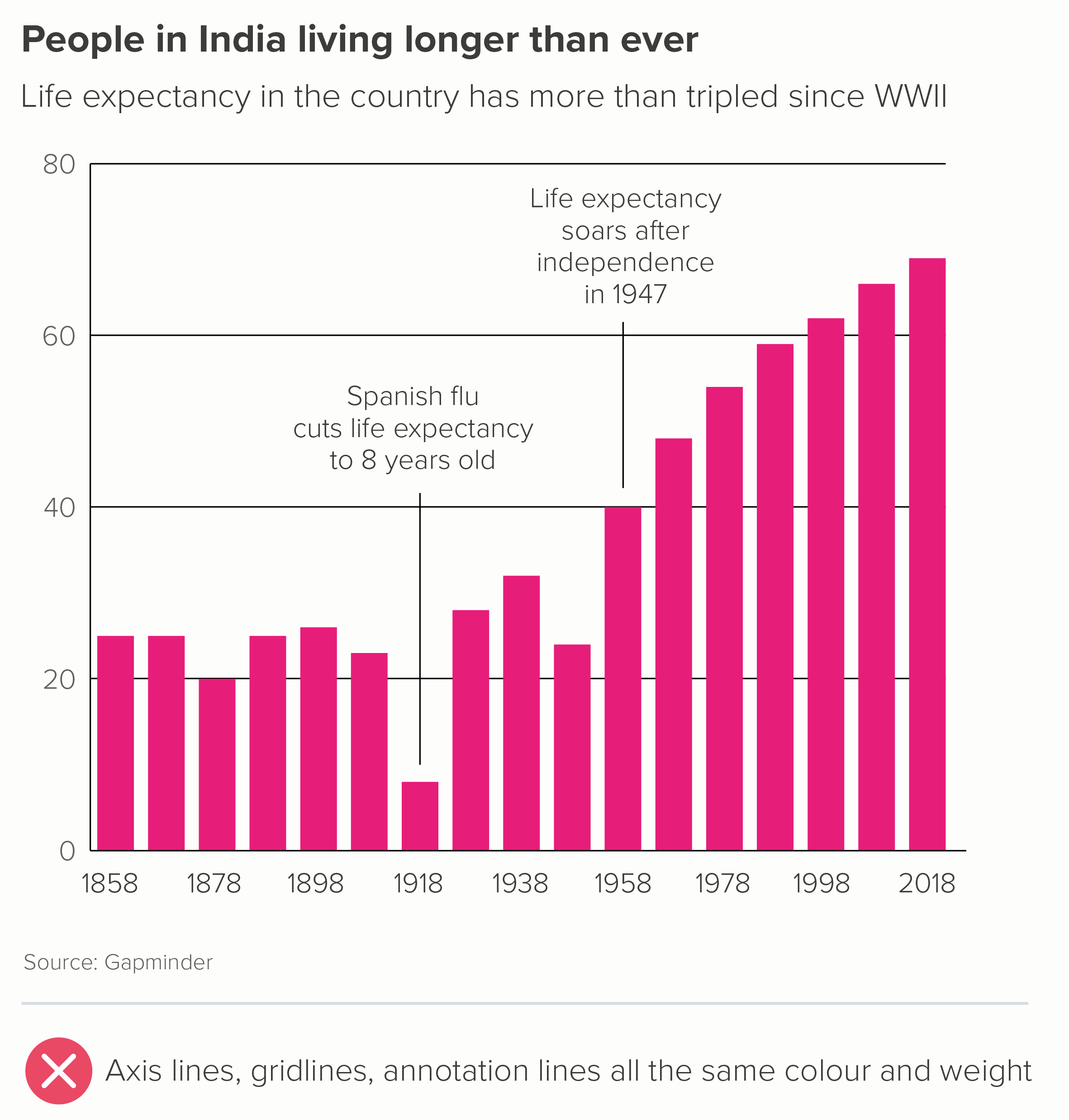
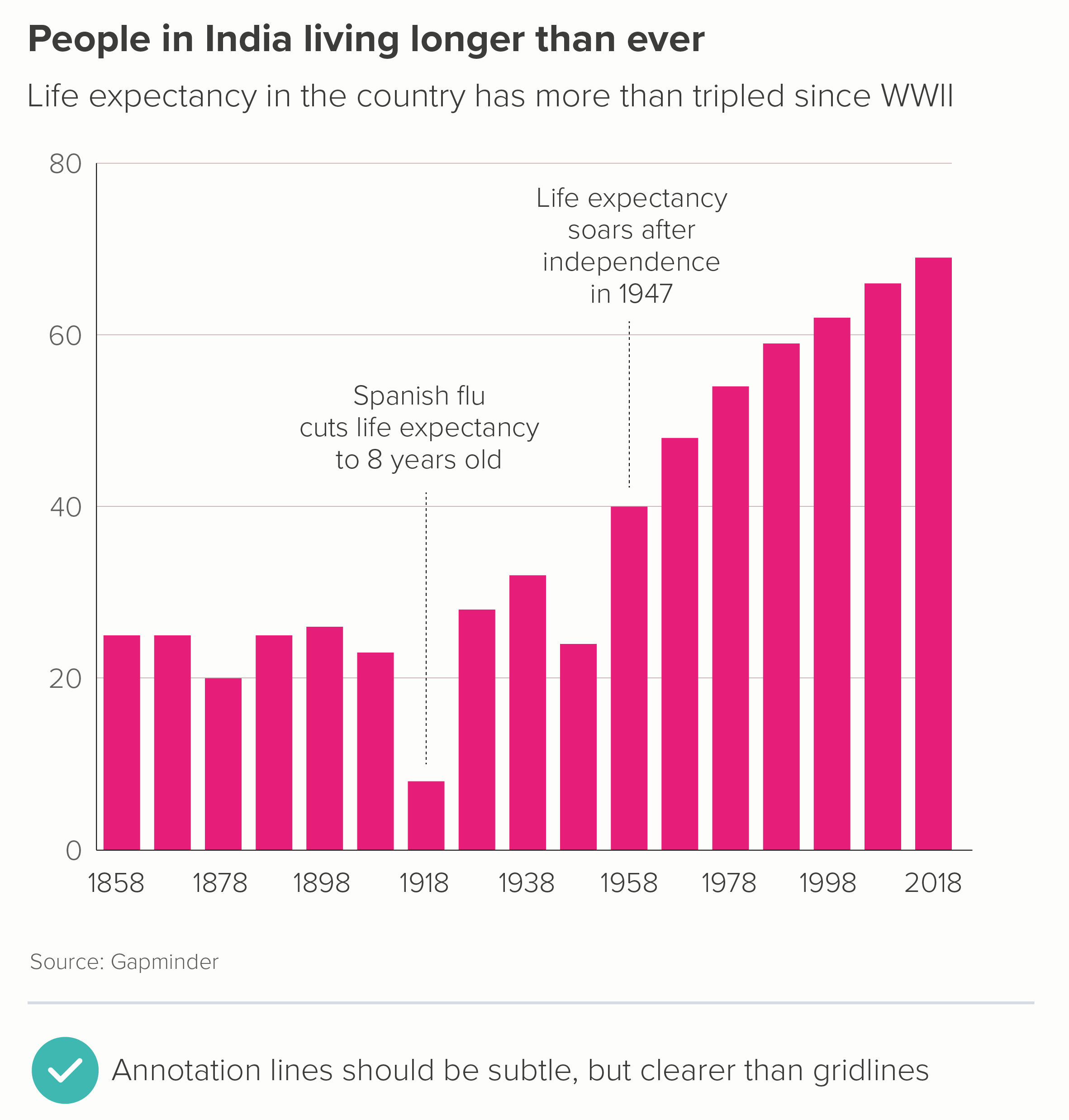
Sometimes a (restrained) use of annotation can help to add depth to your story. The important thing to remember is that this is adding to your story, so the story has to be established first. For this reason, annotation lines tend to be either thin or dotted, to clearly indicate that they are lower down the narrative hierarchy.
However, note that annotation lines should still be more prominent than any gridlines. Annotations are still part of your story, whereas gridlines are just scaffolding.
Exceptional academics
The rules above apply to most audiences. However, when we have worked with academic institutions, we are sometimes asked to put all of this ‘chartjunk’ back in again. So, as I’ve said all along, you do have to be attuned to what your audience expects a credible bar chart to look like. Some academics seem to find crap design reassuring, or good design suspicious, or both.
Source: https://journals.asm.org/doi/10.1128/CMR.00028-20
These examples are from Nature and the American Society of Microbiology - published in 2018 and 2020, respectively.
In the bar chart in the first example, we have:
a chart border
tick marks on four sides of the chart
crowded axis labels
a scientific formula as a y-axis title, which would be hard enough to understand even if it wasn’t rotated 90 degrees
confidence interval lines, which are the same colour (jet black) and line thickness as the border, axes and tick marks.
The content is not differentiated at all.
In the second bar chart, we have:
thick axis lines
tick marks on the x-axis
gridlines
x-axis labels and data labels
a gradient background fill
There are of course other problems with this second example: there are too many bars, they are not ranked largest to smallest, the bars have the strangest fill pattern I’ve ever seen and there are no comma separators to help us read any of the numbers. But the clutter isn’t helping.
The fact that these charts weren’t published in the 1970s, but recently, and the fact they were weren’t self-published by a marginalised crank, but in high-profile peer-reviewed journals tells you all you need to know about the accepted house style of scientific charts. It needs to look like a computer did it, perhaps because it feels more unbiased (though it isn’t, of course) and perhaps because it shows that the author has more important things to worry about than making a chart look ‘pretty’. Whatever the reason, the audience is always right, I’m afraid.
So it’s worth remembering that the clean, clear chart you’ve made for a general audience - with as many lines removed as possible - might look too slick for scientists. Those axis lines and gridlines also signal a concern for precision and exactitude, which is often prioritised over clarity in academic research. All those lines are also a warning sign: this is difficult, this is complicated, this is definitely not for everyone.
So even though I’ve railed against unnecessary lines, it’s worth remembering that your audience always defines what unnecessary means. In most circumstances, you should remove as much as possible, so your title, your bars and any category and data labels can punch out. But for some expert audiences, all those extra grids and glyphs can calm the nerves. You’re walking a fine line.
Verdict: Follow this rule almost all of the time
Data sources: Favourite day of the week - Yougov US; Uruguay is best - World Bank, Our World in Data, Baby names in the UK - ONS, India life expectancy - Gapminder, French vaccination - Yougov Covid tracker
More data viz advice and best practice examples in our book- Communicating with Data Visualisation: A Practical Guide

