
Proportionally sized arrows are often a useful - and eye-catching - way of showing change, especially given how visualising using area means we can accommodate wide ranges of data and still have them all visible.
So, how do we make this in PowerPoint?
In this how-to, we’ll be using the default sample data PowerPoint gives you, so you can follow along without needing to download anything, but if you want to, you can find the dataset we used to make the example at the top, and a PowerPoint deck with that slide in, and other examples, here:
https://docs.google.com/presentation/d/1JuMc8Inkf8t5snQSVtGp7qffzfGwUbV3?rtpof=true&usp=drive_fs
What you’ll need
Bubble chart
Data manipulation
Chart manipulation
Design tweaks
Custom labelling
How you do it
We’re basically going to use custom fills to turn the seized bubbles of a bubble chart into sized circles. While we’re at it, we’re going to use one series of bubbles to add a bunch of custom labels to a bubble table that are driven by the data spreadsheet and don’t have to be edited by hand.
Details
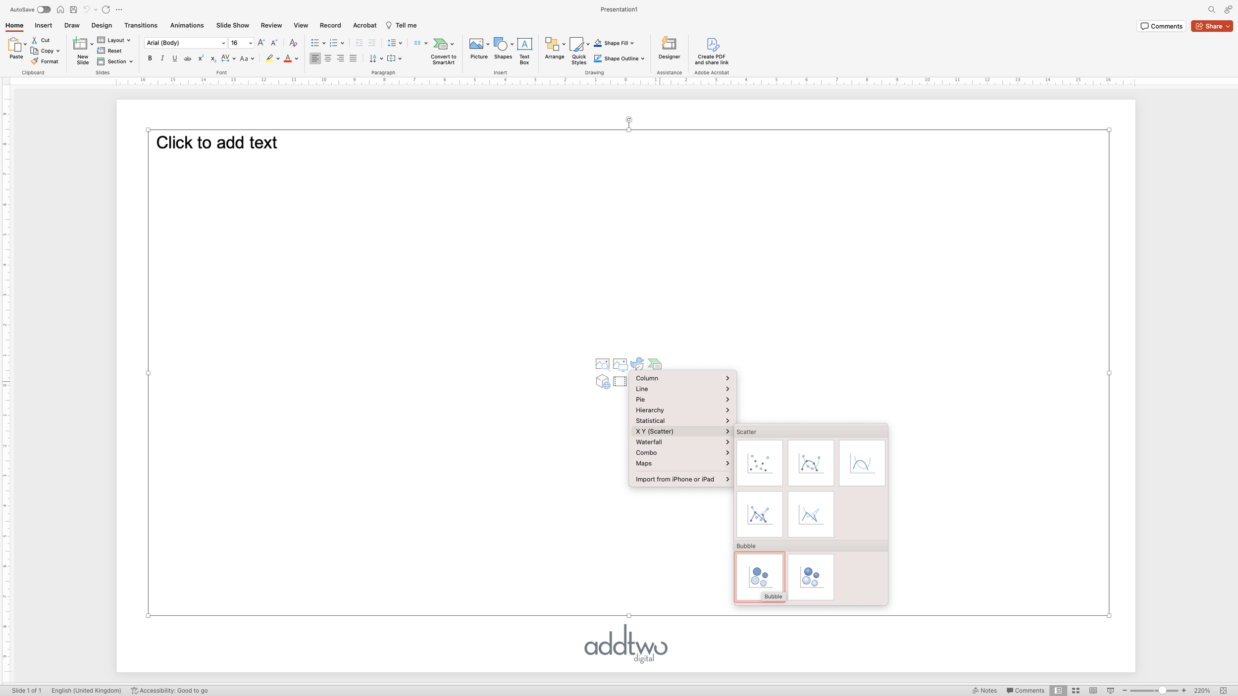
Insert the chart
We’re going to start by inserting a Bubble chart, which you’ll find under the Scatter plots in the PowerPoint chart menu
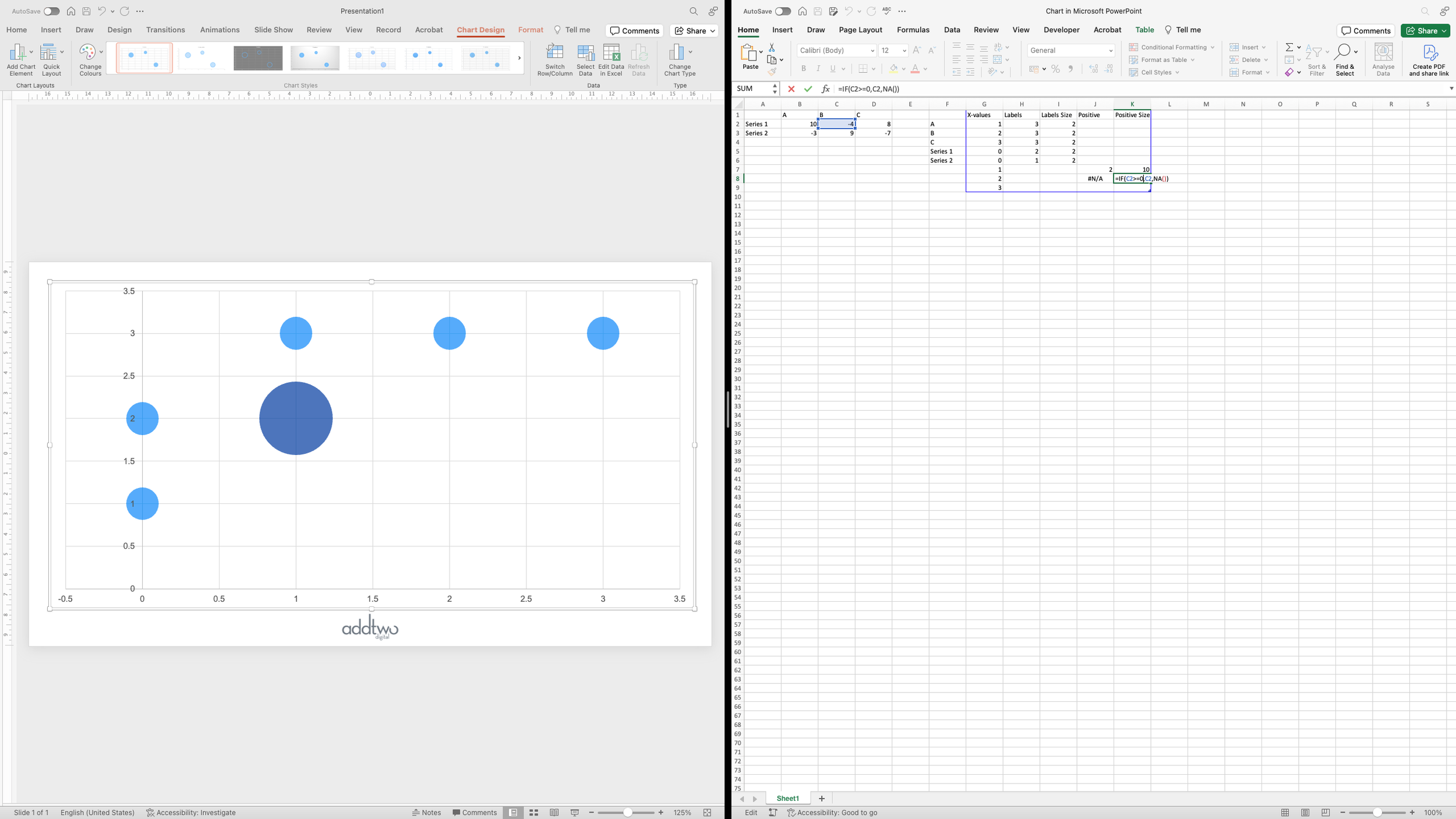
As usual PowerPoint will generate an example chart and open Excel to show the dummy data behind it in a spreadsheet

Although it opens a whole Excel spreadsheet, the PowerPoint charting engine is only ever looking at the data inside the blue frame. We can move that data around and PowerPoint will just carry on visualising it, ignoring the rest of the spreadsheet.

But that spreadsheet still works like an Excel spreadsheet, so we can use it in different ways to help manipulate the data we’re visualising.
Add the data
We’re going to add the data we’re going to visualise in a different part of the spreadsheet. We’re going to make a table of sized arrows, so we’re going to make a table of our example data. We’ll make some of the values negative, as well, so we can have two kids of arrows - positive and negative.

Layout the data
We want our visualisation to be a table of sized arrows, so it’s only the size of the arrows that will actually be linked to our data. We’re going to use the X and Y values just to layout the table into rows (from the Y values) and columns (from the X values).
By adding three rows of data, with X values of 1, 2, 3 but all the same Y values (and all the same Size values), we get a row of bubbles, all in a line.

We’re going to use this row to create our column headers using custom labelling, so let’s prepare for that by adding the column names into an Excel column outside of our data frame (we’re also going to call this data series ‘Labels’, just so we’ll know what is going on if we ever try and reuse this chart).

We’re then going to create two rows in our data by adding two rows to our data. Both the same X value this time: 0, but Y values of 2 & 1, giving us two bubbles down the left hand side of the chart.

These will be the labels for our rows, so we’ll add those names to the column by the side of the data frame.
Generate the data
We now need to add the data for our actual arrows. We have two rows and three columns of data, but as also have two data series: positive and negative. We’re going to want these series to look different, so we’re going to add them as different data series in our spreadsheet.
PowerPoint normally differentiates between data series by requiring each one to be in a distinct Y values column. For a bubble chart this becomes two new columns: Y value and size for each data series.
So to create our new Positive data series, we’re going to add two new columns for the Y value and the Size.

We’re then going to add three new rows for the X values for the three columns: 1, 2 and 3.
The Y values for these three new Excel rows will all be the same: 2, to create a new row directly under the top row of blue bubbles we already have.
BUT we only want to add values where we have a Positive value in our data, so we’re going to have to use an IF Excel formula to test whether the value in question is higher than zero. IF statements in Excel take the form: test something is true, if it is true do this, if its false do this.
So the IF statement for our first Y value will be:
IF(B2 >= 0, 2, NA())The ‘NA()’ just fills the cell with a null value, meaning PowerPoint won’t try and visualise anything.

We’re going to want to do the same thing for the Size, but here, having checked that the value is above 0, we’re going to want to add the value of the cell, as this is what we’re going to visualise in our bubble.
IF(B2 >= 0, B2, NA())
Then we’re going to want to repeat this process for the next value in our table.
This value is negative, so we’ll get a NA() entry. We’ll do the same thing for the final value in this first row in our data table.

You can see that PowerPoint has now added two new circles as a second row in our bubble table.
Now we repeat the same process for the second row in the Excel table.

And we get another circle in the bottom row of the bubble table, as we only have one positive value in that row.
That’s all our positive values, so now we’re going to add two more columns for the negative values.

As before, the first column will be our y-values, placing our bubbles into rows, but, like before, we’re only going to want to add a bubble if our value is negative. So we’re going to write another IF statement, but this time testing if the data is below 0 and, only if it is, giving a y-value of 2 to make our first row.
IF(B2 < 0, 2, NA())
And then we’re going to want to run the same test to add the size value for the bubble, but this time with a slight change.
Sized scatters can visualise negative numbers, but this is done by default using a bubble with only an outline, no fill. We’re going to create our own distinction between positive and negative numbers using these series, so we don’t want our value to be negative. We want to plot a positive value but then style it as negative in the chart design. Fortunately, we can easily convert a negative number to positive using the ABS() function in Excel, which gives us the absolute value of a cell: ABS(B2), for example.
So our IF statement in this case will look like this:
IF(B2 < 0, ABS(B2), NA())
Then, as before, we’re going to copy those IF statements for all the data points in our table.

This gives us our 3 x 2 table of positive and negative numbers.
Label the rows and columns
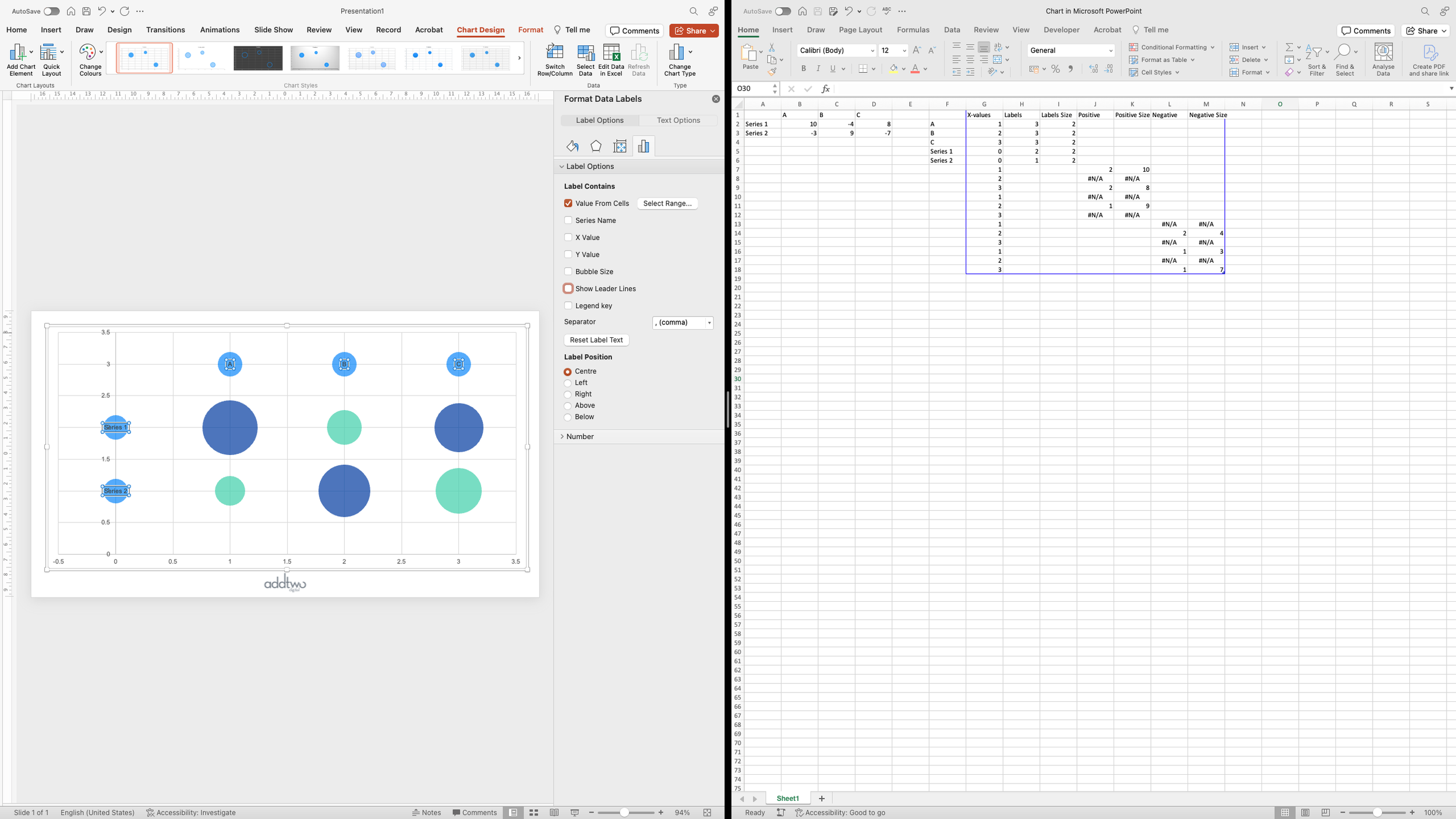
While we have the data sheet open, let’s add the custom labels for the rows and columns, as we’ll need to reference the data to do this.
We’ll select that first data series - the same-sized bubbles across the top and down the left hand side, and add data labels to them. We can do this by right-clicking on the bubbles and selecting ‘Add Data Labels’.

We then want to format those labels, so we’ll select them (you can just click on any of the labels and PowerPoint should select all of them by default), right click and select ‘Format Data Labels’ from the dropdown.

This will open up the Format Pane. Under the Label Options tab, under ‘Label Contains’ we’re then going to select ‘Value from Cells’.

This will then open a dialogue box, asking us to select a range cells in our Excel spreadsheet with which to populate the data labels.

We don't have to select cells from a data range, they can be any cells in the spreadsheet but the range must be the same size as the data being labelled. So we will select the whole column containing the label content that we created earlier.

Once we’ve selected that column we don’t need any of the other, default label content, so we can untick them in the options. We can then centre our new labels in the bubbles.
And now we can close the spreadsheet and concentrate on styling the chart.

Layout the chart
First we’re going to get our table neatly laid out. We’ll start by refining the axes. We can open the Format Pane for the x-axis by right-clicking on it and selecting ‘Format Axis’.

We’re then going to set the Minimum and Maximum bounds for this axis. We have three columns along the x-axis at the x values of 1, 2 and 3. We want to centre these columns in the plot area, so we’ll add an equal amount of space to either side by setting the axis to run from 0 to 4.
So we set the Minimum Bound to 0 and the Maximum to 4.

Now we’ll do the same to the y-axis. If we click on it with the Format Pane still open, the pane will update to show us the values for that axis.
In this case, though, we want to leave some room for our column headers, so we’ll set the Maximum to 3.5, and the Minimum to 0.

But now we no longer need those axes. They don’t show any relevant data, those values are just there to make our rows and columns, so we can delete them.
We can do this by de-selecting them in the Add Chart Element menu under the Chart Design tab.

We can get rid of the gridlines, too, because they’re not serving any real purpose either.

The last thing we’re going to do with the layout is polish up those row and column headers. We’re going to select the bubbles behind the labels.

And then we’re going to set them to No Fill and No Outline to make them completely invisible.

This leaves us with just our row and column labels showing.
Make the arrows
Now we can get on and make the sized arrows to show the two data series. We’re going to do this by creating custom fills for the bubbles. So we’re going to start by adding a circle to the slide, to give us our bubble shape. We can do this using the Shape menu under the Insert tab.

We can make sure that the shape is properly even by setting the width and height in the Shape Format settings.

We’re then going to remove the Fill from the circle, leaving just the outline.

And we’re also going to move that circle off of the slide. This is a really useful little feature. We can have all kinds of graphics stored outside the bounds of the slide - they won’t show up when we’re in presentation mode, but they’ll still be there when we need them.

Now we’re going to add our arrow shape by adding an upward pointing triangle to the slide.

We then want to centre it over the top of our circle, aligning it with the top edge and making sure all the tips touch the circumference.

We can then style that triangle with whatever fill colour we want to use. We’re going to use the options in the Format Pane to do this because we also want to give it a 20% transparency, making it slightly see through. This will come in useful if our shapes overlap.

We’re then going to select both the arrow and the circle underneath - you can do this by holding down shift as you click one after the other, or by simply dragging around both. And then we’re going to remove the outlines from both by selecting ‘No Outline’ under the Shape Format tab.

The circle in the background is now entirely invisible but, crucially, PowerPoint still knows it’s there. We now have a semi-transparent arrow within an invisible circle. Now, with both still selected, we’re going to copy them.

Then we’re going to select the first series of bubbles, the series showing positive change, and open the Format Pane.

In the Format Pane we’re going to set the Fill options to ‘Picture or texture fill’. By default, PowerPoint will fill the bubbles with a canvas texture.

We can change that by hitting the ‘Clipboard’ button underneath. This will fill the bubble with whatever is on the clipboard, in this case our arrow inside the invisible circle.

Now we’re going to make the custom fill for the negative change. We’re going to do this by selecting the semi-transparent triangle and flipping it upside down.

We should also change the colour of this data series, but we need to ensure that whatever colour it is, its still 20% transparent.

Then we’re going to select both the triangle and the invisible circle behind it (it’s easiest to just drag over both in this instance), and this time align the triangle to the bottom of the circle.

And again, with both selected, we’re going to copy them.

The we’re going to do the same thing as we did with the first data series: select the negative data series and Fill with Picture or texture fill from the clipboard.

So we now have our two data series, positive and negative change, shown by up and down arrows.
Add labels
We can easily label the triangles using the Add Chart Element menu by selecting the positive data series and then choosing ‘Centre’ from the Data Labels options.

By default PowerPoint will label using the y value, but we can change that in the Format Pane. We can right click and select ‘Format Data Labels’.

In the Label contains options, we can switch the label to ‘Bubble size’, which is our data point.

Now we want to do the same for the negative data series. We can simply right click on it and select ‘Add Data Labels’.

Then we’ll need to change those labels to ‘Bubble Size’ in the Format Pane.

However, because we set the Size value to be absolute, to get a full bubble, that label is now positive, when we need it to be negative. Fortunately we can set a Custom Number format to amend this.

We then want to make the positive value appear negative, so we can just set it to have a minus sign, “-”, before it.
The number format structure is format for positive number, semi-colon, format for negative number. The format for the negative number already has a minus sign in front of it: -#,##0 (the ‘#’ signs simply show the formatting for the thousands separator, then the 0 the decimal points), so we can adjust the positive number by adding: “-”#,##0 (the inverted commas let PowerPoint know we’re adding text to the number.

So we now have positive and negative labels for our positive and negative data series.
Emphasise the data
There’s one more thing we can do. At the moment we’re just got a bunch of little arrows and nothing looks terribly impressive, but we can fix that.
If we right-click on a data series and select ‘Format Data Series’, we should get the Format Pane with the Scale Data Series option
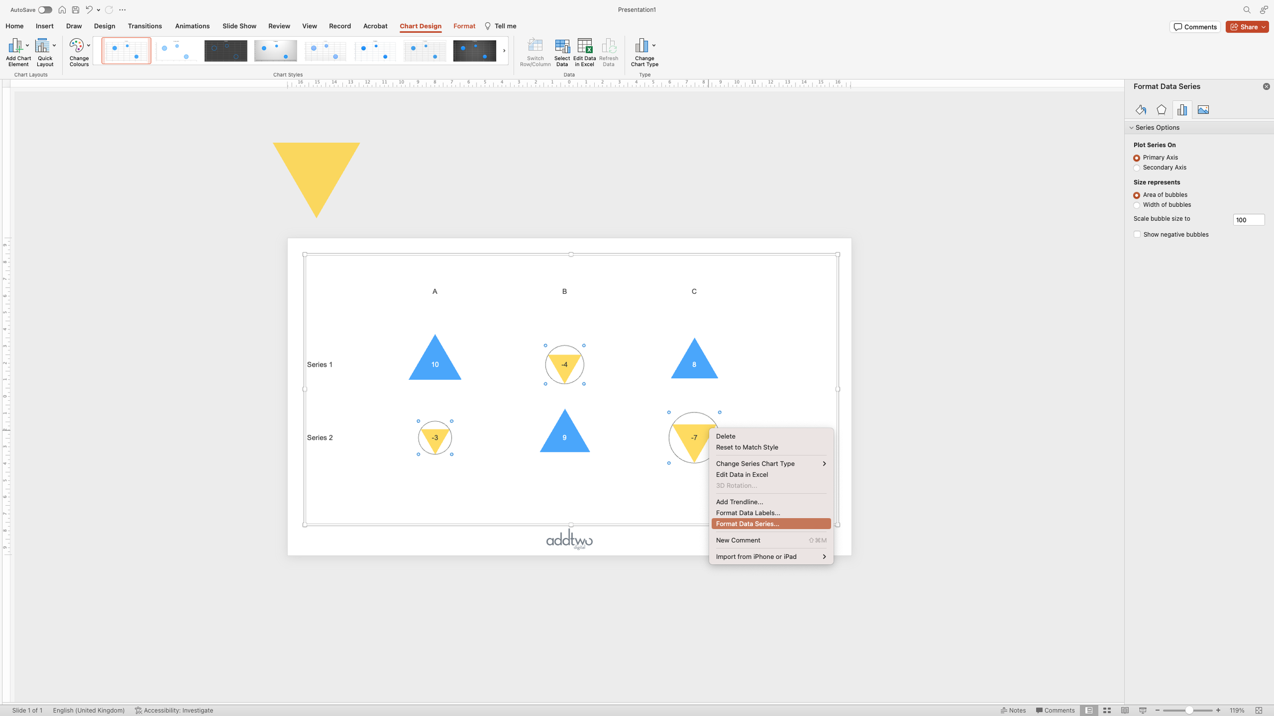
For reasons I don’t pretend to understand you can scale between 1 & 300. I have no idea what those numbers mean. If we scale to 200, say, we get nice big arrows and we start to see how having a little transparency can help when triangles overlap.

So that’s how we make that in PowerPoint
I’ve deliberately chosen rises and falls here, so I could show you how to make different sized shapes for different data series, but obviously you could use this technique to fill your bubbles with any shape you wanted.
You should, though, restrict yourself to simple shapes: squares and triangles and circles. Anything more complicated and it gets harder and harder to judge the differences in area and thus harder and harder to get anything meaningful out of the chart.
Definitely NOT sized icons, right?
