
In this blog series, we look at 99 common data viz rules and why it’s usually OK to break them. Here are all the rules so far.
by Adam Frost
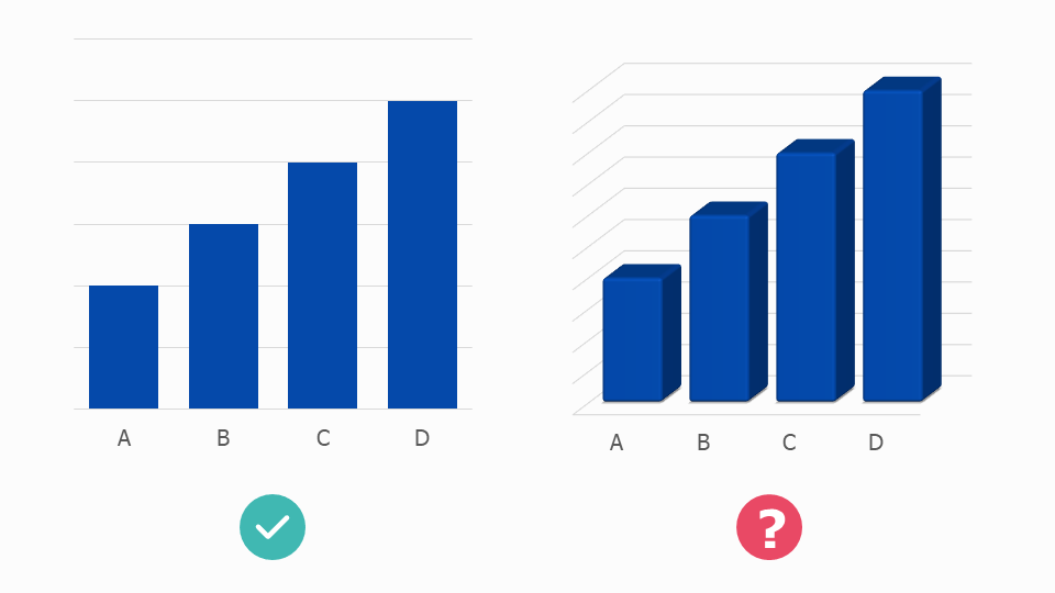
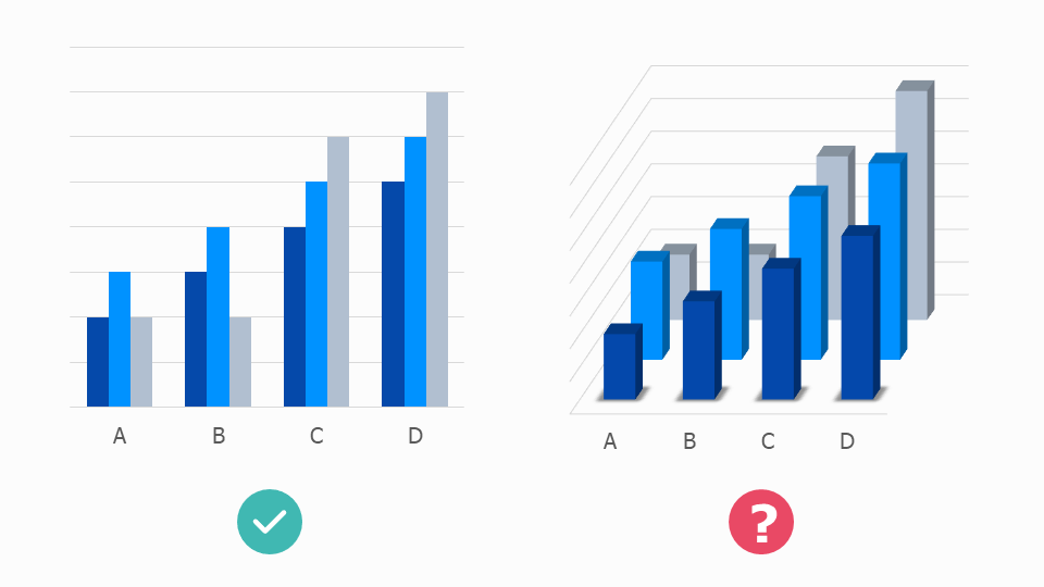
In rule 12, we looked at how spectacularly awful 3D pie charts are. However, most charts are wrecked by 3D, including bars.
You tend to change a chart’s appearance for one of three reasons:
to make its values easier to read and compare
to increase the visibility and emotional impact of its underlying story
to make it look more superficially attractive, so people will pay attention to your story in the first place.
3D bar charts fail on all three counts: they are:
hard to read
irrelevant to the story (the third dimension doesn’t represent a third dimension in the data)
inelegant. A corporate cliché.

Image credit: wtfviz.net
So that was easy. This rule we can stick to. Except, now and again, great designers come along and make 3D bars work.
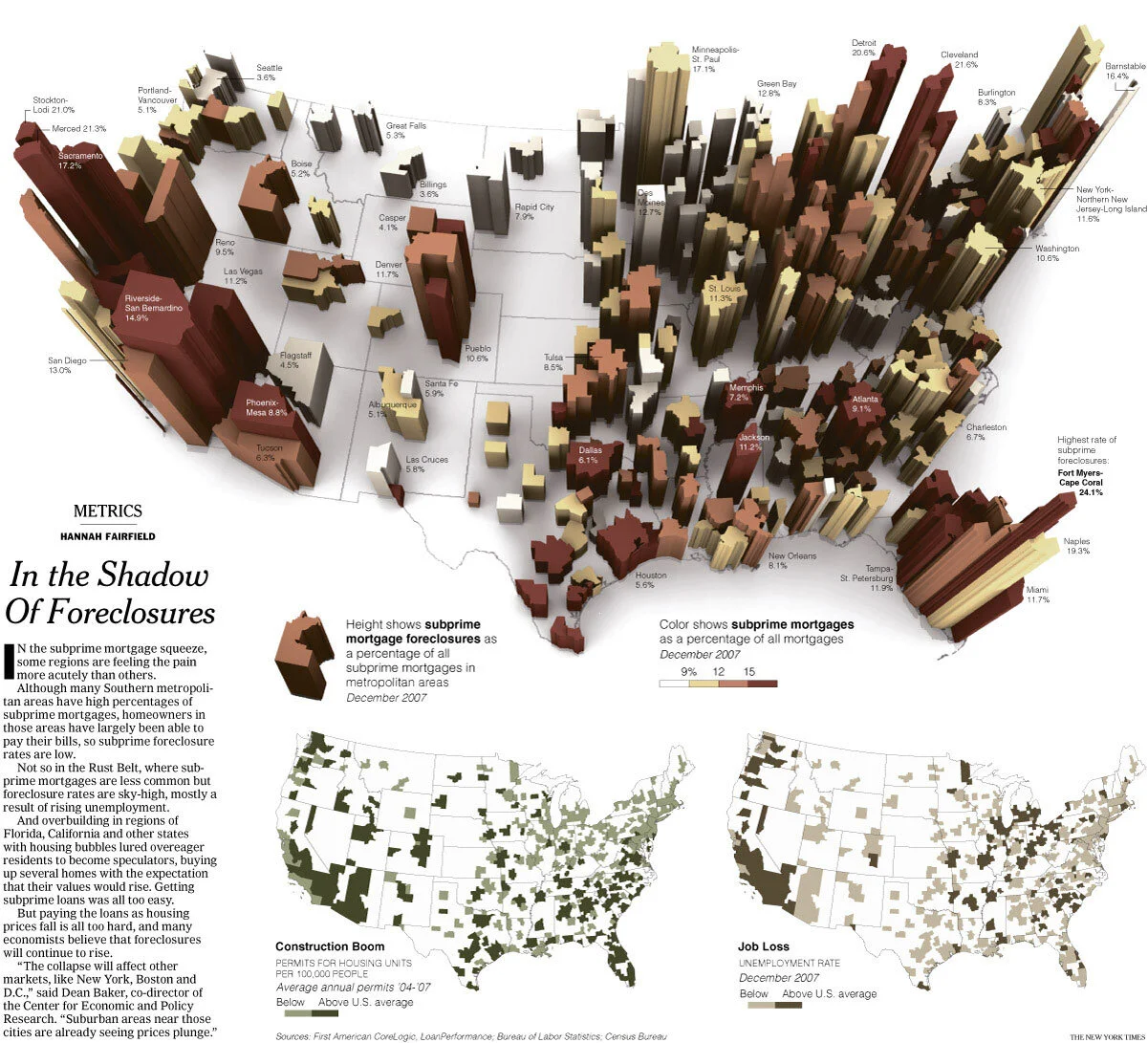
Image credit: New York Times
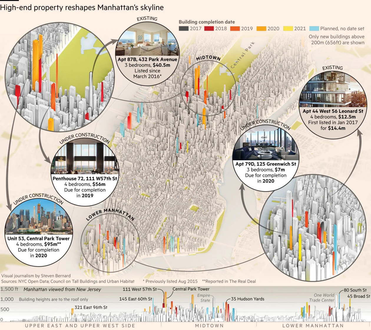
Image credit: Financial Times
I should say, in these two examples, we are not talking about 3D bar charts as such. They are an extruded map and a manipulated photograph. But they both show you can add a third dimension to a modified columnar shape to make your story more immersive.
In the first example, from the New York Times, the height of each block shows subprime mortgage foreclosures as a percentage of all subprime mortgages in metropolitan areas. It would be much more readable as a standard bar: you’d be able to quickly see the highest bar (24.1% - down in Florida). The 3D effect ruins this.
But how dull would this be as a standard bar chart! Any loss of legibility is more than compensated for by the emotional heft of the storytelling. You can see that the whole of the United States is imbalanced by the subprime crisis. You get drawn into the 3D world; the urge to explore is irresistible; you wend your way through those hollowed-out blocks like a disaster tourist.
In the second example, the Financial Times designers turn skyscrapers into bars (or vice versa) and thereby draw on all the stories that bars excel at telling - geospatial, comparison, distribution, change over time - and merge them into one composite visual. I love the way that the order in which I noticed elements of this graphic exactly mirrored the order of the questions I had in my mind: ‘Where will these new buildings be in New York? What shape will they be? Which one will be the tallest? When will they be finished?’ And finally, given that most of us will not be floating above Manhattan in a helicopter: ‘What will it actually look like from the ground?’ (This is the final 2D chart, Manhattan viewed from New Jersey).
There are other situations in which 3D bars can work. For example, interactives and motion graphics are more forgiving of 3D effects. Real World Visuals are an organisation that continually use 3D in their motion graphics in order to make their audience think about the environmental impact of consumer choices in their everyday lives. Furthermore, Real World understand that in animations, few people press pause to scrutinise a chart in detail; rather, we watch an animation to get a general overview of a subject, and therefore the charts often lean towards the illustrative, so we can more easily connect the data to objects in our environments.
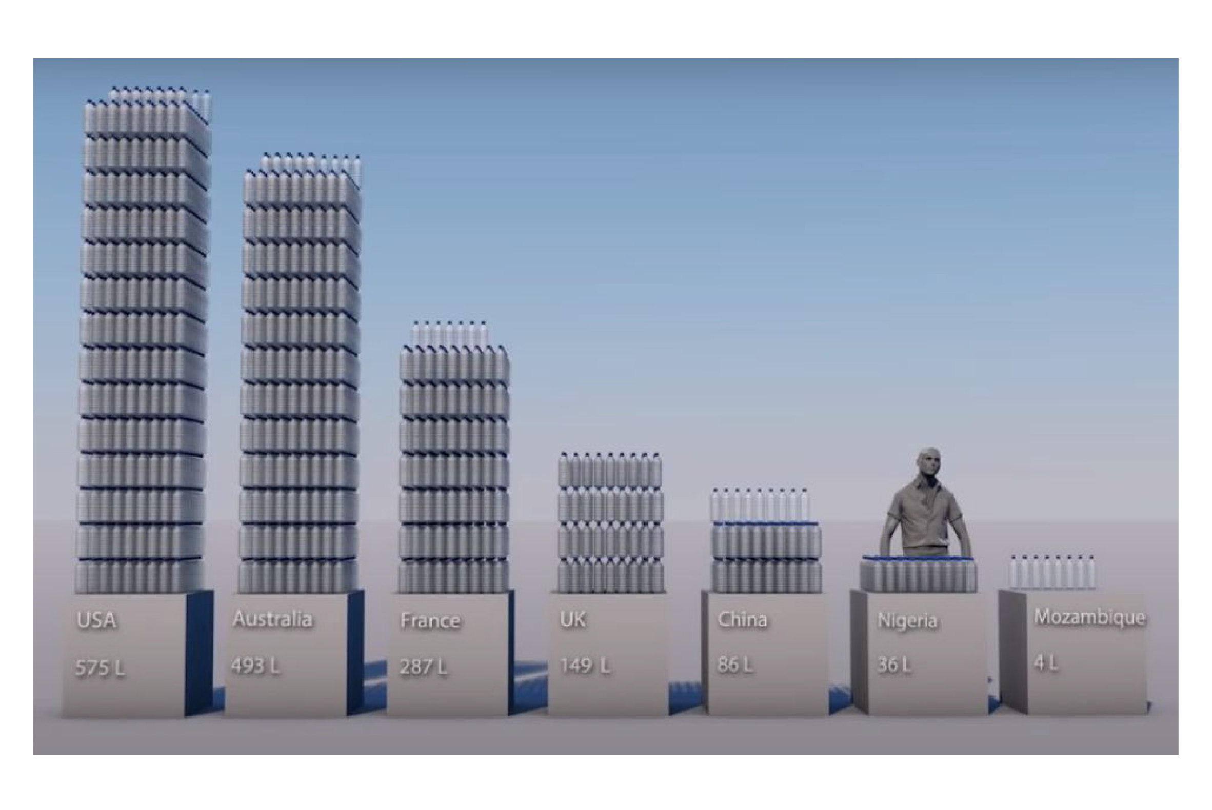
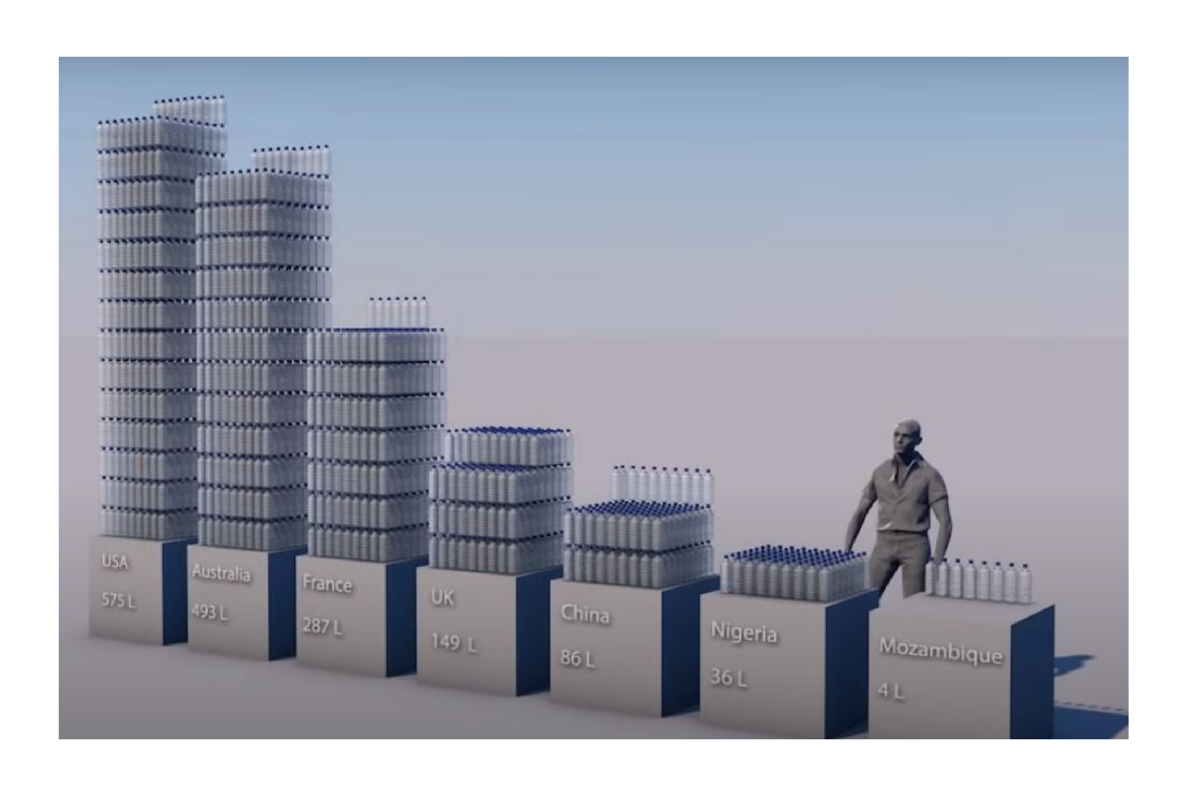
Image credit: Real World Visuals
In this example, Real World Visuals use modified 3D bars to visualise the inequality of water consumption across the world. The USA is the largest bar using 575 litres of water per person per day; Mozambique is the shortest bar, using four litres of water per person per day. The fact that the bars are rendered as stacks of bottled water - like you would see in a supermarket - helps us to think both of the grossly unfair distribution of resources and of the stack-em-high consumer culture that fuels this inequality of access.
To conclude then, 3D bars are usually a multi-dimensional mistake. However, they can be the right choice if:
you are trying to emphasise the real-world context of your data
the objects you are visualising (skyscrapers, bottles of water) are vaguely column-shaped
you have the skills and the software to create 3D visuals that make the real-world connection obvious
If these three conditions don’t apply, stick to two dimensions.
VERDICT: Only break this rule in exceptional circumstances
More data viz advice and best practice examples in our book- Communicating with Data Visualisation: A Practical Guide