
Bar bells are a really great way of showing ranges - either the range within a dataset or the difference between two data points. They can even be used as an elegant way of showing uncertainty, a range which the data may fall.
So, how do we make this in PowerPoint?
In this how-to, we’ll be using the default sample data PowerPoint gives you, so you can follow along without needing to download anything, but if you want to, you can find the dataset we used to make the example at the top, and a PowerPoint deck with that slide in, and other examples, here:
https://docs.google.com/presentation/d/1IOQaYhFiCZKHqIufCU6eHQ9jsibf8bSM?rtpof=true&usp=drive_fs
What you’ll need
Connected scatter chart
Data manipulation
Design tweaks
Custom labelling
How you do it
We’re going to use a connected scatter to make the actual bar bells along the axis - a line with markers at each end, using the y axis values to line the bar bells up into rows. We’re then going to use the ‘Value from cells’ custom labeling option to replace the y-axis with row labels.
Details
Insert the chart
Insert a connected scatter chart or, as PowerPoint calls it, ‘Scatter with straight lines and markers’:

As usual, PowerPoint will create a dummy chart then open Excel to show us the data behind it.

Manipulate the data
Although PowerPoint opens a whole Excel spreadsheet to show us the data, it’s only visualising the cells surrounded by the blue frame. And it only ever does. We can move those cells around and PowerPoint will still only see them:

We can still use the rest of the spreadsheet as a spreadsheet, though, out of the sight of PowerPoint.
We’re going to put our data into a little table outside of the frame and then set up the cells within the frame to create the right structure for our visualization.

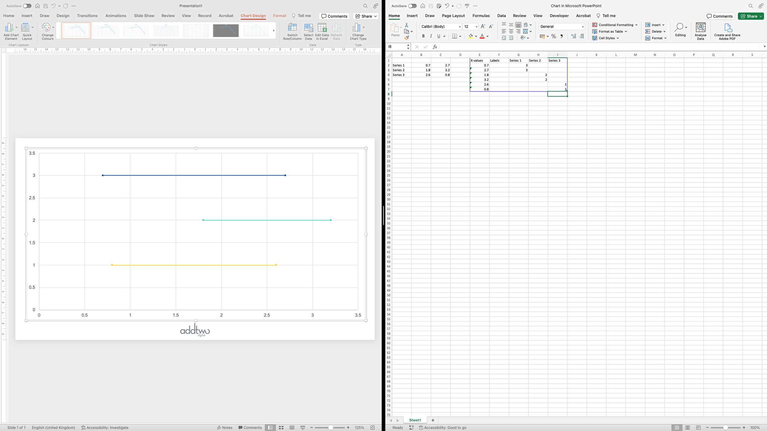
We’re going to use the x-axis to show our actual data, so we’re going to add our values into the X-values column, pair by pair:

To keep each range as a separate pair of values, we want to make each pair a distinct data series. For PowerPoint each new data series is distinguished by being a new column of y-values.
We’re going to give each pair the same y-value, which will line the pairs up into rows. We’re giving the first pair of values the y-axis value of 3, to make them our top row:

By giving the other pairs the values of 2 and 1 respectively, we can make two more rows in our chart:
Prepare the labels
We still have that empty column of y values - an empty data series. We’re going to use that column to make a data series to hold our row labels.
First move all the other data series down three rows, as we need to make space for three row labels.

Then we’re going to add a data series at the far left, at the beginning each row, so we’ll give everything a x-axis value of 0, and then the y values of 3, 2, 1, corresponding to our rows:

Having done that, we can close the data sheet for now and concentrate on the chart.
Layout the chart
First we want to adjust the vertical axis. Select it and open the Format Pane (you can do this by right-clicking the axis and selecting ‘Format Axis…’ from the menu:

In this case PowerPoint has generated an axis of 0 to 3.5. This is the axis we want, but we want to stipulate it as custom Maximum and Minimum for the axes to stop PowerPoint changing it as we make other adjustments, so we’re going to set the Minimum and Maximum Bounds in the Format Pane:

Now we want to adjust the horizontal gridlines - we want to use them as the threads along which our bar bells will sit - so we’re going to set the Major unit for the y-axis to 1, giving us a horizontal gridline for each of our rows are 1,2 and 3:

Because we set the maximum of the y axis to 3.5, we get a gridline at 3, but still have a little headroom, so our bar bells aren’t jammed right up against the top of the chart.
Having done this, we can delete the vertical axis, as its not doing anything other than lay out our rows. We can do this by unticking it in the Add Chart Element menu in the Chart Design tab.
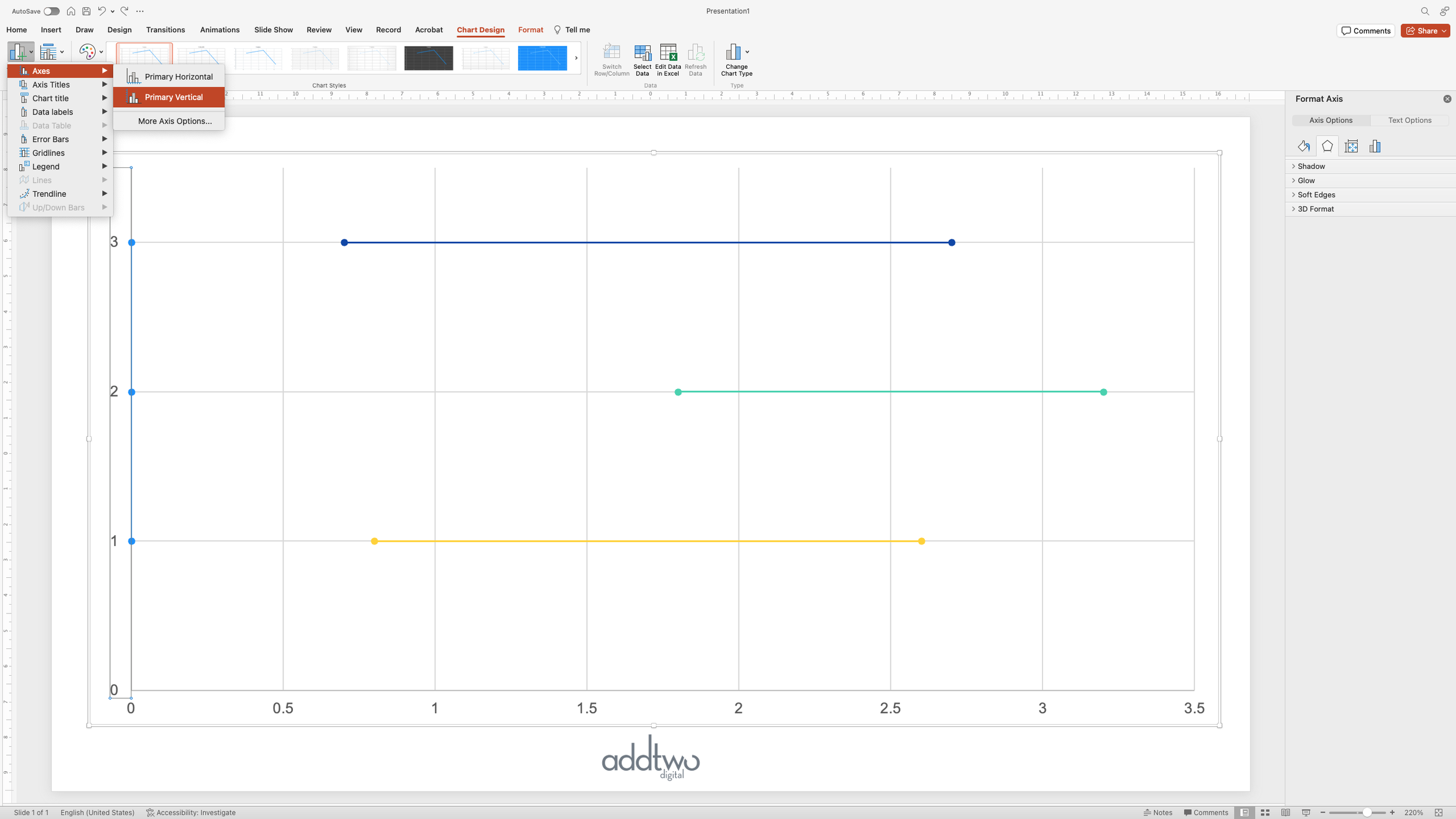
We also want to delete the vertical gridlines
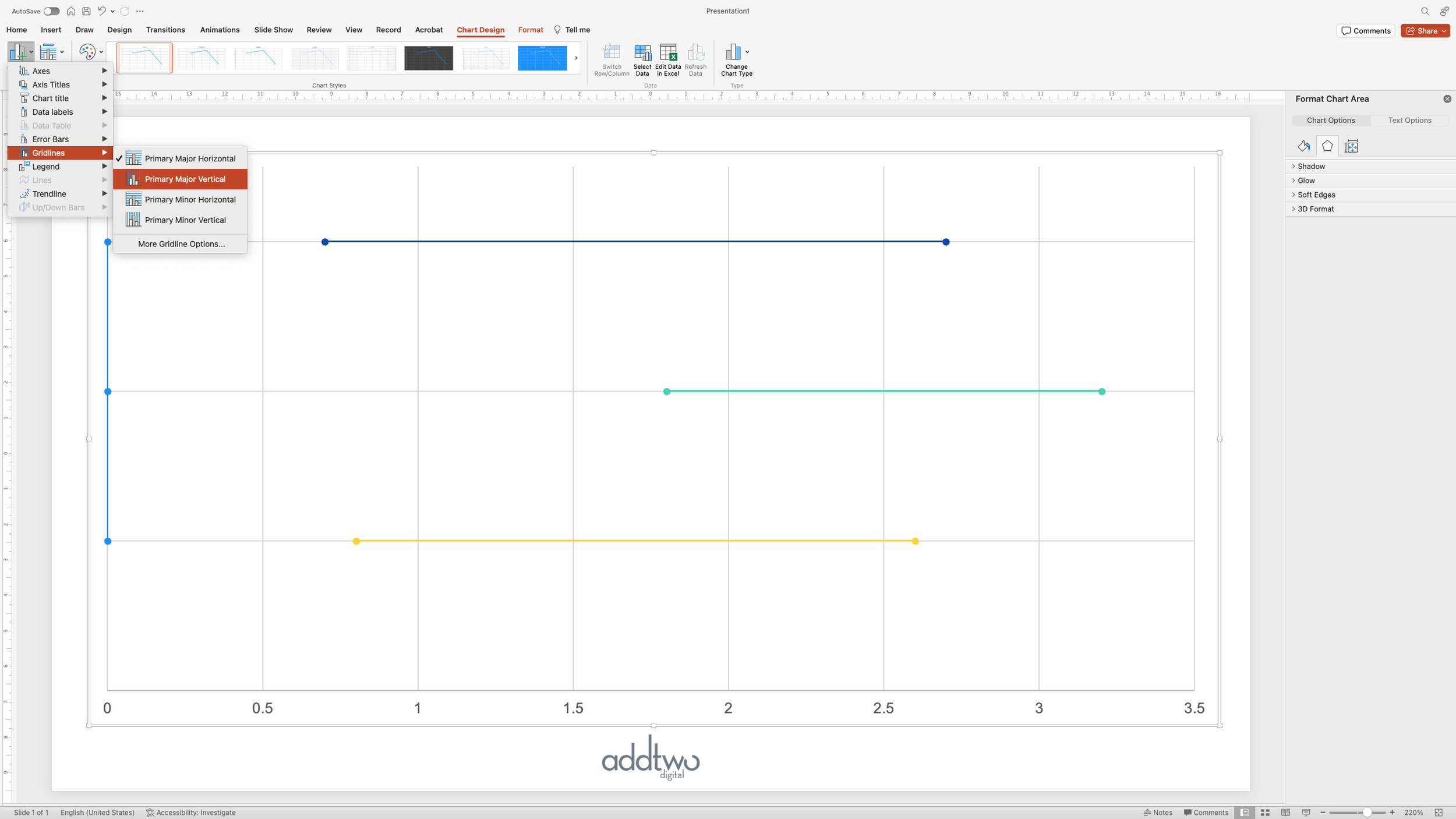
While we’re at it, we might as well format the horizontal axis too. Open the Format Pane for the x-axis:

And set the Major Unit to 1, to make it a little less fussy:

Style the chart
Now we’ll set the appearance of the bar bells themselves. Click on the first data series to select it and open the Format Pane.

Under the Fill & Line options (the paintpot icon), we’ll up the line thickness a little to make it more dominant:

But that means we also have to tweak the markers. We need to the select the ‘Marker’ option at the top of the panel.
In there we can select a Marker style (always better to do it deliberately than rely on defaults) and increase their size. We want them to be a decent size because we’re going to add labels inside them.
We can add labels using the Add Chart Element menu, choosing to position them in the Centre of the marker.

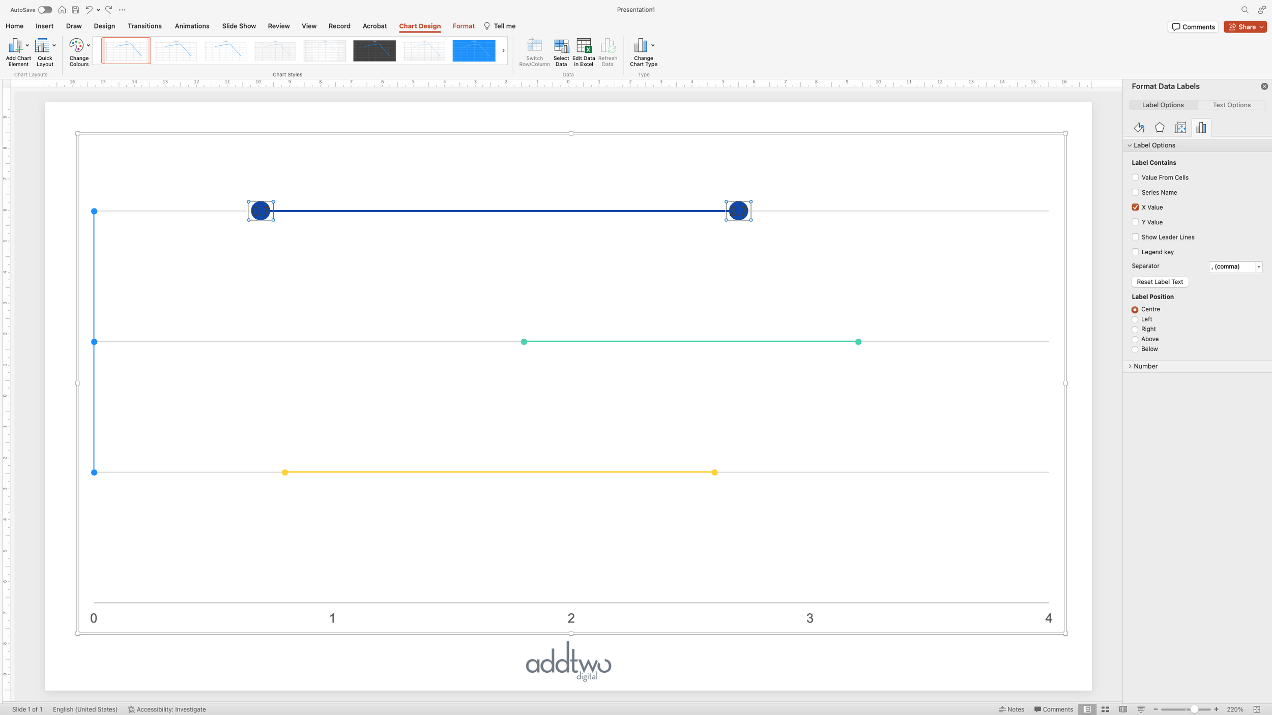
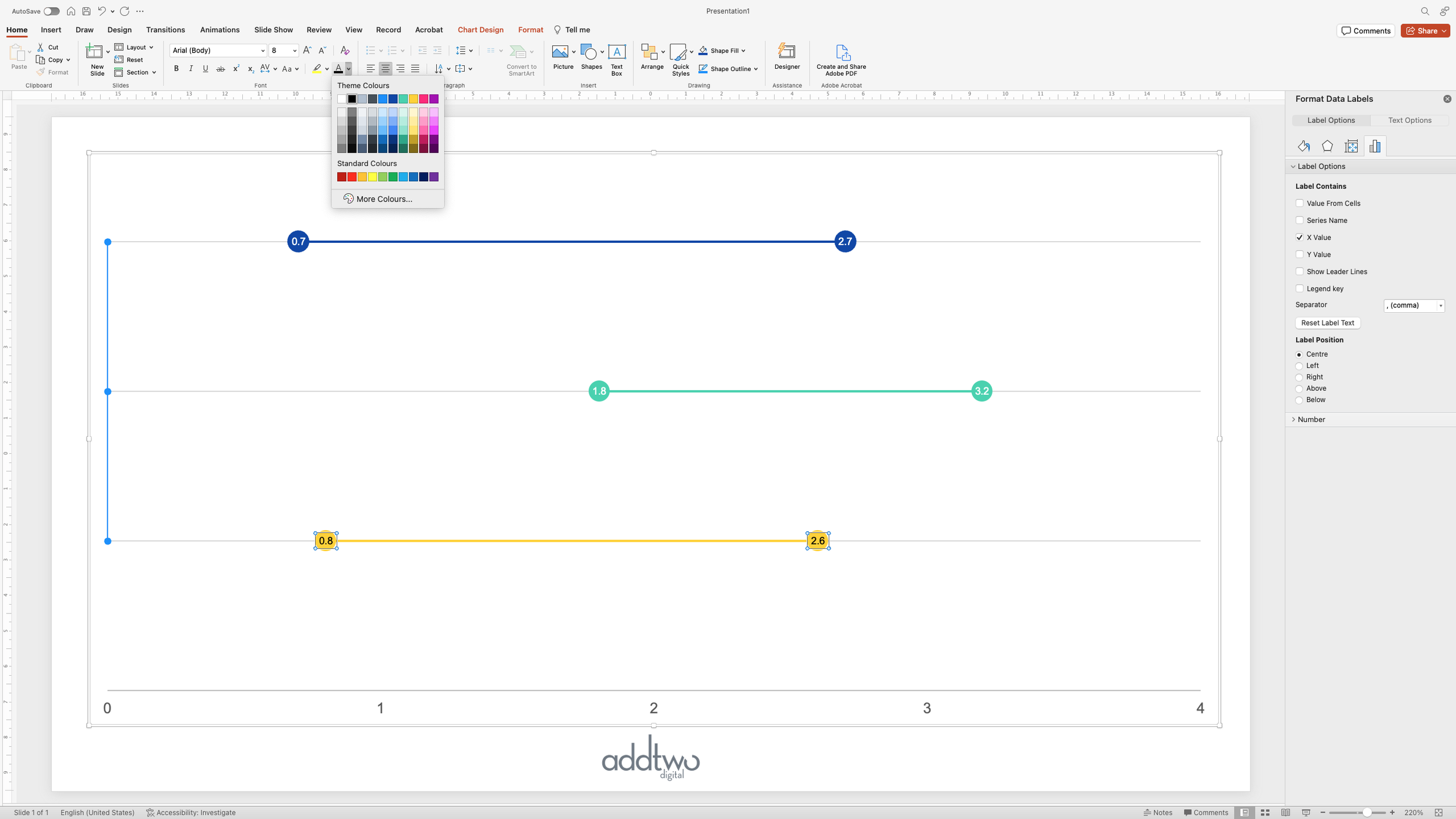
We then need to make sure we’re showing the right label - select label (clicking on one should select both by default) and open the Format Pane.
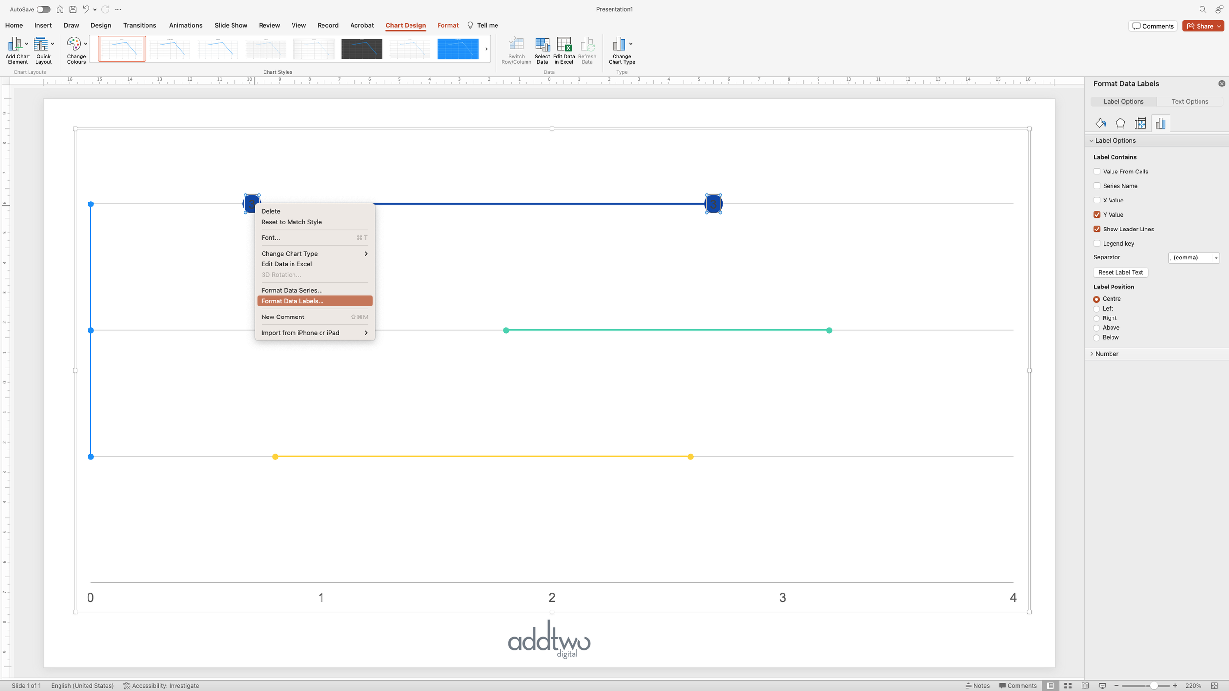
In the options for Label Contains we can select X Values and deselect the others.
We can then style the labels using the usual text styling options

Because PowerPoint differentiates each data series by style, we have do the same thing for each of the data series:

We need to make sure the labels are legible against the markers
Now we can turn our attention to our row labels
Label the rows
We can start by selecting the label series running down the vertical axis and adding labels to it:

Now we want to customise those labels, so we select them and open the Format Pane

Under the Label Contains options, we select ‘Value from cells’, which will open the data sheet for the chart and ask us to select a range of cells to use as labels.

This can be any column in the spreadsheet, as long as the row count matches the rows of the data being charted.
By selecting the column of series names, those become the labels for the data points

We can now deselect the other label options

Now we want to remove the actual visuals for this data series, as they’re only there to position the labels. We can do this by selecting the data series and opening the Format Pane:

We can then remove the line by setting the options to ‘No line’:

And similarly, remove the Markers by selecting ‘None’ under the marker options

One last touch - at the moment the labels are laying over the top of the gridlines, making them hard to read. We can remedy that by giving the labels a background colour, covering up the gridlines

So that’s how we make that in PowerPoint
Bar bells aren’t that hard to make, and are extremely useful, especially when we want to emphasise the difference between data points, rather than just show the data points themselves.
Using different colours for markers can help with the comparison, although that all has to be done by hand, sadly.
