
Well, the smart alec answer is: You click the Insert Chart button.
This is also the actual answer.
This is only going to be a brief overview of charting in PowerPoint because there are lots of other tutorials available that cover the basics but also because PowerPoint is built with the intention of being as easy to use as possible for almost everybody. The surest way to learn is by clicking things and seeing what happens.
Don’t worry, you can’t break it. Any more than it’s already broken, that is. Which is a lot.
The charting engine
By charting engine we mean the mechanism that makes charts.
Every application in Microsoft Office uses the same one, which means the engine works the same way and does the same thing in PowerPoint, Excel, even Word (although, why would anyone want to do anything in Word? <shudder>).
We’re probably most used to it in Excel.
You can just select some of your data
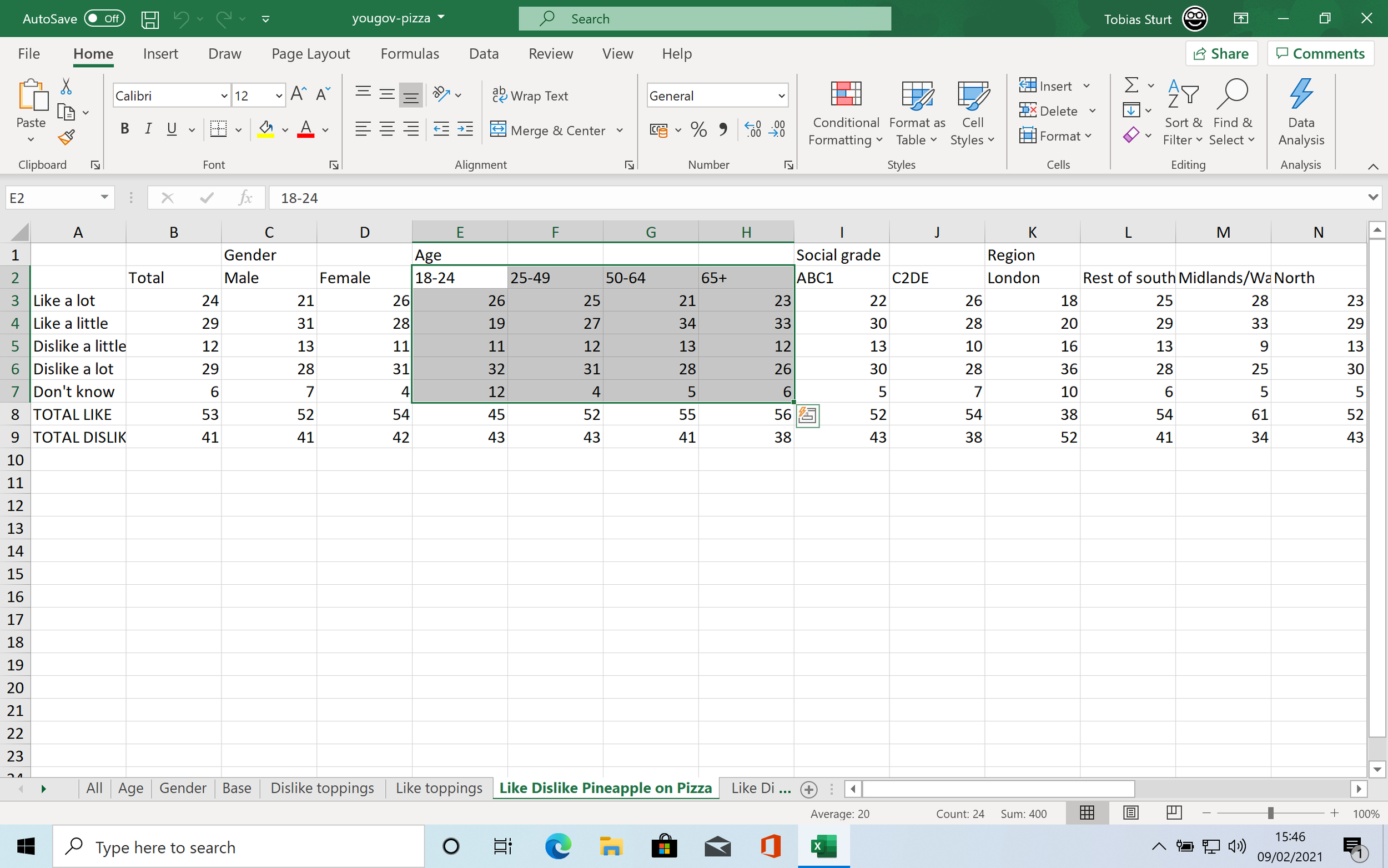
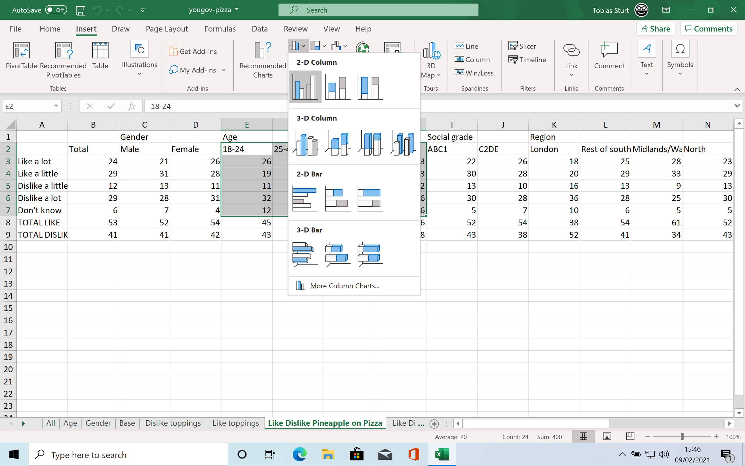
And then, under Insert on the ribbon select a chart type (Excel will also Recommend a chart to suit your data - if you trust it to make good decisions)
Excel will then generate a chart to visualise your data

You can see how Excel has highlighted the cells to show how the data relates to the visualisations. The red cells are the series, the blue cells the data.
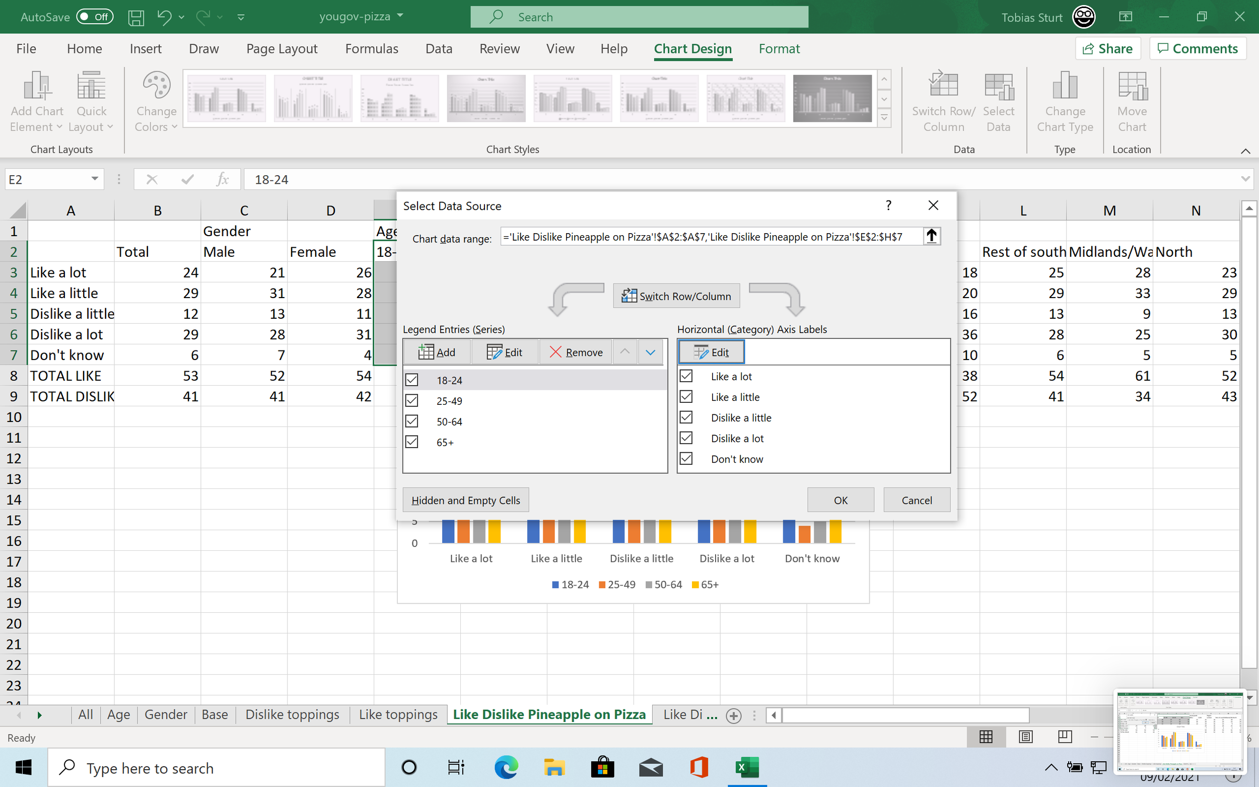
Excel gives us all kinds of tools to manipulate and update our charts.
We could, for instance, update the labelling on the categories, so our x axis would be labelled properly, by using the Select Data options and changing what cells Excel is looking at.
...but yeah, it’s a whole thing.
You can, of course, just copy and paste a chart straight out of Excel into PowerPoint.
As you see, when you do, PowerPoint will automatically display the chart in its own template. It keeps all the structural elements like labels and chart type, but it will update things like font and colours.
You can edit this chart in PowerPoint just as you can in Excel

(We will get to the Format Pane in a moment)
Of course, the charting engine also exists in PowerPoint. We can make and edit charts directly in PowerPoint. This has the advantage of keeping everything in one place and also making it easier to see and edit the data we’re visualising.
Making charts in PowerPoint
PowerPoint is software for making presentations, and one of the things that people present, frequently (possibly too frequently) is data. Charting is integral to PowerPoint. So, as you would expect, adding a chart is easy.
You can insert a chart directly from the ribbon, under the Insert tab.
You will then be given a menu of chart types to choose from.
Picking a chart

The range of charts available is PowerPoint is not large, and the range of usable, sensible charts is even smaller, especially once we ignore Radar charts for being bobbins.
How to choose a chart type is covered plentifully elsewhere (like in our Masterclasses or our book), but we need to make sure that we pick a chart suitable to our data, the meaning of our data and what we want to say about it. The thing to remember is that visuals are particularly good for giving an instinctive overview of a dataset and helping us take in a huge amount of information at a glance, however, in doing so, they frame how we interpret that data, prompting us to read it in a particular way.
Column & bar charts - Good for comparing values or data series (but also a good, reliable chart for pretty much everything). Horizontal bar charts seem to be more legible when ordered, but vertical columns are better for changing values over time, for instance.
Line & area charts - good for change over time obviously (and this is obvious, which is a sign that this is what they’re for. Area charts tend to emphasise what’s under the line, rather than just showing the trend.
Scatter & bubble charts - good for correlation, especially when you have huge amounts of data. Bubble charts in particular can show a large number of dimensions in the data at once: x & y and size, but this can quickly get overwhelming and should be used sparingly (if at all in a presentation).
Pie & doughnut charts (and treemaps) - good for composition, showing a segment of a whole. Pie and doughnuts should always add up to 100% - a grand total of which we are showing the composition. Neither can show many data points and are best used where there is a single key element within a whole.
Pretty much everything else in the chart menu in PowerPoint is a specialist chart - they all have uses but are probably best employed only if you know what those uses are.
You can use the PowerPoint charting engine to make all kinds of other charts, with a bit of hacking and subterfuge, but that’s another story (or, to be more specific, another set of how-tos).
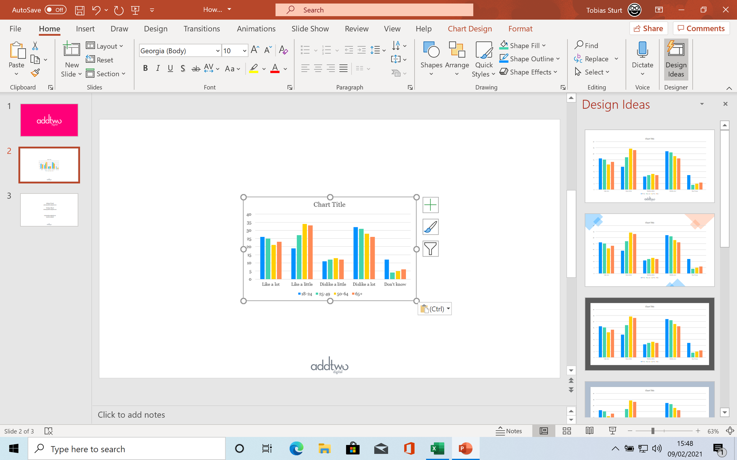
Once you have picked a chart, PowerPoint will insert it into the slide.
Charts and data
Each chart is created with dummy data in, and PowerPoint will also open Excel to show you that data.
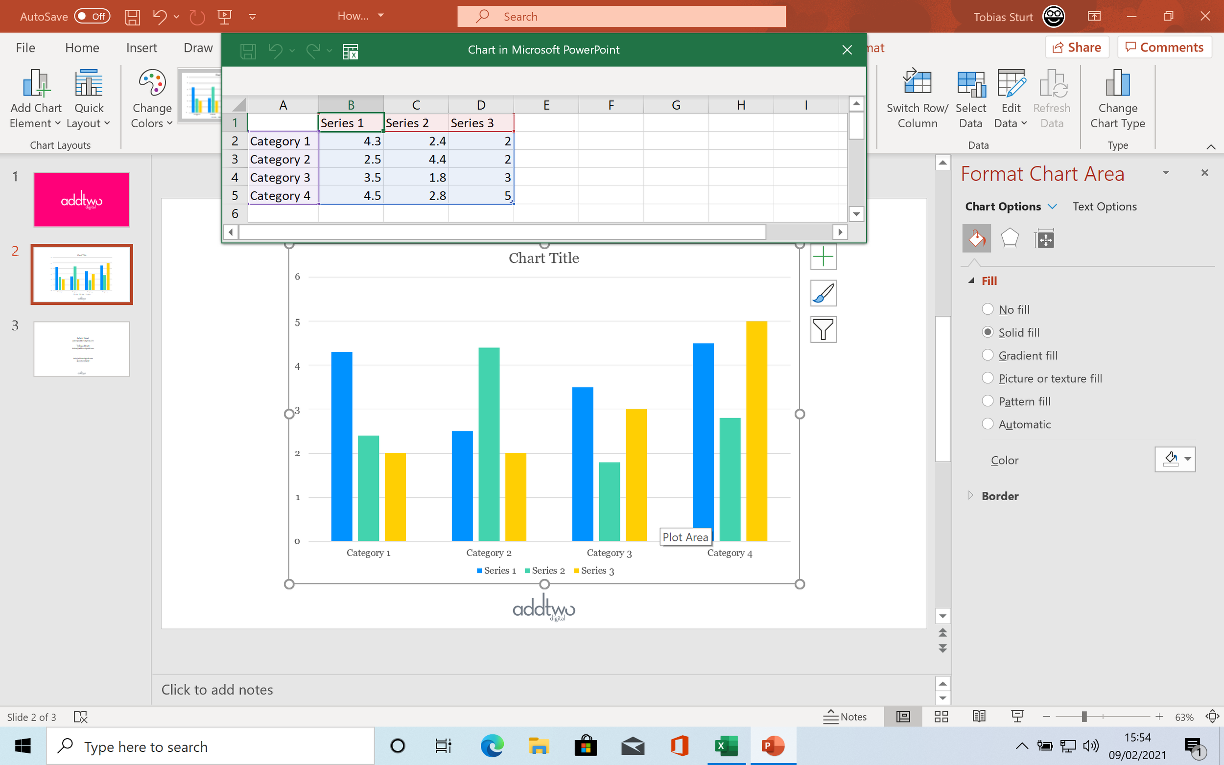
This enables you to see how the data structure relates to the visual structure of the chart.
In a column chart, columns of data are columns in the chart, while rows are clusters of columns.

In a line chart, each column is a line, and the rows become the points on the x-axis (if you want a more flexible x-axis, you might be better off using a connected scatter plot)
Some charts have completely different data structures

For pies and doughnuts, each row is an entry in the column that compromises the data set (you can create nested pies and doughnuts by adding columns)
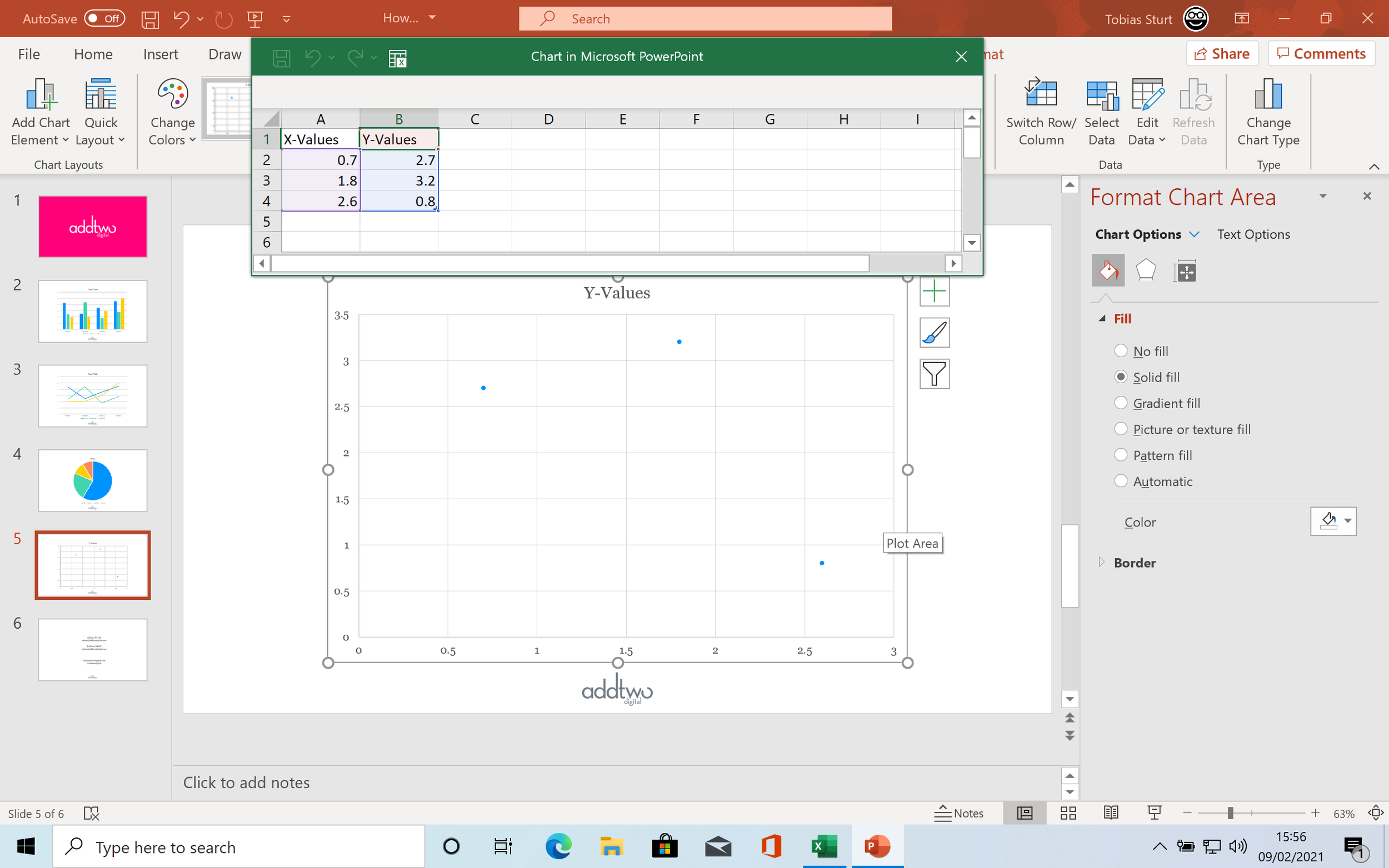
For a scatter plot, the first column is the x coordinates, the second the y. You can create more series by adding columns of y coordinates, but the x coordinates all have to stay in the first column.
It is worth familiarising yourself with the way that the data layout in Excel relates to the chart layout in PowerPoint.
The Excel sheet that PowerPoint generates is a fully functioning Excel document. This means that it uses the same colour coding that Excel uses to denote the data types - pink for y-axis, purple for x-axis, blue for data values.
What’s different here is that, of course, we just have the data in the chart and nothing else. That data is outlined by a blue frame that has a little handle in the bottom right corner. We can use this handle to drag the blue frame and exclude data from our chart (or include new data in it).
We can have elements on the Excel sheet that are not visualised in the chart (because the sheet has the full functionality of Excel we can use this fact to write all kinds of formulas to manipulate the data we visualise, but, as I say, that’s another story).
We can, obviously, copy and past our own data into that sheet.

PowerPoint automatically updated the blue frame to fit the new data (although sometimes we might have to drag it around a bit to get it right).
The advantage of using the charting engine within PowerPoint rather than pasting in charts from Excel is that we have this direct relationship between the data and the chart, which helps us focus on what data we are showing and how we are communicating it, rather than just shoving in any old visualisation we got out of our spreadsheet.
Chart elements
Once we have inserted our chart into PowerPoint we have many tools with which to edit it. Most of them can be found under the Chart design tab on the ribbon, or in the Format pane.

All PowerPoint charts have a range of built-in attributes. You can see the ones applicable to the chart you’re using by clicking the Add Chart Element button under Chart Design on the ribbon
Let’s switch them all on, so we can see them. There are options to add or remove the elements under each menu heading beneath Add Chart Element.

Charts can have titles, legends and data tables. Axes can have titles, labels, tick marks and gridlines. Data shapes can have labels, error bars and trendlines.

Cluttered, isn’t it?
All these elements have their purposes, but we’re generally, in presentations, not using things like data tables or error bars, not least because our data is rapidly becoming obscured here.
The techniques of PowerPoint charting
In fact, the best practice in PowerPoint charting is to be as simple as possible.
It is common in data visualisation to think about our charts as layers of information. We have three layers: the visualisation layer, which are the visual elements that represent our data, the explanation layer, the elements that explain our data (all those elements in the chart above are explanation layer elements) and finally the annotation layer, the elements that gloss and contextualise the other layers.
We absolutely have to have a visualisation layer, because otherwise we don’t have a chart, we almost always need some elements of the explanation layer and we often don’t need an annotation layer at all.
The trick to making a simple and clear chart is to work upwards through these layers.
We start with just the visualisation layer
This means switching everything off, not just all those bits we just added, but also all the default elements PowerPoint put into our chart when we added it
We can do this in the same way as we added elements, under the Add Chart Element button

This is a good moment to consider our visualisation layer: is it showing our data clearly, giving our audience that first glance overview and helping them see how to read and interpret that data?
Assuming it is, we then have to think about our explanation layer: what will our audience need to understand what these shapes mean?
The visualisation layer gives our audience an overview of the data, but they will also need the detail - the actual values in the data.
So let’s add some data labels to start with:

So now the audience can see the shape of the data and also drill down to look up the individual values.
But we need to know what those individual values mean, so we need x-axis labels to tell what the clusters mean:

And we need a legend to explain the colours

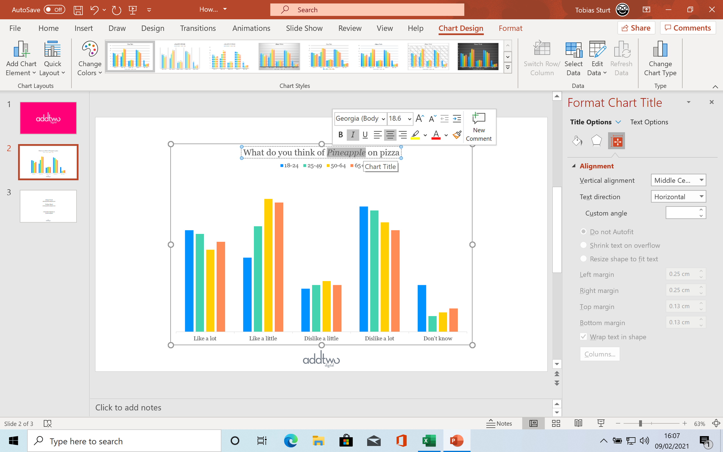
However, while we might now know how this dataset is structured, we still don’t actually know what any of this data represents. We can do that in a title:

Now, at the moment, that just says ‘Chart Title’, but we can fix that. What matters is that once we do, we will have all the explanation layer we need for the audience to understand what the visualisation layer means. Which is to say: we don’t need to add any more elements to this chart. We are done.
Apart from all the other things we have to do.
Chart look & feel
Once we have all our chart elements in place and are confident they are all working, then we can start thinking about what it all looks like.
PowerPoint offers us lots of tools to adjust the look and feel of our visuals.
We can edit the chart elements directly, updating things like text - so we can make our Chart title a little more useful.
We can also access the various attributes of chart elements through the Format tab - you can also access options through the Add Chart Elements menu or by right-clicking and selecting the Format options there.
All of these options will open the Format Pane to the right of the screen. If you select a chart element with the Format Pane open, you can see your options there
There are usually a whole range of options available in the Format Pane. You can usually choose between Visual options and Text options.
For chart elements, the Visual options will then have tabs for things like Fill & Line (the paint pot icon), which is for setting colours and outlines, Effects (the hexagon) for visual effects like shadows and reflections, Size & Properties (the square with measurements), for adjusting things like scale and alignment and Chart Options (the chart icon), which will be named for the element you have selected and will allow you to adjust its particular options.
The Text options allow you to adjust the Text Fill (the colour), Text Effects like drop shadow and Textbox options for margins and positioning.
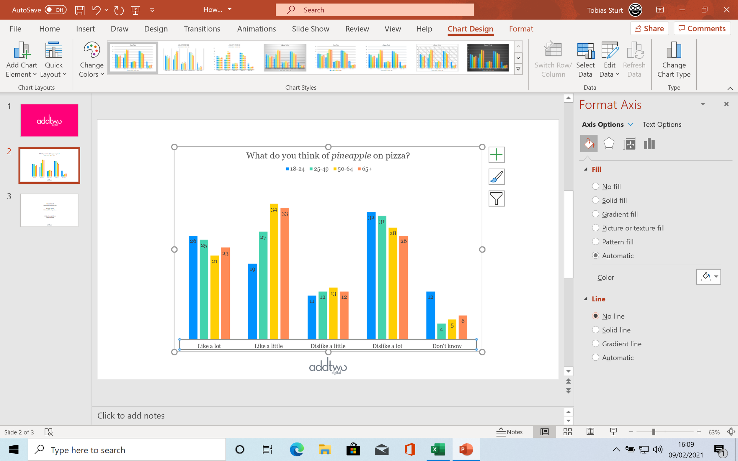
We can use the Fill & Line options, for instance, to get rid of the x-axis line that we don’t need by selecting No Line under Line.
We can use the Text Options to change the colour of the data labels by selecting a label (by default, PowerPoint will select all the labels in that series), then going into the Text Fill options and changing the colour to white.

This changes all the labels in that one series. We’ll have to go through and set all the other series in the same way.
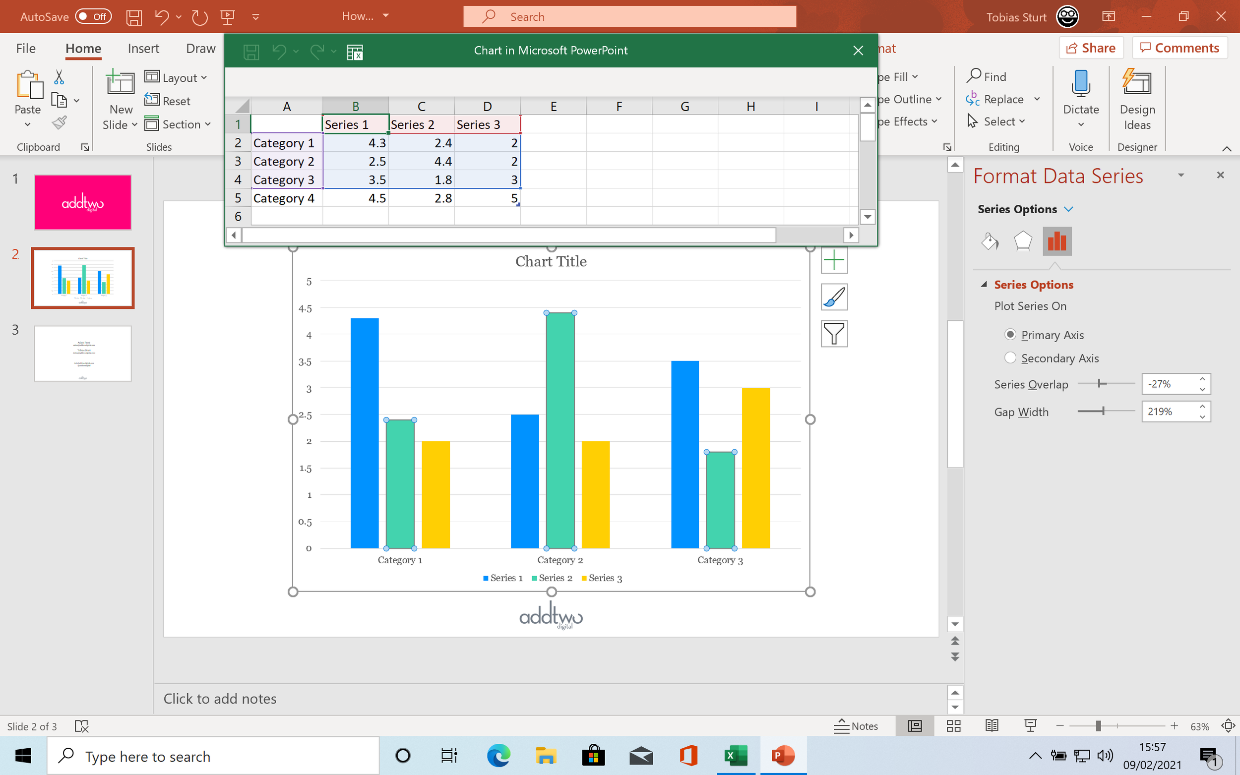
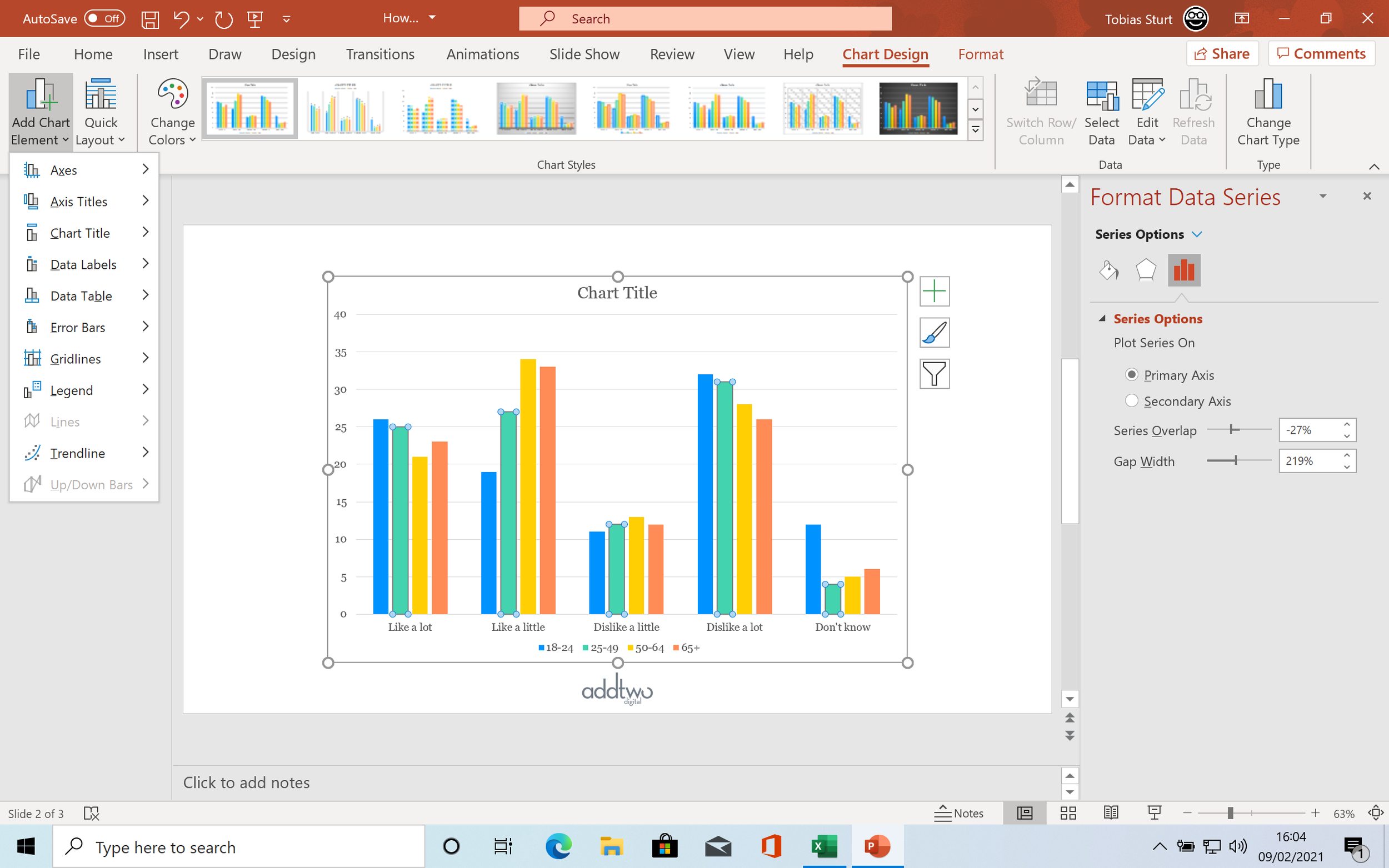
We can use the Chart Options to amend things like the spacing of our bars. If we select one of the bars, PowerPoint will select the whole series, just as it did with the labels.
This will give us a tab named Series Options. There we can alter the Series Overlap - the gaps between the data series in each cluster, and the Gap Width, the gaps between the clusters themselves.
We can bunch everything up a bit, making the individual columns larger, giving our data labels more room.

Obviously there is a lot more we can do - we can use all these options with all the elements to fully customise our chart, but for the moment, at least, we have a perfectly legible and, more importantly, presentable chart.
Sidebar: colour in PowerPoint
The colour dropdown will show us a default palette
This is set in the Slide Master and usually represents the corporate brand colours (or something similar)
There are two parts to the default palette, the text backgrounds and then the main colours
There are two sets of text backgrounds, both set having one light and one dark background
So the first four colours in the palette are usually light/dark, light/dark (white/black, light grey/dark grey, for example)
Then we have six main colours
PowerPoint will automatically pick colours for charts starting with the first of these and then work left to right down the row
Once these colours have been set PowerPoint will generate a set of five tints and shades
It will usually try and do this so the main colour sits in the middle, with some lighter tints and some darker shades
But where there's a particularly light colour it will just generate darker shades, or light tints for a dark colour
You can't change these tints and shades, they're automatically generated
You can, of course, add your own colours
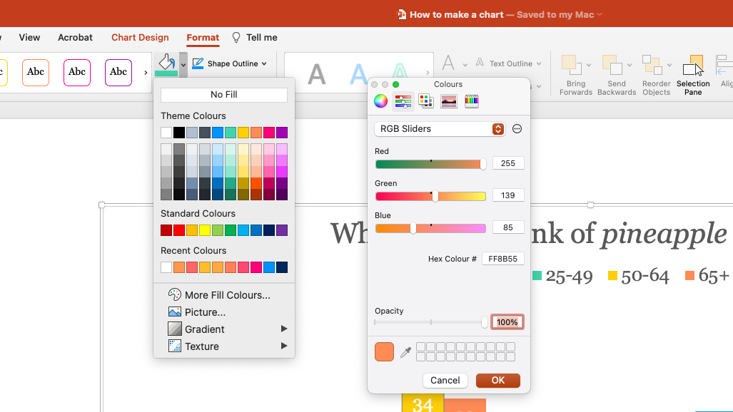
Below the palette is a 'More Fill Colours...' option
In here you will find an eyedropper tool for selecting on screen colours
And tools for setting new colours from HSK, RGB or Hex numbers
PowerPoint will add these colours to a custom 'Recent Colours' tray at the bottom of the default palette
You should note that if you use the colours in the Slide Master palette, if the Slide Master changes, the colours will change
For instance, if you copy and paste your chart to a presentation with a different template, the colours will update
Using the default palette makes it a lot easier to just copy charts across presentations without disrupting the look and feel
So that’s how you make a chart in PowerPoint
As I said at the start, that is just a whistle-stop tour (and I bet that stopped you whistling away, all merry and carefree) of the basics of charting in PowerPoint. It’s always worth exploring, experimenting and exhausting yourself breaking things and crashing PowerPoint, and getting as used as you can to the charting engine.
The main thing to remember is that simplicity is your friend and that, as ever, the most important question you must ask yourself is not how to make a chart in PowerPoint, by why? We need to think about why we are showing our audience this data, what our purpose is and what we want them to make of it: it is the answer to this question that will guide all our choices as we assemble our visualisation.