In this blog series, we look at 99 common data viz rules and why it’s usually OK to break them.
by Adam Frost
I don’t like to hate on others’ creativity. I’m also aware that there are lots of correct answers in data visualisation. I realise I’ve emphasised the importance of trial and error, and experimentation, and the audience always being right. But come on now.
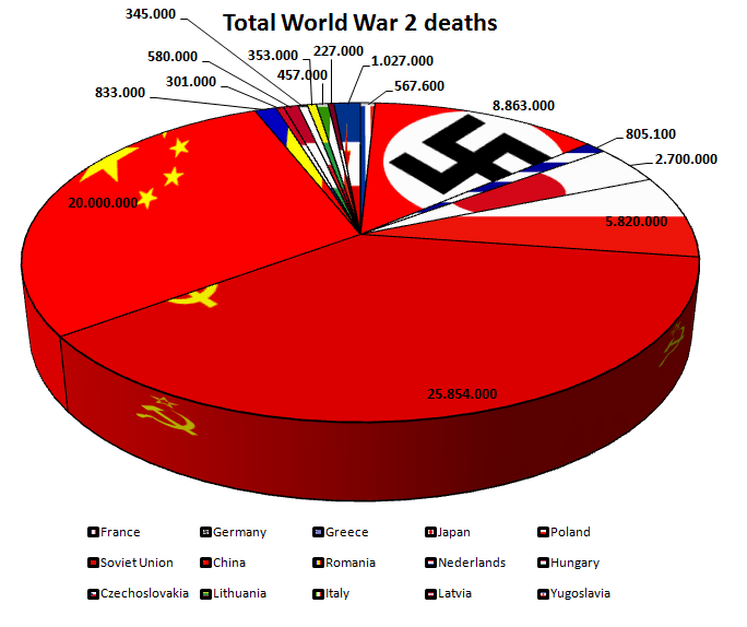
This pie chart, posted on the topforeignstocks website a few years ago, doesn’t have an image credit, so I’m not sure of its author. But whoever made it, is certainly committed to their theme. It’s an unintentionally fitting testimony to the horrors of the Second World War.
We’ve said all along that although you should see our rules as flexible, and break them when the story justifies it, you should still do this with care and consideration, and certainly limit yourself to breaking one or two of the rules rather than all of them at once. But this chart takes no prisoners.
rather than starting at 12 o’clock, it starts just after. Why?
it doesn’t represent 100% of the dataset. Several countries that fought in the Second World War have been omitted. e.g. I have a vague memory of Britain being involved. And didn’t the USA show up at some point?
rather than limiting the number of wedges, or grouping the smaller slices into an ‘other’ category, it shows fifteen countries
it doesn’t arrange its wedges from largest to smallest, or alphabetically. The order seems to be entirely random
it has many wedges that are a similar size, and they are impossible to compare
rather than directly labelling the chart, it has a key, which is impossible to read because of the thick black border around each element
the data labels are crudely positioned; many float alongside the chart title, which disrupts the information hierarchy
it adds a meaningless and unattractive 3D effect. This also distorts the data. Compare the 20 million slice for China and the 25 million slice for the Soviet Union. The Soviet Union slice looks about 50% bigger than China’s, not 25%.
It’s worth stressing that no software application on Earth would make a pie chart like this by default, all of the choices above were conscious and deliberate.
There are other issues too. The text is poor. It has a crude title (‘Total World War 2 deaths’), spelling mistakes (‘Nederlands?’) and even though the chart is in English, it ignores the US/UK convention of using a comma for thousands (‘2,700,000’) and uses the European convention of decimal points (‘2.700.000’). Sometimes these numbers are rounded, sometimes they aren’t. These things may sound minor, but they all contribute to an overall impression of somebody who hasn’t thought seriously about their work (this is meant to commemorate deaths in war!), or has spent too long thinking about the wrong things.
But even though all of these decisions are regrettable, the most obvious mistake - the one that literally jumped out at me as I’m sure it jumped out at you - is the use of decoration. Those flags! You should always think twice before adding flags to any chart because people only recognise a handful of them at the best of times, but particularly when the countries (e.g. Yugoslavia, Czechoslovakia) don’t exist anymore. Furthermore, each flag’s colours will inevitably clash with other flags, with your brand colours, and sometimes with themselves (for example, the flag of Saint-Pierre and Miquellon has nine distinct colours). More crucially, the job of a flag is to draw attention to itself, which means they draw the eye away from the numbers and the shapes in your chart, and create emotional associations which will inevitably be different from those you want to convey in your story.
With pie charts, all of these problems are magnified because you can’t even maintain the rectangular shape associated with (most) flags, instead they become slivers, and they also have to sit right up against each other, so there is no visual respite, no white space between those clashing colours. It also doesn’t help if, like the author of our World War 2 chart, you stretch the flags to fit in the sliver, I’m assuming so the most recognisable element is visible.
I say recognisable. If you can tell me the nine countries represented by those nine tiny tapering flag slices, you deserve the Medal of Honor.
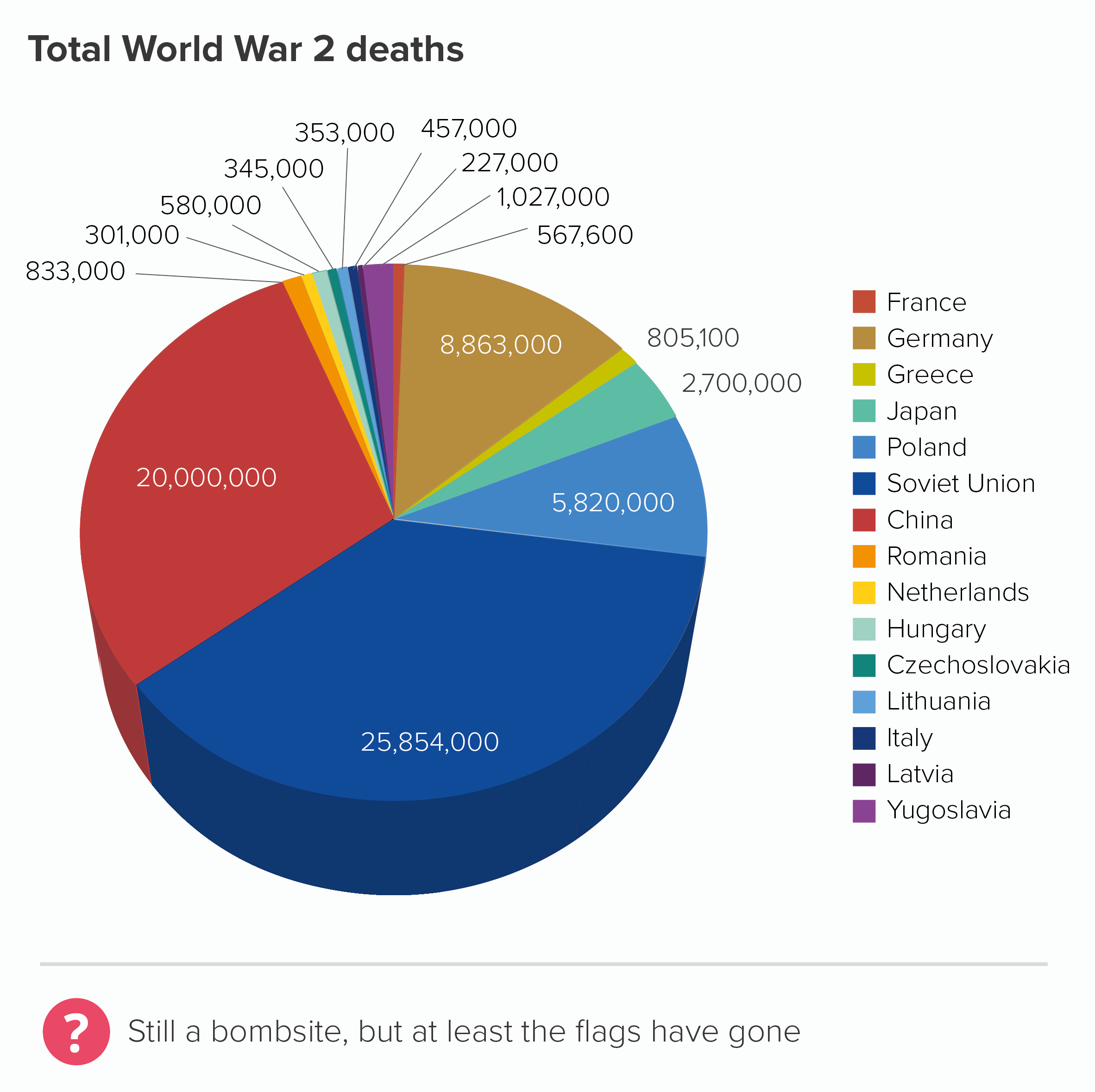
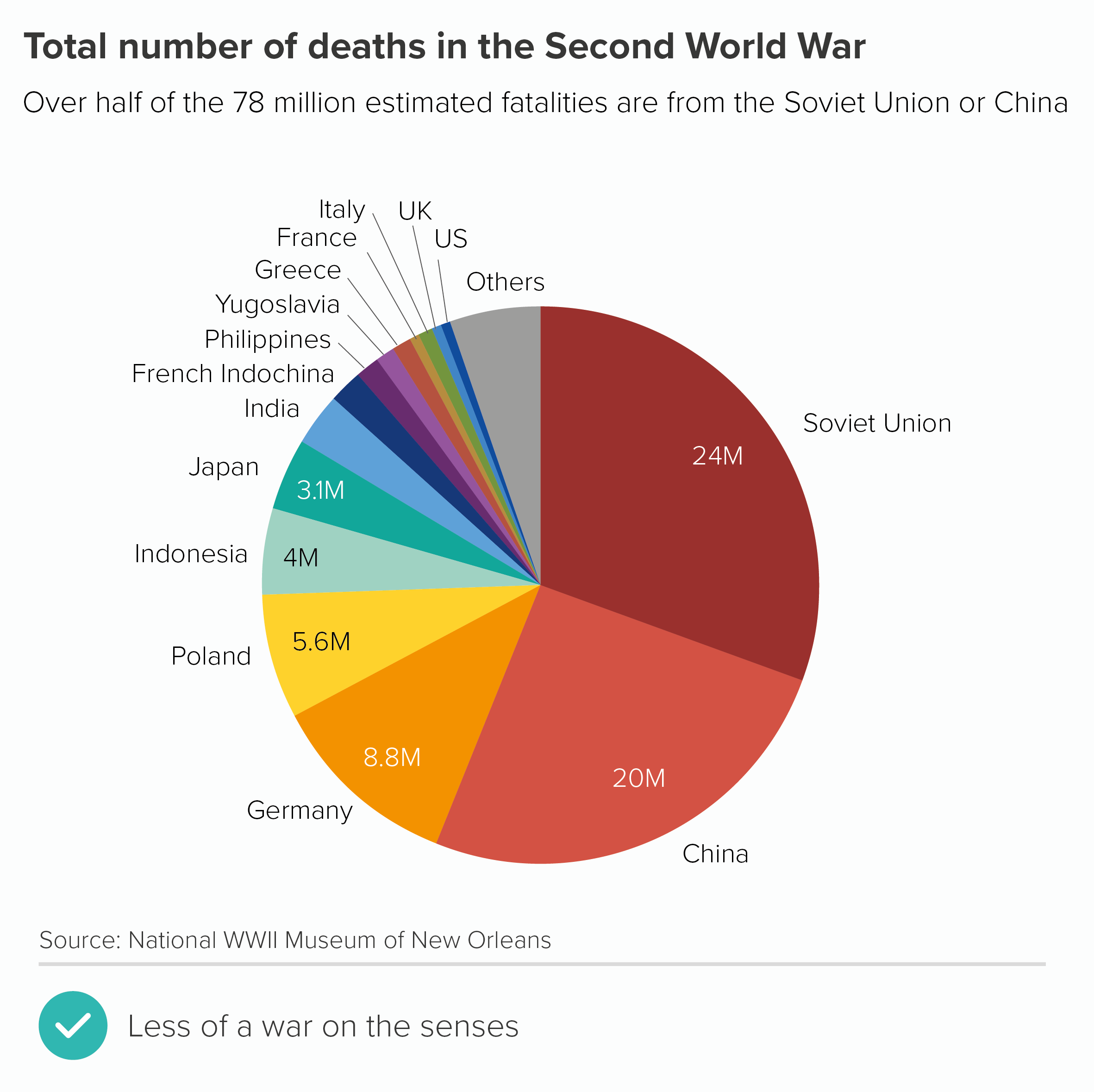
Removing the decorations and adding colour to the slices doesn’t suddenly make this a good chart. But it certainly means you can read it without recoiling from the screen (the first chart below). I’ve also made a version that is 2D (see rule 11 for why) with the slices ordered by size and with accurate data, which hopefully becomes even more useful.
Most importantly, with these redesigned versions, you get a sense of the subject more clearly - war deaths. When it was plastered with flags, I started thinking about communism and fascism, and uniforms, and rallies, and ‘Where’s my country’s flag?’ and ‘Is that meant to be Japan?’ and maybe even how problematic flags are as symbols, but I wasn’t immediately thinking about the 75 million people killed.
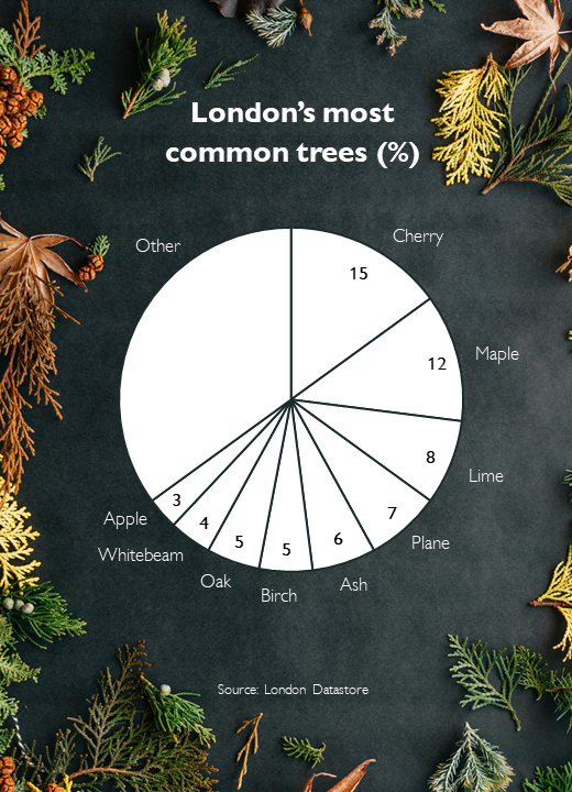
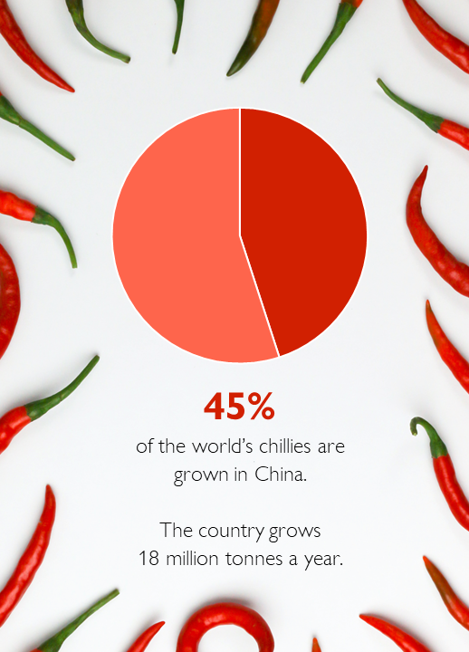
I’ve been hard on flags here, but any kind of decoration tends to damage pie charts. Whether it’s logos, icons or something else, pie chart wedges are rarely a good frame for illustrations. You are already asking your audience to process difficult shapes (angled slices), it’s best not to distract them with unnecessary visual overlays. If you absolutely must use icons or logos on pies, the illustrations should be the same size, colour and style (chart 2 below). And even then, you might want to switch to a chart that works better with illustrative elements, like bubble charts (chart 3), doughnuts or treemaps (chart 4).
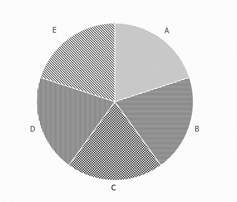
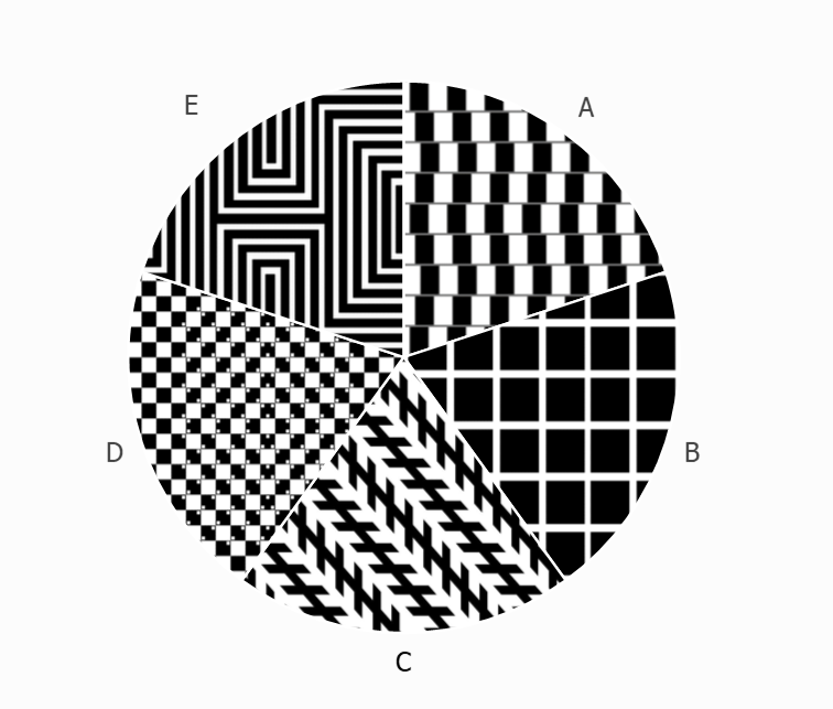
Adding a pattern fill is problematic too. This is rarely a good choice for any chart, but with pies, it’s particularly bad, because we read pies by comparing angle and area, and patterns can confuse both processes, as the fills often have angles of their own, and also the fill areas can appear larger or smaller depending on pattern type, with parallel lines in particular affecting distance perception (look at wedges B and D in the first pie below. They are the same size, but don’t look it).
Moreover, as with flags, the fact that our wedges are side-by-side means the textures interfere with each other too and can even create optical illusions, which are great fun in the right setting, but not when we’re trying to convey information on a serious topic.
In the second pie above, I’ve deliberately filled the wedges with optical illusions - try to spot the illusion type in each case. (Answers at the end of the article).*
So is this an unbreakable rule? Never decorate pies?
I suppose it depends what you mean by decoration. I would say that putting a decoration on a pie is rarely justified. I’ve seen it work on only a few occasions, and in each case, it was achieved by an extremely talented designer so if this isn’t you (it certainly isn’t me), I wouldn’t try it. I’ve also seen it work (sort of) when the pie is essentially a decoration itself: say, part of a museum display, aimed at children or non-specialist adults, when the authors are trying to get us to think how much of the country is farmland, or how much of our body is made up of water, or something like that. A giant pie on a wall with a texture or photo fill is attention-grabbing, and may persuade a passing visitor to explore further.
However, even on these rare occasions, I would still say that the information would be better displayed if the photograph or illustration was beside or behind the pie, rather than on it. In fact, because they are such simple charts, pies often work well with images (if they are well-chosen).
Photo credit: Erol Ahmed (trees), Tamanna Rumee (chillis) via Unsplash
There is nothing wrong with the urge to decorate; it just has to be appropriate for the chart type and the subject-matter.
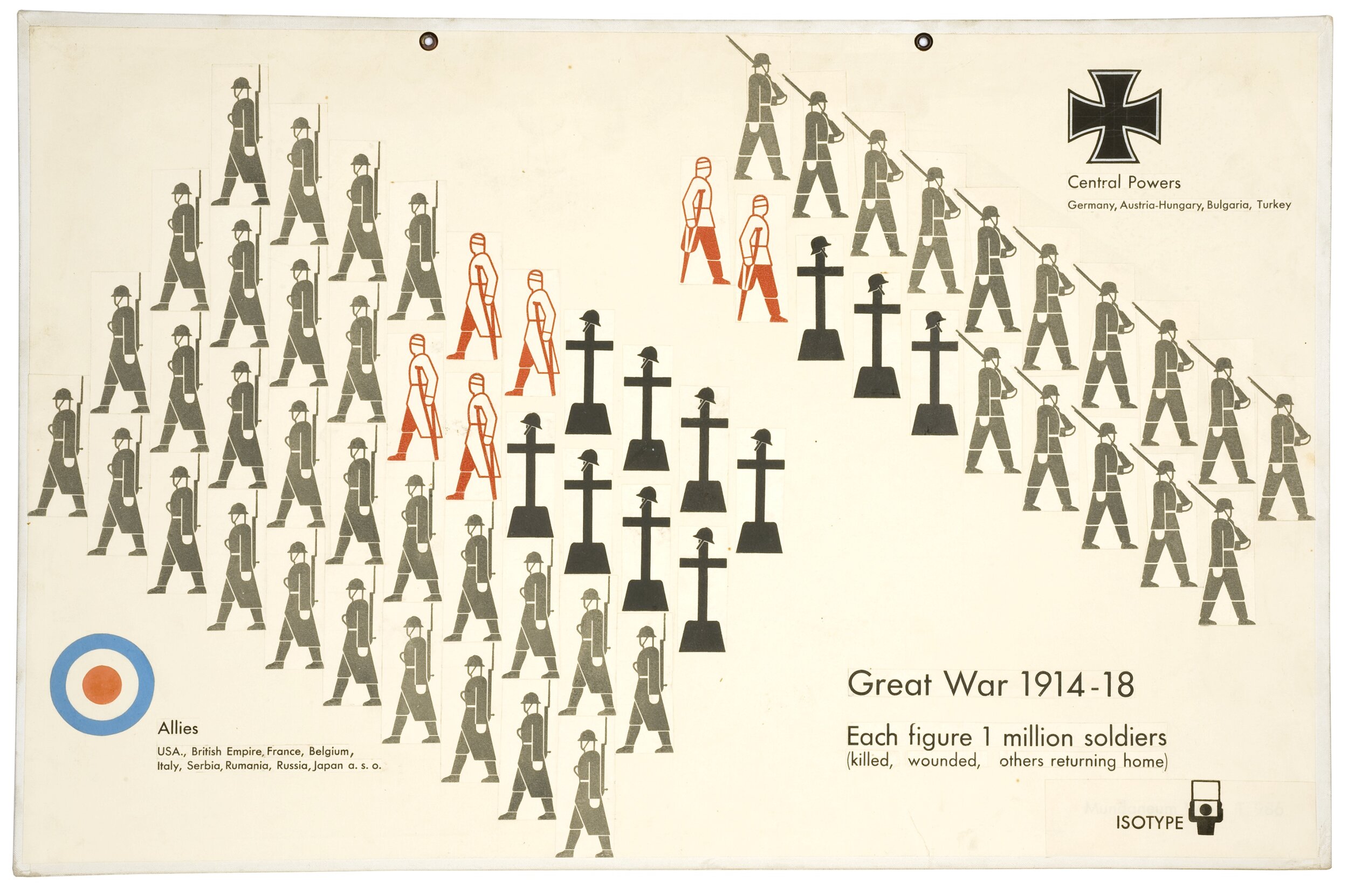
In fact, looking back at our initial 3D World War II pie chart, perhaps the author’s biggest mistake is less the flags, and more that this data shouldn’t ever have been put in a pie chart in the first place. Certainly, if the right chart had been chosen, it could have incorporated iconography or illustration - perhaps even flags. Take a look at this classic infographic by Otto and Marie Neurath about the casualties of the First World War.
There are flags, illustrations, numbers, text. At no point are all the different types of visual information and decoration ‘too much’; instead, they harmonise perfectly. The graphic works as both communication and commemoration.
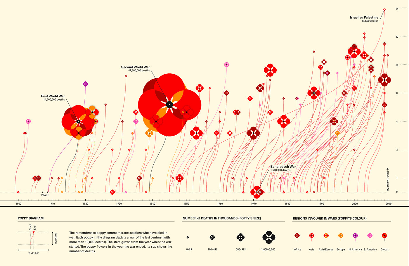
The same is true of a recent graphic by Valentina D’Efilippo. If ‘don’t decorate pie charts’ is a sensible rule, then ‘don’t decorate multi-dimensional scatter charts’ is surely even more sensible. However D’Efilippo shows that, in the hands of the right designer, even a complex chart about deaths in warfare can become not just information, but great art.
Image credit: Valentina D’Efilippo, https://www.poppyfield.org/
VERDICT: Break this rule infrequently
*Optical illusion answers: Wedge A is the cafe wall or shifted chessboard illusion. The parallel lines between staggered rows of squares appear sloped not straight. Wedge B is the Hermann Grid illusion. ‘Ghost-like’ grey squares appear at the intersection points of a white grid on a black background. Wedge C is the Zollner illusion. The long parallel diagonal lines appear to tilt because of the angle of the shorter parallel lines intersecting them. Wedge D is the bulging chessboard attributed to Akiyoshi Kitaoka. The positioning of tiny little squares inside the main chessboard squares, makes the whole board appear to bulge. In Wedge E we see a diamond shape in the centre of those lines, even though there is no diamond, just straight lines changing direction.
Sources: World War 2 data, the World War Two Museum of New Orleans; UK occupation data from Office of National Statistics; London’s most common trees from the London Datastore; largest producer of chillies statistic from the Guinness Book of Records
More data viz advice and best practice examples in our book- Communicating with Data Visualisation: A Practical Guide

