In this blog series, we look at 99 common data viz rules and why it’s usually OK to break them.
by Adam Frost
‘Donuts? Is there anything they can’t do?’ mulls Homer Simpson. Quite a lot, it turns out, when you turn them into charts, but that still doesn’t mean you shouldn’t use them.*
Let’s start with the case for the prosecution. Because people who hate pie charts tend to hate doughnut charts even more. Cole Nussbaumer Knaflic, who is on record saying ‘pie charts are evil’ has added ‘donuts are even worse.’ (Storytelling with Data, 2015, p61). Jorge Camoes writes in Data at Work: ‘Every bad thing you can say about pie charts can be applied to donut charts, and then some.’ (Data at Work, 2016, p210).
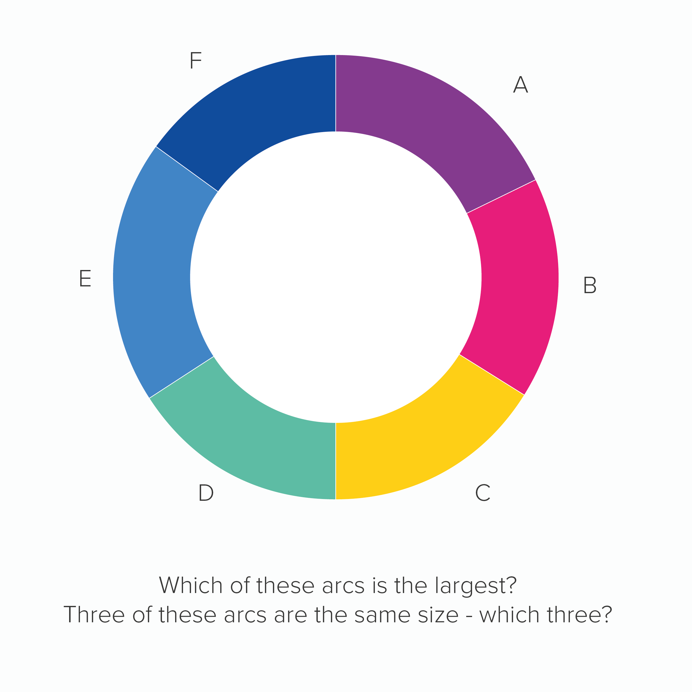
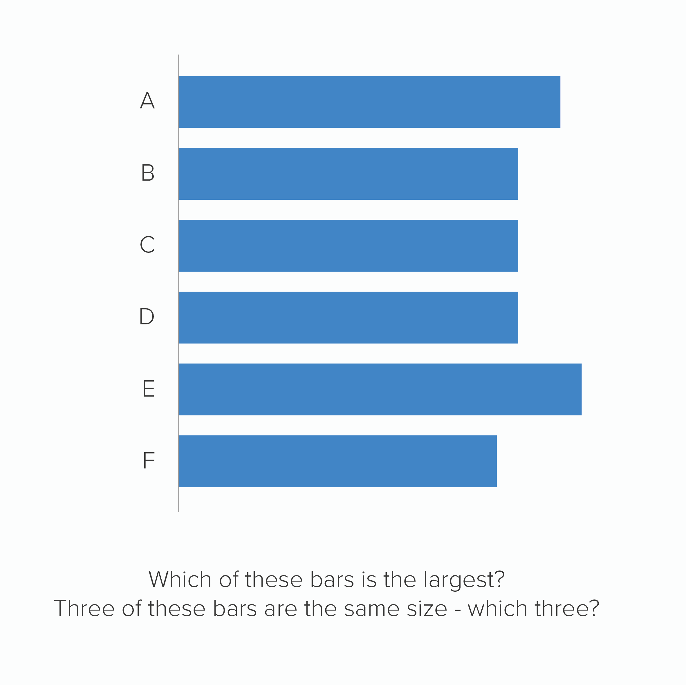
The main reason for this animosity is because, as with pie charts, research has shown that they are harder to read than the same data in, say, a bar chart. In fact, doughnuts arguably perform worse than pies, because at least in a pie chart, we are comparing the sizes of slices, but in a doughnut, we lose that central point of convergence, we only have the tops of our clock hands, which means we are effectively comparing arcs. This is hard enough for us to do when the arcs start at the same point, but it’s nigh on impossible when each arc’s starting angle is rotated.
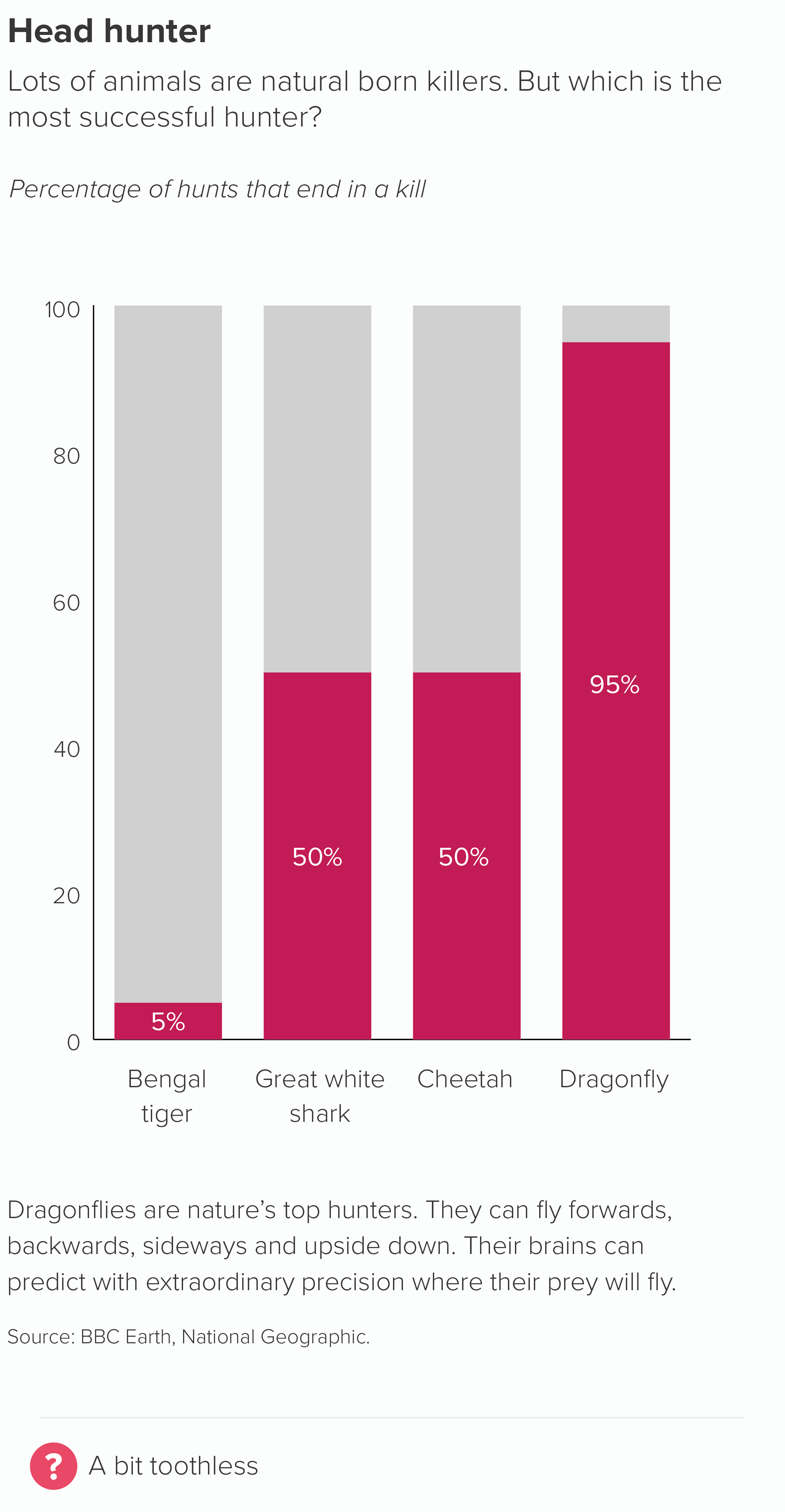
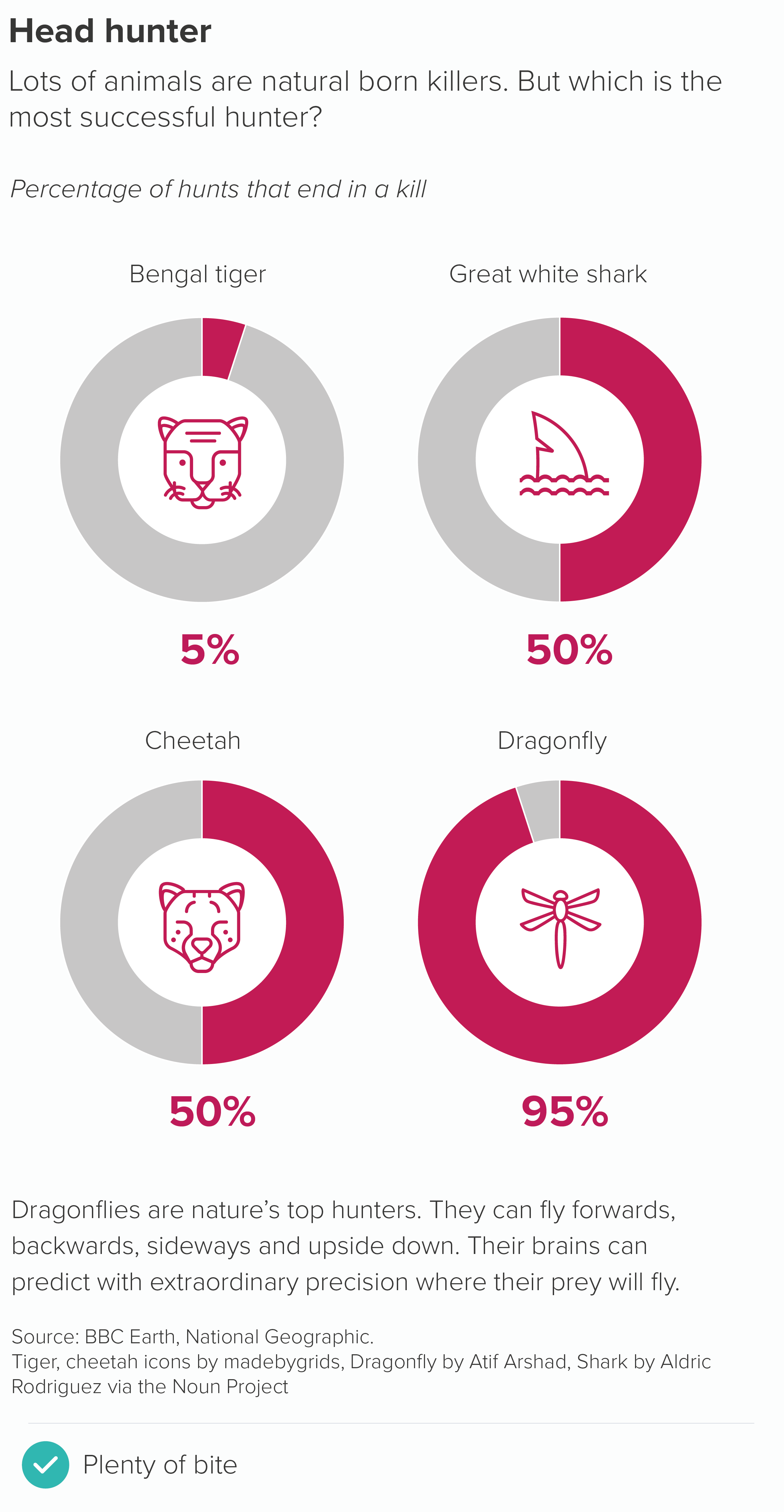
Here is a doughnut and a bar chart showing the same data.
The key question is: does any of this matter? Yes, doughnuts are a little harder to read, but they’re visually distinctive, and besides that’s what text is for, to clear up any ambiguity that our shapes - any shapes - cause if they’re asked to work alone. It’s not as if a bar or line chart makes sense without labels, or you live in a world where everyone strips all the helpful text off their charts, so they can stage some kind of accuracy dogfight between different groups of abandoned shapes.
No, charts are a collaboration between shapes, text and illustration and it turns out that doughnut charts are excellent collaborators. Perhaps even the best.
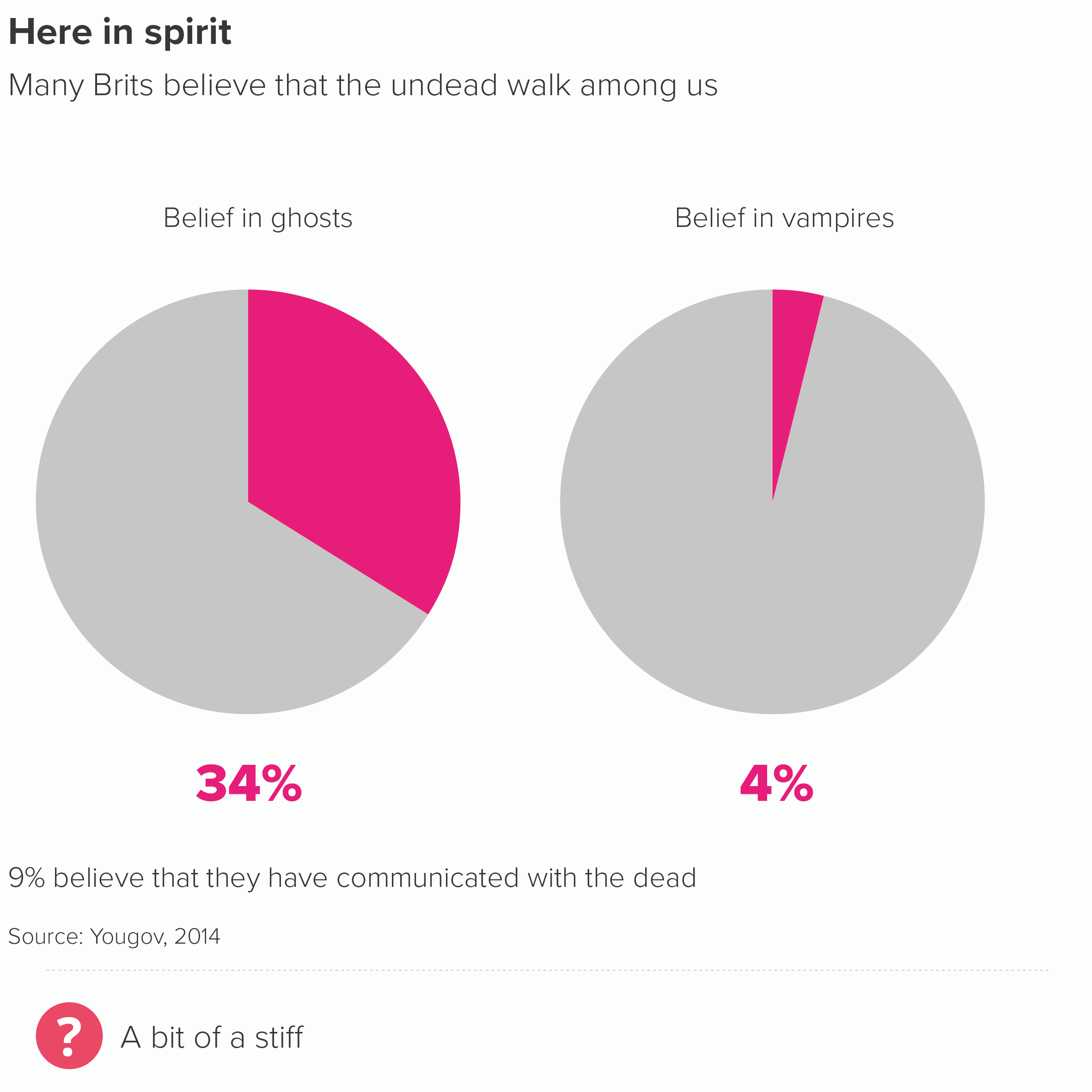
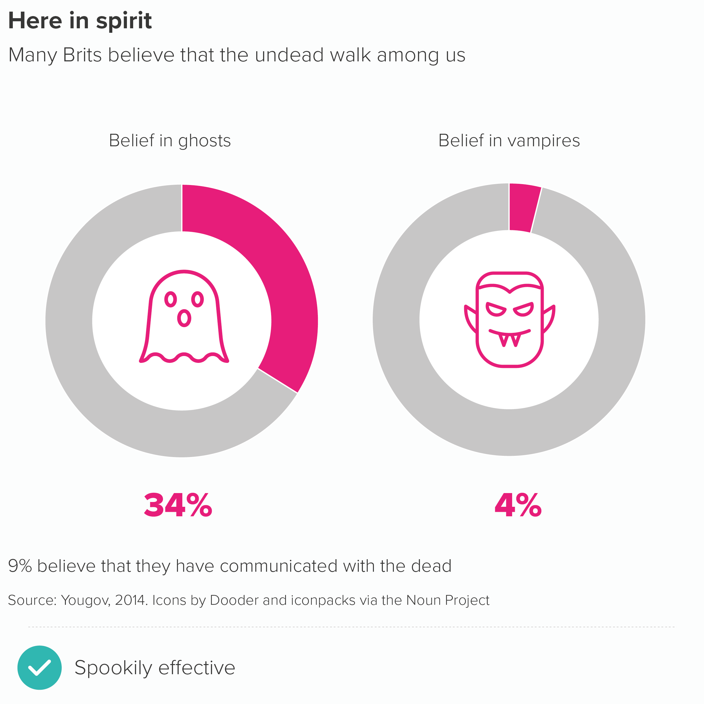
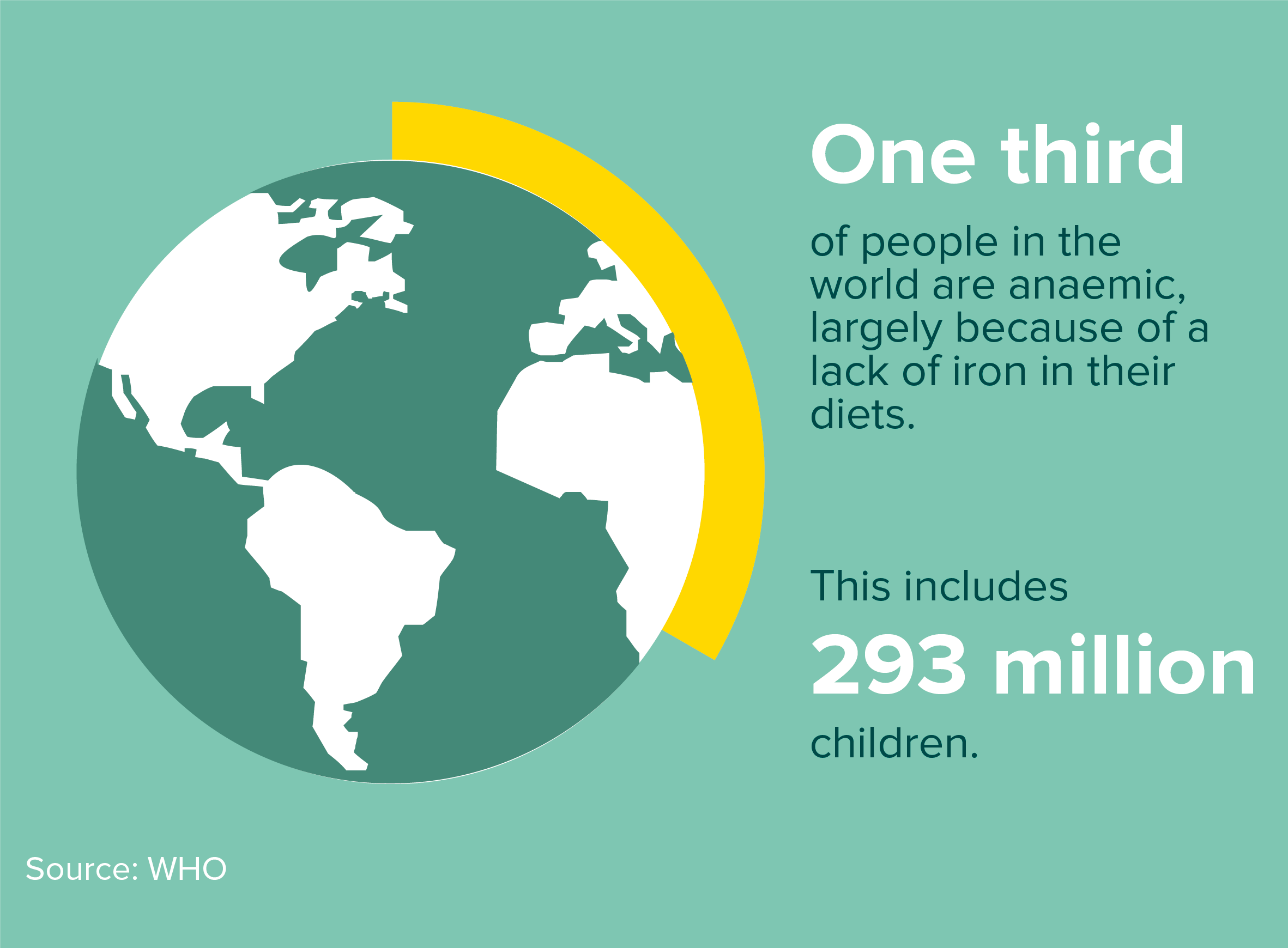
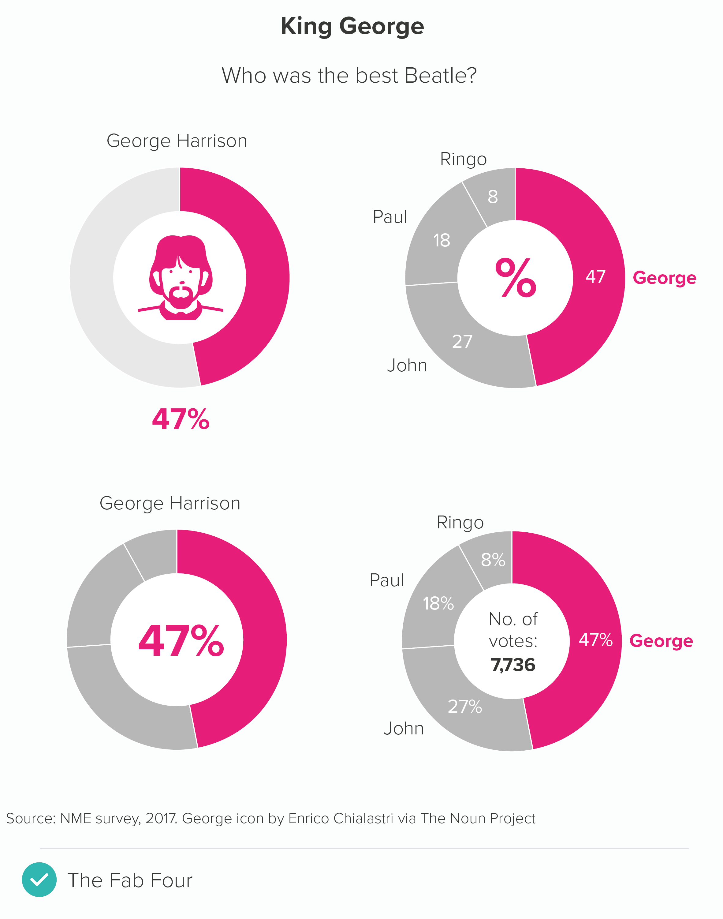
That hole in the middle is the perfect place to drop an important stat or a helpful icon.
Or you can add an illustration or photograph.
Image credit: Earth doughnut chart from Jim Kynvin
As the examples above show, they are at their best when you follow most of the rules that we’ve outlined for pie charts: starting at 12 o’clock, no explosions or 3D.
I’d add a few more. Firstly, they are at their best when you just have two values, an important number and the remainder. I also think they bear repeating, a series of doughnuts with a number or icon in the middle - with the right content - can be more engaging than the same data in a row of pies, or a bar chart.
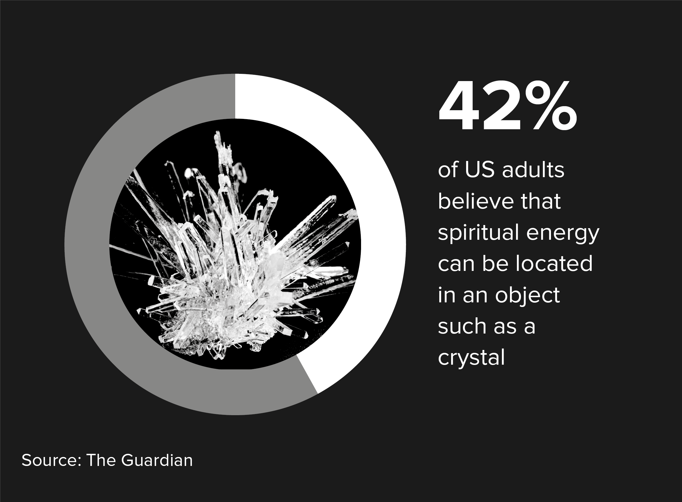
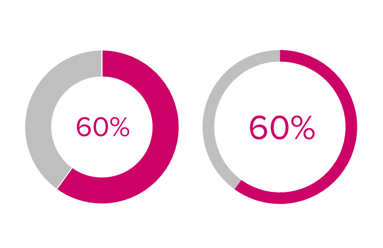
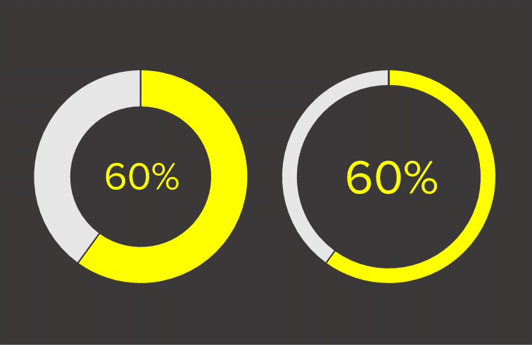
There’s also the vexed question of how big the hole should be. Unless the chart is purely illustrative (like the Planet Earth example above), I personally don’t like it when the arcs become slivers. Graphic designers seem to favour this approach - they are increasingly the norm in the corporate brand guidelines I see - and I'll admit that when they're put on a dark background, they can look… well… ok.
Image: Do thinner slices work better on a dark background?
But, on the whole, I think it’s good to give your audience an outside chance of working out what the number might be from the shapes alone.
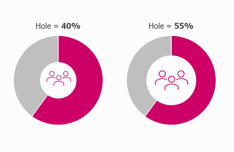
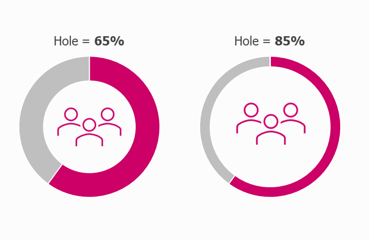
At the same time, making the hole too small means that the number or icon in the middle looks cramped, or ends up having to be shrunk down, thereby undermining the point of using a doughnut in the first place. I’d start with the hole at about 65% - which is usually fine - but adjust it up or down if required.
Most applications seem to get the default hole size slightly wrong - either too big or too little - so I’d get used to opening the doughnut chart settings and resizing to suit your use case.
Once you’ve chosen an appropriate size, make sure you use it consistently throughout your report or presentation.
A couple of other tips. Doughnuts don’t like being labelled. With a pie, you have the option of putting values in the wedges, but with doughnuts, there is less space, so the values or labels often need to go on the outside, sometimes with connecting lines to make it clear which label connects with which arc. In the process, the chart itself gets shrunk or barged out of the way.
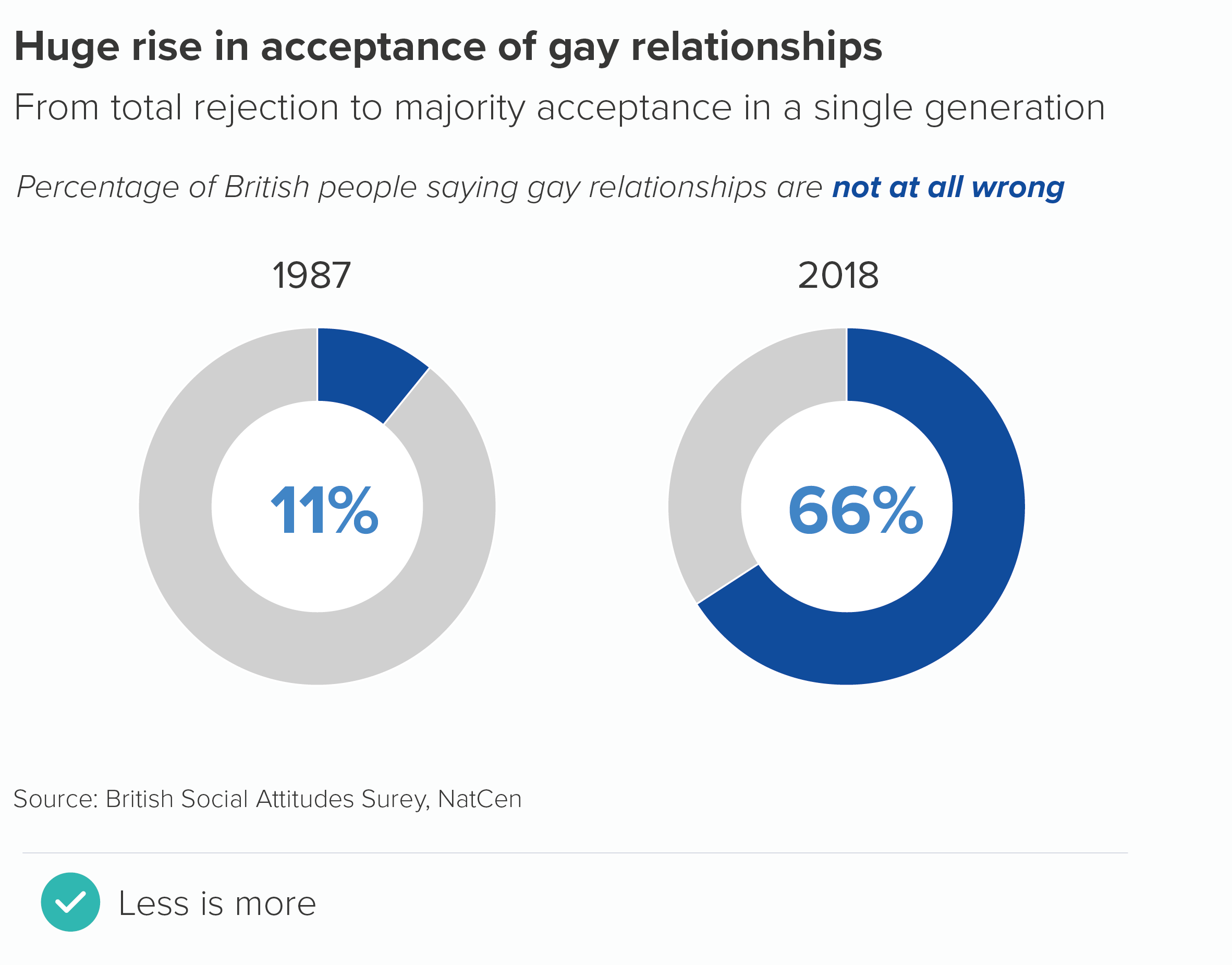
If you can, keep your doughnuts clear of labels. Use the title to make the chart’s meaning clear or put the key number inside or underneath the chart. As I mentioned above, try to only use doughnuts to represent a single number and the remainder, because it will make the job of removing labels easier.
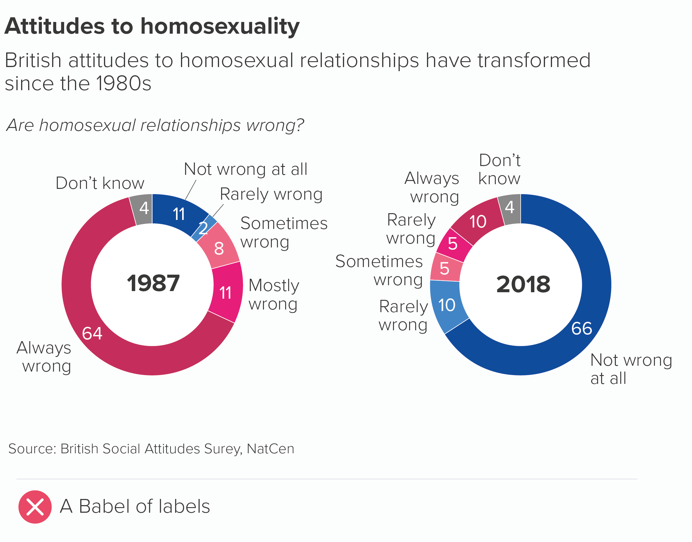
If this isn’t possible, follow the same rules as pie charts. Merge categories where you can, keep all the labels as close as possible to the chart, and avoid adding a key.
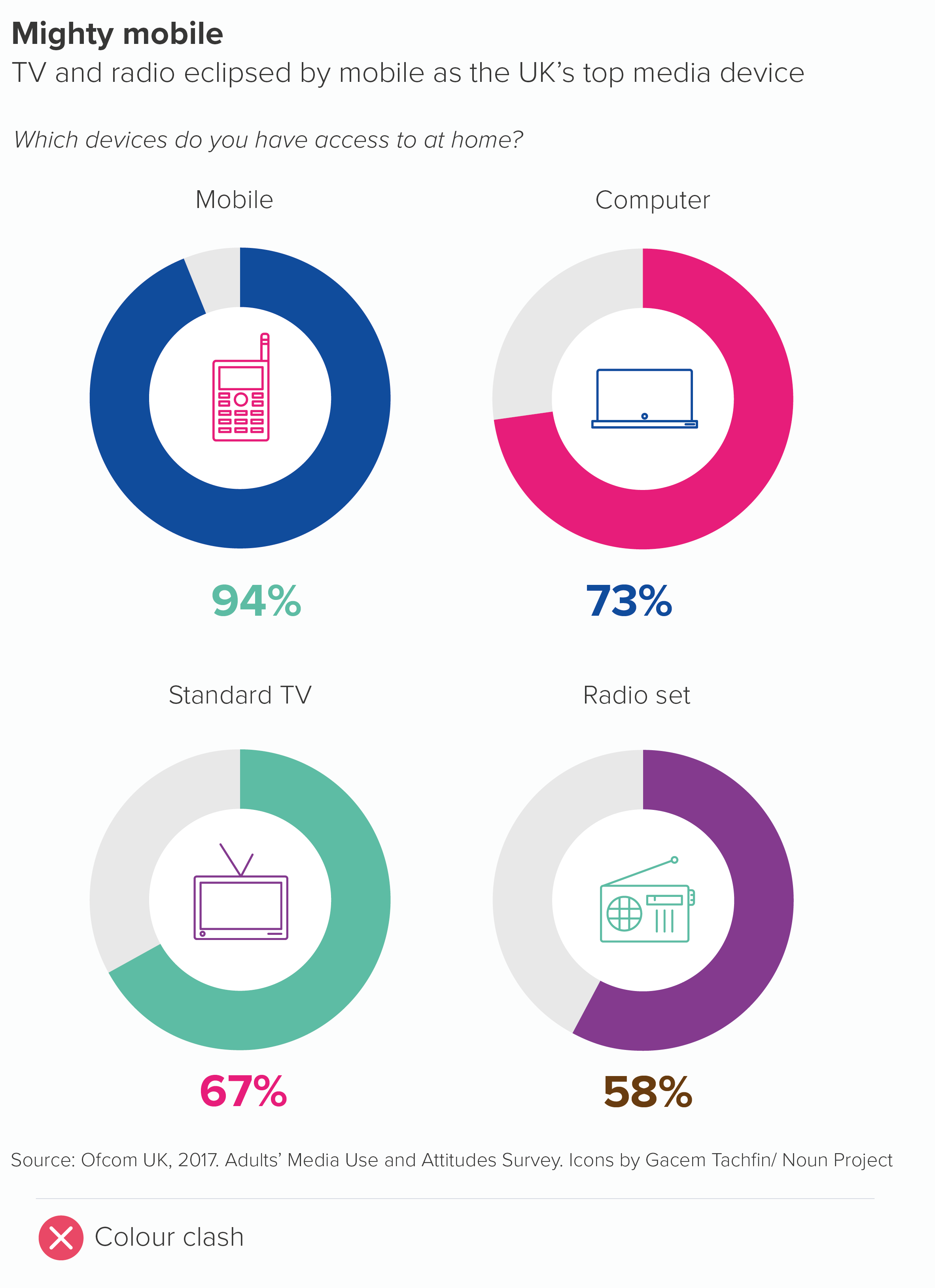
Finally, I’ve suggested icons. We will talk about icon use more generally in later rules, but for now, I’ll just say that any icons you choose for your doughnuts must be in a consistent style. Don’t just search google or the (wonderful) Noun Project and choose the first icon you see. You’ll end up with a mess.
Ideally your icons will all be created by the same designer (Noun Project lets you search by creator), but if this isn’t possible, make sure they share a family resemblance; for example, they might be all be in an outline style (as above), or all share a similar level of visual detail.
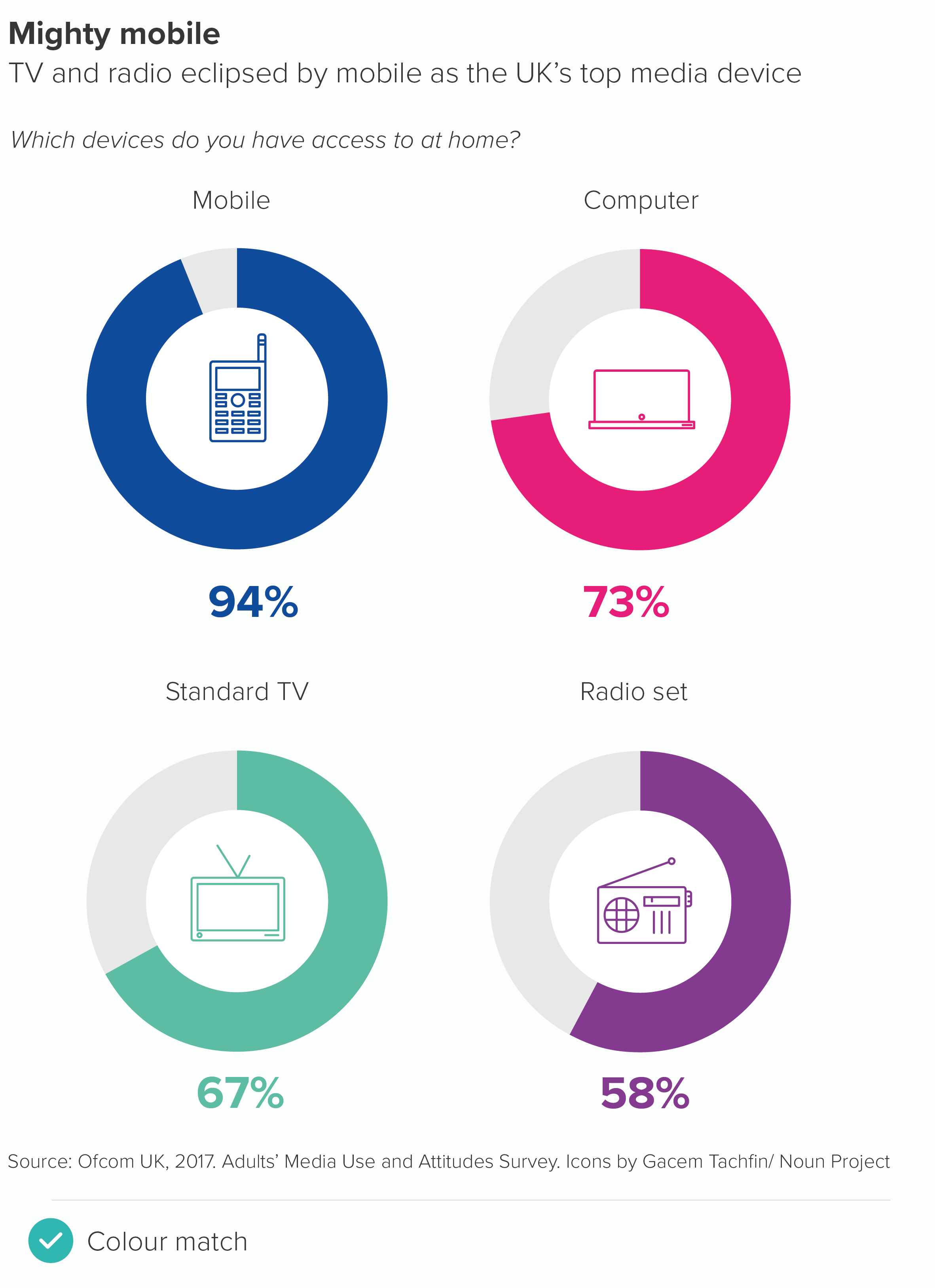
With colour, if you have a row of doughnuts, usually they will share the same colour for their main arc, as in the examples above. But if your story requires different coloured charts, then icon colour should match arc colour (as should the text).
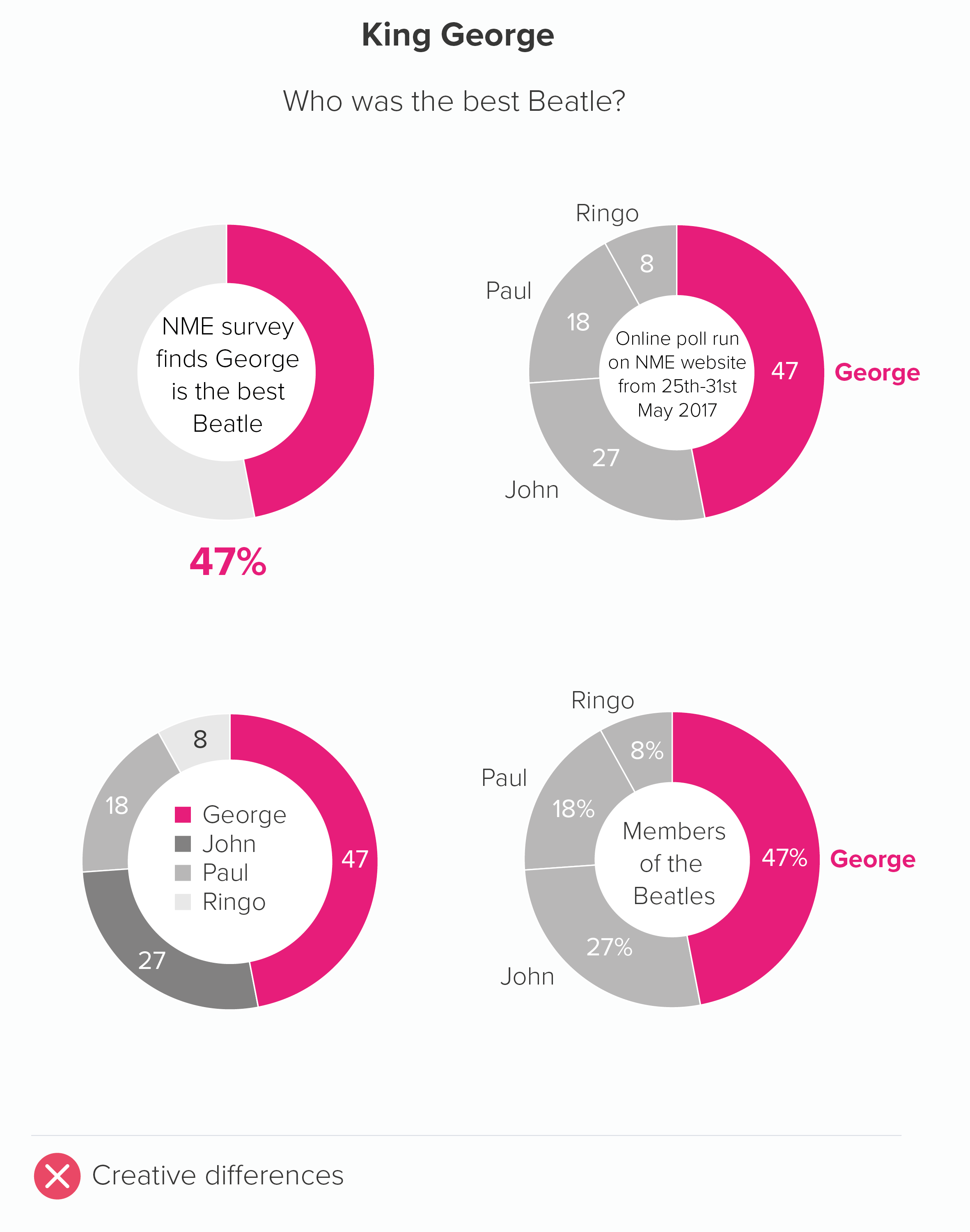
One final point about doughnut holes. If you’re going to fill them, don’t fill them with crap. It’s not where you put the chart title, or a legend, or footnote content. Use it for key information or useful decoration. If it’s relevant, you could add the total number or a percentage symbol to make it clear what’s being measured. But, as a rule, the key number or an icon works the best.
As with pie charts, the main risk with this chart type is using them when your data is dull or irrelevant, as a doughnut chart will amplify whatever qualities your data possesses, and your audience could potentially get annoyed that you have used a bold visual for data that doesn’t merit any special treatment. Also, if you have serious data, or an audience that prefers dense, detailed charts, then doughnuts are usually the wrong choice, as they are fundamentally a lightweight chart, and they can bear even fewer datapoints than pies without buckling under the strain.
I’d think about doughnuts - and pies to a lesser extent - as the charting equivalent of informal language. Just as sometimes a conversational style is appropriate (it suggests you are approachable and on the same level as your audience) and refreshing (it makes a change from business jargon or statistical terminology), so sometimes a row of doughnuts indicates a welcome change of tone. The audience can relax a little: they are not being asked to concentrate too hard, or treat everything in the dataset with the utmost seriousness.
But the opposite is also true. There’s a reason you don’t see too many doughnut charts in academic papers or scientific journals. It’s the same reason that these publications discourage the use of exclamation marks (‘The vaccine works!!!’) or writing in italics or CAPITAL LETTERS to underline a point, or the insertion of intensifiers (‘really’, ‘incredibly’, ‘totally’) to emphasise importance. The information should not need to be cranked up in such a crude way. Your audience will just find it inappropriate, or suspicious.
So always consider your audience’s expectations. If you wouldn’t use informal speech with them, don’t use an informal chart. Especially doughnuts, but also bubbles, isotype charts or any other informal visual elements (icons, illustrations, photos).
But if a conversational tone is appropriate, or if you want to intersperse a formal presentation with more conversational elements, then doughnut charts are the charting equivalent of their real-world namesake. Not especially healthy, but guaranteed to cheer everyone up.
VERDICT: Break this rule often.
Sources: Ghosts data from Yougov, belief in crystals data from The Guardian, predators data from various sources but mostly this from BBC Earth, gay relationships data from NatCen BSA, water content data from various sources, including Encyclopaedia Britannica, mobile phone data from Ofcom, Beatles survey from NME
*A note on spelling. Unlike Homer, I am spelling the word as ‘doughnut’ for this post and only use ‘donut’ when I’m quoting people who prefer the variant. This is because English-language speakers outside of the US usually spell it as doughnut, and in fact many Americans also spell it as doughnut. According to Time magazine, the ‘donut’ spelling only took off after ‘Dunkin’ Donuts’ arrived on the scene in the late twentieth century. (This doesn’t bode well for the U.S. spellings of crispy and cream). So, call me old-fashioned, but I’m going to call those nut shapes made of dough, doughnuts.
More data viz advice and best practice examples in our book- Communicating with Data Visualisation: A Practical Guide

