
In this blog series, we look at 99 common data viz rules and why it’s usually OK to break them.
by Adam Frost
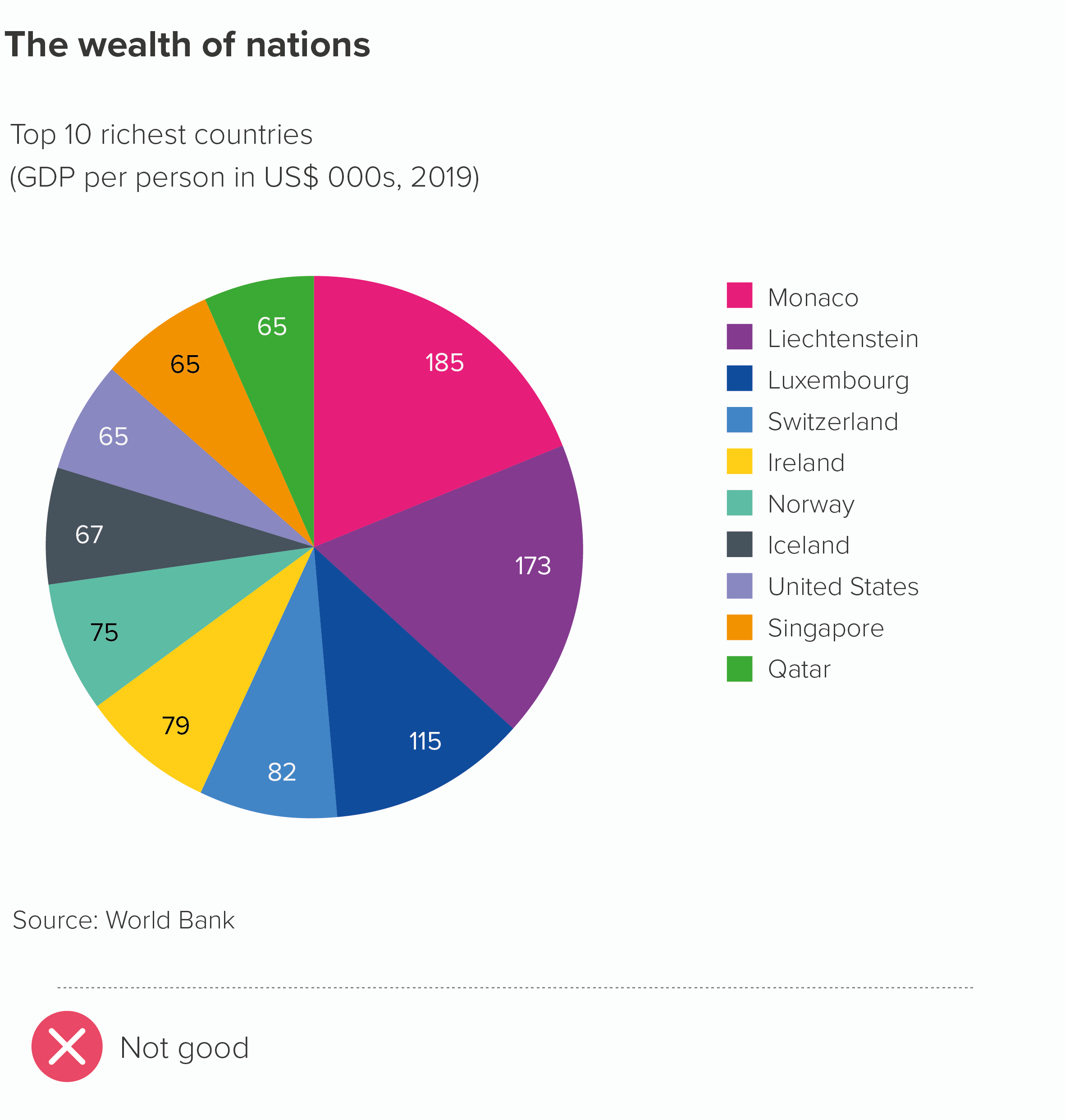
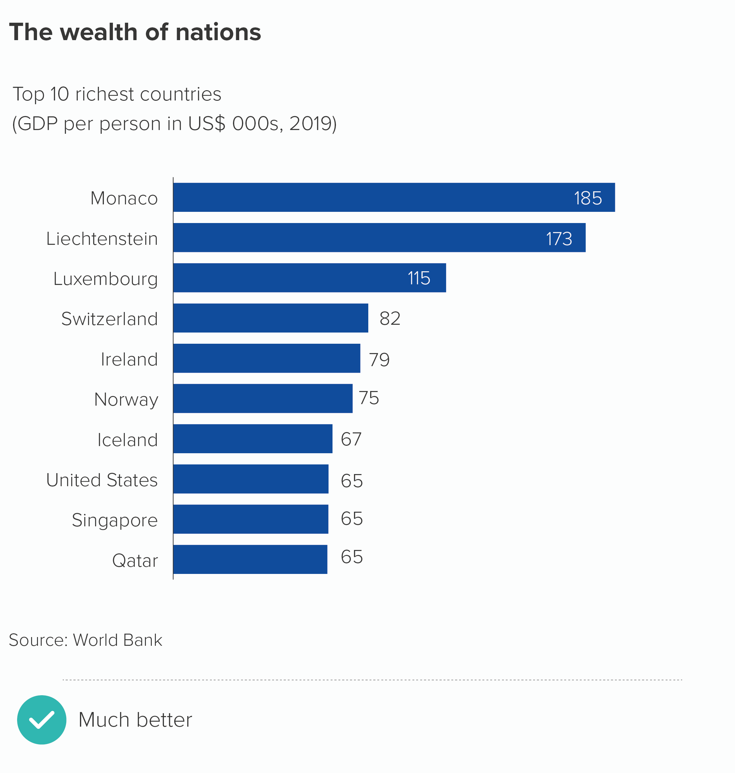
First articulated by John Tukey and reinforced by Edward Tufte, Stephen Few and others on the analytic fringe, 'don't use pie charts' is probably sensible advice if you are preparing visuals for an academic paper, an operations dashboard or another situation where accuracy of perception is critically important. Some research suggests that we find it hard to compare the size of pie chart wedges - particularly compared to, say, the bars in bar charts. As a result, for more data-savvy audiences, the use of pie charts can suggest that the author is unserious or even pulling a fast one.
In this example, a bar chart definitely beats a pie chart.
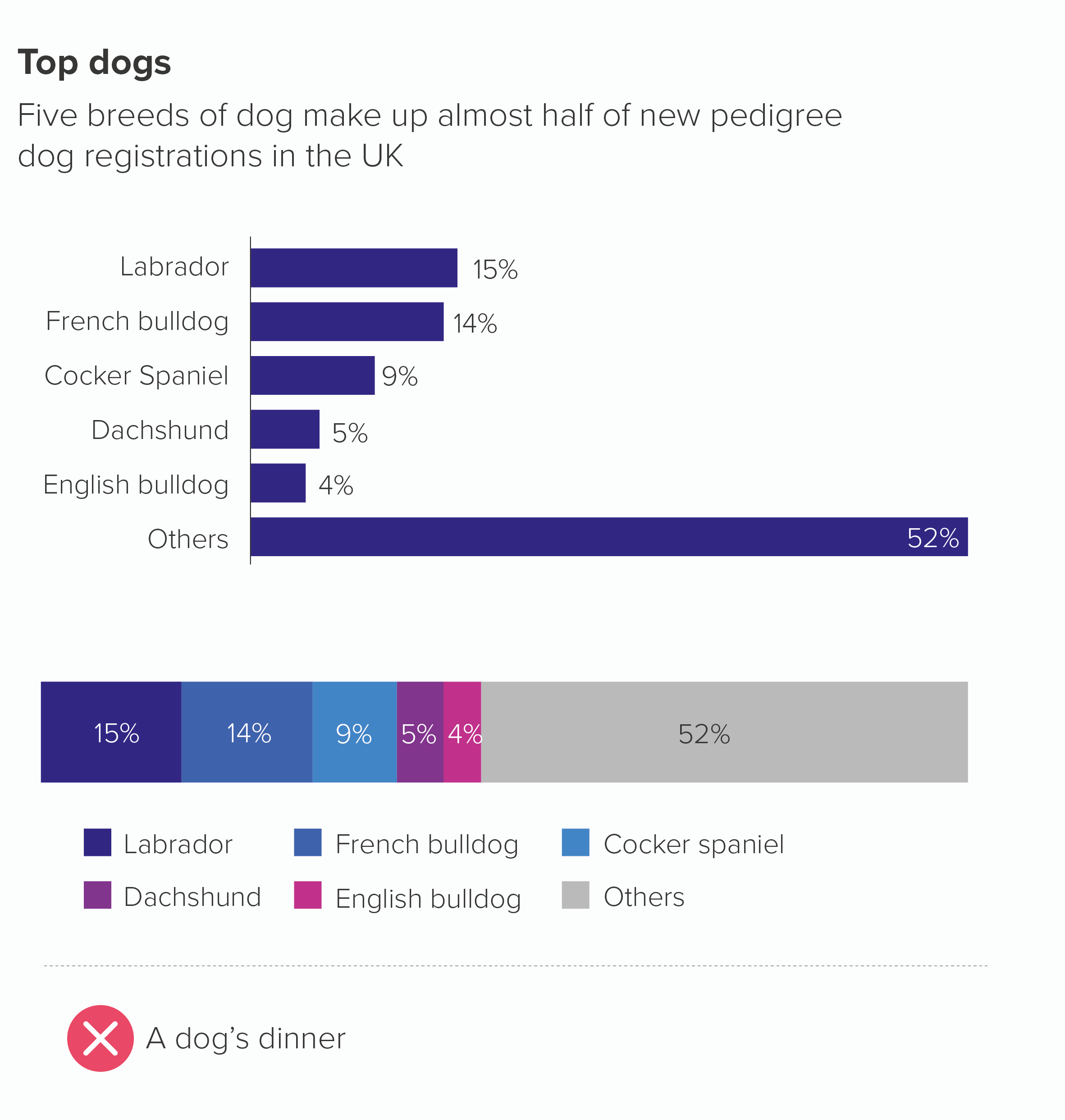
If this is not your audience however, pie charts are a useful tool for telling stories of composition: where you want to break your dataset into its constituent parts or compare one part to the whole. Other charts can also do this (e.g. a treemap, a waffle chart or an isotype chart - we’ll cover these in later rules).
But people love circles, they are the perfect metaphor for a total, self-contained dataset and they can offer a refreshing visual interruption in a presentation full of rectangles and lines.
Besides, saying pie charts are harder to read than bar charts doesn't mean they are hard to read. We can read watches and clocks just fine, and as any parent who has tried to slice three exactly equal slices of cake can attest, we are acutely aware from a young age of the tiniest slither of difference between apparently identical wedges.
Finally, there is research for pie charts as well as against them. And our experience is that for most audiences, when you have a composition story, it is worth sacrificing a little perceptual accuracy for the clarity and memorability that a well-designed pie chart can provide.
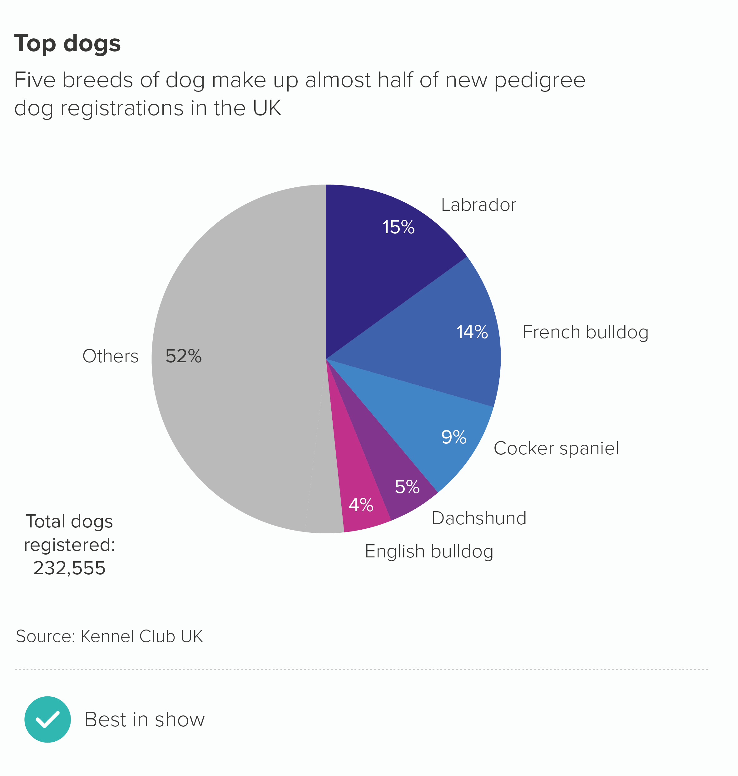
VERDICT: Break this rule
Sources: Kennel Club data on dog breeds, World Bank data on GDP per capita
More data viz advice and best practice examples in our book- Communicating with Data Visualisation: A Practical Guide