In this blog series, we look at 99 common data viz rules and why it’s usually OK to break them.
by Adam Frost and Tobias Sturt
We often have this conversation with clients.
CLIENT: ‘What colours should the slices in my pie chart be?’
US: ‘Use the colours in your brand guidelines.’
CLIENT: ‘But the colours in our brand guidelines are horrible.’
US: ‘Not as horrible as everyone picking their own colours.’
The fact is, 99% of the time, you shouldn’t need to think about which colours to use. Unless it’s a personal project, or you work for a new business that doesn’t yet have them, your organisation’s brand guidelines should make it clear which colours your charts should be.
And this is a Good Thing.
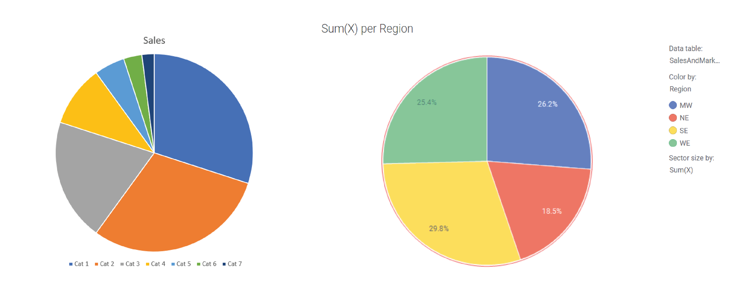
Most of us are not professional designers and have no idea which colours sit well together. The people who develop software applications seem to have no idea either. There are a few heroic exceptions (e.g. Datawrapper), but in most chart-making tools, the default colours will be boring, clashing, inappropriate for your story or (somehow) all three. Here are the current defaults in Powerpoint and Spotfire.
Most importantly, brand guidelines ensure that publications and presentations look visually consistent, which means that your audience can spend more time focussing on the information, and less time figuring out how to read it.
Here are some example brand guidelines.
Image by Tobias Sturt
So what we’re talking about here is how to use your brand colours, rather than which specific colours to use. And if you don’t have brand guidelines, or you do, but they don’t have enough information to help you choose chart colours, then I hope that this summary will act as a starting point for evolving your own charting guidelines (which if you’re an organisation that visualises a lot of data, you need).
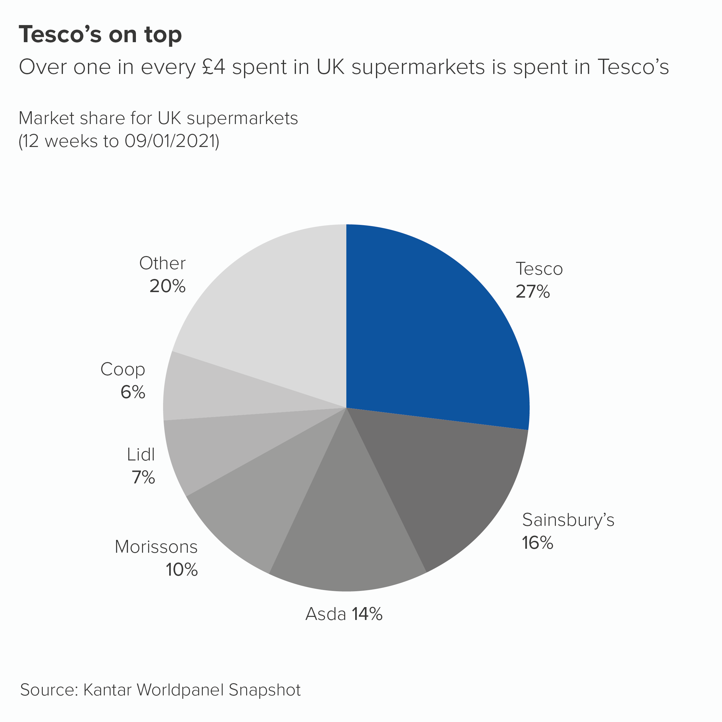
OK, back to the rule. ‘Limit the number of colours you use in pie charts.’ In most situations, this is a good idea. You will usually have a hero slice - often your brand or your country or just the largest slice - that you will want to highlight in some way. So use your brand colour, or a similarly strong colour from your guidelines, for that hero slice. Then knock back the others, perhaps with greys or light blues.
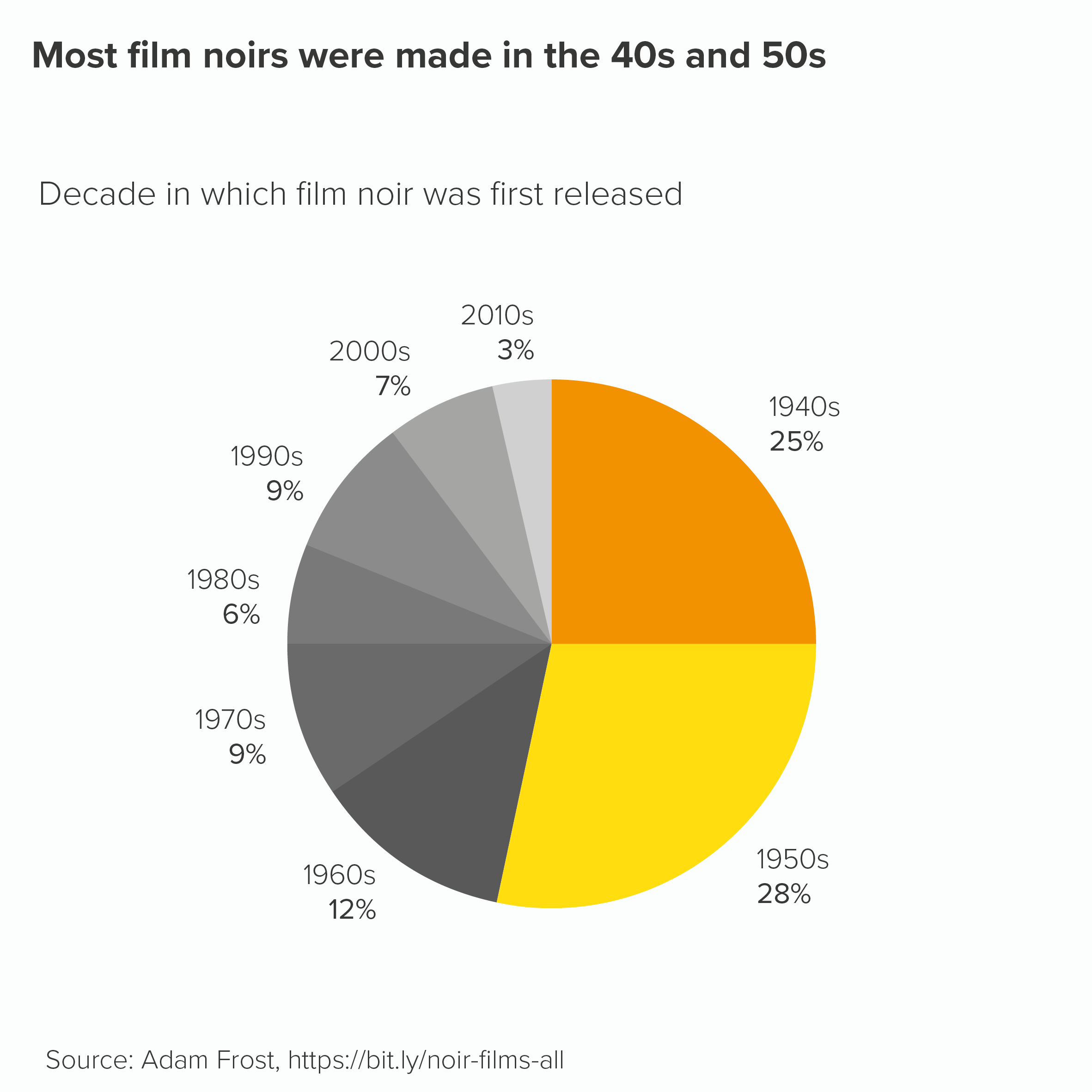
However, sometimes you will have a group of slices that are all important, or all linked in some way, and you might want to call them out and de-emphasise the slices that remain. So you might use your key brand colour alongside tints or shades of that colour. This, by the way, is a cunning way of sticking to brand guidelines as a tint is technically the same colour (or hue), just in a lighter or pastel shade, whereas a shade is again the same colour but a darker version. Therefore you haven’t introduced a new colour to your brand guidelines, just ‘extended’ the current options. Mwa ha ha.
Anyway, in these situations, you could use tints or shades of your main colour to imply that the important wedges are a group. Then you would use grey for the other slices.
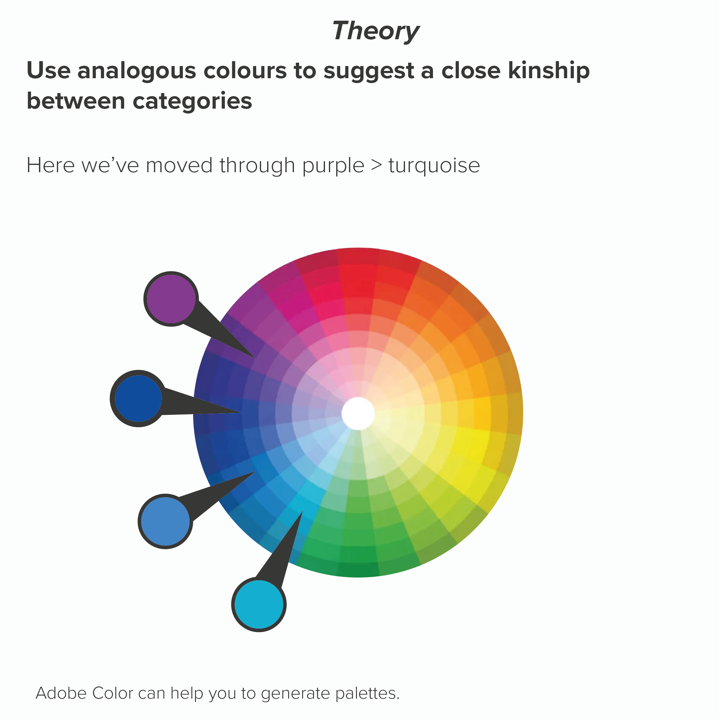
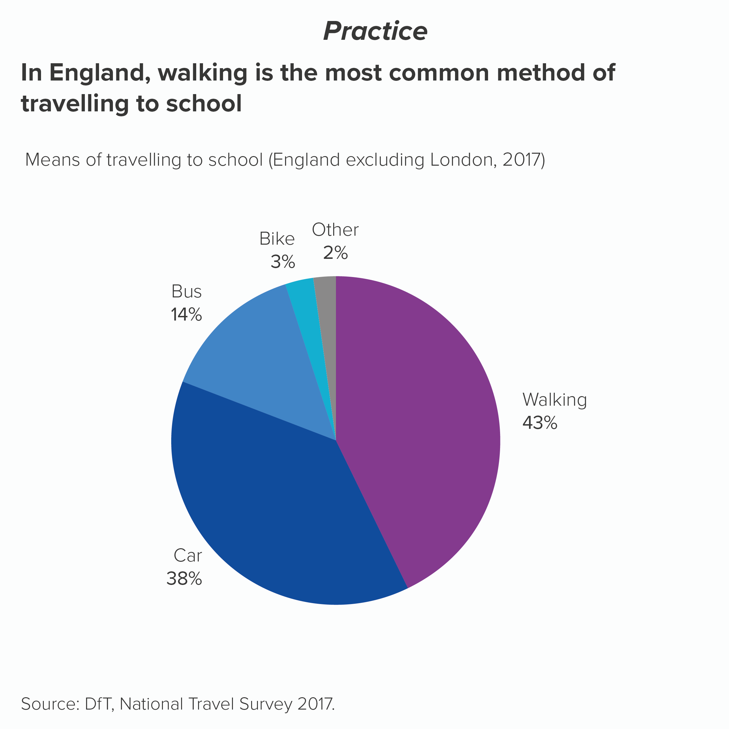
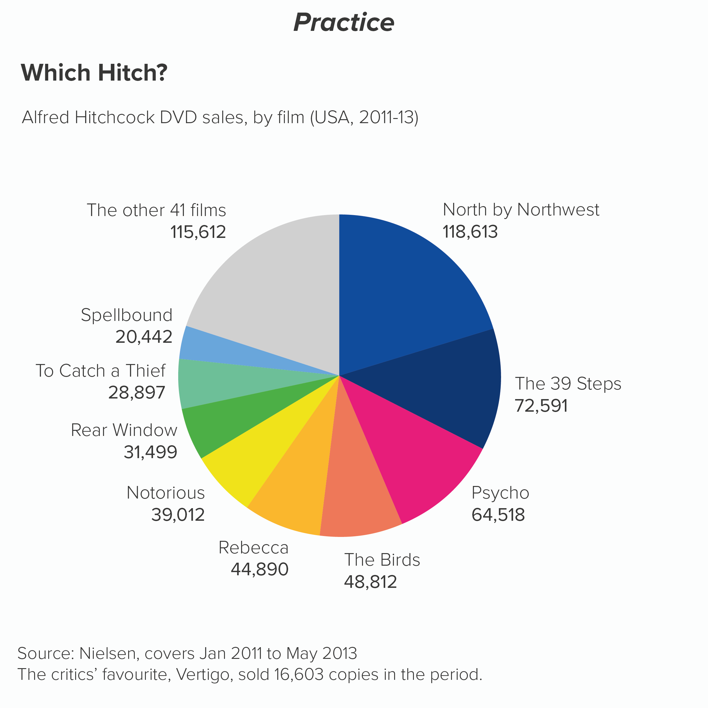
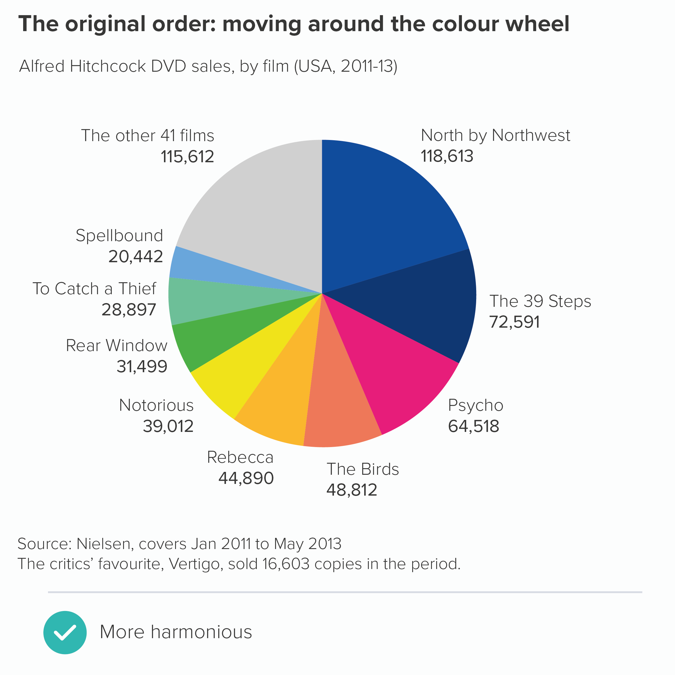
Sometimes all your slices are equal in importance. Using colour to call out one or several wedges would suggest a hierarchy of importance that doesn’t exist. The question then becomes: are your categories similar types of thing? E.g. all things you wear, or all kinds of transport, all types of fish? In which case, you would stay pretty close to your brand colour again. Perhaps your brand colour for the first slice, then analogous colours for the other slices, moving round the colour wheel. This signals to the audience that there is kinship between the categories.
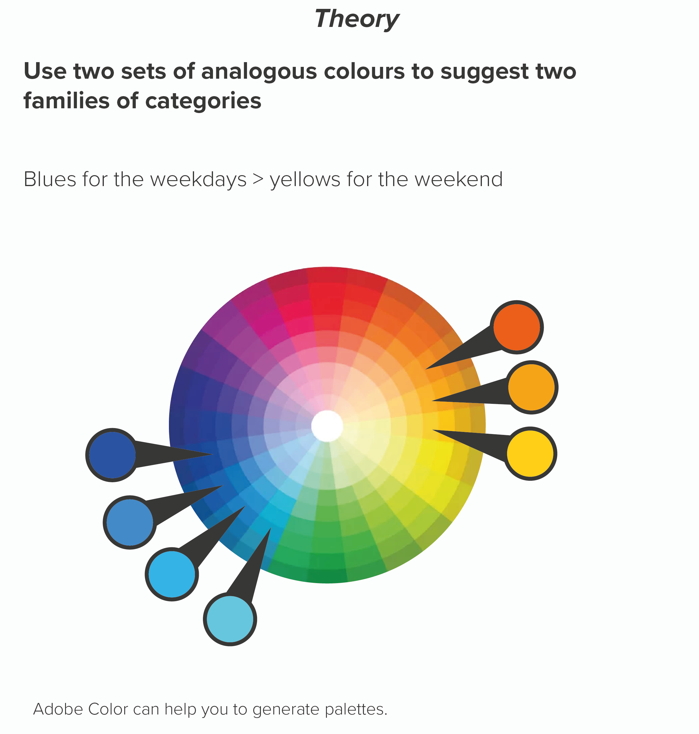
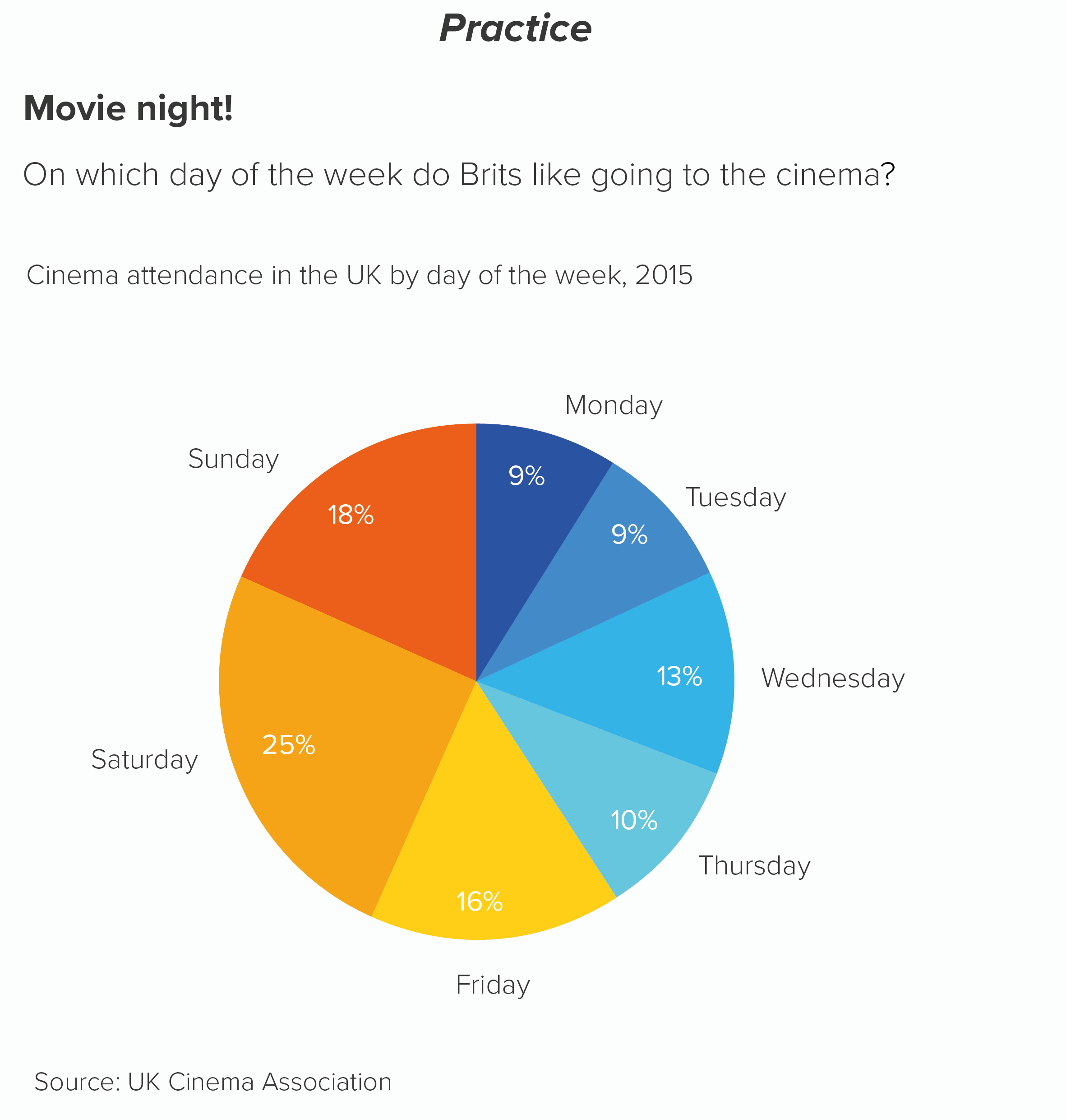
Or maybe there are sub-groups in your data. Four types of fruit and four types of vegetables. Four European countries and three South American countries. The days of the week versus the weekend. Here you might want your colours to help signal these groupings.
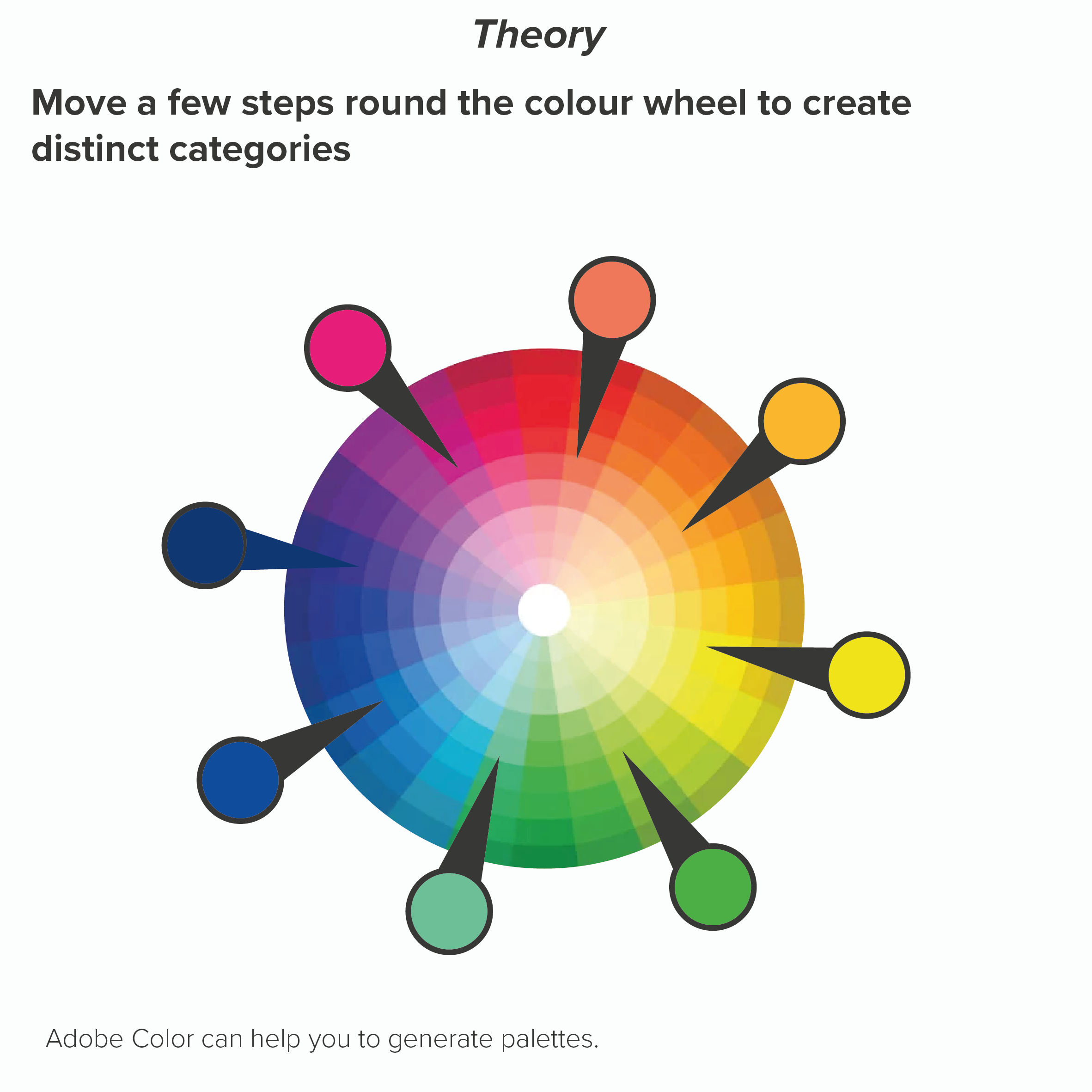
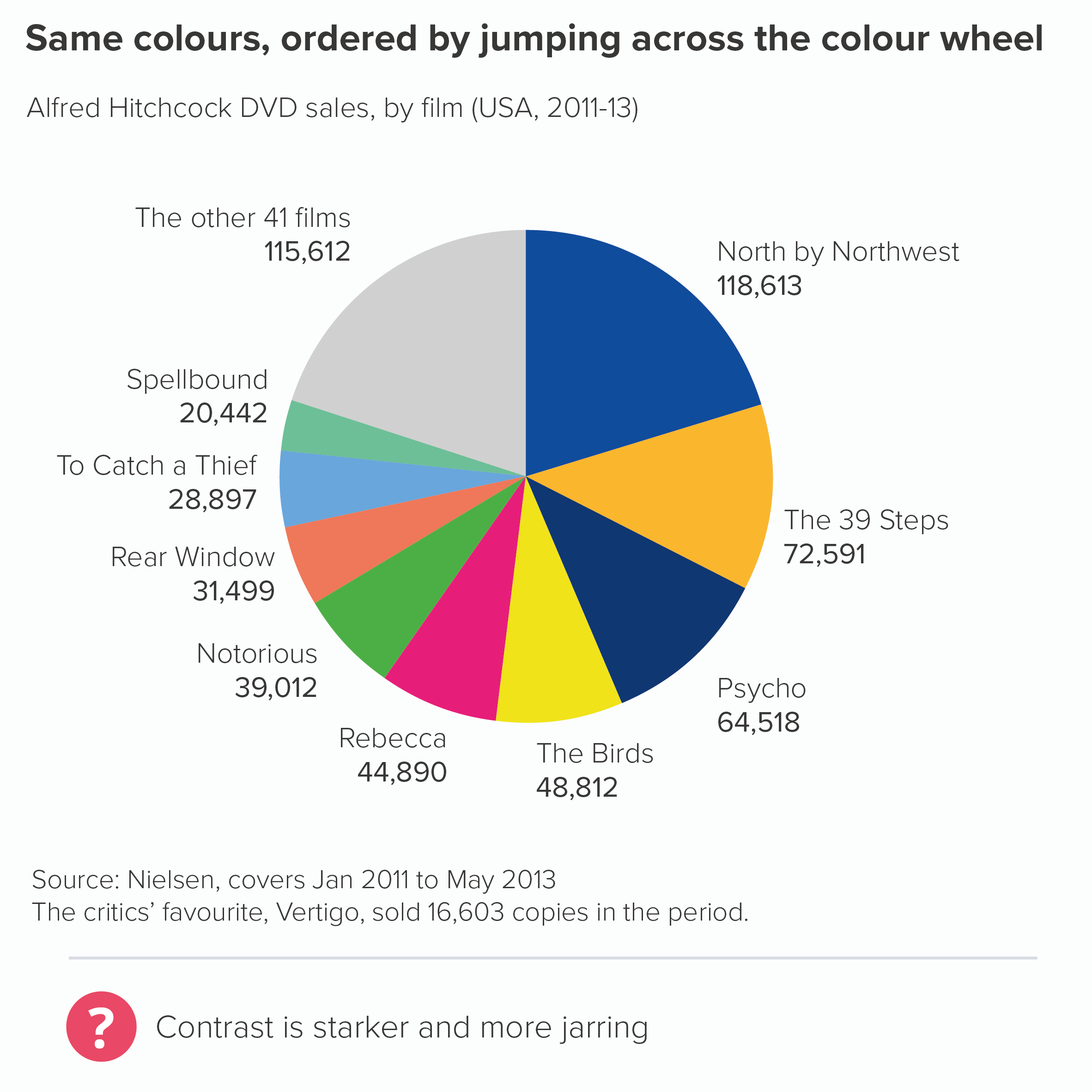
Sometimes all your wedges are important and they all represent very different categories. Here you have no choice but to use colours that emphasise that difference. However, there are ways of applying this principle that avoid the use of jarring complimentary colours (e.g. red and green, purple and yellow). If you keep moving a few steps around the colour wheel, your colours should be clearly distinct (e.g. blue to red to orange) but not directly opposed. Your brand guidelines should have enough distinct colours to allow you to alternate in this way (you might need to dive into the secondary palette). Remember never to repeat colours on a pie - this is guaranteed to confuse.
Here’s what happens if I use the same palette but alternate between complementary colours.
This shows the power of colour: it feels like a minor change - shuffling the order of the colours - but it has a major aesthetic and narrative impact.
If there aren’t enough colours in your guidelines to make these kinds of charts, the first question to ask is: does my pie have too many wedges? (See rule 3). But if your story does justify lots of distinct wedges, then you will inevitably need to build on some of the colours in your brand guidelines and hope that the brand police are too busy arresting real criminals to notice.
Remember that if you’re not a designer, be cautious whenever you’re selecting colours. Choosing a new colour to sit alongside an existing palette is fiendishly difficult; some designers earn a living from doing this and nothing else. So either ask a designer for advice or at the very least use a tool like Adobe Color or this chroma.js colour picker which should stop you committing too many career-ending mistakes.
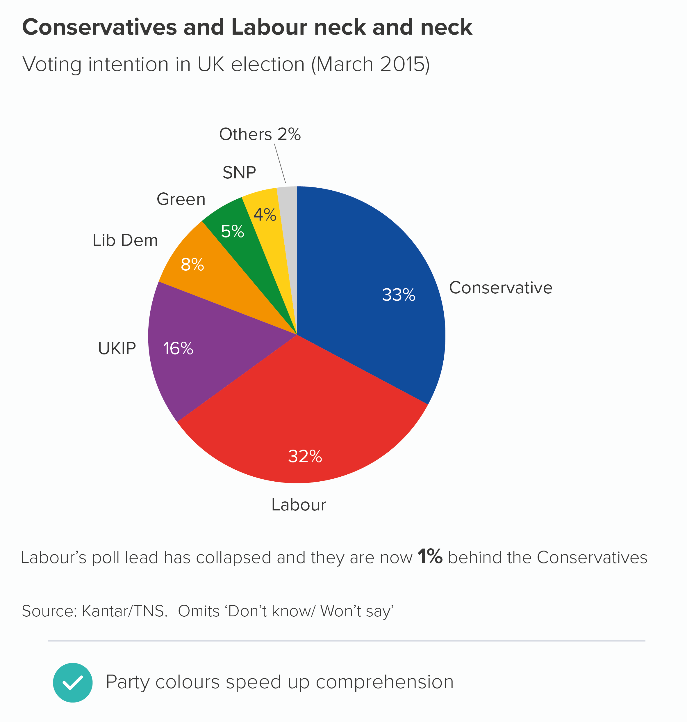
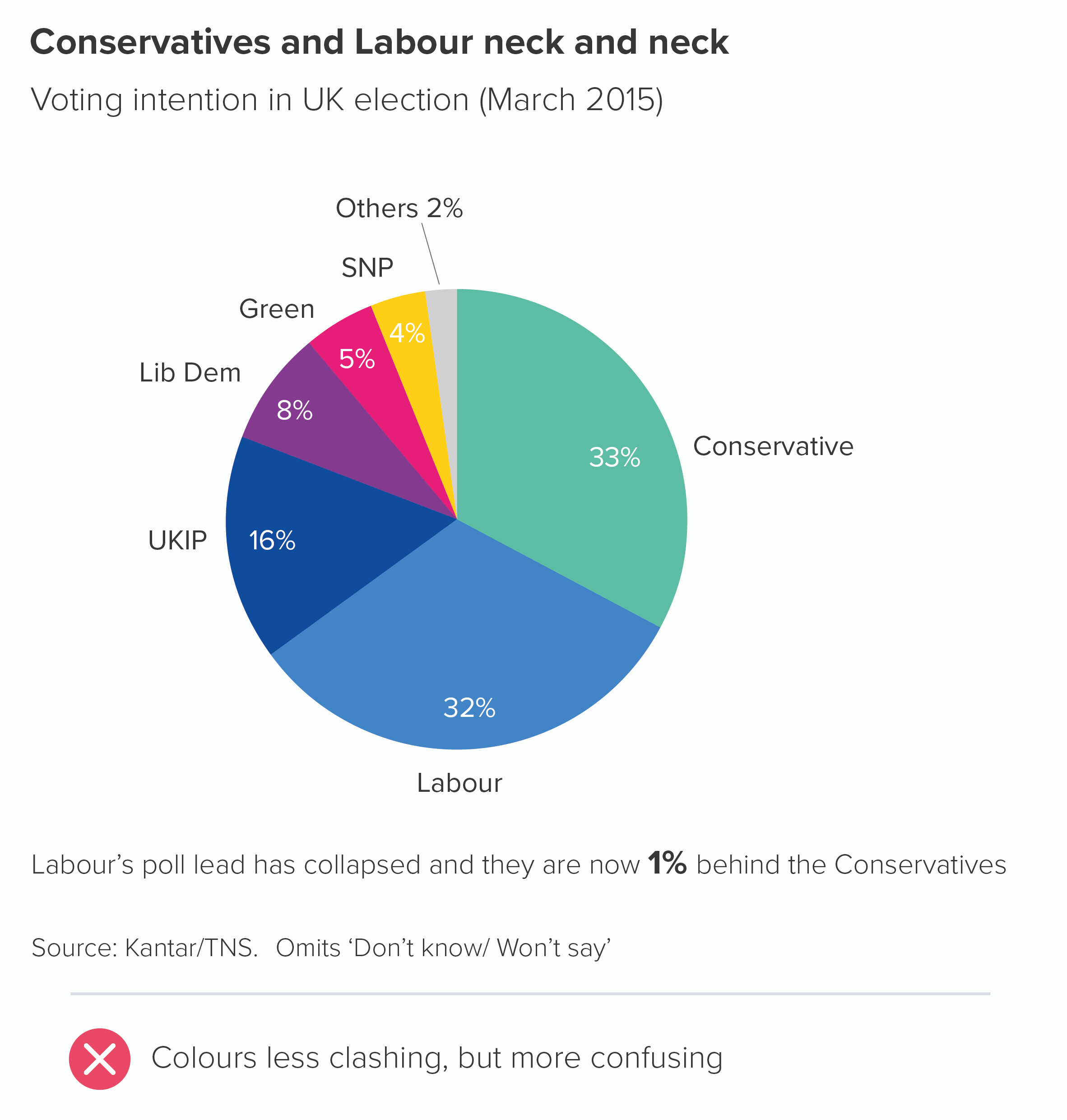
Another important point: sometimes your story will demand the use of certain colours - whether they are in your guidelines or not. For example, a chart showing support for different political parties. This kind of chart will simply look broken if you don’t use the colours associated with each party.
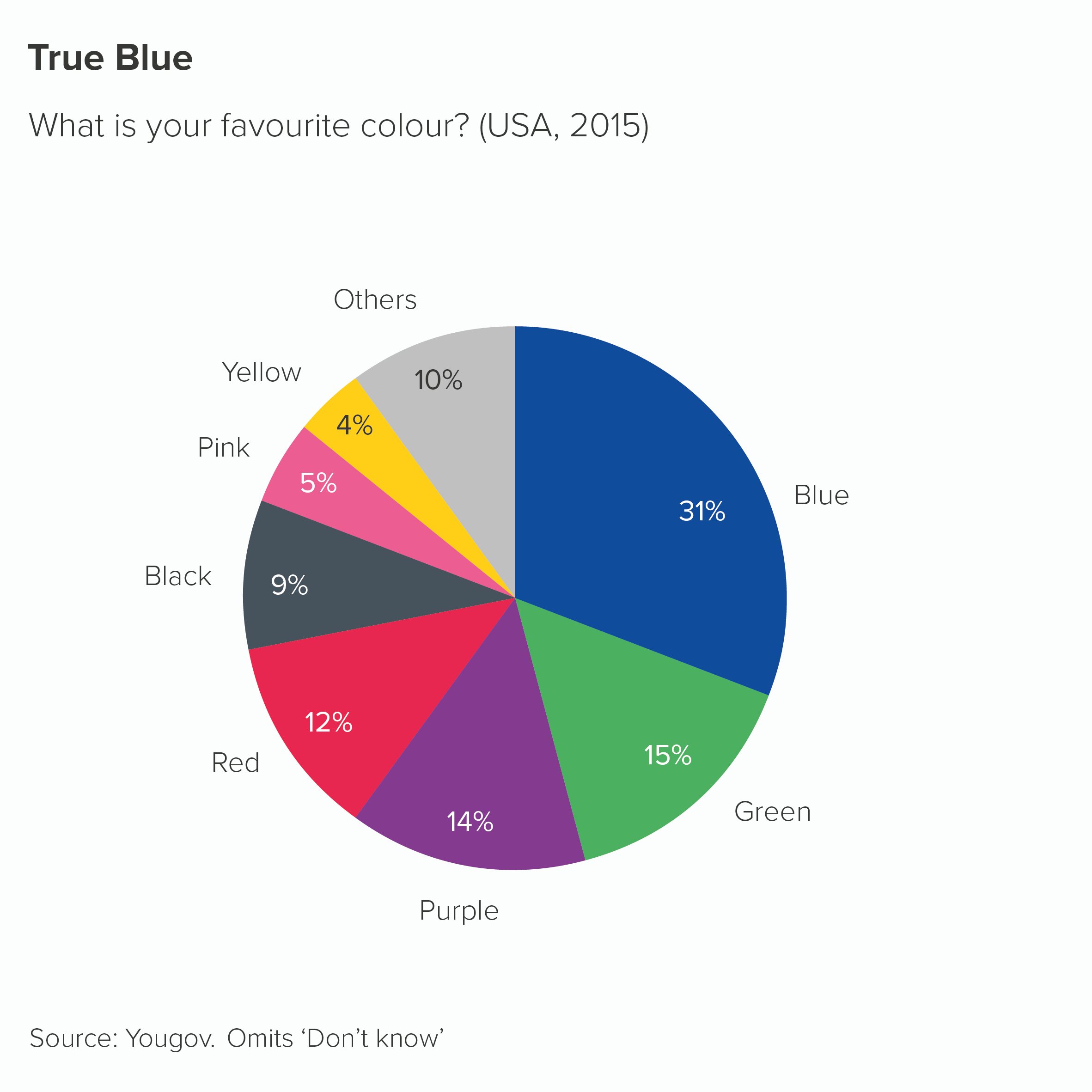
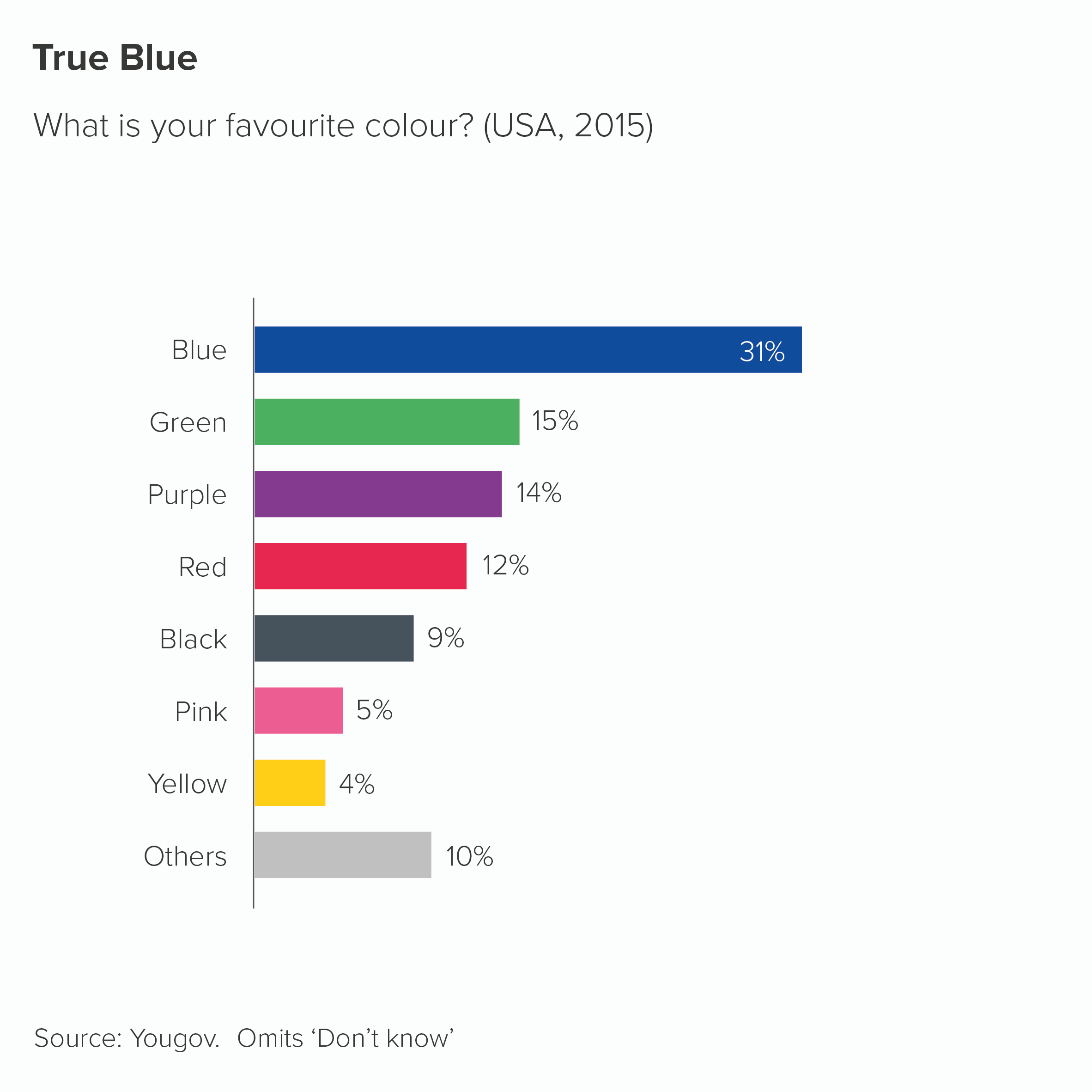
There are plenty of other examples. If you are comparing sales of bananas with sales of other fruit, you might want your banana slice to be yellow. The same applies to comparing football teams or retail brands or anything else where colour is integral to the category’s identity. To use the most literal example, perhaps you have a chart showing the answers to: ‘What’s your favourite colour?’ How else should you colour it? (Respect to Yougov for actually running this survey). Also, I should say, however clashing the colours are, I find them more palatable on a pie chart than a bar chart.
Sometimes you will be lucky and have a colour (or a similar colour) in your brand guidelines, in which case you should absolutely use them. But sometimes you will just have to bite the bullet and use the relevant non-brand colour.
There are also examples where you should consciously not use the colours associated with your categories. For example, if you are representing skin colour. There should be no link - none - between the colours in your chart and your categories in this case. Here is an example from the Washington Post - a stacked bar about US police violence towards black people
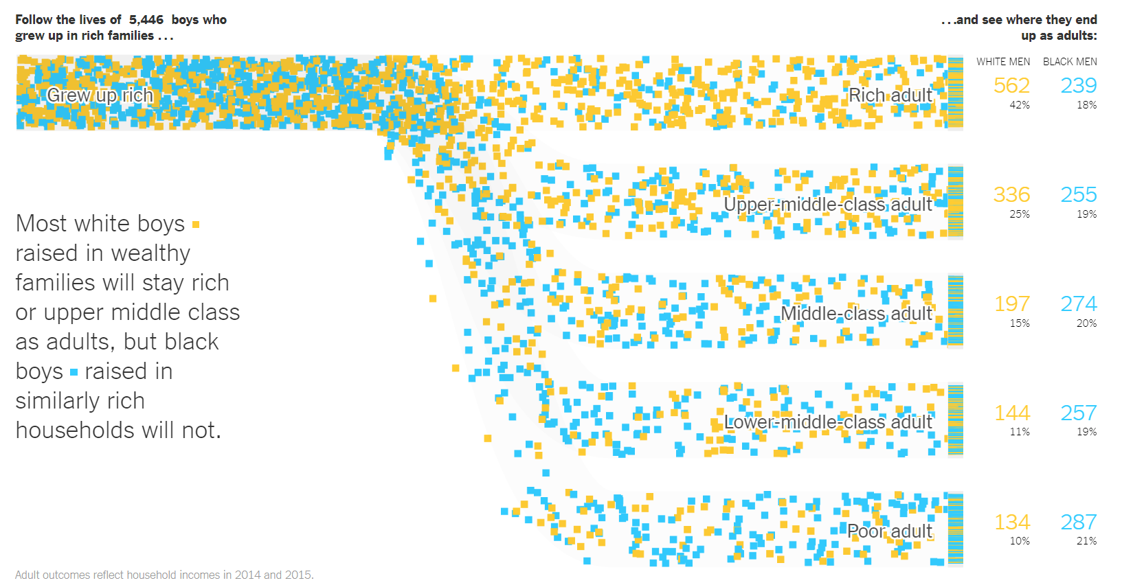
And here’s a masterpiece from the New York Times - a modified Sankey chart this time - about how boys that grow up in rich families have different life chances based on their race. White boys are orange squares; black boys are blue squares. This is a static screengrab, the original is animated.
Finally, the colours you choose need to be accessible. This is another good reason to use brand guidelines because - if they have been designed properly - the authors will have tested that any colours are colour-blind safe and use colours with a sufficient degree of contrast. That said, it’s always good to doublecheck that any chart you make is accessible - brand guidelines are not infallible. Most tools have colour-blindness checkers, or allow you to see your work in grayscale. More fundamentally, it’s always good to ‘get it right in black and white’ - for the sake of all your users. Charts are often printed out on black-and-white printers. Projectors can do bizarre things with colours, washing them out completely. Colour should support your story, but never be critical to understanding it.
OK, back to the rule. ‘Limit the number of colours in your pie chart’. Yes, if you can. Your brand guidelines should be encouraging you to do this anyway. Colours provoke deep emotional responses, and audiences latch on to them, so they need to be handled with care. Every colour you include on your chart adds a wealth of cultural, political and personal signifiers. Too many colours is like playing several songs at once, all from different musical styles, all with the volume turned up to 11.
However, as I’ve mentioned above, sometimes a limited palette undermines your message. The important thing to remember is that any colours you add should be clearly motivated by your story. Colour in data visualisation should never just be decorative. Any colour should have a clear meaning, and that meaning should still be clear even if all the colours get switched off, leaving only shades of grey.
VERDICT: Follow this rule most of the time
Sources: Kantar Grocery Snapshot, Gartner Newsroom, World Bank air passenger data, Department for Transport travel survey 2017, UK Cinema Association box office data, Hitchcock data from Guardian graphic by Adam Frost and Zhenia Vasiliev, Yougov favourite colour data
More data viz advice and best practice examples in our book- Communicating with Data Visualisation: A Practical Guide

