In this blog series, we look at 99 common data viz rules and why it’s usually OK to break them.
by Adam Frost
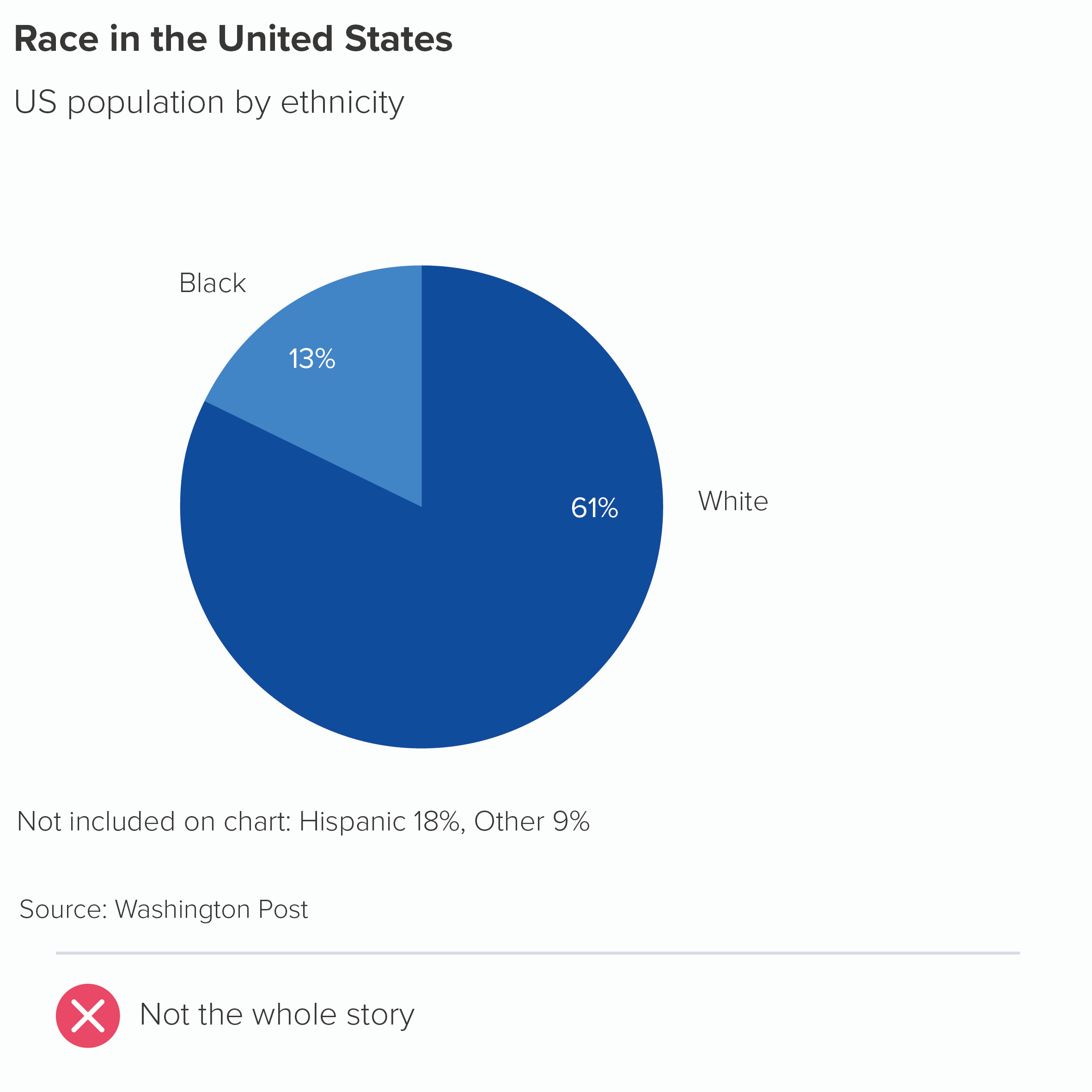
In his comprehensive guide to the field, Andy Kirk writes of pie charts: ‘The total of all sector values must be 100% [...] otherwise the chart will be corrupted’ (Data Visualisation, Sage, 2016). Robert Kosara writes that using pie charts when the values add up to less or more than 100% is a ‘common mistake.’ ‘Corrupted’, ‘a mistake’ - these are strong words, but deserved, I think.
By using a pie chart, you are drawing on the fact that circles are a universal metaphor for completeness, wholeness, perfection. Before you have even read the labels, they say: This is everything. Now let’s divide it up. If you are not including all the values in your dataset (or you are combining datasets), then you are mixing your metaphors - it’s the visual equivalent of ‘let’s iron out the bottlenecks’ or ‘we’ve opened a can of worms in a minefield’. Your audience just gets confused.
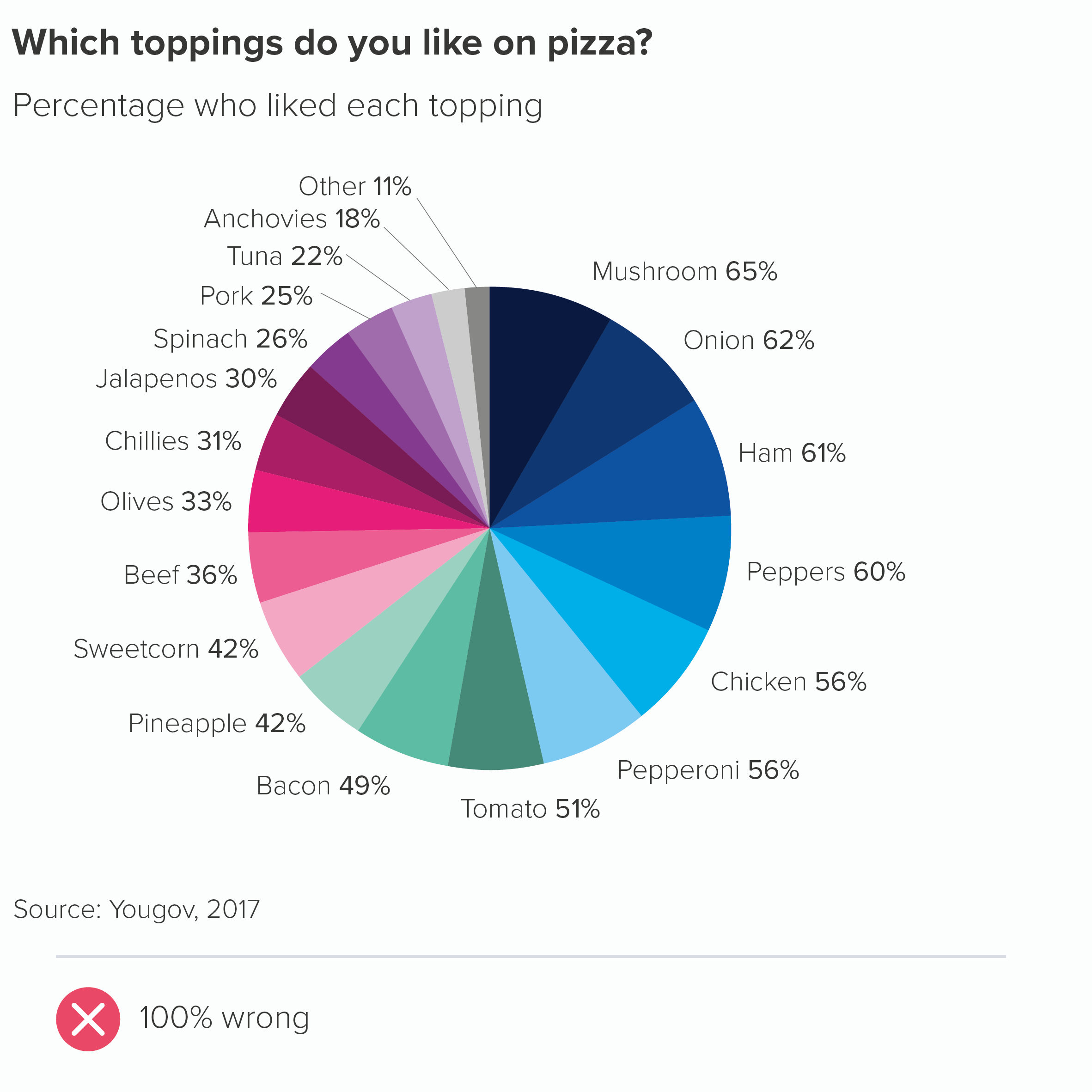
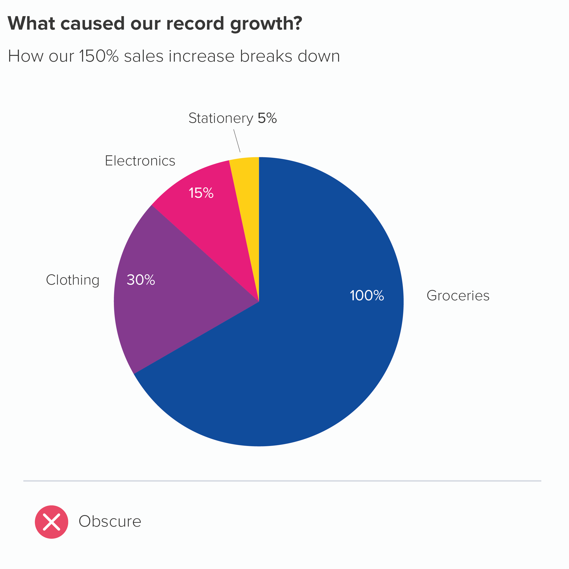
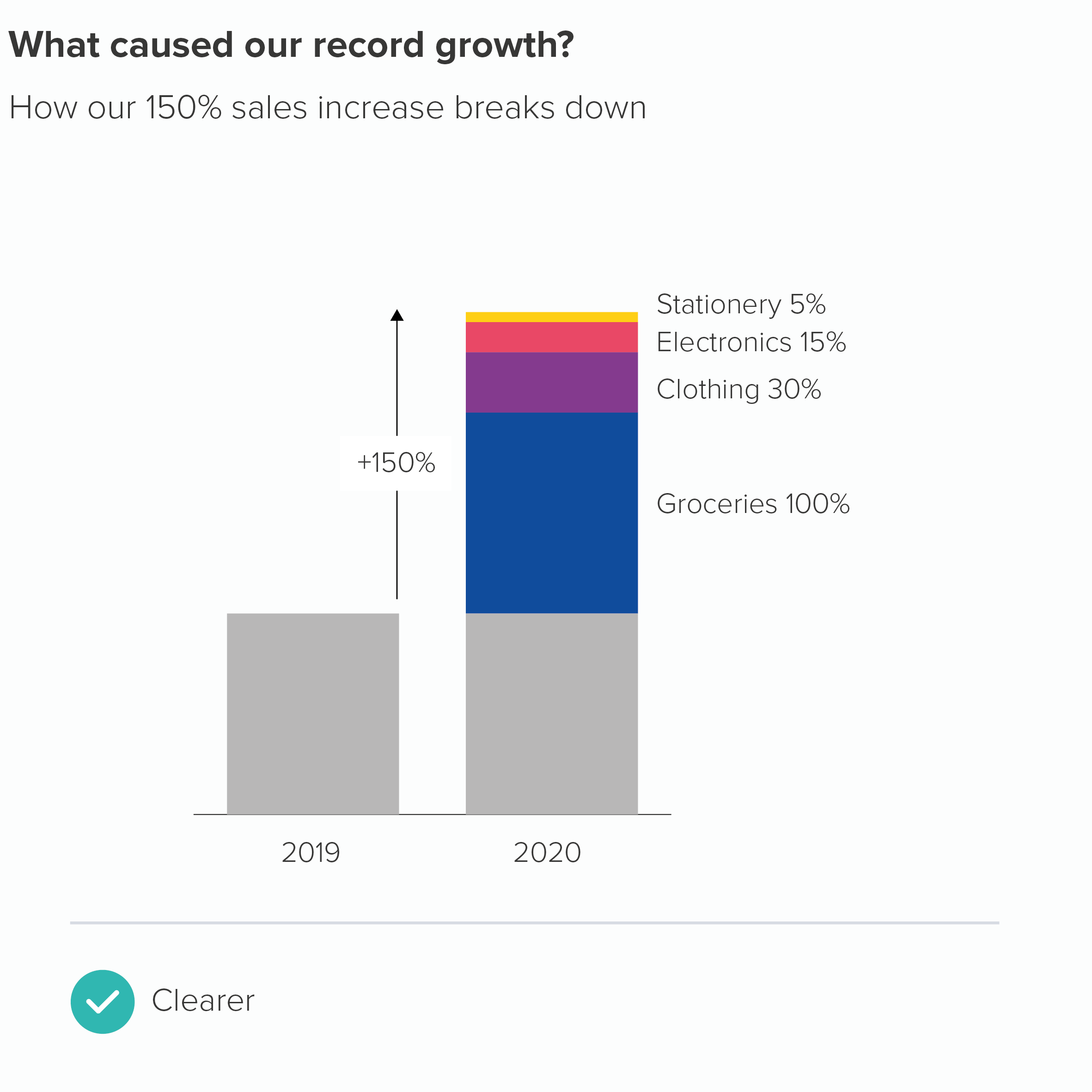
We see this mistake most commonly when people are allowed to choose multiple options from a list (as in the pizza chart above - where people in the survey could choose multiple toppings). Or when, say, a business has enjoyed growth of 150%, and wants to break down where that growth has come from. The problem is, a circle by itself does not suggest growth or increase, its visual power lies in its stillness and self-containment, so bars would be a better choice of metaphor for this story.
So we have our first unbreakable rule, don’t we?
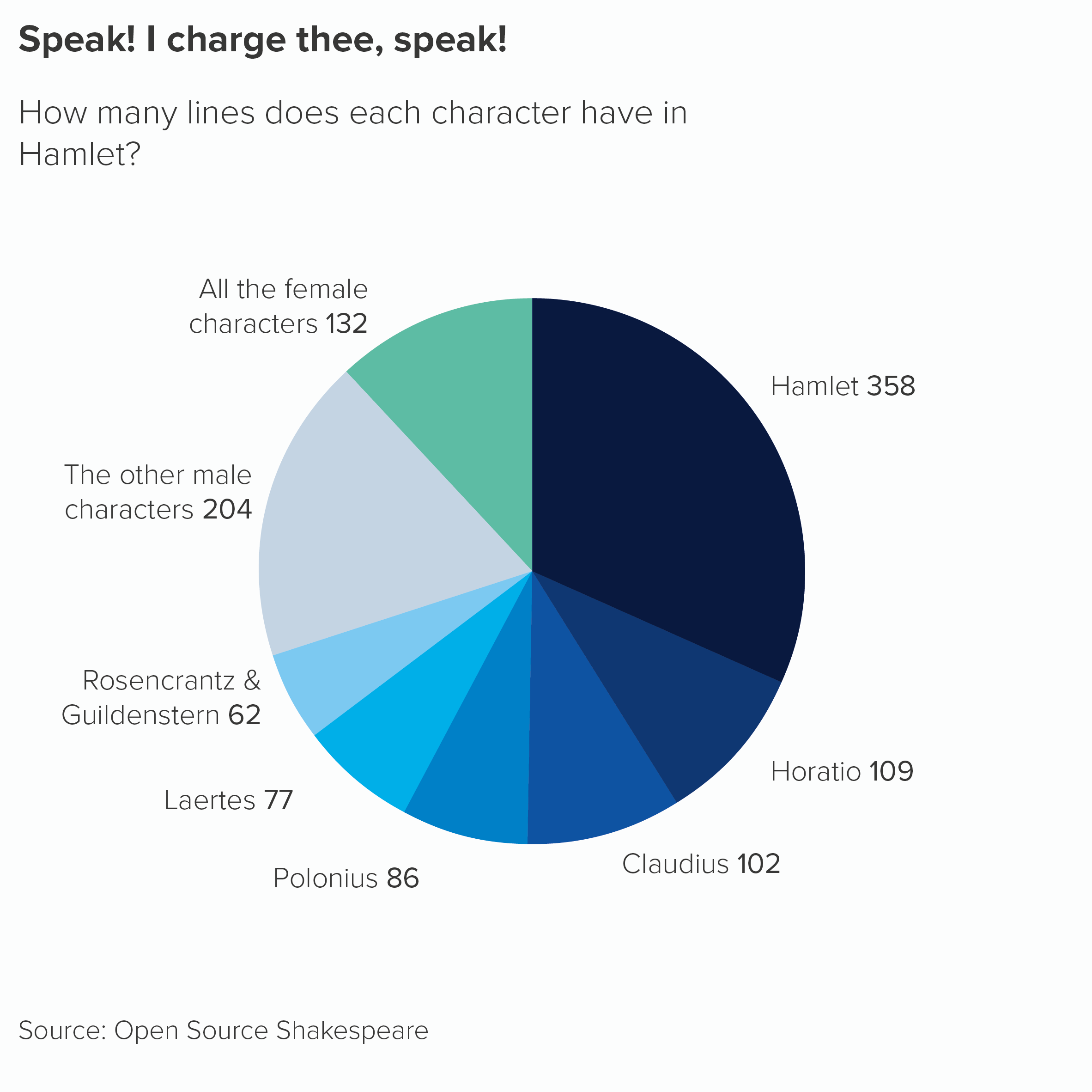
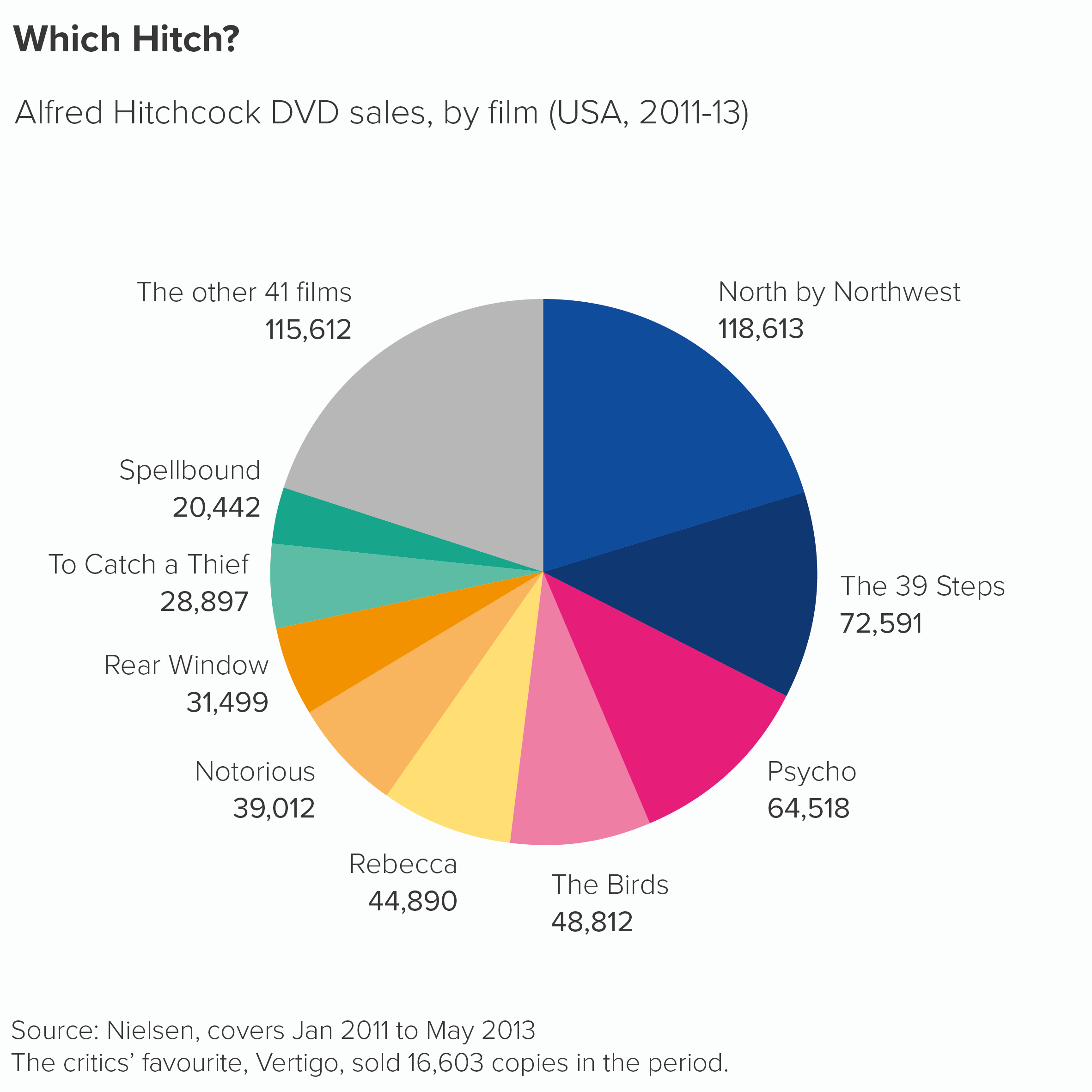
Well, almost. The fact is there may be reasons where you don’t convert your numbers to percentages, as in the Shakespeare chart we showed you in rule 3. There are a couple of other examples below. (Also, check out William Playfair’s original pie chart in the next rule). They aren’t quite as intuitive as pie charts showing percentages, but you might decide that using the original numbers gives the audience valuable information.
Secondly, we are big fans of rounding. This means both 9.5% and 10.49% become 10% and inevitably means that pie charts can add up to 98% or 102% or anything in between. One good rule breaks another. (When this happens, it’s a good idea to mention it in a footnote e.g. ‘Numbers are rounded so the percentages may not add up to 100%.’)
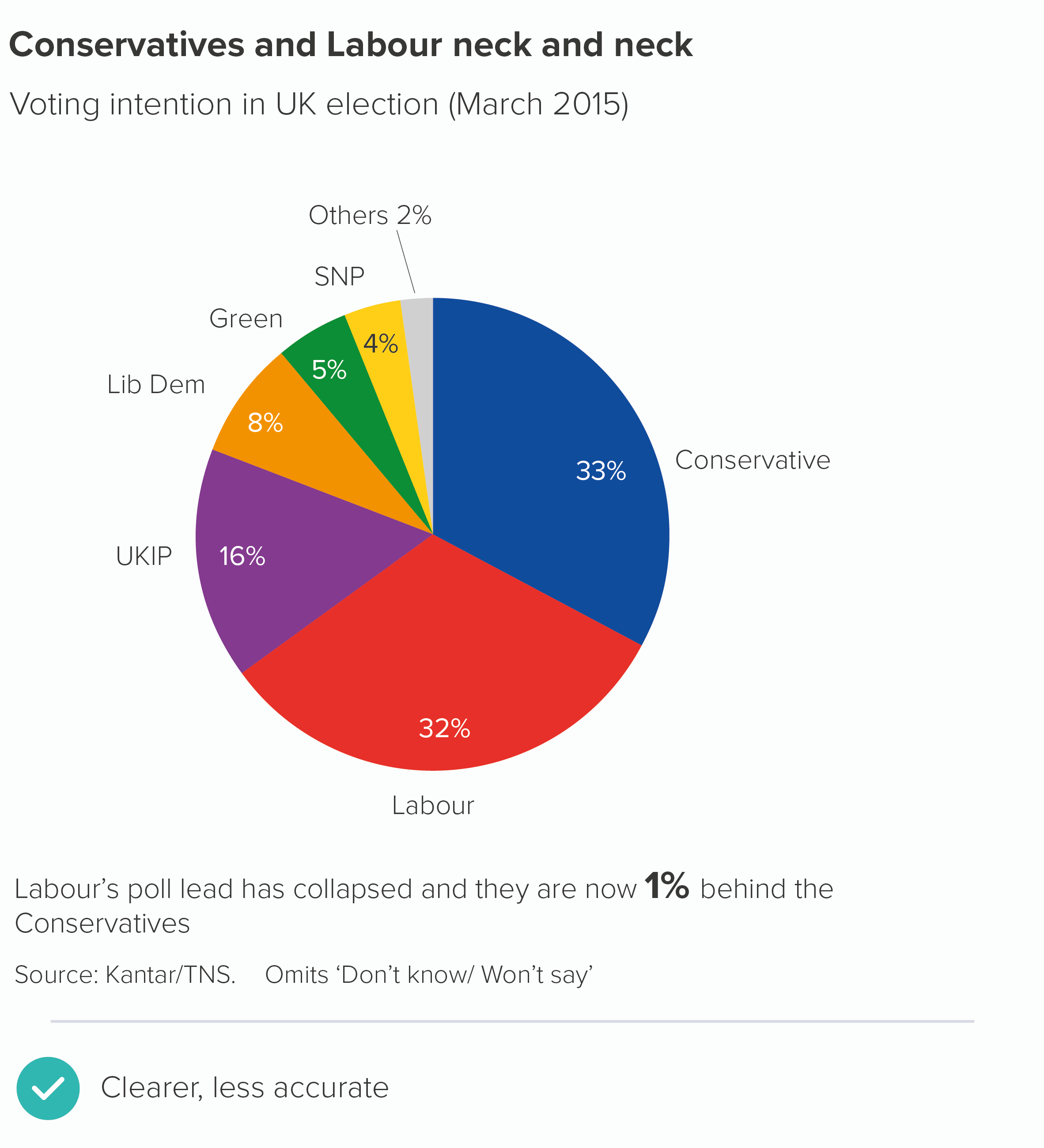
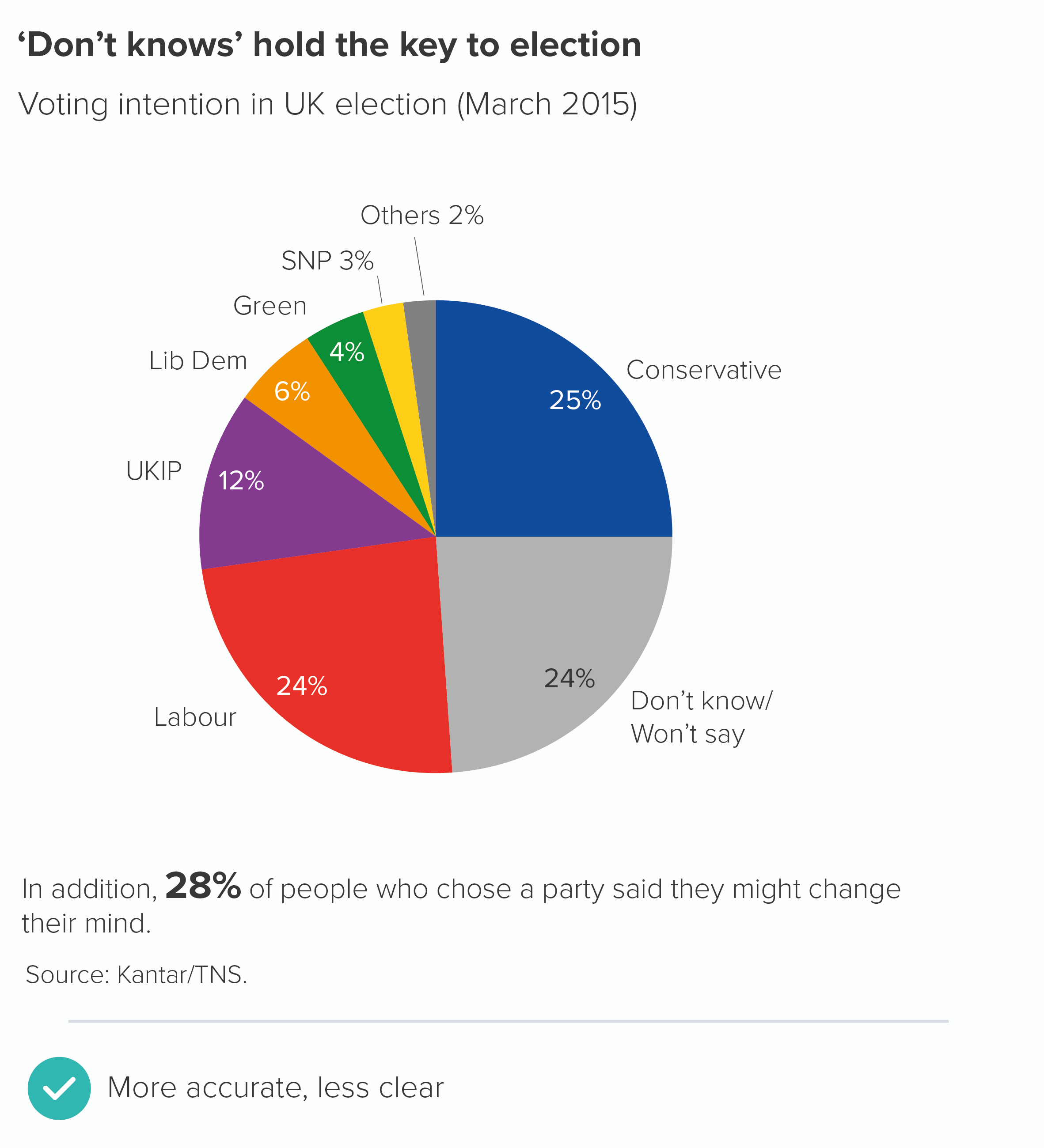
Finally, following this rule can create other problems. If pie charts should show 100% or a ‘meaningful whole’, then how do you define this whole? For example, I worked for a UK market research firm for a few years and we would sometimes have to show pie charts of voting intention. What should be included in this ‘whole’? Everyone who intends to vote, you might think. But in fact, the convention (and it seems to be global) is not just to exclude people who aren’t going to vote, but also to leave out people who intend to vote, but who won’t tell the company what they’ve decided. Also people who haven’t reached a decision yet. Only people who express a clear choice at that moment are included in the ‘100%’.
I’m not saying the first chart here is wrong. These charts are designed for the media, and journalists prioritise clarity and drama. Including the ‘don’t knows’ (the second chart) creates a fuzzier message. But it’s emblematic of the wider problem: even a statement as superficially straightforward as ‘pie charts should add up to 100%’ can involve tough subjective choices. It’s like opening a can of worms in a minefield.
VERDICT: Follow this rule between 98% and 102% of the time
Sources: Yougov data on pizza; Washington Post data on race; Hamlet data from Open Source Shakespeare; Hitchcock data from Guardian graphic by Adam Frost and Zhenia Vasiliev; Kantar/TNS data from March 2015 now taken offline
More data viz advice and best practice examples in our book- Communicating with Data Visualisation: A Practical Guide

