
Getting animated
Exercises & examples
Exercise 1: Scenarios
The first exercise in the book is to write some example scenarios. I included one in the book, but I actually wrote three different approaches and then made Adam pick one (which is what we often do - although it’s usually the client we’re making pick. I’m including them all here as examples of different visual approaches.
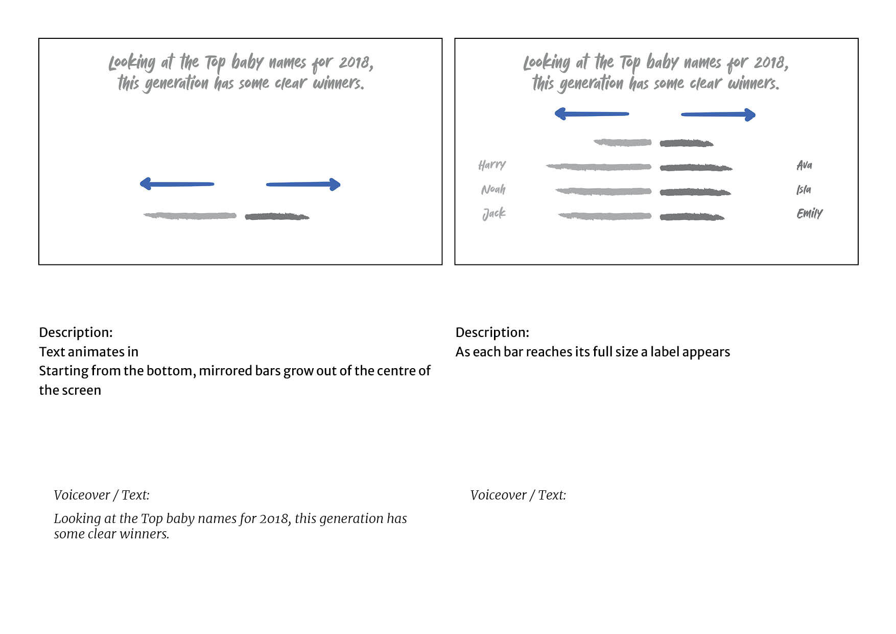
The first version is the version that was included in the book. It’s a version of the ‘slideshow’ animation - essentially transitioning between and animating charts in interesting ways.
| Voiceover/ Subtitles | Visuals on screen |
|---|---|
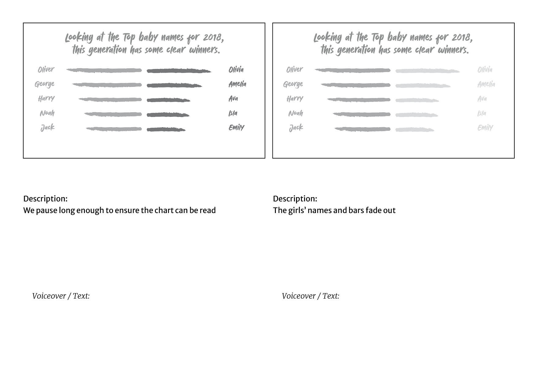
| Looking at the Top baby names for 2018, this generation has some clear winners. | Two mirrored bar charts (top 5 names for girls and boys) grow from the centre of the screen, both starting from the bottom |
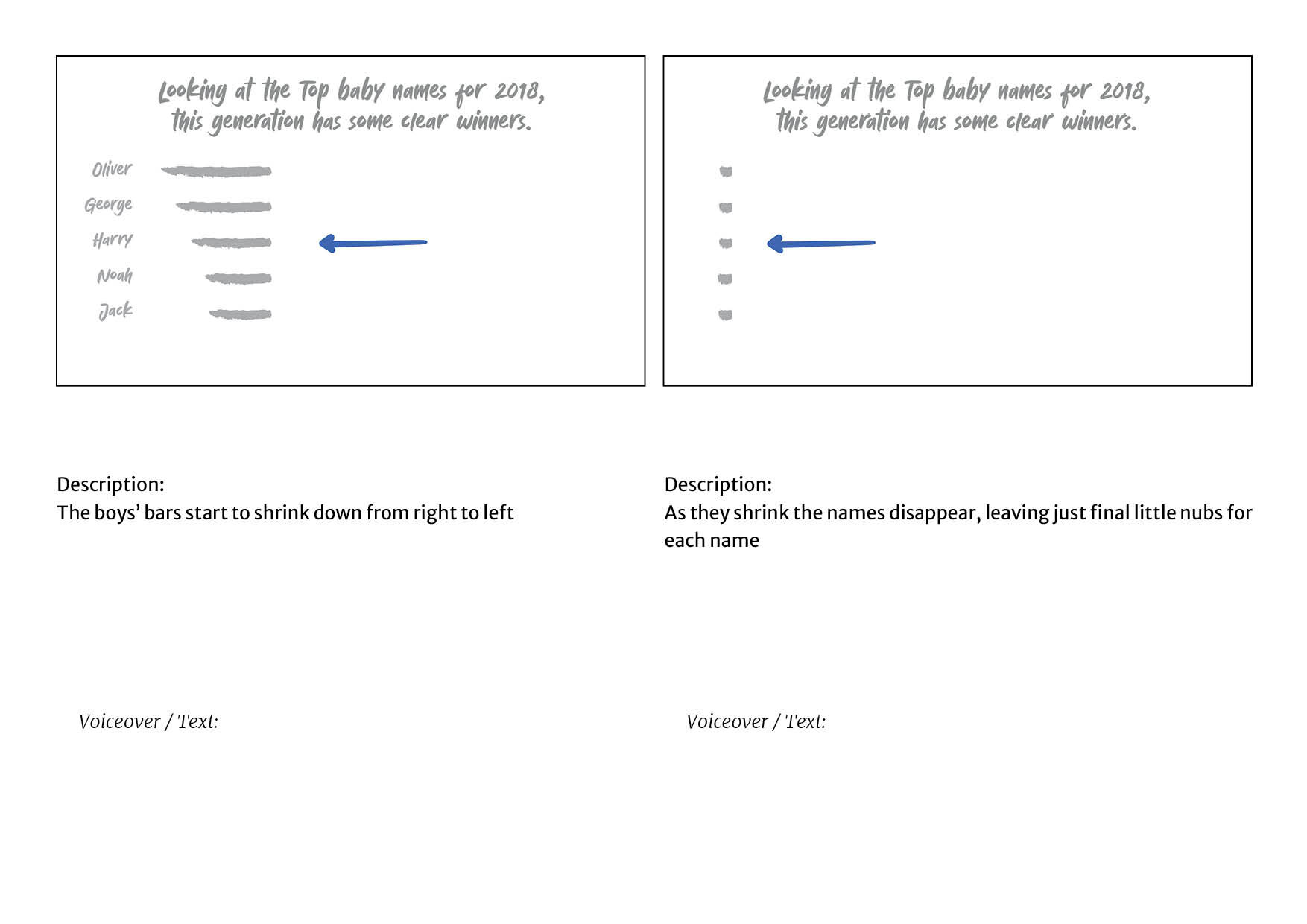
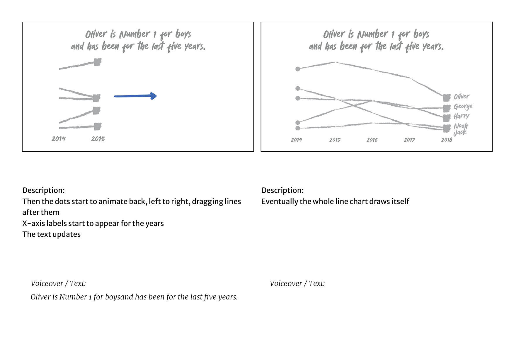
| Oliver is Number 1 for boys - and has been for the last five years. | We highlight Oliver at #1 and fade out the girls’ bars, shrinking the boy’s bars down to a square for each name and moving the names to the right. Lines grow back left across the screen to show the ranks for the last 5 years |
| Olivia is Number 1 for girls - and has been for the last three years. | Cross fade to a similar line chart for the girls but only showing 3 years |
| Other names - like Amelia and Emily for girls and Jack and Harry for boys - have been in the Top 10 for at least a decade... | The line chart extends out to 10 years and grows to be a top 10, highlighting Amelia & Emily. We then cross-fade to the same chart for boys, highlighting Jack & Harry |
| and represent this generation as surely as Sarah and Chris did in the 1980s . | The camera pushes left, the names disappearing off to the right, the lines crossing and fading as the x-axis years tick back towards 1984. By the time we get there the line chart has disappeared entirely and another mirrored bar chart appears showing the top 3 names for girls & boys. |
| and Margaret and John in the 1950s | The mirrored bars transform to show the top 3 in 1954 |
| So names have changed. This generation has its own identity, right? | The bars animate away and the axes of four line charts appear, the x-axes all labelled 1900 at one end & 2018 at the other |
| Actually, it’s not that simple. Yes, we’ve dropped the boomer names, but replaced them with names that were popular four or five generations ago. | Each line chart traces the same pattern: popular in 1900s, disappearing, reappearing again in the 2000s, they are labelled Grace, Ivy, Arthur & Edward |
| They are retro chic. | The line charts fade away leaving the names highlighted. Then they fade |
| And even when the names have changed, the attitudes certainly haven’t. | The screen starts to fill with 30 dots |
| Girls are still named after flowers and plants. | 25 dots fade away, leaving 5 that then grow to become sized bubble and are labelled: Poppy Lily Willow Rosie Daisy |
| Boys are still named after kings and religious leaders. | We crossfade to the same chart for boys: George Henry Noah Muhammad Isaac |
| For girls, we are influenced by celebrities and fantasy movies. | The boys’ bubbles fade away and a dot chart grows from the bottom of the frame showing: rank change since 2008: +1365 Harper/ +570 Aurora/ +537 Luna |
| Whereas boys. Well, let’s just say – don’t mess. | The dot charts shrink back and fresh ones grow for the boys: rank change since 2008: +236 Reggie/ +50 Ronnie. Illustrations of Reggie & Ronnie Kray appear in the dots. |
| Which begs the question: when we give our children a name, are we really thinking about what their future life might be? | The dot charts shrink away and two sized bubbles appear on screen, labelled Oliver & Olivia. The bubbles are then filled with illustrations of babies’ faces |
| Or are we stuck in the past? | The babies morph into illustrations of Oliver Cromwell & Olivia DeHavilland - the labels update to match |
| Read more about our baby names coverage at: www.theguardian.com/baby-names-2019 | Logo and url on screen |
The second version is a ‘changing scenery’ animation, with a single chart - in this case a bubble chart, but the content of the chart and the background changes as the story evolves.
| Voiceover/ Subtitles | Visuals on screen |
|---|---|
| Looking at the Top baby names for 2018, this generation has some clear winners. | Twenty iconographic babies, two rows of 10, appear on screen one by one. Baby shower decorations appear, including balloons spelling out 2018. Sized bubbles grow around the babies. The babies are labelled as the top 10 boys & girls. |
| Olivia is Number 1 for girls - and has been for the last three years. | The balloons spelling the year start to change, counting back, and as they do, the illustrations change and swap round as the names change rank |
| Oliver is Number 1 for boys - and has been for the last five years. | The same happens with boys, but, of course, Oliver stays #1 for longer than Olivia |
| Other names - like Amelia and Emily for girls and Jack and Harry for boys - have been in the Top 10 for at least a decade... | The balloons continue counting back, but now Amelia & Emily are highlighted in the girls and Jack & Harry in the boys - we can see that they stay in the top ten back to 2008. |
| and represent this generation as surely as Sarah and Chris did in the 1980s . | Now the decorations change to something a lot more 80s: geometric primary colours, and the babies update to the top ten for both for 1984 |
| and Margaret and John in the 1950s | And then everything updates to become a lot more mid-century with the top tens for 1954 |
| So names have changed. This generation has its own identity, right? | Everything changes incredibly rapidly, decorations getting more & more old fashioned, the baby illustrations start disappearing |
| Actually, it’s not that simple. Yes, we’ve dropped the boomer names, but replaced them with names that were popular four or five generations ago. | We are back in the 1910s and are left with four babies: Grace, Ivy, Arthur & Edward, labelled with their ranks. Then we start speeding forwards through time: First World War, Second World War, 60s, even our four remaining babies have disappeared |
| They are retro chic. | Then they reappear and we are back in the 00s |
| And even when the names have changed, the attitudes certainly haven’t. | We are finally back in 2018 and more babies reappear so we now have 10 on screen, still in their two rows, 5 girls and 5 boys |
| Girls are still named after flowers and plants. | The five girls are labelled: Poppy Lily Willow Rosie Daisy and the background sprouts a garden |
| Boys are still named after kings and religious leaders. | The garden changes into the gothic interior of a palace and the boys are labelled: George Henry Noah Muhammad Isaac |
| For girls, we are influenced by celebrities and fantasy movies. | These babies fade back and three more appear, labelled with rank change since 2008: +1365 Harper/ +570 Aurora/ +537 Luna, and the background changes to a red carpet event |
| Whereas boys. Well, let’s just say – don’t mess. | Then the background changes once again to 60s London and two more bubbles appear for +236 Reggie/ +50 Ronnie. The Kray twins appear in the background. |
| Which begs the question: when we give our children a name, are we really thinking about what their future life might be? | The background changes back to the 2018 baby shower and the bubbles update to our top tens for boys and girls that we started with |
| Or are we stuck in the past? | Then the background starts to shift rapidly as names highlight: Oliver/ 1640s, Ava / 1950s, Arthur / Mythical Britain , Freya / Ancient Vikings - the years keep flicking by as the scene fades from view |
| Read more about our baby names coverage at: www.theguardian.com/baby-names-2019 | Logo and url on screen |
The final version uses a completely different visual approach - using photographs and film footage rather than just pure vectors - and relies much more on the conventional film language of montage through editing to build a story.
| Voiceover/ Subtitles | Visuals on screen |
|---|---|
| Looking at the Top baby names for 2018, this generation has some clear winners. | A collage of photos of celebrities builds on screen: Olly Murs, Olivia Wilde, Prince George, Karen Gillan as Amy Pond, as the top names are listed in the centre of the frame |
| Oliver is Number 1 for boys - and has been for the last five years. | Cut to the clip of Mark Lester as Oliver Twist asking for more as a simple line chart showing Oliver as #1 is superimposed over the top |
| Olivia is Number 1 for girls - and has been for the last three years. | Cut to Olivia Coleman winning an Oscar, with the same kind of line chart - she is very happy about it |
| Other names - like Amelia and Emily for girls and Jack and Harry for boys - have been in the Top 10 for at least a decade... | A simple line chart of the top ten girls names, with Amelia and Emily highlighted appears over the top of footage of Emily Blunt smiling on a red carpet, followed by the same for boys with a clip of Harry Styles |
| and represent this generation as surely as Sarah and Chris did in the 1980s . | A clip of Sarah Greene on 80s TV under a list of the top names for 1984 |
| and Margaret and John in the 1950s | Then a clip of John Mills in Ice Cold in Alex (the famous scene at the end with the beer) under a list of the top 3 names for girls and boys in 1954 |
| So names have changed. This generation has its own identity, right? | An image of a baby playing with a mobile phone |
| Actually, it’s not that simple. Yes, we’ve dropped the boomer names, but replaced them with names that were popular four or five generations ago. | Ancient film of King Edward VII (it doesn’t matter that no one will recognise him because the footage look old) under a line chart of four names over time: Grace, Ivy, Arthur and Edward - they dip and the clip crossfades to |
| They are retro chic. | ...and old person holding a baby as the names reappear on the chart |
| And even when the names have changed, the attitudes certainly haven’t. | A clip of a boy in blue and a girl in pink |
| Girls are still named after flowers and plants. | A little girl plays with flowers with an overlay listing: Poppy Lily Willow Rosie Daisy as top 30 names |
| Boys are still named after kings and religious leaders. | Cut to a little boy playing with a sword while the names George Henry Noah Muhammad Isaac are listed |
| For girls, we are influenced by celebrities and fantasy movies. | Cut to an image of Victoria Beckham with Harper overlaid with sized bubbles showing rank change since 2008: +1365 Harper/ +570 Aurora/ +537 Luna |
| Whereas boys. Well, let’s just say – don’t mess. | Then footage of Ronnie and Reggie Kray, overlaid with bubbles showing rank change since 2008: +236 Reggie/ +50 Ronnie |
| Which begs the question: when we give our children a name, are we really thinking about what their future life might be? | A quick montage of of children growing up - toddlers, teenagers - but it quickly gets science fiction: a young man building a robot, a female astronaut in a futuristic spaceship |
| Or are we stuck in the past? | Smash cut to footage of Oliver Reed falling over drunk on the Late Show then to black & white footage of Olivia DeHavilland looking disapproving |
| Read more about our baby names coverage at: www.theguardian.com/baby-names-2019 | Logo and url on screen |
Exercise 2: Storyboards
Here is the example storyboard from the book, hopefully at a larger, more legible size.
Notice how much space is given over to describing the first chart compared to the line chart. The transition of the lollipop chart requires a lot of explanation, while the line chart just draws itself on in the way you’d expect.
Here’s that storyboard sequence animated:
In the final animation, those two charts take about the same time to animate in, but notice how some new elements have appeared that weren’t storyboarded. There’s design elements like the mobile in the background, for instance, but I also didn’t realise that I’d need to move the left hand labels around until I’d got to that point in the animation.
Examples
Here are some examples of the four kinds of animation visual approaches I mentioned in the book:
Slideshow
This animation is essentially just transitions between individual ‘slides’ of information. However the frames of information all have little bits of animation and loops in, and the transitions are all exciting and rapid (all brilliantly animated by Angela Gigica), so everything moves along and keeps our attention.
Rostrum camera
Here we have a whole scene - a lovely little town drawn (and animated) by the splendid Jamie Lenman - which the camera roams over, discovering new things at different resting places. This makes a virtue of when we want to revisit places and discover new things there - instead of ‘rewinding’, we’re ‘re-exploring’, which feels more purposeful.
(One thing I had to cut from the book was the story of Ken Morse, the rostrum cameraman whose name appeared in the credits of so many documentary shows that he became a minor celebrity and the BBC2 Late Show did a whole programme about him)
Changing scenery
Here we have a single visualisation - 10 houses, each standing for 10% of the UK housing stock (illustrated by Zhenia Vasiliev, animated by Rosie Roche). The visualisation stays in the same place and updates in the same way, individual houses being highlighted to show percentages, while around them the context changes - the text updates, extra bits of animation and scenery appear, constantly updating and decontextualising the visualisation.
Scene by scene
This is pretty much pure montage, cutting from sequence to sequence, all to illustrate the story the cartoon scientist is telling us. This animation, by Jamie Lenman again is also a really good example of how animation can character and emotion to a factual, information rich story. However, even simple character animation like this is incredibly hard and time consuming.
Examples of concepts
Some of the concepts in animation were quite hard to explain in print, so here are some further, moving, examples.
For a start, here’s some examples of easing in tweens.
Hang on. A what in a what?
A tween is filling in the movement between two key frames in an animation. In this case I have given all the circles the same beginning and end points, and the same number of frames in which to make the transition. I have then asked the computer to fill in those frames. However, I have applied a different easing to each tween.
The first circle has no easing at all - it travels the same distance in every frame, a even speed.
The second circle has in easing on its journey right, that means it starts slowly and then accelerates as it approaches its destination. It then has out easing on the journey back left. It starts quickly and then slows down to reach the end.
The third circle has both in & out easing on both legs of its trip. This means it starts slowly, speeds through the middle and slows down again to finish. Because it’s using exactly the same number of frames as the circle with no easing, this means that it pretty much jumps across the middle of the journey, it happens in only a frame or two, because it needs a lot fo frames to do the slow motion.
As I point out in the book, this has an effect on how we interpret the object moving. With easing comes a naturalness and also a drama of movement. This can frame how we read the data:
Both these charts are showing the same data, but in two different ways. Obviously there are fundamental differences in how the two charts, line & bubble, show data in the first place. The area of the bubble tends to hide small differences in the data that are obvious in the line chart.
But the manner of animation also changes how we think about the data. Both dramatise the development of the data over time, but while the line chart draws its own history, the bubble exist only in the moment, denying us any ability to compare the present with the past. Meanwhile the judders and bumps of the bubbles are far more dramatic and surprising than the careful drawing of the line.
All these things mean we can use animation to add drama and character to a dataset:
This animated chart uses a lot of those techniques on the list from the book, Disney animation: the Illusion of Life. The biggest feature is probably the use of squash and stretch in the bounces, where the ball elongates and squashes as it flies about, and the anticipation, drawing back before it zooms up or taking a little run up before it bounces.

A screenshot of the animation file (done in Adobe Animate, because I’ve been using Flash for 30 years and its too late to change now). You can see the various tweens on the timeline below - and where I’ve edited them to squash the ball and tweak the timings of the bounce.
All of these give even just a data dot character - its hard to not to read intention and emotion into its movements.