LeARNING MATERIALS - CHAPTER 3
Here is the Excel exercise referred to in Chapter 3 of our book, ‘Communicating with Data Visualisation’ (Sage, 2021).

Here is the Excel exercise referred to in Chapter 3 of our book, ‘Communicating with Data Visualisation’ (Sage, 2021).
Note: this tutorial is for people who might know the basics of Excel but haven’t really used it extensively for data analysis. It covers some of the functionality that we use the most. If you are an Excel ninja, you will probably know all of this already, and may well know better ways of achieving the same results.
1. Start by downloading this World Bank fertility rate dataset: https://bit.ly/excel-task-dataset. Or you can download the latest dataset from the World Bank site directly: https://data.worldbank.org/indicator/SP.DYN.TFRT.IN
2. Work through the tasks below. If you get stuck at any point, you can download our modified spreadsheet here, where we have broken down each task on to a separate worksheet: https://bit.ly/excel-worked-example
3. When you open the World Bank Excel file, it should default to the first worksheet ‘Data’. Delete the first three rows of this sheet - they are redundant. You want your first row to be ‘Country Name’, ‘Country Code’ etc. So select the first three rows, right click and choose ‘Delete’. At this point, you might want to also save the spreadsheet and give it a name of your own.
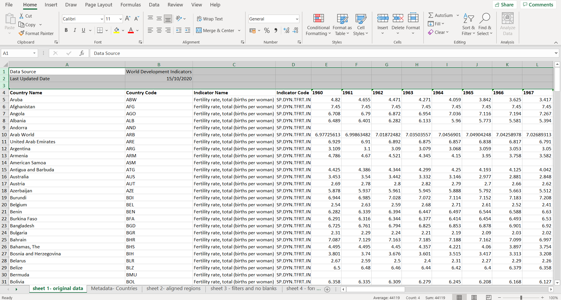
Select the first three rows and delete them.
4. Next - it would be good to have the regions on this first worksheet too (and each country’s income level - if you like). Click on the ‘Metadata - Countries’ sheet (you should see the tabs at the bottom of the sheet). On the Metadata- Countries sheet, you’ll find region and income level on columns B and C. HOWEVER, if you just paste this ‘regions/ income level’ information into your first worksheet, everything will be misaligned about halfway through. This is because, about half way down on that first worksheet, you’ll find a row titled ‘Not classified’. Its code is ‘INX’. It’s in between India and Ireland. This doesn’t exist in the regions list. So delete that row.
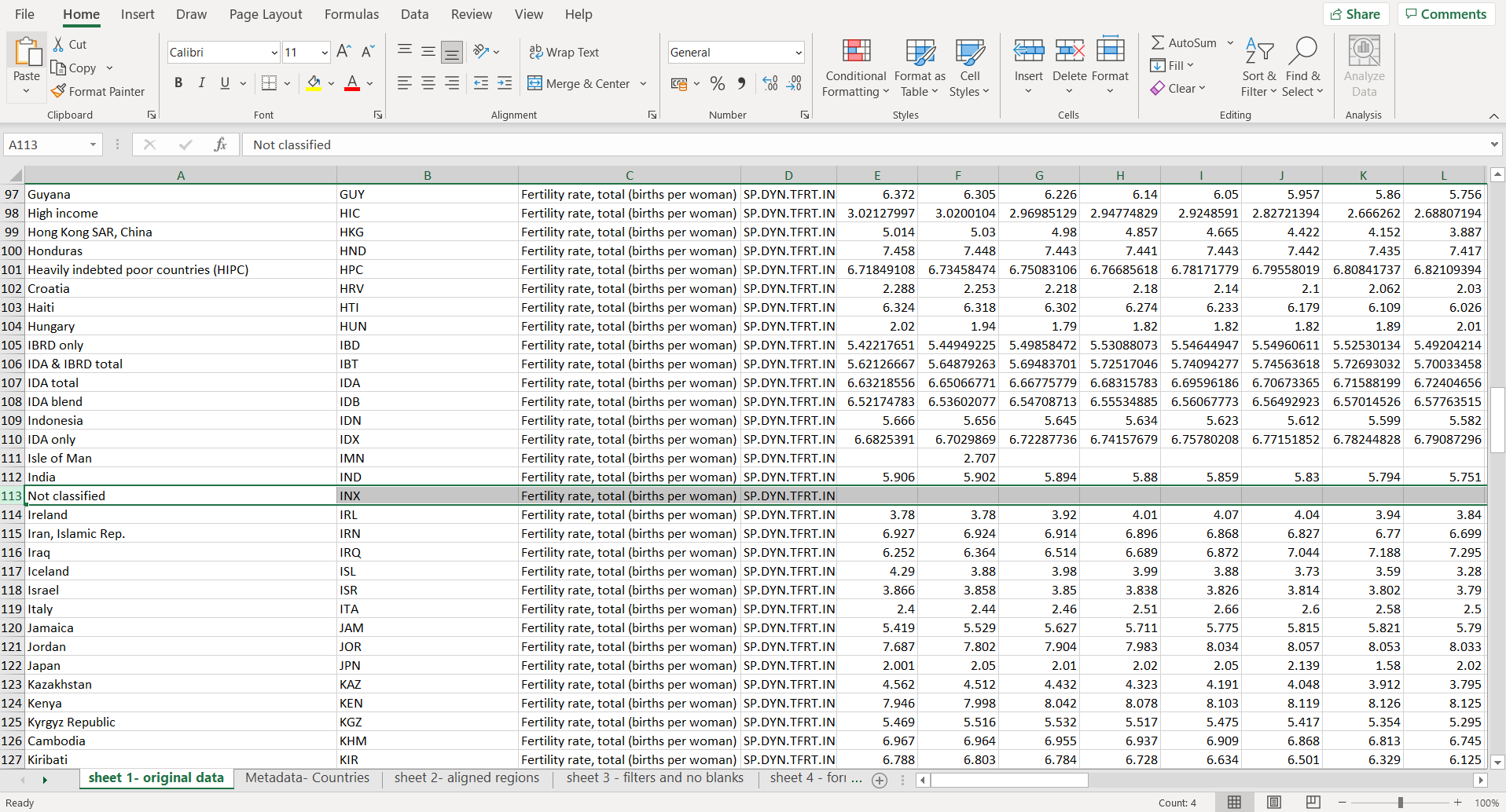
Delete the annoying ‘Not classified’ row
5. NOW you can copy over the regions and income level columns from the ‘Metadata - Countries’ sheet. I always copy the Country Code column too (you can delete the duplicate later) just because it’s easier to check that everything is aligned. So select the first three columns on ‘Metadata - Countries’. (On a PC, you do this by clicking on the A at the top of the first column and then pressing shift + right arrow twice.) Copy those three columns - CTRL + C or right click and select Copy.

Select the first three columns on ‘Metadata - Countries’, right click and select Copy
6. Now go back to your ‘Data’ worksheet. Right-click on the top of Column C and choose ‘Insert Copied Cells’ in the drop-down. Note that if you do anything between copying and inserting the copied cells (e.g. if you delete something, or change a typo), Excel will probably forget what you’ve copied, and you’ll have to copy the three columns again.
7. Have a quick scan through of your two duplicate Country Code columns. They should all match. If they don’t, amend/ cut/ delete rogue rows appropriately. Otherwise, if all is well, you can delete one of those Country Code columns.
8. At this point, you can probably delete the ‘Indicator Name’ and ‘Indicator Code’ columns. You don’t need them. So right click on the letter at the top of each column (to select the whole column) and choose Delete.
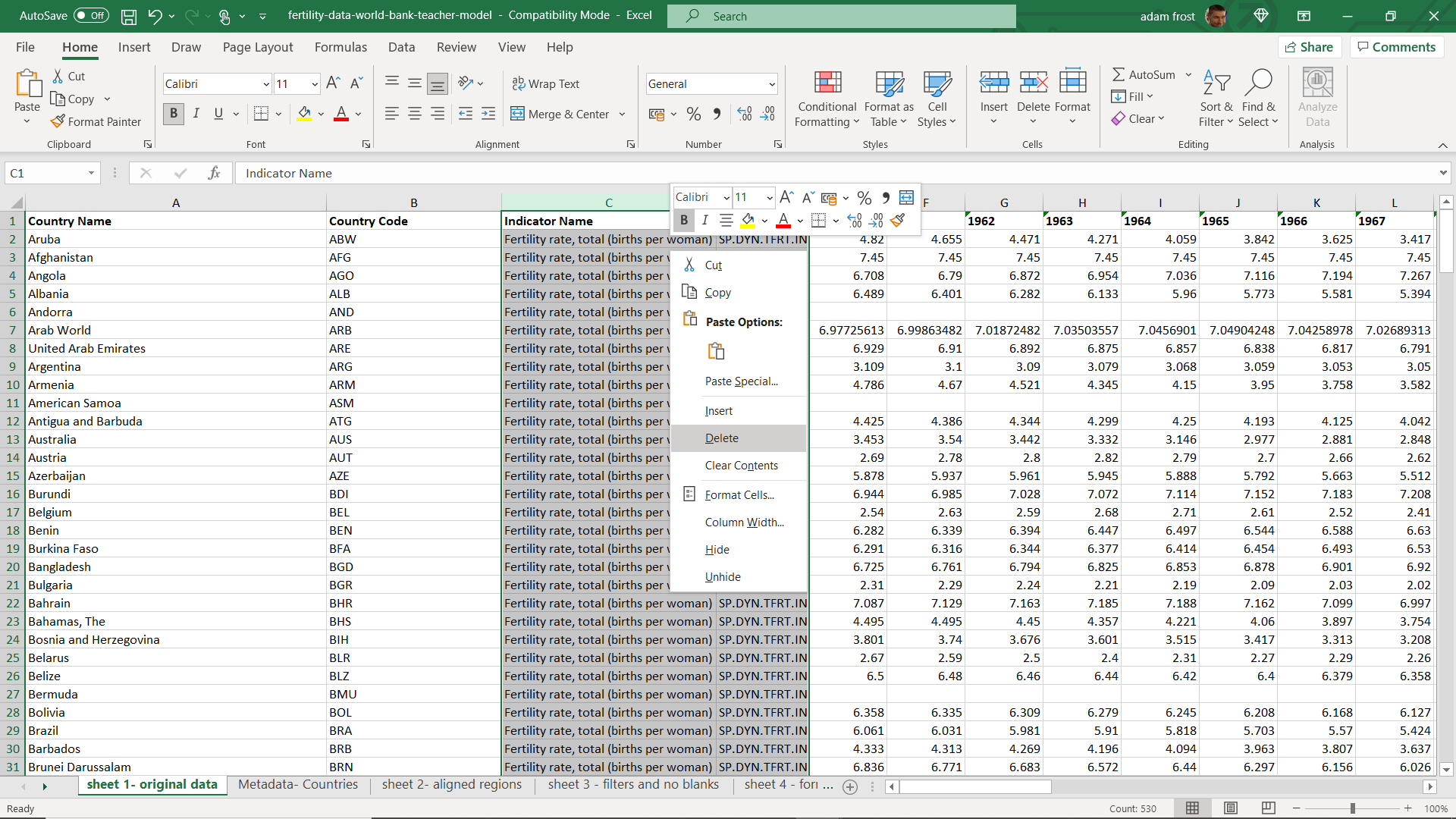
Delete the columns full of nonsense
9. This might also be a good time to change the width of some of those columns. They are taking up a lot of horizontal space, and it’s always good to see as many columns as possible on screen at once. To make your columns narrower (or indeed wider), hover near the edge of the column and you should see a double-headed arrow appear. Click and drag to change the size of your columns.
10. If this causes some of your text to be cut off, you can choose whether to leave it like that, or wrap the text so its fits and expands the cell. One quick way of doing this is to i) select the whole spreadsheet (CTRL + A or click on the arrow at the top left of the spreadsheet, to the left of Column A). ii) Right click and choose Format Cells. On the pop-up window, choose the Alignment tab, and tick the Wrap Cells tick box.
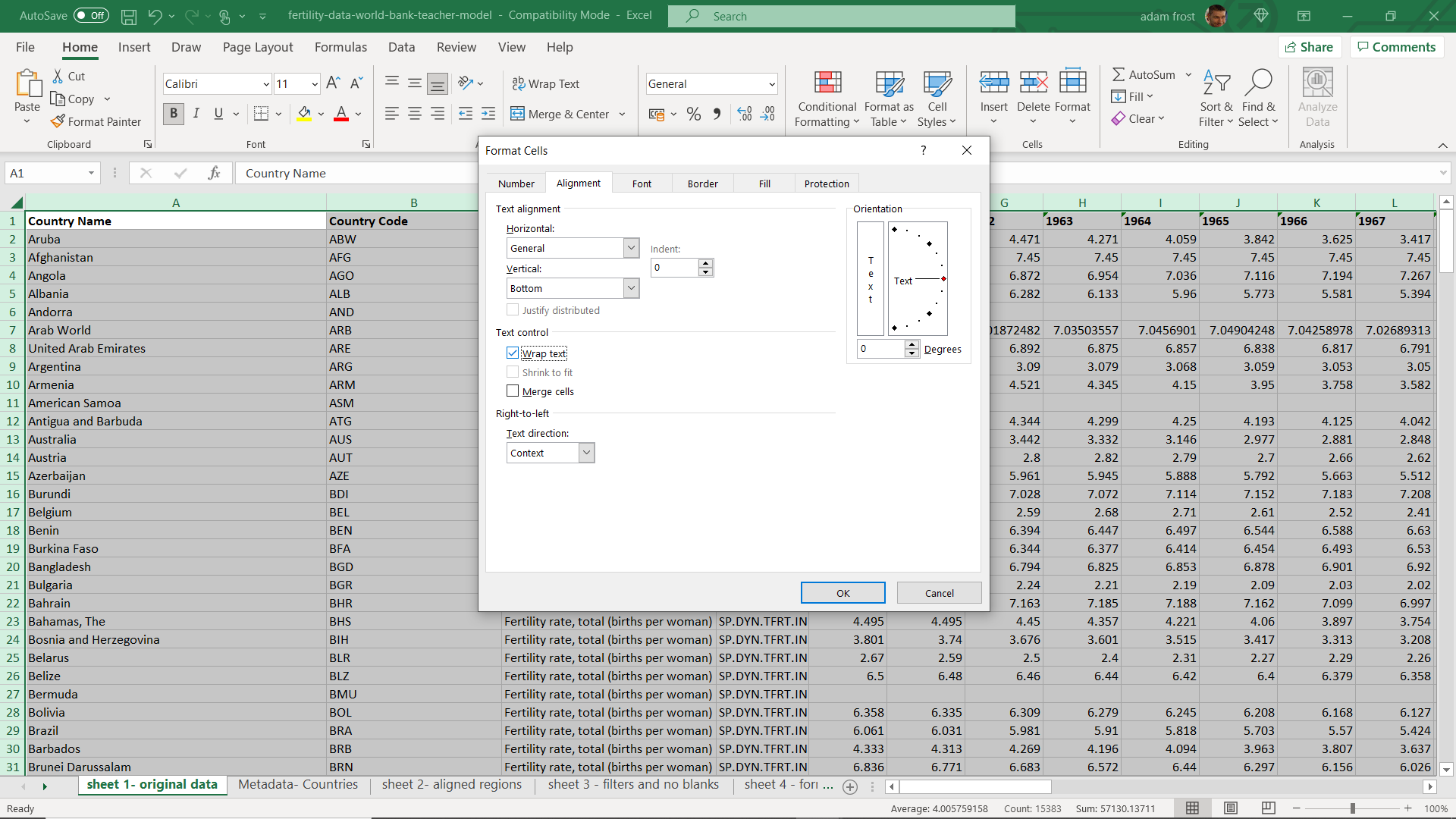
Wrapping things up
11. Now, after text wrapping, you might decide this makes all your cells too deep. If so, you can always just Undo it (CTRL+Z) or you can simply adjust the width of the columns again, as you did above. However, after re-sizing your columns this time, Excel (unhelpfully) doesn’t just adjust and make the text fit all those cells in the most natural way. At this point, you might find AutoFit Row Height useful. Select everything again (CTRL+A). Then click on Home in the top menu bar (Home might already be selected - it is the default), then go across to the Cells panel, choose Format and click ‘AutoFit Row Height’. The rows should snap back around the text again.

Survival of the Autofittest
If you’re finding all of this difficult, or Excel isn’t behaving, you can just download our worked example https://bit.ly/excel-worked-example, and jump to ‘worksheet 2 - aligned regions’, which shows a finished version of everything we’ve covered up to this point. Now carry on following through the instructions below.
12. At this point, your spreadsheet should look a bit like this.

A little bit cleaner
13. The next stage involves getting rid of those top-level country groupings that the World Bank uses. Things like ‘East Asia & Pacific (excluding high income)’. Sometimes, these groupings are helpful and you might use them in a visualisation, but for the sake of this exercise, I’m going to assume they are redundant. Fortunately, there is a quick way of getting rid of (most of) them. But first, we need to add some filters.
14. Filters are great. We’ll add some by selecting our first row (click on the 1 on the left-hand side of row 1). Click on Data in the top Menu (it’s probably on Home at the moment) and then in the Sort & Filter section, choose Filter. Now you’ll probably just spend about five minutes playing with those filters and sorting different columns by highest, lowest, alphabetically or whatever. Who had the lowest fertility rate in 2018? And the highest? Who had the lowest in 1960? When you’ve finished having fun, move on to the next step.

Adding filters to your sheet
15. I want to get rid of those top-level groupings. So first I’m going to click the Region filter. If I choose A to Z in the drop down, it filters alphabetically and you’ll notice all those entries with blank ‘region’ cells have been put at the bottom of my spreadsheet (they are, in effect, after Z). You’ll also notice that they are all the country/ regional groupings that I don’t want. I can now select all of these rows, click cut and put them somewhere else (maybe in another sheet). I wouldn’t delete these rows - you might need them later, particularly ‘World’ as you might want to compare individual countries to the global average. (In my worked example, you’ll find them in the worksheet ‘appendix - groupings’). If you don’t want to remove these rows permanently, you can simply filter them out. To do this, you click the Region filter arrow again, but untick (Blanks) in the list of checkboxes. They vanish - but look at the numbers of your rows on the left - those hidden rows are still there, you can see the numbers jump rows at certain points.

Either choose Sort A to Z or untick ‘(Blanks)’ in the checkbox list.
16. At this point, you might want to experiment with sorting and filtering, ticking and unticking different options in your drop-down lists. For example, maybe you just want to see all the countries from Europe and Central Asia? How might you do this? And then how would you bring all of the countries back again?
If filters have defeated you, you can just download our worked example at https://bit.ly/excel-worked-example, and jump to ‘worksheet 3 - filters and no blanks’, which shows a finished version of everything we’ve covered up to this point. Now carry on following through the instructions below.
17. Now we have a decision to make. This is an incomplete dataset, like most datasets. The majority of countries have fertility rate data going back to 1960, but a few countries don’t. If you click the 1960 filter, and scroll down to see the blanks for 1960, you can see that most of these countries are small (Andorra, Bermuda, Faroe Islands etc). In this instance, I think I’m going to remove these countries - I’d rather deal with a complete dataset and mention these omitted countries in a footnote. So I’m going to remove these 27 rows and put them in another appendix sheet (If you’re following along with our worked example, this is in the worksheet ‘appendix - smaller countries’). I can always restore these countries if I decide I need every country to be shown (e.g. in a geographical heatmap)
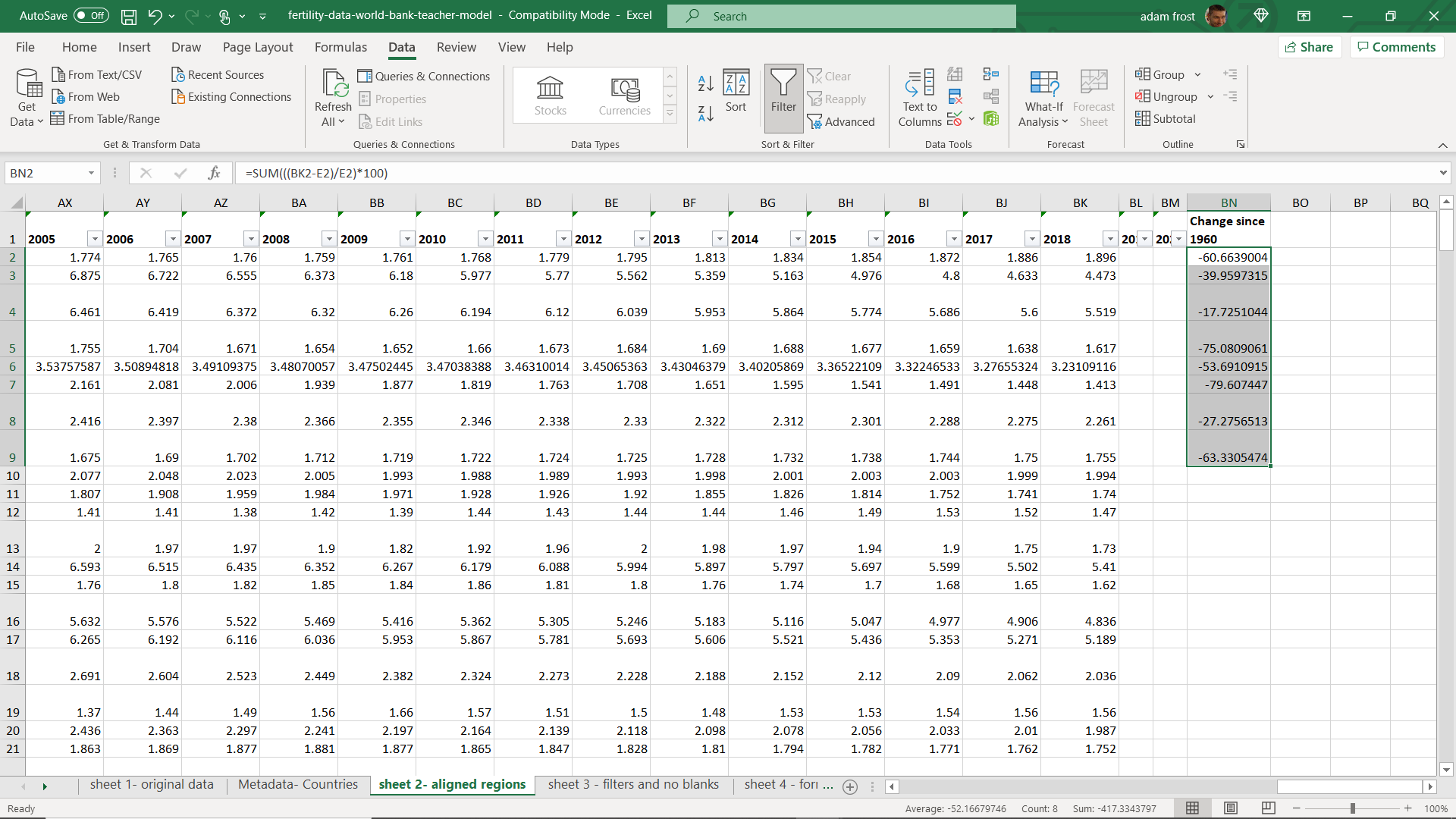
18. Let’s add a formula now. Formulas will save you a lot of time. I want to know which country’s fertility rate has dropped (or risen) the most - in percentage terms. So I’m going to add a column at the end of my spreadsheet and call it ‘Change since 1960’.
19. Note - at this point, this column won’t be included in my automatic filters. To be on the safe side, I would stop at this point, highlight row 1, go to Data > Filters and switch off all the fiters. Then switch them all on again. (Click the Filter button twice - in other words). Now your new column will be included in the filters.
20. Ok, now a very simple formula. I’m going to ask Excel to work out the % difference between 1960 and today. To do this, I’m going to use the SUM function. I click on the cell in the first row below my row title - in my spreadsheet, this is cell BN2 and it should be the same in yours.

Summing it up
21. If ever you want Excel to do maths for you, you start by typing = SUM and then put the sum you want it to carry out between brackets. So if I wanted Excel to work out 5x5, I would put =SUM(5x5) into a cell and the formula would magically turn into 25. The formula itself is preserved up in the formula bar at the top of the spreadsheet, but the cell itself shows the answer. If I want Excel to add numbers up that are featured in particular cells, I reference the cell numbers in any formula. So, for example, if I want to add the numbers in cell BJ2 and BJ3 together, I would enter =SUM(BJ2+BJ3). (You can also click on cells to build a formula, adding mathematical symbols in between). If you’re after complex calculations, remember BODMAS from school. Excel works in the same way: Brackets, Order, Division, Multiplication, Addition, Subtraction. So =SUM(15-3*4) gives you the answer 3 not 48.
22. In our case, we want to calculate percentage change. So first I need to work out the difference between the value in 2018 and 1960. So that would be BK2-E2 (or whatever the relevant cell names are for you). Next I need to turn this into a percentage of the 1960 figure, so I need to divide the answer to BK2-E2 by E2. Finally I need to multiply the answer by 100 to give us a percentage figure. However, remember BODMAS. My sum needs to happen in a specific order. First the subtraction, then the division, and finally multiplication. This is not BODMAS order, so I’ll need to use brackets to make sure my formula moves through the calculations in the correct way. In other words: =SUM(((BK2-E2)/E2)*100)
23. An optional extension task: add another column where you show the change since 1980 and the change since 2000 and create a suitable formula that calculates this change. Clue: you only need to change ONE cell name in your formula (the E2 representing 1960).
24. OK, so you’ve added a formula for one cell and one country: Afghanistan (unless you changed the sort order and another country is in Row 2, of course). I can now see that Afghanistan’s fertility rate has dropped by 39.96% since 1960, although it’s still pretty high, at 4.47 children per woman. Now do you have to write that same formula in your remaining 189 rows? Of course not. This is the real magic of Excel. If you click on your formula cell, you will notice a small black square on the bottom right, hover over that and your mouse should change to a plus symbol. Click and drag down.
Excel works its magic
25. Hurrah! Excel will automatically populate the cells under your initial formula cell with numbers. And these numbers will all be accurate. Because Excel assumes that you don’t want the same formula repeated. It assumes that you want the formula to update so that it performs the same calculation on the numbers on each row. Click on one of those answers and inspect the formula in the formula bar. See how =SUM(((BK2-E2)/E2)*100) has become =SUM(((BK3-E3)/E3)*100) and then =SUM(((BK4-E4)/E4)*100) and so on. You can drag all the way down to the bottom of the spreadsheet and get the right percentage change for every single country.
If formulas are proving tricky, you can just download our worked example https://bit.ly/excel-worked-example, and jump to ‘worksheet 4 - formulas’, which shows a finished version of everything we’ve covered up to this point. Now carry on following through the instructions below.

26. You should now be able to filter your ‘Change since 1960’ column and see which country has had the biggest drop in fertility. Remember you’ll be sorting ‘Lowest to Highest’ to see the biggest drop! South Korea should be at the top of your list: its fertility dropped from 6.1 to 0.98. That’s a huge 84% drop - they now have the lowest fertility rates in the world. They are followed closely by Singapore, who have experienced a similar drop: from 5.8 to 1.1. The lowest drop should be the DRC whose fertility rate has barely shifted in almost 70 years.
27. Let’s add some formatting to our table to help us see patterns more clearly. First, I’m going to click on my 2018 column and sort highest to lowest. I want to know which countries have the highest fertility rates right now.
28. A glance at my Region column suggests that most of the countries with high fertility are in Africa, but I’d like to make that more visible. So I’m going to click on the top of Column C to select it. Then I’m going to click on Home in the nav bar (if it isn’t already selected) and click on Conditional Formatting in the Styles panel. I have quite a few choices here - we’ll come back to those. Right now, we’re going to go for: Conditional Formatting > Highlight Cells Rules > Text that Contains. I’m going to type Sub-Saharan Africa in the text box. Next I’m going to select ‘Custom Format’ in the drop-down. Then I’ll click on the Font tab and choose a white font and then, clicking on the Fill tab, I’ll choose a dark grey background of some kind. Click OK. Sub-Saharan Africa should all be formatted with that dark grey background and white font.
29. Now if I glance down my list of ‘countries sorted by highest fertility’, I can quickly see that most of the Sub-Saharan countries are at the top of this list. In fact, there is only one country - Mauritius - in the bottom half of my list.
30. I’m then going to do the same for all the other regions, format them with a different coloured background. What this gives me is a quick sense of which regions have the highest fertility rate. For instance, it’s now easier to see all those European and East Asian countries down at the bottom (particularly if you use a similar hue to colour them).

Applying formatting
31. Most of the time, you’ll be using conditional formatting on numbers. It can quickly turn your dataset into a heat table. Let’s do this now. Select the ‘2018’ column. Once again, go for Home > Styles panel > Conditional Formatting. But this time, choose Top/Bottom rules. Select Top 10% and choose a style. Do the same, and select Bottom 10%. You should notice that the Top 10% and Bottom 10% of your 2018 dataset are coloured. If you want to set specific bands, you can do that by going into Highlight Cells Rules and use the ‘Greater than..’ ‘Less than…’ and ‘Between…’ options. Essentially, colour this column in a way that makes sense to you. I think I’m going to go with Top/Bottom Rules and then colour my dataset depending on whether they are Above or Below Average.
If formatting is proving tricky, you can just download our worked example https://bit.ly/excel-worked-example, and jump to ‘worksheet 5 - formatting’, which shows a formatted version of everything we’ve covered up to this point.
32. This is just the tip of the iceberg. But hopefully it’s shown you how Excel can save you time and energy - and help you to find stories. If it’s whetted your appetite, the Excel Bible walks you through more advanced functionality (make sure you get the latest version - the year is usually in the book title). And Data at Work by Jorge Camoes shows you how you can use Excel to create some (reasonably) attractive data visualisations.